By Phil Hecken
Follow @PhilHecken
Last evening, the Miami Florida Marlins returned to their roots, playing the San Diego Padres in the first of a three-game series in which they will don throwback uniforms. Last night, the team broke out their “original” 1993 uniforms. Mostly.
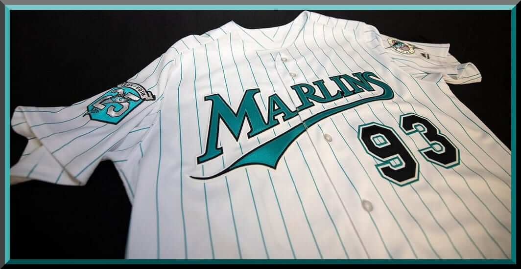
If you recall, I actually wrote about the Marlins “Sign(ature)” uniforms last weekend, and I opined that the 1993-95 uniform set was indeed the team’s signature one. This was due largely to the fact that that set was very teal-dominant, giving the team a unique visual identity in baseball. I was hoping they’d replicate that set last evening. For the most part, they did. Let’s take a look at Bill Henderson’s depiction of the 1993-2002 jersey:

How’d they do?

Teal pinstripes? Check. Teal “Marlins” wordmark outlined in black? Check. Black numbers outlined in white/silver/teal? Check. Shoulder patch? Check. Teal cap? Double check. It all looks good.
Everything seems right in the world, although seeing the Marlins dressed in these colors in front of the world’s worst outfield “sculpture” (which I’m pretty sure owner Derek Jeter has sued to have removed) was a bit jarring. NOB’s (note the nameplate vs. direct sew) & numbers all check out too (wish there were some semblance of hosiery however):

On the field, the Marlins looked *exactly* as you’d have them look. The team seemed into it — they went to a small amount of trouble to make sure the graphics (and headshots) all had the team looking sharp in their original outfits:
Back in Miami. Back in teal.
📺: @FOXSportsFL
📻: @940WINZ, @radiomambi710
💻: @YouTubeTV: https://t.co/9DTWe1xiwp #Marlins25 | #JuntosMiami pic.twitter.com/0nxdEJF7hZ— Florida Marlins (@Marlins) June 8, 2018
As our buddy Todd Radom points out, those original Marlins were a study in teal!
The @Marlins 1992 merch catalog, a study in teal, fronted by the art of LeRoy Neiman. Note that matching undershirts will be in stock just prior to Bill Clinton's election as president. pic.twitter.com/8tnbkGLG1B
— Todd Radom (@ToddRadom) June 9, 2018
Everything was perfect. Well, almost everything. Here’s the problem — the team was throwing back to 1993, and well, the 1993 team wore pretty much teal everything (helmets, undershirts, sleeves, etc). Pretty much everything but the stirrups (which were black) was teal. Last night…
The team went with matte black helmets…

…and black undersleeves…

…and catcher’s gear.
Now, the team currently wears matte black helmets, so instead of going the extra mile and having teal ones made, they simply stripped the current decal off the helmets and slapped on the original logo:
Disappointing. The black sleeves actually balanced out the helmet (when the team was at bat) but didn’t look so hot when the team was in the field, with the teal caps.

You can get a sense of it all in this short video clip
.@Marlins Brad Ziegler ➡ J.T. Realmuto ➡ Justin Bour for a HUGE double play with the bases loaded! 👏👏👏👏
Watch all the #Marlins25 action against the Padres LIVE now on FOX Sports Florida and FOX Sports Go! #JuntosMiami #MLB pic.twitter.com/LFQY2VmB7b
— FOX Sports Florida (@FOXSportsFL) June 9, 2018
Other than the black sleeves/helmets, I thought the team did a nice job with the throwback. They’ll be throwing back again today and Sunday (I’m not sure if it will be the same set or another set from their time as the “Florida” Marlins). After 1995, the team wore much more black (switching to black caps/helmets full time, and also wearing black undershirts), and won their first World Series wearing vests with black undersleeves, and by 2003, when they won their second World Series, they were wearing black jerseys and caps. Perhaps we’ll see those looks today and tomorrow. But this team was born in, and will always be associated with, teal — so it would have been nice, even if just for one night, for the team to go full teal, including the helmets and shirts.
With the new ownership group headed by Derek Jeter (who, along with the fans, loves the teal), we may see the club return to that color sooner rather than later. If this was a trial run, it got off to a pretty nice start.
You can see more photos here.
Your thoughts?


Kreindler’s Korner
I had the distinct pleasure of featuring the wonderful artwork of artist Graig Kriendler on two occasions over the summer and fall of 2017.
For those who don’t wish to click the links, Graig paints baseball heroes (and regular guys) from the past, and is an immense talent.
Occasionally, I will be featuring his work on Uni Watch.
Here’s today’s offering (click to enlarge):

Title: “Frazee Finds Fortune”
Subject: Babe Ruth, 1918
Medium: Oil on linen
Size: 34″ x 30″It’s still interesting to me that a lot of people tend to forget Babe Ruth started his big league career with the Boston Red Sox. Perhaps more often than not, baseball fans are exposed to him as an aging superstar with a big belly, wearing those pinstripes of the New York Yankees. Certainly those years of the early 1930s – when he was the absolute focal point of sports in our culture – are rife with more images of him doing more things in and out of uniform than perhaps at any time in his career. Perhaps because of the ubiquity of THAT Babe Ruth, when I see an image of him with the Red Sox as a young, svelte upstart, I’m always very attracted to it.
This particular image depicts the man-boy at Chicago’s Comiskey Park during the 1918 season, when he had almost doubled the amount of games played from the year before, splitting time between the outfield and the mound. The motif of him looking into the camera with a bat on his shoulder was cool enough, but when coupled with such bright light, I couldn’t say ‘no.’
It was that quality of light that I really tried to push here. Whenever I had seen photography or video footage of old Comiskey Park, more often than not, the sunlight was of a blinding quality. So much so that it often washed out the light plains in the very reference I looked at. Obviously, it’s not ALWAYS bright in Chicago, but in my head, I wanted the sunlight in this painting to mimic what I had been used to seeing. As a result, the painting was treated as an exercise in painting something high-key in its value structure – in other words, those values would inevitably stay in the upper (brightest) shades on the scale, with the exception of whatever accents I chose to plug in. I kept most of those in his face and bat where I wanted the viewer’s eyes to be drawn to; but otherwise, there are a lot of very bright areas with seemingly lost edges
The result of this kind of thinking made for a painting that I thought pretty well captured the memory of seeing and feeling that blinding Chicago sun. But I suppose having a 23-year old George Herman Ruth on there helps with the coolness factor, too.
Thanks, Graig! You can (and should!) follow Graig on Twitter.
With Father’s Day Approaching…

…comes a new twist…
What you see above is a photo of some of the gloves (well, a glove and a mitt) that belonged to the father of reader Bill Hetrick.
As most of you know, for several years now I’ve featured photos and short remembrances of readers and their fathers “in uniform” (you can see the 2017 edition here, which also links to prior years submissions). I’d still like to invite readers to again submit photos of their dads wearing any kind of uniform (sports, work, military) with a short (less than 100 words please) writeup describing the man and his uniform — you can see the prior years’ for an idea of what I’m looking for.
This year, Bill Hetrick approached me and asked if I were still planning on doing the Father’s Day column and if he might make a suggestion for a possible addition to that column: sports equipment your dad used and which he passed down to you. I’ll let Bill explain…
My Dad’s gloves
by Bill Hetrick
My Dad was an attorney, and he worked a lot of hours, but he always found time to play catch with me when I was young.
I don’t remember when I got my first glove, but for many years we played catch with his childhood gloves, circa 1935, but anachronisms today. I’ve included some photos. For a long time, those were “my” gloves, too, and I had no idea there might be something “better” to be had.

In the 1960s, like many families, we had one car, and my sister and I would ride with my Mom to pick him up at the end of the day. He’d come home, take off his coat, tie and dress shirt, put on shorts (still with dress socks) and his slippers and then he’d brew a cup of coffee, walk the perimeter of the house, inspecting everything well, and afterwards we’d play catch for a while.
Neither of us were very good athletes, and baseball was the only sport that interested him. But I’ll always remember the games of catch, time alone, just me and my Dad.
Dad passed away on Palm Sunday this year, and I was alone with him when he died. He had been unresponsive for several hours, but just before he left us, he opened his eyes wide, stared at me, and I told him everything would be OK not to worry. Minutes later, he was gone. This will be my first Father’s Day in 56 years without him.
I admired, respected and loved my Dad, and I told him that many times over the years, especially in his latter years when he was ill and things were uncertain. For anyone who has not made sure their loved ones know that you love them, I highly recommend it. One of the blessings of my life is that there was nothing left unsaid between me and him.
When I began collecting signed baseballs, I was still living at home between semesters at college, and would display my meager collection on my dresser. One day I noticed an unfamiliar signed ball. Turns out it was from my Mom, who had signed it and slipped it in to see if I would notice. Of course, I did. We still laugh about that today.
Her signed ball is now nestled in one of my Dad’s gloves, and both gloves and the ball are proud pieces of my collection. Part of the joy of collecting for me is pairing items together for display; connections that make sense and spark memories for me. That ball and those gloves are the ultimate remembrance of the impact my parents have had on my love for sports – and my love for them.
A quick side note: Dad was at the 1950 Boy Scout Jamboree at Valley Forge, PA, and he and some friends went to Shibe Park in Philadelphia for a game. I found a scorecard and ticket from that day, June 27, 1950, among some of his personal possessions, and collected some memorabilia from the ballpark and teams; pennants, stamps and postcards off ebay. With the help of a talented framer, I put together the tribute pictured here: The scorecard kept by my Dad that day at then-Shibe Park, later Connie Mack Stadium. Red Sox 7, A’s 5, June, 27, 1950. The Splendid Splinter homered off Bobby Shantz, his 22nd of the year.

Thanks Bill. Condolences (again) on the loss of your father. I lost mine in 2011, and there isn’t a day that goes by I don’t still miss him terribly.
So, this year, I’m again asking readers to submit a photo of their dad (or granddad or uncle) in uniform and a SHORT writeup to accompany it. In addition, if you have any of your dad’s old sporting equipment (a bat, a hockey stick, a football, etc.) that he passed down to you, if you’d like to send me a photo of that with a BRIEF (less than 100 words) description, I’ll include that in next Sunday’s Father’s Day post.
Thanks.
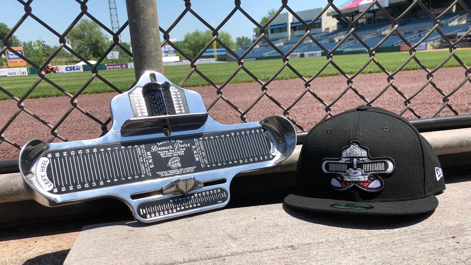
And now some words from Paul: Hey there. Have you ever wondered about the logistics of how a minor league team executes a one-game rebranding, complete with a new team name, custom uniforms, and so on? In case you missed it yesterday, I’ve written a ESPN feature about that, using the Syracuse Chiefs’ recent Brannock Device Night as a case study. Some of the piece is about the Brannock promotion and my role within it, but more of the article is about the steps that have to be taken for one of these one-game makeovers. It was a super-fun piece to report and write, and I think you’ll really enjoy it. Check it out here.
Also:
• Our friends at Vintage Brand are raffling off two of their gorgeous canvas prints. The deadline for entering is Sunday, 7pm Eastern. Full details here.
• We have some new Naming Wrongs designs. Full details here.
• With the Fourth of July fast approaching, this is a good time to grab one of our Uni Watch stars/stripes T-shirts. And if you’re Canadian, we also have Canada Day T-shirts.
That’s it for today. We now return you to your regularly scheduled Phil-harmonics.
The Ticker
By Anthony Emerson

Baseball News: Oh my god, check out this absolutely gorgeous Cardinals warm-up jacket from the early 20th century. The buttons, the collar, the logo…just magnificent (from Rich Rauch). … Ben Zobrist Gets It™. That’s from yesterday’s game against the Pirates (from @tlad44). … Paul Sewald also Gets It™ (from Michael Romero). … The Brooklyn Cyclones will become the Brooklyn Bagels on July 22, which maybe takes the cake for best minor league ball team/local food crossover event. Just look at that cap logo! … Yoenis Céspedes wore his Mets equipment, including his custom batting helmet, during a rehab appearance with Double-A Binghamton (from Bill Tharp). … How does a 3D helmet logo become a 2D helmet logo? When the helmet is absolutely inundated in pine-tar (from Ben Eshelman). … The Coors Field jumbotron displays the old D-Backs wordmark instead of the one they’ve had since 2016 (from @domenicobj). … Good spot by Rich Paloma who noticed Oakland’s Jed Lowrie had a bit of a cap mixup at the start of Friday night’s game.
College/High School Football News: We’ve all seen championship T-shirts, caps and other gear. But have you ever seen championship sneakers? Austin Aaron found these 1992 Alabama national champions sneakers at a thrift store. … The North Carolina State Wolfpack got new uniforms.

Hockey News: Maryland Congressman and Democratic Whip Steny Hoyer wore Caps gear on the House floor yesterday. At first glance, it looks like the cheapest knockoff jersey he could find, but some further research suggests it could be this hoodie with the hood part removed or folded under the collar. Hoyer represents the DC suburbs in Maryland. Full video of Hoyer’s speech in honor of the Caps here (thanks to Steven Shepard for bringing Hoyer to our attention, Christopher Heath for the hoodie suggestion and Brian Goff for the video). … The NHL Draft Caps are in. Submitter Mike Engle writes, “Most notable thing is the postal address city, state on the brim. To Fanatics’s credit, it looks consistent—I specifically cross-checked the Ottawa Senators hat, and even though they play in the western suburb of Kanata, the arena post office address indeed lists Ottawa, and the hat says Ottawa. Of course, it also properly says Tampa, Sunrise, St. Paul, Las Vegas, Brooklyn, etc.”

NBA News: The Oakland Public Library is giving away Warriors-themed library cards today (from @njlars). … On Twitter, the Lakers posted a breakdown of how the team did in each of its five unis in the 2017-18 season (from Andrew Beckner). … Darren Rovell tweeted, “How valuable were sponsor patches on NBA jerseys this year? @GumGum ran the numbers.” (from several readers). ADVERTISER Patches Darren, Advertiser patches.

Soccer News: New kits for today: Hull City, Bolton Wanderers and Union Berlin all released their new primary kits (thanks, Jamie). … New kits for Celta Vigo. … Real Madrid’s new third kit has been leaked to FootyHeadlines. … New change kit for Athletic Bilbao. … Just about an hour after it was leaked, Huddersfield Town’s new kit and badge were formally revealed by the club. Here’s a closer look at the new badge, and here’s the old one for comparison’s sake (from Josh Hinton). I must say, I do like the Umbro logo repeating itself around the cuff of the sleeve, because it reminds me of my favorite kit of all time, Manchester United’s 1998-99 and 99-2000 home kit, which has the Umbro logo going up the sleeves… AS Roma posted this jokingly “photoshopped” image of new signing Bryan Cristante “in” a Roma kit (from Anthony Gonsalves). … Here’s a (surprisingly tricky!) quiz on the four teams in the 2018 World Cup who play in colors other than those on the national flag (thanks, Phil). … New logo for FC Edmonton (from Avry’s Sports Show).

Grab Bag: Not uni-related, but here’s a great article on former hockey analyst Brian McFarlane, the first (and last) reporter to actually go onto the ice during a stoppage of play, to get a live interview with a linesman who was struck in the face with a puck (from Ted Arnold). … Delcastle Technical High School in Wilmington, De., has a logo for its new volleyball team.
@Mike Engle – Kanata was amalgamated into Ottawa in 2001. Thus, the Senators play in the city of Ottawa, within the community of Kanata.
It is not just the new logo for FC Edmonton. It is their rebirth. FC Edmonton had ceased operations last fall and left the NASL. The new logo announcement coincides with the news FC Edmonton has joined the new Canadian Premier League to start play in 2019.
link
Just about an hour after it was leaked, Huddersfield Town’s new kit and badge were formally revealed by the club. Here’s a closer look at the new badge, and here’s the old one for comparison’s sake
The Terrier badge only appears on Huddersfield’s shirts. The “old” badge remains the club’s logo for all other purposes. Similar to the simple Liver bird badge that appears on Liverpool’s shirts, but is not the club’s logo.
Huddersfield Terrier isn’t the new badge but will be featured on the kits (my bad). Old badge will be used for all other purposes, a la Liverpool.
Time for the Marlins to return to the Florida-era uniforms full time.
What’s stopping them from going aqua and orange like the Dolphins? Theoretically, the Heat have those Miami Vice unis and could rock aqua and orange. They’re then 3 of 4 teams from Miami pulling a Pittsburgh.
The simple fix for the A’s cap snafu last night it to just go back to lighter green. Looks so much better than the dark green.
Yep – Friday night baseball highlights can look better than other days, especially when both the A’s and the Padres are playing at home in their Friday uniforms.
Thanks for making me cry, Bill. When my dad passed away in 2008, I got to say “I love you, Dad” to him as they were wheeling him into surgery. Those were my last words to him, and it is a very precious memory to me. Tears are literally streaming down my face as I sit here and eat my breakfast while reading Uni Watch.
I’ll take the Marlins sculpture over the Mets apple
Not sure why so many people gripe about the Marlins sculpture. It seems to fit the aesthetic of the stadium perfectly, and when you see it in person it isn’t nearly as big as it appears on TV.
Love the Teal of the Marlins, and I hope they go back to these including Teal hats and not black. Orange would be a nice addition. I don’t want them to go back to “Florida”. I only like having a state name if they are the only team in the state. Never liked when the Angels were called “California”.
I Still Call Them The California Angels.
I didn’t mind “Florida” as well, but you can keep “Miami” and keep the sculpture as long as you Bring Back The Teal.
The only black I want to see is on the numbers, outlining the letters and on the brim of the cap/helmet. I actually like that better than the all teal lids.
When the Florida Marlins arrived, they were the only team in the state. I grew up with this team, and still call them that. I don’t like how the discarded those two decades of history in a rebranding effort. I know why they did it, but I just don’t like it.
I also call them the California Angels.
I’ll never understand why a team that plays outdoors, in summer, in Miami of all places, would want to wear so much black.
They don’t play outdoors.
If you listen to the PR departments of uniform makers, they’ll say that every color uniform is 17.4567% lighter and faster than any other color used before! Black included!
And this season, the Marlins Park roof has been open more than ever because the new owners are too cheap to pay for the air conditioning needed to keep it cool inside with it closed. Jeter sucks.
I still call it Dominion Day..
Re: Marlins helmets. “One-shell Rule?”
;-)
The NHL draft caps all look good, except the San Jose Sharks. Hopefully the physical cap won’t have part of a recolored Bruins logo behind the Sharks logo.
Re: soccer jersey quiz.
Three were very easy; the fourth was a bit of a trick, but the idea is to consider the PRIMARY color of the uniform vs. what is on the national flag.
As much as the United States have deviated from their national colors, the primary jersey has always been predominantly white (even in the Where’s Waldo era).
Thank you Special K, I appreciate Phil and Paul letting me share this with y’all.
Love the throwbacks. Not a fan of the 90’s teal phenomenon. But, the Marlins rocked it. I wish they would go back to this uniform!!!!!!! It definitely goes with the colorful ballpark they play in today. Unlike, playing in the football stadium they used to play in.