The Phillies have just unveiled their City Connect uniform. As you can see above, the earlier purported leaks were accurate and the design is brutal.
We’ve known about the jersey design for more than two months now, but this is our first look at the cap. Its logo features a Liberty Bell with the Philadelphia city skyline:
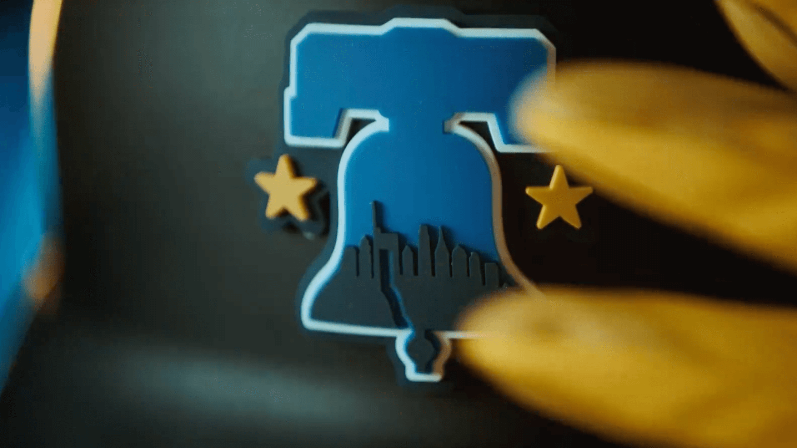
The batting helmets, which have a matte finish, feature a raised, rubberized execution of the cap logo:
Like so many other CC uniforms, this one features black pants, which look like slacks when the players go low-cuffed:
Players who choose to go high-cuffed (none of which were shown in the unveiling photos) will wear these socks:
The uni numbers feature the little perforation pockmarks:
Speaking of the numbers, the font is really, uh, something:
We’d seen the sleeve patch in the earlier leaks, but the baseball stitches weren’t apparent until now:
———
And that’s about it. It’s all pretty embarrassing.
The Phillies plan to wear this uniform for all Friday home games. Here are the dates:
Awesome Interview Reminder
In case you missed it yesterday, my Substack article this week is an interview with former Nike art director Tom Andrich, and it’s quite simply the best interview in Uni Watch’s 25-year history. Unfolding over the course of a whopping 8,000 words, it includes Andrich’s thoughts on working with NFL team owners, dealing with fan feedback, doing things “the Nike way,” balancing innovation vs. aesthetics, creating those alarm clock numbers for the Bucs, and a lot more. Packed with behind-the-scenes insider info and previously unpublished graphics, it’s essential reading.
But don’t take my word for it. Here are some of the comments that readers have posted in response to this piece:
- “Paul, your time at Uni Watch is closing in spectacular style. You’re doing some of the best work I’ve read in my 20 years following Uni Watch right here at the end of an era.”
- “Spectacular interview. Fascinating insight into how Nike works and great to have a human face to go with that.”
- “25 years! And as soon as you are about to be done with it, you go and land an interview like this!!!?? This was definitely my favorite NFL piece you have ever managed to do! Thank you for this in depth look into the mind of a former Nike designer!”
- “Great interview. Honestly have been hedging on the Substack for a long time and stuff like this makes it worth it.”
- “That was great Paul!! So many insights and overall an honest and revealing conversation.”
- “Wow, this was a fantastic interview. Really fascinating to see the insider approach, and also how much weight the league and teams really have on all of this, too.”
- “This is amazing work, Paul, and explains so much about the state of things in professional (and college) sports.”
- “Spectacular interview. Uni Watch is going out on the highest of high notes! You are doing some of the best work I’ve ever read. Well done, sir!”
- “This is phenomenal.”
I could go on, but you get the idea. This is a special piece.
You can read the first part of the interview here. In order to read the entire thing, you’ll have to become a paid subscriber to my Substack (which will also give you full access to my Substack archives). Believe me, you won’t be sorry.
Can of the Day
Maybe we can get these folks to become the Cardinals’ next sleeve advertiser.


I happened upon a Philly area news outlet post on social media about the unveiling event the Phillies are hosting today, needless to say the response was 100% negative in the comments. I think my favorite comment was something like “This might be the first time a uniform is booed off stage.”
If it’s good enough for Santa Claus…
If ever there was a time for Philadelphia to boo, this is going to be it.
The cap is meh but it is more of a generic Philadelphia hat than anything connected to the MLB team we have had since 1883. SIGH
Hey, it worked for the Saturday Night Specials.
All about $$$! Been a fan for 52 years this is so ugly!! And peps buying this you peps are morons should be no sales for that crap
I wonder if we’ll get to a place where teams will purposely leak a design that’s not going to be used so as to protect the actual design they will be using?
I feel positive the toilet paper roll graphic will be the best thing we see about this all day. Enjoy the Go!
The blue roll thumbnail made me think of the blue shop towel rolls you get at an auto supply shop
I like the cap better than the jersey. But the Phillies have long used the Liberty Bell as a uniform design element, so I’m not sure what is so novel about this, other than the colors. Seems like it will fall in the DBacks and Dodgers category of changing, but not all that much.
Philly is a cool city with a lot of things Nike could have referenced. I’m surprised they keep going back to the Liberty Bell.
I’m a Phillies fan. I think the jersey is atrocious. I am definitely buying one for that very reason.
The hat’s not bad.
As a stand alone “Philadelphia” hat, sure it looks pretty good. But it’s not a Phillies hat. The Phillies are red and white, not yellow and blue.
It’s a decent cap. But it’s more a fashion cap that represents the city than something that represents the Phillies baseball team.
“it’s more a fashion cap that represents the city than something that represents the Phillies baseball team”
Pretty much the entire raison d’etre for the program
Well, contrast this with, say, the White Sox. Because their City Connects were a play off their basic uniform set, you could look at them and say “hm, black/dark gray….Old English lettering….White Sox.”
Since I can’t reply to the comments below, I’ll reply here. I think the original warriors “the city” unis are a perfect example of how to combine a teams identity with its locality and not lose the essence of either. It is essentially the first city edition uni. For one: it refers to SF as the city, which (as a bay local) is definitely a thing people say, but has always felt presumptuous as an “official” nickname because that’s how most urban/suburban metro areas refer to their major city by default as a way to differentiate it from the suburbs. Second: the front design is based on a municipal structure. Third: the back design is based on a municipal service. Hear are now considered a classic unifirm and one of the most loved unis in sports history (too bad they’ve all but destroyed the memory with the newer, lazy “homage” set that pales in comparison to the original). I would argue that “the whole point” of the city unis for MLB or the NBA is (correction: SHOULD BE) to CONNECT the city and the team; meaning bring elements of both to the design. Nike shoots themselves in the foot by making these such structured gimmicks. Some teams that never seem to settle on a visual identity for very long aren’t hurt by fiddling around and often find great new designs that way (jazz, suns, d-backs, marlins) that could jumpstart a new overall look for the team. Some teams (Yankees, lakers, Celtics) always feel forced or borderline pointless trying to have the novelty without it diluting their classic look. Then there are all the teams in the middle who could have an “out there” alt uni design, but shouldn’t be required to have one, shouldn’t change it super frequently, and it should still feel like the team, or be a part of their tradition (Toronto st pats unis, Phillies maroon unis). I’m all for experimenting, and I like that, at least with MLB, Nike is containing the weirdness to the CCs, but it’s too forced, and often too weird.
Actually would be a cool hat to wear to a Philadelphia Union game. Great generic Philly hat but in Union colors.
The skyline is missing the original Comcast tower, the one that looks a little like a thumb drive.
The hat is nice, and if the “PHILLY” font is based on the script on our founding documents, then I understand how this uni *connects to the city*.
the font is for Benjamin Franklin and the kite story.
So the script IS a nod to the founding documents. Also: “So is the font, which Nike said it created specifically for the Phillies. Inside the letters are subtle markings meant to represent the cracks in the Liberty Bell. There are 13 of them to represent the 13 original colonies.”
link
Speaking of founding documents, I would have loved a cream-beige uniform with “Philadelphia” in black handwritten script in the style of the Declaration of Independence or Constitution, and numbers on the back also in handwriting.
And instead of player NOBs, there’s the name of one of the signers of the Declaration. Number 1 could be the first signer (Hancock) on upward. With 56 signers, that means no jersey numbers over 56, which is how it should be anyway. :)
“With a notably blue collar!”
The funniest line in the video :-)
Is there a team with a resolutely white collar? Say, the Tigers? I would root for them and make a point of it.
Looks like a mashup of the Mariners and Brewers’ City Connects.
With a hint of Los Dodgers and the awful Dbacks bloodstained looking uni failure from a few years back.
Thank god the pants are navy. I absolutely DETEST sublimation, but if you’re going to do it, at least the sublimation goes from light blue on top to dark blue down below. But other than that…to paraphrase Dennis Green, they are what we thought they’d be. And I’m trying to find one redeeming feature.
A guess the cap is nice enough.
As someone who deals with sublimation every day, it’s only as ugly as you let it be. Sadly, most people who design sublimation are trying to do something “badass” instead of making a uniform. It’s not all bad, for instance right now I’m wearing a sublimated version of a 1980’s Tigers V-neck jersey that every kid in Detroit had. Most people who try to design sublimation think “What else can I do with this”, where some of us take a Frank Lloyd Wright approach and say “What can I take away from this?”. I always say that sublimation is to uniform design what Karaoke is to good music. Sublimation can make you look better than you ever thought you could, or worse than you ever realized you were asking for.
Very interesting point of view and I agree: it is but a printing technique, ultimately the designer decides what the outcome will be. In this case something really horrible that will feel outdated after 5 minutes.
Sublimation should be left to the Rec Softball leagues.
I’m confused? Paul said they are black pants.
I could be wrong, but I’m pretty sure they’re a dark navy — a midnight blue like the Yanks and Tigers use.
I don’t think they’re black.
CC is reporting them as midnight blue. link
That’s what I thought until I read Paul’s comment. As a kid growing up I thought many of these dark navy blue teams were black. Even when we got a color TV the quality wasn’t good enough to discern black from dark navy. I thought the Bears were black and red.
I definitely thought the Yanks (and Tigers) wore black when I was young. Until I went to a sporting goods store (Herman’s; long since folded) and saw the Giants and Yankees plastic batting helmets — you know, one of these bad boys: link — side by side. And the difference was noticeable; I still sometimes *think* the Yanks are black, not midnight blue.
I have an authentic Wilson ‘86 Bears jersey; the navy is a very dark shade close to black and the orange is very reddish.
Do you mean you detest color gradients on uniforms, or all sublimated graphics in general? Do you detest sublimation in other applications as well, or only on uniforms? Sublimation is a great technology and is an effective means to apply color to fabric without breaking the bank.
I’m not a fan of sublimation — although if done well (which to me is a rarity), I’m ok with it. I’m thinking of all those NBA jerseys from the 1990s when the sublimation craze really exploded. It almost gives a designer too much freedom/canvas allowing for overdesign when simple would be better. Again, that’s not to say every uniform with sublimation is bad, but IMO most are.
I’m even less of a fan of gradients. But AFAIK, you can’t achieve gradients without using the sublimation process (if I’m wrong please correct me). I get that there advantages (especially cost) to sublimation, but as a classicist when it comes to uniform design, I prefer stitched logos, patches, wordmarks etc. on a solid color uniform.
YMMV
Got it. And I mostly agree. I don’t have a dog in the fight, and I think I only own one item with sublimation on it; a golf shirt my Dad gave me for Christmas a few years ago that I’ve only worn once or twice. I just thought it was weird that you sounded like you were saying you hated sublimation as a technology that exists. It has its uses, and is extremely effective… where appropriate.
As far as uniforms are concerned, I’m a classicist as well. My barometer for whether a uniform is good or stupid is – If someone time traveled from 50 years ago, would they immediately know what team they’re watching?
Gradients on uniforms are definitely stupid. Gradients in general are a perfectly fine design element. The company I work for has a gradient in its logo and it looks just fine. Sublimation, as a technology is good. Sublimation on the 30 uniforms that the players and coaches wear on the field to represent a multi-billion dollar organization is stupid.
PS: Gold is a metallic element, and yellow is a color!!! ;) Cheers!
Without a doubt one of the best city connect uniforms released
I have many many doubts.
As a Giants fan, I am now felling a little bit better about their CC uni. Thank you Phillies.
As expected, it’s hot garbage. This whole program is hot garbage, and I am absolutely cringing already imagining what my Cardinals are going to have thrust upon them. If the Yankees can opt out of this stupidity, they should too…but apparently they haven’t. UGH.
While I have absolutely no insider knowledge of the Cardinals CC, I’m willing to bet it’s mono-red. In a way, I almost hope it is.
That’s kinda what I’m fearing…and I hope the rest of us Cardinals fans will absolutely revolt if that happens.
I have a feeling it will incorporate the St. Louis city flag (which is awesome), be mono-red (which sucks), and say “The Lou” on it somewhere (which is an embarrassing thing people keep trying to make happen, but no one in reality actually uses).
I feel like we can only hope that it a mono red. At this point in the CC program it could be brown and silver to tell the story of the great muddy Mississippi River and the oh so shininess of the Arch. Because why not.
Most of the CC’s are bad, but I do like the Angels and Red Sox. The Angels font is exceptional.
They gave up the red jersey for this? I hate the Yankees but I respect them for valuing their brand and not giving into a City Connect jersey that diminishes the overall brand recognition.
Totally agree. Being conservative about your uniform suddenly starts to sound appealing when seeing these horrible efforts at reaching out to non-fans.
And unless it’s a lighting issue, the uni in the pic at the top of this post looks much lighter than the official release. And the letters in the pic look shorter/smaller than the official release
link
It is a lighting issue. These are best viewed during the peak of next week’s eclipse, or better yet inside a dark, dark cave deep inside the earth.
A whole lot of cities apparently connect with black pants
Starting to think Nike/Fanatics is just having a hard time producing white pants.
Individually I hate every piece, and was worrying about this since the leak. But for some reason when it’s all put together, it’s so bad, I actually like it, ironically. I think it’s the font I hate the most. What number is Trea Turner wearing? It’s literally a question mark without the dot
That font is absolutely horrible indeed. If they are supposed to represent Ben Franklin’s kite they look like they have been hit by lightning way too many times.
My first impression was the font was German.
The uni is ROUGH but the hat’s pretty solid.
Paul, I think you nailed it in your interview yesterday comparing City Connect to the NHL’s reverse retro programs: the NHL has been successful because the special uniforms are about the team’s visual history. They’re exciting and different but also in keeping with a team’s established identity. These City Connect unis get worse and worse.
Having said that, there’s a small part of me that’s been itching for a light blue and yellow Red Sox hat because I feel like it’s going to be such an obscure blip on the radar in a couple years.
Horrible uniform. The video shows more positive passion than this uniform will generate from Phillies fans is my guess. The font is 80s hard rock or 90s slasher movie, the gradient is way too gaudy, the patch makes me snicker (again the bell?) and the hat is not bad but could be from any Philadelphia team (ding dong once again). I am a Mets fan and I fear for our CC uniform coming up. I only like the Arizona, Washington, Cubs and White Sox CC uniforms (mostly the hats), the rest has been garbage. And a tip of the royal blue hat to the NYY for refusing to take part in this CC lunacy.
I might like the hat logo if the crack in the Liberty Bell didn’t make it look like an earthquake had torn the city asunder.
Now that you mention it…
Oh, my! I didn’t even know about the earthquake when I wrote my previous message! It’s almost like I manifested it into existence. (With great power comes great responsibility…)
All I can focus on is the crack being a white extension of the outline on the hat and blue negative space on the helmet. WTF?
“The pants are midnight blue with yellow piping.”
link
They can call it whatever they like. If it looks black, then for all practical purposes it’s black. And if they can’t capture the actual photo in their own promo pics, that’s on them.
I just mentioned on a reply to Phil that growing up I thought many of these dark navy teams were black. Especially since TVs weren’t great back then.
Sure, but in the very article you linked, it clearly states that they are midnight blue with yellow. If you’re going to report on them, you should get the facts right in my opinion.
Fair.
Die hard Phils (50+ years) fan here………Honestly they look miles better on the players, the pants and hats/helmets (fire) complete it nicely. Pleasantly surprised-they’re growing on me!!
We all already knew what the jersey was going to look like, and I am still disappointed in the result. But quite honestly after reading Paul’s Substack yesterday (which was excellent BTW), I better understand the thought process behind designs like this. In that context, it’s probably an adequate design that supports the ‘super hero’ ethos that markets well with a younger demographic. I mean it’s baseball, they play 162 times so who cares if they wear this every Friday. I care about fixing the teeny tiny names on the back of the jersey way more.
And I have to admit, I really really like the hat.
These uniforms fill me with despair…
I actually like the wordmark and color scheme and gradient… but for a basketball team (and, not the Sixers). It’s not a baseball uni, and definitely not a Phillies uniform.
Can teams just wear their colors? Is that too much to ask? My Bucks have been wearing royal blue for a few years. So weird.
I almost always prefer pro sports to college, but college has a few things right: Teams don’t move (of course), and they NEVER change their colors.
Colleges add black when it’s not part of their official school colors.
Spot-on about not being allowed to move, though.
I’ll state a minority opinion and say that while I far prefer the Phillies regular uniforms, this one is not as bad as people are suggesting. The hat is actually pretty nice, in my opinion. I think these might look all right on the field.
These look like what you’d see in a movie where the producers don’t want to pay to use the real uniforms.
Nah, this is way worse.
Finally, a can I’m personally familiar with! My dad taught me to refill his Zippo from, among others, exactly that Cardinal can.
Based on the leaked jersey, I didn’t assume that the Phillies CC uniform would be as ugly as it is. I mean, the shirt definitely implies the extended coal-polluted ugliness of the full uni, but it didn’t require it. That jersey, on top of bright blue pants with a prominent yellow stripe, wouldn’t have been a terrible uniform. Or if it must fade to dark pants, then make them not quite black dark-gray and add Fresh Prince-style graffiti elements. Or something, anything, other than plain black dress pants like the team is attending a junior prom. At least the hat is kind of nice.
OK, I will pick up the hat if I find it in a thrift store some years from now. But that jersey I will never wear, even when given as a present.
I’ll concur with others that the hat is decent, in that that bell with stars is always a good look. Of course the skyline on there is a bit of a dud, as Philly doesn’t have a particularly iconic skyline as compared to other cities.
Overall hot garbage as expected. I do get a kick out of seeing Harper in this uniform, seems right up his pandering for attention shtick.
I’m glad they provided all the dates they will wear this in advance, I’ll be sure not to come to the ballpark for any of those games.
Is anyone ever going to throw me a bone and do some respectable vertical-arching again?
It’s got to be a cost thing, right? Unless I’m missing something, doesn’t each letter have to be customized for each name?
I’m sure it’s a cost thing, exactly as you describe. I’d like to think it’s a typesetting/legibility thing, since vertically arched lettering distorts letterforms and thus reduces legibility, but I highly doubt that consideration ever entered the question. It’s got to be about material cost and worker time.
The player names are another thing entirely. I just want to see a well-done word on the front, like the Royals’ road uniforms.
I can’t believe how terrible these are.
Please tell me all of these “uniforms” are just one big Nike troll job
LBELLVE
What an earthshakingly bad uniform!
I see what you did there.
Too soon!
I’ve liked a few of the CC caps…Marlins, Cubs, Orioles…and this one is pretty nice as well. The rest of the program can go away.
The patch is so close to being really nice. I feel like “City Of Brotherly” should be above “Love”. With the baseball stitching, it could be a very cool logo for shirts, caps, etc.
Everything else is pretty bad.
The one thing I can really get behind here is the stars on the cap, assuming those stand for the Phillies’ two WS championships. I have frequently wished US teams in sports other than soccer would wear stars to represent their titles. (Except the Yankees, who can take their 27 stars and shove them.)
It looks like if the 2013 Jaguars were a baseball team, and that is NOT a compliment.
Well, that uniform was so bad, the planet itself tried to shake it off and scare people from going to the stadium to buy them.
It unfortunately didn’t work.
They look better on the players than I expected, but that font SUCKS.
I thought this guy had a better CC concept for the Phils
link
It’s funny to me that it’s based on the colors of the Philly flag. It’s not an especially good one and has nowhere near the local love that, say, Chicago has for its flag. I also don’t love the usual tropes getting trotted out — the broken bell, the quasi-historical font, a trademark-avoiding LOVE logo.
Part of me wishes they had struck a deal with Robert Indiana’s estate and built something around the actual LOVE sculpture, especially because the version in Philadelphia is Phillies’ red (and blue and green).
“a trademark-avoiding LOVE logo”
Is THAT what that is? I’ve been sitting here trying to puzzle out what “LUE” meant. That font is so bad they even fucked this up.
These are pretty awful, yet somehow aren’t even in the Bottom 5 of CC jerseys. I do think the players going high cuffed will make it look much better. The socks are really kinda nice, and are the only redeemable quality of this uniform.
I appreciate the inclusion of a list of games to avoid.
The cap is the only redeemable element here.
Do you think it was only a coincidence that 10 minutes after these crappy uniforms were released the Philly area experienced an incredibly rare earthquake? It’s almost certainly related! At least I say so. :-)
Ugh….give me this instead: Powder blue jersey with maroon “Philly” in the old 80s Phillies font. i’d even take maroon pants with those. Maroon 80s Phillies style hat with a powder blue “P” and a powder blue brim. I wish i had some graphic design skills!
Reverse retro for MLB!
The hat is amazing, but it’s kind of weird to me to have it be the same navy as the pants.
I thought the gradient would be…worse. I don’t feel anything about, neither positive or negative. Just a meh feeling.
Although after reading that interview yesterday, I do have an apprication for the mindset of the design, and for the city connect in general. And I think this will grow on me, but the Phillies aren’t really a blue team, more of a red one.
Its funny – I really think this has the basis of being an excellent alt uniform, but the execution is what failed them.
The cap – The Liberty Bell outline is tired, to be certain. Its like slapping the Washington Monument on any DC related item, or the Space Needle for Seattle. If you want to embrace the blackletter typeface, this is where – PHILLY, like the jersey, across the front, with the skyline cutting off the bottom. Im going to say stick with the colors here.
The jersey – This is all about the lazy typeface creator here. Would I rather create 10 numbers or 26 letters, plus variations for flares? The former, for sure, but putting the letters in a player’s name in the blackletter, as opposed to some weird numbers is a BAD choice. Numbers on the Declaration of Independence aren’t this, they have flowing flares all over. Do those numbers, and you may have something, but the choice here bad.
I think everything else on the jersey is fine, and I dig the PHILLY nameplate across the front (which is why I would have put it on the cap) and the gradient is neat, in my opinion.
Pants/socks – Look, they are really dark pants, with a bright stripe. Nothing you can do here, but lets say they phoned it in here. The socks are the real travesty here – what were they thinking? I mean, seriously, what were they thinking? Those have no design in them – its like they found Sock Canva, and just dropped elements on to fill the space.
Hey Nike, how about this? Bring in A Designer from each city, to work with your staff, who have parameters of what you can reproduce in mass quantities, and give these dang jerseys something feeling like a soul, instead of this corporate 8-bit design that is faking cool.
You need to read the article when the owner of the team was interviewed. They talk about a lot of the subjects you bring up.
Maybe you need to read it – on the article of the link, I see Bryce Harper, a bunch of execs for the franchise, but I don’t see the owner listed anywhere in the article, and I don’t see them explaining squat, other than ‘trust the process.” The process missed but I think it’s closer than others think, I just think the result ultimately is milquetoast and bland – wannabe edgy
Note that July 12 is on the days it’s worn.
So much for the potential throwbacks.
I’m puzzled by the comments of a few people saying “they look much better on the players than I expected.” To me they look significantly WORSE. The white (or light-colored) shoes jump out and create a sort of discount store vibe, the long cuffed pants (which almost all players who wear this will choose) looks like garbage with these, the “navy” pants which for all intents and purposes are black and create basically 3/4 of a complete black uniform, the shockingly bad typeface. Get rid of the sublimation and just have them wear light blue pants and it’s still bad but not tragically bad. This is just junk that looks like free giveaway replica unis. I never thought anything would look cheaper than the Giants alts, but here we go.
This number font looks dangerously similar to the Adias font issue on the German kits.
Nike continuing the “NBAification” of MLB with these goofy looking uniforms that never match the colors or design that we identify each team with. When you look at this, what about it makes you say, “YES! That’s the Phillies!”
I think it’s awesome that the Yankees doubled down and went to basically a throwback/minimalist uniform for their road grays instead of doing something dumb like a City Connect.
#ShittyConnect
All the people hating on them, Come on. They aren’t the worst of the CC uniforms. They are upper middle. There are much worse ones, and a few better ones. And no, the colors of some of teams wont stay the same.
Cardinals fans were already mad their team’s powdered blues are delayed by a month or two, but to know they got put in line behind churning out this garbage has to be extra sickening.
There is only one city-connect uniform that I think is actually decent. That’s the White Sox uniform. All the rest are so gimmicky and ugly.
A couple of the City Connect unis (Boston, for example) strike me as good uniforms in general, but bad uniforms for the team. I think Paul’s written that at some point.
This Phillies uniform is bad in every respect. It’s surprising how many of these Connect uniforms have been duds. The beginning of the NBA’s City Edition set had some absolute classics (Miami Vice, Phoenix Valley, Utah mountain design, etc.). Feel like that hasn’t been the case at all for MLB.
Best thing about the Phillies CC uniforms is Paul’s use of the word “slacks” to describe the pants. I’ve always loved that word.
When I initially saw the Phillies City Connect uniforms, I thought they were going to use light blue like what is used for the City of Philadelphia flag. But when I saw that they used a gradient color design (descending into darkness?), that idea went away. Just another bad Nike design for the City Connect series. I just don’t like the look of dark “trousers” (using trousers since Paul used slacks) on baseball uniforms. I’m sure there are possible exceptions to that statement, but I can’t think any right now. I just think the baseball uniform is more aesthetically pleasing with lighter colors (white, light gray, or light blue). The sunlight or the lights of the baseball stadium seem to show the colors better to me.
It looks like no one’s complained yet about how bad the representation of the skyline is
I normally save these for sleeve advertising, but I think they are appropriate for these:
I want to believe Tom Andrich was right when he said Nike designers are sports fans just like us.
Uniforms like this one make me think they hate sports, and us.
That number font is the cherry on top of a hot mess sundae.
Phillies fan since my first game at the Vet in 1977. Horrid. Just horrid. Looks like something someone would wear in a slow-pitch game.
Nola’s jersey: Is that a 2 with the bottom line missing or a question mark with the period at the bottom missing? It sureashell isn’t a 7.
I don’t hate the hats. That’s all I can say positive about this.
I think these uniforms are ugly The black pants gotta go White pants would look way better I hate Dark uniforms N blue isn’t the Phillies Only thing I do like Is the Letter Font style is cool otherwise trash these quickly
The hat is passable, the rest, a disgrace.
Everything about these is terrible. The helmet logo not matching the hat logo is particularly annoying to me. If you didn’t notice, the crack in the liberty bell is white on the hat and blue on the helmet. I understand that’s because the colors on the helmet logo are achieved by layering different colored pieces of rubber. The layer behind the crack is blue, and that means the crack is blue. It’s annoying to me, nonetheless, and is just another one of the countless reasons why the city connect program (I threw up in my mouth a little bit while I was typing those last three words) is ridiculous to begin with.
I’m tired of Nike’s push for sports uniforms as fashion. If you want to do that on the side and maybe have the teams wear that shit during warmups, great. But keep that crap off the field during game time. Takes the professionalism out of the game.
Agreed!
The color scheme is Nike’s “what would Jacksonville Jaguars uniform look like as a baseball uniform” post. But with a crazy font.
Things are looking bad in the City of Brotherly LTVE.
Not the worst (hi Astros and Dodgers) but, they ain’t that great. If it’s supposed to represent the flag, where’s the midnight blue come from? Been a lot more misses than hits with the city connects.
The Nats are the only team I have heard of that is retiring their CC unis after 3 years. The team made it seem like it’s a Nike thing. Not looking forward to what Nike could do for a replacement. The cherry blossom theme is very popular in the DMV.
Are the Phillies the only team with 5 different pants?
Now THAT is a brilliant question. And I think the answer might be yes!
Until the Cardinals unveil their CC
Soon to be had in the discount rack with the Eagles blue and yellow jerseys. What a mess.
Liked the Yellow/Blue on the Birds…YVVM.
But the Phils never looked worse.
I do like the Bell logo. It’s a nice look, albeit, not necessary.
BUT, “A collar that’s notably blue” from the team’s tweet undoes anything positive. I don’t think I’ve read something that sounds both so pretentious and so cringey. Uffda!
I’m not a fan of anything Philadelphia related in general (as with most Pittsburghers) but I actually really like that hat.
The uniform has to be one of the worst in recent mlb history though
They remind me of kid’s pajamas. Like a lot of these CC unis, it seems like Nike spent more time explaining their “thought process” and all of the little “intentions” behind the design than in actually making, yanno, an appealing uniform. What a waste; Philly has such a rich history and Nike blows by all of that to churn out a rejected costume design from Tron.
I actually like that MLB is finally opening up with trying out new designs, but man so many of these CC jerseys are so awful that I think it’ll tank any future innovation for a long time. I just can’t get over that multiple people who make at least 6 figures a year looked at some of these trash pieces of laundry and said “Looks great, ship ’em out!”
That font! Ugh! (Didn’t a soccer team change a font recently because it looked like the Nazi font, forbidden in Germany?) As a Met fan, I do like the gradient blue uni, but of course with orange trim and the bridge logo across the front. Font? Not sure, but definitely not this. Comment on your fave font.
Oh, God, if you’re listening, please, please don’t let the Mets CC be awful. I may have to break out the crayons and get into the design game. As a child, I loved drawing logos. Seems Nike could use some fresh ideas.
I’m a Reds fan and the Reds Black City Connect Unis have been a pretty big hit in and around Cincy. I think they appeal to a little more of a hipper crowd.
I think these are about the worst I’ve seen though. The font reminds me of ACDC, apparently the Phillies were reaching out to the Heavy Metal fans! I feel a bit for the players and fans to have to don those every Friday night.
I know a lot don’t like the Reds CC Unis, but they do at least have kind of a younger urban vibe I think. I don’t know…someone needs to do maybe a reset on the whole City “Connect” program!
These are atrocious. And in large this entire CC program is out of control. It’s one thing to honor the city/citizens you play for (and generate new revenue) but the unis should still have some tie in to the team’s brand and identify. Something like this revolting and off the wall design is a slap in the face. I’m not a Phillies fan but if I was, I’d be finding other plans every Friday rather watching these putrid rags in action. Nike is ruining MLB fan/brand equity before our very eyes.
I see these gems are getting some rave reviews… but with all the negativity, the reality is you are still going to see people wearing them and thinking they are pretty cool rocking these at the Phillies games. And that is the real tragedy here. You could sell cow manure with the Nike swoosh on it and people are still going to buy it
They way Nike is putting the names on the chest is creating a problem that only pullovers can solve. Not mad if they do, but still bad design created the problem
Don’t forget the Phillies red jersey had to be removed from use due to making sure of the 4+1 rule. Although the reds weren’t my absolute favorites, its much, much better than this.
Paul, before you leave can you make sure Nike gets the approval from Uni-Watch readers before any uniform gets put into rotation? If no approval, no release.