By Phil Hecken
Follow @PhilHecken
Back in 2016, I began undertaking a series of entries looking at a team’s “signature” uniform. Loosely defined (and subject to interpretation) a “signature” uniform would be a uniform which one might definitively associate with a team, the one which stood out the most over the years. A signature uniform is not necessarily a team’s best uniform, or one which the team has worn the longest (although either of those could still apply), but rather the one uniform that, when you think of how a team looked at their most distinct, you have their signature uniform. Earlier this year, I resumed the series with the Montreal Expos, the Arizona Diamondbacks, the Oakland A’s, the Kansas City Royals, the Washington Nationals, the Atlanta Braves, and the Colorado Rockies.
If you missed the previous 2016 entries in the series, you can see them at the following links: Indians, Pirates, Astros, Mets, Rays and Padres.
Today we’ll look at the Florida/Miami Marlins. Born in 1993, one of a pair of expansion teams that year (the Rockies were the other), the Marlins began life in South Florida not as the “Miami” Marlins, but the Florida Marlins, due to a long period of acrimonious negotiation with the city of Miami. The name “Marlins” was the name of a previous minor league team (a Triple-A affiliate of the Philadelphia Phillies and later the Baltimore Orioles) which sported some gorgeous uniforms in orange and blue (the team would actually throw back to these a few years back). It was a great opportunity to modernize that classic and become the Miami Marlins again.
Instead, the team became the “Florida Marlins” and quickly adopted teal and black for its colorscheme. Why? Chris Creamer notes,
MLB suggested the club pursue teal, the new “hot” colour in sports, as a primary team colour instead of the pink “Flamingos” identity the club favoured. “Florida” was selected over “Miami” or “South Florida” despite 88% of fans polled wanting “Miami”. Correctly predicting another Florida team was an eventuality, they went with the state name in the hope they would win those fans before a new team could be born.
Though their inaugural uniforms would scream 1990s (Paul has noted the teal and purple craze of the 1990s), they would actually be pretty conservative overall and, other than perhaps a ‘dated’ color, would prove to be their most memorable. Yes, you read that right — the Marlins were actually born in their signature uniform.
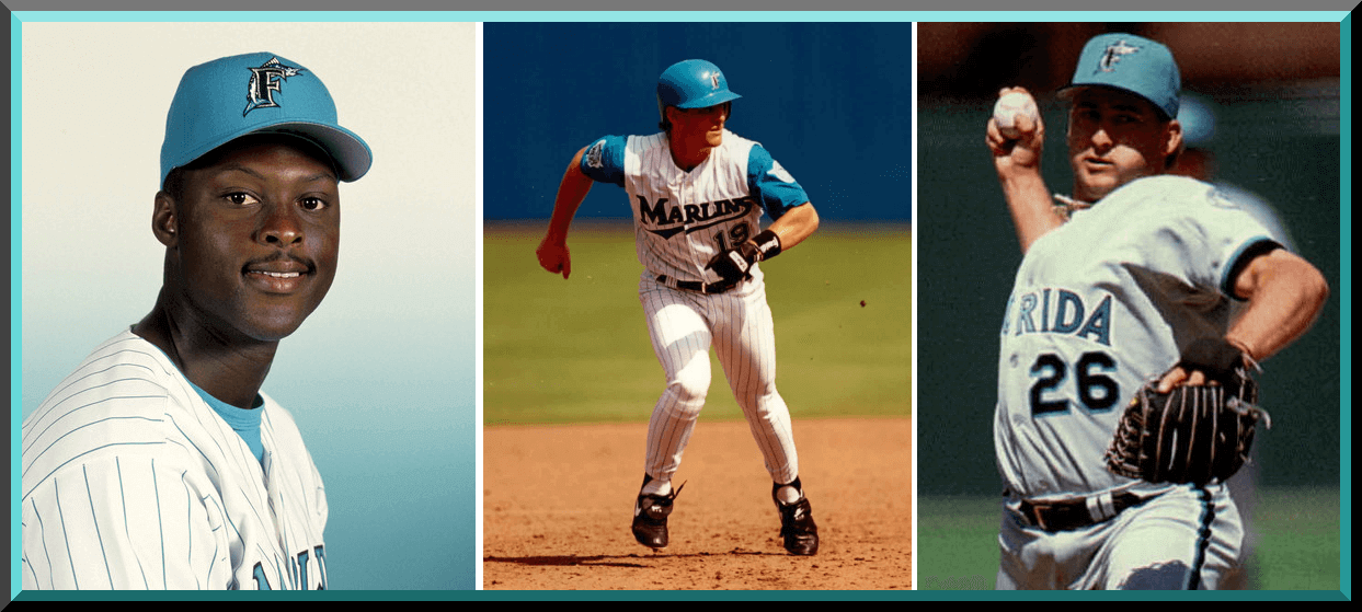
The team would sport two home outfits — a white full sleeve jersey with teal pinstripes (and matching pants) and a “vest” (actually a sleeveless jersey) that was identical to the jersey, save for the lack of sleeves. Both would have “Marlins” rendered in teal script with black outline, front numbers in black outlined in white and teal, with black NOBs outlined in teal. Back numbers would be rendered in the same pattern as the front numbers. Caps were solid teal. For the vested outfits, undershirts would be teal as well.
1993-2002* Home

1993-2002* Alternate

The road jersey would be gray rendered in a very similar style to the home, with “FLORIDA” spelled out on the front in teal with a black and white outline. NOB and front/back numbers would be in black with teal outline. Sleeve ends and pants would have black/teal/white stripes. The cap would have a teal crown and black brim.
1993-2002* Road

Some would say the original uniforms were dated from the start and haven’t aged well. While I was never a huge fan of teal (for any team, with the possible exception of the Charlotte Hornets), it had a unique look and quality for the Marlins of the early-mid 1990s. No other team ever came close to having that look, and for better or worse, the original teal cap was rather attractive. Paired with the home pinstripes (also in teal) and with teal undershirts, yes, it screamed 1990s (and to an extent, the colors of the waters of South Florida), but it certainly set those original Marlin teams apart from the rest of MLB.
You’ll note the three uniforms pictured above all carry an asterisk next to the year 2002. This is because after the 1995 season, the Marlins began to reduce the teal presence on the uniforms. They’d drop the teal undershirts and caps, replacing the teal with black in both cases. The uniforms themselves would remain unchanged, but the elements worn in conjunction with them would. Black was becoming the “hot” color in sports, and the Marlins, born in trendy teal, were now shifting towards black.
1996-2002

The team would win a World Series in 1997 (in only their fifth year in existence). They’d win their second World Series six years later (in 2003), both times as Wild Card teams. In fact, in their entire 25 years of existence, the team has never won their division, yet twice they’ve been crowned WS champs. Thanks, Bud. But I digress.
By the time 2003 rolled around, after 10 years in their original uniforms, the team made some changes. This would emphasize the black even more. The home jersey would now have the Marlins wordmark rendered in the same pattern as the numbers had been — black with a metallic sliver/white and teal outline. Pinstripes went from teal to black as well. The “F” with jumping marlin on the sleeve added metallic silver to the outline and was larger than previously.
2003-2011 Home

The road jerseys would see even greater changes. The “FLORIDA” wordmark was changed to more closely resemble the “Marlins” home script. That script, as well as the numbers and NOBs would be in black, with black/metallic silver/teal/white outlines. The black/teal/white striping on the sleeve ends and pants would be replaced with a thin black stripe.
2003-2009 Road

With black now much more predominant than teal as the team’s primary color, in 2003 they introduced a black alternate jersey. It carried the same Marlins script as the home, but it was rendered in metallic silver, outlined in black/teal/white. There were no front numbers on these jerseys. NOB and back numbers were in the same silver/black/teal/white pattern. This would be worn both at home and on the road.
2003-2010 Alternate Black

Although the team would ditch the vest after 2002, they did add another alternate home jersey — this one would be similar to the new home jersey, but instead of “Marlins” across the chest the cap/sleeve (F-Marlin) logo was placed on the left chest. The team did not add front numbers to this. Although listed officially as an alternate in the style guide through the 2010 season, they were not worn after 2007.
2003-2010 Home Alternate

As mentioned at the beginning of this article, the relationship between the Marlins and Miami was not always smooth, but it did improve over time. By 2010, the team and Miami would reach an agreement to build the team a new stadium. Coincidentally (or perhaps not), the Marlins removed the “FLORIDA” from their road jerseys for the 2010 season, putting the “Marlins” wordmark where the “Florida” formerly was. The team would also remove the F-Marlin logo from the left sleeve.
2010-2011 Road

With their relationship with the city now improved, and a new stadium opening, the 2012 Marlins completely redesigned their uniforms AND they also changed their name from the Florida Marlins to the Miami Marlins. They actually introduced the new uniforms in 2011 (and I remember writing about Pit Bull and the team having a fashion show to preview them). Gone was the teal, their signature color, and in were orange, aqua, yellow and black for their new colors. The black and orange would take the most prominent roles, with the team introducing orange alternate jerseys and caps, along with a black alternate jersey and a black cap. The logo itself was a huge, stylized “M” with a jumping marlin — which would appear as the “M” in “Miami” and as a sleeve patch and cap logo. The team would place MIAMI squarely on the home (and road and black alternate) uniform, rather than “Marlins” (although the “Marlins” wordmark would appear on the orange alternate jersey).
The home uniform would be a very basic white, with “MIAMI” radially arched across the chest, and thin orange stripes would adorn the collar, sleeve ends and pants. Both the “IAMI” and numbers would be rendered in black with orange drop shadow to provide some depth. NOB was black, outlined in a faint metallic silver.
2012-Present Home

The road jersey would be very similar to the home: rendered in gray, the Miami wordmark was the same, except the “IAMI” was rendered in white with black lutlines and orange dropshadow. NOB and number would be the same as the home color-wise. Thin black stripes draped about the neck, around the sleeve ends and down the pant legs.
2012-Present Road

The team also introduced a black alternate which was slightly different than the road — the Miami wordmark was the same, but white piping replaced black on the neck and sleeves. NOB were rendered in white, outlined in metallic silver and numbers were in orange, with a black drop shadow outlined in silver. The team wore this at home as well as on the road (and in fact, it basically served as the road jersey almost from the outset).
2012-Present Black Alternate

The fourth jersey introduced in 2012 made the most sense for a South Florida team — an orange alternate — and the only one not to have the “MIAMI” wordmark. This one would say “Marlins” in white with black outline and blue dropshadow. NOB was rendered in black with metallic silver outline, and jersey humbers would also be in black, with blue dropshadow and silver outline. Black piping would ring the neck and sleeve ends.
2012-Present Orange Alternate

For a team that plays in South Florida, you’d think the team would want to emphasize the bright, bold colors they’ve had in their palette (first teal — which they did play up for 3 seasons) and now orange, yellow and blue. But instead they’ve always tended to prefer the black (maybe because it sells better and has always been a popular uniform color). The team has never really taken to wearing the orange jersey or cap (in fact, in the new set the team went a season without wearing the gray road jersey, and also ditched the orange caps. More recently they announced they would scrap the orange jerseys). I’m also surprised they still have yet to introduce a blue alternate, which IMO would be perfect for them. But the team is what it is. Not so much by default, but by dint of uniqueness, the team’s signature uniform is their original — trendy teal and all.
Your thoughts?


Old Time Base Ball Photos
Readers will recall I featured Ronnie Bolton (who posts on Twitter as @OTBaseballPhoto and who you should definitely follow) earlier this year with some great football played on baseball field photos and writeups, some MLB Opening Day specials, and more recently with some old baseball stadia (here and here). As his twitter handle implies, Ronnie’s specialty is old baseball photos.
With my look back at the Miami/Florida Marlins Signature uni today, Ron’s got some old time photos of various ballparks of South Florida. We also caught last night’s Mets game — not the greatest end to a wild two days for me (Syracuse Thursday, Mets last night). I think Ron wore that black/blue Mets cap just to piss me off.

Enjoy. Here’s Ronnie:
Miami Stadium

Miami Stadium, Miami, Florida, ca 1953 – This 13,500-seat ballpark with a unique cantilever-style roof was built in 1948 by Jose Aleman Jr, a wealthy Cuban exile, and while it never gained the national attention as the Orange Bowl (just a couple miles southwest) did, in South Florida it became the symbol of baseball.
When it opened in 1949 it was home to the Sun Sox, a minor league baseball affiliate of the Brooklyn Dodgers, until 1954. The following year the Dodgers moved their spring training home to the area and playing games at Miami Stadium, they would also play their first game as the Los Angeles Dodgers on March 8, 1958, against the Philadelphia Phillies.
Over time Miami Stadium would become home to the Miami Marlins of the International League and for 32 years (1959-1990) spring training home to the Baltimore Orioles. But time also was not a friend as the ballpark due to neglect was falling into despair and eventually razed for new apartments.


Orange Bowl, Miami, Florida, August 7, 1956

57,000 baseball fans pack a football stadium to see one of the all-time legends in Satchel Paige pitch in a minor league exhibition game. It was the largest crowd to ever watch a minor league game as the 50-year old Paige donned a Miami Marlins uniform and pitched into the eighth inning before leaving the game with a 6-2 lead over Columbus Jets. To top it off the great one knocked in half the Marlins runs with a three-run second inning double that would give him a 4-0 cushion to work with.
All the proceeds went to charity and the pre-game entertainment included Cab Calloway. To compensate for the short dimensions in right field a giant fence was constructed at the wall, much like the one they would construct two years later for the left field wall at the Los Angeles Memorial Coliseum for the newly-arrived Dodgers.
Paige enjoyed a stellar campaign with the Marlins finishing the season with an 11-4 record and 1.86 ERA

Thanks, Ronnie. He’ll be back periodically with more wonderful old photos and the backstories that go with them.
Jimmy Corcoran…
…having some fun
So yesterday Paul did a nice writeup of the Syracuse trip where he threw out the first pitch (he was actually one of five people to throw out the “first” pitch — and I’ll have more to say about this tomorrow); it was a fun time (as he detailed nicely) and I was able to document the first pitch via cell phone video (he not only threw a great pitch, but the other four ranged from turribul to not-so-great, so there was a *little* less pressure on Paul to bring a good one but he did).
Anyway, for yesterday’s splash, Paul ran a photo of me, himself and Sports Logos prexy Chris Creamer showing off our Brannock Device tattoos (Paul’s is real, but Chris and I had temp ink). That prompted my buddy Jimmy Corcoran to send the following e-mail:
“Hey Phil! When I saw this picture the first thing I thought was, this is the Mt. Rushmore for uniform fans.
Jimmy”
And here’s how he tweaked that pic:

If only Todd Radom had been able to join us — then it would be complete (lol). But thanks Jimmy, I got a chuckle out of the photoshop job!
The Ticker
By Anthony Emerson

Baseball News: It’s hard to tell in these screenshots, but Derrel Thomas was wearing a batting helmet while playing the infield in 1973 (excellent find from @MBDChicago). … Vexillologists (that is, people who study and collect flags) will love the Chattanooga Lookouts’ Hispanic Heritage jerseys (thanks, Phil). … After using Chase Utley’s bat to get a game-winning hit, Dodgers IF Kiké Hernández wore Utley’s jersey during BP (from Stetson Prevear). … John Tschudy noticed that the Rockies’ “CR” logo on the Coors Field jumbotron featured the C overlapping the R, opposite of the way the team’s official logo has it (R overlapping the C). Anyone else ever seen the CR logo like this? … People who ordered their Rochester Red Wings Plates cap got it delivered on a paper plate wrapped in foil (from Pete Soscia). … Here’s a good look at the Cincinnati Red Stockings unis in this year’s Vintage Baseball Classic in Dayton, Oh. (from Eric Farrell). … We finally got to see how the Montgomery Greenbow Biscuits’ orange jerseys looked on the field, and the answer is obvious: damn good (from Will Califf). … The Oklahoma City Dodgers changed their name to “Cielo Azul” (“Sky Blue”) for Hispanic Heritage night (from Segev Goldberg). … I haven’t seen every baseball uni in history, but I’m pretty sure IU’s BP unis are the greatest of all time (from @mikeag96). … Here’s a great look at Northeastern’s gorgeous black stirrups with black sanis (from Clint Richardson). … Oh my god, check out these gorgeous all-maroon unis for the Macon Bacon (from @CaliGlowin). … The New Jersey Jackals have unveiled their new unis (from John Cerone). … LaRue County (Ky.) High almost Gets It™; those are beautifully striped socks, not stirrups (from Josh Claywell). … Blue infield and warning track for the Trinity (Pa.) High School Hillers (from Jim Vilk). … Beautiful Little League unis from New York City in the late 1950s. The picture comes from this great piece on Mosco Street in Chinatown (from Adam Herbst). … On his way to third base, Gleyber Torres’ cleat went flying in the air (thanks to Mike Chamernik). … (Phil here): I didn’t take any photos of the Mets/Cubs game last night, but EVERY Cubs player who started the game was wearing high cuffs (some video highlights here). Ben Zobrist (who played THREE positions last night) also went with a beautiful set of ‘rups (which you can see at the end of this short video). I’m not sure when the last time an entire team went high-cuffed (it’s probably happened more than I’m aware of), but it was a very pleasant surprise. — OH SWEET! Not long after I wrote that, Tom Ekstrand sent this in: “For some reason, nearly the entire cubs lineup went high-cuffed Friday night. Extra credit to old-timer Ben Zobrist for some stirrup flair.” Glad I wasn’t the only one who noticed! … Reds catcher Tucker Barnhart is wore a hockey-style catcher’s mask last night, a style he hasn’t worn (Joanna Zwiep believes) since 2015.

NFL/CFL News: Bill Kellick writes in: “I always wondered why Craig Clemons was wearing Doug Buffone’s #55 jersey in his 1977 Topps card. Clemons wore three numbers during his six-year career with the Bears (25, 43 & 45), but never 55 which linebacker Doug Buffone wore for the entirety of his 14-year career in Chicago (1966-79). The fact that Clemons is smiling broadly probably means the joke was on.” Great find, Bill! … Pro Football Journal recently posted a story detailing the inconsistencies of the Bills’ 1987 uni numbers (from Kary Klismet). … The Ravens seems to be using a game jersey template on their practice jerseys. Any other team do this? (from @texasbacon). … The Montreal Alouettes are wearing blank helmets during preseason as players will have to “earn their wings” (from Wade Heidt).
College/High School Football News: The University of Charleston’s new helmets are pretty beautiful (from Brett Benes). … Also posted in the college basketball section: Florida Atlantic has made a relatively minor alteration to their logo (from Jake Elman).

Hockey News: Mask artist Stéphane Bergeron gave a sneak preview of Chicago goalie’s Corey Crawford’s new mask (from Marc-Louis Paprzyca).
.

NBA News: It appears that Nike added an “NBA Finals” mark upside down on the inside of players’ socks, knowing some — like Steph Curry — flip the top of the sock inside out (great spot by @HitTheGlass). … Tudor Electric Football has come out with a 70th anniversary logo (from R. Scott Rogers). … Here’s the 2018 NBA Draft cap for the Nuggets, featuring their new primary icon logo and one of their 3 new alternate logos (from Conrad Burry).
.

College Hoops News: Cross-posted from the college football section: Florida Atlantic has made a relatively minor alteration to their logo (from Jake Elman).
.

Soccer News: Leicester City have launched their new home kit. … Portuguese side Benfica have had their new change kit leaked (from Josh Hinton and Jamie). … Bournemouth have had their change kit leaked, and I think it’s an early frontrunner for Worst in the Premier League (from Josh Hinton and Jamie again). … Scottish giants Rangers have signed a new deal with Hummel, replacing previous kit provider Puma, and will apparently have an orange jersey this year, as well as orange highlights on their blue home kit. This could prove problematic, as Rangers are traditionally associated with Protestantism and are widely supported by (largely Protestant) British unionists in Northern Ireland, and the color orange is associated with unionism and Protestantism (see, for example, the right-wing Protestant group Orange Order, an organization oft accused of sectarianism). Rangers’ archrivals, Celtic, were founded by Irish Catholic immigrants to Scotland and are associated with Catholicism and Irish nationalism. As the “Old Firm” rivalry between the two sides is often violent, one hopes the new kits (if they do indeed include orange) do not create an even more acrimonious situation. … Nike’s (awesome) Nigerian World Cup kits sold out in near-record time. … Speaking of those kits, “I saw this on the BBC News App and thought you should see it,” writes Ted Arnold Nigeria’s snazzy sold out World Cup kit. … Both the USMNT and USWNT are wearing rainbow kit numbers in support of Pride Month. They did the same last year (thanks, Jamie). … In a related story, (former?) USWNT player Jaelene Hinkle told the Christian talk show 700 Club that she refused a call-up to the national side last year because of the rainbow numbers. Hinkle has not been called up to the USWNT since. … Because of FIFA’s arcane and ridiculous kit rules, France was forced to wear their white change strip at home in Parc des Princes for a friendly against blue-wearing Italy (from Josh Hinton).

Grab Bag: Woot.com has a T-shirt making the incorrect argument that a hot dog is a sandwich (from R. Scott Rogers).
.
I agree about the Marlins signature look. But their best look hasn’t been created yet. That’ll be when they ditch the black and drape themselves in glorious teal and orange.
“Because of FIFA’s arcane and ridiculous kit rules, France was forced to wear their white change strip at home”
Was that the case or were they just wearing it to show it off? The latter seems more likely because Italy could change to basically the exact same look.
Also, the game was in Nice, not Paris.
Yeah, to be honest I’m really not sure. (I didn’t bring up FIFA insanity, but they are insane.) What struck me as odd is that they were playing a historically good team in their same federation that wore the same color as them and chose to change at home.
yeah the blame is on nike i guess, wanting to show off the new away kit before the world cup begins
The ’87 Bills had some players in Champion jerseys (like Bruce Smith in the second-to-last photo) and some others in non-Champion jerseys.
I agree with the Marlins’ signature look and wish they would play up the blue again. I also loved the teal BP jerseys they wore in the first season.
link
Really enjoy the signature look series. Looking forward to the ones on the Orioles and Reds.
Agreed on the marlins, love the teal hat with back brim. Will be interesting when the Phillies come up in this series as it really comes down to their late 60s to early 90s maroon look vs the current look.
Also I don’t know whether a hot dig is a sandwich or not, but I enjoy them! (I’ll say not because I usually need 2 to be filled, a sandwich you should only need one to fill you up)
The Marlins teal cap with the black brim was great. If they could recreate that with a refined “M” logo, and use more teal than black in their uniforms, it would be the perfect look for the team. The 2003 overhaul had too much black and silver, and while the 2012 change is OK, I’d be fine with the team dropping orange.
No link to College of Charlston’s Helmets.
The Cubs went high cuffed in support for the starting pitcher, Tyler Chatwood.
I don’t get the hatred for teal. Sure it was a 90s thing, but it fits certain teams like Miami and Arizona. And their teal really is aqua or turquoise.
Agreed. Successful teal usage is completely geographic. If a team in Detroit for example were to use it,it would look stupid and out of place…..oh wait.
Big fan of the huge stylized “M” (thankfully, now smaller on the cap) as the Marlins logo. Unique. Simple. Beautiful.
No link for “The University of Charleston’s new helmets are pretty beautiful (from Brett Benes)”
Marlins should be, and should have always been, in teal & orange. Current suits are terrible. The road grays have white graphics in front and black numbers in back– a bad look.
The styled M with psychedelic marlin fish is a hideous J. Loria contribution.
Now that D. Jeter and Co. have blown up last year’s team maybe they can come up with better uniforms than their current costumes. Go, Fish.
The original sleeveless 1993-2002 alternate is the Marlins best look. Black should never be a primary color for any warm climate team, even if they mostly play indoors.
Right on. The art decoish lettering and the stylized pastel fish both scream “Miami” to me.
I agree, the Marlins first uniform set was the best. I had one of their teal helmets growing up. I loved the F Marlin logo on teal.
The alternate for 03-10 is atrocious, though. So boring.
I loved the pictures of Miami Stadium and the Orange Bowl as a baseball stadium. It immediately made me think of the “Chinese wall” at the LA Coliseum. I actually saw a Dodger game there and we sat so far down the right field line it was difficult to see what was happening. Of course, maybe that was because I needed glasses and didn’t know it until my parents took me to the eye doctor.
The Nuggets are changing again? ….I really wish some of these teams would just stick with something for a couple of decades. I’m just now getting used to the Broncos and they changed in the 90s.
Woot.com has a T-shirt making the
incorrect argument that a hot dog is a sandwichFixed.
Marlins…Teal…
As. God. Intended.
Great work on another SigSeries piece!
Thanks Phil!
PROOFREADING: In 2011, Pitbull should be one word. In 2012, “…the “IAMI” was rendered in white with black lutlines…” should be “outlines”.
And, as others said, the missing link in the CFB section.
Wasn’t expecting a history on Scottish sectarianism in the ticker, but I suppose it is the expected response to a millisecond blip on a kit manufacture’s promo-GIF.
And with links to Wiki and a nine year old Irish news article!
Orange ya glad they left the purple out this time, laddie? ;)
link
I never did understand why the Marlins had four layers on their uniform lettering (including NOBs which became hard to read) in the 2000s. IIRC, they were also the most expensive jerseys to buy because of all that complexity.
As a native Floridian and Marlins fan from the very start, I can’t stand the new Miami name, logo, and colors. I look forward to the day they are replaced. Yes, teal is their signature look, but honestly, it’s not my favorite. My favorite era is the 2003-2009 where black and silver took over for some of the teal. Perhaps the 2003 championship has made me like it even more, but I just think it looks sharp, especially the black alternate with silver numbers. That alt is the only baseball jersey I’ve ever owned, and I wear it to every Fish game I attend, with my all-black F cap. I liked (and originally owned) the teal with black inaugural road cap, but the all-black F cap will always be my personal favorite.
I still call them the Florida Marlins, and don’t mind the teal beginnings, but the 2003 black-focused set is my signature choice.
One more thing: even though I like the old black uniforms, I think the current black alternate is much worse than the old stuff or the orange alternate that they’ve abandoned. As Phil said, they should wear that orange alt much more and embrace the sunshiny tones that screams Miami. The outfield walls are lime green and the home run sculpture is gaudy, but they sure are unique to MLB!