Click photos to enlarge
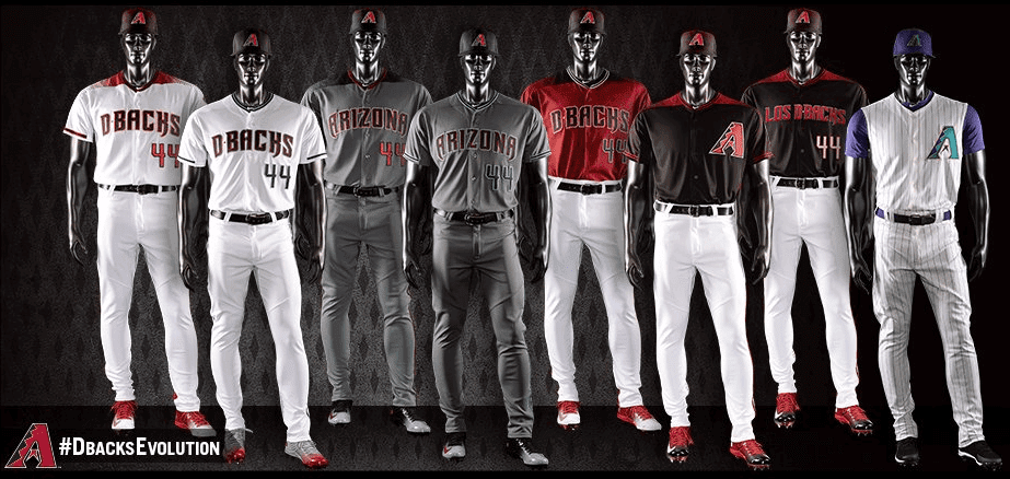
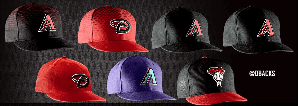
Yes, it’s true — the Diamondbacks now have eight different jerseys and seven different caps (c’mon, couldn’t they have matched them up, eight and eight?), all of which were unveiled last night. You can read my fairly extensive thoughts on the set in this ESPN piece, which was posted shortly after the unveiling. I recommend starting there. And if you want more photos than the ones included in the ESPN piece, Phil took lots of screen shots from the unveiling.
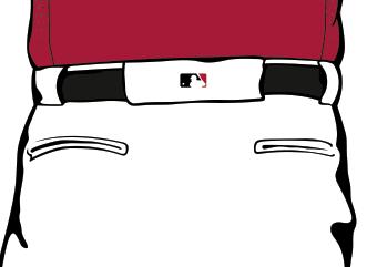
There are two additional D-backs notes worth mentioning here, and they both involve belt tunnels. First, eagle-eyed readers may notice a difference between Arizona’s throwbacks and the rest of their new uni set — the throwbacks don’t have the MLB logo on the back belt loop:
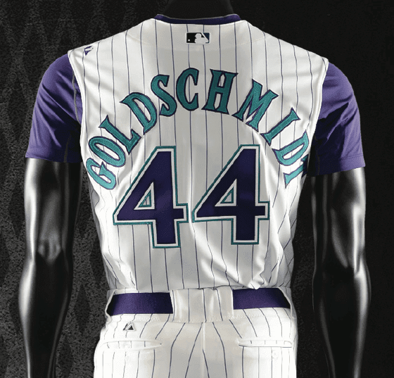
As you can also see, that’s the old Majestic logo above the left pocket and near the left armhole — they used one of last season’s throwbacks for the mannequin photo. A team spokesman has confirmed for me that, unfortunately, the MLB logo will indeed appear on the 2016 throwback pants. Rats.
I also want to mention a detail that was too small to be included in my ESPN piece but is definitely up for discussion here. Amidst all the flashy elements like the sublimated snakeskin and the extra-dark road grays, the D-backs are using — and calling attention to! — a tapered rear belt tunnel:
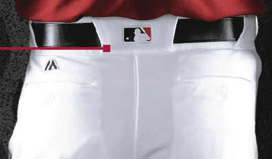

I don’t think I’d call the tapered look particularly “modern” or “athletic,” but I do like it when a team thinks about the little things, and also when elements like belt tunnels don’t all end up looking exactly the same across the entire sport. It’s especially good to know that the addition of the MLB logo on the rear tunnel in 2016 doesn’t necessarily mean that all tunnels have to look the same (maybe there’s even hope for the Tigers). So I officially approve of this move.
Interestingly, the MLB style guide doesn’t show Arizona’s tapered tunnel — it just shows the default style:
Also worth noting: While I don’t particularly like this set, I absolutely respect the way they’ve presented it. The press materials, most of which formed the script for the unveiling event, were extremely thorough, with lots of very good information, and the team’s PR staff gave me advance access to CEO Derrick Hall, who was great about answering my questions about the designs. A very professional bunch.
One final note, regarding Arizona’s new dark-grey road unis: Reader Mike Engle reminded me of something I’d forgotten, namely that the Blue Jays had apparently planned on going with a graphite road uni for 2004 but it never made it onto the field. I wrote about it in this 2007 ESPN article about prototype designs, where I wrote:
When the new wardrobe was finally unveiled, retail displays included a charcoal/graphite “Toronto” jersey — with a number on the front, no less — that never made it onto the diamond, although its impact continues to be felt today. Reader Braden Leibovitch explains:
“The Blue Jays unveiled their new logo and uniforms on Sept. 2, 2003. The plan was for them to wear the graphite road away jersey with graphite pants and a graphite hat the following season. The video game MVP Baseball 2004 showed the solid graphite design as the team’s road uniform. Apparently these jerseys were nixed by the MLB because they were too dark (imagine playing a day game in Arlington in those!). But the Jays already had the insignia production finalized, and a ton of graphite replica jerseys had been made. The team’s solution was to take the existing insignia wordmarks — which had a graphite outline, to blend in with the graphite jersey — and place them on regular gray jerseys. This created a contrasting graphite outline that’s still visible on the team’s road grays to this day. I’m surprised they haven’t changed it, because the original version was such a rush job.”
So the Jays could have beaten the D-backs to the dark-gray punch by a dozen years — but it didn’t work out.
Obviously, there’s a lot to digest and discuss here — get to it.
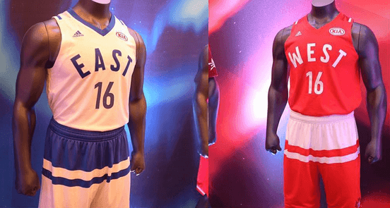
NBA dresses up for the prom: The uniforms for the 2016 NBA All-Star Game were unveiled yesterday. As you can see above, Adidas revived the cummerbund design that drew so much ridicule during this past spring’s March Madness. There’s also a Kia ad patch, which I assessed in some depth when it was announced back in October.
The design is supposedly based on the uniforms of the old Toronto Huskies — additional info here. And you can see additional photos here.

Friday Flashback: With the Padres having unveiled a brown alternate jersey this week, my Friday Flashback on ESPN takes a look at the team’s history wearing brown from 1969 through 1990 (including a few unis that I bet you’ve forgotten about). Check it out here.

Where the rubber meets the road produce: The Tugboat Captain was over at my house the other day and made herself some kind of vegetable stir fry. The next morning I noticed a small, thick rubber band in the kitchen (quarter provided in photo above for scale) and thought to myself, “Oh, I guess her stir fry included broccoli.” I asked her, and it turned out I was right.
Sometimes the broccoli rubber band is blue, like the one used in this instance, and sometimes it’s pink. But the size and shape are what I find instantly recognizable, regardless of the color. It’s kind of amazing to think that this particular rubber band style is so functionally specific that I instinctively associate it with one particular vegetable. I don’t even like or buy broccoli, yet this visual association has somehow imprinted itself upon me.
It got me thinking: Is this particular type of rubber band used for any other purposes? Was it developed specifically for the broccoli industry? I mentioned all of this to the Captain, who pointed out that asparagus also comes packaged with a characteristic rubber band, usually purple (shudder). Are there other examples?
Meanwhile, here’s something many of you probably know already, although it was news to me: While looking for broccoli photos, I stumbled upon the term broccoli wad, which apparently refers to using the broccoli rubber band as a money clip. There’s even a product with that name, although it’s a silicone band, not a true rubber band. Here’s a fairly absurd commercial for it, featuring former Sopranos actor Vincent “Big Pussy” Pastore:
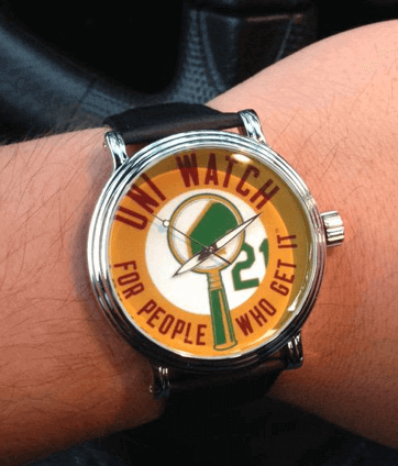
Fun gift: I was doing an image search on something else yesterday and stumbled upon a photo of something I’d completely forgotten about: the Uni Watch watch! You can click on that photo, which shows the watch ordered about six months ago by reader Nik Streng, to see a slightly larger version. It’s available in many styles here. (And even if you don’t want one, it’s still fun to say, “Uni Watch watch.”)
The Ticker
By Paul

’Skins Watch: Schools in St. Paul, Minnesota, are considering a ban on Washington NFL apparel (from Barry Brite). ”¦ “I was at a Native American art show in Rapid City, South Dakota, last weekend and snapped a pic of this snarky painting, called Custer’s Last View,” says Taylor Nicolaisen. “It was the only sports-themed artwork I saw there, though there was a handsome abstract piece of natives riding Indian motorcycles chasing a cowboy on a Harley.”

Baseball News: Not sure we’ve seen this before: a headspoon without a handle. That’s the new uniform for Elon University. Love the striped stirrups, natch. ”¦ “Utica, Mich., has created a three-team league and a $12 million stadium, hoping to spark an independent pro league across Michigan,” says a reader who prefers to remain nameless. “The logos are pretty bad — angry unicorn and angry beaver. At least the frog isn’t angry.” Further info here. ”¦ The White Sox are giving away this T-shirt modeled after their 1970s leisure suit jerseys with ticket packages for Sox Fest 2016 (from Kyle Chisolm). ”¦ Here’s the logo for the 2016 Midwest League All-Star Game (from R. Scott Rogers). ”¦ Our own Phil Hecken discussed the Padres’ new uniforms on this podcast.

NFL News: While looking for something else, I came across this 2000 photo of Emmitt Smith with his belt unbuckled. ”¦ Bud Light is coming out with a series of 40 Super Bowl can designs (thanks, Phil). ”¦ Here’s a pretty cool look at uni/equipment violations for each NFL team (from Joe B.). ”¦ Here’s another article about NFL players trading jerseys (from Jerry Wolper). ”¦ Here’s what the Browns will be wearing this weekend. ”¦ Love this old NFL poncho ad that Aaron Husul found in a 1970 issue of SI. (That sound you just heard in the background was Brinke Guthrie plotzing.)
College Football News: Looks like BFBS and/or GFGS may be in Iowa State’s future. ”¦ Oregon is selling off a bunch of helmets (from @chriszeppie). ”¦ “Alabama’s high school football championships are at the Univ. of Alabama’s Bryant-Denny Stadium this year,” says Dustin Semore. “They didn’t try very hard to remove the Crimson Tide’s midfield logo before adding the ‘Super 7’ logo.”

Hockey News: Ace DIYer Wafflebored’s latest necktie project is this Rocket Richard beauty. Boy is he good! Love the quilted numeral and the striped keeper loop. ”¦ The U. of Minnesota hockey team is giving away team-colored Mexican wrestling masks (from John Muir). ”¦ The ugly sweater phenomenon has now made its way onto the Red Wings’ masks. Further info here (from James Thomas and Alan Kreit, respectively). ”¦ The Hockey News has been counting down the top 50 jerseys of all time. Here’s Nos. 20 thru 11 (from Ted Arnold). ”¦ Yoda-themed warm-up jerseys for the Flint Firebirds tomorrow night (from Craig Gasperosky). ”¦ Star Wars jersey for the Lake Erie Monsters, too. ”¦ Aaron Husul was looking through the 10/5/70 issue of Sports Illustrated and found an item about NHL teams being scheduled to wear colored skates that season. “I thought California was the only team that ever wore colored skates,” says Aaron, and that’s what I thought as well. Did this ever happen?

Basketball News: Green throwbacks tonight for the Mavs (from @Tyyeezus). … The teams at LeSueur High School in Minnesota are called the Giants, and it looks like they had the Jolly Green Giant — or at least some kind of giant — on their jerseys in 1949. Would love to see a color (or at least crisp/clear) photo of that uni! As it happens, there’s a big roadside statue of the Jolly Green Giant about two hours away from LeSueur, in Blue Earth, Minn. (I visited it while doing a cross-country road trip in 1997), so I assume there’s some sort of Minnesota connection there (big thanks to Dan Brookens). ”¦ Check out this amazing photo of the 1909 U. of Minnesota women’s team!

Soccer News: New kits for Chelsea. ”¦ Miami FC will unveil its new jersey a week from today (from Chris Maxwell).

Grab Bag: So here’s a little something: When the Tugboat Captain and I attended this installment of the New York Food Film Festival a few months ago, we met one of the filmmakers, who turned out to be a bit of a uni-watcher. We’ve stayed in touch, and now he says he’s interested in making a documentary about Uni Watch, and about me. I’m frankly a bit skeptical that this will actually get off the ground (how would you raise money to produce a movie about a fairly obscure writer?), and even more skeptical that anyone besides my mom, the Captain, and a few friends would want to see such a movie (I can certainly think of many writers and media figures, including several friends of mine, who would make far more deserving and entertaining subjects), but hey, I’ve been wrong before. ”¦ I was reading this excellent article about the Marshall Islands the other day and was curious to learn more, so I poked around and discovered that the Marhsalls have a really cool national flag and a pretty awesome seal, too. ”¦ New rugby sevens jersey for Australia. ”¦ The Color Mafia has declared that Rose Quartz and Serenity — yes, Sereni-fucking-ty — are the colors of 2016 (thanks, Phil). ”¦ Whoa, check out the 1926 Drexel women’s rifle team! Ya think the gal at far-right shot the leopard that ended up as her coat? ”¦ Love this 1968 photo of then-presidential candidate George Romney — Mitt’s father — bowling candlepins in New Hampshire. And he was wearing French cuffs!
Friday Flashback is now up:
link
Those Arizpna unis… Looks like “D-BACHS.” The shoulders. They are a joke. Worst uni set in years for any team. ugh. Who came up with this crap?
Los D-Backs, huh? Stupid.
Also… I don’t see 7 different caps, I see 4. Is there some subtle difference between the 3 black A caps or the 2 red D ones? Because, I’m not seeing it. I guess maybe it’s mesh vs non-mesh for weather reasons or something, but I wouldn’t call that a “different” cap design.
Agreed on the Spanish name – putting ‘Los’ in front of the name is super lame. “Los DBacks, Los Mets” come on… If you don’t have ‘The’ on the jersey to begin with don’t add Los to try to show Spanish heritage, it seems lazy.
Putting “Los” in front of the name is actually how it’s done in Spanish, when speaking about team names. I agree it seems redundant, but I imagine native Spanish speakers don’t think it’s lame at all.
None of the Mexican teams have a Los on their jersey or logo.
link
But we also put an article – “the,” usually – before team names when speaking in English too. That’s not the question. The question is whether teams in Spanish-speaking countries put the article “los” or “las” on their jerseys. In the Mexican League, to the best of my knowledge, a few teams do but most don’t.
Counterpoint: What would we make of the Puerto Rican team Cangrejeros altering their jerseys to read “the Cangrejeros”? Would that look like a respectable attempt to Anglicize the name of the team?
Kerrect as you almost always are Mr. Scott…
This is a classic case of when “Greed meets Need”. In this scenario – creating a new revenue stream marketing the “BRAND” for a “diverse” audience (No Murrica’ flags please). Combine this with a lack of imagination you get a jersey that panders with a capital “P”. They try to be number Juan and it comes out number two (dos?).
Case in point. Slapping a “Los” on the jersey, creating another variant of the $200 shirt to sell, with a small initial production cost, would seem like a bargain for management. Justifying this well meaning positive (financially) effort at diversity by management saying that this is the grammatically correct way to do it… well I will stop right here with a “You can all Bite Me you greedy mofos”.
Honestly, I do not need MLB, the NBA or the NFL to tell me about proper grammar (btw Uni-watchers are among the finest in this blackest of the black arts, the art of comma f*cking. I am in total awe of their superior skills.)
With just a little imagination, a real no brainer here, you could get awesome sauce. Yet they still screwed the pooch on this one. Creating real brand awareness to a diverse audience. Oh it’s not all bad in baseball, the Giants and Brewers do it right. No Los needed. Nobody has to bow to the english grammar police.
I totally concur with Pee El that using the “Serpientes” would be awesome. New nicknames do not always suck.
This diversity awareness pr is old hat for the big boys. you know… Coca Cola, Pepsi et al. Here is an example of how the big boys play.
link
MLB could learn something about how to do it, but I am not holding my breath.
@ElTee of DC: regarding that link you included, I really liked how the Arabic FedEx logo included the negative-space arrow that’s used in the English version. Better yet, the arrow points in the opposite direction since Arabic is read right to left.
This diversity awareness pr is old hat for the big boys. you know… Coca Cola, Pepsi et al. Here is an example of how the big boys play.
link…
I’m not so sure that those examples are that great. Most of them are just “iconic symbol with foreign-language-text next to it”. I guess FedEx gets a point for managing to cram their negative-space arrow into non-english lettering, but that’s it.
Ok, so reading the more detailed article… outline color. So we’ll have a few players wearing the wrong cap during the season.
I guess they basically look alright, even if having 2 different white and 2 different gray uniforms is kinda dumb. If they really wanted to break away from baseball traditions, why not go with a copper road uniform instead of gray?
Caps: Not just outline color. Some of them have the snakeskin and some don’t.
This is perhaps my least favorite thing about this uniform: the design feels indecisive. Having eight different uniforms is one thing, but several of the uniforms differ from each other only in subtle ways (red vs. teal numbers, snakeskin vs. no snakeskin). It feels like they couldn’t decide on a visual identity and just used the shotgun approach.
I agree with JD. More broadly, I think the D-Backs have ALWAYS had the problem of too many uniforms and not enough unity. They’ve often come out for different games of the same season where someone new to the sport would never guess that they were the same team. While that’s not quite the case here (outside of the throwback), there’s still too much. Either use the shoulder yoke all the time, or don’t use it at all. Either have teal as part of your color scheme, or don’t. Either use the A cap logo, or the D. Make up your minds!
I don’t really like the darker gray in these images, but I have a feeling I might like them when I see them on the actual field. It’s an interesting idea, anyway. I don’t think I’ll like the snakeskin thing, but we shall see.
I didn’t see anything about batting helmets. I remember they used to have a contrast between the cap and the batting helmet. Are they going to have seven different sets of batting helmets too? Or is there some other scheme planned for those?
D-BACKS
The comments section on the ESPN article shows strong support for the uniforms and plenty of “old man” disses to Paul. I also liked reading the old guys not understanding that when the kids say the uniform is ‘sick,’ it means they like it.
IMO
The uniforms are overall bad, especially the piping on the pants.
However, I love the dark grey and I am glad the A is back on the cap over the D. The alt logo cap is not good.
The teal on the cap is alright but doesn’t seem to fit right the way it was used on the uniforms.
Not a fan of the sublimation on the uniform but for some odd reason I like the way it looks on the black cap.
The back belt loop reminds me of a “whale tail”
______
NBA All-Star shorts look like bathing suits.
Exactly, While I wouldn’t want to see this uniform on the Yankees or Dodgers The half a dozen kids on my sons team all thought they were awesome, and then asked if we could get those pants. It’s marketing and entertainment. And if you have 6 jerseys instead of 3 you will sell more jerseys. Same with caps. I would expect at least 3 more teams to get this treatment in the next 2 years.
Re: the movie idea, I’m trying to imagine what sort of cheesy tagline would accompany it.
Never mind batting practice. The home whites look little league. This will certainly be a design that trickles down to the little league level. Or inspires similar designs. Little League World Series just featured shoulder yokes this past summer!
Also, if you’re going to use teal, just pair it with the purple. I think it looks dreadful with the Sonoma red (or whatever they call that color).
Proofreading:
“the team’s PR staff gave me advance access CEO Rick Hall”
“So the Jays could have been the D-backs to the dark-gray punch by a dozen years”
“Here’s a fairly absured commercial for it” (unless you found an interesting verb)
“Further info an NHL goalie’s mask”
You don’t have to apologize. You’ve been busy.
Thanks, Jerry. All fixed.
Without doing any research, my immediate recollection about the colored skates in 1970 is that the Penguins and Blues wore them.
My response to the new Arizona uniforms is one word: “fashion”.
Those two-tone blue Penguins skates were beautiful!
The tiny, weak, instantly-crumbly rubber bands on green onions. I always try to re-use them, and it never works.
Custer’s last view … knew it was familiar: link. I have got to get those collections out of storage!
Reminds me of the closing credits shot on Eight Is Enough.
I mostly like the new set for the D-Backs. Take away the stupid “snakeskin” pattern and I think the primary home look would be a solid B+. However, I like the alternate with the teal more than the red and black. I’m always a fan of incorporating colors that are seldom used elsewhere.
I’m a little surprised for the hate on the charcoal. I think it would be nice to see a little more variation in the “road grays” across all of MLB. I still hate that San Diego did away with their road “sands”.
Take away the stupid “snakeskin” pattern and I think the primary home look would be a solid B+.
This is like saying, “Take away the smell and shit wouldn’t be so bad.”
I think I have my QOTD for tomorrow.
I really liked the Padres sand uniforms too – not much middle ground with readers here on that uni
Interesting that the ideal player for the Cowboys in the Equipment Guide is wearing mid-calf white socks and blue leggings under his pants.
After seeing the new D-backs uniforms the NBA all Star uniforms look like an all time classic.
Its only a matter of time before little league goes the D=backs route just like it did with the digicamo.
Though Green Giant has a presence in Blue Earth, it started out in LeSueur; the Minnesota River Valley is the original Valley of the Green Giant.
Much more interesting statuary around Blue Earth: A&W mascot with a paint job posing as Sprout. link
I must say, if they didn’t have the alt tops and hats, and just the teal accented whites and greys, with the throwback alts, I would like this set a lot more.
What is the “status” of the Jolly Green Giant?
I’m sure George Romney was playing “candlepins” in that photo.
And the hammock on the Marshall Islands seal “is a stylized fishing net, fish being the main staple of the diet of the Marshallese people.” More information about the seal is here:
link
Thanks. All fixed.
I actually like the new D-backs look, although I wish they’d stick with one home, one away, and one alt/throwback.
The dark gray and red looks great. The black hats with the subtle snakeskin pattern looks cool. The home whites with red shoulders is different, but not bad (unless you believe that with uniforms, different IS bad).
I know especially with baseball uniforms that people think there is one way they need to look and anything new or daring is automatically ugly, but I think overall they do a good job pushing the envelope without going overboard. It’s not like the Diamondbacks are a “classic” franchise with a well-established look.
Overall grade: B (would be an A if not for too many variations)
In a critical detail, I give the Diamondbacks credit: They took more than 17 seconds on the pants. All too often, you know everything about the team from seeing the hat and the jersey. Also, good on them for getting the player names, numbers and uniform script to match up. It had been an issue with this team.
first glance at the d-backs made me think they did some kind of 70’s throwback… like a really wide faux collar…. like those old short pants white sox uniforms from the 70’s with the collar. that’s going to be hard to unsee.
BTW, did anybody else spit coffee on their keyboard after Paul, in his ESPN column, give Arizona’s horrible purple-and-teal throwbacks an A, saying they look “classic”? Never thought I’d see that, although it does back up my assertion that any design will seem “classic” if you give it enough time.
Still not sure why he claims that the Carolina Panthers’ current look is “dated” and “too 90’s” if he likes the 90’s D-backs look. Oh well.
I think the D-backs’ “A” has aged well, and that the Panthers’ various design elements (which I won’t run down here because I’ve already done so many times in the past) have not. Simple as that.
Good point on “classic,” though — lazy word choice on my part. Should simply have used “original.”
I was mostly surprised because of the purple issue. Although to me those early Diamondbacks uniforms are a hot mess, as we’re fond of saying here in the South.
That set has grown on me, even with the purple. I like it a lot.
First the Vikings white over purple uniforms, now this… I think someone doesn’t hate purple quite as much as they claim.
The original Diamondbacks uniform was the rare instance in which the purple in a uniform reliably reads as purple, without shifting into an apparent dark blue or even dark red in some conditions.
Related to Jimmy Howard’s new mask, when a goalie gets a new mask, especially a novelty one like this, does the team foot the bill? I can imagine that with all of the hours involved in the initial design phase as well as the actual process of painting the mask it’s up there in the thousands of dollars, and he’ll only wear it once or twice.
Good question that I’ve wondered too. I remember a period in the late 80s when the modern hybrid mask first appeared and only some goalies had paint schemes. They must have paid out of their own pocket back then.
One difference I notice today is that goalies always paint back a brand logo on the front. There is no NHL rule that forces goalies to put the logo so perhaps the Bauer/CCMs of the world pick up the cost of the entire paint job?
Personally I hate when goalies plop in a bunch of different designs. Goalies should have one iconic design.
Paul, regarding Elon University’s handle-less headspoon, didn’t the St. Louis Cardinals of the 1930s have something link?
Ah, good one!
I’ve also seen the short-handle design on some European teams. In particular, a couple of French clubs come to mind.
link
link
Yaqui de Obregon in the Mexican winter league have done them the last 2 years as 3 button pullovers,, even ran in the ticker.
If you’re going to try something different, you might as well go all out like Arizona did. I prefer traditional baseball uniforms, but I like these (except for the DBACKS wordmark).
Not a fan of the MLB logo on the pants though. I actually would like if they ditched the MLB logo on the jersey altogether and use their respective league’s logo instead.
I would be very interested in a Uni-Watch documentary!
I can already envision a trailer featuring Jim Vilk saying “I’d watch it!”
I probably would.
Paul do you know if that league logo on the side of the BP caps is going to be on all of the caps next year? If it is I have a lot of hat shopping to do this weekend.
Not a fan at all of the new Dbacks unis.
Dunno — sorry.
Thanks!
“Paul do you know if that league logo on the side of the BP caps is going to be on all of the caps next year? If it is I have a lot of hat shopping to do this weekend.”
~~~
Wait — why is that?
Because he wants a cap without that extra logo on it, duh.
Thanks David…oh wait, it’s just THE speaking out of turn.
Anyway, he said “A LOT OF HAT SHOPPING” not that he wants “a cap” without that extra logo.
I was curious as to what A LOT of hat shopping entailed and why.
Thanks, I’ll hang up and let David answer.
When the Jays nixed the Graphite unis they did have not get rid of the graphite cap. For at least a year the Jays wore that graphite cap with their home white unis.
You wrote about the Blues colorful skates back in 2010. :)
link
40 Bud Light Cans?
I don’t get it.
Somebody ‘splain.
Yeah… I don’t get that either. Are some teams not getting cans, or are they getting lumped together? Or…
Also weird that the apparently complete set of team cans for this year is only 28. It’s like they’re stuck in some sort of weird alternate dimension or something.
The four missing teams are sponsored by MillerCoors: http://www.adweek.com/news/advertising-branding/bud-light-unveils-28-different-team-specific-cans-nfl-fans-166472
I would assume the 9 missing super bowls were won by those teams.
Heh. Well that would explain it, and yes, those 4 teams have won 9 Super Bowls. Seems kinda weird to be a “league sponsor” and not be able to use some of the teams… but it’s their money, so whatevers.
It’s 10, not 9
Ugh. Yeah. I forgot about the most recent Packers win.
Pretty funny that Bud Light paid the NFL to be able to issue Super Bowl cans but can’t actually use the first Super Bowl.
Hmmm… 5 for the Cowboys, 4 for the Packers, 1 for the Bears and zero for the Vikings makes 10.
Is there also a generic can for Super Bowl 50?
We use those broccoli bands to keep a pair of tongs closed so they fit in the drawer. Works perfectly.
Whenever I see a Diamondbacks jersey, I see “D-Bags” not “D-Backs,” but maybe I’m just immature.
I like the two teal-trimmed ‘Backs jerseys.
Sign me up to see Searching for Jerseyman or whatever the PL doc winds up being called, if it happens.
We use those broccoli bands to keep a pair of tongs closed so they fit in the drawer. Works perfectly.
Thought I was the only one who did that.
Whenever I see a Diamondbacks jersey, I see “D-Bags” not “D-Backs,” but maybe I’m just immature.
I know you are, but
whatso am I?. ;)If your full name looks awkward on a jersey, maybe you need a new name. “Snakes” or “Serpents” or just about anything is better than “D-Backs.”
Not going to give my full review yet, but just mention a couple of tweaks:
* In this day and age, you can’t design a wordmark that doesn’t end up with split lettering? C’mon, Snakes (and Padres)…fix that or go pullover.
* Sssssssnakessssskin! Not enough of it, though. They should’ve gone full snakeskin, albeit in a very muted way (cream on the white jerseys, gray on the charcoal jerseys, etc.).
* LOVE the teal outlining. Should be on all the options.
“Not going to give my full review yet”
~~~
NO? Dude, we’re all waiting with bated breath for this!!!!
Riiiiiiiiight…
As an Iowa State alumnus, on one hand I’m disappointed by the possibility of BFBS or GFGS unis, but I suppose the thinking is that is one of the things the recruits are looking for, and I am not going to be the one wearing them, so why not?
My question is, why would Iowa State want to wear the colors of their main rival in Iowa? You’d think that the color black would be, no pun intended, blacklisted in Ames.
While I break out the tacos ‘n sauce for the Padres, I recognize a vital detail on their brown hats. The “spinnaker” panel on the front nudges the eyelets of the two front panels away from the center. When all the eyelets are centered, the need to curve that seam around them yields the perfect “bell” profile. It became really obvious when orange was added as a trim color. It has become the team’s most enduring trademark; ironically, used by the Twins during their All-Star game.
OFF-TOPIC: Watching the Packers/Lions game last night, the “40” yard markers at Ford Field have a much thicker bottom vertical stroke than the rest of the vertical stroke on the “4”s. And it isn’t just them; I think I saw this at a couple of other NFL stadiums last weekend. Any explanations? It looks wrong, like a Frankenfour.
Off Topic: What is the email address that I should send a pic of all the monthly shirts to? I believe it wasn’t your normal email.
Also what happen to Thursday games being Color Rash?
1) link
2) Only some Thursday games are Color Rash. Even before we knew about the Rash (i.e., when we heard that color vs. color was in the mix but didn’t realize they’d be creating new uniforms instead of just using their existing ones), we knew that the Packers had opted out for this season. It’s mandatory next season.
Dallas in all white wasn’t colorful enough?
Maybe all white should be a “Tint Sprint” ?
I really enjoyed yesterday’s post on unis becoming fashion. And now I see you were just trying to get a jump on today’s conversation.
I wasn’t, actually — didn’t even think of that. Just happened to be an evergreen piece that I had in the pipeline and decided to use because there was no major news for a lede yesterday.
Fortuitous timing, though!
School boards in Minnesota banning NFL apparel from a specific team? Didn’t they get their noses out of joint when some school in Wisconsin punished a kid for wearing a Vikings jersey on Suck Up To The Packers Day? (I know it’s owing to the social issue at hand, but it still seems kind of like they’re inviting headaches.) (And I’d pay cash money to see Danny Boy Snyder pick that fight.)
Didn’t this very site show a brick red shirt with the legend, “Washington NFL Football”? Aren’t items like that custom-made to tweak the arbiters of fairness?
An artist in Maine is selling lobster band wedding rings.
link
A quick search showed that there is no pattern to the coloring regarding size, origin, time, etc, but the rubber bands can be customized when ordering large quantities.
Just remember to take the bands off before boiling your lobsters or you’ll get rubbery tasting claws.
SB
I would be more tolerant of the Diamondbacks attempt to break the mold if they had managed to correct the D*BAACKs problem (a stupid abbreviation and a failure to cross the Rubicon properly). I cannot stand side panels in any form outside of the Broncos. Really wished they would ditch the “D” cap entirely. I hate that logo.
Another quibble I have is that I wish they’d decided to do either sleeve or collar piping but not both. Doing both makes a jersey that’s already cluttered by the snakeskin even more so. The jersey has so much going on that its dying for some breathing space.
As far as the two alternate colors schemes, pick a lane! Do you want teal or not? Just decide on one color scheme and commit.
These D-Backs uniforms remind me of the ’70’s Pirates. Not sure if Arizona is planning on doing the same mix-n-match that the Buccos did.
I am surprised no one is addressing the cut and fit of the pants and jerseys. They look tighter. Especially the pants on the mannequins – the bottom half of the pants almost looks like tights.
There also clearly seems to be a seam running right across the thigh on some of the pants.
Yes, that’s where the truncated piping begins.
the tapered leg was the first thing I noticed too.
One of the Diamondback’s new caps shows a snake with a baseball in its mouth.
I may be answering my own question here – but wasn’t there some sort of restriction against having a baseball anywhere a uniform / cap? I’m thinking the intention might have been to avoid trickery or confusion of some sort.
I do realize that the Oakland Elephant stands on a baseball, the 1980s Phillies “P” logo had one, Mr Redlegs, and Mr Met … I’m sure there are others.
Maybe it was not so much a “restriction” but maybe a “suggestion”.
Found it – MLB Rule 1.11(e) states that…
“… No part of the uniform shall include a pattern that imitates or suggests the shape of a baseball…”
link
So what gives?
Here’s what gives: Anyyone with a fucking grain of common sense, and/or anyone who understands the difference between the letter of the law and the spirit of the law, can see that a sleeve patch that includes a square inch or two of a baseball in a snake’s mouth is not going to deceive or confuse a batter or fielder.
Glad we cleared that up.
Paul, I agree with you, was just putting up a strawman.
I was only wondering why Rule 1.11(e) is on the books.
May have a second contender for QOTD…
I remember hearing about that rule – brewers have been getting away with it for awhile
I used to buy Blue Band Celery with a blue rubber band, recently I’ve only found celery in bags.
OK, I’ve spent way too much time looking at link.
What the hell is the difference between the two solid black caps in the upper-right?
Logo on one of them has teal outline; other one does not.
Yeah, I guess it does.
I really appreciate what the Diamondbacks are trying to do even if I don’t necessarily love the results. Their new uniforms are unique and while there are elements of them that I hate (the snakeskin on the caps) there are also elements that I love (the teal uniforms). Overall when I compare what Arizona did with their uniforms this week to what San Diego did to their uniforms this week San Diego just looks boring. Sure they brought back the brown and yellow but they ruined the jerseys with a horrible, generic wordmark. The hats are great but who knows how often we will see them. The rest of their new set are just navy with yellow instead of gold and a horrible, generic wordmark. Even if the Diamondbacks new uniforms are largely a failure I’ll take an interesting failure over a boring failure.
There’s both a lot to like and a lot to dislike about the D-Backs’ midwinter skin-shedding. Both in terms of fashion and in terms of design. But big-picture, the pre-unveiling hints here comparing the new D-Backs duds to the new Hawks unis seems useful. While the Hawks went much further than the D-Backs in their attempt to break out of established molds, I think the Hawks have the much more successful uniform set. I think there’s a decent chance that in the long run, the new Hawks uniforms will be seen as either a minor classic or an exemplary artifact of its time. I have a hard time imagining the new D-Backs uniforms being either well-remembered or influential. In large part because the uniforms are, ironically, too constrained by tradition and established practice.
Things that work for me:
The dark road gray. About bloody time somebody ran away from MLB’s current trend toward barely-off-white road “gray” uniforms. Shades of gray vary from team to team, but the trend has been toward lighter grays, to the point that the Phillies in particular should stop pretending and just wear white on the road. As both design and in aesthetic terms, this is a great thing
The sublimation on the shoulders. I’m not sure I like this aesthetically, but in terms of design I think this is pretty successful. Not to the extent of Houston’s rainbow guts (which I also don’t actually like, aesthetically, even as I appreciate it as a good bit of uniform design). The few “action” poses illustrate how this makes effective use of otherwise under-used space on the uniform to make players look very distinctive. Effective design here, as long as not many other teams start aping it.
Adding teal. The D-Backs have a too-dark color scheme. Which could work, if they embrace a very simple overall uni design so that the dark colors pop against very plain white or gray unis with simple block numbers. But they’re never going to go that route, so adding the bright teal into the mix is a very good idea, even if not particularly well executed. Paul calls the teal a “glow-in-the-dark effect” on the road alt. Which is exactly why that’s the single most effective use of the teal on the whole new set.
The sublimated pants bottoms. Almost. Pajama pants have largely turned what was once a key element of a uniform’s ability to communicate distinctive team identity into an undifferentiated wasteland. So as a matter of design, applying team-identifying decorations to the bottom of the pants is an about-damn-time idea. Not particularly well executed here, though.
Belt loops. It’s not just the rear tunnel. Look at the slanted loops on the front and sides. A very nice touch!
Things that don’t work for me:
“Snakeskin” on the caps. The solid block of white or gray along the shoulders of a baseball jersey is wasted space that does almost nothing to identify or distinguish the team. The solid block of color at the top of a baseball cap, however, is doing a lot of work identifying and distinguishing the teams from each other. If the D-Backs were going to put the snakeskin on every cap they wear, this might work, barely, as a design element. But they don’t, so instead they’re diluting the effectiveness of one of the key elements of their uniform’s functionality. Ugly aesthetics and bad design.
Truncated pants stripes. There are so many interesting things a team could do to shake up its pants. Especially a team with a snake mascot. This is not one of them. If you want to do something different, do something different. But the same old basic ABA stripe pattern, applied as if the factory had an industrial accident, isn’t something different. It’s just something bad.
The choice of colors for jersey elements. Don’t worry, you’ll be able to read the numbers, Phil assured us earlier this week. Not so! The numbers on the road grays and the red alt will be among the least legible in MLB. The team seems to have a rule that jersey script and front number must always contrast, and NOB and back number must always contrast. On home whites, no problem. But on the dark road grays or the dark alt jerseys, a too-slavish devotion to templates and rules here comes at the expense of basic functionality. What’s the point of adding a new color so vivid that it reminds people of glow-in-the-dark but then not using it to make the bits of the uniform that people need to read, you know, easy to read?
Home and road alt sublimation. Adding identifying decorations to unadorned space like the tops of the shoulders: Good design. Adding identifying decorations to thickly adorned space that already serves both to identify the team and the individual player, such as the back of the jersey: Bad design. Busy-ness here makes NOB and rear number marginally harder to read. That is, the uniform becomes less effective at one of its most basic functional purposes.
I like the sublimation on the teal home and away uniforms a lot more than I like it on the regular home and away uniforms, mainly because grey on white is a lot more subtle than red on white and subtlety is sublimation’s friend.
“Don’t worry, you’ll be able to read the numbers, Phil assured us earlier this week.”
~~~
To be fair, I was working off the MLB style guide, and on there they are QUITE legible. And I don’t find them at all as illegible as you seem to.
Didn’t mean that as actual criticism of you, Phil. Just illustrating in strong terms how basic the “can you read the numbers” thing is, or ought to be, to uniform design. You can make one ugly-ass uniform, but as long as the fans can still tell what team it is and who the player wearing the jersey is, it’s not a bad design. Conversely, the most beautiful uniform with hard-to-read numbers is badly designed. Good art, maybe, but bad design.
Didn’t take it as actual criticism of me, Scotty. Just rebutting your point — and while I won’t strongly argue that the numbers could be easier to read, I don’t think they’re as illegible as you’re making them out to be.
But, just like Paul & I always (or at least usually) say — lets see how the unis look on a person…let’s see how these actually look on the field of play. Of course, if the style guide mocks had impossible-to-read numbers, someone (probably? hopefully?) wouldn’t have followed through with making the actual design.
The studio shots look harder to read than they may actually be. But I will give you that the alternate gray (with teal) (from my screenshot of last night’s fashion show) does lead one to believe the numbers will be hard to read…all because they put the stupid snakeskin on the BACK of the uni, instead of the shoulders. The red unis don’t suffer from this overdesign. I’ll give you those are bad and probably should be retired before they’re even worn.
Here’s how the style guide portrayed those unis.
Quite different from fashion show top shown above.
LOVE the new DBacks colors scheme, red/black/teal is unique and looks great together, they should drop the sand completely.
HATE the snakeskin sublimation, looks terrible literally from head to toe. The hat, the shoulders, the back, the ribs, and the back of the pant legs, all needs to be completely removed.
8 jerseys is too many and 7 hats is too many. They should just keep the four in the foreground of the picture. Those four are technically the home white alt, road gray alt, black alt and a throwback. Keep a black A hat, a black D hat and a throwback…boom, done
My 3 biggest gripes are:
1) the continued existence of last year’s non-snakeskin regular home and road hats. regardless of whether or not you like the snakeskin sublimation, if you’re gonna go in on it, go all in. having both a snakeskin and non-snakeskin pair of the same 2 hats seems like a bad route to take of trying to have it both ways.
2) since the sublimation gets thicker towards the tops of the hats, the squatchee of the red hat should be black and the squatchee of the black hat should be red.
3) the sublimated league logo on the ostensible new BP hat confuses and frightens me. All the BP hats I liked last year that I haven’t bought I apparently need to buy immediately, so they don’t have this new addition.
The Broccoli Wad was featured on ABC’s Shark Tank (Ep. 204) and ended up getting a $50k investment. Partial video of the pitch link and more info link.
I could see, and would watch, a Uni Watch documentary. People love stories of the obscure and the obsessive. After all, if they can make a film about General Tso’s chicken …
A lot more people have eaten General Tso’s chicken than have ever read Uni Watch!
Whose fault is that? just kidding.
Actually a mini story would be awesome. Can you not see this?
The elements of the Uni-verse – letterforms, color, fabric, merge to make timeless design or in most cases not… are right up your alley PL. Embrace the sartorial splendor of the uniform. Done visually and with some style – see Todd Radom about that – would be smokin’ hot excellente.
Here is a glimpse of the future, could be a new way to extend the UNI-WATCH brand. Beats “Los” uni-watch.
link
I would totally watch a film about General Tso’s chicken. I’ve spent enough time browsing YouTube looking for variations in the recipe to try at home.
link
Next to the Spunk Lads, Broccoli Wad was my favorite punk band. They was great, man.
Woof, those D-back uniforms are nasty, holy shit I actually just threw-up in my mouth. Those “uniforms” and believe me I use that term loosely have no place on a Major League baseball diamond (maybe college football). They should have gone with 3 of those outfits, the throwback (purple home), the all-white home, and the all grey roads.
Serenity now, insanity later.
I hate those DBacks unis with the power of 10,000 Phoenix suns. Though they’d be perfect for when baseball gets their arena league.
The worst thing about Arizona’s new uni is the pants-cuff detail. It’s not a bad touch IN ITSELF–as Paul said, it works nicely with the shoe color. No, for the first time we have an MLB uni design that explicitly treats pajama pants as the default option. I don’t think one can overestimate the ultimate yield of that tiny little bomb, mentioned almost in passing.
On the positive side: I don’t dislike the darker road grey as much as Paul. In fact, I think both it and the alt black jerseys (if only the latter were allowed) would contrast nicely when worn with one of the red caps: just think how snappy-looking the original Atlanta Falcons were.
And as for the ESPN article and its feedback: it is a truth scarcely requiring utterance, that the use of the word “sick” in a colloquially approving sense disqualifies the user and his opinions from any further notice or consideration.
And as for the ESPN article and its feedback: it is a truth scarcely requiring utterance, that the use of the word “sick” in a colloquially approving sense disqualifies the user and his opinions from any further notice or consideration.
Are “bad” or “bad ass” still acceptable? What about “wicked”?
it is a truth scarcely requiring utterance, that the use of the word “sick” in a colloquially approving sense disqualifies the user and his opinions from any further notice or consideration.
It’s really just an evolution from “ill” and “dope,” right? But I never liked those, either.
Of course, to be fair, I frequently refer to things as “cool,” which was probably greeted with similar disdain from establishment types when it first came into vogue. But “cool” has proven itself to be a potent cultural force spanning many generations. Entire books have been written about “cool”; university courses have been devoted to “cool.” I strongly suspect the same will not turn out to be true of “sick.”
I remember when I was like 6 or 7 years old, “tough” was where it was at. We picked it up from listening to my friend’s older brothers talk. That one really didn’t stand the test of time.
Are the kids still saying “sweet” these days? That one’s hung in there for a lot longer than I thought was possible.
The best D Back uni was and always will be the vest. Its original and simple. The 85 other designs are trying to hard to be different or appeal to goddamn millennials.
Once upon a time, placing pinstripes of a modern color such as purple on a classic cream base was “a lot of thought went into that uniform.” Now? I don’t want to know how dead horses were beaten in that committee room. Plus, the name and number typography has gone downhill with every iteration.
I still wear that watch all the time. Worth every penny.
Oh. My. God.
How did I not know until like 2 minutes ago that the New Orleans Pelicans’ home arena is called Smoothie King Center?
Ugh.
Usually I tend to find something I like in bad inform designs (hell, I even sometimes like designs most people hate, evidenced by the first black Islanders alternate hat hangs in my closet) but I see no redeeming qualities in those D*Backs unis. The closest thing to nice I can say is that the throwback looks okay in comparison.
Also, tying back to yesterday’s fashion column, I don’t think these jerseys or caps (the parts of the uni one would I assume a team is trying to sell to the public) are going tone successful in the marketplace at all. Maybe the charcoal road jerseys. Cap-wise, and I say this as a collector of New Eras who posts hat boards and etc, the snake skin kills them. Now, I completely agree with Paul that merchandising should have NOTHING to do with uniform design, but in this instance I feel like Arizona failed even on that level. Just a total mess. I wonder if the Cardinals are breathing a sigh of relief for losing the “Ugliest Uniform in Arizona” title.
A little late to this posting party but the [‘snarky painting’]( link) reader Taylor N. contributed is actually a direct rip off of a comic from Gary Larson’s The Far Side just with Chief Wahoo.
[Original Gary Larson Far Side Comic Here](link)
yikes…I’m in reddit mode, sorry…
link
link
The gradation at the bottom of the D-Backs’ pants just looks like they’re all wearing hi-tops. Whatever. No big deal.
The red shoulder tops looked a bit like Pittsburgh Steelers cape unis. Next step for them would be to a white front, red back and replicate a real cape.
SB
Oh, Arizona!!! The pants stripes are terrible. Honestly I think the set with the teal will grown on me over the years despite the funky pant (and sleeve) stripes. I hope they transition more towards that teal set than the others. It’s an interesting look that I actually look forward to seeing on the field, unlike the rest.
Of course if they were smart what they would’ve done is go back to the original colors, used the original purple alt on the road, the original black alt at home, and go with the 1999 home/road set and be done with it. But that wouldn’t be nearly as flashy.
JEERS to that AZ Dback trash. P U!
CHEERS to 69-71 Padres set. what a beauty!
JEERs to that abortion of an NBA ALLSTAR UNI
MAJOR CHEERS to the Uni-watch WATCH! COLLECT THE WHOLE SET!
CHEERS to the WhiteSox Leisure Tee!
I’m glad to see something from the 80s/90s versions of TV Guide still around!
Well it looks like the uniform designer for the DBacks finally passed their spelling course, images of their previous jerseys which read Arizona was scripted ARizona.
Does anyone else get “403 forbidden” errors when clicking on links from an RSS feed reader? I’ve updated my feed and am still having the issue, for example when I try to click on the link for “this snarky painting” and others.