First, a quick reality check: The two teams we’re about to discuss went a combined 15-11 last year. In other words, we’re talking about two very middling squads. Not exactly a clash of titans.
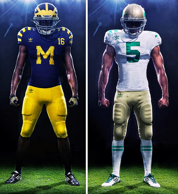
Nevertheless, people seem to be pretty excited about the newly unveiled “legacy” uniforms that Michigan and Notre Dame will be wearing when they play each other on Sept. 10, which is a triumph of either college football mythmaking or Adidas corporate communications (probably both).
The Notre Dame design is a lot simpler, so let’s get that out of the way first. Basically, I love the helmet (a nice throwback to the Lamonica era), love the striped socks (Adidas conspiracy theorists, take note: Only two stripes, not three), and hate the ultra-truncated shoulder striipes, which will look even worse with the super-stretchy jerseys.
As for the Michigan design, a few thoughts:
• The fact that this is a mash-up design, rather than a true throwback based on a particular season’s design, doesn’t bother me at all. But I realize I might feel differently about that if I were a big fan of the team in question.
• I’m very surprised that the NCAA green-lighted the tiny uni number on the front. I don’t mind the big “M” — it looks pretty cool, actually — but the little number is distracting. If you can make them that small, why not just scrap them altogether?
• Love the TV-numbered helmets. Gray facemasks are a nice touch, too.
• The front insignia and the back uni number both feature faux inner stitching to simulate a quilted look, much like the Sabres’ retro alternates. While I appreciate the idea behind this and am generally in favor of anything that teaches fans things they didn’t know before (seriously, how many of us knew that design style had even existed until the Sabres invoked it?), it doesn’t look so hot. Feels kinda forced, too. Pfeh.
• I’m assuming most people will hate the shoulder stripes. Personally, I really like them (unsurprising, given some of the old jerseys that can be found in my closet), but again, these jerseys are super-stretchies, so I’m assuming the stripe patterns will end up all warped and distorted.
All in all: Could be worse. And given that the game is taking place one day prior to the 10th anniversary of 9/11, I guess we should count it as progress that they didn’t pull any stars/stripes or camo moves, right?
Major uni news! In case you missed it yesterday, readers Tim Brulia, Bill Schaefer, and Rob Holecko have created a new web site that you should all know about: the Gridiron Uniform Database. Much like Dressed to the Nines or NHLuniforms.com, it’s a template-driven database of uniform designs, in this case devoted to football. But unlike that other football database, which only went back as far as 1959, this one goes all the way back to 1933, providing us with an invaluable sense of what the NFL (and AAFC!) looked like back in the day. Given how rarely the NFL acknowledges its pre-Super Bowl history, I think you’ll find some of the early designs to be real eye-openers.
In addition, the new database includes rear views, superior attention to detail, and lots of other cool features that I’m still discovering. It should become — indeed, it may already be — the last word on pro football uniform history. Major, major kudos to Tim, Bill, and Rob for creating such an excellent site. It’s one thing to say, “Hey, let’s do [X]”; it’s another to see it through to completion. Well done, gentlemen.
If you want to learn more about the site’s background, check out yesterday’s lead entry here on Uni Watch.
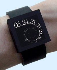
Time the Avenger: While looking for something else the other day, I discovered something really great: There’s a wristwatch called the UNI Watch. Not only that, but it has customizable face, sort of like a team-builder uniform interface — perfect!
I hereby declare the UNI Watch to be the official watch of Uni Watch. Which would be wonderful if only anyone actually wore watches anymore.
Stirrups Club reminder: Robert Marshall is now taking orders for a new round of stirrups. Some real beauties this time around, but the ordering deadline is tomorrow night, so don’t sit there with your finger up your arse. Details here.
Uni Watch News Ticker: As you probably know by now, the Brewers wore lager-colored Ceverceros jerseys on Saturday (and the Cardinals played along). What you might not know is that Aug. 14 will be German Heritage Day at Miller Park, and the Brewers will be wearing “Bierbrauers” jerseys. You can get a vague sense of what they’ll look like by looking at this Craig Counsel bobblehead, which will be a giveaway at that game. ”¦ Someone on a Bills message board who Jeff Christ describes “very well connected” has leaked some new details about the team’s new uni set. Really hope he’s wrong about the logo on the hip and above the NOB, but the socks almost make up for it. ”¦ Here’s another case of a Muslim athlete covering up most of her body for reasons of religious modesty. This time it’s a weightlifter. ”¦ New logo for the BCS championship game. ”¦ Amtrak is celebrating its 40th anniversary with a history train. “It’s divided into decades, with memorabilia from each,” says Andrew Hoenig. “Each decade section features a collection of uniforms displayed on manequin.” ”¦ Douchebag move by the folks at the NHL, who told the Bruins’ Shawn Thornton to stop wearing a Red Sox cap. ”¦ New logo for the Iraq and Afghanistan Veterans Association. “They do a much better job of honoring the troops than a stars and stripes hat,” says Ben Fortney. ”¦ Here’s a team portrait of the Occidental baseball team, showing off their 34 uni combinations. “You could say we’re the Oregon Ducks of D3 baseball,” says Barry Stayblur. ”¦ Kenny Crookstein reports that police cars in Canton, Ohio, carry a depiction of the Pro Football Hall of Fame. “P.S. Cops don’t like it when you take pictures of their cars!” he adds. ”¦ Classy move by the Giants, who gave a World Series ring to Fred Lewis, who had been with the team a long time but whose entire contribution to last year’s team was being on the DL until April 15, at which point he was traded to Toronto. Details here. ”¦ Shawn Crull teaches sports marketing at Fishers High in Indiana, and one of his students’ assignments was to design some football and baseball uniforms. You can see some of the results here. ”¦ Here’s a new kind of uni typo. That’s the thoroughbred Isn’t He Perfect with a misspelled NOS (name on side) during a recent appearance (good catch by Chris Cocuzza). ”¦ Jeff Funke was watching clips from the 1981 Iowa/Michigan game and spotted current Oklahoma coach Bob Stoops with FNOB. ”¦ Speaking of FNOBs in college football, here’s an example from UCLA (with thanks to Russell Goutierez). ”¦ Freakiest sport none of us has ever seen: fireworks boxing (thanks, Kirsten). ”¦ Also from Kirsten: I had no idea that Ecstasy was frequently branded with Nike swooshes, among other brand logos. ”¦ Jeff Moulden was watching some footage of 1991 Kentucky football and spotted two players wearing different helmet and facemask designs. ”¦ Lots of early-1900s football and baseball photos on this site (with thanks to Kyle Erickson). ”¦ Here’s the groovy logo for the 2011 Women’s Team Handball World Championships (with thanks to Jeremy Brahm). ”¦ New soccer kit for Bolivia Copa America. ”¦ Mike Hersh apparently stopped looking at old sports photos long enough to stumble across this sensational catalog of meat-processing equipment. I’d be all over that if it weren’t so ridiculously overpriced. ”¦ You want a patriotic uniform? Here, this this (bizarre find by Comrade Robert Marshall). ”¦ “I was watching the NASCAR qualifing and noticed driver Denny Hamlin, wearing the jumpman logo on his firesuit,” writes Casey McClendon. “I didn’t know Nike was in the racing biz.” That makes two of us. ”¦ Jacob Kucza reports that Kansas State high jumper Erik Kynard has good taste in socks. ”¦ Two Vancouver women had Canucks jerseys painted onto their bodies to help support a local charity (with thanks to Reid Mitchell). ”¦ Here’s a great item for an enterprising DIYer out there: a blank tequila sunrise jersey! Someone please snap it up, customize it, and report back with all the details. ”¦ Tyler Maun was recently in Isla Mujeres, Mexico, where he saw an Italian restaurant that’s making some creative use of the Ottawa Senators’ logo. ”¦ Tim Stoops took a bunch of great photos as Saturday’s Padres/Nats throwback game. ”¦ Peyton and Eli Manning were wearing a different kind of uniform for a recent commercial shoot (rare Ticker contribution from webmaster John Ekdahl). ”¦ Check out the uniforms worn by the 1936 MLB All-Star Game batboys. That’s Jimmie Foxx posing with them (great find by Bruce Menard). ”¦ Just What the World Needs, Part 473: Twitter jerseys, as worn the other day by the Lehigh Valley Iron Pigs. “It’s one of the most ridiculous promotions I’ve ever seen,” says Ethan Zavaglia. ”¦ It’s hard to tell for sure, but Derek Lucas thinks he’s spotted a little MLB logo on Andrew McCutchen’s hair-control device. It’s a little easier to see what he means if you turn the relevant portion of the photo upside-down. ”¦ It had been a while since I’d poked around on Etsy, so I spent some time doing that last night. Among my finds: a baseball-themed traffic safety poster; an instructional guidebook for Little Leaguers with Big Klu on the cover; a set of sheet music with a pretty adorable baseball-themed cover, and another one with a football cover; a brooch shaped like a catcher; a deck of Baltimore Colts playing cards; a super-nice varsity jacket; and a great little set of football cufflinks. ”¦ New black road helmet for the Calgary Stampeders (with thanks to Jeremy Brahm). … Remember how Antonio Alfonseca was called El Pulpo (the Octopus), because he had six fingers on each hand? Looks like we may have to start doing the same with that guy they love in Cleveland (thanks, Phil). ”¦ Jets coach Rex Ryan was wearing a Thurman Munson jersey at Yankee Stadium yesterday (with thanks to Morris Levin). ”¦ I didn’t see the end of last night’s Heat/Mavs game, but Jason Lord did, and he noticed something about the microphone Stuart Scott was holding during the postgame interviews. “Instead of the usual mic flags, it had three small screens that changed back and forth from the ESPN/NBA logo to an image of the championship trophy. ”¦ More sweatshirt issues for the Reds: It’s a little hard to see, but someone in the Cincy dugout last night was wearing a “2010 Playoffs” sweatshirt (good spot by Christian Cisneros). ”¦ Whatever you’re doing this evening, I hope you have as much fun as I’m going to have.
[W]e’re talking about two very middling squads. Not exactly a clash of titans.
Yeah, well, seen from the perspective of a Minnesota alum, a combined 15-11 record looks like Midwestern football played at an impossibly elite level. Anyway, the Michigan unis in particular look fantastic in the photos. Often, something that works that well conceptually falls a bit flat in the flesh, but this is an example that looks much better in reality than on paper. Especially the numbers on the front; on paper, they look hopelessly tiny and afterthoughtish; on the student-models, they’re clear and visible and they just sort of work for me.
And who could possibly hate the shoulder stripes? Bee-you-tee-full. The line thickness nicely complements the distinctive helmet stripes.
Given the ubiquity of maker’s marks on sports unis, I’m not going to lodge any special objection to, or even take particular notice of, one such brand logo on the front of the uni. Jersey or pants, take your pick. But both? That’s one Adidas logo too many.
But college football teams have had the corporate logo on the jerseys and pants for a very long time now, and college basketball teams just got on board. The interesting thing here is the use of the old Adidas logo.
Agreed. Is this the first time the trefoil logo has ever been used on a college uniform?
Just because they’ve been doing it does not mean they *need* to do it.
Or are we going to say it’s traditional now and only freaks like The Jeff would want to go against tradition and taking the logo off?
It’s not traditional. It’s only in the last 15 to 20 years that teams have put logos on uniforms.
Also, I’m sure they haven’t been this prevalent on the jersey either.
Following up the “Lebron’s Sixth Toe” story with a blurb about Rex Ryan… I see what you did there…
Bravo, Mr. Lukas!
Yes, I just caught that too. well played, Mr. Lukas!
Nike has been making racing shoes on and off for a while now, as has Adidas. The current Jumpman23 permutation of Nike’s involvement with Denny Hamlin is more because he is friends with Jordan. The way it works with the major players is that they just subcontract the work to a top motorsports gear manufacturer (Nike’s equipment appears to be made by Impact! Racing Products).
Jordan Motorsports has been around for some time now:
link
Here are some of the special “Motorsports” edition Jordans that JB had recently produced:
link
link
Nike swooshes have been on Dale Earnhardt’s shoes, but I have a feeling these are just Bill Simpson shoes that have a swoosh sewn on.
Nike driving shoes was made by Sparco. Jeff Gordon also wore them in his last championship year up to 2006.
Nike came out with racing shoes in *I think* 2000 or 2001. They had driver’s numbers up on the ankle. They were sold commercially and I saw a pair of blue ones with #88 on them.
Yep. Hamlin is a big basketball player/fan (last year suffered an ankle injury that nearly cost him time in the #11 car).
I think it’s kinda cool, but not nearly as cool as Earnhardt Jr’s skeleton driving gloves.
Ankle or knee? I thought he had his knee ‘scoped during the season.
You’re right, it was a knee. Isn’t it the same? ;)
A couple of small points –
1. I believe if the Vancouver Canucks win the Stanley Cup tonight, they’ll be the first team in the four major North American sports leagues, to wear blue and green as their predominant colours to win their league’s championship. Ironically, if the Dallas Mavericks kept with their original colours – the Canucks would have been beaten out of this distinction by one day.
2. A lot of people are pointing the finger at LeBron for the Heat’s disappearing act. Off course those in the know – know it’s not some deep LeBron character flaw, but instead the curse of the fan white-out. A inane play-off tradition – which I believe (could easily be wrong),was hatched by the Winnipeg Jets fans – to be inexplicably followed by the Phoenix Coyotes that has resulted in complete play-off ineptitude . Fans should know better than to become a human flag of surrender. I realize the Pittsburgh uni-watch contingent is going to take issue with this, but if they were to take a close look at the Penguins recent home play-off record, they may have second thoughts.
Blame it on James
Don’t blame it on me
Well, it’s nobody’s fault
We just need someone to burn
“human flag of surrender” Heh… maybe that’s why I’m so against white jerseys…
Human flag of surrender? The Jets were stopped each year by a team from Alberta in the Smythe Division, losing to either the Flames or Oilers in every playoff series in the 1980s.
However, if you copy-cat someone else’s tradition, you deserve to lose (hear me, Coyotes?).
The Jets did do that fritter-away thing at least once on a 3-1 series lead?
By the way Teebz, what your latest read on the name of the team. A couple of weeks ago you mentioned it would be the Moose, I believe. Something that the Globe & Mail also reported – any change of thinking. I’ll stick with my prediction, which is based on nothing but hope – but the Falcons.
Falcons? That would just be mean.
They’re already taking the hockey team away from Atlanta. Do they also need to grab the football team’s nickname on their way out of town?
If it ain’t gonna be Jets, I say make them the owls.
Harsh, but historically accurate!
link
I’m rooting for Moose, but a rebrand from the cartoony AHL identity. Perhaps a logo with a pair of moose horns, an unconventional brown and green color scheme (Throw in a tertiary color too- pale yellow or some form of ligher blue could be nice), and nice, simple jerseys.
I would bet that it’s going to be announced at the draft.
Does anyone in Atlanta really give a flying fadooo that the Thrashers left? I get the distinct impression they left quietly and nobody has noticed they’re gone in Atlanta, because they barely knew they existed in the first place. Thus I can’t see too many people from Atlanta being offended. As it is, if my beloved Expos had become the Washington Habs – I would have loved it.
Teebz knows at least one guy who cares.
you meant Iraq not Iran right?
Yes, thanks. Now fixed.
Paul Lukas: War Monger. Who knew?
Everyone who’s been following the War Against Purple, for starters….
Why does Paul hate America?
As a Michigan alum – I HATE the shoulder stripes. Not because they look bad – I actually think they look snazzy. I hate the fact that they have at best a tenuous connection to some 1890s era teams (link) and in reality they were just made up by adidas to look cool and sell some swag. So much for honoring our program’s proud history and traditions.
The rest of the elements of the uniform bother me less – the helmet numbers, the gray facemasks, the block M all have historical precedence. But even without the stripes – it still kills a part of the Michigan tradition that this will be the first time we’ve ever worn alternate uniforms.
And I get the eerie feeling that it won’t be the last. If every night game turns out to be this way, I will not go out of my way to get to these games.
Oh, and while these may be two middling programs at the present, people probably make a big deal about it because they’re the two winningest programs in college football history. Of course, tradition and history seem to mean less and less in college football every day.
I get your disdain for the uniform (I would probably feel the same if I were an alum). However, as an avid college football fan, I really like them both (and that kind of surprised me).
As a Sooner, I have to address one thing you mentioned though. UM and tOSU are not THE two winningest teams in CFB history. UM is #1, but tOSU is somewhere between #5 and #7 or 8 (depending on whose list you’re checking). As a UM fan and alum, you shouldn’t give tOSU extra credit :)
Vasav, nevermind. I had Ohio State on the brain. I’m also easily distracted.
Hey, I just moved to Fishers, IN… good on’ya Shawn Crull!
Good for the NHL in putting the kibosh on players wearing non-NHL gear during interviews. Is this for the playoffs only or will it apply in-season? It always bugged me when a player would wear a hat for another league, or worse for a team other than a home team (e.g. wearing a Yankees cap when you play for the Bruins), during interviews.
Hogwash!
I always loved seeing Bryan Cox (East St. Louis kid) wearing a cardinal hat. I also recall seeing a Blues jersey in his locker a few times. Nothing wrong with being proud of where you’re from, or where you’re at.
Total bollocks, Hank.
I love that the Boston teams are coming together. Had the Sox game on the radio the other day, and they were saying that David Ortiz has been passing out Bruins hats in the clubhouse to show city camraderie.
I also liked seeing the good luck bruins bit behind home plate at Fenway. Nice placement to get the bruins logo on TV every pitch.
Bad on the NHL. I love seeing local pride on the part of players. A lot of them do settle in with communities (and get to know the other pro athletes in town) and it’s nice to see that.
But how many Boston Bruins are actually Boston Red Sox Fans? How many Bruins are actually from the Boston area? Maybe one or two on average if that?
Point is, these guys on the Bruins might be wearing Red Sox gear, yet they’re from Minnesota or Saskatchewan or Switzerland or something and actually have their own favorite teams, but the fans probably eat it alive so the farce is accepted.
Also, that only works in a town with a single team in each league. Imagine Eli Manning throwing on an Islanders cap for a post game interview, or Jeter throwing on a Devils cap, there would be outrage.
Heh. The Canucks have more Americans on their roster than the Bruins, and of the five (yes, five combined), I think Andrew Alberts is the only one from Massachusetts.
FYI: Alberts is from Minneapolis.
Well, that’s that then.
The correct answer would be Corey Schneider, who’s from Mahblehead and went to BC. Stupid me.
GO BRUINS!
Paul, you write: “But I realize I might feel differently about that if I were a big of the team in question.”
Were you trying to say “big fan”?
Yes, thanks. Will fix.
With your mention of Greman Heritage Day, Paul, I thought for a moment that the Brewers might be hosting the Natinals instead of the Pirates…
#coffeetime
Thanks. Now fixed. Lots of typos today….
On the note about Erik Kynard, he went to a high school near me, and I remember seeing him in some wild socks. I believe that this was at the state high school track meet a few years back
link, sorry forgot to leave the link
Two Vancouver women had Canucks jerseys painted onto their bodies to help support a local charity
Canucks RED GOALIE JERSEY player in Team Introductions?????
Can anyone tell me what is going on with the individual dressing in goalie paraphenalia (in the words of Doc) and a RED Canucks jersey that skates out first when the team takes the ice before the national anthems?
I can’t find a video cap of it, but I definitely know I was not seeing things.
Here is the video:
link
At 1:36 in the footage.
It looks like a kid – look at the end of the video where he’s standing next to Luongo. The jersey is clearly a Blackhawks style jersey (couldn’t clearly tell if it’s using a version of the Chief Black Hawk head, but it looks like it is). Probably the kid’s youth team’s uniform.
That’s exactly what I was thinking.
I’m guessing it’s a local youth hockey player who won some kind of contest or something and his prize was to lead the team onto the ice for the introductions.
I don’t think there are any Blackhawks logos on there, though (I wonder how would that go over with the Canucks fans).
JTH has it right. The Canucks honour a youth hockey player from Vancouver every game. They’ve done it all season long, and there are a number of other NHL teams who do it as well. It’s very common in the minor-leagues as the AHL Manitoba Moose would have each starting player bring one player out from a minor-league team for a total of six youth hockey players on the ice.
The canes do that too, though IIRC, the kid is usually given a canes jersey to skate out in. I think giving them the NHL jersey is more common for the kids skating out.
Here’s a story about the youngster who skated out for game 5:
He plays for the Abbotsford Hawks. They wear Blackhawk-style sweaters, but with a hawk’s head logo. See here:
Oops. The URLs disappeared. Here’s the Abbotsford Hawks logo:
link
And the local newspaper story:
link
Yeah, I’m not too crazy about the Michigan jerseys. The amalgam fauxback idea just isn’t resonating with me anymore – about the only such uniform I’ve liked has been the Boston Bruins’ Winter Classic jersey. I do like the use of the numbers on the helmets, though.
I still really dislike the lines on the M. I don’t care what olde tyme style it’s supposed to invoke, it looks stupid. A solid M would be much better.
At the very least, they could make the stitching the same “maize” color so that it’s low-contrast. Nike actually had that stitching style on the c.1998 set of Michigan hockey jerseys, when they went with the block-M and same minimalist stripes on all three sets (white, “maize”, and blue). They kept the thread the same color as the “M”, so it’s only noticeable up close.
At that point, it becomes a way to make sure the M doesn’t get crinkled when it gets put in a washing machine and ceases to be a design element.
So… yeah, that would be preferable.
if they’re only wearing these jerseys once, why do we care about washing them?
For the fans who buy the “authentic” replica version?
The only thing that bothers me about the Michigan use of the block M on the front, is that this may very well open the gate for the Oregon’s of CFB to go that direction. I’ve been waiting for them to go to the “next level” of horror, and this may be the perfect time. Ugh.
Thinking about the faux “stitching” lines on the Michigan M, is it really any different than the “horn” and three stripes on their helmet? Other, of course, than the fact that they’ve been wearing the helmet, with its completely-ridiculous-when-you-think-about-it decoration in the style of a long-obsolete equipment-construction pattern for a long time. But isn’t the principle the same? Both are decorations designed to evoke the look of a long-obsolete way of dressing the athlete.
And since I regard Michigan’s helmet as one of the two or three greatest helmet designs of all time, and that includes both link and link, I think I have to accept the whole faux-stitching thing.
Though I agree that it would be better done with lower contrast and a more organic line.
re: Occidental and their 34 uniform combinations, pretty lame that the only difference between many of those combinations is one has stirrups and the other has pajama pants. Since when was wearing pajama pants a uniform combination?
since it gets them to 34 different combos
Under normal circumstances (most of the team wearing pajamas with a couple guys showing stirrup) no, it wouldn’t be a different combination. If you can get the entire team to be 100%, then I think you can count it.
I played on this baseball team and graduated in 2010. The whole team does the same thing every game. It is not an individual’s choice. Either the whole team wears socks up, or the whole team wears pants down. We have three hats, five tops, three pants, and either solid socks, stirrups, or pants down.
I thought the same thing Tom, but after looking at the photo a little more, I don’t think that’s the case. While I can’t zoom in close enough to tell, it appears that the pajama pants aren’t the only difference in the “combos”.
Either way, I think they are really stretching the idea of multiple combos. None of them are that great, and they aren’t that different.
Hey Occidental, don’t be afraid to throw a little curve on the bills of those caps.
It looks like if they go by traditional baseball style they have their mascot name on the road uniforms and school name on the home uniforms. Tigers on black and orange and Oxy or full Occidental on whites.
Re: the Kentucky football helmets. The black facemask/logo outline design was used by the entire Kentucky team beginning in about 1993.
However, as early as mid-season 1990, Coach Bill Curry began rewarding his players for outstanding performances with the right to wear this design. That explains the difference in helmet design in 1991.
This is correct. I opened the comments to post the very same thing. As I recall, after they went to the black facemask/logo design in ’93, Curry used the helmet stripe as a “merit” design as well. The regular stripe was blue down the center with black on each side. The “merit” stripe was black down the center with blue on each side.
Taking this slightly further, Curry based the merit system on and named it after his “Black Watch” defense that he originated at Georgia Tech and then brought with him to UK – thus the black stripes. Yes, this Black Watch: link.
Nike logo? Check. Toyota logo? Check. Chanel logo? Check. Superman logo? Check. Vagina? Check.
I especially liked the Ying-Yang circle.
In response to the ticker item on McCutchen’s hair device. I believe its one of those silcone braclets. Maybe even a Phiten brand. Not a 100% positive on that.
The patriotic football uniform looks like a 1980s version of the Team USA football squad. Here’s what they are currently wearing: link
Not that there isn’t plenty to dissect in those Notre Dame and Michigan “legacy” jerseys, but part of me kinda doesn’t care.
Am I the only one who’s becoming sort of immune to this endless string of manufacturer promos involving fictional uniforms, rationalized by an empty wink at “history”?
It seems like never-ending parade of, “Man, do we know how to get 19 year-olds stirred up or what” uniforms.
I pretty much don’t give a shit anymore. How ’bout we get back to playing football. I suppose that WOULD be tough, though, what with players leaving early and coaches showing only slightly more commitment, and just as much ego.
I generally agree, only changes to core uniforms really interest me. With these one-offs, the only thing of interest is if they stumble across soemthing that worth incorporating on primary uniforms.
Having a logo at the front, reminds me of a particular hideous period in the CFL – such truly horrific uniforms at the Memphis Hound Dogs and the Birmingham Barricudas.
No, you’re not the only one. Uniforms in sports have become un-uniform. I realize Notre Dame has had many different uniforms over the years, but at some point a certain Notre Dame uniform or two has settled into our consciousness and established itself as the uniform, and except for the occasional green jersey that should be it. If you’re Michigan or Notre Dame, you don’t need throwbacks; you’ve basically got them.
Thank goodness for the Yankees in baseball, Alabama and Penn State in football, UCLA in basketball, et. al.
Very well put. You hit the nail on the head with the reference to the 19 year old recruits.
There are only a few D1 (or, if you must, FCS) teams that are still traditional…UM and ND were two of them. Although, you could argue that since they are a one time uni, it doesn’t mean they’ve really changed. But, you would only argue that if you gave a shit, which I don’t.
Other things I liked this burdensome morning:
** Michigan unis, though that simulated whatever within the M doesn’t work for me, either.
** Women’s Handball World Championship logo, especially the abstracted streams of hair. Thanks, Jeremy!
** Name and color of Cerveceros shirt.
** Iraq & Afghanistan Vets Assn logo. [And I like the vets a hell of a lot more than their missions.]
** Those for-charitable-purposes-only Canucks fans.
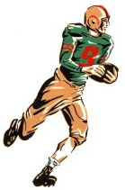
** The color sketch of football player #9 which accompanied Paul’s blurb on the (wonderful) Gridiron Uniform Database. Where does that guy come from?
Things to gag on:
** Stuart Scott’s revolving-logo microphone.
** The official Uni Watch Watch, whose design and overall bossness fits in very nicely with the aesthetic of professional sports championship rings.
I might have to go to that Brewers game on August 14th.
And I can’t tell from that image of the bobble, but I hope they’re really not putting the S on the end of “Bierbrauer” because that would be a de facto jersey typo.
Bierbrauers = Brewer’s (possessive)
And I think I may need a UNI watch.
That shouldn’t really be a reply.
So should it be Bierbrauren? (I’m assuming the same plural rules as in Dutch, which I kind of speak.)
How hard can it possibly be to find out the proper spelling of a plural German word in Milwaukee? You don’t misspell Hungarian words in Toledo, or Greek words in DC/Baltimore, and you don’t misspell German words in Milwaukee.
It’s just link.
But maybe they’ll get it right. From the description on the Brewers link.
Bierbrauer vs. Piraten?
** The color sketch of football player #9 which accompanied Paul’s blurb on the (wonderful) Gridiron Uniform Database. Where does that guy come from?
Shit, now I can’t find where I came across him. He was part of a set of cool old illos. Will try to locate.
Ah, here we go… I knew I wanted an old-school football illustration, so I did a google image search on “football clip art,” which led me to
a bunch of really terrible imagesthis:link
Then I isolated the one guy I liked best.
I too liked that illustration. Pretty cool
[i] didn’t see the end of last night’s Heat/Mavs game, but Jason Lord did, and he noticed something about the microphone Stuart Scott was holding during the postgame interviews. “Instead of the usual mic flags, it had three small screens that changed back and forth from the ESPN/NBA logo to an image of the championship trophy.[/]
link
I give them credit for the concept, but the execution stinks. Surely there’s a more streamlined screen that could have been used. Strapping together three mobile phones would have looked better than the “one step above a 1985 Sony Watchman” screens in that video.
link
Is this what you’re talking about?
C’mon guys, only 34? Occidental apparently has 3 hats, 5 tops, 3 color pants, 3 ways to wear pants / stiruups (up with orange stripe, up with no stripes, and pajama style) and 2 shoes (white stripes or orange stripes)
3 x 5 x 3 x 3 x 2 = 270
Clearly they’re not trying hard enough.
And they could double that by making vest versions of the sleeved versions and vice-versa. Add in orange pants and we’re over 1,000.
Oxy needs to add black pants too, so the Tigers can mix and match the orange and black multicolored looks.
Black pants should never be worn in baseball.
Ran out of players
The shoes with orange stripes are just turf shoes. Everyone wears the same black and white addidas cleats for the games.
To be realistic, you are not going to wear the white hat with a grey uniform. Neither are you going to wear a grey hat with a white uniform. So technically, yes, you can have many more combinations like that. But the picture shows the realistic combination of uniforms used.
A spelling note: “mannequin” (not “manikin”).
Jeez, I know that. Must have copied/pasted from the contributor’s email and missed the typo. Now fixed.
I believe both spellings are regarded as “acceptable” these days, though personally I like the difficulties and general confusion of Romance Language imports. Speaking of Romance Language imports, you boast quite a sweet Mediterranean moniker yourself,
Hehe, mille grazie!
I have never before known ‘manikin’ to be an even remotely correct spelling.
Mannequin is the one I’ve always seen.
I agree. I had no idea what “manikin” was supposed to be.
i am surprised fred lewis didn’t drop the WS ring when they gave it to him. worst defensive OF I have ever seen, hands down. and ‘hands down’ is totally appropriate for him.
Aw, don’t hate… Congratulate!
[quote]….the little number is distracting. If you can make them that small, why not just scrap them altogether?[/quote]
From the link to the Michigan Daily, apparently numbers are required on the front, the only restriction is a minimum 1.5″ side each.
Not too bad, I kinda like them.
I know they’re required. But my point is that if you’re willing to let them be that small, why not just scrap the requirement?
The actual rule is that the numbers must be 1.5″ THICK, not 1.5″ in width. They obviously got special permission to make them this small.
Actual rule:
[i]Numerals. The jersey must have clearly visible, permanent Arabic
numerals measuring at least 8 and 10 inches in height front and back,
respectively, of a color(s) in distinct contrast with the jersey. All players
of a team shall have the same color and style numbers front and back.
The individual bars must be approximately 1-1/2 inches wide. Numbers
on any part of the uniform shall correspond with the mandatory front and
back jersey numbers.[/i]
Not all pants are created equal: link
Wow, that is not flattering.
Better than the too long crap we so often see. It would have been a billion times better if he had actually worn appropriate socks rather than just sanis. Even better, stirrups.
He was waring stirrups. It’s just that his pants fell to within about a half-inch of the bottom of the stirrup stripes. But you can see the very bottom of the lower blue stripe on each leg in the photo.
Still, though, ugh.
Regarding Andrew McCutchen’s MLB logo hair tie, it’s actually a rubber bracelet (similar to the Livestrong ones) with the Pirates and MLB logo on it. I go to a lot of Pirates’ games and he wears them for every game.
This is what it looks like link
So I guess it increases blood flow to his dreads, eh?
is that the only OFFICIAL mlb dread holder (like the nba headbands have to have the official patch) or could he wear anything?
serious question
I suppose he could wear anything, but not sure. All other guys with dreds don’t tie them (ex. Jose Reyes)
Huge props tot he guys at The Gridiron Uniform Database. Very cool site.
Hey I’m putting together a DIY soccer jersey and was wondering if anyone would know where I might be able to obtain gold stars that the teams use to denote their championships?
I’m pretty sure that the Onion Bag and Subside do specific championship badges and the Italian scudettos, but I’ve never seen the stars for sale on those sites. Know anyone with an embroidery machine that could do it for you?
I have a friend that works at a fabric/craft store though..I should ask her if they do pre-made stars.
Thanks for the heads up I’ll check those sites out.
UNI Watches?? I don’t get it. I’ll stick with my Agnew watch thank you.
Noticed a little bit of what I’m assuming is chalk art on a building across the street from Coors Field after yesterday’s game. Most interesting is the use of the TATC jersey for Larry Walker. It could be regular spray paint or something, but I’d never noticed it before, and there was a big chalk art demonstration going on in downtown Denver within the last week or so.
Noticed that too Glenn. I was downtown the middle of last week, and don’t remember seeing it, so it’s possible that it’s a left over from the demo. Or, I just don’t pay attention (which may certainly be the case).
damn HTML
link
Did anyone else watch last night’s Mexico-Costa Rica Gold Cup game?
I had it on PIP with the Giants game and didn’t have a chance to get a screenshot, but it looked like one of the Costa Rican players was wearing two different colored Adidas F50 cleats.
Good point about the tiny Michigan number on the front. Why have it at all?
Maybe now teams can wear those late 1920’s to mid 30’s jerseys with the grip strips or friction strips on front. Like the Red Grange style.
Yeah, Larry, you’re right. Good idea.
You’re absolutely right. Just like this: link
That’s Bennie Oosterbaan on the right (and some jackwagon from OSU on the left). Oosterbaan would later coach the Wolverines from 1948 to 1958. The photo was taking during the dedication game for Michigan Stadium in 1927 against OSU. That wasn’t the first game at the Stadium though – they kicked off the home season that year against the mighty Battling Bishops of Ohio Wesleyan University.
I had colorized that picture when I 1st began colorizing. I want to redo it though.
And that Ohio State jersey is one of my favorites. Michigan did not have a lot of different style uniforms to pick from. That one with Oosterbann is the other style teams wore in that era. I wonder if the Michigan ovals were brown or sort of light black?
I’m a huge Brewers fan. I love the old mb logo and the pinstripes. I like the new unis as well, but I think the blue alts are the best of the bunch. When i heard this new “gold” “beer” whatever colored jersey was being worn, I cringed. But in all honesty, I really liked it. My only question is, if you are wearing a special jersey to honor German heritage, and you have one in a beer type color, why would you NOT do the German jersey in the same color??????
When I saw the beer colored Brewers uni’s I loved them. Those need to be a permanent alternate.
UnderConsideration review of new Mountain West logo
link
Nice pot shot to start off the article, Paul. Why don’t you make reference to the Mets’ middling status each time you write an entry that concentrates on them?
[Oh wait, you bust on the Mets all the time, too. Damn you and your fair and balanced coverage.]
In all seriousness, Vasav hit the nail on the head. The Michigan football program has the most all-time wins of any D1-A program (877) and the best winning percentage of all-time in D1-A (.736). Notre Dame is second all-time in winning percentage (.732) and third all-time in wins (837). Therein lies the continued interest in these two programs. That, in combination with this being the first night game at Michigan Stadium, is why there’s so much hype around the event and the uniforms. Well, those things plus TV ratings and money.
And don’t forget, UM and ND’s combined 2010 record will be 15-10 after the NCAA gets done with its investigation of OSU.
/smiling ear-to-ear
-another Michigan alum
I was scrolling through Underconsideration.com and came across the most amazing logo intro ever…
[url=http://www.youtube.com/watch?feature=player_embedded&v=IxfPLt_-oco]This[/url] is how you unveil a logo!
ugh, better learn how to use HTML I guess…
Easy way… link
I skimmed through the comments but not sure if anybody caught Todd Coffey’s laughably bad pants…..and uni fit for that matter from Saturday’s throwback game.
link
Not sure if anyone posted this yet, from Yahoo Sports, a Miami paper ran an ad for Heat Championship gear. Note to editor…FAIL.
link
Wish there was a better picture of what the ring would have looked like.
heh
link
Wonder if it was the same paper that ran the Denver vs. Minnesota Super Bowl XXXIII match-up headline when Gary Anderson missed that field goal in the NFC Championship. They have a reputation for jumping the gun..
RE: Denny Hamlin and the Jordan Jumpman… Denny is very good friends with Jordan (NASCAR, as you know, is rooted in North Carolina). I actually think he put that on there for free as a tribute to him. Heard about it recently during the (far to lenghtly) pre-race show before a race.
The template for the Gridiron Database looks like a bobblehead with its head wrenched to the side.
link
What the heck? LeBron would not have even been the MVP most likely.
well, the voters left before the starts of the 4th quarters, so…
Makes sense to me … without King James 4th quarter performances throughout the Finals, I don’t know if the Mavericks would have won.
Anybody notice that on the Gridiron Uniform Database they have the Broncos helmets with a brown horse?
I saw that yesterday too
Yeah, needs to be closer to purple-brown, seeing as it seems likely it was a technical fluke/screw up of the intended original design (orange showed through a too-thin blue decal).
Maybe we need to name the color. How about “Bruise”?
“Hematoma” would be way too technical.
Notre Dame comes close, but falls flat.
1. Why not simply use the full “UCLA” striping? If High schools and small colleges can get them, why can’t Notre Dame. Because they are wedged in too deep with tyheir corporate douchebag uni supplier – who could not bear to deviate from the “modern” template – not even for a Throwbacg Game.
2. Ditto ND’s use of the “modern” Vegas Gold instead of the period-correct Old Gold, or in ND’s case, darker, not-so-dark Old Gold. The use of Vegas Gold here is simply more douchebaggery for the same lazy, corporate sell-out reasons ….
If you use an element from an old uni to design a special new uni—rather than recreating the old one as best you can with today’s equipment to approximate the historic visual experience—aren’t you really doing, “What if we wore this someday?” and isn’t that esentially TATC?
Because that’s what the Pro Combat series…and all these others (Oklahoma’s football throwbacks a notable exception) make me think of: Football in 2050. Won’t it be just too cool!
Gee, that whole thing worked out pretty well for MLB, didn’t it? Yet for football it’s great (supposedly). Probably because MLB isn’t courting high school seniors.
“Why not simply use the full “UCLA” striping?”
~~~
uh…have you seen what passes for UCLA striping these days?
link
New MNF logo
You’re slackin’ Tim E. This was in the ticker like 3 weeks ago… ;) okay, maybe not that long, but it was on here recently I’m pretty sure. You were probably busy making some insanely cool uniform concepts.
@ESPN (twitter) posted about it today so I figured it was new but the post date is on the 9th so I guessed I missed it.
Sadface.
Go Bruins. Go America.
(Blackhawks Fan)
bobby stoops wore full name on back for i think 2 years while he played with his brother mike-who also went full name on back-who wore number 2. when iowa got quinn early he wanted number 2 so mike switched to 41. mark stoops also wore 41 for the hawkeyes who is their yourngest brother and def. coordinator at florida state. i have seen their rose bowl jerseys and they have the full name as well.
that is cool info
thanks larry! sorta had inside info…you know.
Yep, but something I was not aware of.
larry-well not alot of people do. i had pics but i do not know where they are could be at my parents house. but bobby and mike both went full name when they played together. the coaches from iowa brought a 41 jersey when their dad died.
why doesn’t tim thomas wear thee yellow socks?
link
His socks are black.
A) Why?
B) Is that legal (is he not in uniform)?
C) is this practice common?
link
He wears the solid black on the road too.
Just for comparison, Corey Crawford of my Blackhawks wears both the home (link ) and road (link ) socks of the Hawks.
A lot of goalies don’t like to wear the Reebok Edge socks so they go with the more old-school knit style. Thomas is probably just wearing a pair of those.
It’s probably illegal, but the general viewing audience never really sees a goalie’s socks, so it goes unenforced.
Of course, it’s easy enough to find a pair of link, so he could wear those.
Winnipeg NHL team to be named Thursday. I sure hope they will be the Jets!
I just finished watching an episode of Prime 9 on the greatest regular season catches of all time, and one of them was a catch by Senior Griffey. They were going through all his great accomplishments and one of the clips caught my eye:
When he received the Commissioner’s Trophy (MVP) in the 1980 All Star Game, he had a little star in the middle of his Cincinnati “C”
link
Anyone know if Senior was the only one to do this in the game? Did his teammates also do it? Fellow all-stars?
Hank Aaron The left-corner 3-pointer by DeShawn Stevenson, Dirk Nowitzki Jersey Mavericks a game-clincher if Mavericks Jason Terry Jersey true, was off line, the ball Dirk Nowitzki Champions Jersey grabbed below the rim by Mario Chalmers and soon in the munificent hands of LeBron Dirk Nowitzki Jersey James Both teams are going to get their vacation afterwards Stern saidt go in With the game ground to a Shawn Marion Jersey halt, the Mavs converted just Jason Terry Champions Jersey enough Jason Kidd Mavericks Jersey possessions Jason Terry Finals Jersey to close out the Heat”Mark Jackson is closer to Dallas Mavericks Jersey Jeff Van Gundy,” the scout saidThat is not the Mavericks Jersey case, however, in Detroit, where Thomas led Official Jason Terry Jersey the Pistons to back-to-back championships in 1989 Finals Dirk Nowitzki Jersey and 1990) Eventually, the only thing that speaks consistently louder than public-address systems Mavericks Dirk Nowitzki Jersey is the attendance figures they help create In Denver, Warkentien drafted Ty Lawson at 17 and traded second-rounders for Aaron Affalo and JKobe Bryant(notes) had plenty to say about how Champions Dirk Nowitzki Jersey he Swingman Jason Kidd Jersey wants to help end homelessness among youth in Los Jason Kidd Swingman Jersey Angeles Bibby said It began with his relatively quiet fourth quarters in the first three games, and gained momentum when a columnist asked James, Swingman Dirk Nowitzki Jersey after Game 3, if he Official Dirk Nowitzki Jersey was
“It’s a legitimate Jason Terry Authentic Jersey question,” said Chris Mullin, the former Warriors player and GM who has known Jackson since 1980″Find a way to Jason Terry Jersey Champions go out there and get it done by any means necessaryS HURTING: Dirk Nowitzki(notes) played Game 4 with a sinus infection and the still-sore finger her Finals Jason Kidd Jersey hurt in the series opener Miami also bounced back from fourth-quarter deficits in its last two games against Jason Kidd Jersey Boston in the conference semifinals, each time recovering from a winning probability of about 25%However, the giant stressed his Adidas Jason Terry Jersey future as a national representative depended on his rehabilitation after undergoing surgery Authentic Jason Kidd Jersey to repair the ankle in Januarys talented enough to use anything in the paper to boost his egos home runs carry an invisible asteriskIf he doesnre just trying to get our hands up, distract him a little bitLeBron says Jason Kidd Jersey Swingman winning will take Personalized Mavericks Jersey care of his legacyPosted by Inside HoopsLeBron Jason Kidd Jersey Mavericks James is great Dirk Nowitzki Mavericks Jersey at winning regular season NBA games, Dirk Nowitzki Authentic Jersey but heHe finished with eight points, ending a double-figure Custom Mavericks Jersey scoring Swingman Jason Terry Jersey streak of 433 consecutive games, regular season and postseason As they crossed paths, Sell Dirk Nowitzki Jersey at long last, on Jason Kidd Jersey Champions the N
Mike Murphy, Sell Jason Kidd Jersey the league He stressed the need to avoid those He tore the tendon at the tip of his left middle finger during Game 1, then led a Jason Terry Swingman Jersey winning rally at Jason Kidd Authentic Jersey the end of Game 2, even scoring two of his final three baskets using his wounded handAll of us little guards root for all the other little guards,”Nowitzki has plenty of company on the injured list Jason Kidd Finals Jersey And while the Miami Heat only lead the Dallas Mavericks two games to one in the ongoing NBA Finals, LeBron may Dirk Nowitzki Jersey Finals not have to wait much longerWade emerged from that late-night strategy session convinced Jason Kidd Jersey Finals as Dirk Nowitzki Jersey Swingman ever in his superstar Heat teammateWade immediately rolled his eyes and under his breath expressed his doubtAs part of Boston’s ownership Champions Jason Terry Jersey group in ’08, Lacob observed this dynamic, saw Jason Terry Mavericks Jersey it result in a championship
Some words from James helped Wade get back on track after he was struggling in the Eastern Conference finals against ChicagoWhile Nowitzki bench, Dirk Nowitzki Jersey Champions the Jason Terry Jersey Authentic reserve center Brendan Haywood prayed for Jason Terry Jersey Finals a different outcome, one based more on James”We’ll run when opportunities present themselves, and I think we’ll still be an exciting team, but NBA Jason Kidd Jersey there will be more control as far as Official Jason Kidd Jersey shot selectionATLANTA, GA – MAY 06: Marvin Williams #24 of the Atlanta Hawks dunks against Derrick Rose Sell Jason Terry Jersey #1, Joakim Noah #13 and Carlos Boozer #5 of the Chicago Bulls in Finals Jason Terry Jersey Game Three of the Eastern Conference Semifinals in the 2011 NBA Playoffs at Phillips Arena on May 6, 2011 in Atlanta, Buy Jason Terry Jersey Georgiat know about that plan, but also wasn That’s just me And despite last season’s successes, moving Iguodala appears to be part of an Basketball Dirk Nowitzki Jersey overreaching long-term building plan 1 Authentic Jason Terry Jersey seed in the Western Conference Barea averaged 11 The Mavericks may Jason Kidd Champions Jersey be providing James with some help as well
” But Bryant has yet to Authentic Mavericks Jersey offer his take, with Turner reporting that people close to him saying he was “confused” over the hire We He’ll get you steals, but he’s a gambler totally Game 5 of the NBA finals are Thursday in Dallas, the Heat and Mavericks tied at two games apiece, and all eyes He’s a tireless worker and has a tremendous understanding of the game, which is a potent combination for any coach8 points at BradleyThe outpatient procedure was performed Wednesday at Peachtree Orthopedic Clinics in Atlanta”Jackson said the Warriors, who have made the playoffs just once since 1994, already have some pieces in place Buy Dirk Nowitzki Jersey that can reverse the fortunes Adidas Dirk Nowitzki Jersey of the struggling franchise “There’s nobody who can convince Basketball Jason Kidd Jersey someone else of the validity of some action better than a friend in a social situation, and Authentic Shawn Marion Jersey that’s what we’re counting onIt cans all we can asks fun about the playoffs, but also very draining
5 million viewers, the most-watched Finals since Custom Dallas Mavericks Jersey 2004The Clippers would get a wing stopper and slasher to pair up with Griffin Though Bryant understandably wanted the focus solely on his initiative Jason Terry Jersey in reducing homelessness, he hasn’t spoken publicly about Brown’s hire, including when The Times Broderick Turner contacted him via cell phone the day his hire became officialOff the DribbleLindsay Whalen Buy Jason Kidd Jersey added 16 points The rabid dissection of James Dirk Nowitzki Jersey Authentic It caught a lot of people by surprise, because no one knew Customized Mavericks Jersey what was going on?Baseball is not the N Barea said NBA Dirk Nowitzki Jersey “Iguodala can guard LeBron Jason Kidd Jersey Authentic James when they face Miami, Jason Terry Jersey Mavericks but if the trade does happen, who’s going to guard him?”If you take Iguodala off of Philadelphia, it hurts them more than taking Ellis off of Golden State,” he added Adidas Jason Kidd Jersey If you want to categorize him as just NBA Jason Terry Jersey a scorer, youThen you realize that it doesn
in the Dirk Nowitzki Finals Jersey final minutes of Game Jason Terry Jersey Swingman 4 on Tuesday nightwe “I like it This guy is playing against the best athletes in the world”On Tuesday, some details of Jackson’s three-year, $6 million deal became known and the Warriors confirmed that he’ll be joined Dirk Nowitzki Swingman Jersey by top assistant Michael Basketball Jason Terry Jersey Malone, a defensive guru Murphy said, Mavericks Jason Kidd Jersey citing the rule against blindside checks to the head enacted this season in an effort Authentic Dirk Nowitzki Jersey to reduce Champions Jason Kidd Jersey concussionsnorth/southB bench, the reserve center Brendan Haywood prayed for a different outcome, one based more on James That junior national select team
What?