Phil here, popping in for a bit of College Football news.
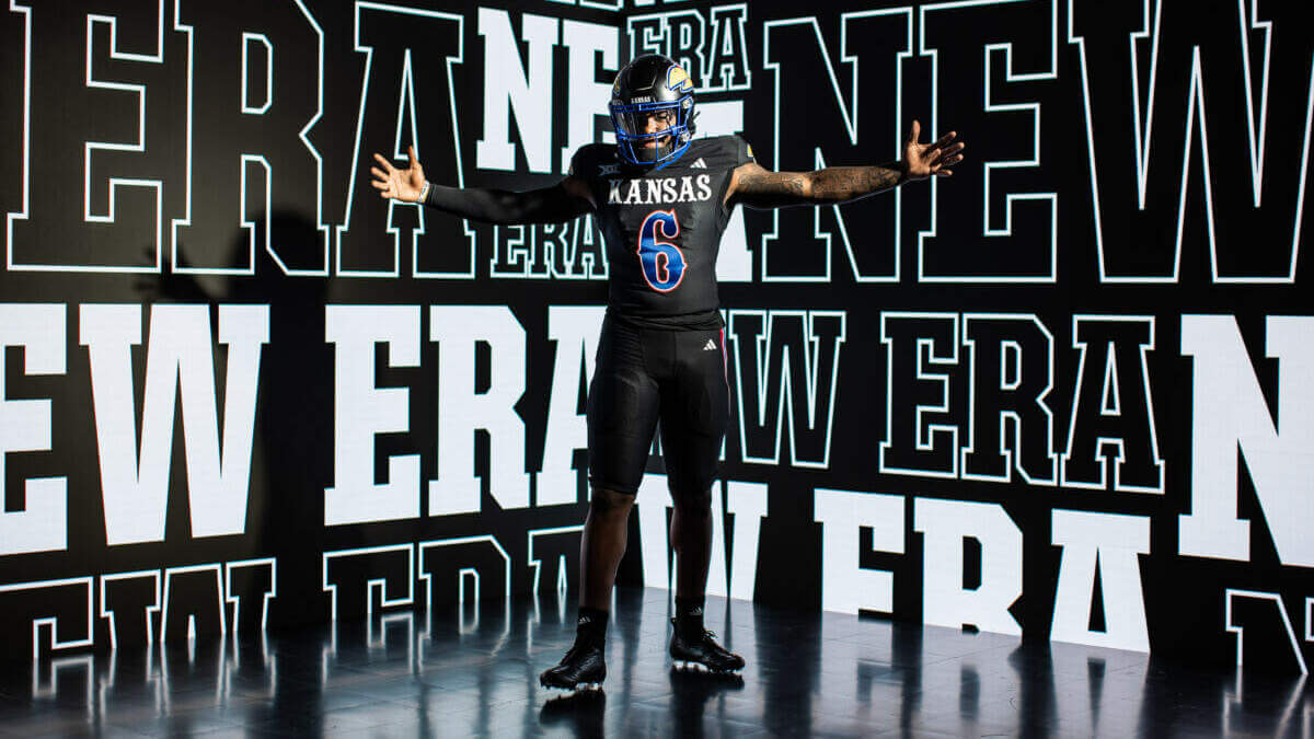
In case you missed it, over the Labor Day weekend, the Kansas University Jayhawks introduced a new, all-black uniform they’re dubbing “Blackhawk,” and which they’ll wear for a prime time matchup this Friday against Illinois.
If you hadn’t been paying attention, earlier this year, the Jayhawks debuted brand new blue and white uniforms (which look really, really good). My only complaint about the new uniforms is the new trend of teams adding a HUGE wordmark across the chest, a trend the NFL seems to be toying with as well.
But the new all-black uniforms are slightly different in style from those which debuted earlier this year.
Let’s take a look.
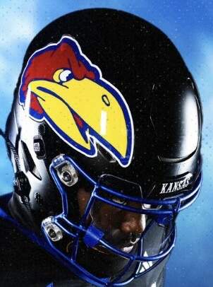
As you can see, it’s head-to-toe black. The black helmet features a blue facemask, and a different logo (the “1941 Jayhawk” that is also known as the school’s “warhawk” design).
Here’s a handy-dandy guide…
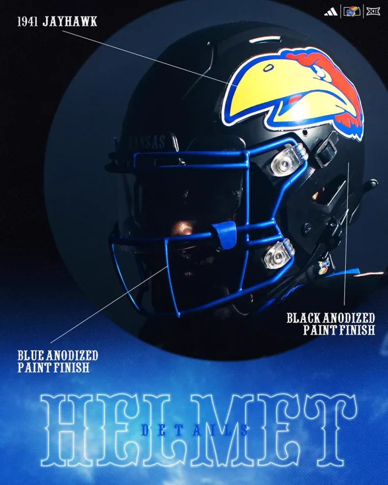
You’ll note the paint finishes on both helmet and cage are “anodized.” I didn’t realize that was a thing for football helmets, but according to Wikipedia, “Anodizing is an electrolytic passivation process used to increase the thickness of the natural oxide layer on the surface of metal parts. The process is called anodizing because the part to be treated forms the anode electrode of an electrolytic cell. Anodizing increases resistance to corrosion and wear, and provides better adhesion for paint primers and glues than bare metal does.” So there’s that.
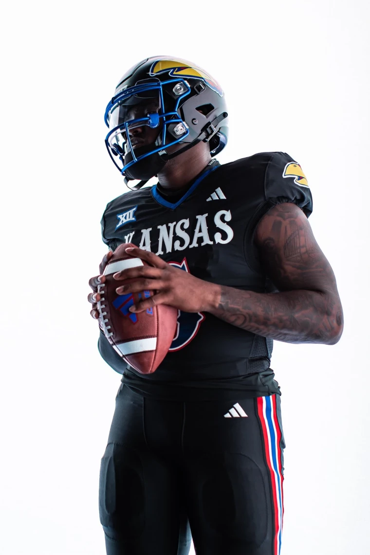
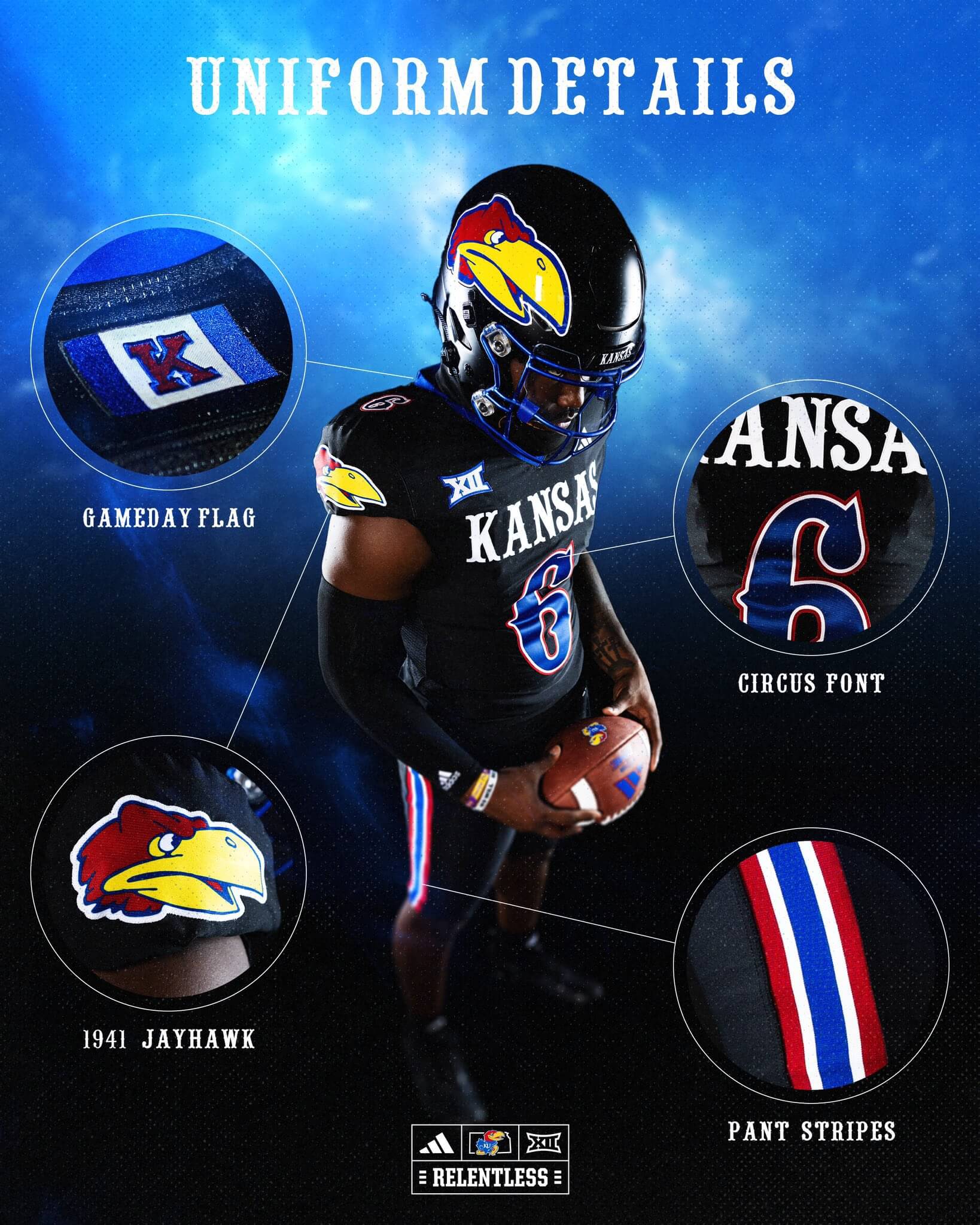
Moving down, the jersey and pants are also black. The jersey features the 1941 Jayhawk logo on each sleeve cap, with the word “KANSAS” in white across the front. The number is blue, with a white and red outline. Fans of fonts will recognize the style is “Circus,” a style that has been adorning the team’s basketball jerseys for years.
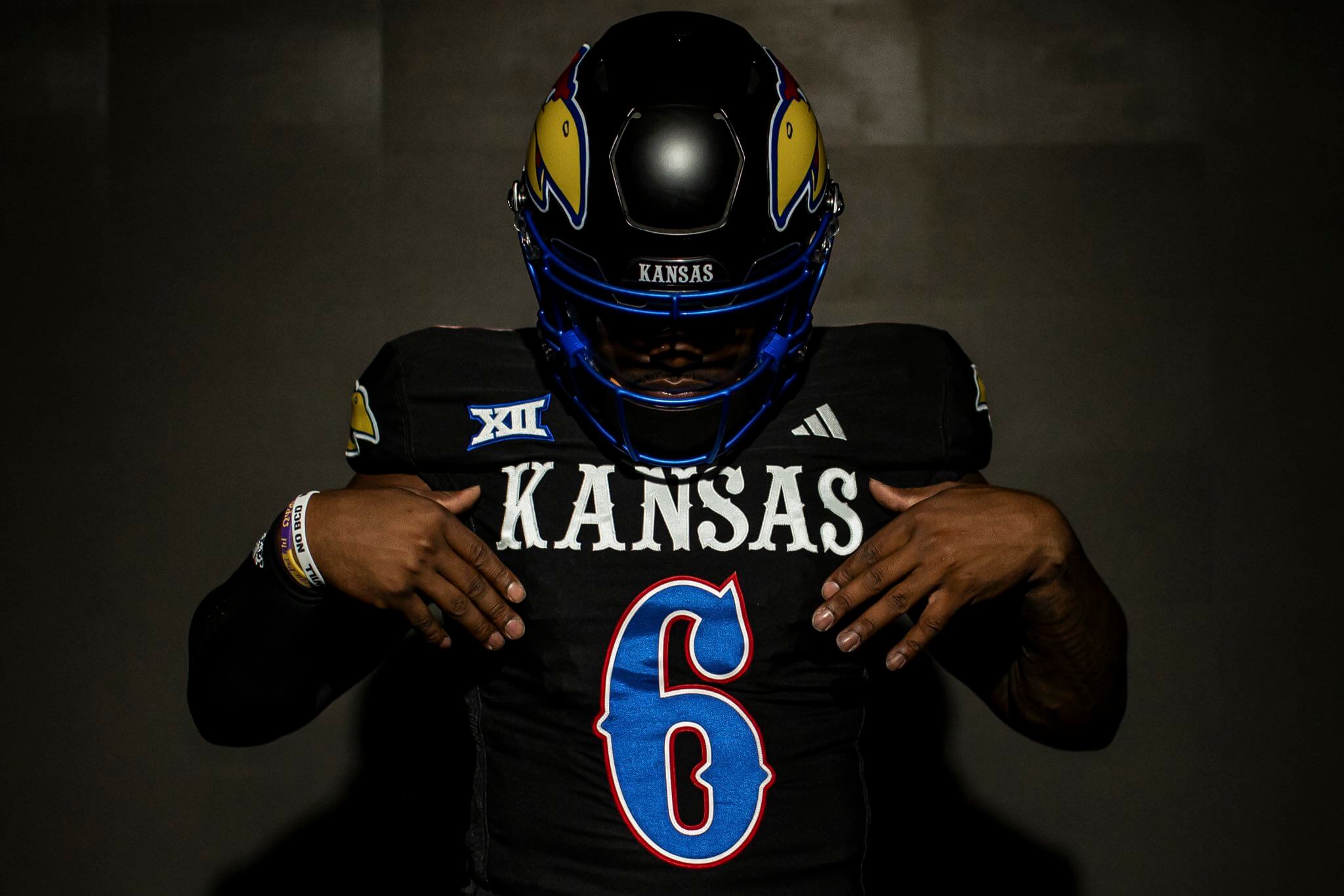
Pants are black with a thick red/white/blue/white/red stripe down each side.
The jersey features a blue collar stripe, while NOB is rendered in a standard block font in white. Rear number is in the same style as the front.
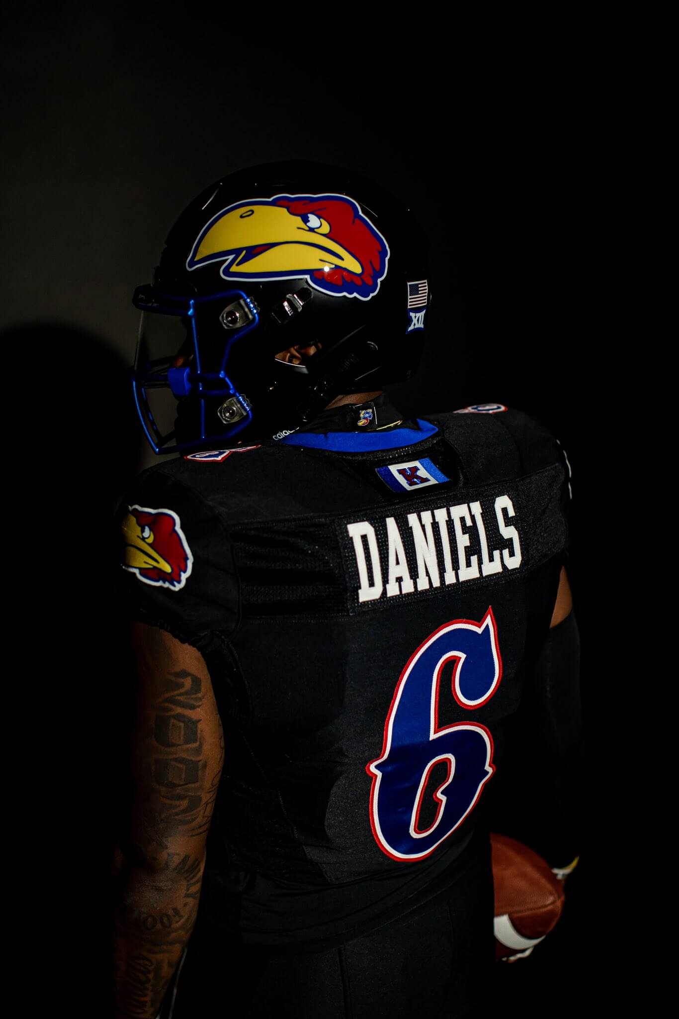
If you look closely at the above photo, you’ll notice a blue-and-white flag with a “K” just above the player’s name on the back of the jersey.
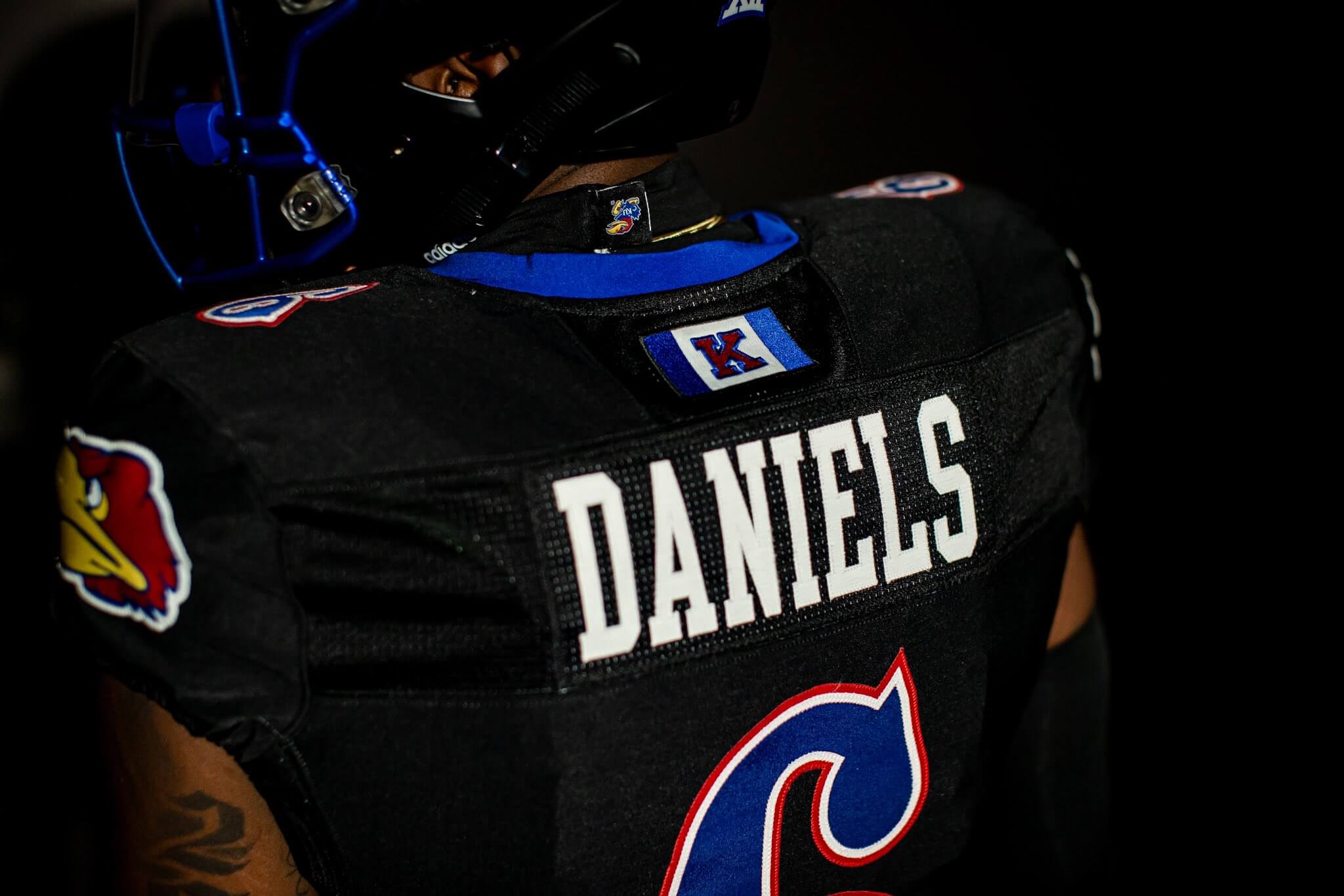
That’s the Kansas “Game Day” flag, and it was added to the uniform at the request of the players.
In case any of this wasn’t clear, here’s the details:
Of course, no unveiling would be complete without the hype video. I’d recommend turning the volume down (or off) for this one…
BLACKHAWK ⚫️⚫️🔥
9.8.23 pic.twitter.com/v3iHBUv27O
— Kansas Football (@KU_Football) September 3, 2023
While it was announced the team will debut these new alternates this Friday night against Illinois, they did not state whether or not they will be worn more than once. I suppose that may depend upon whether they win or go Blackhawk Down.
Really love the design, just wish it wasn’t a black uni.
That’s pretty much it. Well said.
I agree. As a KU fan, we’ve kind of owned royal blue in the Big 12 for years (now BYU technically has some claim, but for a while we were the only one) so it really is a shame not to lean into that more. But…
The circus font makes everything better.
Imagine the beautiful home and road unis with the circus font and the shoulder stripes instead of the Jayhawk head and you have yourself a 10/10 no notes. Add a side stripe on the pants for good measure.
Numbers are on players’ lower backs and stomachs now instead of chests and upper backs
Foghorn Leghorn on the helmet. That’s a nice touch.
Looks like they at least used a black undershirt (at least in the unveiling photos), so it doesn’t end up looking like a messy belt like some of the photos for the blue and white unis, which have contrasting undershirts.
Was this done by New Era?
Nothing worse in uniforms than BFBS. I have no problem if black is an officia
Mind you, I’m a Mizzou fan, so all of this should be taken with a very large grain of salt. The KU uniforms are reprehensible, of course. But it’s gosh darned appropriate that KU and Illinois are playing a Friday Night Lights (i.e. high school) football game.
As a Kansas fan, the KU uniforms are reprehensible. Using black when it’s not a school color is unforgivably lazy, and I abhor the “warhawk” logo.
There is no way those helmets are actually anodized. It’s doubtful the facemasks are anodized. I’m sure that is just what they are calling the color. You can’t just anodize any material, it’s generally done to aluminum, and it’s expensive, not to mention incredibly harmful to the environment. The chemicals used to anodize are incredibly hazardous and is generally reserved for smaller parts.
Oh yeah, and as a KU fan, I agree, the use of black is a bit lazy. I do enjoy the 1941 Jayhawk, and the Circus Font, just wish they weren’t used on a black base uniform
You beat me to it. You most definitely can’t anodize plastic. Facemasks are made of metal, but they are coated in a thick layer of plastic for safety (probably dipped). I’m sure that the marketing folks were just reaching for a “cool word” that hasn’t been used yet that most people wouldn’t balk at. If anything, maybe they were just hinting at the look of the finish, since anodizing usually results in a sort of semi-gloss or satin look.
Blue number + black jersey = massive fail.
Never been a fan of that clown font either.
It’s “CIRCUS” font.
And it’s a bazillion times better than Trajan
Clown, Trajan… they’re both bad.
The main issue I have with these is: too many hawks! Put the classic hawk on the shoulder OR the helmet, but not on both. It’s like they’re saying, “Look! It’s the 1941 Warhawk! See? SEE!?” The design speaks for itself, it doesn’t need to be overdone.
Too bad it is black instead of blue and white. Love the Circus font and the gameday flag, nice touches.
I personally dislike when logos on the shoulders are the same as the logo on the helmet. comes across as redudant.
I don’t dislike the uniform, but I think the Game Day Flag placed above the NOB would be better suited for the shoulder logo than repeating the warhawk.