
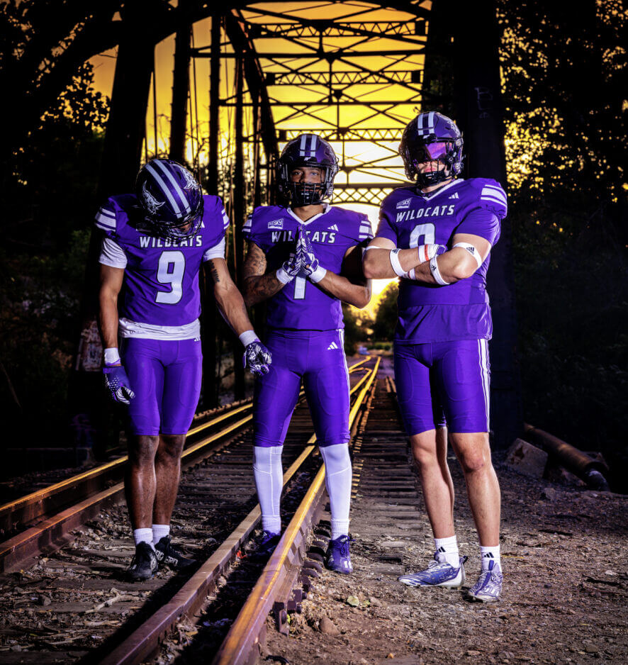
The Weber State Wildcats unveiled an updated purple uniform set which will be worn during the 2023 season. Since the “accursed” color is probably best left unseen by Paul’s eyes, here is the new look:
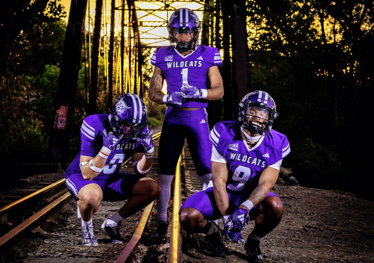
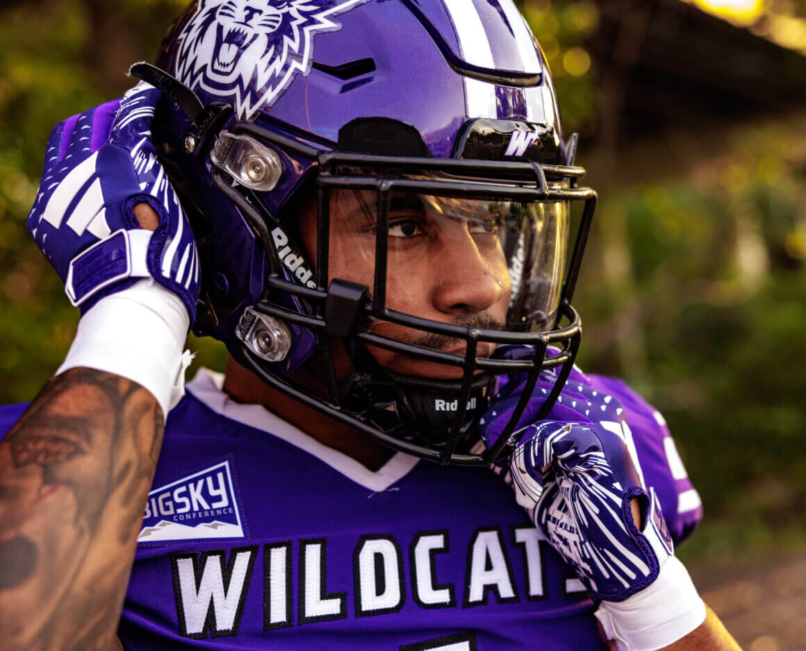
As you can see, the purple helmet has two white stripes, with white wildcat logos on the sides of the helmet. Jersey caps and pants both feature Northwestern striping.
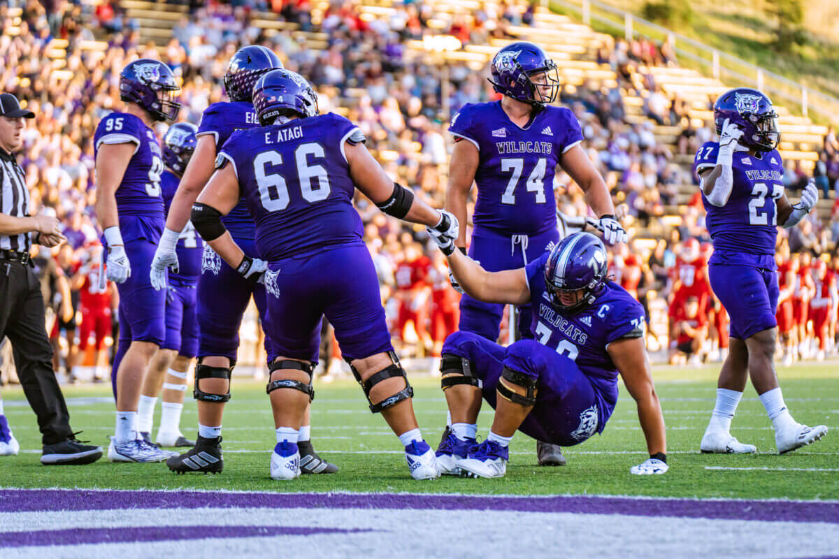
The jersey has a white collar, and a new “WILDCATS” wordmark on the upper chest, in white lettering with black outlines. Numbers are in in new, rounded font, also in white with black outline.
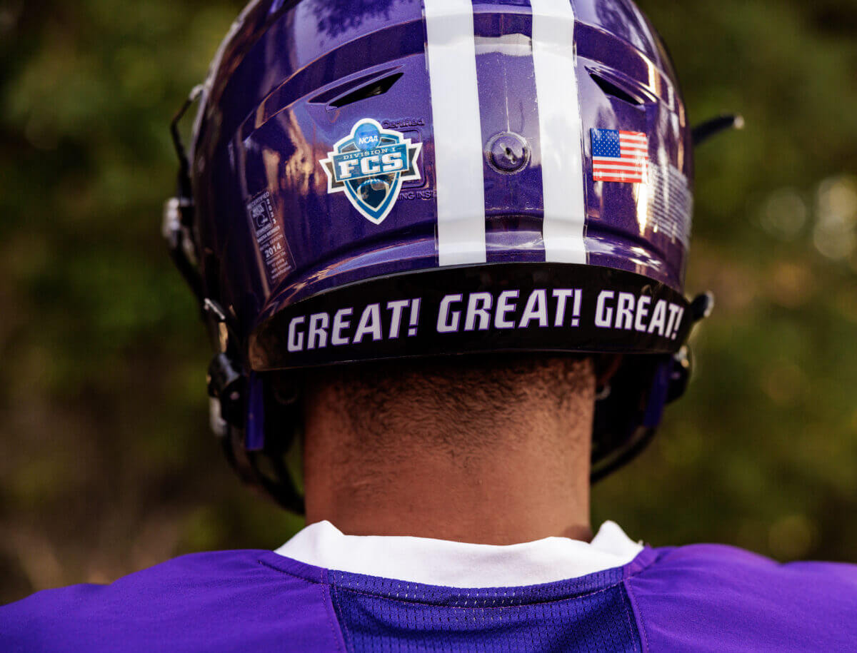
The rear bumper on the helmet contains the phrase “GREAT! GREAT! GREAT!” which comes from the lyrics to the team’s fight song.
The uniform could best be described as more traditional, especially in light of some of Weber State’s more recent looks. Here’s how the uniforms looked last season:
You’ll note that the helmet striping is different, and the jerseys featured only a slight white stripe on the hem. “WILDCATS” was rendered in dark purple with a white outline, and pants were stripeless, containing the Wildcat logo on the left hip. Numbers were a block font. The squad also has had mono-black and mono-white uniforms in the recent past, and they have mixed and matched those colors at will. No word yet if either the white or black set have or will be updated along the lines of the purple uniforms.
Paul’s outside, looking at a blue sky, right?
Can’t say I watch much Weber (WEE’-bur) State football, but I like the more traditional look, especially the new helmet stripes. They got it right.
All the players featured on the pics have above the knee pants. None below the knee. That’s kind of weird.
There is another purple-clad team named the Wildcats with Northwestern striping, that isn’t Northwestern?
Do they know Paul took the month off? Ideal time to drop a Purple uni. Oh yea, the Suns too! He must have more influence than was previously known!
If you hadn’t told me this was Weber State, I would have thought it was Kansas State, just with a purple helmet and pants. Especially the head-on shots where you can’t see the helmet logo.
Haha, now with Paul on vacation I can say it…I really like purple uniforms!
Weird that they went more traditional but dropped the block font in favor of a crappy modern one.
The Nevada Wolf Pack (but in purple).
Thanks for a professional writeup.
It definitely looks like an upgrade compared to last year’s getup. My only complaint would be to have the school name instead of Wildcats on the jersey. Wildcats is too generic and I’d like to know who this team is when I’m scrolling through the channels on a random October afternoon.
Yes, it would certainly not be a stretch to say Northwestern could wear this same uniform, all but the Big Sky patch.
I’m sure the rail industry, which has a huge problem with people posing for photos on active railroad tracks (with occasional tragic results) is just thrilled to see where these photos were taken.
Mono is a no no for me. But I like that wildcat logo, the best wildcat in the business.
Love these! Definitely 5&1 candidates no matter the opponent.
Interesting detail on the word mark, it’s like there’s a notch cut out of the top left on some letters. Very Washington Huskies ‘14-‘18