Imagine being in Great Britain back in 1987. You probably knew about the Super Bowl; maybe you even stayed up late to watch it. But did you and other Brits really know anything about the NFL? Did you even care?
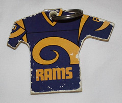
I would have guessed that the answer was no, but apparently that wasn’t the case, because a UK company was producing a line of gumball-style mini-jerseys (or “shirts,” as they called them) in 1987. Each pack came with a little keyring thingie, allowing fans to make their own NFL keychains.
I learned all this from UK reader Dan Tearle (co-founder of the excellent Illustrated NFL site). He gave me the full story on the UK keychains:
The mini-shirts came out in 1987 after the success of a range of gumball helmets the year before. The jerseys were made of a thin plyboard and paper-coated. They came with a keyring as well as the four bubblegum balls for 35 pence. The display board was a mail-away offer for 99 pence. The shirts had team logos or wordmarks on the front and No. 85 on the back.
I believe these uniform designs were based on uniforms from possibly a couple of years before. The sleeve striping on the Saints jersey, for example, was pre-1986, despite having been released in 1987. This led me to think perhaps they’d been released in the States a couple of years prior and had only just made their way over to England due to the NFL’s mid-’80s boom in popularity.
There were also a few other quirks:
• The Bears jersey had the “GSH” memorial initials on both sleeves.
• Inexplicably, every Bill s jersey had the sleeve stripes printed in black on the reverse side.
• The Patriots jersey had truncated stripes — in 1987!
The pictures from my set show how the shirts were prone to getting very battered very quickly, although mine have also been involved in numerous house moves, etc. Sadly, I’m now missing the Redskins, Broncos and Seahawks. I’m pretty sure they literally fell apart several years ago.
The offer for an “authentic” NFL team shirt was another mail-away deal. NFL Properties really pushed merchandise on us, and their own jerseys were absolutely everywhere. I still have the same 49ers shirt that I had back in 1987. I don’t think these were ever released in the States. All 28 teams were available, although less fashionable teams were very hard to find. The jerseys were very lightweight and the graphics were heat printed, so the numbers tended to start cracking after the first wash. But they were all the new fan could get at the time, so we snapped them up at around £11 a time!
All the jerseys carried the number of a popular player at the time, although sometimes these changed. For instance, the original Redskins jersey was No. 7, but in 1986 it changed to No. 81, for obvious reasons. I actually know pretty much all the player numbers they used.
As a newish fan back then, I found all this stuff very exciting. They really got me interested in the uniform aspect of the teams, too. I’d love to make some updated versions of these keyrings myself!
Fantastic stuff, Dan. It’s fascinating to hear how the NFL was being marketed across the pond 25 years ago. And I really love how the mini-jerseys have the team logos on the front, making them seem more like hockey sweaters. So cool!
Gift membership reminder: Want to give someone a Uni Watch membership card for Xmas but don’t know what design motif to use for the back of their card? We’ve got a solution to that problem — look here. (And if you just want a membership for yourself, full sign-up instrux are, as always, here.)
Giveaway reminder: Our friends at Gridiron Memories are giving away a college football helmet to lucky Uni Watch reader. Full details here.
Stirrups Club reminder: Robert Marshall is currently taking orders for his latest batch of stirrups. Full details here.
Uni Watch News Ticker: Big news out of Pittsburgh, where Ben Roethlisberger will be wearing a clear plastic face shield to protect his broken nose. Sounds Rip Hamilton-esque. When’s the last time a football player wore anything like that? (Update: It took about two seconds for someone in the comments to suggest that this probably just means a standard clear visor, not something more exotic. Dang.) … The Toledo Walleye are looking for fan input on the design of their fifth (yes, fifth) jersey. Go to their Facebook page and scroll down to the “Hey fans” entry (with thanks to Jacob Kubuske). ”¦ Reprinted from yesterday’s comments: Remember that poor kid at Notre Dame who was recently killed while filming the team’s practice? Oregon’s D.J. Davis wore a photo of him on his belt last weekend. ”¦ Latest chatter from the rumor mill: Phil Knight has supposedly pitched T. Boone Pickens on the idea of turning Oklahoma State into “the Oregon of the south,” or words to that effect, beginning with these helmet concepts. No idea if those concepts truly originated with Nike, or what the corresponding jerseys/pants might look like, or whether any of this is more than idle speculation. ”¦ New kit for the Houston Dynamo. Additional details spelled out here (with thanks to Michael Orr). ”¦ Nice to know Santa wears Adidas socks. Wayne Koehler took that shot at Florida Southern College’s tree-lighting ceremony last weekend. ”¦ Two rugby reports from Eric Bangeman, who writes: “The Harlequins of England’s Aviva Premiership are going with an unusual alternate uniform ”” half white, half harlequin. Also, invite-only side Barbarians played South Africa over the weekend. They’re the only team left that still wears the old-school loose cotton jerseys, and they’ve lost the jersey sponsor this year. Best of all, the players continued the tradition of wearing socks from their home club.” … New gray alternate uni for Valpo hoops. “I love the design,” says Valp alum Dave Elbrecht. “I just wish the uni were brown, gold, or white — the school colors — instead of gray.” ”¦ Jeff Barak found an Austrian hockey jersey with UWCNOB — that’s Uni Watch columnist’s name on back. ”¦ Great work by Zach Brady, who’s created a logo- and uni-based guide to all the bowl games, along with a separate breakdown of all the redesigned bowl logos. ”¦ Since everyone seems to agree that the brown helmet was the fly in the Packers’ throwback ointment, Phil decided to see how last Sunday’s uniform would have looked with some other headwear colors. I like the old gold myself.
It sounds like Big Ben is going to wear a visor, which is actually very common in all levels of football. I would think the visor would offer at least as much protection as a mask would…
Oh — you’re probably right. When they said “face shield,” I envisioned something more like what Rip Hamilton wears, but a standard visor makes more sense.
I wonder if you might have been thinking about that picture of Don Meredith with that nose shield from yesterday’s ticker.
I am loving the bowl uniform guide. I especially like that he went far enough as to show which teams will be wearing colors and which will be wearing whites.
I agree that the guide is great. Just one small error that I found. The Hawaii Bowl game between Hawaii and Tulsa is being played in Honolulu on the 24th not in San Diego on the 23rd.
For what it’s worth, the white-red-red combo isn’t Arizona football’s home uniform, and I know I’m not the only fan praying that the equipment staff rediscovers Pantone 281…
Ummm, the Cats have worn at least three different combinations at home this year, including white-red-red vs. Washington.
link
And vs. Iowa
link
And vs. Cal
link
And vs. USC
link
@James, I know, and I hate it. I’m really hoping they go white-blue-white for the bowl game. It’s a GREAT look for them.
Any chance that Miami could wear those mono-orange alts for the Sun Bowl? Since they’re one of my least-favorite teams and they’re in my favorite bowl, it’s the least they could do for me.
who says the sun bowl is their favourite bowl?
the guy who doesn’t get espn
i don’t get espn either, and i could never put that sentence together with a straight face. who puts “love” and “sun bowl” in the same sentence? i mean really.
love,
the blue-bonnet bowl selection committee
I loved the Bluebonnet Bowl, too!
Man, I went to Rice and I still didn’t like the Bluebonnet Bowl. Our stadium is the reason waited 30 years to give Houston another super bowl.
What about the Astro Bluebonnet Bowl? That’s the one I really remember.
I still have the same 49ers shirt that I had back in 1987. I don’t think these were ever released in the States.
IIRC, except for the NFL patch on the sleeve, they look fairly similar to a style of jersey you could get at Sears back then.
I think the Packers would have looked great if they went with a matte finish brown. Think a brown, stripeless version of Oregon State’s helmet from last week.
I liked everything about those packers jerseys, even the brown helmets. I don’t care what anyone says.
I did too, but I really like the idea of a matte finish brown. Maybe next year.
Those NFL properties “authentic” jerseys look really similar to the kids jerseys they sold here in the US back in the late 70’s to mid 80’s. I remember having a Raiders number 30 with the team name on the front like those…somewhere around ’85 or ’86. I have no idea why it was number 30 instead of 32.
…and switching the Packers throwbacks to a yellow or tan helmet helps… but then it makes either the circle on the jersey or the pants look badly out of place. The best visual fix I can come up with would be both a yellow helmet & yellow pants… but then you pretty much destroy any remaining historical accuracy. I think we should just accept that it’s an ugly mess and hope they never wear it again.
link. and if you say he wasn’t on the team anymore, maybe your mom got it at the local thrift.
Wow! I haven’t seen or thought about those key rings for such a long time.
I was 9 in 87 so very much in the target market. I think the same company put out the ‘gumball’ helmets in the UK a year before.
Still bothers me that the number font is wrong for the Bears, just like it was on the £11 shirts. I got through three Bears jerseys as a kid growing up (34, 34 and 35).
If Dan Tearle has any other advertising scans for UK mags like Gridiron, Touchdown and Quarterback I’d love to see them.
Phil, can you add yellow pants and half white socks to your yellow helmet mock? That may be the ticket to make that uni rock.
Find me a bigger picture, and I’ll do it.
here it is big & with gold pants
high whites won’t look good, but THE jeff can add them to this one if he wants
aight…here it is
with white socks
Very cool – where’d you find the high-res original?
shoot me an email
I ended up grabbing a smaller, but workable shot on my own…
a little Q&D, with white socks:
link
#32 had some kind of black tape job or something so I just colored that part white instead of going farther up his leg with it
It always seems to look better when the Helmet matches the Jersey/Pants.
An interesting look, but perhaps too similar to a neighboring state’s prominent college team?
Yeah, it does have a bit of a Wolverine feel to it…
So, because someone had to do it – how about in their normal colors?
link
it is fun to look at what they could have done, and some of them are right fine looks, y’all have done a bang up job, but then they wouldn’t be throwbacks would they? i may be the only one, but i didn’t hate the brown helmet, which also didn’t need to be matte. actually, i loooved the brown helmet.
The brown helmet would have only looked good on the Padres. No, these mocks aren’t throwbacks, but they are improvements.
I’m with Robertmarshall on this one. I’ve always wanted the “way back” throwbacks to go with a brown helmet, and I’m glad someone finally did. I just wish they would have attached clear face masks.
They could probably make The Jeff’s mockup their regular uniform if they wanted to change, as long as they put the oval G on the side of the helmet of course.
Paul,
Good call on the title of today’s article – Anytime you can work a Joe Strummer/101ers reference into UW, it’s a good day!
Thanks for such a great site!
Chris
Thanks, Chris.
For those who don’t know what we’re talking about, here:
link
INDEED! What a great surprise! One of my favorite discoveries as a kid was that near-bootleg 101er’s album that was thrown together after The Clash hit America.
I want to support the MLS, I really do, but every time they debut a new kit, WOOF! The new Dynamo top looks like something I wore for my rec team in 1984, which is not a good thing.
The new Dynamo kit looks ridiculous. The club website actually has the gall to consider the sublimated pattern symbolic of “the energy of the club and the city.”
link
Now that I’ve vented, anyone know why they would want to resemble the Netherlands at Euro ’88?
Eh, Liverpool’s been putting weird 80sish designs on their kits recently, too.
Goofyass scousers.
“Dynamo” is just an odd name for an American sports team for me, because I’ll always associate the name with the Russian sports society and its associated (and formerly-associated) teams, particularly the Moscow Dynamo hockey club.
The more famous (and accomplished) Dynamo in reference to soccer was Dynamo Kyiv, which is now, of course, in Ukraine.
Well, Holland are THE global team in orange. So any club that picks said color is in someway emulating the Dutch. Plus, Holland won Euro 88 – possibly the country’s greatest sporting achievement (especially with it taking place in hated Germany). That shirt… link
I’m on board with cheesy 80s/90s prints – like with Liverpool, as someone mentioned below. I think for a lot of middle aged soccer fans it brings back some nice memories from a cool – and slightly less antiseptic – era for soccer.
Don’t like 90% of Adidas MLS offerings, but this is a good one. Points for the collar too. Another nod to ‘purity’ and international soccer nostalgia for MLS, which I think of as a good strategy (though they can be a little ham-fisted with their execution sometimes – *cough* Real Salt Lake *cough* *cough*)
Well, I never thought the old Dynamo unis looked good (link), so, I think the new one is an improvement, but still a long way to go.
I wish the Pack would have used the ‘tan’ helmet in the lower left photo Phil suggested. Besides clashing with the green dot, as Paul noted, the dark brown is better than the Packer Gold color which is not quite reminiscent of the leather heads era.
Again, dark brown and bright green is a great color combo. You guys are nuts.
“Again, dark brown and bright green is a great color combo.”
…for a baseball field, if it happens to be raining and the dirt is wet.
T. Boone Pickens is pretty much the funniest name to me, mostly because I always read it as “T Bone”.
Nuthin’ wrong with T-Bone link
When you mention T-Bone, I think of George’s nickname:
link
link
fety_mode=1
I may actually bid on that Austria “Lukas” jersey.
Paul, Phil, JTH: I got the stuff from the publishers. Expect packages around Christmas. :o)
Oh dear God, is every NCAA fb team eventually going to have four (or is it four dozen) helmets? link Online dictionary defines uniform as: u·ni·form (yn-fôrm)
adj.
1. Always the same, as in character or degree; unvarying.
2. Conforming to one principle, standard, or rule; consistent.
3. Being the same as or consonant with another or others.
4. Unvaried in texture, color, or design.
Guess that concept’s going out the window.
They still follow definition 3. Everyone on the team is wearing the same thing. :P
Maybe I need to come up with a 2-2-2 set for the NCAA. I know a lot of people weren’t overly fond of the idea, but it is much more limiting than what teams like Oregon are going with.
From game to game to game to game. Let’s forget about Oregon, how many helmets did Virginia Tech run through? Uniform sets? The notion has lost all meaning.
no offense to ben traxel and his desire to make more teams like the ducks…
but this is a bad idea — the ducks are *unique* because they are (well, not so much anymore) ONLY team to do the different uni combo every game
having the “oregon of the ___________” not only ruins it for everyone else but they ruin it for oregon too
much as phil knight would probably love to turn every team into oregon…
they should just. stop. now.
Perhaps we need to redefine what uniforms really are. They are … UNIFORM, i.e., something a team wears that is constant and identifiable — ideally, a home uniform and an away uniform. Okay, I get the notion of an alternative or throwback jersey that may be nice to have on an occasion. But once you start expanding the wardrobe and wear something from week to week, what you get are outfits, cute little outfits. And guest what? You can mix and match them and come out with even more outfits. They are no longer uniforms. They are like teenage girls going to the mall shopping for clothing.
“they should just. stop. now.”
As they say on the highlight shows, you can’t stop them, you can only hope to contain them.
The concept shouldn’t have started in the first place, because you know the rest of the schools weren’t going to sit there and let Oregon have all that uniqueness to itself.
Agreed, Oregon does take it too far. I can understand throwbacks and alternate uniforms, but when you have too many options, it takes away from the identity of the program. Besides, it’s always better to be known for on-field accomplishments, than what you’re wearing.
oregon doesn’t “take it too far” — they invented it…no more so than the pirates took it too far with their ridiculous mix and match wear of the 70-80s…
and oregon is in the bcs title game…which they may just win…
i think if they weren’t known before now for their on-field accomplishments, they’re about to be
it’s the oregon copy-cats who need to be stopped, not oregon
if 4 or 5 teams had done what the bumblebee pirates did, it would not only have diminished their own look, it would have detracted from what the bucs did
that’s what great about something being *unique* (or horrible, depending upon your perspective) — once it’s not unique anymore, it’s not great
Penn State’s uniforms are BORING. I think you get what I’m saying here.
The Bucs stuck to team colors. They didn’t add carbon for carbon’s sake and BFBS. Had the Ducks stuck to team colors (and used a real font and not worn sweatbox-belly jerseys), I would respect them a little more.
And Penn State is classic. If you took the numbers off the sleeves, then you might have borderline boring.
you missed my mothervilking point
oregon is NOT about team colors…if they were, they’d actually wear them
im talking about the uniqueness of their uni scheme…it kills traditionalists, but i’ve swallowed enough duck kool aid now to be immune to the schtick…
the bucs were also unique in their seemingly random swapping of tops and bottoms…although as jerry wolper has shown through his tracking, there was at least a rhyme to their reason
buc trackers and duck trackers
everyone else just. stop. now.
imitation may be the *sincerest form of flattery* but in the uni world it’s poison
“oregon is NOT about team colors…if they were, they’d actually wear them”
There’s just really no way to respond to that. I can see how changing the shade of a team color to contrast another team with a similar color might be cool, but what Oregon does is the same thing the Mets do, just on steroids.
I can respond to your last line, though. It wasn’t poison when dozens of schools copied (proper) UCLA stripes. Imitating what’s good has its place. Imitating what shouldn’t have started in the first place – that is uni poison.
So actually, I didn’t miss your point, ’cause I don’t have a problem with the mix & match aspect. They just took it too far.
copying ucla loops, or northwestern stripes…or any form of pants striping isn’t *imitation* — it’s more design … sure you could say that others “copied” them, but i don’t really see repeating a design element as copying — did everyone *copy* the “university block” or whatever it’s called font?
im talking about imitating a *style* — the bucs and ducks, for better or worse, have created their own style — ones which no other team (which i suppose in football, if you’re in the nike stable, is debatable) has (or had)
like the oakland a’s from the late 60’s thru the early 70’s, with the monochrome unis and the white shoes — it was cool when they did it, but when everyone started copying the white shoes…and to a certain extent their uni machinations…that ruined it
is everyone who has a solid color top in baseball a “copycat”? i suppose you could make that argument, but that’s not really what i was saying — there’s only so much you can do with a softball top
but if one team started wearing every uniform (home, road, and two different colored alts) with say, colored raglan sleeves…and then so too did three other teams…that’s imitation
As I mentioned in another thread a little while back, I think Oklahoma State has the WORST football helmets in the land. I really like some of the Nike designs posted; in particular, the designs with a Cowboy logo, as I think the basic “OSU” logo is a terribly boring and non-distinctive design. While I hate the idea of the team potentially having multiple helmets and uniforms, I still think it beats their current look.
On the Illustrated NFL site the artist Keith Batcheller seems to have come up with a “flying Elvis” concept for Super Bowl XX. Great stuff all over that site.
I don’t think it was actually for SBXX, as there’s nothing that indicates it (it just so happens that the two images are of the teams that played that game), plus the Pats uniform has sleeve stripes (c.1970-83), not the white-blue-white shoulder loops of the SBXX team.
link, not only because it reminds me of old Atari 2600 game box art, but because of how the jersey on the Broncos player in the bottom left has a white jersey’s left shoulder and sleeve on an otherwise orange jersey.
Interesting you mention the Atari cartridge art – Cliff Spohn, who did much of that art also did a lot of the work on Illustrated NFL – link
Keith’s paintings were painted for the Damac poster range, and these were from the late late 70’s, it’s just a coincidence he worked on the Pats and Bears!
Some of those Ok State concepts hitting me in a one of my only twitchy zones.
The angle of the OSUs looks slightly off. Seems to me the line that extends out from the S should run parallel to or like an extension of the top of the facemask frame/helmet brow line.
I see this a lot on concepts online and it’s like a crooked picture frame for me. Photoshop the would-be decal in such a way that it looks right on the helmet.
That’s harder to do than you might think, or at least a bit more time consuming than a lot of people want to deal with.
It’s much easier to just slap the logo on there and call it good enough than it is to try and distort it just right to match the perspective and curvature of the helmet.
Had a feeling that’s what it is.
One of those little things I just have to get used to.
speaking from really recent experience of helping with my companies catalog it is a giant pain in the ass to change the angles just so, especially if the software you’re using doesn’t have the ability to change angles easily.
I love those keychains, especially the various quirks and mistakes! God, I spent many hours pondering over those inaccuracies as a kid (not on the keychains, but anything I could get my hands on).
And I think the hockey style jersey looks pretty cool, too. Why not that design in reality? Especially today with the sleeve issues.
As a Valpo alum, I can tell you that my Facebook page was lighting up with people commenting on how God-awful those gray alts were last night (though I agree with Dave Elbrecht, as quoted in the ticker, that the design itself was nice). When your school colors are brown and gold (second only possibly to maroon and burnt orange as the worst combo in college sports) you have to try really hard to introduce another color to make things even worse; congrats to my alma mater for achieving this dubious distinction.
Between those unis and all the Purdue turnovers in the first half, that game started off almost unwatchable.
At least Purdue fixed their turnover problem at halftime. ;)
I suppose brown and gold is generally reviled around here as an athletic color combo, but to me, something about this just feels… right:
link
And yes, the bucking horse/cowboy should be Wyoming’s and Wyoming’s alone (sorry Oklahoma State).
no…it feels here too…
im not so sure about brown, athletic gold and navy blue being such a hot combo, however
Almost EVERY TIME that TWO colors (other than White)are added to Athletic Gold, the uniform looks like crap.
Just use Athletic Gold, another color, and White, and BE DONE WITH IT.
Hi Ben,
I have binders full of the magazines and will happily scan some in!
Apologies, that was supposed to be a reply to one of the above posts! As a sidenote, there was a partwork published in the 80’s which introduced the NFL and it’s teams and history, again created for the UK market. These magazines had team uniforms printed in the same style as the keyrings, but with pants and socks as well. I’ll try and scan some of those in too.
Thanks Dan!
Was it from Marshall Cavendish? I think it was just called ‘American Football’. I loved that.
As I kid I used to love the NFL and loved reading so would devour these things.
My dad ran a bar and one Saturday night in about 1986 brought home a pile of those NFL jerseys for me that had fallen off the back of a lorry. I’m guessing he can’t be arrested for this now. Don’t know if you remember this but department store BHS used to sell Seahawks stuff identical to the rest of the NFL line but with the BHS logo alongside the NFL shield on the collar tag. Weird, weird, weird. IIRC it was only the Seahawks.
It was from Marshall Cavendish that’s right! I still have mine :-/ I would read them non stop, if you remember there was also a glut of actually quite good books at the time, such as the annual C4 book etc, as well as loads of hiked in price imports from the US, but I snapped up everything I could then.
I do remember jerseys at BHS, and there was another store that did a similar thing, but I honestly can’t remember the shop now.
I too grew up with the NFL in the UK in the 1980s; my NY Giants LT shirt was bought in Mothercare of all places. I also had a Bears Walter Payton one which I wore until all the numbers and lettering came off.
While we’re here, did any other UK fans have that NFL book that Marks & Spencer produced? It had a report of every Super Bowl, detailed review of the 1985 campaign and a team by team preview of the 1986 season. At the back were features on the likes of Namath, Tarkenton Montana, McMahon, Landry, etc.
Have just remembered a project from primary school project from 1989 where I designed football kits and drew around the outside of these keyfobs as an outline.
Sadly as I have no artistic talent I can’t now claim this was the start of my career in design.
As for the books I had dozens and many of them probably still survive in my dad’s loft. I think I eventually put all the mags in the recycling due to a lack of space. It was done with a heavy heart.
Until I saw one of the ads on your site I had no idea you could ever get the NFL Record & Fact Books in the UK. I dread to think how attached I would’ve got to those.
I used to do exactly the same thing with the jerseys but change the numbers to my favourite NFL players! It’s something I’d really like to do again if I ever got time. It was around this time I decided I wanted to paint the NFL full time, and it’s still all I paint to this day.
Luckily, I managed to keep most of my magazines and books, although I did lose a lot in a house move…I still have a few Record and Fact books from the 80’s, I used to lose hours in those stats!
@ James, I have all the St.Michael editions through to ’88.
@Dan there was more than one? *scurris off to eBay*
I think there were 4. The first had IIRC Wendell Tyler on the front, then Phil Simms, Doug Williams and lastly Roger Craig. I don’t recall one being out for 1989. Mine are in the loft right now, but I definitely have those 4 editions.
I see nothing wrong with those Okie St. helmets, actually quite cool, love the bucking horse, and the cowboy himself…too cool
I really like the bucking horse on the white helmet concept.
Actually, very traditional-looking.
I agree completely. Nike isnt always out to ruin things the way Paul thinks
Oklahoma State is one of those schools with a rather bland uniform set, they should have stuck with the Barry Sanders era uniforms to date. Moving forward, I like a couple of those new concepts, although the cowboy on the bucking horse looks like Wyoming. I would use the orange OSU helmet, and find a place on the uniform for the cowboy, either the shoulder pad area, or hips.
I don’t believe Oregon has a unique right to use different uniforms, the same way Penn State doesn’t have a unique right to wear a conservative uniform.
I dunno, the bucking horse and cowboy remind me too much of Wyoming’s logo, which is also used on the state license plates and I don’t know what else as I’ve only seen Wyoming from 35,000 feet.
Their state quarter:
link
When I see a guy on a bucking horse, I don’t think cowboy. I think rodeo. Which sucks. Slap a hockey helmet (with full cage) on the guy.
I posted this over on the ostatesports.com, an OSU message board I frequent. It has spawned some discussion. One of the posters said that he received these in en email over the summer. Another said that they originated on orangepower.com (a different OSU message board)
At this point, I’m inclined to think that this is pretty much rumor only.
link
REPOSTING MY COMMENTS FROM ABOVE
As I mentioned in another thread a little while back, I think Oklahoma State has the WORST football helmets in the land. I really like some of the Nike designs posted; in particular, the designs with a Cowboy logo, as I think the basic “OSU” logo is a terribly boring and non-distinctive design. While I hate the idea of the team potentially having multiple helmets and uniforms, I still think it beats their current look.
From the Illustrated NFL: link interestingly enough shows the Saints in white, and the Cowboys in blue. I’m not sure when Cowboys-white-at-home became the norm, but it’s interesting to note the Saints doing it back then. (Of course, they’d have been playing out of Tulane back then, since it was before the Superdome.)
If that (cool) illustration were fully accurate, it would have shown the Browns, Cowboys, Rams, Giants and Steelers also wearing white for home uniforms in ’67.
Cowboys have been a White-at-Home tean since switching to the “current” uniform in 1964 (Silver/Blue helmet & pants).
I do not believe that they have EVER worn Blue at home since, other than the Thanksgiving or Throwback (pre-1964 uni) games.
1960-1963 the Cowboys wore White helmets and pants, with contrasting jersey shoulders, and wore Blue at home.
Saints wore White at home for most of their early years (1967-1972), wearing Black jerseys at home for selected late-season games. When the Saints played in Tulane Stadium (1967-1974) the early season games were regularly played in temperatures ranging from the mid-80s-90s. A “scientific test was done showing that the players were SEVEBN degrees hotter wearing Black (durene-this is pre mesh jerseys) as opposed to White jerseys, and along with the ideas of having the Saints fans experience other teams color or dark jerseys, the Saints made the decision to wear White at home as a regular policy.
I do not believe that the Saints EVER wore Black at home from 1971-1974. Upon moving to the Dome in 1975, they wore White at home (over White pants – a one year uni) and then wore Black jerseys at home for the final 2-3 games. When Hank Stram was hired in 1976, for the first time the Saints became a Black-at-Home full time team. Other than Bum Phillips first year, the Saints remained a full time Black-at-Home team until 2000, when the Jim Haslett/Aaron Brooks era brough occasional White-at-Home along with the dreaded, sickening Black Leotard pants, along with a very inconsistent jersey and pants schedule, which very sadly persists to this day.
I just love that illustration. How good those uniforms look!
Tried to sneak link into the Ticker, but they aren’t that uni-relevant to be honest.
But there’s some great texture in these shots.
The reason I didn’t Ticker-ize that link today is that it was already Ticker-ized a month or two ago… Sorry, I should have written back and let you know….
That’s cool. Thanks, Paul.
link Based on the jersey numbers (both by roster and color) this was from the 1982 team, featuring Billy Sims (20), Doug English (78), and… punter Tom Skladany (1)? I think I’d have gone with kicker Eddie Murray (3), personally, but Skladany was a Pro Bowler in 1981, so…
What in the world was wrong with those uniforms, that logo? Absolutely nothing.
Those NFL mini-jerseys take me back… 1987 was the height of the NFL’s popularity over here (I remember being taken to Wembley to see the Rams vs. Broncos and being terrified by the intensity of the crowd). Every week I’d badger my parents to buy me more packs of those mini-jerseys in the hopes I’d finally find the Rams jersey. Never did, but I somehow ended up with about a million Patriots jerseys…
I went to the Rams and Broncos game too, was an amazing day. What was there, about 86000 of us there for a preseason game?!
There was more people than I’d ever seen in my 7-year-old life up to that point.
I don’t think people realise just how popular the NFL was over here in the mid-late 1980’s. Channel 4* virtually built their channel around it in the early days, there was merchandise everywhere… For pretty much every boy in my school, it was Serious Business, even more so than football (soccer).
*Does anyone else remember the animated helmet logos Channel 4 used to use before each game? I’m pretty sure that’s the whole reason I got into the NFL in the first place…
NHL Panthers’link goes awry.
“New gray alternate uni for Valpo hoops. “I love the design,” says Valp alum Dave Elbrecht.” – Same design as MIZZOU’s new set no?: (see photo 2)- link
I am almost certain that the new Valpo grays are not made ny Nike.
The home whites are:
link
That’s the same design I’ve seen on DePaul. So, yes, I think they are Nike.
They are Nike. Valpo just got three sets of new uniforms in this design and wore them for the first time Tuesday. The grays are alternates, normal home will be white and road will be gold.
Santa apparently has an endorsement deal with Adidas. Seen here last week waiting for the bus in SF.
link
You think they’d put Eric Forman in a Packers jersey, huh?
link
And Tony Eason never had hair that looked that awesome…
But Tony’s jersey looked better.
link
Those keyrings bring back a whole lot of memories. Our entire school in Scotland collected those and the gumball helmets. I owned of the shirts as well. Giants #56 – Lawrence Taylor I believe. The Raiders and the Dolphins were the most popular by far.
As a bit of background to the whole NFL explosion, pretty much every household in the UK was limited to receiving four television channels only and the NFL was broadcast on the relatively new “Channel Four” on a Sunday evening at first IIRC. TV on the Sabbath used to mean antiques, religious programming and a variety show then early “school-night” bedtime for children across the land. I kid you not. Broadcasting was a strange business back then.
Channel Four arrived in 1982 and was like a breath of fresh air, bringing U.S sitcoms, strange sports and some risque material to British shores. Sunday’s lineup now consisted of The Cosby Show, Garry Shandling and the NFL. I remember watching it on a tiny black and white TV because you had to at least know the team names to take part in Monday’s playground chat, if not the rules! Couple that with very troubled times for domestic “soccer”, the American football craze spread like wildfire. Channel Four even commissioned a sports quiz with a “gridiron” motif at one point.
I might add that the fad soon died down a little and many youngsters quickly moved on to collecting yo-yos with the names of soft drink manufacturers emblazoned on the side, followed by the WWF at the dawn of satellite broadcasting. However, a lot of hardcore NFL fans who make the annual pilgrimage to Wembley can trace their introduction to the game back to those Sunday nights on Channel Four.
Happy times!
Youthful NFL/uniform love from someplace other than the USA. What a wonderful story. Thanks for sharing.
Don’t forget trying to listen to live games on the AFRTS network (87.3MW!) and watching teletext for scores! You really could write a whole piece on the NFL’s aggressive marketing towards the UK. Does anyone remember the improved jerseys that started to appear in 1989, generally a much larger cut, but much better quality, they had a nameplate area on the back which featured the team wordmark logo, and were also about three times the price of the first jerseys we had?
Gilbert Arenas wore $400 dolce and gabbana basketball shoes last night against the Lakers.
link
Those Oklahoma State helmet concepts are most assuredly fan-made designs that were first posted on an OSU message board called OrangePower.com.
It’s true that there are rumors circulating about OSU potentially signing a new uniform contract with Nike next season, but to my knowledge (and I know a lot of people who know a lot of people), that’s just hearsay at this point.
On those British NFL jersey keychains, the Saints jerseys is sporting the 1971 (!) Saints stripping and numeral trim.
In 1972 the Saints had that stripping, but one-color numerals. 1971 was the last year of those stripes and two-color numerals of White trimmed in Gold. In 1075-1986, The Saints striping was quite a bit different, and the numerals had the “San Diego” trim seperation.
Those uni templates are the 1971 Edd Hargett/Archie rookie uni!
I’d missed that detail on the Saints jersey, I just knew the stripes were not current, did they have no stripes but a map of Louisiana on the sleeves then?
Want the game-worn uniforms/helmets that the Packers wore last Sunday? Well you can for the right price:
link
Aaron Rodger’s helmet is going for a cool $8K.
However… one of the coolest things about purchasing one of these super rare items is the awesome looking certificate of authenticity:
link
Another cool thing is the description of the game worn jersey:
link
“Each jersey has a signature mark from the seamstresses who prepared the jerseys for the game. The mark will be identified upon receipt of your purchase. A record of the signature mark will be kept on file by the Green Bay Packers for authentication purposes.”
Real or fake, there was some good stuff in that batch of OSU helmets. Three thoughts:
1. The rider logo with the orange stripe is really sharp. The graphic has a definite retro feel to it, yet the helmet as a whole feels fresh and contemporary.
2. It’s surprisingly nice to see Pistol Pete make an appearance, even if this attempt is a little too derivitive of Boise’s blue alternate helmet.
3. Grey has no place in any Cowboys uniform.
just a heads up to Zach, the Holiday Bowl is now sponsored by Bridgeport Education, and not Pacific Life
link
The times?
They are a changing.
The Ducks look O.K.
The Falcons look like shit.
Some people look at shit… other people wear it.