Good (later) morning, Uni Watchers. How awesome was it for Paul to check in from Hawai’i to cover the Royals NOB fiasco? VERY awesome, that’s what, especially with my time online sorely limited for another week or so.
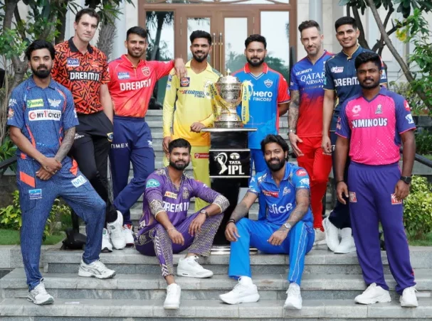
I’m pleased to welcome back the one and only Jimmer Vilk — the man who will be our Weekend Editor in about two months — to tackle a sport about which he is passionate, but which is only just beginning to grab a toe-hold here in the States: Cricket. More specifically, the 2024 uniforms for the Indian Premier League. For those not familiar (such as myself), the IPL is like the biggest and most popular cricket league in the world.
A few of you may be aware, but I spent a winter semester in England in 1987 (actually spent my 21st birthday at Stonehenge, which was a bit of a trip, to say the least), and at the time, there were basically four sports on TV: Darts (yes it’s a YUGE sport there), Snooker, Soccer, and Cricket. I’m sure there were other sports, but those seemed to be all we could get at the time. So, I did watch a fair share of Cricket…and it’s really a fascinating sport. But I digress. We’re not here to discuss the cricket I watched (this was the one where games take like five days to finish, everyone wears all-white everything, and they stop play for tea) — we’re here to discuss the decidedly bolder and louder uniforms sported by the athletes in the IPL. And for that, there’s no one better to give you his take on this year’s IPL unis than the one and only Jimmer.
So enough of my yakkin’ … here’s Jim with his…
IPL Uniform Preview
by Jim Vilk
Uni Watch readers of the past seven years should be familiar with the sport known as Twenty20 cricket. In 2017 we covered the first T20 league (sorry, the photos have suffered link rot), then last year we covered the newest league. Today, we bring you the most popular cricket competition in the world, the Indian Premier League.
The IPL opened its seventeenth season last Friday, and it wraps up on the same day Paul Lukas wraps up his Uni Watch career: May 26th. Those days and the ones in between are a festival of white cricket balls flying into the stands, lots of colorful sublimated (and sometimes garish) uniforms, and sadly, LOTS of uniform ads.
Because of the abundance of advertisements, none of the following unis will receive my highest rating: the esteemed and extremely rare “I’d buy that at full price.” In fact, none of them will get the “I’d buy that at a discount” rating. Will any of them at least get an “I’d wear that”? Let’s find out as we begin (in alphabetical order…I will rate them but I won’t be ranking them).
Click any image to enlarge.
Chennai Super Kings
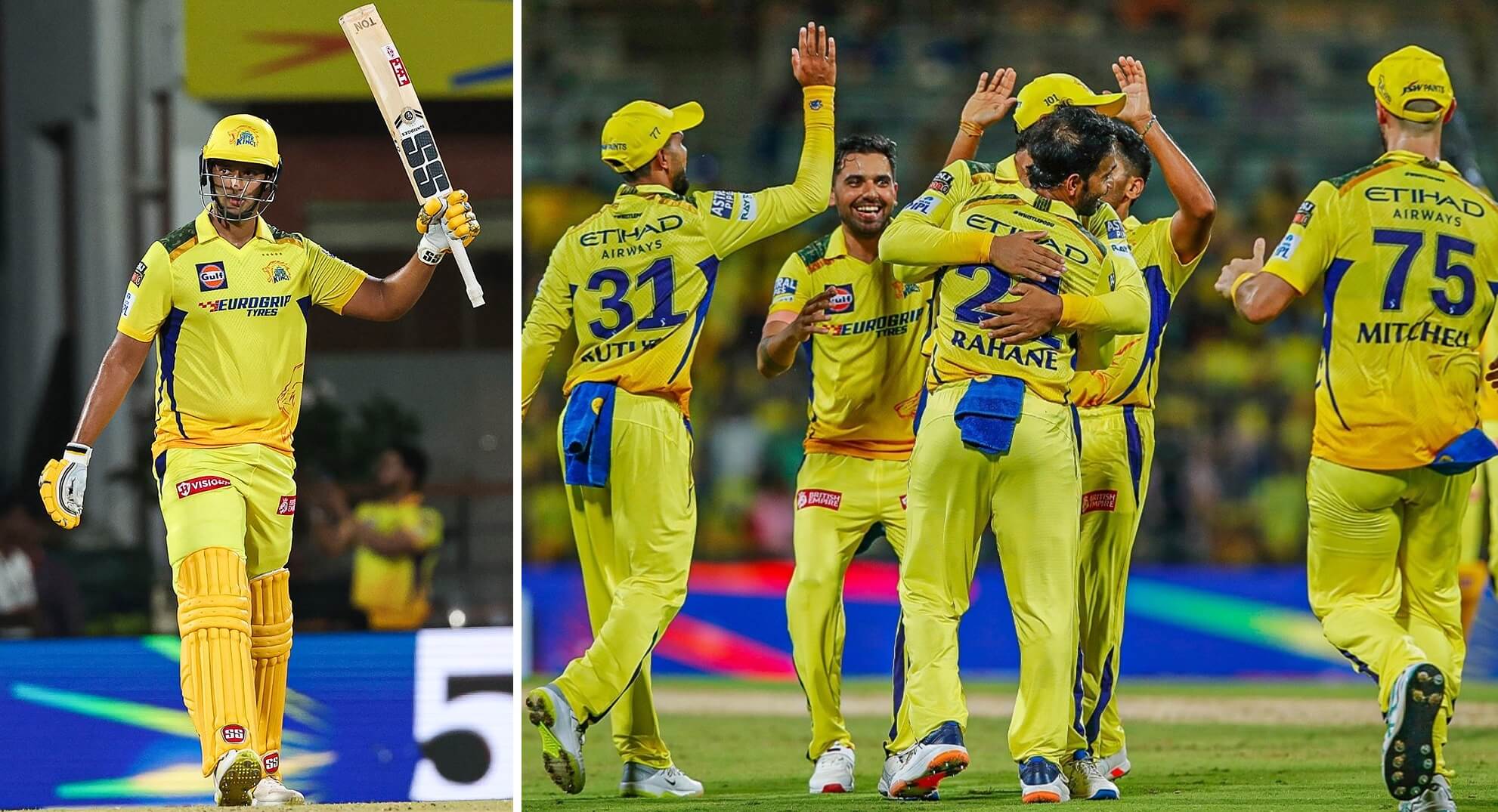
Just like their offspring, Major League Cricket’s Texas Super Kings, that’s a whole banana bunch of yellow. While Texas had red striping, Chennai has blue. Note the sublimated red lion at the bottom of the jersey. A number of teams will feature some big cats in that area. Also note the ads on the pants. They’re not in the same places for each player, as you can see better in this closeup. The Super Kings aren’t the only ones in the league who do this, for some reason.
Rating: I guess “I’d wear that”…if it was free or if the advertisers paid *me* to be their billboard.
Delhi Capitals
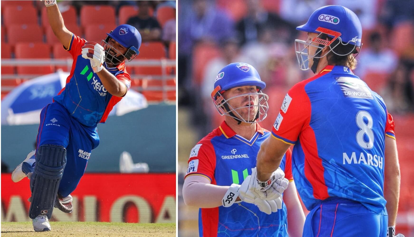
As you may have noticed now, there is a standard number and name font, and there’s a tiny IPL logo at the bottom of each number. International soccer and cricket fans are used to that concept. Another big cat at the bottom of the jersey. Behind the tiger there’s a nice city map, which shows up better here. I love the combo of royal-ish blue and red, I love the sleeves contrasting the body of the jersey, and the sublimation is neat.
Rating: A definite “I’d wear that.”
Gujurat Titans
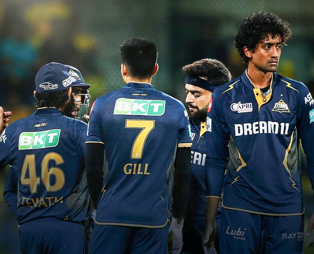
This is as close to minimalism as you’re going to get in the IPL! Speaking of that, I just got over a season of covering college football, with clean yawn-inducing minimalist monotone uniforms being all the rage, so I probably will rate all of these unis higher than you would. At least they’re not boring! Anyway, not much here except some gold lightning bolts on a dark blue uniform, with a funky angular wave pattern on the sides.
Rating: Just like Chennai, pay me and “I’d wear that.”
Kolkata Knight Riders
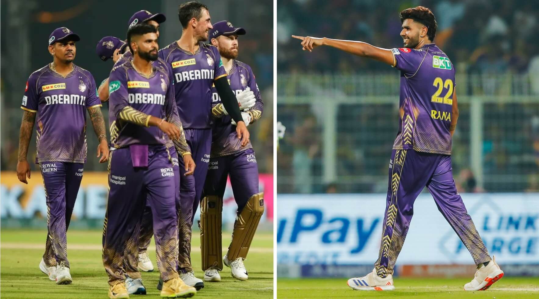
From a distance it reminds me of a much neater version of what I wear for doing dishes: a paint-splattered shirt and a bleach-splattered pair of sweatpants. That sounds like an insult, but really it isn’t. I like the gold angular patterns, and the side pattern goes all the way up to the shoulders. Hopefully, the LA Knight Riders of MLC will look the same or even better. I don’t know if I’d buy that, although I’m tempted to order a Uni Watch membership card in that design for the final Purple Amnesty Day!
Rating: “I’d wear that”…jersey *and* pants!
Lucknow Super Giants
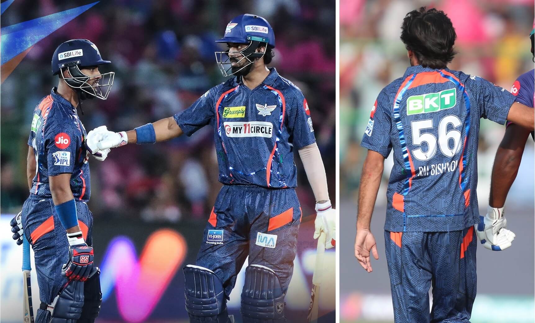
These would make great pajamas. Again, not an insult. At this point Phil is scratching his head wondering why I like these but not tie-dye. That’s because there’s a geometric pattern here instead of a random swirl of color that would make me seasick. I like the small swirl of orange stripes on the blue uniform. Not crazy about the reflective blue striping, though. I’m just glad they didn’t make the numbers reflective, unlike our next team.
Rating: “I’d wear that”…to bed.
Mumbai Indians
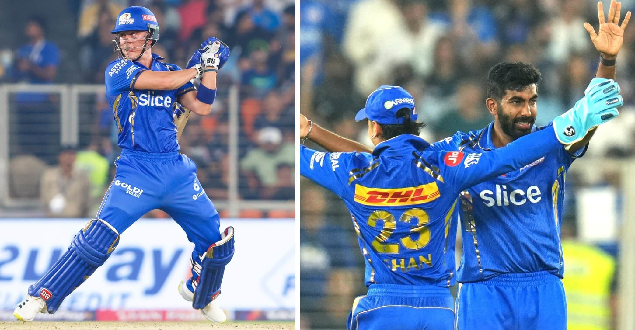
Unlike their offspring, MLC’s MI New York, these aren’t the worst unis in this league. That’s because they’re not the only ones who use reflective gold numbers which sometimes are legible and other times are completely unreadable. I love the blue, and the very subtle sublimated M’s are nice. That’s not enough to save this uniform, because of the numbers and the reflective side and shoulder stripes.
Rating: “You couldn’t pay me to wear that.”
Punjab Kings
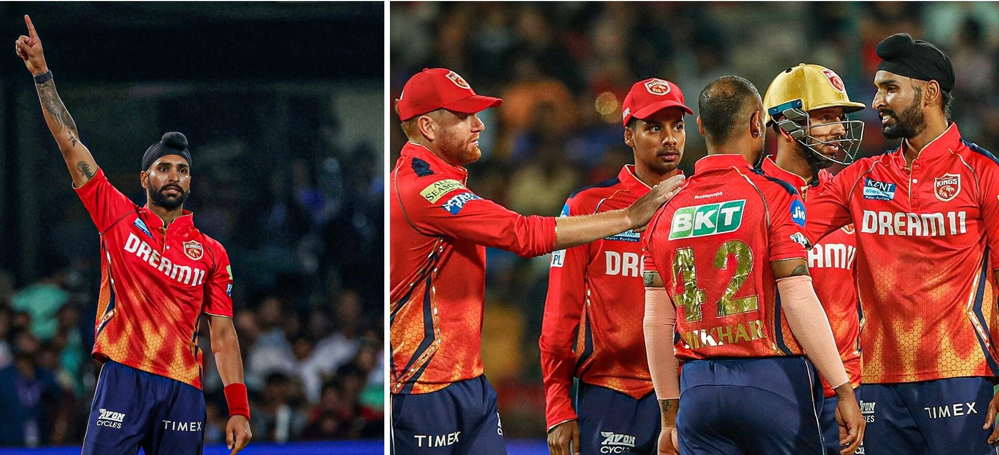
Et tu, Punjab? What is it with the shimmery shiny number trend? That and the ad on the right shoulder that looks like a “Hello, my name is _____” sticker completely ruin an otherwise nice look. I kind of like the blazing honeycomb sublimation, and the angled blue and gold side stripes work for me. Finally, a non-monotone uniform, as they go red over dark blue. Too bad they didn’t make the numbers white, but I guess they’re more worried about what fans will buy versus what looks good on the pitch.
Rating: “I can’t wear that.”
Rajasthan Royals
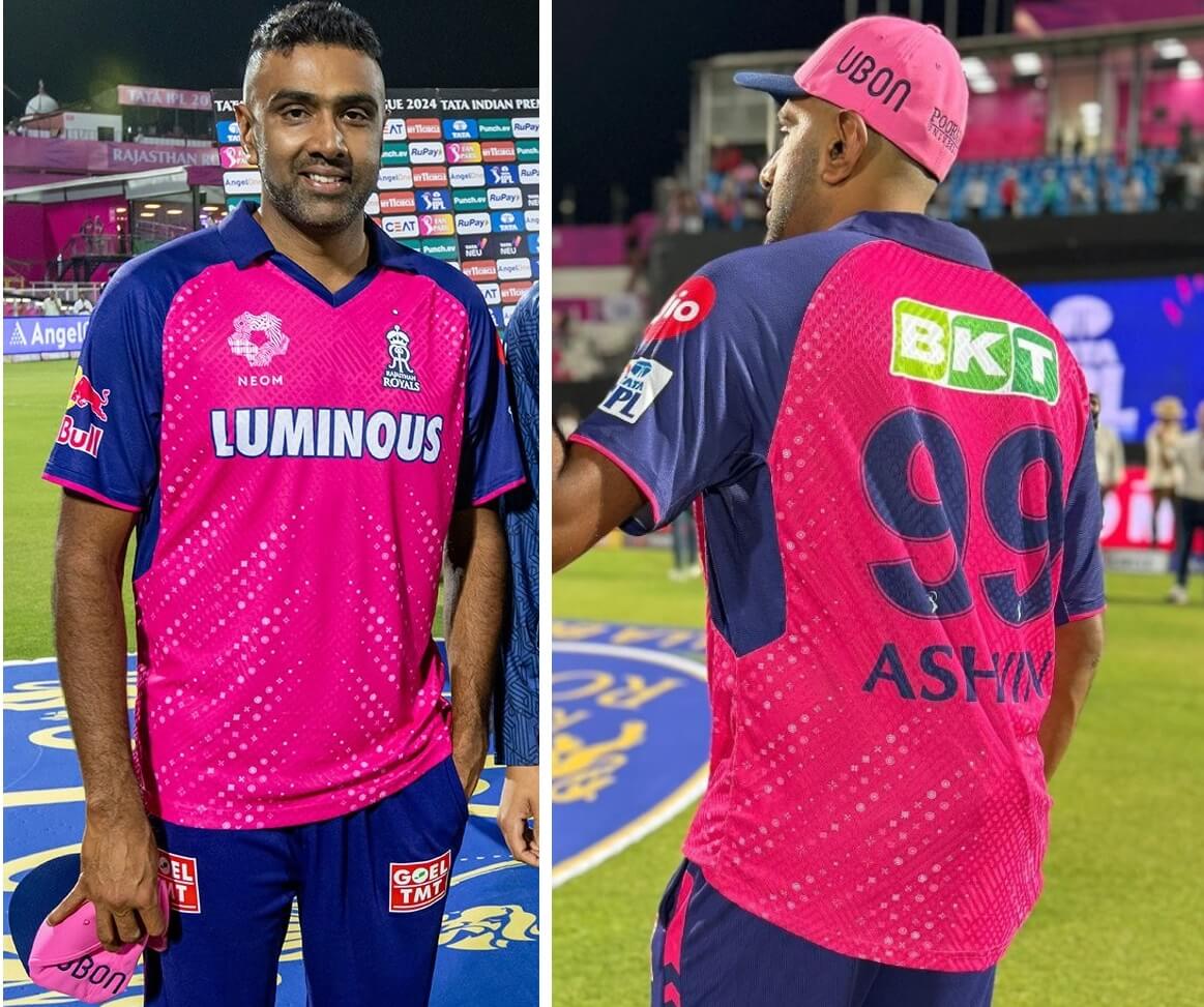
For once, the main jersey ad perfectly describes the jersey. That is quite the luminous combo of bright pink with white “dots.” Zoom in and it’s actually a pattern of different shapes. Fortunately, they didn’t go all pink (although there’s talk of them going mono for one game…that’s more than enough). The blue sleeves and pants are a perfect complement to the pink, especially when the Royals are batting. What started out as a one-game cancer-awareness tribute several years ago has become a regular thing, since Jaipur (where the team plays) has long been known as India’s Pink City. Interesting pants stripes, too, with upward pointing “arrowheads” and dashes. This might be the one time Phil and I are in agreement today, since he keeps calling for more pro teams to make pink a part of their regular color scheme.
Rating: You bet “I’d wear that!”
Royal Challengers Bengaluru
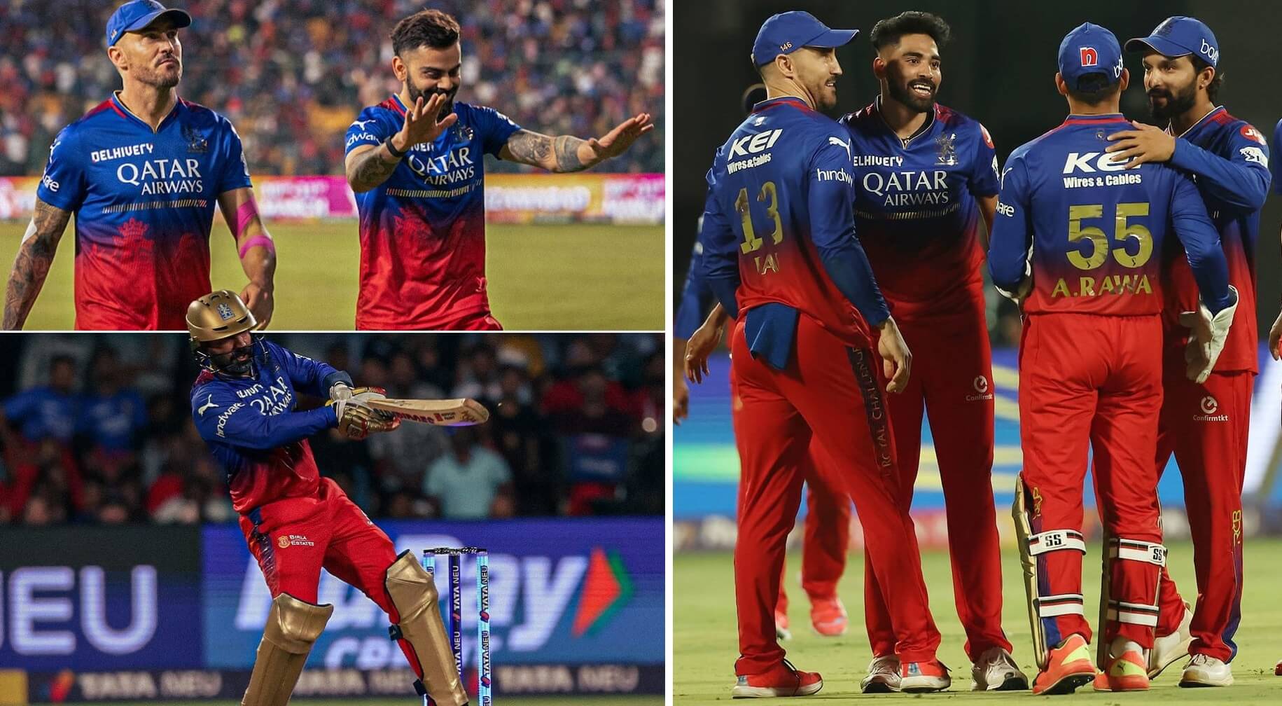
Enough with the shiny gold numbers! The team logo and the team name running up the leg are just as unreadable. Almost as hard to see is the sublimated royal cat trying to escape what looks like the inferno of the underworld. Blue over red is a nice combo, and yet this still is the worst looking uniform in the IPL. If the ads were in shiny gold, and the logo and numbers were white, I’d like it. Instead, I have to give this my harshest assessment.
Rating: “Burn these in unquenchable fire.”
SunRisers Hyderabad
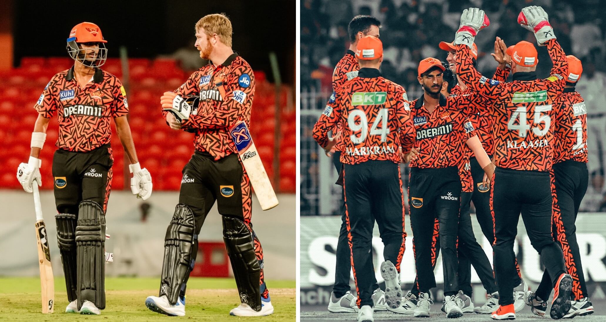
I…don’t hate this. In fact, the more I look at it, I really kind of like it. White numbers were a wise choice on this orange over black combo, for sure. As we say in Sunday Morning Uni Watch during football season, Contrast Matters! Okay, up close the wacky orange and black pattern on the jersey does raise my blood pressure a bit. Maybe solid black sleeves would help. It makes for a really great pants stripe, though. And on said pants, you can see another instance where the ads are on different thighs for different players.
Rating: “I might wear that.”
As I mentioned towards the beginning, I’m not expecting much agreement when it comes to my ratings. I’ve just been so Nike-ed out and fed up with their Lighter/Faster/Cheaper obsession that I’m glad to see teams who are making more of an effort to make sports worth watching. Sure, there are some swings and misses. I’ll take that over cutting corners or trying to convince more teams to wear all white or all black. Variety is the spice of life, and the IPL dishes out a heaping curry-like helping of it. Now if we could just do something about all those ads…
Thanks Jim! Great rundown as always. And yes, I do think pink (but it does depend upon the shade) should definitely see more use in professional sports, and purple and pink actually pair extremely well together, so we’re in agreement there.
And Cricket is definitely growing here in the USA — in fact, the 2024 ICC Cricket T20 Men’s World Cup Qualifiers are being played on Long Island in a couple months, in a park that is located about 10 minutes away from me. I think I’ll definitely have to check out at least one of those matches. I actually drove through that park yesterday (!) and the stands they’ve already constructed will seat more than 30,000! Here’s an artist’s rendering of the finished grounds.
You guys have a great Saturday, and I’ll catch you back here tomorrow.
“What is it with the shimmery shiny number trend?”
I can tell you don’t watch much domestic T20, Jimmer, lol. In addition to IPL, Pakistani Super League has 6 teams, two of them (Kings, Gladiators) have gold leaf numbers.
Never seen a PSL game, but I have seen some IPL and CPL on YouTube because I don’t get the Willow channel.
I knew Mumbai has had the gold numbers for quite a while. Just didn’t realize after seeing those, that other teams would think it’s a good idea.
the ads on the legs (and sleeves for that matter) will be on different sides depending what hand they bat with.
Nice to see an article about a sport I never think about, but which is actually a pretty big deal. I’m not much a fan of these uniforms, but at least they are making an effort to be interesting and aren’t sticking to one stupid template.
Meme league gets meme uniforms. Want to see some good looking cricket kits, do a County Championship preview. Nothing beats classic cricket whites.
I love me some County Championship. Been listening to them on the BBC app for years.
Wouldn’t make much of an article, though.
Free streaming on YouTube since COVID. ECB site links to the specific streams as well.
Also if you include Blast & One Day Cup kits you get some variety. Not as insane as franchise cricket kits though. Same thing as baseball with their home whites and various alternates.
That advertisement above the numbers (and often with what looks like some kind of manufacturer wordmark) throws off the balance even more than the 2024 Fanatics-Nike MLB uniforms. The advertisements that are two lines long are double garbage.
I got into cricket in 2020, just as the delayed 2020 IPL season was starting. And after the visual shock of the league’s extremely loud uniforms wore down a bit, I adopted the Royals as my team maybe 90% due to their bold pink uniforms, maybe 10% due to the trio of Butler, Curran, and Stokes. I didn’t realize that the Royals had been a fairly staid blue and gold team until 2019.
Visit us for Latest Updates of IPL 2024
link