Good Sunday morning, Uni Watchers. I hope you all enjoyed a pleasant Saturday.
I’m joined today by “Mr. Five and One” himself, Jimmer Vilk (although he will be bringing you looks at six uniforms today, it’s not in your accustomed 5 & 1 format). Nay, Jimmer’s here to discuss an “old” sport which is familiar to a good chunk of the world (particularly in Great Britain and its former colonies): Cricket. And while cricket isn’t staging a British invasion, per se, it has reached the shores of the United States for a limited — for now — engagement.
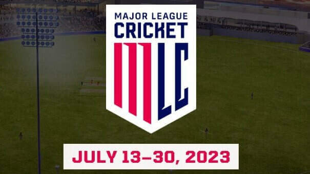
Yes, folks, Major League Cricket is here! With six teams and uniforms for each, Mr. Vilk is going to give you the rundown on this new league. While I’m generally not a fan of the unis, I absolutely LOVE that logo! The league began play on July 13th and will conclude on July 30th — so if you want to catch a match or three, you’ll have to hurry.
Let me turn it over to Jim now as he prepares to…
by Jim Vilk
Wow, has it really been six years since I wrote about cricket here? Time flies, and so do the balls in Twenty20 cricket. And now the balls are flying out of fields here in the USA! Get ready for your new national pastime: Major League Cricket.
Back in my last piece, I mentioned there were three forms of cricket: the traditional red-ball white-uniform game, which is played over a few days, and the white-ball colorful-uniform versions of One Day and Twenty20 cricket.
Twenty20, or T20 for short, is a 21st century innovation where teams get 20 overs in which to bat, unless the fielders get ten outs first. An over is six deliveries, so each team has a maximum of 120 chances to hit the ball. These games are typically played in two or three hours and are very popular with spectators and television networks.
Now, same as when Major League Soccer first started, I thought to myself, how “Major” is this T20 league going to be? I envisioned a bunch of aspiring players competing in front of friends and family, with games shown online or just edited down to YouTube highlights. Imagine my surprise when I found out these games are on cable, there are passionate crowds, and half the league is backed by the Indian Premier League. That means a LOT, because the IPL is considered the premier T20 league in the world. There are several leagues, each lasting about a month. The condensed schedules let the best players hop around the globe plying their trade. And some of those hired guns are here to add instant creditably to this infant league.
Anyway, I’ve talked enough about the sport. Now it’s time to dig into the uniforms. It won’t take long, as there are six teams in the inaugural season. Each team has one uni. No homes and roads, no alts.
For my fellow Americans, brace yourselves for lots of uni ads. And for uni fans of any origin, be prepared for lots of sublimation. That being said, let’s begin our look at the unis beginning with…
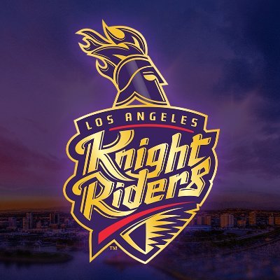
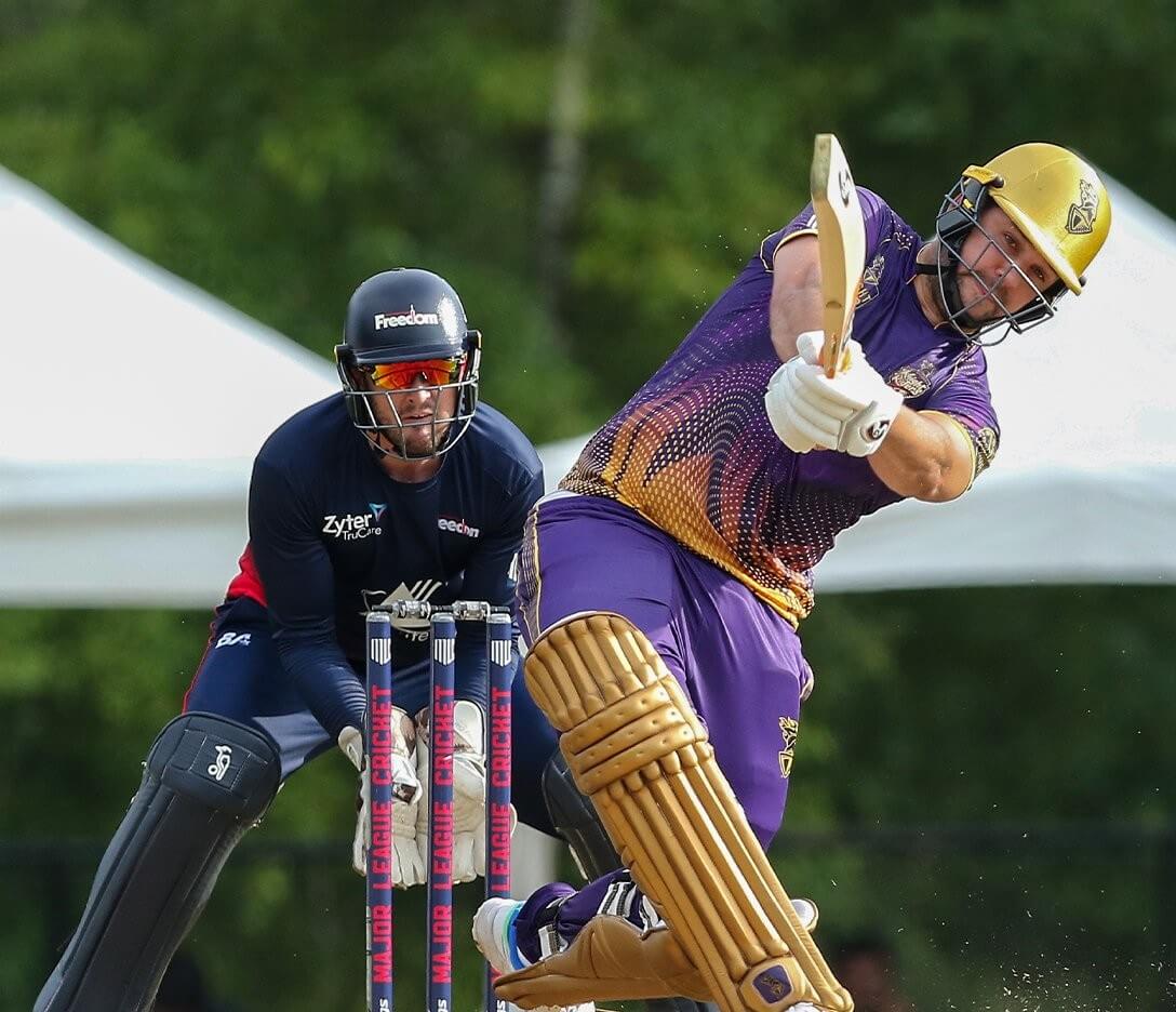
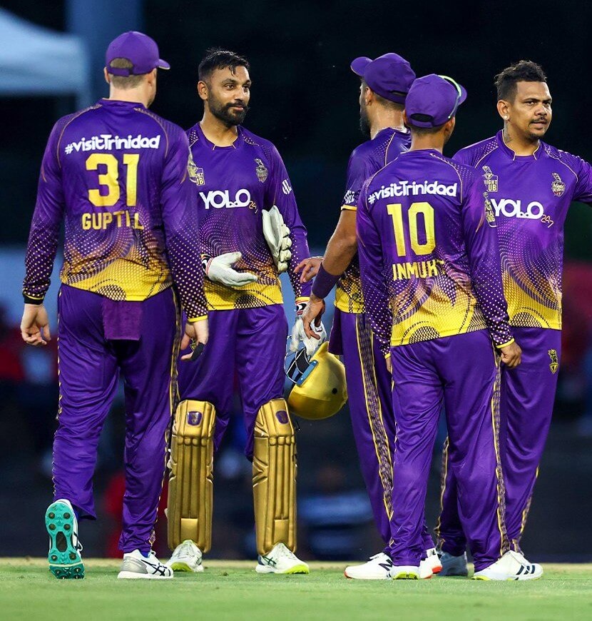
And let’s begin with lots of purple! The colors aren’t an homage to the NBA’s Lakers. They’re the colors of the IPL’s Kolkata Knight Riders, who own this team. If sublimation is a deal breaker for you, you won’t like this team. It steers clear of the numbers, so I’m not bothered by it… much. For T20, it’s a solid uni.
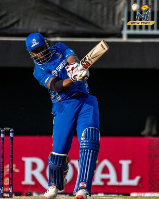
Another IPL-owned team. This one belongs to the Mumbai Indians. I put the NY in quotes, as I’m doing for each team, because the league is playing in two hub cities, USFL-style, until each team gets their own stadium built. MI NY will be based in Brooklyn. Now, here’s where I risk ticking off the largest city in America, and 1/10th of a billion people in India…these unis are the worst in MLC and the worst in the IPL. Shiny gold numbers on a blue jersey that are barely discernable during night games? They’re not just gaudy; they’re not functional. Scrap these and let’s move on.
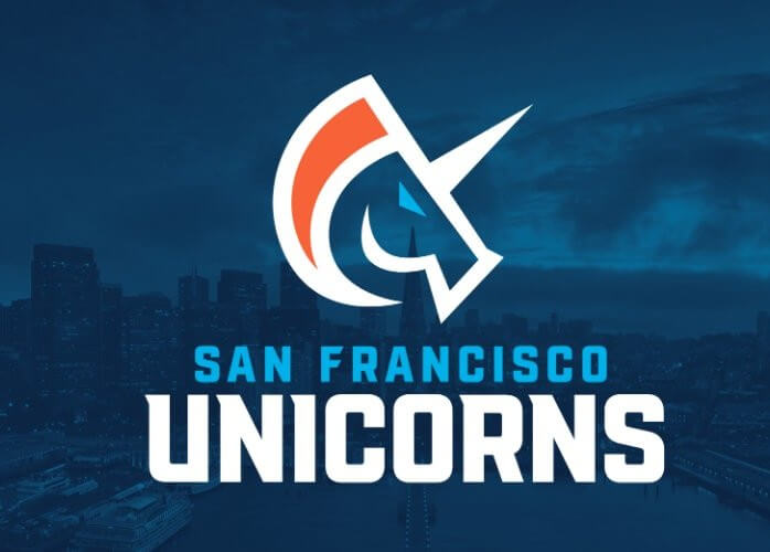
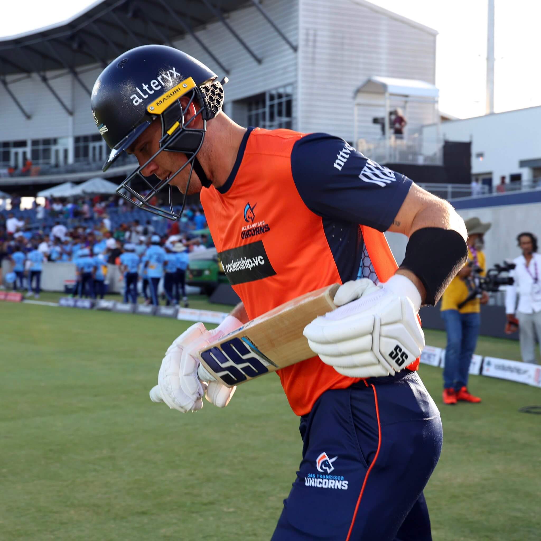
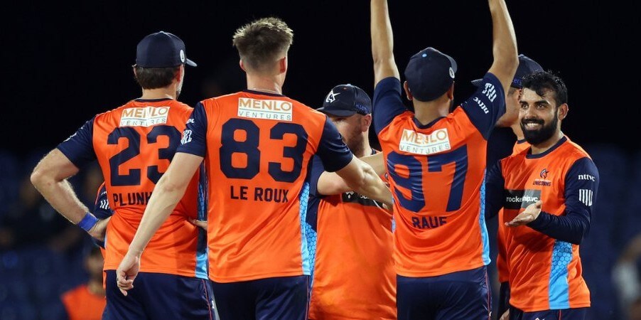
I should put double quotes around a team that will eventually play in Santa Clara, which is closer to San Jose, which is bigger than San Francisco. Ignoring all that nonsense, this is a really nice T20 uniform. Dark blue and orange with a hint of light blue? Sign me up. And if you know your Silicon Valley business jargon, the name makes perfect sense. A real home run…er, I mean, the marketing and design departments hit it out of the park for six runs here.
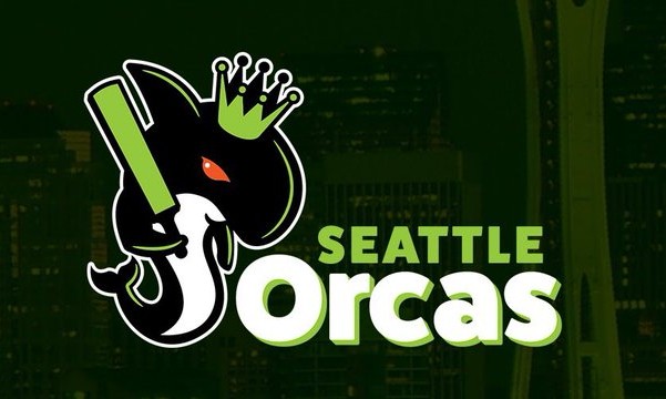
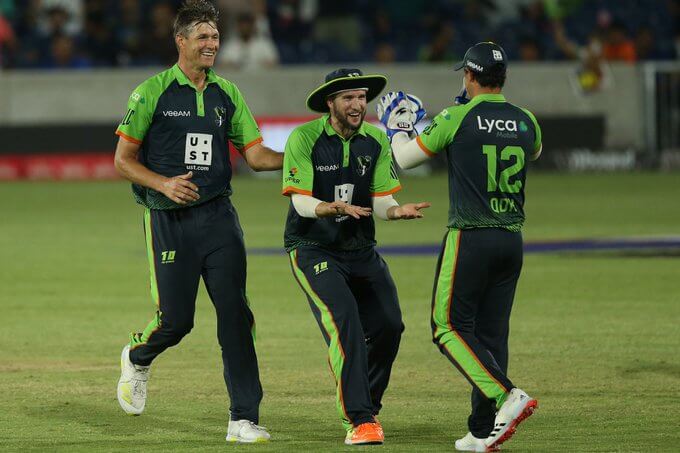
Love the name. Love the mascot. Sort of like the uni. All uni ads are bad, but the one on the front of the shirt is really clunky. And I could use a little more contrast on that nice blue/green combo. Maybe go Action Green like your eventual neighbors, the Seahawks?
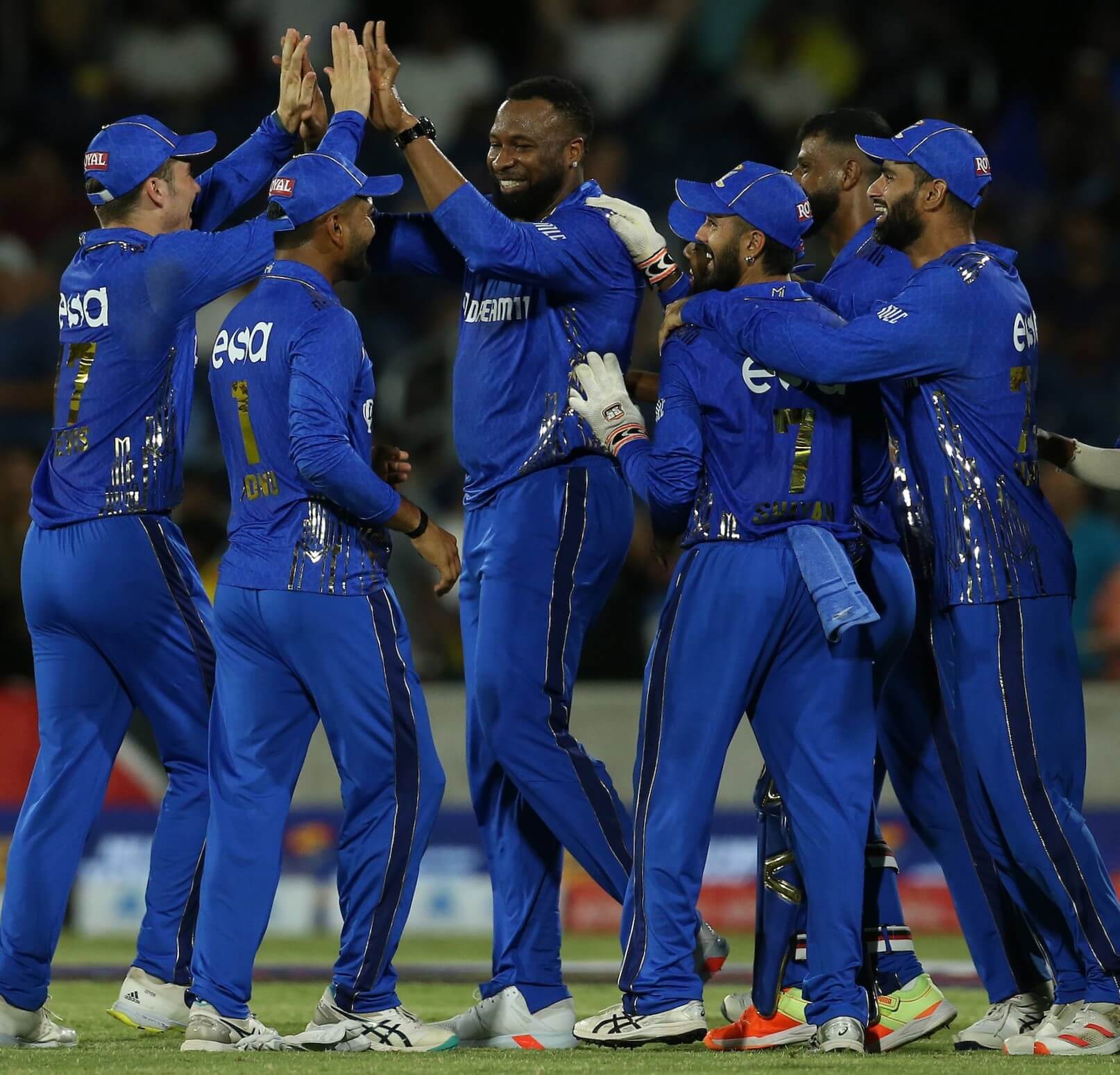
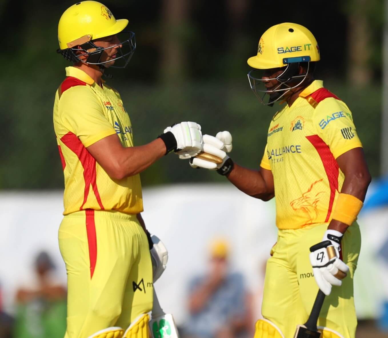
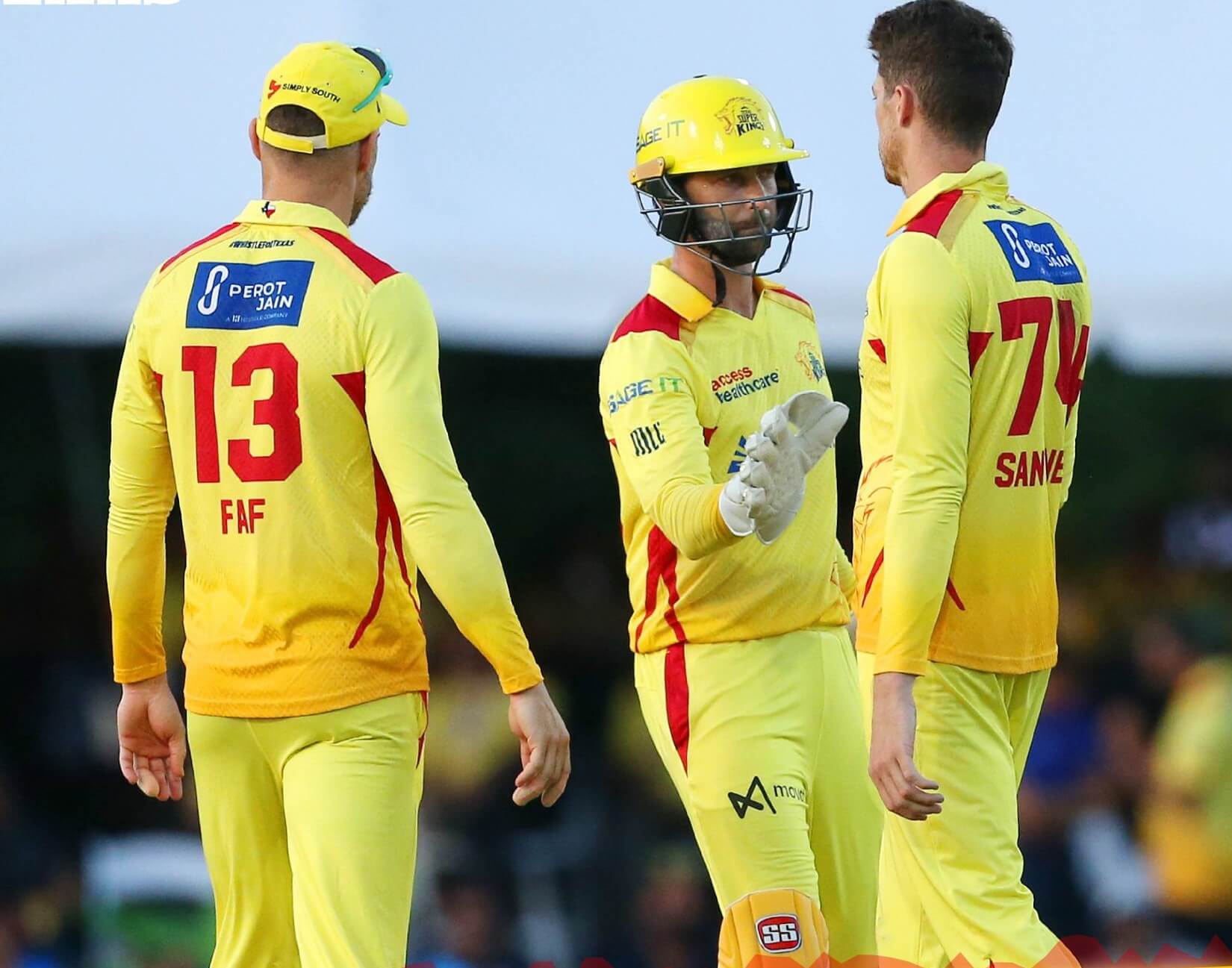
The third and final IPL-owned team. This one belongs to the Chennai Super Kings. As with the parent club, I love the color scheme and I tolerate the trim and subtle sublimation. Yellow mustard with a splash of ketchup is always welcome on my hotdog, and on my cricket unis.

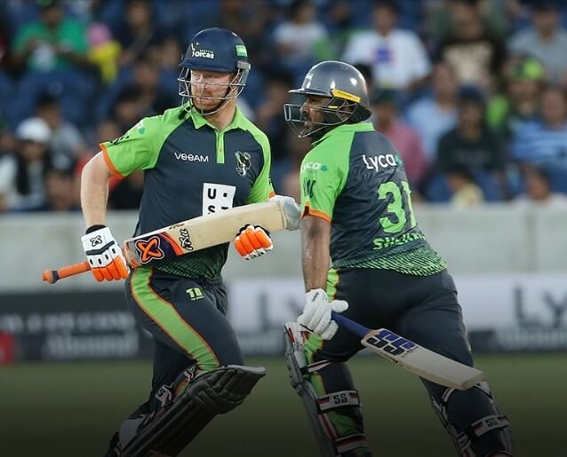
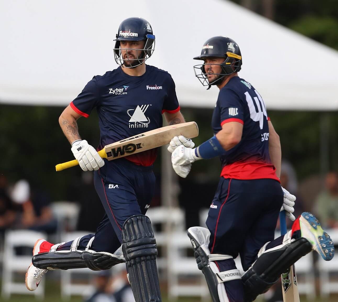
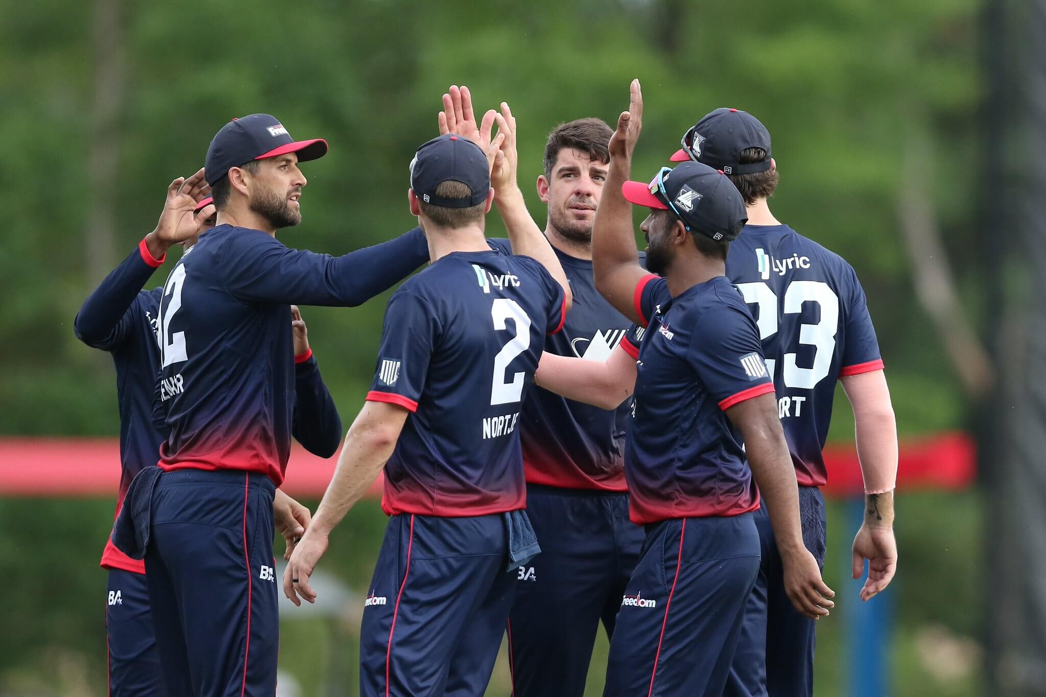
Saved the best for last, even though I was doing these in alphabetical order. The sublimation is extremely subtle, and if you know me, you know that properly sized numbers score major points with me. Love the colors, which of course go well with a team from the DMV. Even though I get a little FedEx vibe from these, and even though I could do without a nickname that doesn’t end in an S, this is my favorite MLC uni. I’d wear that.
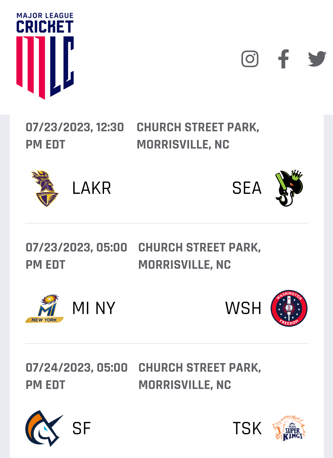
If you’re still with me and think this new league is worth a shot (I have a feeling it’s here for the long haul), you might be wondering how you can watch some games. Most of them are on the Willow channel (named for the wood they use to make cricket bats). A select few are on the CBS Sports Network as well. I’m including today’s and tomorrow’s schedule, so if you have some time, check it out and enjoy!


I’ve often wondered how the angry Seahawk would look on the classic unis, and, of course, it’s amazing, so we’ll probably see a one off of it only sigh
I’ve often wondered how the angry Seahawk would look on the classic unis, and, of course, it’s amazing, so we’ll probably see a one off of it only sigh
I’ll always be a fan of the “hung-over” seahawk, though the angry one is objectively a better design.
Generally I dislike sleeve logos…especially ones that copy the helmet decals…but the Seahawks are an exception.
I’m still not sold on the idea that these should replace the current uniforms.
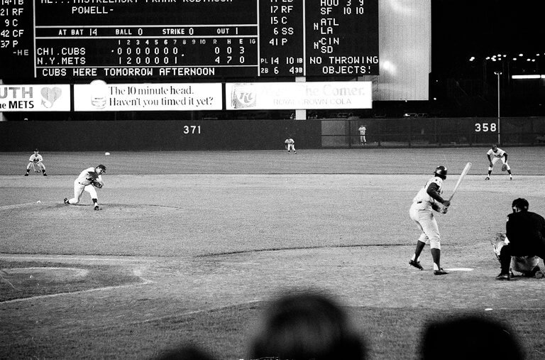
Seaver’s “near-perfect game”, broken up by the mighty Jimmy Qualls of the Cubs, with one out in the 9th in July 1969.
This game was on July 9, 1969 and the Metropolitans (boo!!!) won 4 – 0. Cub Hall of Famer Mr. Cub Ernie Banks is about to strike out in the top of the 8th inning. It was the 10th of Seaver’s 11 strikeouts for the game (and Ernie’s 2nd strikeout in the game). The Cubs did win the next game 6 – 2, so the Mets didn’t ruin the Cubs season.
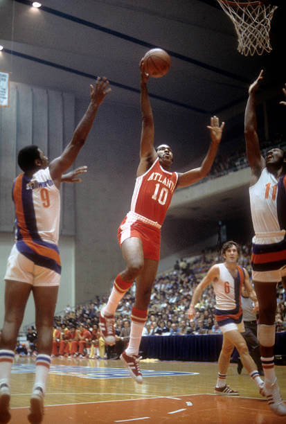
GTGFTU is the October 13, 1972 game between the visiting Atlanta Hawks and the (then) home Baltimore Bullets (now the Washington Wizards). The game was won by Baltimore 115 – 98. The photograph shows Don Adams of Atlanta driving the lane against Baltimore defenders Dave Stallworth (9) and Hall of Famer Elvin (The Big E) Hayes (11) with Baltimore’s Mike Riordan (6) in the background.
The numbering and NOB’s on those Baltimore unis are unusual…I wonder if they’ve ever been noted on this site before. I’ve never seen anything like it.
Quite possibly the greatest uniforms in NBA history. I love how the “st” in “stallworth” is in a contrasting color to accommodate the stripe.
Re: The Stallworth namespace:
I have never seen anything like that on any uniform anywhere. Pretty cool. Usually they’ll just put all the letters on a single-color nameplate.
“…(then) home Baltimore Bullets…”
October 1973 was the first month of the 1973-74 regular season. They were (then) the Capital Bullets.
link
link
Oh, snap, never mind. I read the year wrong. My bad. Please ignore me.
Nice job, Mike! Glad everyone enjoyed this photo…those Bullets uniforms were crazy!
This was the final time Don Adams wore the road reds…only suited up 4x for the Hawks that season.
Anyone know what brand of sneakers he’s wearing?
I think Keds. Here’s Pistol Pete wearing the same shoe
link
Thanks Jim for breakdown of what Major League Cricket is about. Not surprised to see another “Seattle ” team wearing blue and green. Considering the short season the hub format may be the best way to go longterm for this league.
It’s irritating when people feel the need to note that there is a larger population within the legal city limits of San Jose than those of San Francisco. The only reason it’s true is because an ambitious mid-20th century city manager managed to make the city 8 times bigger area-wise by annexing lots of surrounding land, correctly predicting that this would result in an inflated population figure that would imply that the city is some kind of surprisingly massive metropolis, rather than what it is in reality, which is more or less a sprawling collection of suburban neighborhoods. Other cities that did this around the same time and have also seen huge success in using the technique to convince people that they are more urban than they are (including in the attracting of sports teams) are Jacksonville and San Antonio
Annexation is not some trick San Jose played, it’s the historically normal process by which sensibly run metropolitan areas organize themselves. San Francisco and the state of California tried several times before WWII to consolidate the Bay Area into a New York style single municipality with boroughs for San Francisco, Oakland, Alameda, and so forth. Politicians and business leaders in Oakland and the suburban counties blocked each attempt, so now the better-organized San Jose gets to brag about having more residents than San Francisco. Which it does.
And relevant to cricket, Americans of South Asian descent are the primary demographic for cricket participation and spectating. The San Jose metro has a larger South Asian population than the San Francisco metro, so it really would make more sense for the team to call itself the San Jose Unicorns. Historical patterns of municipal consolidation aside, that’s where the fans are.
As a Houstonian I recall people felt our city’s expansion to 555 square miles was a tax scam. We’d annex and tax others, then spread out services and personnel to cover the larger area. This let the city tout itself to more potential migrants, like a Ponzi scheme, until the crash finally hit in 1986. Houston did not have police precincts until the 1990s. Before that, they used to say that there were only enough cops to count the corpses.
The other services weren’t too great either.
I am thrilled that cricket is making a serious foray into the states. Firstly, it will make celebrities of Indian and West Indian athletes, who are sorely underrepresented in professional sports. Second, it’s reintroducing the name “Indians” into sports by people who have fair use of the term.
No doubt that is the “Fabulous Baltimore Civic Center” in GTGFTU, with that dumb stage where seats should have been. Nothing like playing an NBA game in a low-rent opera house.
It’s reasonable for a medium-sized arena to only have seats on three sides. Many of the secondary arenas being built in the suburbs of large cities, and also primary arenas in small cities that have >10,000 seats use this arrangement. It means fewer seats on the ends, which is a good thing. It’s not this arena’s fault that no one built a proper major league arena inside Baltimore to replace it.
I recall this arena because, when it was called First Mariner Center, it was the home of an indoor football team, the Baltimore Mariners, that had a 16-0 season and won the AIFA championship in 2010, only to have the team shut down by the IRS weeks later. The owner had stolen money from his partners in other businesses to pay for his superior roster. That’s indoor football for you.
What has San Francisco got that Santa Clara and San Jose lack? Pixie dust! There are no songs called “Anaheim is My Lady”, “Please Come to Saugus”, or “Another Rainy Day in Yonkers”. The second and third cities owe their existence to the first. I have no issues with franchises naming themselves after the most significant local metropolitan area.
Well, Dionne Warwicke did have a hit with “Do You Know the Way to San Jose?”
Another Rainy Day in Yonkers sounds like a great song by Bacharach/David, Randy Newman or Leon Russell.
Thanks for the overview, Jim! I’m a Willow subscriber and I’ve been looking forward to MLC for years. And enjoying the games, especially since the “Washington” Freedom look so good on the field. MI must be the first ownership in pro sports to field teams in multiple leagues with the worst uniforms in each.
It’s also interesting that T20 globally is a sport that eschews home and road uniforms in favor of each team having a distinctive single colorful uniform set. So test cricket is white-on-white and the short formats are color-on-color. In English county cricket, it’s common for the county teams to invert the color of their One Day and T20 uniforms. So for example Sussex wears black shirts with blue trim in One Day matches, but blue shirts with black trim in T20.
When I lived in Virginia, a park near my Woodbridge home was the site of weekend amateur cricket games. After I moved to Wisconsin, that park became the home field of the DC franchise in Minor League Cricket, which has since renamed itself as a Baltimore team even though it still plays in that park miles south of DC in Virginia.
“Baltimore”…
I keep hoping Surrey will opt for all brown in England’s One Day Cup, but alas, they keep going black over black. Just glad they still wear the brown batting helmets.
Wish I had Willow, but at least my sister does. So when I go there to visit my baseball-loving dad, I sneak in a few overs during commercial breaks on whatever he’s watching. Maybe I can get him hooked some day.
Glad you enjoyed the article!
“… these games are on cable…” What’s that? You mean you can get updates delivered via telegram? Did you know that these games are also televised? Yeah, I stumbled across one the other day – Texas vs. New York, I believe.
I know the D in Washington Freedom is supposed to be a cricket paddle (or whatever they are called), but it sure looks like a syringe with blood in it.
At first I thought it was just a bad attempt at the Warshington Monument. It still doesn’t look like a bat to me. Syringe is more like it.
I think we’ll all agree this is a logo fail.
No worse than the hockey stick in the Capilals wordmark. With the hockey, basketball, and now cricket teams all incorporating their sports’ equipment into their logos, we need the Nats, Commies, and United to follow suit and make this a distinctive DC sports feature.
GTGFTU Oct. 13, 1972. I feel the key hint is Hawks #10 Don Adams who didn’t appear in the other Baltimore Arena games that season.
That Bullets uniform is something I would wear but preferably with bigger shorts. As for cricket, we simply cannot have enough of it in real life and on TV, even if I dislike all these logos and uniforms (but the MLC logo is indeed very good). The thing is that all teams from the former British empire trying to have cool logos mess it up horribly. The team logo design is either heraldically based (which is OK with me) or they come up with a forced effort to look snazzy. Whether it is Australia, India, NZ, South Africa and whether it is American sports, cricket or rugby. The exceptions are the mighty Springbok and the NZ Fern. Another exception is Canada, where they get most team logos right (like the Blue Jays, one of my favorite sports logos, and the Canada Basketball logo with a ball and a maple leaf intwined).
Forced snazziness… that’s a good way to put it.