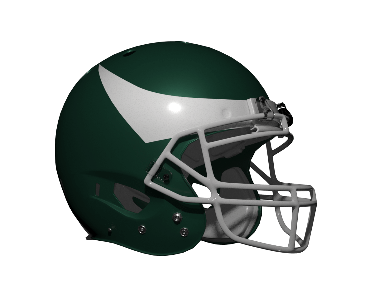
Last weekend, reader/contributer/writer/graphic designer Chris Diamond was featured in a post entitled, “What If All NFL ‘Bird’ Teams Were Like the Eagles?” in which he noted there are several NFL squads who are named for birds, yet their helmet designs vary from team to team. But what if they all followed the pattern used by the Eagles?
The piece generated lots of feedback, as well as several comments and suggestions. Chris has taken those to heart, and as such, he offers this “Redux” of that article. Click on any image below to enlarge.
Here’s Chris:
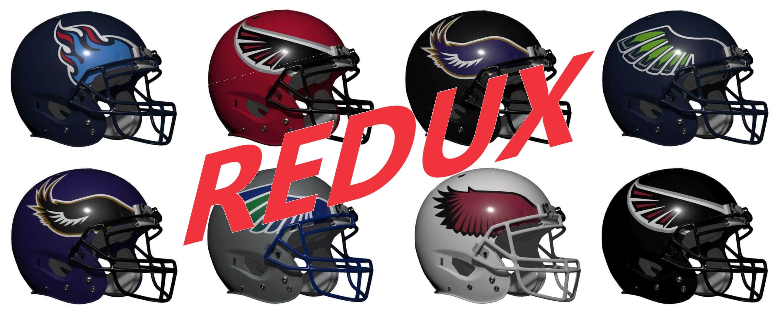
In the comments for the “What If All ‘Bird’ Teams Were Like the Eagles?” were a few suggestions and things I had missed (like the Jets) so I’ve done a few Redux versions if you want to slip them in at some point! So we have:
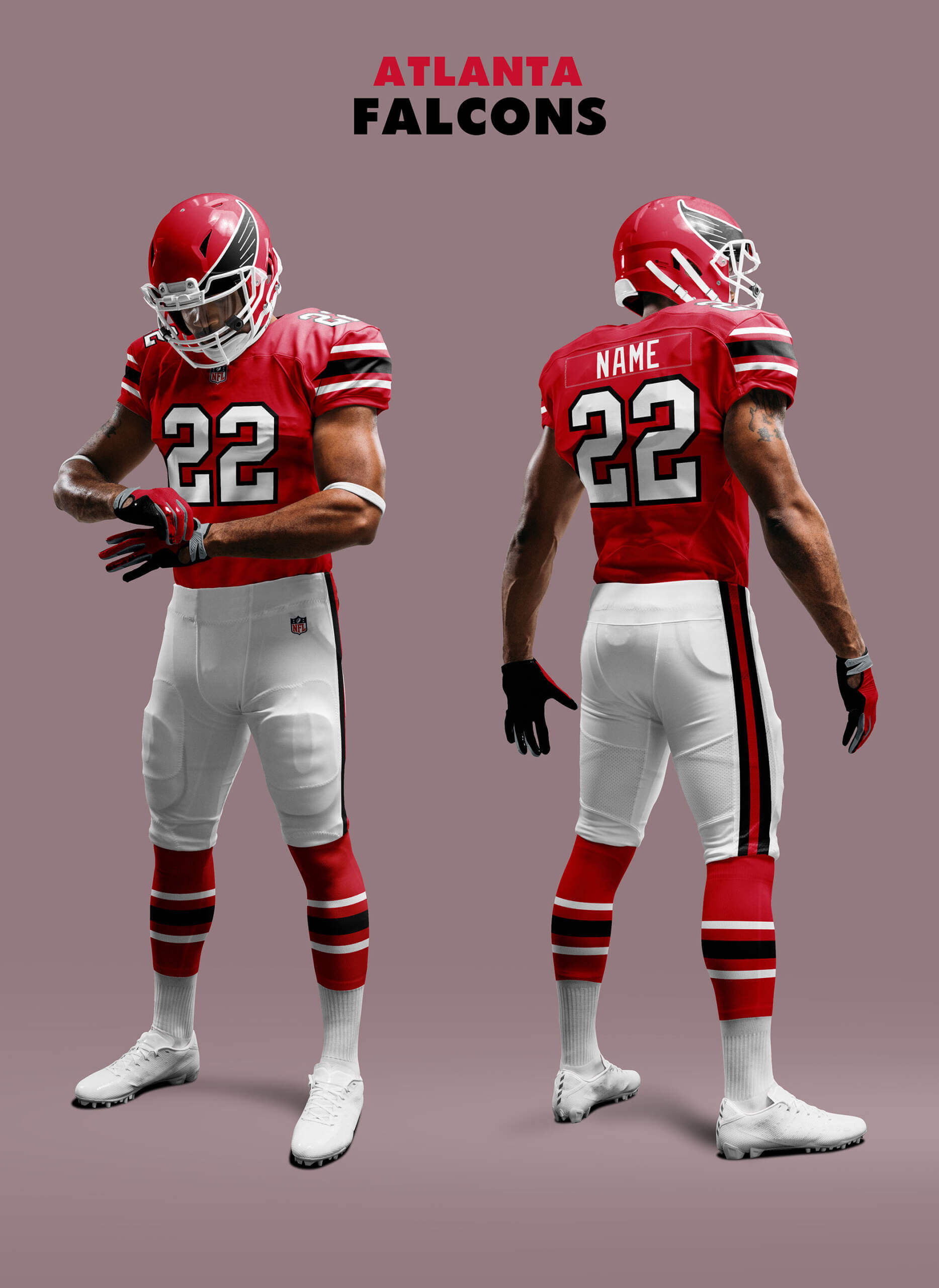
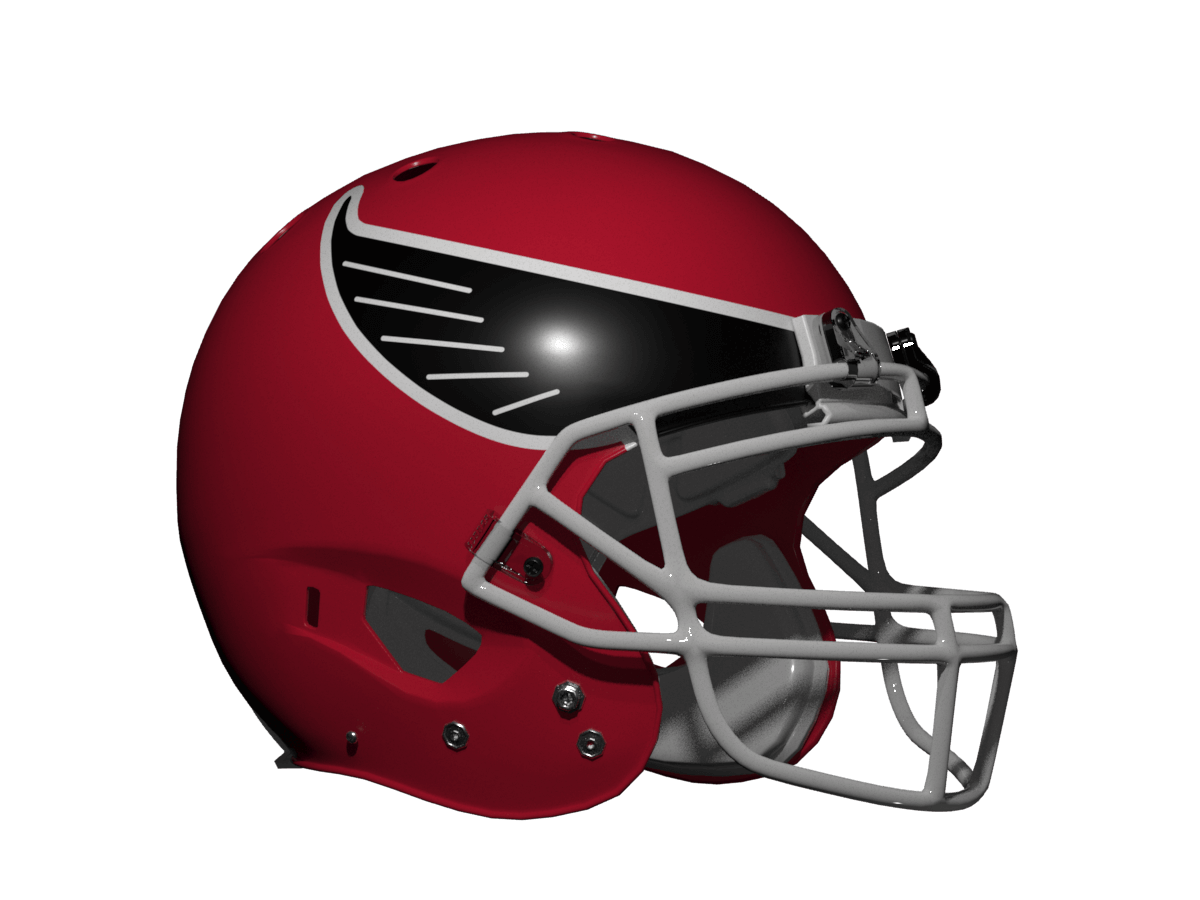
• Atlanta Falcons Red REDUX – based on Kary’s suggestion of seeing the old wing logo and their 70s era unis.
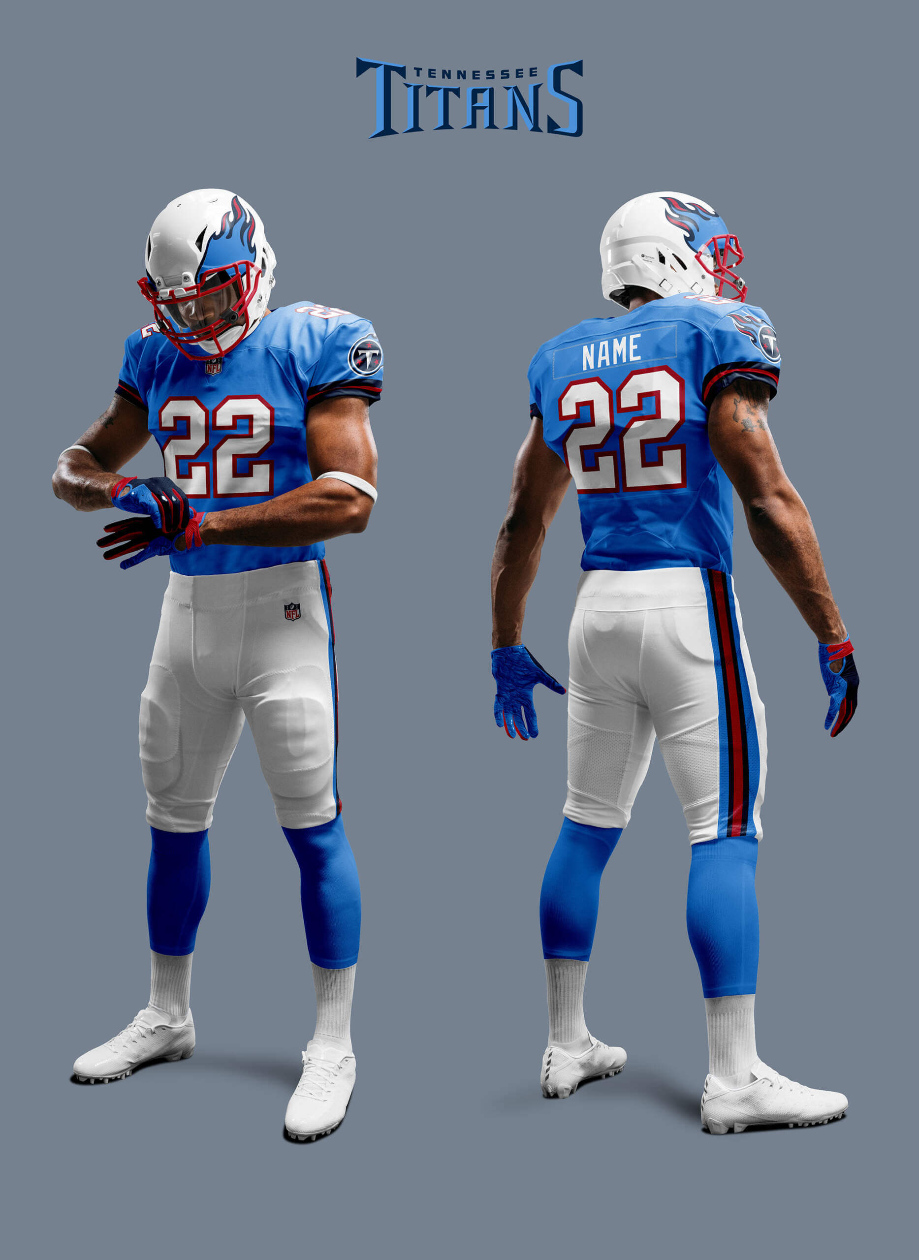
• Tennessee Titans REDUX 1 – based on Chris H’s suggestion of Titans in Oilers Columbia blue.
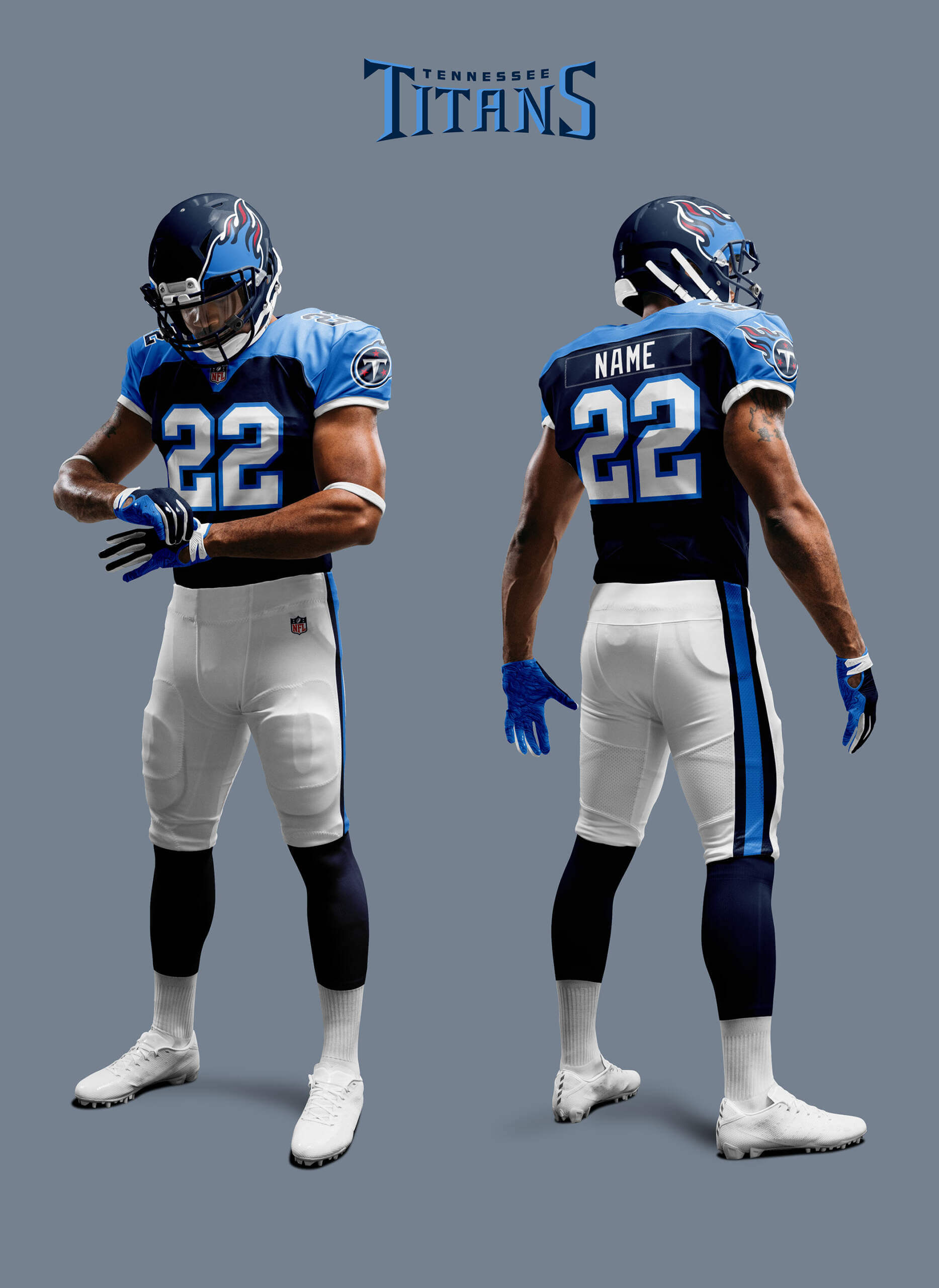
• Tennessee Titans REDUX 2 – based on Jimmer’s request for the shoulder yokes back. Yes I know I said “no capes”! 😉
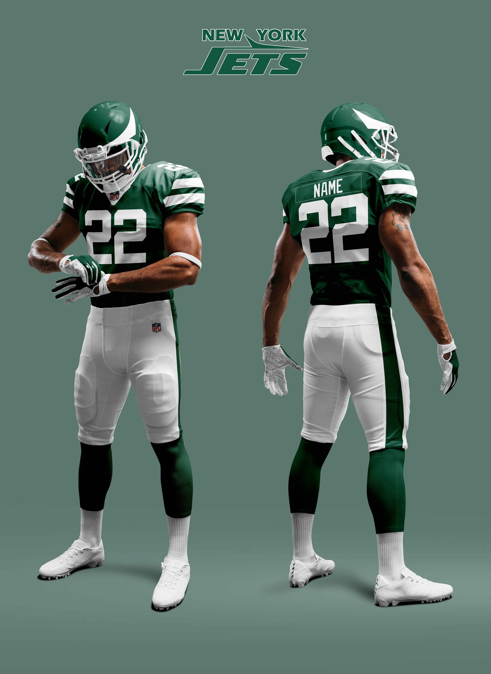
• New York Jets Wings – based on RG1’s suggestion. I’ve used the wing from the classic Jets logo as the basis.
ATLANTA FALCONS RED REDUX
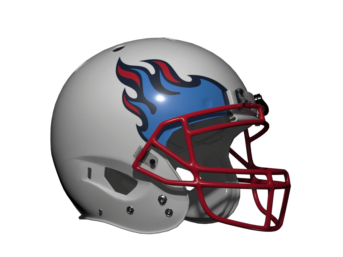
TENNESSEE TITANS REDUX 1
TENNESSEE TITANS REDUX 2
NEW YORK JETS
Thanks, Chris! And thank you readers for the feedback — what say you now?
Good tweaks, Chris, especially the red Falcons uni.
Those who have disliked the “flaming thumbtack” look of the Titans should certainly find your take on their helmet to be an improvement.
Thanks Jeffrey!
I’m confused, is a Titan a bird? Regardless, I like it better than their current helmet.
Hi Rick, no it ain’t! I did cover this last week, but I snuck the Titans into the Bird category as the flames look a bit like wings.
After googling…
“ Titanis (meaning “Titan” for the mythological Greek Titans) is a genus of phorusrhacid (“terror birds”, a group originating in South America), an extinct family of large, predatory birds, in the order Cariamiformes that inhabited the United States during the Pliocene and earliest Pleistocene.”
Maybe this should be used as their mascot.
Now that we have two non-bird teams, I’ll say it again: Let’s see every team in the league!
Hi Kevin – work in progress! Not all ‘bird wing’ helmets, but there are other iconic helmets that can be used as inspiration :)
Ooh, I really like that Falcons concept.
Jets, not so much. The “classic” (1978-97) Jets logo is a fuselage and a tail; it looks like two tails instead of wings. How about a Jets concept based on the A-10 (link), with the turbofans in the front above the nose bumper?
I think you might have something there GZ! The trick would be to make it not look like a pair of owl’s eyes.
Love the updated Falcons look (along with the other updates)! Thanks for taking our suggestions to heart, Chris! It was fun to see how they turned out.
My pleasure, Kary! Always open to good suggestions :)
I love designs where it’s not just the logo, so this Jets helmet is a big win!
Thanks Ky!
Great additions, Chris!
Highest marks for the Oil-Titans.
The Falcons concept is fantastic – wonder if a black mask would up the ante.
Love the ‘right-sized’ sleeve stripes on the Jets…the helmet is about the best you could do with what they gave you to work with…hmmm, maybe a wrap around decal (2 jets on either side with a connected contrail…akin to “The Tholian Web” ST:TOS)?:
link
Thanks Chris! I prefer a black mask with the Falcons red helmet, but white is more authentic for the mid-70s look so I went with that. I already did a concept like you suggest for the Jets recently link – is that what you mean?
The Falcons one is perfect as is.
And the second Titans looks even better than I imagined!
The Jets’ helmet is overly simple; the back end of a 747 might brighten things up. I still think a shock wave would more effectively conjure the idea of a jet (or perhaps a jet stream) than trying to decide between a fighter plane and a jetliner.
I tried a few designs with the Jets. The problem is that jet wings curve the wrong way and lack the dynamic feel that birds wings have. If you’re not careful the helmet starts to look like something Roger Ramjet would wear. So I went with the wing outline from the old Jets logo. I think you should have a go at this walter :)
These are fun. I enjoy uni-concepts when they’re restricted to a theme of some sort and not just a free-for-all.
The Jets are giving me a New York Bulls vibe.
That red Falcons helmet with wings should be adopted by the team right now.