
Time for more Uni Tweaks from the UW readership. I usually run these as part of a larger article, but with two submitters and three sets of concepts, they get their own post!
I hope you guys like this feature and will want to continue to submit your concepts and tweaks to me. If you do, Shoot me an E-mail (Phil (dot) Hecken (at) gmail (dot) com).
Today’s concepts come from Chris Diamond and Sean Walsh. Enjoy!
New York Jets Concepts
by Chris Diamond
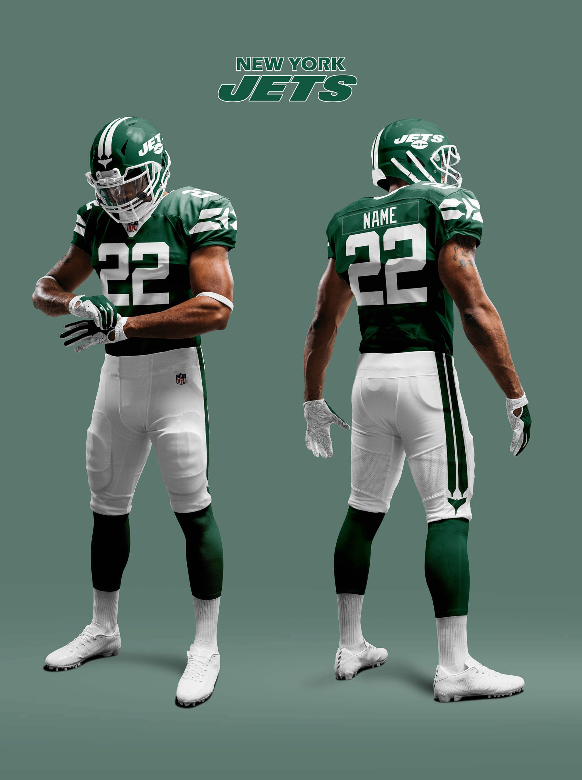
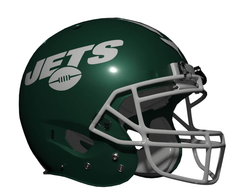
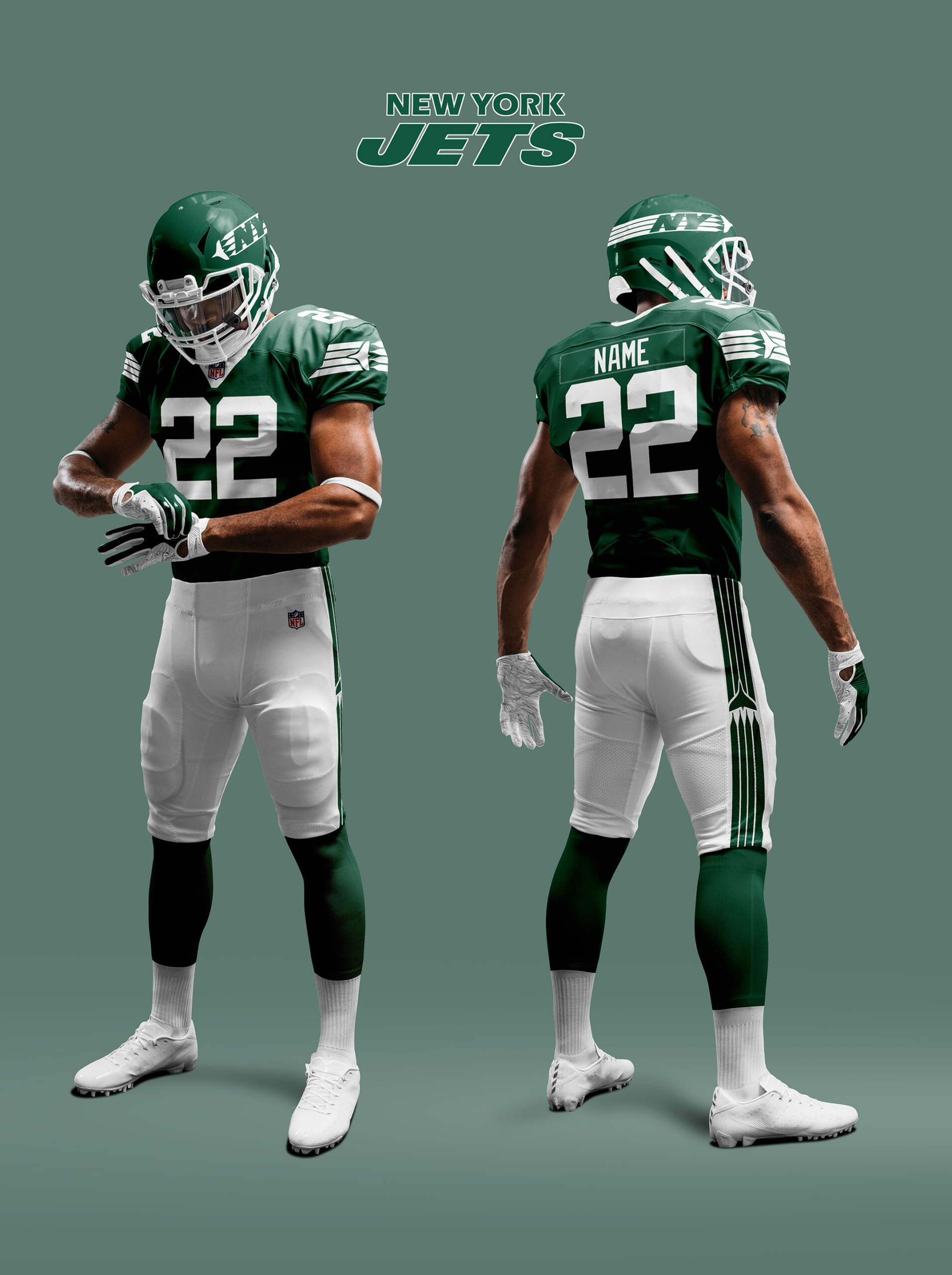
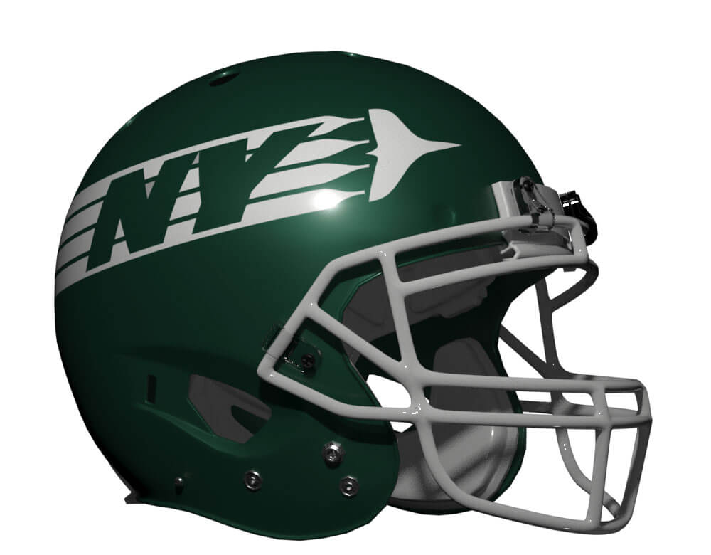
Recently Paul posted a piece about the Jets possibly going to their Sack Exchange Unis Full time. Or perhaps going to a new design along those lines. Well I have come up with a couple of concepts based on that idea. I tried to combine the two-colour simplicity of the throwbacks with the team’s excellent Gotham green and metallic helmet as well as trying to bring some kind of Jet-ness into the design. For the last of these it suddenly occurred to me that the twin white stripes looked like jet contrails. So both designs use this – the first twin engine (looks most like existing design) and the second four engine. Of the two I prefer the more radical four engine design, but I like both.
CONCEPT 1:
CONCEPT 2:
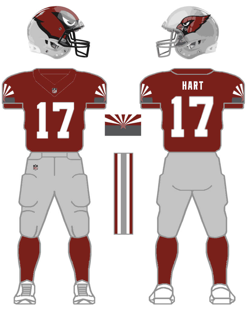
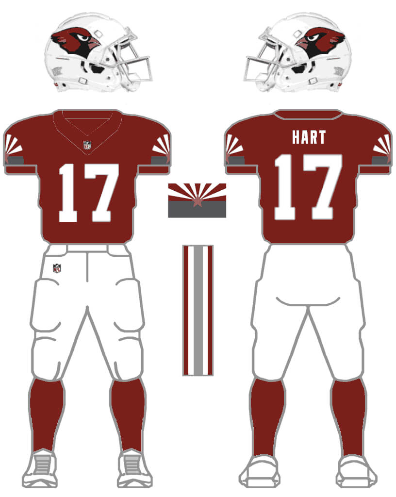
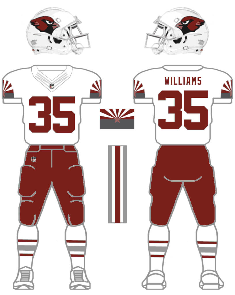
Arizona Cardinals Concepts
by Sean Walsh
Like many (most? everyone?), I thought the Cardinals re-do was as bad as what it was replacing (the all-white was OK), but I get it, they’re chasing a younger demo. I liked the addition of sliver/gray to their color palette, finally recognizing the Desert Cardinal but thought they really missed a chance to refresh and localize their look by not using it as a primary color instead of just an accent. New element include silver/gray pants and helmets (I couldn’t decide on the big logo or classic logo, so I posted both), and the state flag in team colors on the sleeve caps, combined with a classic number font and stripe pattern they’ve used for much of their history. It creates a unique color combination in the NFL, and if they want to go with a classic, fauxback look sometimes, a white helmet, and white and cardinal pants are included (but no blood clot combo allowed).
CARDINAL/GRAY:
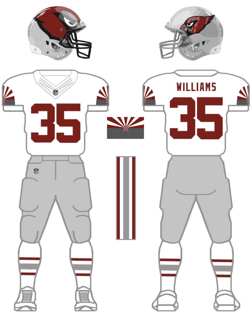
CARDINAL/WHITE:
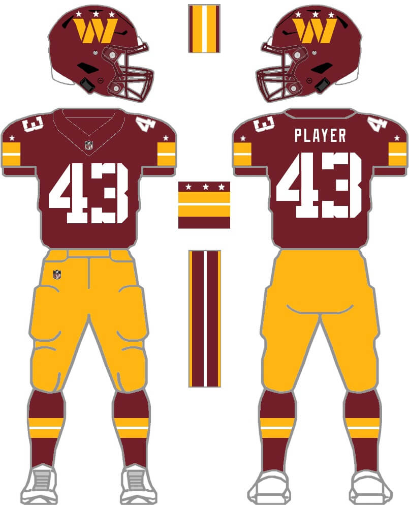
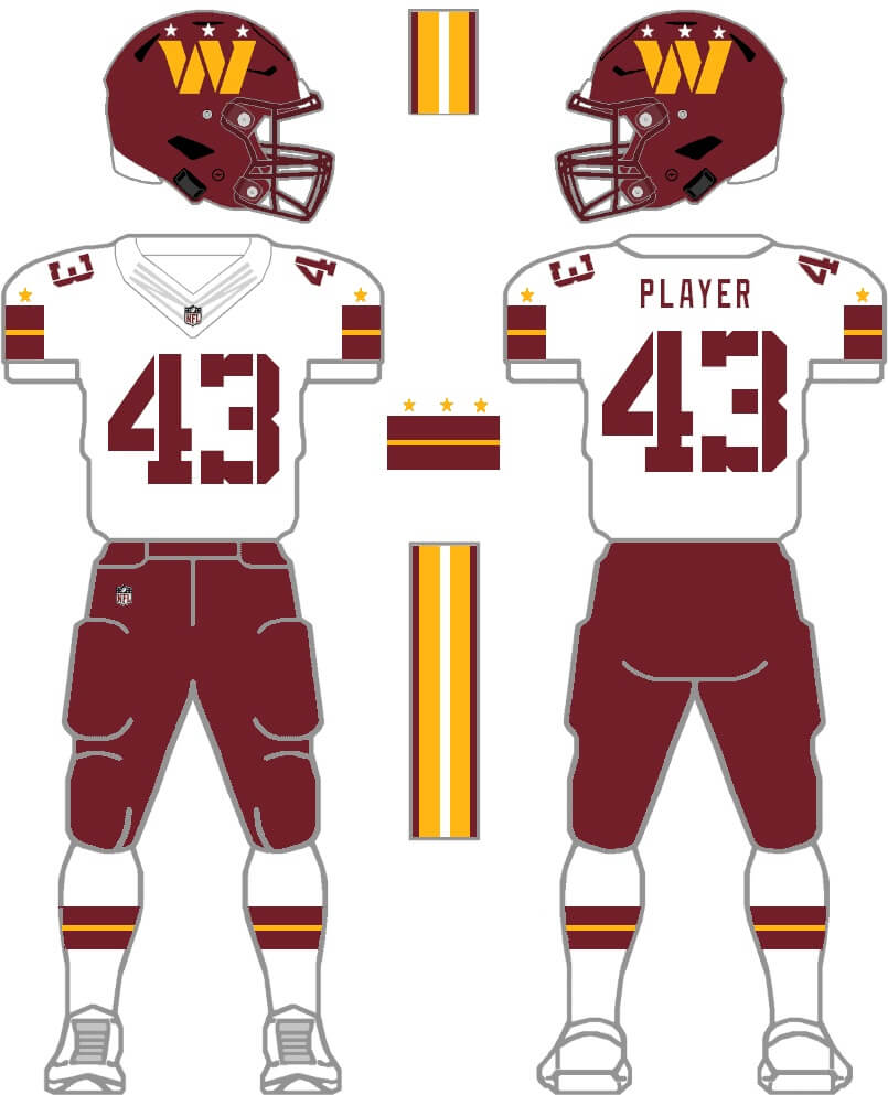
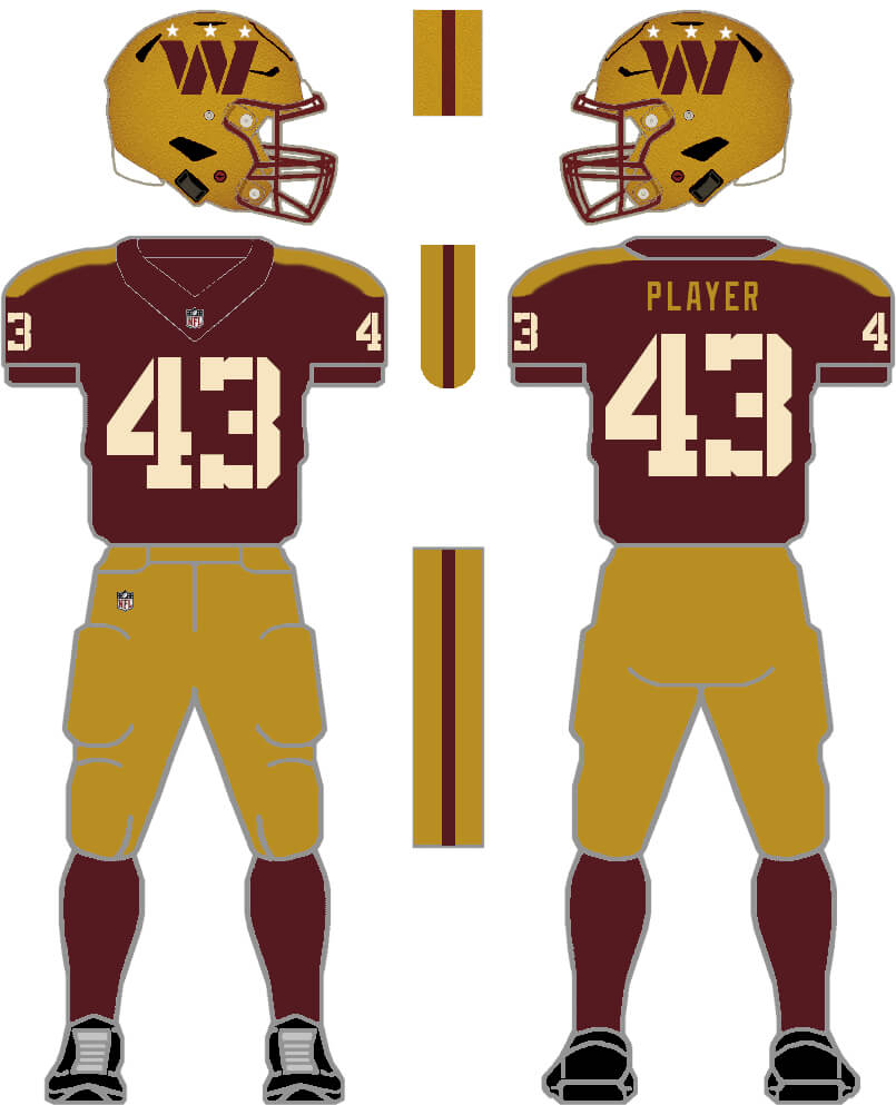
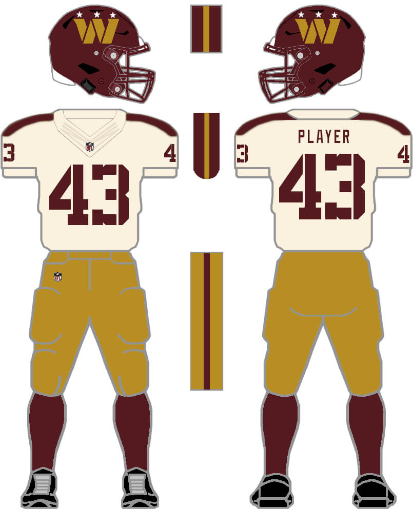
Washington Commanders Concepts
by Sean Walsh
Same with Washington, a mono-fest, but I think the individual elements aren’t bad, and just need a bit of a re-mix. First, start with their two most recognizable and probably most Washington fans’ preferred looks, burgundy over gold, and white over burgundy from their most successful era. Second, I like the 2 broad stripes, just need to be consistent throughout the uniform, i.e., helmet, sleeves, pants, socks. I took the 3-star motif from inside the collar and placed them over the 2 stripes on the sleeve, invoking the DC flag, and over the 3 points of the W logo, making it a little less generic, and because “Commanders” tend to have stars on their uniforms. Third, I made the military stencil font a bit more obvious, it’s barely visible in its current form, and used a classic athletic block font (same font as the Nationals). I also created a Fauxback, with darker, more muted versions of their colors (maroon and old gold, taken from their recent throwbacks) and a gold helmet for the home set, with cream numbers on the home jersey, and a light cream jersey for away. Stripes are simplified to a single stripe on the pants and helmet, and the 2 stripes are moved from the sleeves to the shoulders to emulate epaulettes.
PRIMARY HOME & ROAD:
FAUXBACK HOME & ROAD:
OK readers (and concepters). If you have some tweaks or concepts, shoot ’em my way with a BRIEF description of your creation and I’ll run ’em here.
The Commis look is pretty good, though I’d bring back the yellow face mask. The monochrome helmet and mask makes me think Univ of Minnesota or late 20th century USC.
These are great, except for the Jets concepts, where I can already envision weirdos getting apoplectic over incorporating CHEM TRAILS into its uniforms and helmets.
I think anyone who would have a problem with a contrail would also have a problem with any jet aircraft as the two are inseparable!
I like the first Jets concept better than the second, although I’d like to see what it would look like with an A-10 (link) instead of the generic fighter jet. That said, if we can’t have the Namath/Parcells kits back, let’s just go with the Klecko kit.
I like the Cardinals concepts but still wish they’d adopt the 1984 Wranglers color scheme (link), or something like it.
The Commanders concepts are very good; make the outer pants stripes a wee bit thinner.
Here’s an A-10: link
Thanks! I purposely avoided using any specific jet outline for a number of reasons. First is that it immediately dates the unis. Second, the use of a specific aircraft would be fraught with copyright issues for the team (a bit like the Houston Colt ’45s). I don’t know how the Winnipeg Jets handle it with the F/A-18 on their logo but I imagine they must have got special permission at least. Finally some people have issue with the use of overtly military imagery so something like an A-10 would be problematic.
Definitely get that last point; although football *is* the most militaristic of all the major sports, it’s probably a good idea not to make it too overtly militaristic (or to tie a franchise too closely to any particular aspect or branch of the military). That said, the A-10 is *the* most kickass aircraft ever designed, built and flown, so it’d be the perfect symbol for a football team.
I don’t think the U.S. Government (or Fairchild Republic) owns any intellectual property rights with respect the shape or image of the A-10; I would expect that all U.S. military imagery is public domain. By contrast, the name “Colt .45” is a trademark, and the pistol itself is a commercial product.
And I wouldn’t be too worried about the A-10 “dating” the uniform; indeed, it’s a plane that the Air Force can’t seem to kill. It’s been around since the ’70s, and no matter how hard or how often they try to retire it they can’t come up with a replacement that does what it does as effectively, let alone any better.
On military visual IP – random but have recently been watching some film production commentary and specifically a video on how the film industry has to pay the us military to use accurate details (from vehicles to uniforms), and beyond money extends to making script adjustments as well (don’t need to get into the political convo here but a lot of interesting examples from Transformers to Marvel).
I would guess if a team wanted to make a very accurate silhouette the military might at least sniff around, especially because there’s an existing advertising relationship with the league. Either they’d bless it and make it part of the marketing when the uniforms are released (accurate blah blah plane representing x storytelling), or the team would just do something more generic like the artistic throwback logo
“Finally some people have issue with the use of overtly military imagery so something like an A-10 would be problematic.”
I’ve always thought of that Jets name as more of a civilian one akin to the New York jet-setting lifestyle, so even if you had styled it more militaristic I think my mind still would have went to that and I hope that some people who don’t like the overt military imagery can still appreciate your excellent Commanders uniforms, the military font and the stars really help that design, love the throwbacks… Great job
I liked the Wranglers colors as well, I think if the Cardinals added bronze/gold, they would look too similar to the 49ers though.
Sean Walsh (aka superfly)
Copper, not bronze/gold.
I like the use of a jet and contrails as the Jets helmet stripe. It reminds me of Purdue’s terrific use of train tracks as a “helmet stripe.”
Thanks! I think one of the reasons the Jets have struggled to incorporate Jet-ness in their look is that, all the issues I mention above about *specific* planes aside, it is hard to come up with something that is recognisable at distance. Which of course is the acid test of how good a design is and which a lot of modern team logos fail.
Really like that logo as well.
Sean Walsh (aka superfly)
I am a fan of any Jet helmet that has a Jet on it.
The Cardinals need to just change mascots already, with roadrunners would be the most obvious avian replacement.
And, as always, change to the Washington Federals!
“And, as always, change to the Washington Federals!”
THIS!!!
IMO the Federals had one of the best designs in the USFL which had a lot of great looking ones. It’s such a shame the team stunk the place up so badly as it still looks good today and is so much better than the Commies identity. It would probably even look good in burgundy and gold (obviously green, silver and black in a division with the Eagles would NOT work).
“obviously green, silver and black in a division with the Eagles would NOT work”
I see no problem…Unless the Titans go back to their Oiler look full time, the AFC South is poised to have 2 light blue/dark blue/red/white teams. Way to go Texans (I guess their self-loathing is not strong enough to completely rebrand – as the Gamblers of course!)
… I just love the Titans Texans Oilers discussions… the week of the draft is going to be a hoot when we get those Unis revealed to see if they are trying to poke the Titans fans or ownership (makes me wonder if Strunk asked to see the Texans’ designs before they become “official”, it is rumored she is more protective over the Oilers identity than her dad was)
The Federals did have a nice look, but yeah, green and silver/gray, with an eagle logo (it was an eagle, right)? I don’t think that would work.
It was in the back of my mind that the new owners are discussing a new name and/or look, the Federals name would work with my uni, just take the stencil break out of the font, and the 3 star motif still invokes the DC flag, and now, the 3 branches of the federal government.
The Jets concept. Wraparound helmet logo with the 3 thin lines within it. Reminds me of and has similar characteristics to the old Saskatchewan Roughriders helmet.
link
Iowa Barnstormers is what came to my mind
link
But love all the concepts, especially the Cardinals with the return of the AZ flag.
Yes, you’re right Wade they do have the same look-and-feel to them! I’ve obviously seen the Riders logo before but it wasn’t a conscious inspiration for this look.
Love all the concepts, as a Jets fan, I really wish they’d go back to the 90s logo & ditch the current one with the football. The team shouldn’t have to put the ball in the logo for you to know what sport they play. Also, those Commanders uniforms look fantastic, I love the addition of the stars above the stripes and the addition of the cream color. Good job!
As I die-hard Jets fan since the early 70’s, I pass on these concept designs. I just want a traditional uniform and no Nike weird striping nonsense. Get rid of the entire current set that looks like a fifth grader designed. I’d take the sack exchange era. The Commies concepts are very nice though.
I’d rather see the Cardinals have yellow accents instead of grey/silver, regardless if there are “Desert Cardinals”. I see plenty of red cardinals here in Arizona. For that matter, I see plenty of black cardinals here, but it doesn’t mean I want the Cardinals to have their black uniforms.
JETS: yes to either if we’re not going full Gastineau.
CARDS: no to the oversized logo on the helmet but yes to everything else, including the flag stripe sleeve caps and use of silver.
COMMIES: no to the stencil font and stars over the helmet logo (both too forced IMO, and their current problem is that they tried to incorporate everything and be all things to all people), yes to yellow pants, yes to yellow facemasks.
Nike needs to hire both of these dudes
I love them all
Thanks Christopher! Sadly, my impression from watching a number of documentaries about Nike (and other sports design companies) is that they don’t want “classicist” designers. They want the sort of left-field thinkers that produced impressionism in the face of the Academy des Beaux Arts. But getting rid of all the design rules doesn’t necessarily produce a Monet. More often it produces things like the 2015 Browns or 2014 Buccaneers!
Very well said.
The Cardinals big logo and the Jets contrails helmet are very interesting. I like them.
What I dislike about current cards units is they wear same colored socks as the pants are copper colored pants would look great with white Road jerseys I agree about old Wranglers uniforms do away with white pants. No red pants either good secondary colors would be turquoise and purple. Copper pants with white stripe edged with those two colors would look great. Add white jerseys with copper numerals edged with secondary colors. White socks with secondary color combination stripes. Home jerseys could either be copper with secondary colors and white numerals or red jerseys with white numerals and secondary color edging. I would like to see your renderings of these ideas please.
The Commanders mockups look pretty good, but with one issue. The three stars come from George Washington’s family coat of arms. It’s on the District of Columbia flag.
In the U.S. military, Commanders *do not* wear stars. They wear a silver oak leaf. Admirals and Generals wear stars. As Commanders have not yet attained the rank of Admiral, they don’t get to wear stars. Strike them from the Commies uniform
I mentioned the DC flag in my description, so not sure what your point is.
Regarding the 3 stars, when I said “Commanders” I meant it more generally (no pun intended) like Generals and Admirals, didn’t realize Commander was an actual naval rank, so my mistake.
Hey I was trying to give credit for thalose sweet Commanders uniform to Chris…sorry about that, both of you hit home runs, Awesome…
And as a side note when you mentioned silver helmets for the Cards I did not think it would look that good, that was an unforseen upgrade…Thanks
Thanks, and I agree, Chris’s are great designs too
…which is why “Admirals” would have been a better name than “Commanders”.
Yep.
Weren’t the Jets named in reference to all the PASSENGER jets flying in & out of New York?
Not directly; it was a more generic reference to the jet age/modernity. Also, it rhymed with “Mets,” with whom they’d be sharing Shea Stadium, which was being built near LaGuardia Airport.
The original 1963 Jets logo clearly resembles a passenger jet (albeit one without engines); the generic silhouette above the letters in the 1978-97 logo sort of looks like the Concorde SST, albeit not quite as that aircraft’s vertical tail fin was not backswept. The Jets have long avoided committing to any particular jet or type of jet aircraft; indeed, “jet” could also refer to a jet engine, or to any device that propels air, gas, or liquid at high speed.
Great job, all of these are improvements over what they’re currently putting on the field.
The first Commanders concept is so much more Commanders-y than their current uniforms. The DC flag as a sleeve stripe is a great idea, I’m surprised no DC football team at any level has ever tried it before, to my knowledge.
That 2nd Jets concept with the contrail is so silly and outdated and I LOVE it. It looks like it’s straight out of 1971; I’m positive if the Jets ever had the gumption to try such a logo, that they’d want to make it look more sleek and modern, but it would be to its detriment, It’s honestly such a shame that they didn’t come up with this design way back in the 60s or 70s because if they had kept it thru to today, it would be an all-time classic.
DC Fan here.
Still hate Commanders as a name, but the uniforms are well done. Gold facemask though. The fauxback is superb. Uniform (helmet logo notwithstanding) can go with any new name, and I’d prefer it, lol.
The Jets uniform ideas are superb. It’s not my team, but to be fair, while they’ve had classic looks, nothing this team has worn outside of Namath era has been uniquely their brand. I think the options listed create their own brand with a look that can span multiple ages.
I like the Cardinal concepts, but also:
Arizona needs to change from the Red Cardinal to the Silver Desert Cardinal. Permanently. Like, I’d prefer the team to have a primary jersey of silver with cardinal letters and numbers outlined in white to make it pop. Cardinal as a secondary color. Cardinal helmet, chrome facemask, Chrome Desert Cardinal logo. Yes to bringing back the Arizona state flag.