Recently reader Greg Seher sent me a big batch of NHL uniform concepts he had created a few years back.
He writes, “For your weekend content, here a set of uniforms I did for the NHL. The idea behind it is bringing back lost / relocated franchises, such that all 36 cities/regions that had franchises still have their original franchises. Good uniforms stay the same, teams in need of minor adjustments have them, and when needed teams get full overhauls. Good luck taking over full time this spring!”
Since there are 36 of these, I’ve broken them down into four sets of nine, alphabetically. With each part I’ll include the introduction below.
This is the fourth and final Part. If you missed Part I, click here, if you missed Part II, click here, and if you missed Part III, click here. In addition, there is one bonus graphic at the very end.
Click on any image to enlarge.
Doing some minor realignment and relocation. Firstly going back to old alignment names, Wales and Campbell conferences rather than Eastern and Western. Likewise going with updated version of Adams, Patrick, Norris, and Smythe divisions. Moving to 36 teams to bring back the cities that lost franchises, and also relocating franchises back to their original cities. I’ve divided these up into 3 groups, the first is essentially no changes to the uniforms, be it existing or making an alternate or throwback design the primary. The second is some slight modifications to existing or past uniform designs, be it color swaps, combining a logo and uniform from different periods, etc. The third group is for the most part original designs, or significant enough mashups of elements from various designs to count as new. All teams going with the same lace up jersey template.
QUEBEC NORDIQUES
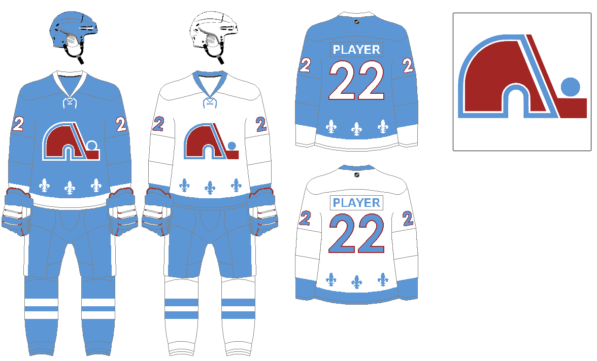
Returning to the look they had before they relocated to Colorado. Only difference being using a lighter shade of blue and darker shade of red.
SAN JOSE SEALS
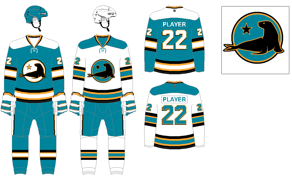
Since they eventually made hockey work in the bay area, let’s assume the Seals hung around the region and ultimately found a home in San Jose. They had used teal and yellow anyway towards the end of their run in the mid 1970’s, which ended up being part of the Sharks look, and at one point featured black in the logo. The teal is a mix between the Seals and Sharks shades. Newly designed seal logo featuring the star from the state flag, a nod to their days as the “California” Seals.
SEATTLE EMERALDS
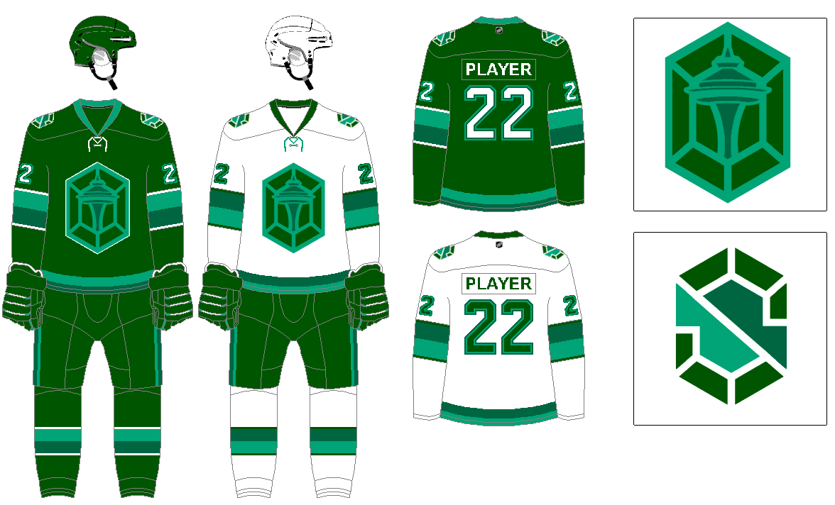
The Kraken name is pretty brutal in my opinion, I’d rather see something more classic like Emeralds or Evergreens, something with staying power compared to a reference to a movie people won’t even know in a few years. With Emeralds you are going with varying shades of green into an aqua color, which would be a unique combo in major sports. The logo featuring the iconic space needle within a gemstone.
ST. LOUIS BLUES
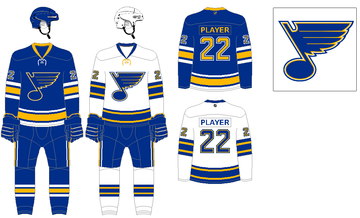
Pulling the navy accents from their color set, and using their original uniform, which is their current alternate. For the white jersey, pretty similar to the 1968 set, minus the contrasting shoulder yoke.
TAMPA BAY LIGHTNING
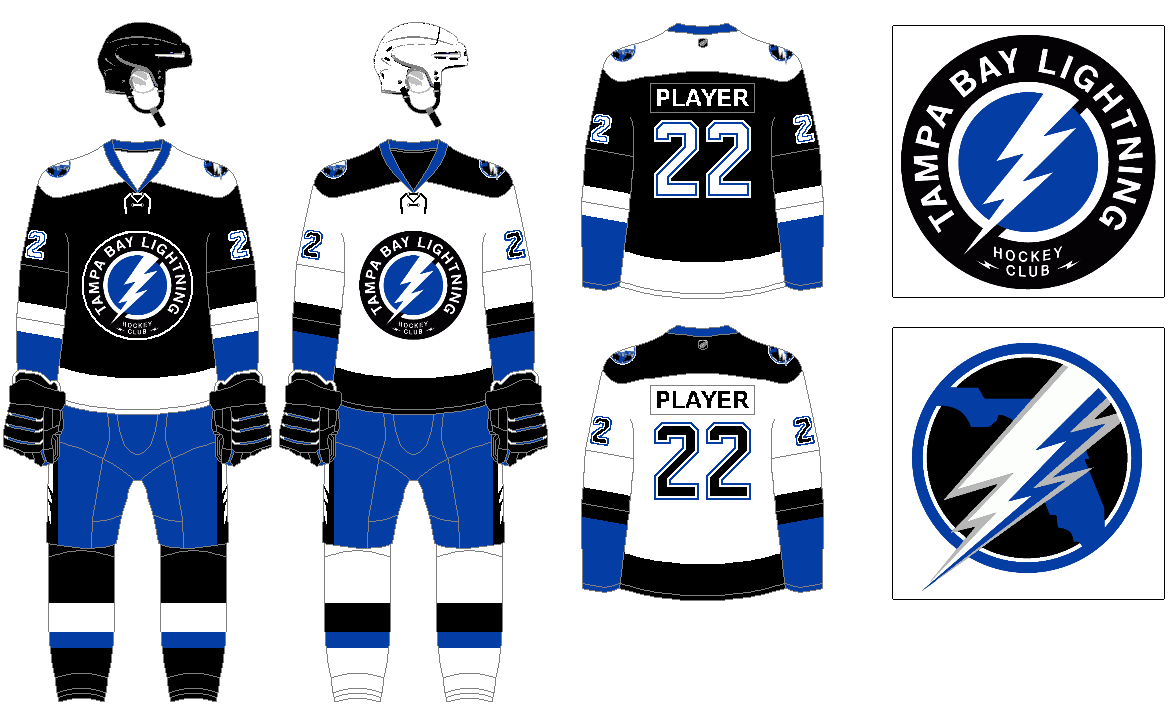
While their current blue design isn’t bad, it is kind of generic and also derivative of the Maple Leafs. Their secondary logo with the team name is much better than the plain lightning bolt. So bringing black back into play into the logo and uniform. Using their original design as the basis for the new version. Also adding a color updated version of their Florida and lightning logo.
TORONTO MAPLE LEAFS
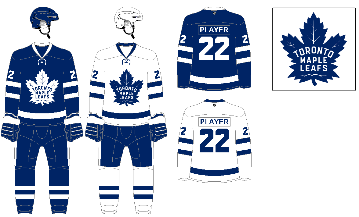
Another original six team with an outstanding design.
VANCOUVER CANUCKS
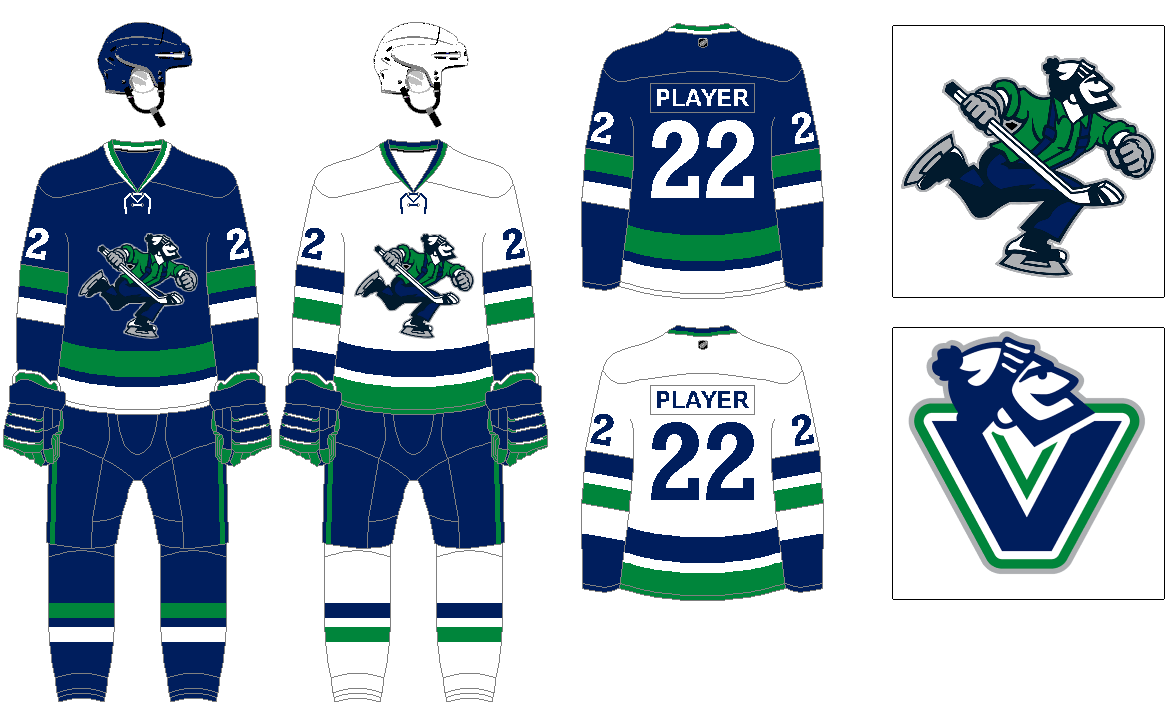
I’ve never been a fan of the whale logo, but the Johnny Canuck lumberjack logo is one of the best in sports. The uniform design is based around their original 1970 look, with some changes to the stripe pattern and number font.
WASHINGTON CAPITALS
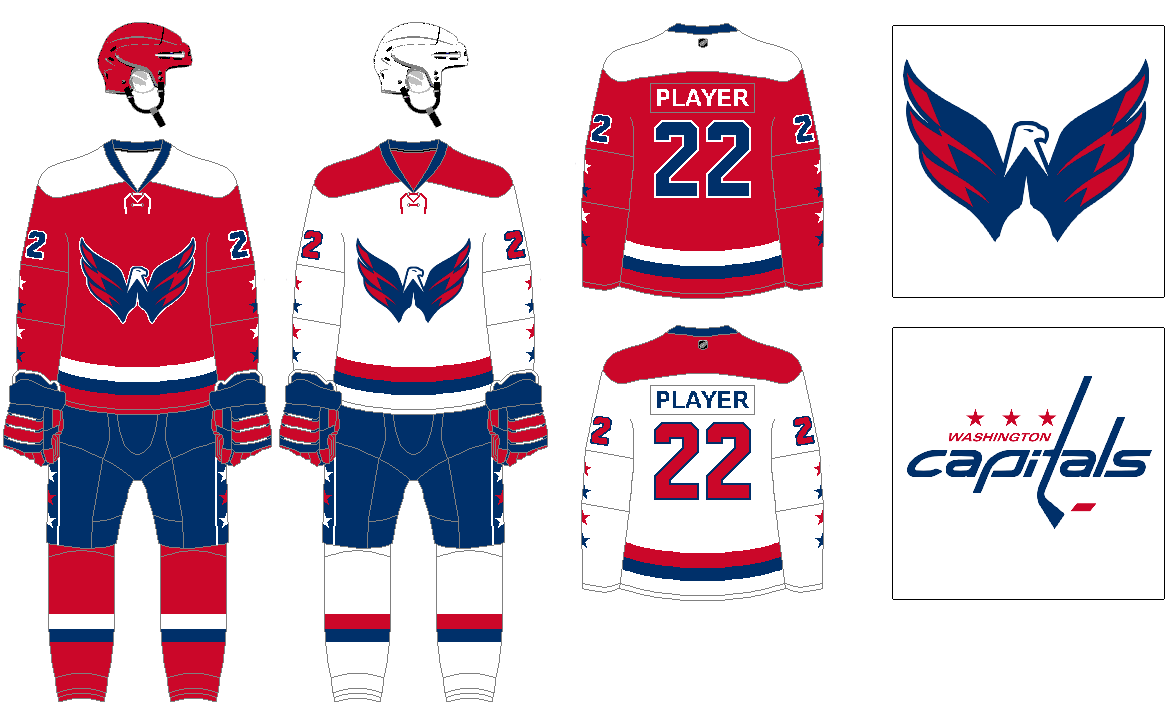
Their alternate winged eagle logo is another example of a great logo relegated to alternate status. Using that logo on a design pretty similar to their original uniform set featuring the stars on the sleeves.
WINNIPEG JETS
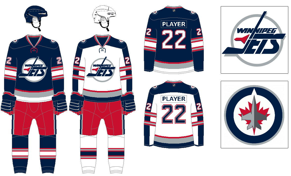
I tried to do a mashup of the original Jets franchise look and the current look. Making a modified version of their original logo to the primary, and current logo their secondary. As far as the uniform, I’ve sort of mix elements from various uniforms in the team’s history.
*BONUS* — MIAMI PANTHERS
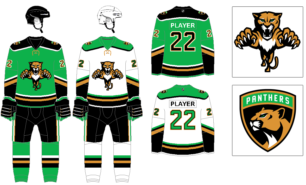
[There seemed to be a segment of Florida Panthers fans looking for a design for their team I replaced as the Sharks. Here is a design I had already done keeping them as the Panthers.]
Not a fan of state names when there is more than one team in the same state, so changing to Miami Panthers, (even though Florida Panthers is a direct name of state animal). Since we are no longer going with Florida, moving off the colors from the state flag, and using the Miami flag colors. The bright green as a primary, and the gold is a hybrid between the existing team’s gold and the orange of the city flag. Black as a dark color in there for contrast. I do love the crest logo, but it looks out of place on hockey jersey, so that moves to the secondary mark and the modern leaping panther logo as the primary. The sleeve stripes are partially inspired on by original jersey design.
Thanks, Greg. Wonderful set of NHL concepts. We appreciate your sharing your designs with the Uni-verse.
Only one thing better than that Nordiques uni: swap the helmets.
I like state names. Especially when using one perfectly describes your mascot. I’m still calling them the Florida Panthers.
Great series of concepts, Greg!
Excellent choice of colo(u)rs for the Nordiques! Kinda wish the Avs had simply cut the corner of the igloo/n into a capital A, lost the fleur-de-lis, brought back powder blue/scarlet to the ice and called it a day.
Black and blue is a challenging pairing to work with …you did a wonderful job bringing balance to the Bolts.
Big fan of the Vancouver Victory V’s – but seeing Johnny front and center/centre in blue/green is terrific. The whale is a Hurrica…err, Hartford thing.
That there’s no uni-nod to the Atlanta Thrashers in your treatment fir Winnipeg is unfortunate, but understandable.
Agree with the Avs, the Nordiques had a great set, they could have certainly kept more the team legacy in there.
Agree with Tampa’s colors, but it definitely felt like they got it right the first time, as long as it is a vibrant blue it can work with the black.
Didn’t consider that with the Jets’ history in Atlanta, but that is a good idea, I’ll dig into the Thrashers’ uniforms and if some inspiration strikes with them to modify the Jets’ design.
Love the concepts! Awesome simple fix for the Blues! Got rid of the navy. Canucks look good too, but I almost think the Johnny Canuck v-neck logo works better as a main crest . But you’ve upgraded a lot of teams tremendously!
Big upgrade for the Capitals’ uniforms, you hit the nail right on the head. Not so pleased with the Winnipeg effort, it looks like the Blue Jackets. Stick to the WHA uniforms; the dark sweaters look good with a red bucket.
Thanks, I agree the Caps have some good elements they could easily merge to create a great uniform.
The Jets were one of the teams I struggled with. I knew I wanted the logo from the 90s on the chest, and for the colors to be navy, silver, and red, but I didn’t have much inspiration besides that. Will certainly revisit that at some point.
Great job, Greg! (But I do miss the yoke on the Leafs’ road sweater.)
The Caps uniforms are pretty much what’d do – original uniform template more or less but with the Weagle. I’d have blue on the shoulder and a blue helmet.
I figure they will redesign once they have their arena situation figured out. Hopefully, they stay where they are and not in my city of Alexandria.
The myth of the kraken in Scandinavian seafaring lore dates to the 1700’s, well before the invention of the movie camera, and there is a long legacy of Norse immigrants and civic leaders in Seattle. Personally I preferred Thunderbirds, but, you know. Still, your argument against Kraken sounds more appropriate for the Toronto Raptors and their initial logo.
I’m aware of the history of the Kraken beyond the movie, but if I recall the ownership had at some point mentioned the line from the movie as part of their inspiration for the team’s name. Either way, names that don’t end with s never sit right with me. Though I will say they did a great job with their branding, if I was keeping the Kraken name I’d probably just come up with different colors for it, since there are already so many blue teams out there.
Comments are closed on the post, but just wanted to say that the Calgary logo is fantastic!
Thanks, I enjoyed that one since I was sort of starting fresh, only drawing on some non-NHL teams for ideas.
Good stuff again, Greg. The only thing is that I would bring back the trumpet logo as a secondary for the Blues and put a red line in somewhere to distinguish them from the Sabres plus the Seattle primary logo you created, as creative as it is, reminfs me of the Vegas logo as the Space Needle and the emerald lines blend into some kinfd of helmet. Maybe do the Needle outlines in white.