Recently reader Greg Seher sent me a big batch of NHL uniform concepts he had created a few years back.
He writes, “For your weekend content, here a set of uniforms I did for the NHL. The idea behind it is bringing back lost / relocated franchises, such that all 36 cities/regions that had franchises still have their original franchises. Good uniforms stay the same, teams in need of minor adjustments have them, and when needed teams get full overhauls. Good luck taking over full time this spring!”
Since there are 36 of these, I’ve broken them down into four sets of nine, alphabetically. With each part I’ll include the introduction below.
This is Part Three. If you missed Part I, click here, and if you missed Part II, click here. Click on any image to enlarge.
Doing some minor realignment and relocation. Firstly going back to old alignment names, Wales and Campbell conferences rather than Eastern and Western. Likewise going with updated version of Adams, Patrick, Norris, and Smythe divisions. Moving to 36 teams to bring back the cities that lost franchises, and also relocating franchises back to their original cities. I’ve divided these up into 3 groups, the first is essentially no changes to the uniforms, be it existing or making an alternate or throwback design the primary. The second is some slight modifications to existing or past uniform designs, be it color swaps, combining a logo and uniform from different periods, etc. The third group is for the most part original designs, or significant enough mashups of elements from various designs to count as new. All teams going with the same lace up jersey template.
MONTREAL CANADIENS
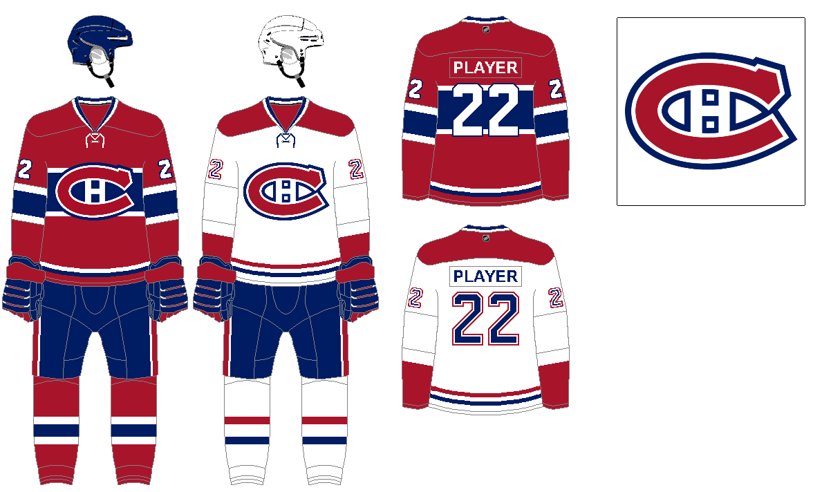
Another classic with no need for changes.
NASHVILLE PREDATORS
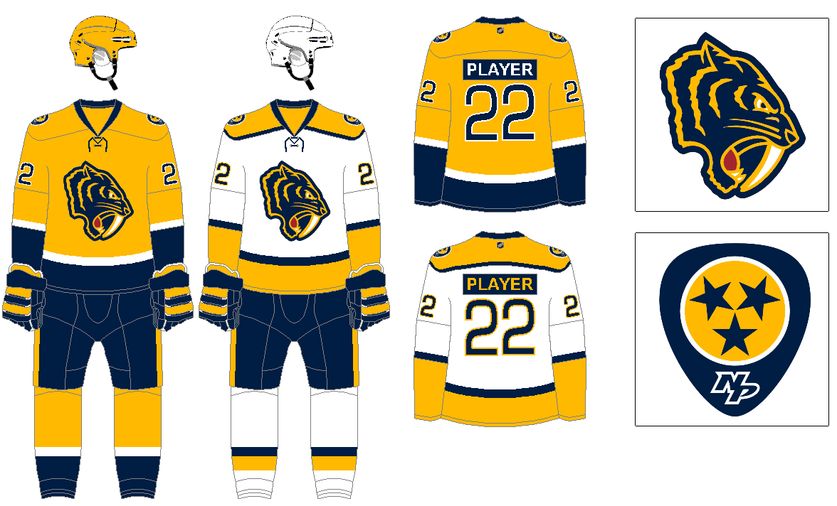
The Predators’ fauxback logo from their Winter Classic is way better than their actual logo. So the uniforms are basically just their existing set, with the new logo. A couple of other tweaks being putting the secondary logo patch on both shoulders rather than just one, and also a navy contrasting nameplate on both yellow and white jerseys.
NEW JERSEY DEVILS
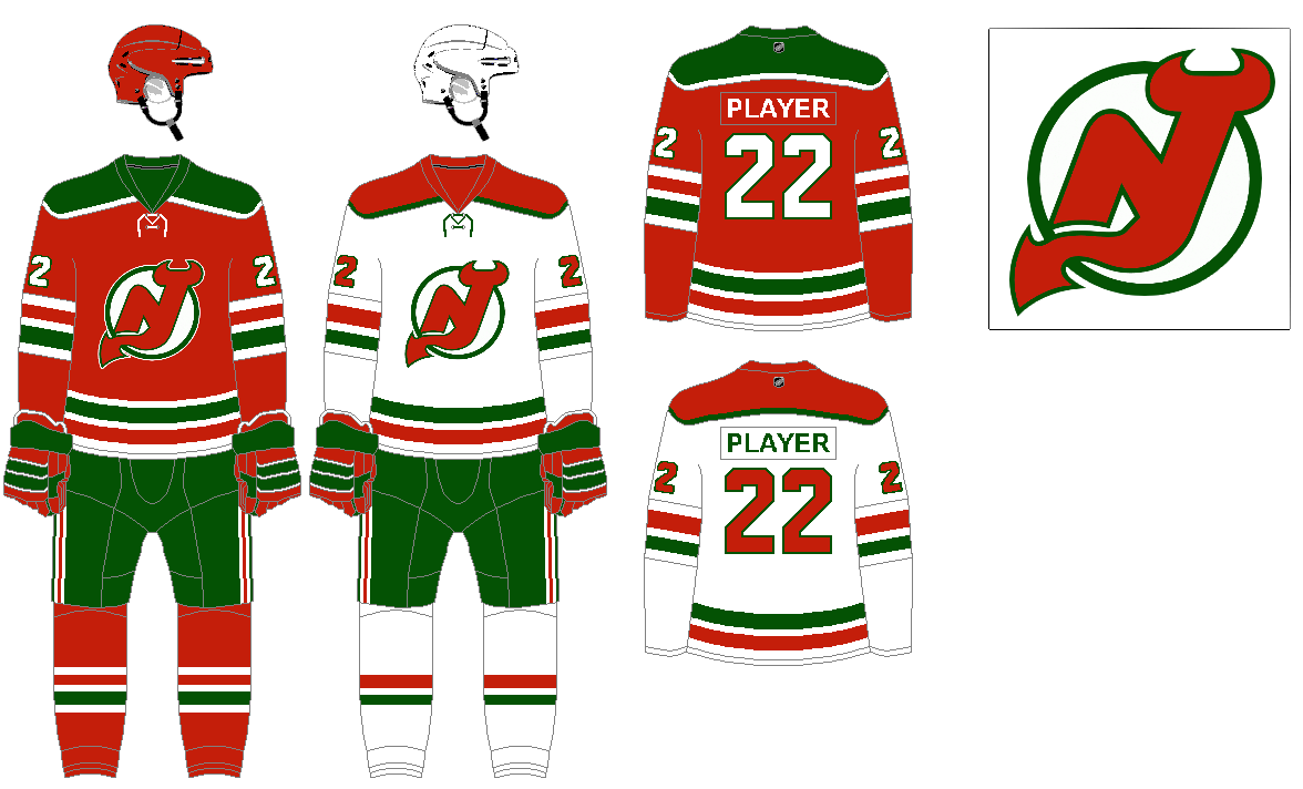
Red and green are a far more unique combo than red and black, so just bringing back the original design they had from the 1980’s.
NEW YORK ISLANDERS
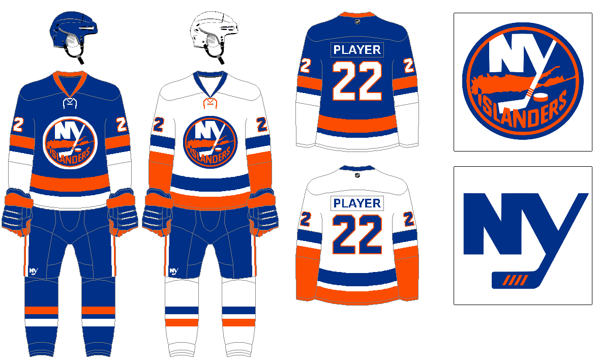
The current look, which is mostly a throwback to the original design is great, just putting the secondary NY logo on the breezers.
NEW YORK RANGERS
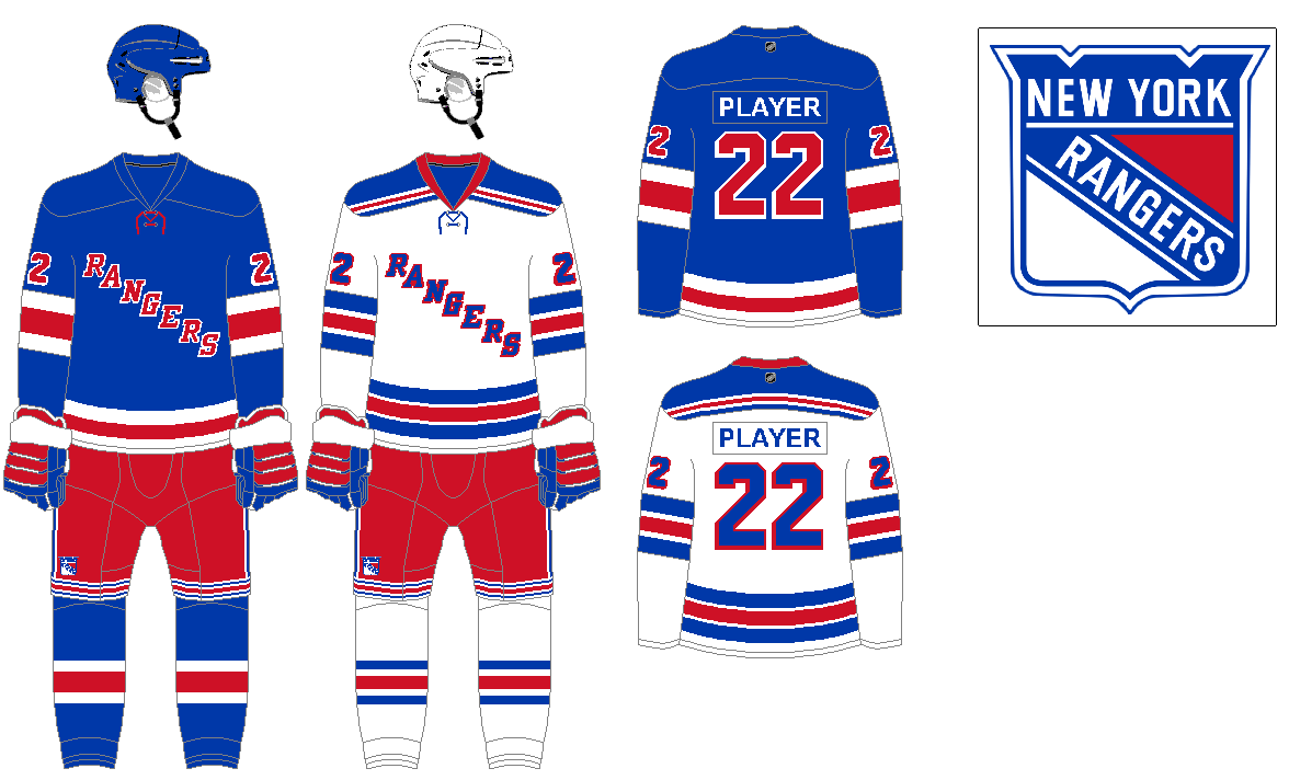
Another classic not needing any changes.
OTTAWA SENATORS
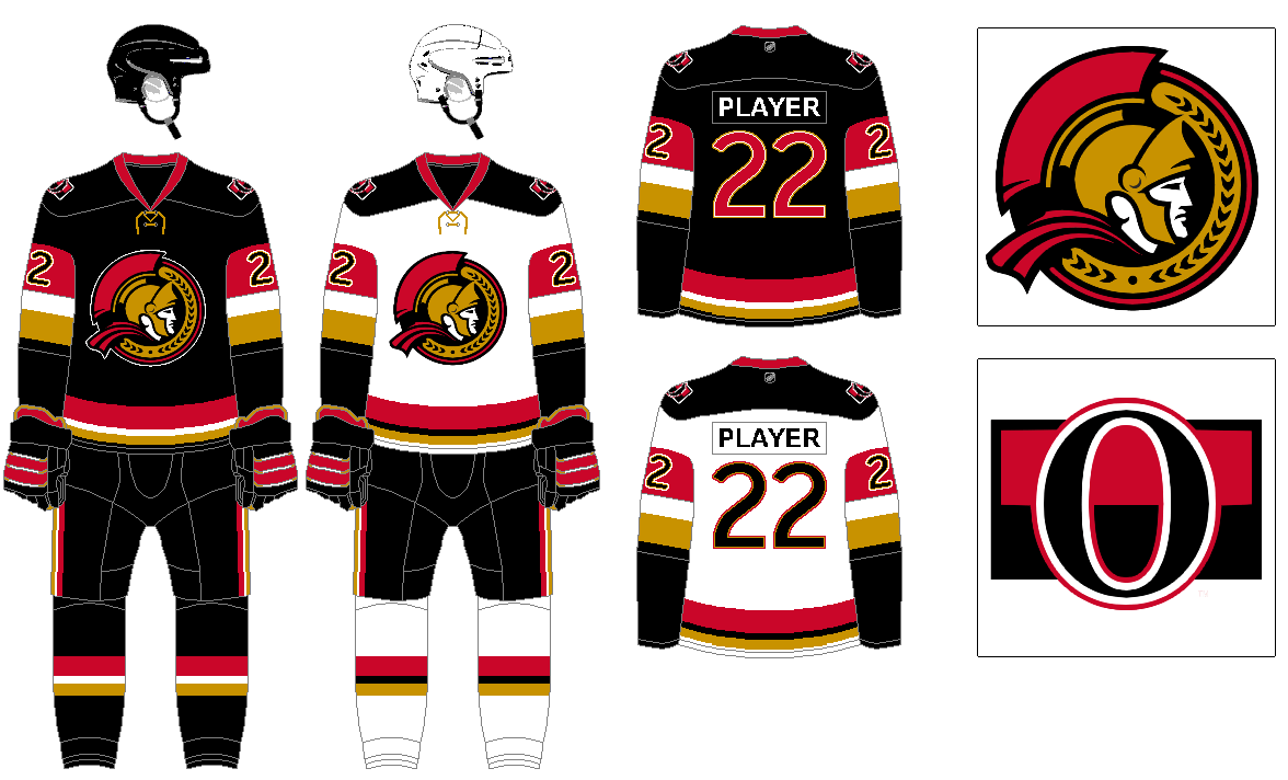
I much prefer the 2007 version of the side profile Senators logo, so switching that to the primary mark, with the stripe O as a secondary. When it comes to their uniforms I don’t really think they have had a definitive classic look at any point. And when I think of the Sens I always think of them as a black team from their first several seasons. So tried to come up with good black design that features both red and gold as secondary colors.
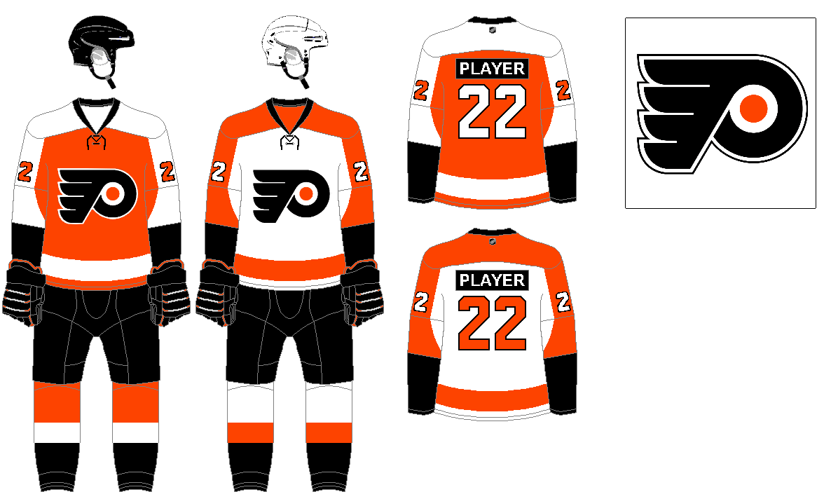
Essentially the design they wore starting in 2010, with the brighter orange, simply making the stripes running down the shoulders to the sleeves wide enough for the numbers to fully fit in there. Also keeping the nameplate contrasting black on both orange and white jerseys.
PHOENIX COYOTES
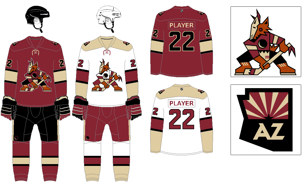
I much prefer Phoenix rather than Arizona for the name. I think a mashup of the original kachina styled logo with the dark red, sand, and black color scheme is great. As far as the uniform itself goes, the red uniform would be based on what the logo coyote is wearing. With the white uniform there is more emphasis on the sand color than black, as well as an alternate version of the logo in the white uniform. And even though I’d call them Phoenix I still like the AZ version of the state shape secondary logo.
PITTSBURGH PENGUINS
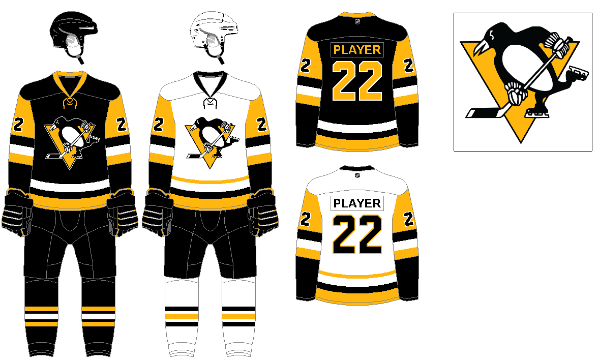
The current look as of 2016 nails it.
Thanks, Greg. We’ll be back with the final set of concepts tomorrow!
Good going again, Greg!
I pine(lands) for the Devils to bring back the green/red permanently, though the striping pattern could use a tweak…maybe, but your design in fine!
The NYI blue sweater has a layered/short-sleeve-shirt-over-long-sleeve-shirt quality to it – that’s unique and I love it!
The Flyers the contrasting nameplate on the white jersey never should have been a ‘thing’ – never looks good, YVVM of course – but the white with black letters on the oranges is (takes deep breath) iconic … best to leave that alone (and keep that style in Philly-sorry Preds) The socks might make them look like they’re wearing boots.
Given the lack of teams that use a red and green combo, and the amount of Italian Americans in North Jersey, it puzzles me that the Devils don’t take full advantage of that color scheme. I understand when they dropped green for black that was the era uniforms were in, but now that we seem to be back to embracing vibrant colors, the Devils aught go back to the green.
Good concepts Greg! That Senators logo is awesome. The sand Coyotes yokes are not.
Yeah, I definitely can see that sand is not a color that works for everyone. Wanted to try something a little different for the Coyotes since sand is such a light color that could work in with the white jersey.
Another great entry Greg!
Squads I think you completely nailed:
Nashville. Current uniforms just seem a little dated and uninspired. Your treatment gives them a richer feel. Hearkens the Bruins throwback. I would see Nashville as less of an imposter with this look.
Phoenix. I grew up in northern Arizona (much closer to Vegas; Go Knights!). I never adopted the Coyotes because there was always a threat they’d leave, bankruptcy etc. I didn’t want to go through what we did with the Browns (I was born in Cleveland). I think your purposeful choices with this redesign pretty much perfect what the Yotes could ever trot out in.
Lastly, the Devils. This has always been the look. Enough said.
Really enjoying this series! Thanks!
Thanks, it was great the Coyotes went back to the Kachina style logo, but I think it works best with their red/gold/black color scheme. Also creates a fun opportunity to match the uniform of the logo to the actual uniform for home and away.
I feel like almost all franchises with bad looks have have various good elements from their history that could easily be combined into something classic and distinctive.
So glad to see someone address the fact that the Preds got their design right ONCE, and have basically mothballed it since. They are lost in the weeds right now and have a fantastic logo just sitting on a shelf.
Right? Their winter classic fauxback is amazing, not sure how they let that sit in storage while primary logo is awful.
Good treatment on the Senators, Greg. They need to emphasize their gold color.
Thanks. Yeah, was watching them last night vs the Flyers and couldn’t help thinking how drab their uniforms look. If black is the primary color, then red and gold are both great contrasting colors in the trim that should be used.
As nice as the blue Rangers’ sweater is, I’d go with the ones Fred Shero put on his players in 1979. I’ve always liked the letters, spelling out “NEW YORK”, and the stripes match the ones on the white jersey.
Devils, Senators are huge upgrades.
Leaving the Habs, Rangers, Isles and Pens alone is wise.
Never liked the contrast-colored nameplates for the Flyers and they’ve been my team since forever.
@ChrisH: do you pine(lands) for the Devils to go back to red/green… or pine (barrens) for it? Asking as a lifelong South Jerseyite.
Piney Power!
Lands, Barrens…potato, potahto.
link
PS: it’s pork roll.
Damn right it is. The FDA declared in 1905 that pork roll is NOT ham, and therefore calling it “Taylor ham” is factually incorrect.
Loving the South Jersey representation. Everyone knows pork roll is the food, the other name is just one of the brands. Much like there is no Central Jersey, only North and South, central is just northern folk who wish they weren’t.
Flyers contrasting nameplate took some getting used to for me, growing up a fan from the Hexy through Lindros years. But I have come to appreciate it as a fun quirk, and works well for them given the strong contrast between orange and black.
I nearly made their 2012 winter classic as the primary, but I couldn’t go against the history with this design.
You GET IT, sir.
609 or 201.
08xxx or 07xxx.
Eagles or Giants.
There just isn’t enough area for a 3rd region.
Well at least you’re saving the best for last, tomorrow.
Let’s get Kraken!!
I love the Devils and Sens look, the Habs should never change their look.
Great job all around!!
Sаved as a favorite, I liҝe youг site!
Good stuff from Greg, especially the Senators, the Predators and the Devils returning to La Bella Italia.