Recently reader Greg Seher sent me a big batch of NHL uniform concepts he had created a few years back.
He writes, “For your weekend content, here a set of uniforms I did for the NHL. The idea behind it is bringing back lost / relocated franchises, such that all 36 cities/regions that had franchises still have their original franchises. Good uniforms stay the same, teams in need of minor adjustments have them, and when needed teams get full overhauls. Good luck taking over full time this spring!”
Since there are 36 of these, I’ll break them down into four sets of nine. While Greg has created these by realigning old conferences and divisions, I’ll run them alphabetically. With each part I’ll include the introduction below.
This is Part One. Click on any image to enlarge.
Doing some minor realignment and relocation. Firstly going back to old alignment names, Wales and Campbell conferences rather than Eastern and Western. Likewise going with updated version of Adams, Patrick, Norris, and Smythe divisions. Moving to 36 teams to bring back the cities that lost franchises, and also relocating franchises back to their original cities. I’ve divided these up into 3 groups, the first is essentially no changes to the uniforms, be it existing or making an alternate or throwback design the primary. The second is some slight modifications to existing or past uniform designs, be it color swaps, combining a logo and uniform from different periods, etc. The third group is for the most part original designs, or significant enough mashups of elements from various designs to count as new. All teams going with the same lace up jersey template.
ANAHEIM DUCKS
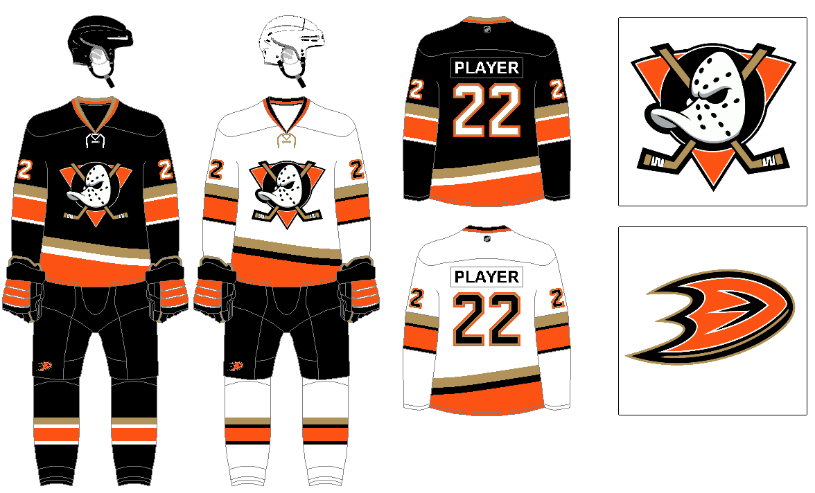
The original logo is way better than the webbed D. So color swapping it to the black with orange and gold look they have now. I can’t say any of their looks have ever been classic, but the old angle torso stripe design was noteworthy, if not great. Tried to make it a little less outlandish for this design.
ATLANTA FLAMES
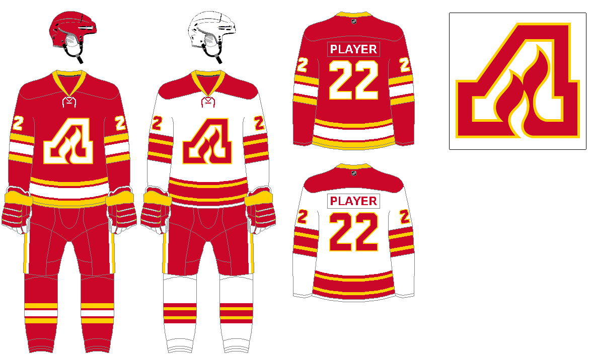
Essentially taking the existing Flames design and replacing the flaming C for the A from Atlanta.
BOSTON BRUINS
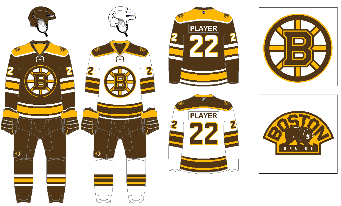
I’ve always preferred them in brown for some reason. This is mostly the uniform the team started to wear in 2007, but in brown, and with modifications to the stripe designs. Also finishing the outline around the shoulder yoke to go all the way around.
BUFFALO SABRES
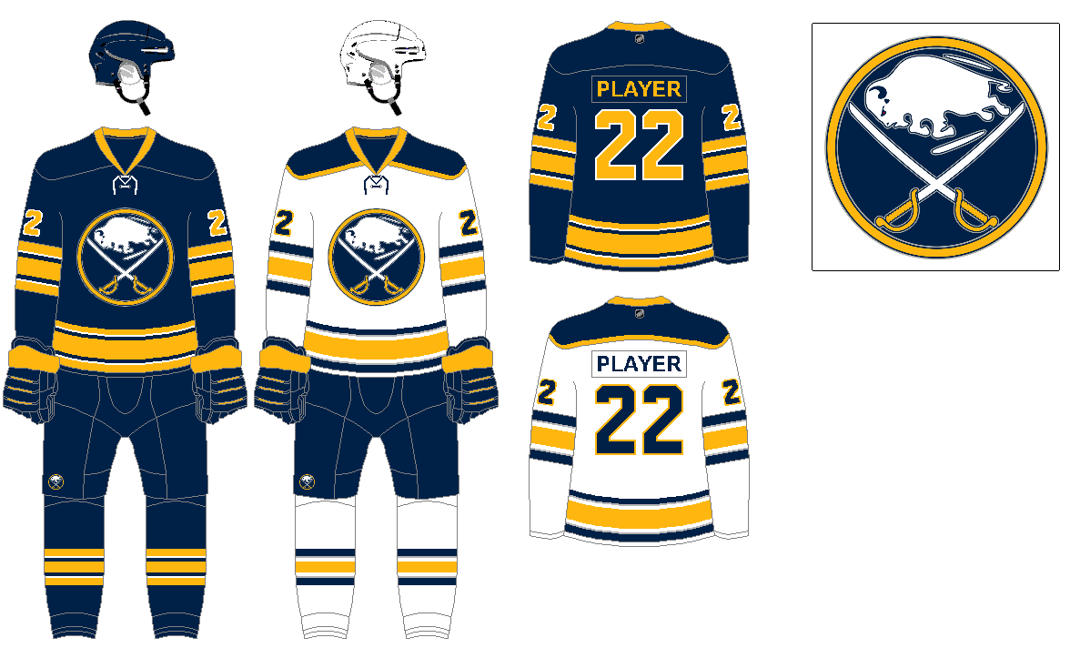
I’ve always preferred them in navy rather than royal blue. Royal blue and yellow looks to similar to St Louis. I went with the 2017 design, but got rid of the front numbers, the gray on the navy jersey, and returned to a block number font.
CALGARY WRANGLERS
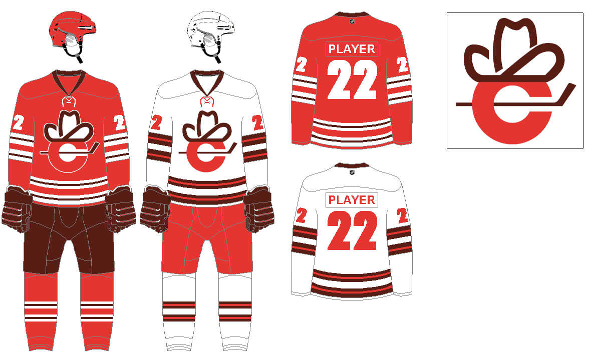
Going with the old WHL name for Calgary, and taking inspiration from the WHA Calgary Cowboys logo to bring back the hat from the city flag, on top of a C with a hockey stick. Keeping the icon red that various franchises in the city have always worn, but throwing in some brown that fits the western, frontier theme.
CAROLINA HURRICANES
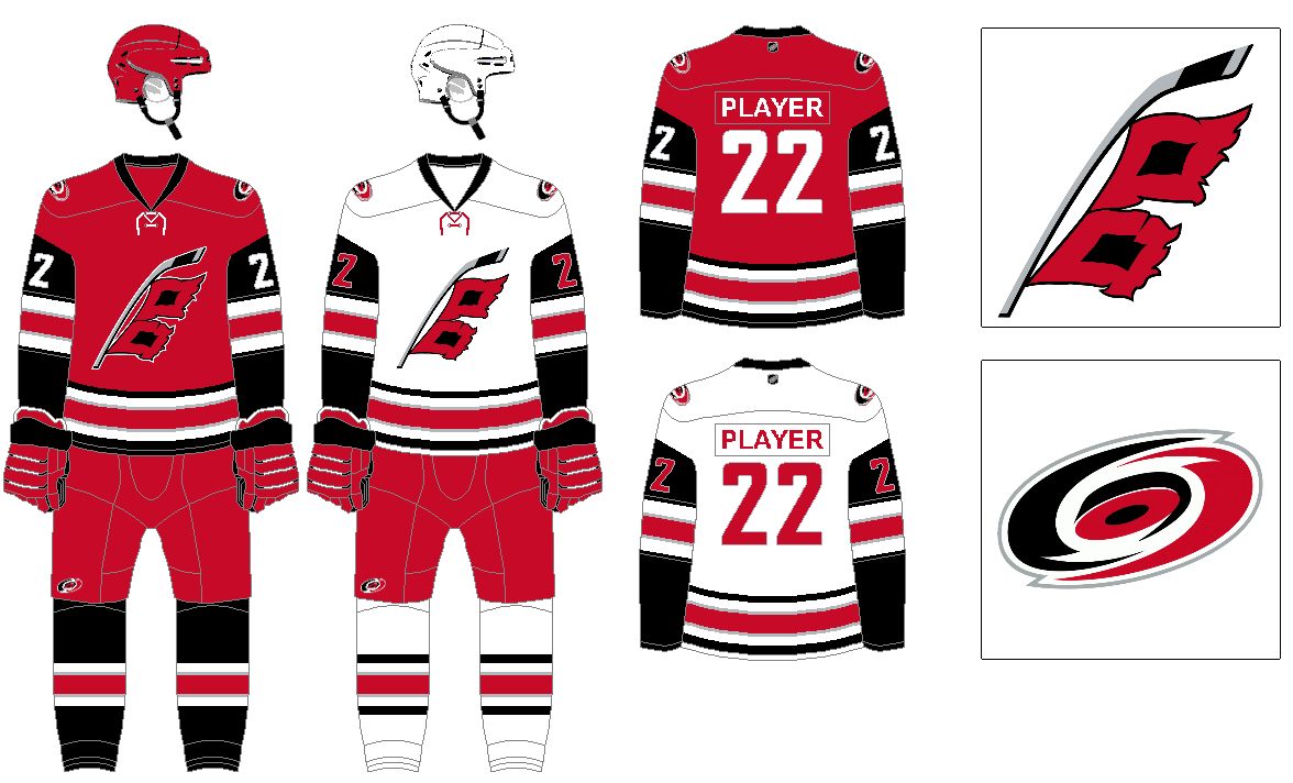
The stick and flag logo is certainly superior, making that the primary logo and crest on both home and away uniforms. The design in 2017 starts as the basis for the jersey, with some modifications going with contrasting black sleeves.
CHICAGO
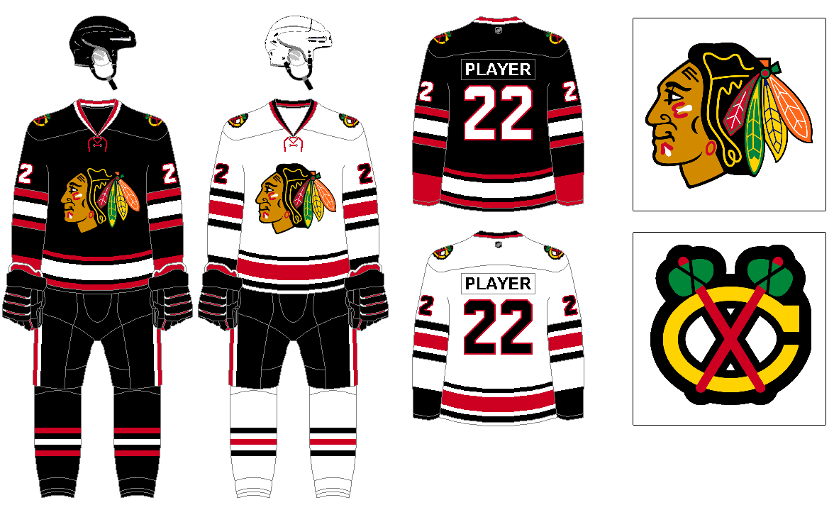
It always bothered me that the BLACKhawks were a red team, so I’m just taking their black alternate worn from the mid ’90s thru the early 2000’s and making that the primary home jersey.
COLORADO ROCKIES
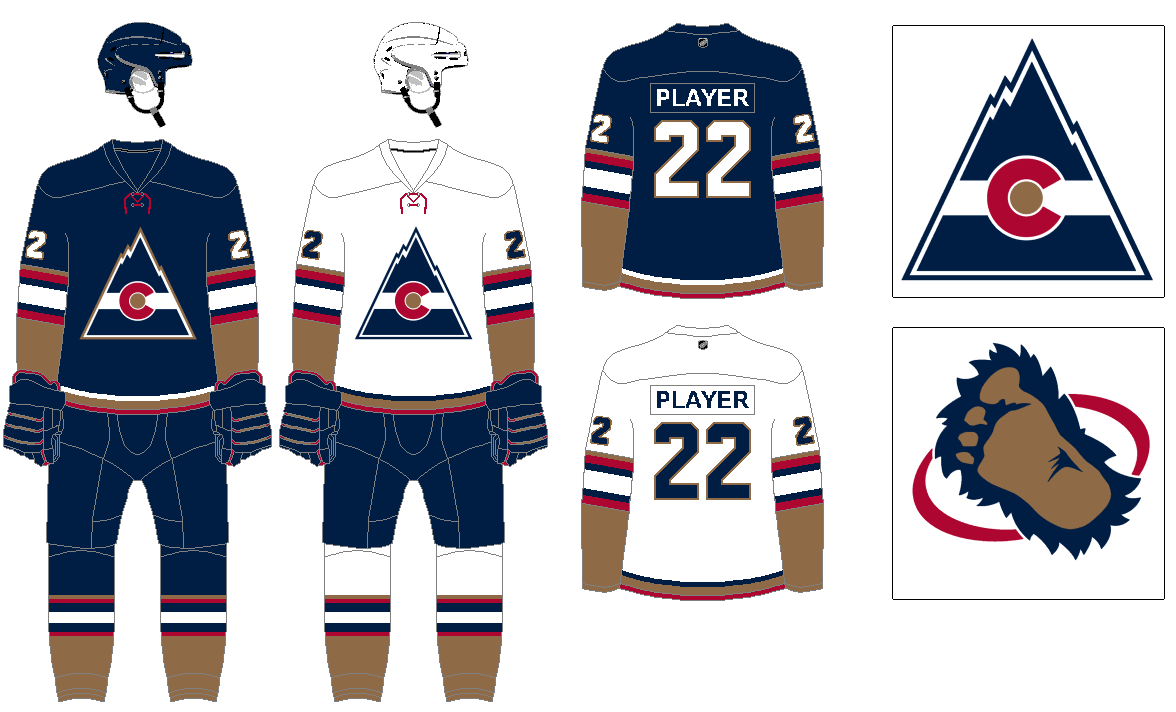
In this timeline the hockey team would have been around before the baseball team, and regardless I don’t mind the idea of teams sharing nicknames like used to happen. The original mountain/flag logo still works, just recoloring from blue, red, and yellow to navy and gold with red trim. Using the white stripe across the logo as the basis for the uniform’s stripes. Keeping the bigfoot logo from the Avs around as a secondary mark.
COLUMBUS BLUE JACKETS
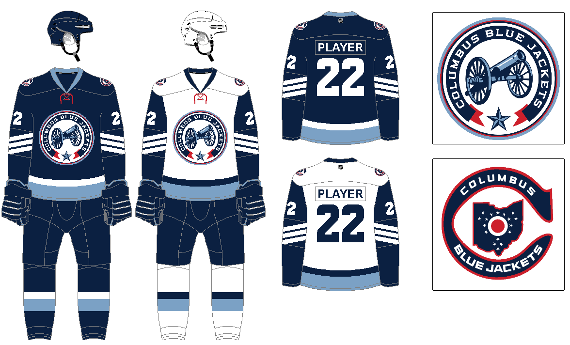
I’m not a fan of their primary logo or current uniforms. However their cannon logo is great. I like having them with navy and columbia as their primary colors, with red as just an accent. Attempted to mimic the actual blue jackets worn in the civil war with the stripes on the sleeves. For the secondary logo a mashup of existing Columbus designs with the old Cleveland Barons logo.
Thanks, Greg. We’ll be back with more of his concepts tomorrow.
Nice job with these concepts come out Greg! Thanks for sharing them! As an Avalanche fan and a Denver resident, I like the color scheme you chose for your Rockies concept. I’d love to see that on the ice sometime.
I think my favorite, though, is the Calgary Wranglers. Personally, I like it quite a bit better than the Flames, which is just a holdover from their previous home city of Atlanta.
Thanks. I think the original Rockies logo is such a classic, so it was one of my favorites to put into place here. The Wranglers was one of the ones that I had the least to draw from since it was just from bits and pieces of non-NHL teams, so I’m glad it ended up looking good.
There was a lot to love about old WHL Calgary Wranglers uniforms. Stars on the last jerseys. The 2-toned Koho helmets. But what was the answer to the question about the rink at Stampede Corral? Were the boards too high or was the ice just too low? Both answers may be acceptable.
link
Definitely like the way you sweat the details, Greg. I’m frustrated by “concepts” which only turn out to be a jersey.
Thanks, of course this is uni-watch! Most of us on here care about the details and aren’t just jersey-fans.
As Paul and Phil routinely say, have to judge a design by the entire uniform, not just the jersey that fans are going to buy.
Lots to like here, but I disagree on a couple things:
SABRES: royal/yellow is a vastly underused combo and the Sabres look best in royal/yellow. Minimizing any influence of the Buffaslug and goat head years is a good philosophy. And I prefer the even striping to the Northwestern stripes around the waist.
HURRICANES: the flag/stick is their best creat but their best look also had the warning flags around the waist.
BLACKHAWKS: current waist striping is better than Northwestern stripes, but I don’t hate the black.
Everything else is an enthusiastic thumbs up, can’t wait for the rest. Love the Calgary concept too!
Thanks. I’m not going to disagree that Buffalo looks better with the royal blue, but one of my pet peeves with uniforms at the pro level is when teams look so similar. Blues were there first, so for me they get to own royal blue and yellow. Navy and yellow still being a very good combo, so I’m happy with Buffalo in that.
For Carolina, I think I always go back and forth if I like the warning marks on the stripe, it is a great concept, but sometimes I think it is too much, especially when paired with the stick logo. I am working on an alternate for each team, so for Carolina I am definitely going to bring that feature back in the black alternate, that would also feature the eye logo.
Fair points, both. In the case of the Sabres, I do think there is room for 2 similarly-colored teams in a 30-team league. The teams are only 3 years apart in age, and the Boues traditionally used a lighter shade of royal.
Good going, Greg!
Your brown Bruins are beautiful.
Love that you’ve brought the Rockies and Flames home…so to speak.
Atlanta needs no tweaking, but Colorado should dial back the gold – or move that color from the sleeves to the shoulders for a better balance?
Thanks. For Colorado I felt I needed something for them to stand out compared to other teams in all navy, and the gold on the sleeves seemed the best option. But I am always tinkering and adjusting the designs so I’ll see what else I can come up with. I appreciate the feedback.
Loved everything about this, Greg! I have to say that I believe you absolutely nailed Anaheim and Columbus. You perfectly captured the best of what both of those teams could be.
Thanks, I agree, I feel like this is such an obvious design for Anaheim and it seems frustrating they don’t do this on their own. And ditto for Columbus, a more simple design with the cannon logo seems a no brainer upgrade for them.
“Essentially taking the existing Flames design and replacing the flaming C for the A from Atlanta.”
So, in other words, just bringing back Atlanta’s uniforms. Because, with the exception of their first season, where they had different striping, the only real change to the uniforms aside from the logo when they moved in 1980 was the collar treatment, which doesn’t matter as much with the modern collars anyway.
Yes. Greg stated in the intro that some uniforms are left basically unchanged (as you’ll see in future Parts)
Beat me to it! Thanks Phil.
Your Blue Jackets concept is INCREDIBLE. I love the new secondary logo—the use of the old Barons brand in a way that really makes sense with the Blue Jackets brand is amazing, and it’s a great way to keep the state flag around since you appear to be getting rid of the current primary in your redesign—and the striping is SUCH an improvement. GREAT JOB all around Greg, but especially on that Jackets uniform.
Always good to see the Barons treatment!
Off to a great start, Greg. Can’t wait to see the Nordiques.
I think you missed a chance to give the Chicago team a new logo. Never cared for it, and would say it’s time to get past using indigenous iconography for our teams. (spare me the origin story of the team name, I know it. It doesn’t change my mind)
I really like a lot of these concepts… Anaheim’s history is a big hot mess – but I’ve thought combining mask logo, slanted waist stripes and current colours ties it all together and is perfect for them. (orange, gold and black don’t go together, but it is unique!)
But Chicago needs to read the room and move on from that logo, so I was surprised to see a whole set of concepts with some clubs getting newly designed logos, but that makes the cut?
Chicago Hawks with a black hawk as a logo.
I will add though that this is otherwise great work!
Good stuff Greg!
Everyone knows how I feel. It’s no secret. The only way to go for the Ducks is eggplant, jade, and silver!
Man, I wish the Blues would get rid of navy. Every jersey they have reminds me of metro police uniforms. I’d gladly take back royal and gold.
Hard pass from a Bruins fan on replacing black with brown.
Hard agree from another Bruins fan. Black and gold forever.
Cleveland Barons have as much to do with Columbus as the Buffalo Sabres have to do with the New York Rangers.
Agree with other comments that these are top shelf -in detail & inspiration.
One thing isn’t clear to me… why change color scheme of Colorado?
Bruins’ jersey concept: stripe overkill.
I like every one of these, especially the Calgary entry and the Blue Jackets transformation. That should take place right now.