Good Saturday morning, Uni Watch readers. I hope everyone had a good (and hopefully “short”) week, with a safe Independence Day thrown in.
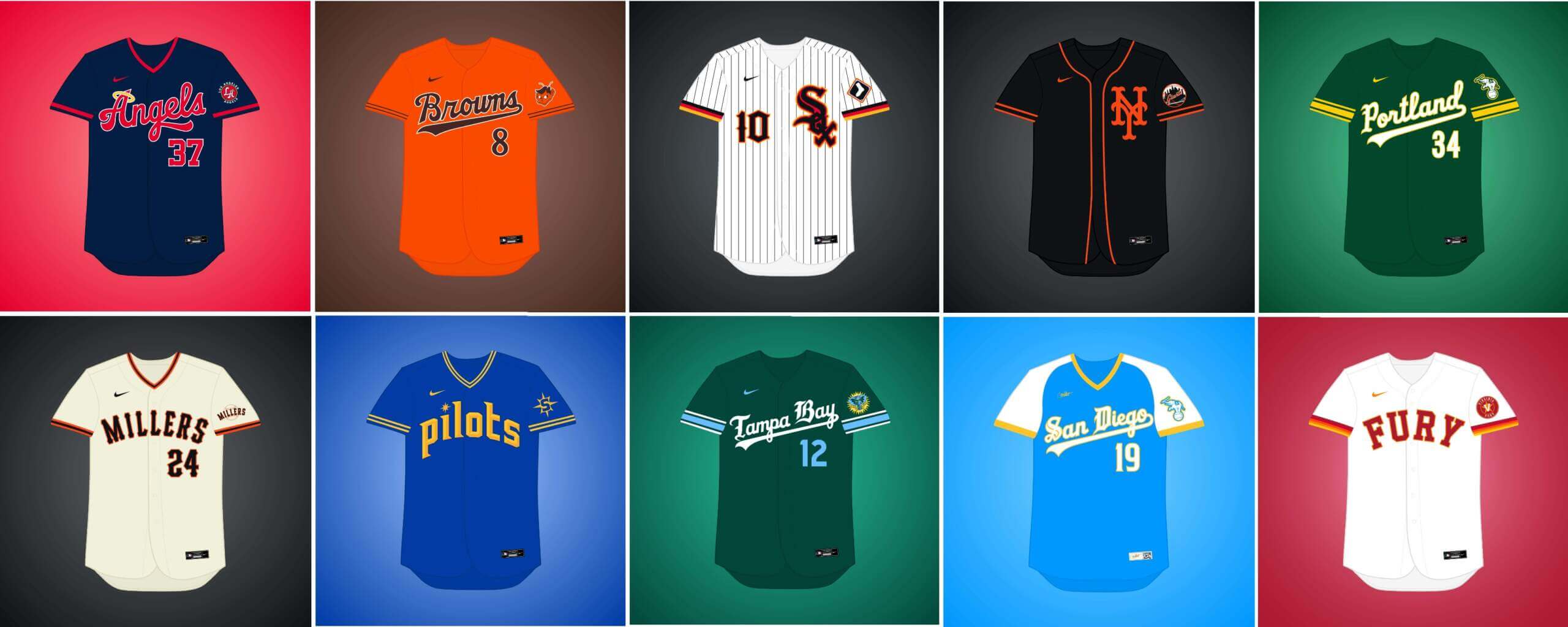
A couple weeks back, Matthew Drake shared the first of several sets of concepts he’s calling the “MLB Multiverse.” I’ve included Matthew’s introduction from his introductory post below, so you don’t have to click on Volume I for an explainer. As in Volume I, for each “what if” I’ve included the new “home” jersey inline, with road and additional alternates in the gallery beneath. Enjoy!
You can follow Matthew @MJD7Design on the Twitter, and check out his progress on this project as well!
Here’s Matthew:
MLB Multiverse, Volume II
by Matthew Drake
I call this series “MLB Multiverse,” it’s essentially collection of “what-ifs”: either relocations of MLB teams that very nearly happened, or what certain teams would possibly look like if they never relocated in the first place.
Obviously referential of Marvel’s recent cinematic dealings with the concept of the “multiverse,” another way of thinking about this is that these teams do in fact exist in an alternate universe, where their respective relocation deals followed through to completion.
The series was heavily inspired by user @SFGiants58’s legendary “MLB: The Defunct Saga” series on the sportslogos.net boards, as well as logo/uniform legend Todd Radom’s “Phantom Franchise” segment on Buster Olney’s podcast.
I created over 60 (!) different alternate-universe teams in this series, my biggest series ever by far. It was fun and exciting to try and flex my creative muscles a bit more beyond simply fixing up the 30 big league teams. I hope you enjoy seeing these designs as much as I enjoyed creating them!
What if… the Athletics remained in Kansas City?
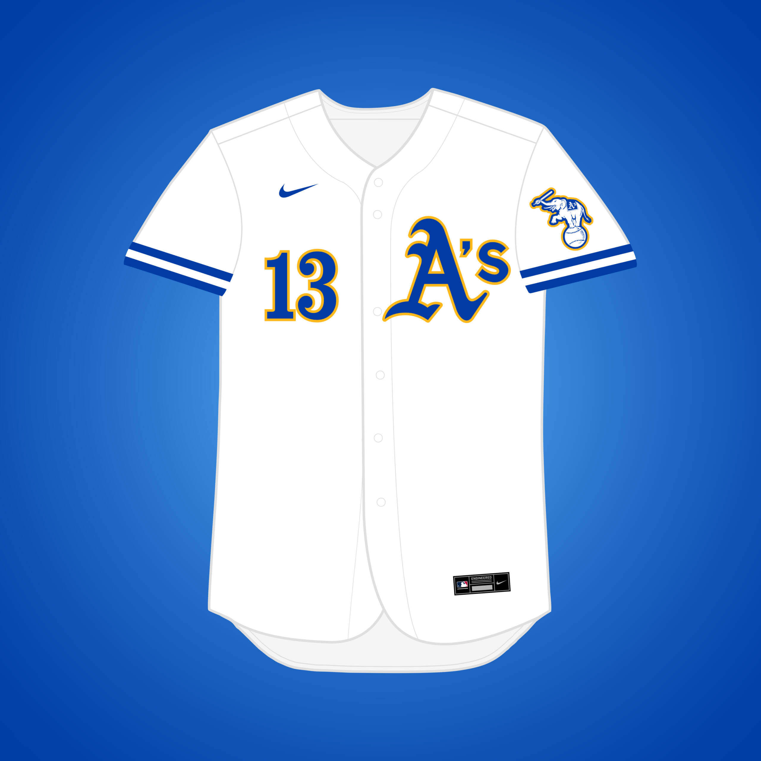
The A’s left KC for Oakland in 1968, but what if they stayed? The classic green & gold actually originated in KC, but royal blue paired with gold syncs better with the team KC actually got, the Royals.
What if… the (original) Senators relocated to Los Angeles (and changed their name)?
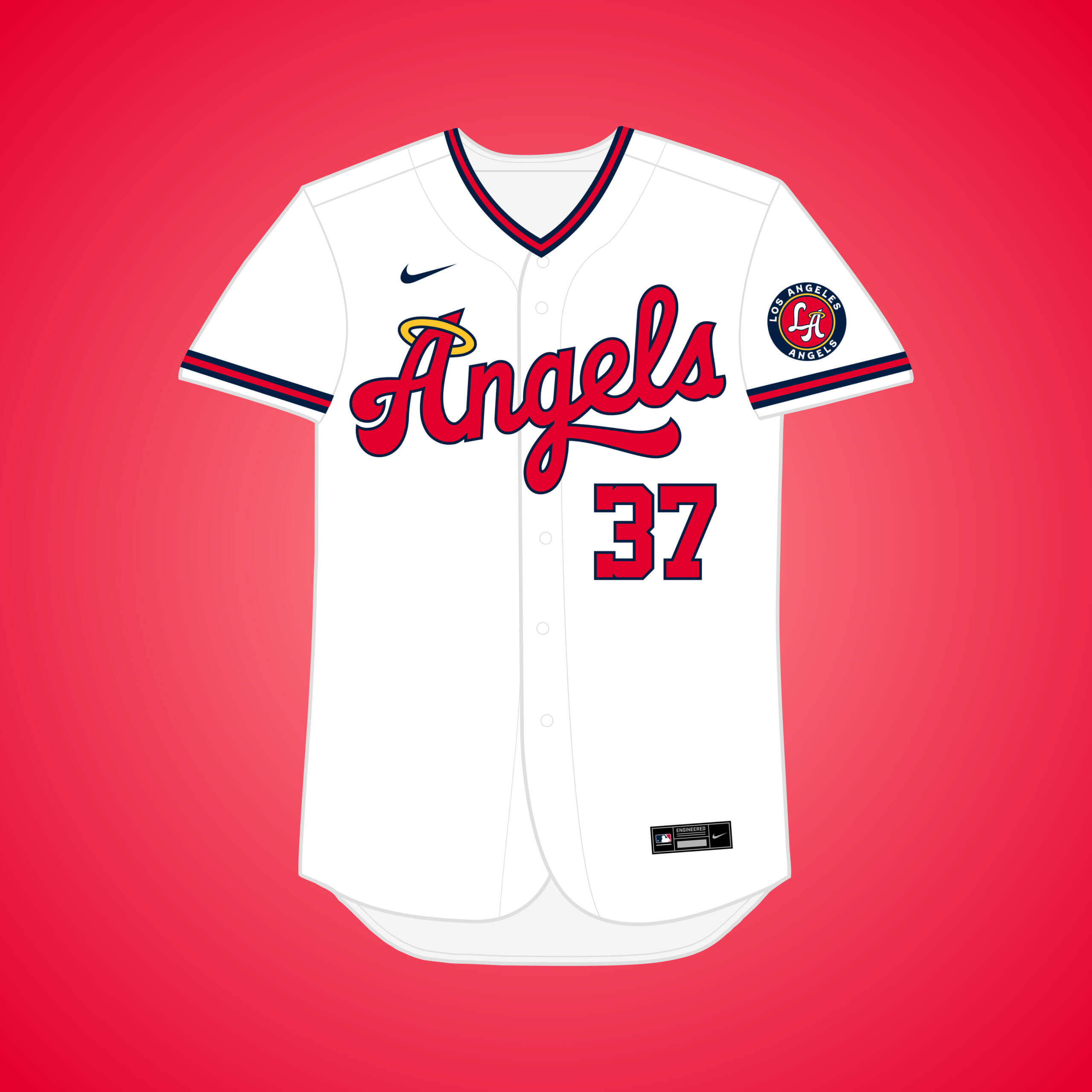
This is the same premise as my other Senators → Angels set, just with more of a Senators style as opposed to the Twins.
What if… the Browns relocated to Los Angeles?
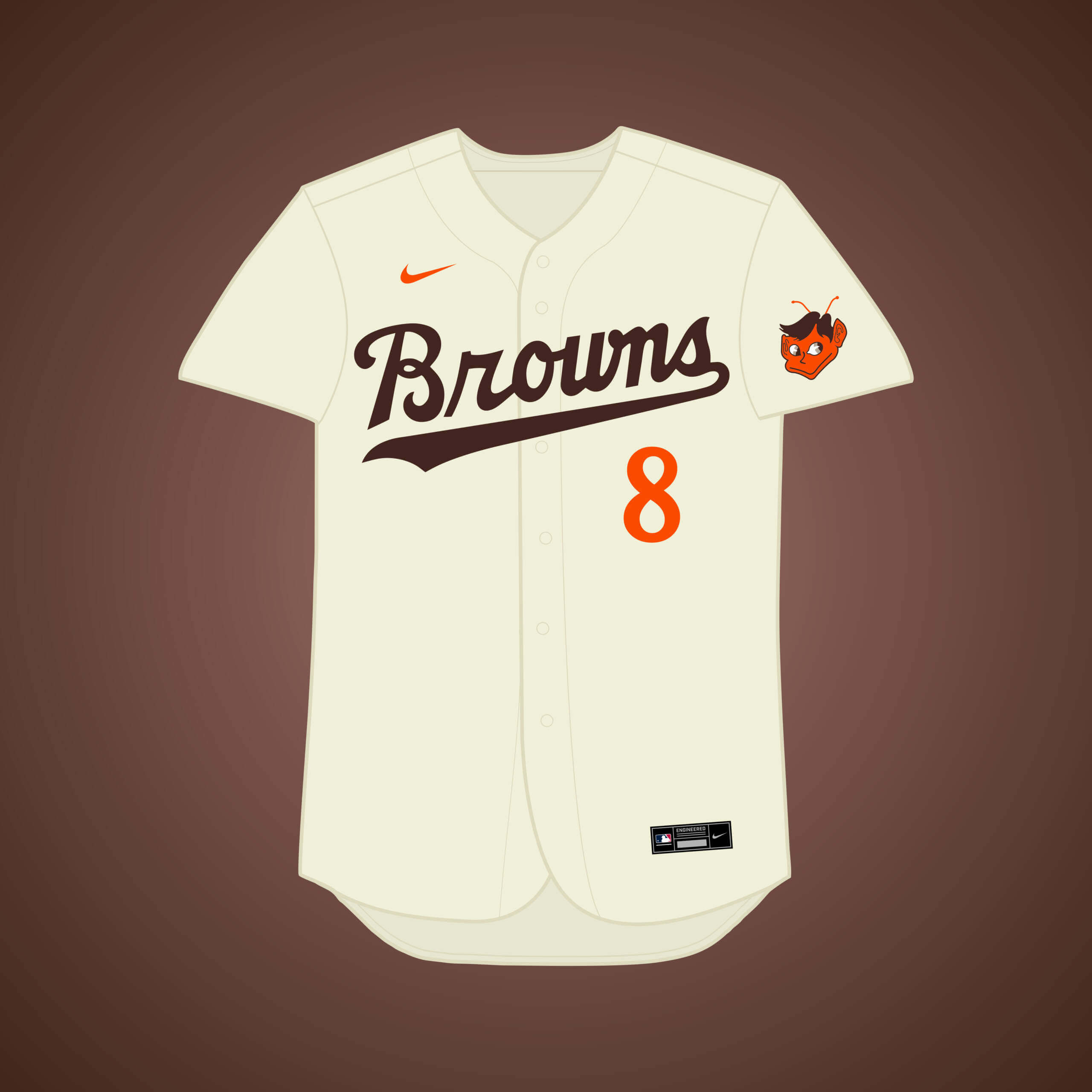
The owner’s vote on the move was set to occur on December 8th, 1941. If you know US history, you’d understand why the owners unanimously rejected it, including the Browns. The Browns’ script & colors combine with classic Dodgers.
What if… the Braves remained in Milwaukee?
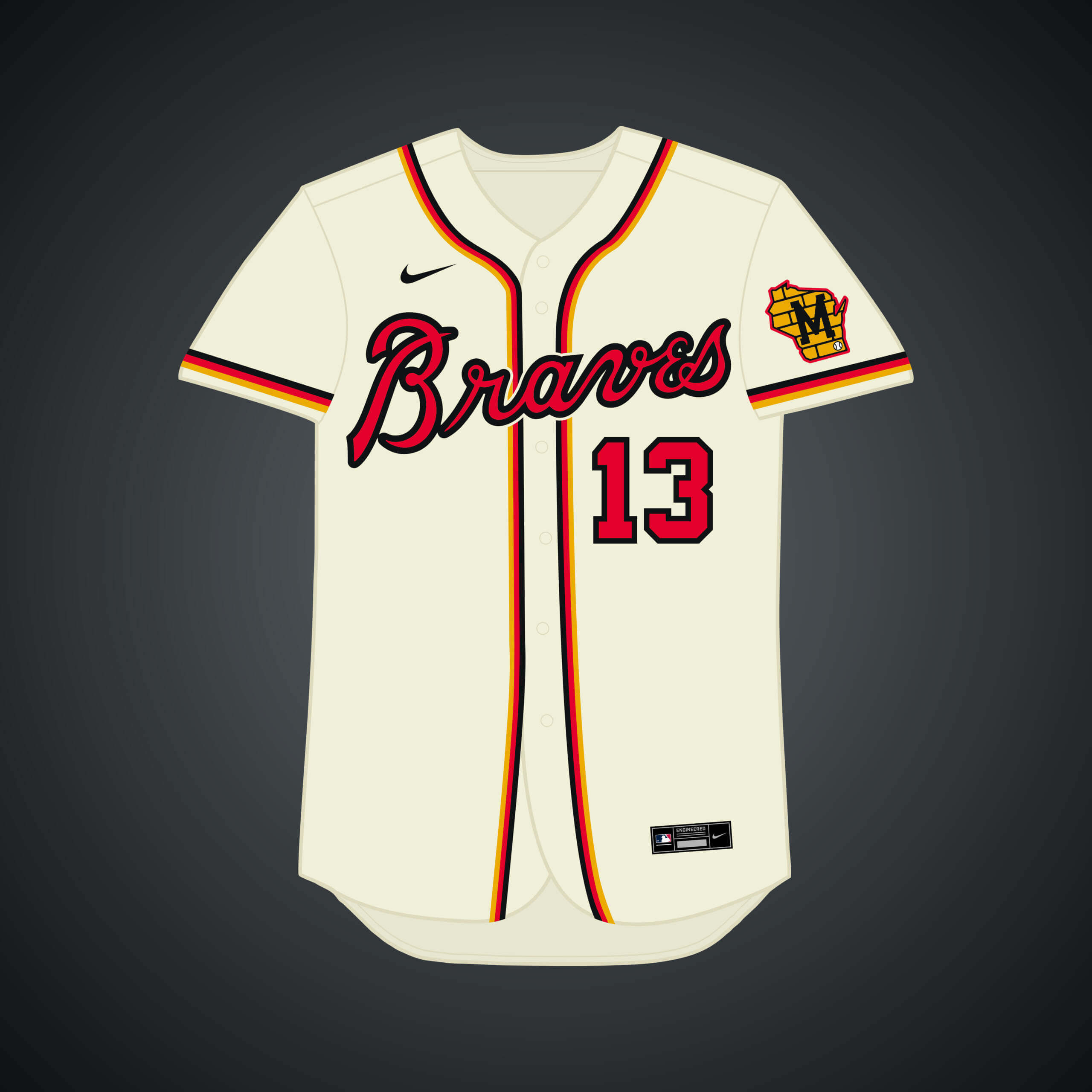
The Braves left for Atlanta in 1966, but what if they never did? Like the Milwaukee White Sox, I went with a Germanic black, red, & gold scheme by elevating gold’s presence in the set.
What if… the White Sox relocated to Milwaukee?
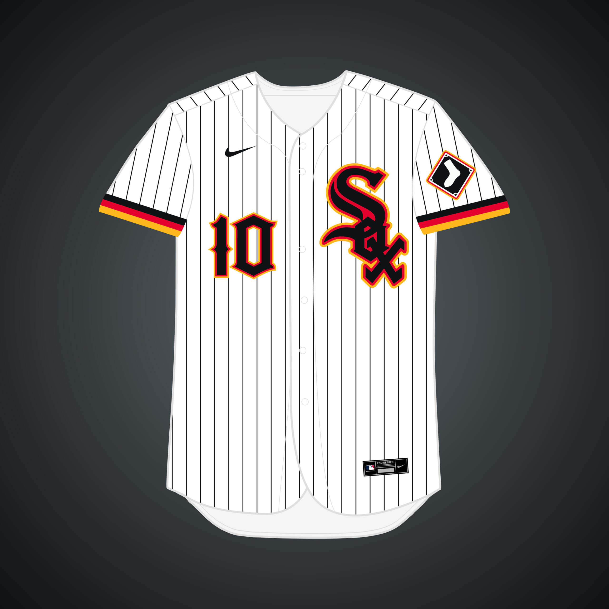
The Sox played 10 regular season games in Milwaukee in 1968, seen as a move by Bud Selig to try to lure the team to move there. Red & gold accents are added to the Sox’ look to capture the Germanic culture in the city.
What if… the Giants relocated to Minneapolis (and changed their name)?
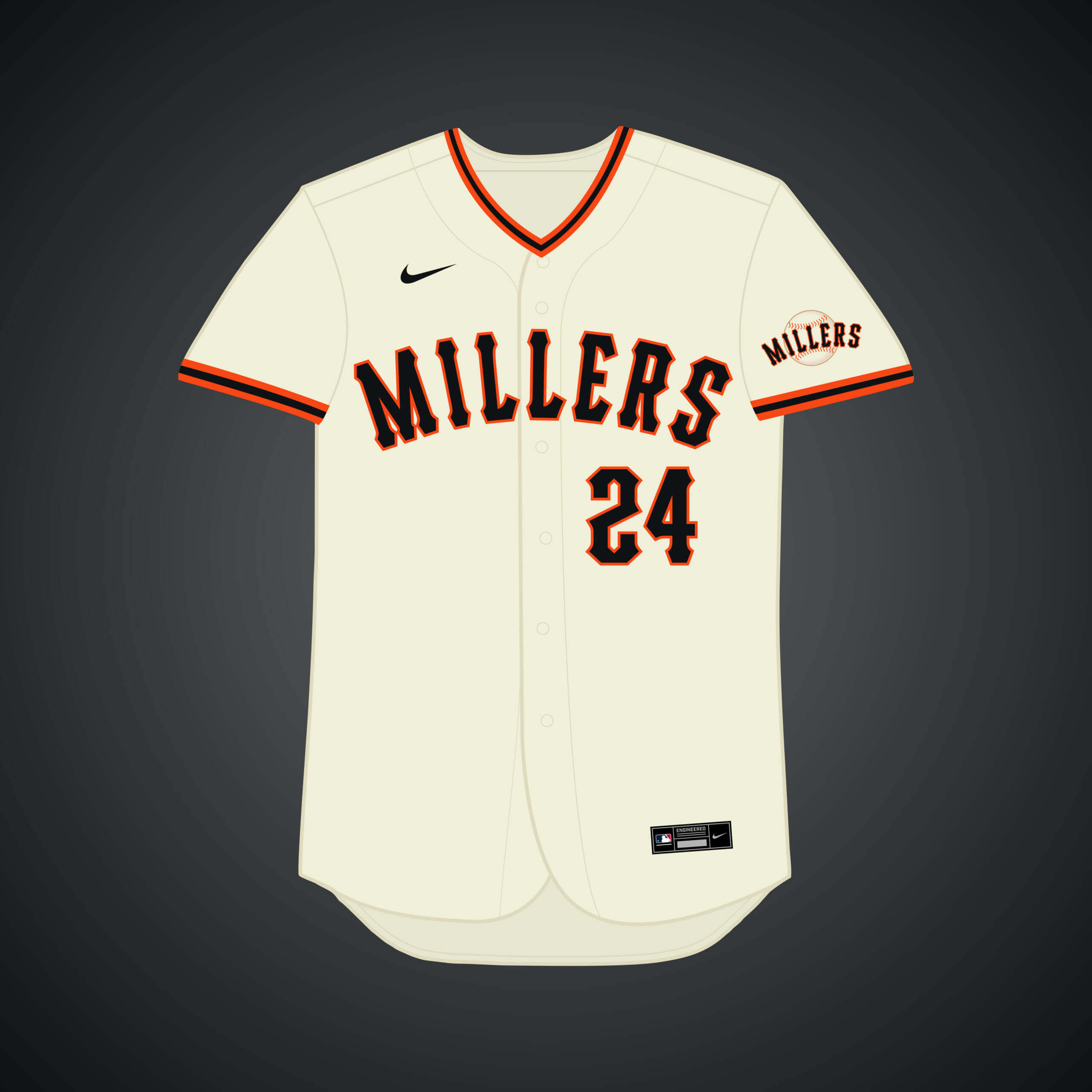
They nearly did move in the 50’s, to the city of their top farm team, the Minneapolis Millers. However, the Dodgers lured them out west. The Giants’ aesthetic combines with a few Twins elements.
What if… the Giants remained in New York?
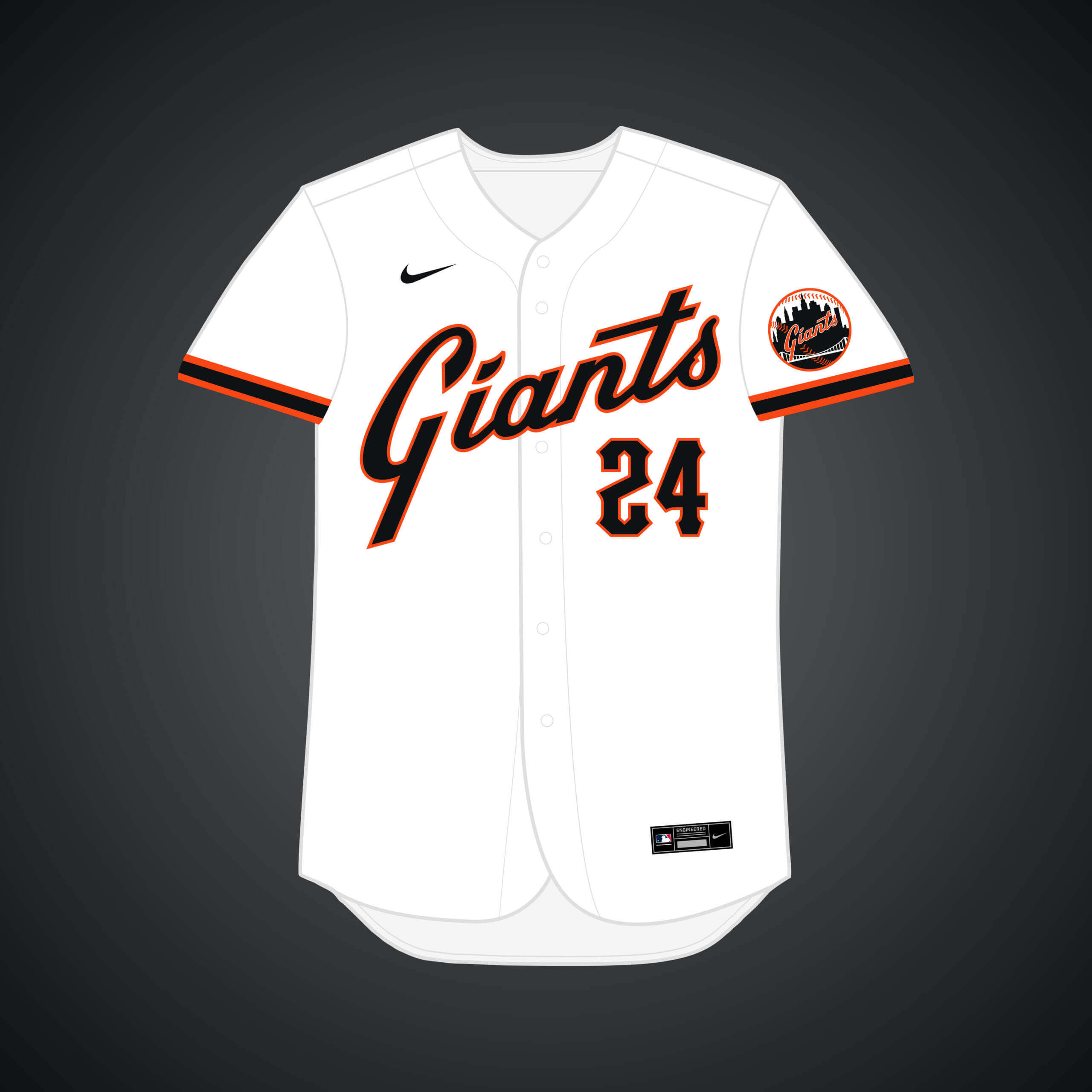
The Giants left for San Francisco in 1958, but what if they never did? I kept the gothic style of the font from that era, befitting of New York, & added the Giants script & a new striping pattern for more of a Mets-like flair.
What if… the Athletics relocated to Portland?
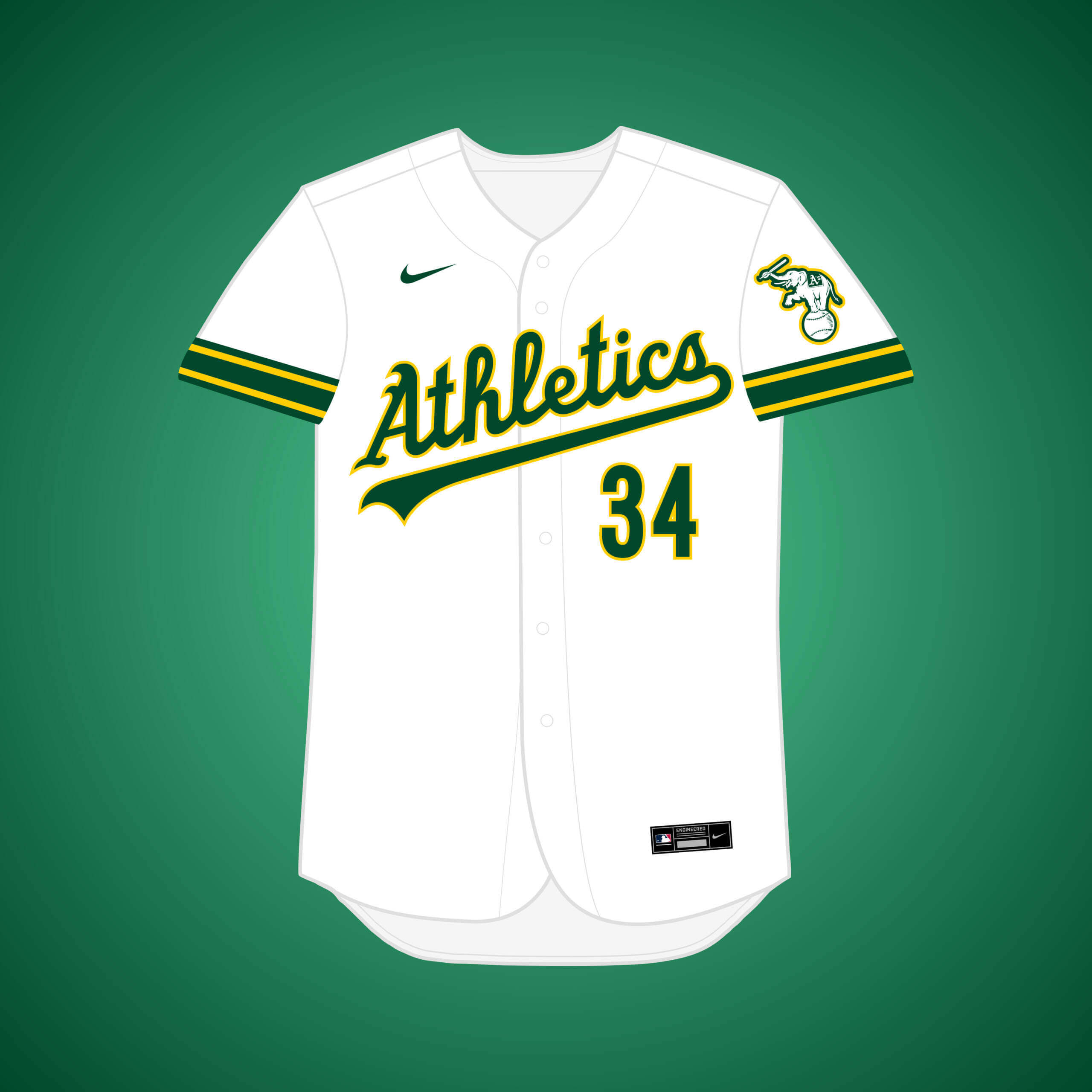
This rumor has been present since the 2000’s, and I remember it gaining a lot of prominence in the 2010’s. I brightened up the yellow to sync with the Portland Timbers.
What if… the Athletics relocated to San Diego?
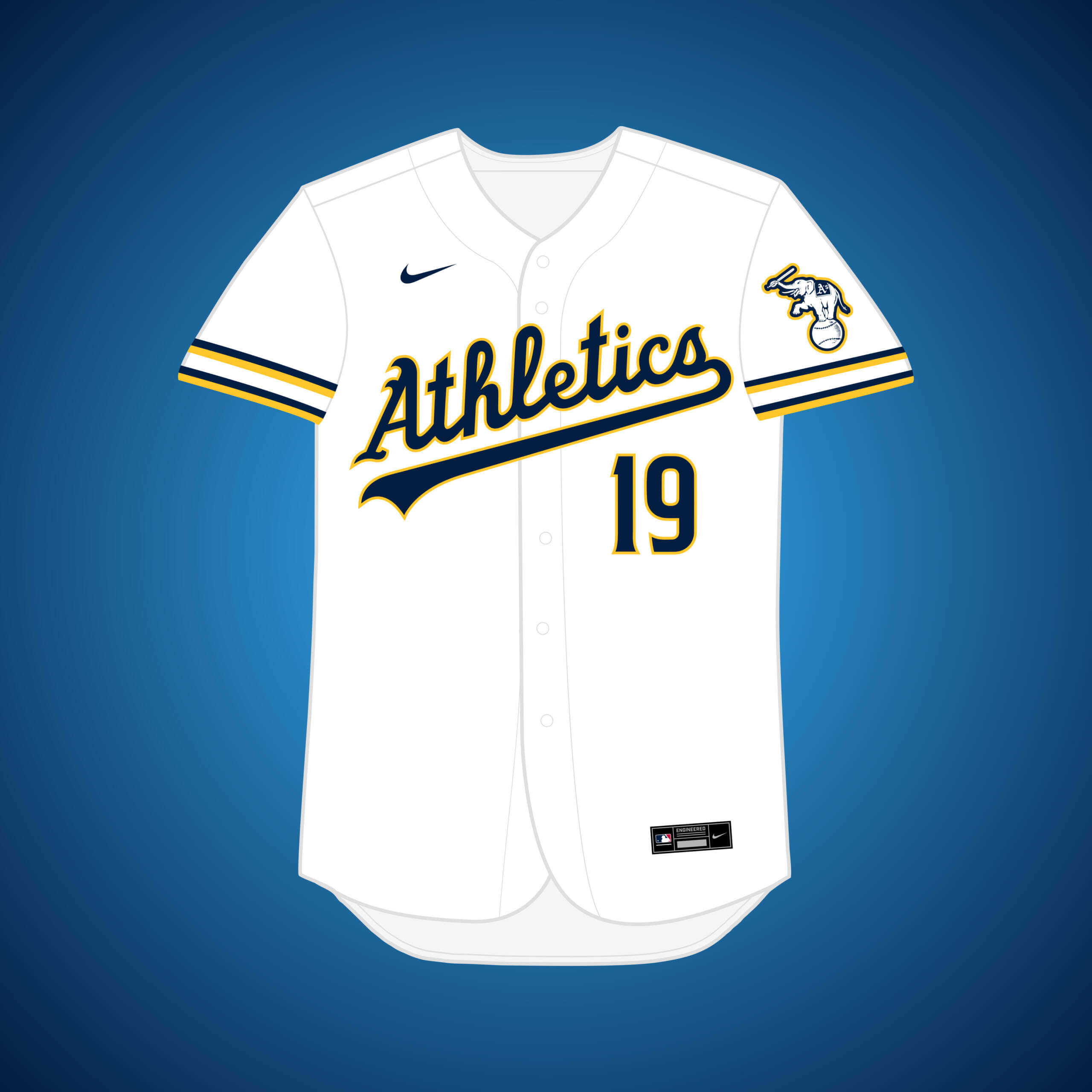
Yet another move that A’s owner Charlie O. looked into, forest green is replaced by navy to lean into an aesthetic inspired by the (now departed) Chargers.
What if… the Senators relocated to San Francisco (and changed their name)?
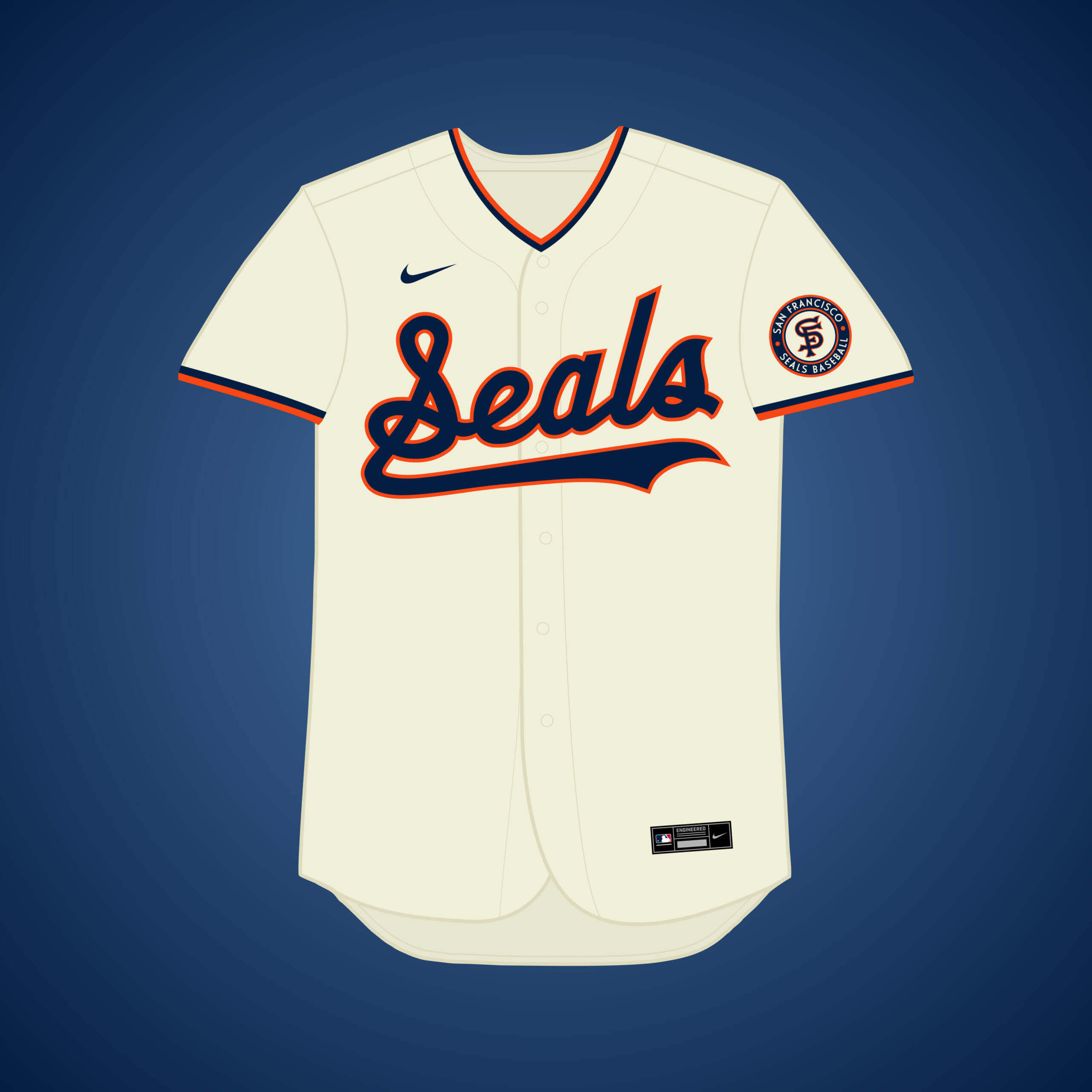
Once the Dodgers began winning the LA battle, the Senators pivoted to San Francisco, but the Giants won out because they were in the NL. The PCL’s San Francisco Seals combine with Senators/Nationals logo styles.
What if… the Pilots remained in Seattle?
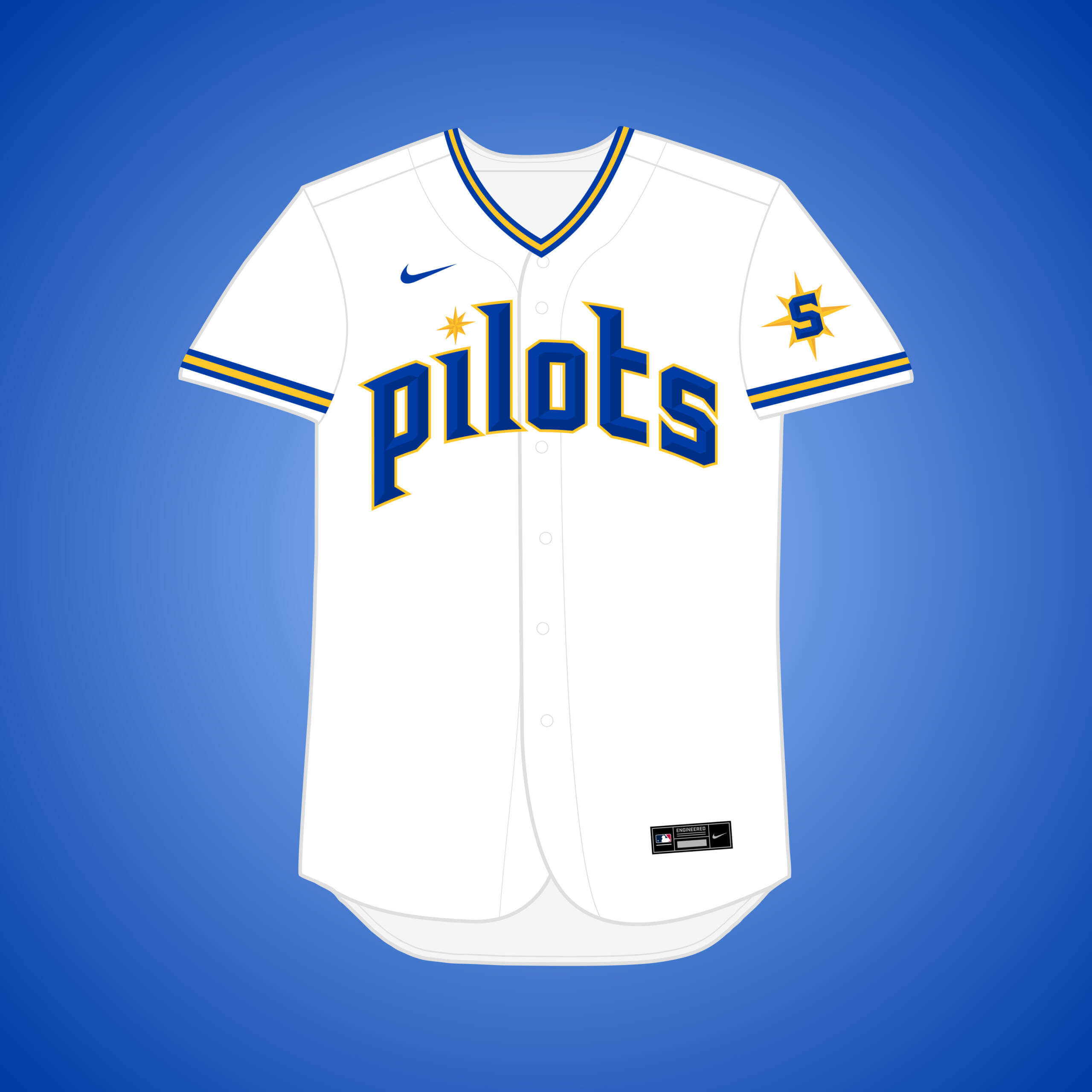
The Pilots only lasted one season in Seattle before moving to Milwaukee in 1970 and becoming the Brewers, but what if they were able to stay? This set takes heavy inspiration from the Mariners’ recent City Connect jersey.
What if… the Athletics relocated to Tampa Bay?
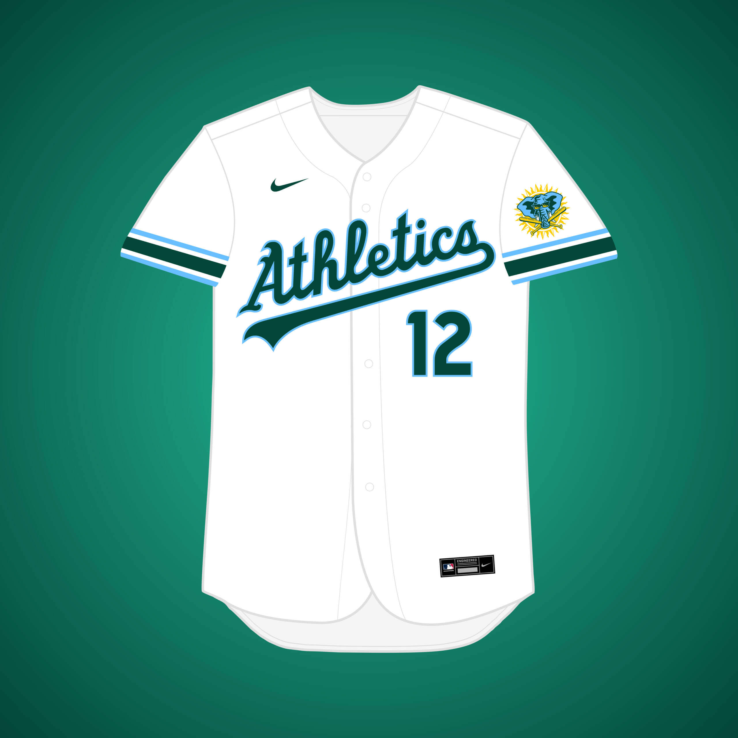
Unsurprisingly, the A’s were one of the teams interested in Tampa Bay in the 80’s. Rays’ columbia blue combines with A’s forest green to create a unique color scheme.
What if… the Rangers relocated to Tampa Bay (and changed their name)?
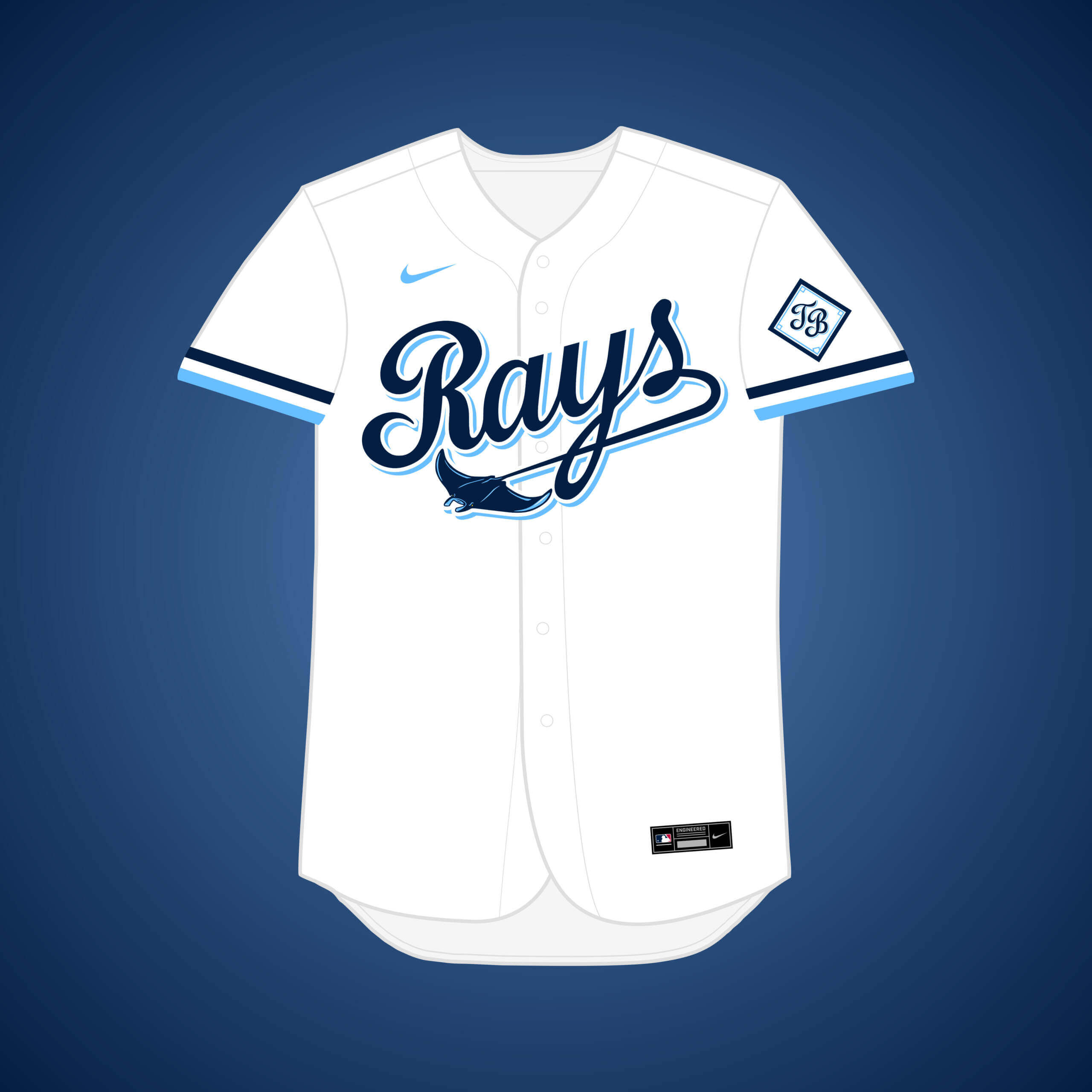
The Rangers tried negotiating a deal to sell the team to a Tampa group in the late 80’s, but it fell through. I combined the Rangers’ script font with the Rays’ beautiful color scheme.
What if… the Giants relocated to Toronto (and changed their color scheme)?
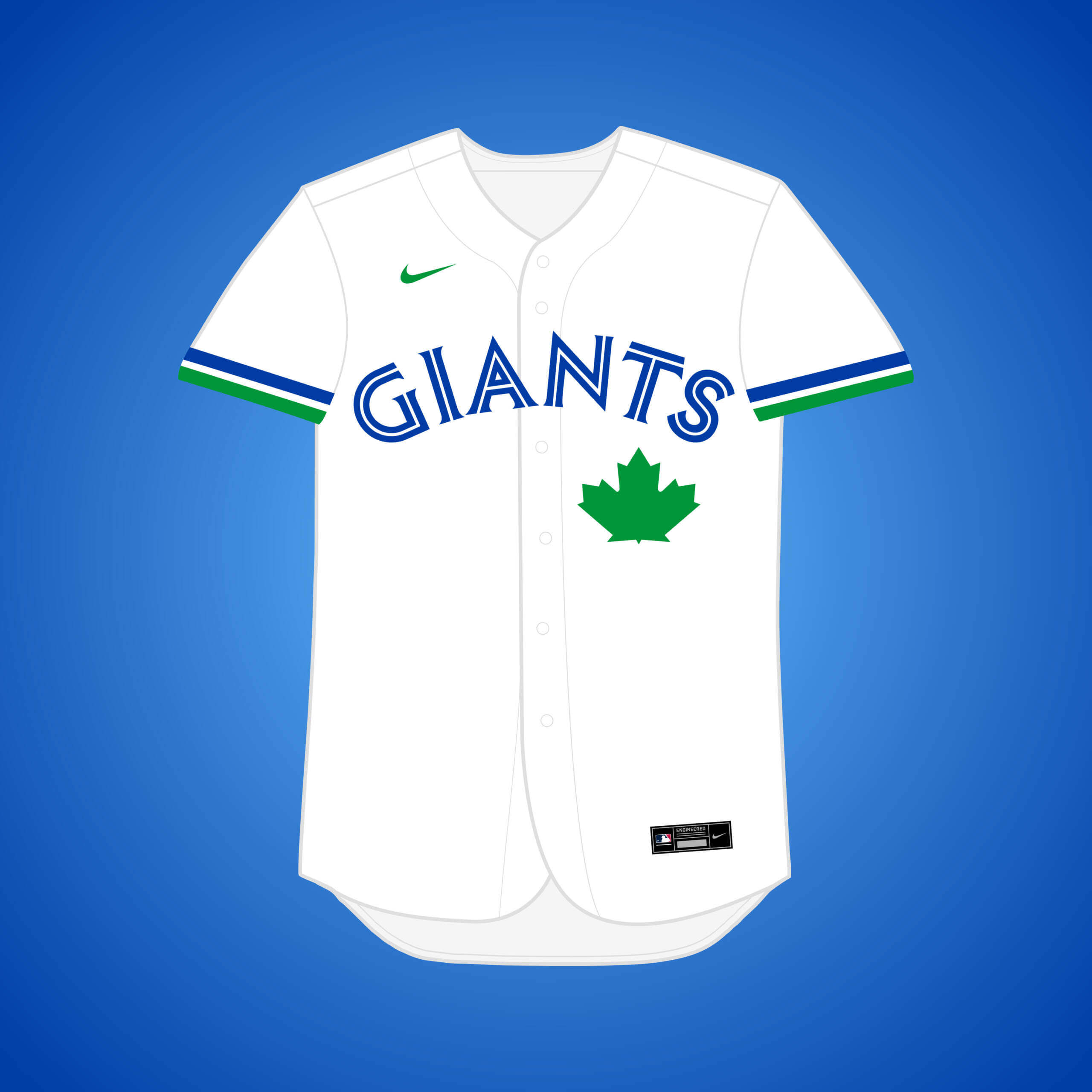
Going back to the Toronto Giants, I hinted at a new color scheme they considered, which is one of my favorites: royal blue & green. This change brings them closer to our universe’s Blue Jays aesthetic.
What if… the Astros relocated to Virginia (and changed their name)?
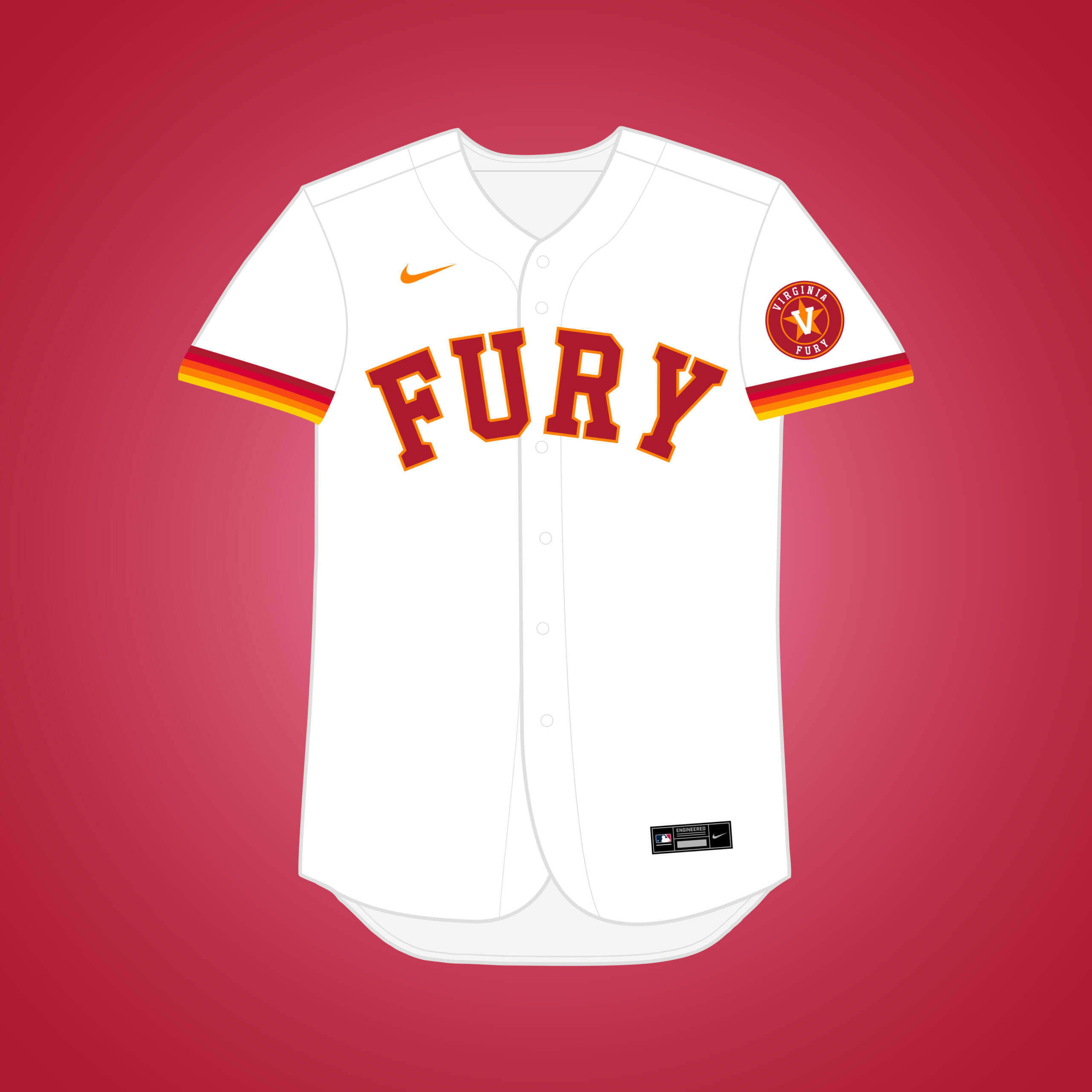
The ‘Stros had a “handshake” deal in the 90’s to move to the DC area and become the “Virginia Fury,” but it was rejected by the owners. The tequila sunrise is used to convey the “firey-ness” the name provokes.
Thanks Matthew! As I previously noted, a lot of those relocations (or teams not moving), were if not in the development stages, certainly in the planning stages, and it would have been interesting what alternate uniforms would (or might) have been created with franchise moves — another fun look at what could have happened, and looking forward to Volume III.


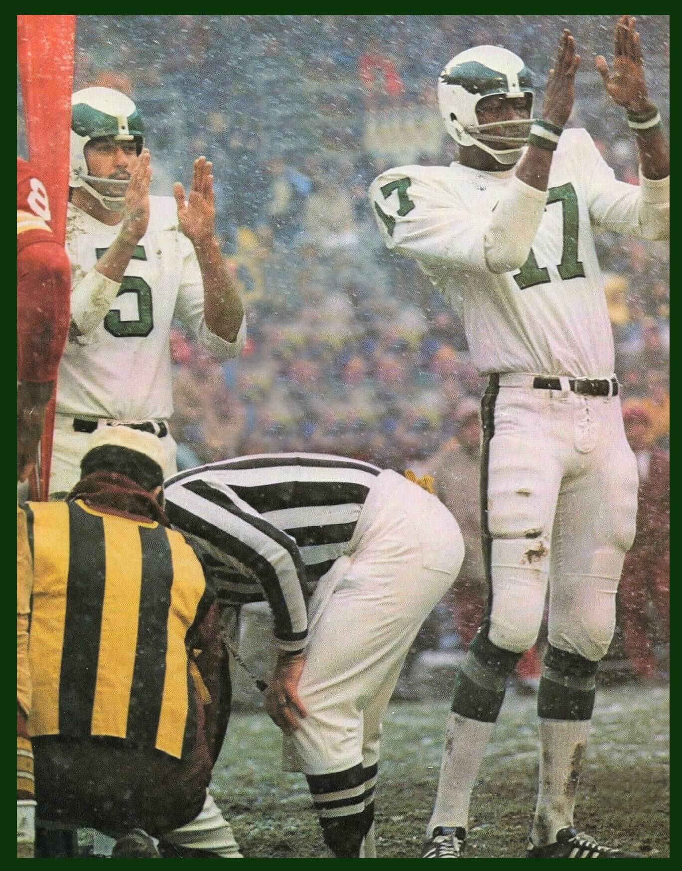
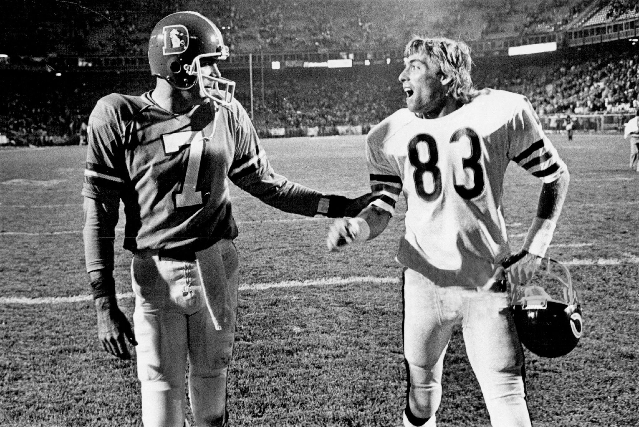

The GTGFTU is the Monday Night Football game of October 16, 1978 in which the home Denver Broncos defeated the visiting Chicago Bears 16 – 7. The photos show Bronco QB Craig Morton (7) greeting Bears WR Golden Richards (83) at the conclusion of the game. Both were former Dallas Cowboys.
You got it Mike! Craig Morton and Golden Richards were only teammates for a season and a half in Dallas, 1973 and 6 games into 1974.
You can tell I read UW before I had my morning coffee, because for a brief moment I thought, John Elway is greeting Mac Percival? Wait, that can’t be right.
And it wasn’t.
Another cup, please.
Also the last time the Bears went white- over-white (which I’ve long held should be their road standard!) in Denver during the ‘Orange Crush’ era…they wore that combo once again for their ‘03 game against the dark blue Broncos.
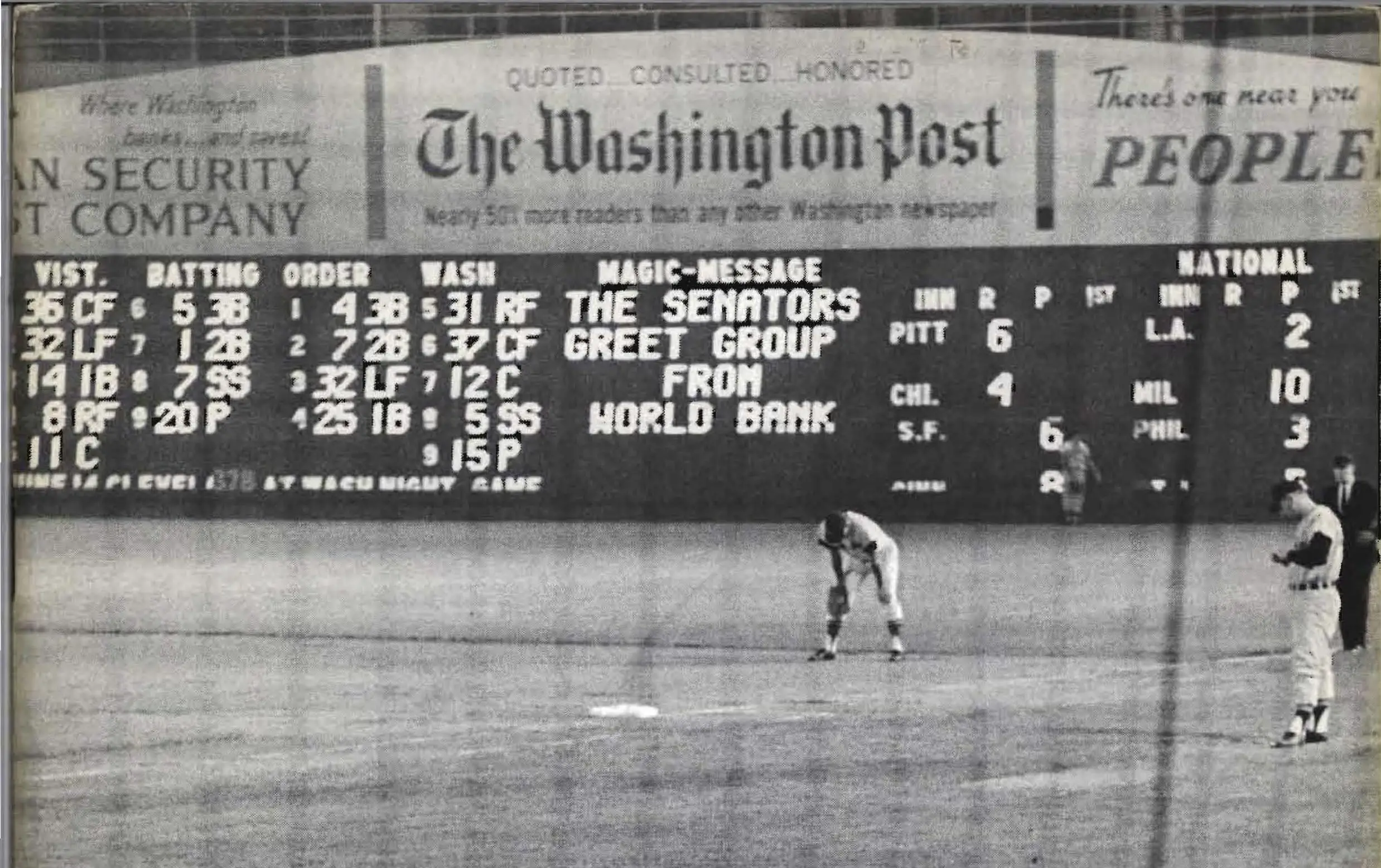
The GTGFTS is the second game of the June 13, 1962 doubleheader between the visiting Cleveland (then) Indians and the home Washington Senators. Cleveland won the game 4 – 1. Jimmy Piersall was in center field for the Senators and Tito Franconia was the first baseman for Cleveland.
I had never heard the Virginia baseball team would have been called the Fury. Source?
In yet another universe, they stayed put and became the Houston Hissy Fit.
With a name like Fury, I could very well understand why the owners rejected that proposal.
Agreed, Jim. I’m very glad it didn’t actually happen!
I know that “fury” and “furry” are two different words, but I definitely read that as the Virginia Furry. ♂️
Just about the only name that would be worse than “Fury.”
Hey William, you can listen to sports logo legend Todd Radom talk about it on Buster Olney’s “Baseball Tonight” podcast at this link (it’s towards the end, about the 3/4 mark): link
We could make a multiverse entirely based on every place the A’s could have landed. On the other end, we could have a different multiverse where every team relocates to Tampa Bay and/or Toronto.
Agreed! The A’s have by far been the most popular team in this series, and plenty of other teams were interested in Tampa, as well.
Someone get MLB on the phone now and make the Rays and Angels concepts the reular uni sets (minus relocation.) Seriously amazing upgrades for both teams, the Rays particularly.
Thanks, Dan!
Oh man i can’t wait for Vol. III. I’m really looking forward to see if the Original 1901 AL Charter Baltimore Orioles never leave for New York gets mentioned. Just imagine the history of MLB if that move never happened.
Thanks, Steve! I honestly didn’t have plans for an (original) Baltimore Orioles set, but since a user on the sportslogos.net boards also recommended it, I might have to try it out!
And the 1901 AL Charter Milwaukee Brewers (Later the Browns and Orioles)
How about a multiverse where there is no Nike?
Thank you!
Great job. I’d love to see the hats for these teams, especially the Angels with the unique “LA”. Would they be red, navy, or like the original Angels navy with a red bill? Wonder where the Angels or Browns stadium would be located? I think I read that the Browns were going to play at the old Wrigley Stadium in LA.
Thanks Rick! For the Angels, I imagine it’d probably be navy with a red bill, although they could certainly have an all-red alternate cap, or vice-versa.
Loving these concepts, especially the Pilots and Browns.
The Raiders NEED to do that immediately!! They are a team where BfBs works and works well.
Black is a team color so it wouldn’t be BFBS.
Also, it doesn’t need to be done.
Thanks Sean!
The Browns sleeve patch, to me, doesn’t work in this context. It was a creation of Bill Veeck’s in the 50s (he liked “cute” or “amusing” logos, which is what the Smiling Indian was intended as). If the Browns go to LA in 1941, Veeck never gets his hands on them, and the logo never exists.
Besides, if the Browns moved to LA, they almost certainly would have changed their name.
Loving that Rays logo, nice work.
Thanks, Ian!
Those are some seriously nice jerseys. Well done, Matthew!
Thank you, John!
That Rays jersey and script needed to happen in 2008. Sooooo the hell better than what they chose.
Thank you, Randy!
Another terrific installment…thanks, Matthew – The Angels again look sensational!
I wish your take on the stay-put Pilots had retained the winged ball rather than compass, but it’s still a wonderful set.
It too bad the O’s don’t throwback to their StL roots. Brown and orange is a great combo for baseball – one I’ve missed since the Padres abandoned that; while their ‘80’s set is one of my uni ‘guilty pleasures’, they really belong in brown/yellow.
They did once (and I believe only once). link
Not the uni I would liked to have seen. Still better than nothing…with such a rich plethora of great unis, it’s something they should definitely consider doing again!
Wow they didn’t even try for a semblance of accuracy there. Did it on the cheap. Why bother.
Thanks, Chris! I thought about using the winged ball for the Pilots, but I couldn’t figure out how to update it properly to match the more modern-looking wordmarks.
Fun stuff, Matthew! Thanks for sharing your concepts. The Virginia Fury is the one that intrigues me the most, particularly the color scheme. As a teenager doodling uniform designs, I used a similar color scheme for a fictional Phoenix team I created: link. Looking back, I think it’s a challenging color scheme to pull off, but one that could be really unique if done right.
On a different note, I was living in Washington, DC, when the discussions about moving the Astros to Northern Virginia would have been happening. For some reason, I have no recollection of it, and I was certainly an avid sports fan at the time. I’m not sure how I missed it, but it’s not hard to find information about it online. Oh, well! I guess the Astros’ current retractable-roofed stadium is the result of those neogtiations.
Thank you! Your concept looks really nice! It was a fun challenge to try to pull off the ‘Stros “tequila sunrise” color scheme without the dark, cool navy to balance it out.
I didn’t know much about this Astros relocation prior to this series, either. I think it would’ve been at least a little bit smarter if they moved to DC proper, which you’ll see in Volume III.
Thanks for the kind words, Matthew! I’m definitely looking forward to Volume III!
These are as beautiful as they are intriguing.
Any chance we could get these put into production? Or a t-shirt series? Caps?
Would Ebbets Field Flannels bite?
Thanks, Aron! I’m actually just now starting to look into that, although I think a good amount of them might not be allowed to be made due to copyright restrictions. Stay tuned, though!
Cool! Fingers crossed!
Excellent stuff. Some of these might have worked pretty well but I am glad the Giants left town and the Mets came into existence.
I’m late to this, but I had a Multiverse concept where the Mariners moved to Tampa Bay after the 1995 season when they failed to secure funding for a new stadium, which led to the Washington/Northern Virginia area to get a 1998 Expansion Team, and the embattled Expos moving to Seattle after the 2004 season.
The team would remain the Expos, which would now reference the 1962 World’s Fair instead of Expo ’67. The NL team would use a hunter green (since they wouldn’t really be competing with the A’s for ownership of the color) and the “Galaxy Gold” sort of metallic orange color that was originally used to paint the Space Needle.
I did a couple of drawings about it, but I didn’t really put anything together digitally.