[Editor’s Note: Paul is on his annual August break from site (although he’s still writing his weekly Substack column). Deputy editor Phil Hecken is in charge from now through the end of the month.]
Good morning, Uni Watch! It’s Friday — we made it.
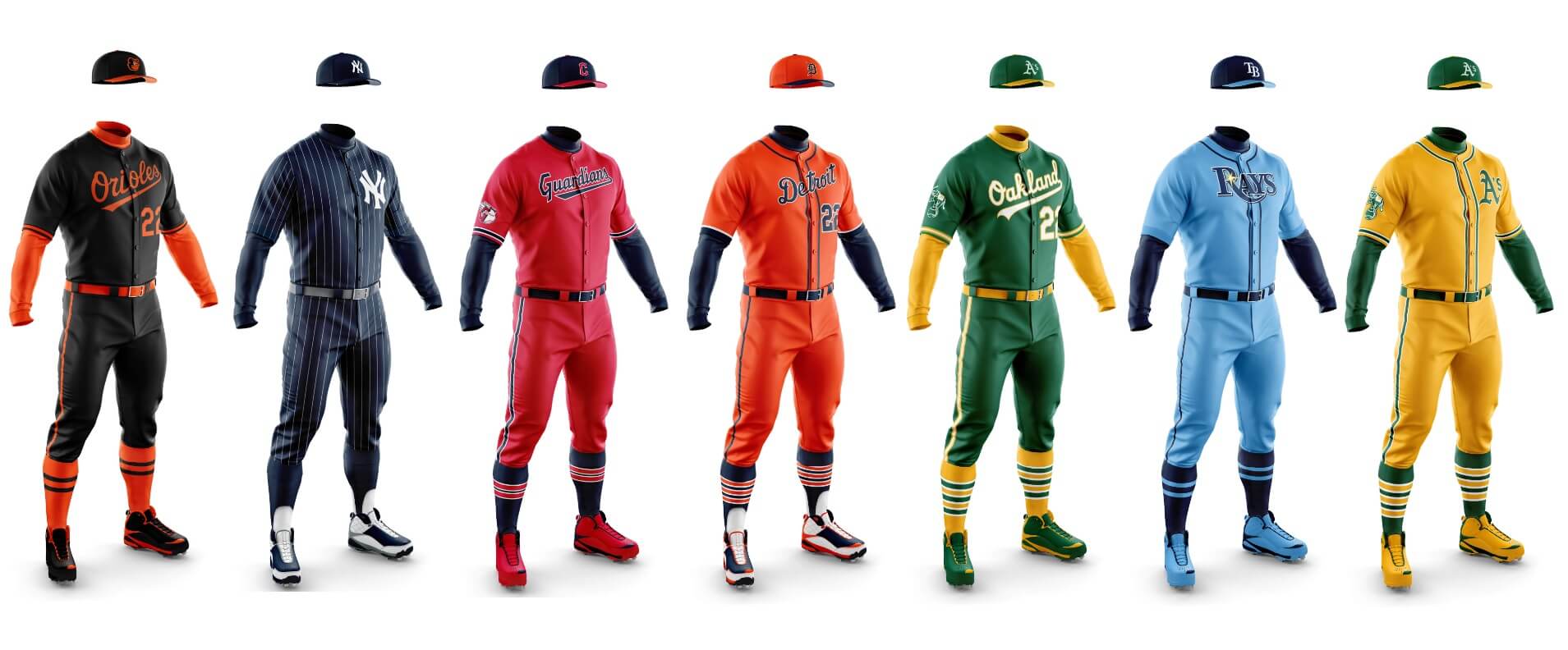
I’m back again today with Chris Diamond to bring you Part II of our series exploring mono-dark uniforms. In Phase I we looked at how every team with a dark alternate jersey would look if it were paired with same-color dark pants, making no changes to the caps, jerseys or socks. In Phase II, we’re going back and seeing which teams “made the cut” for possible mono uniforms, and also creating dark mono uniforms for teams who currently don’t sport a dark alternate jersey. In the NL, that was LA and St. Louis, and today you’ll see what Chris has created for the Detroit Tigers and New York Yankees (gasp!).
If you missed Part I of Phase II (which also includes links to all of our Phase I articles), click here. Everything you need to know is explained in those posts.
Let’s move on to the American League. As with Part I, I’ll identify which of us selected the uniforms we’ve chosen to be considered for possible dark-mono usage, plus look at the Yankees and Tigers’ proposed dark mono alternates.
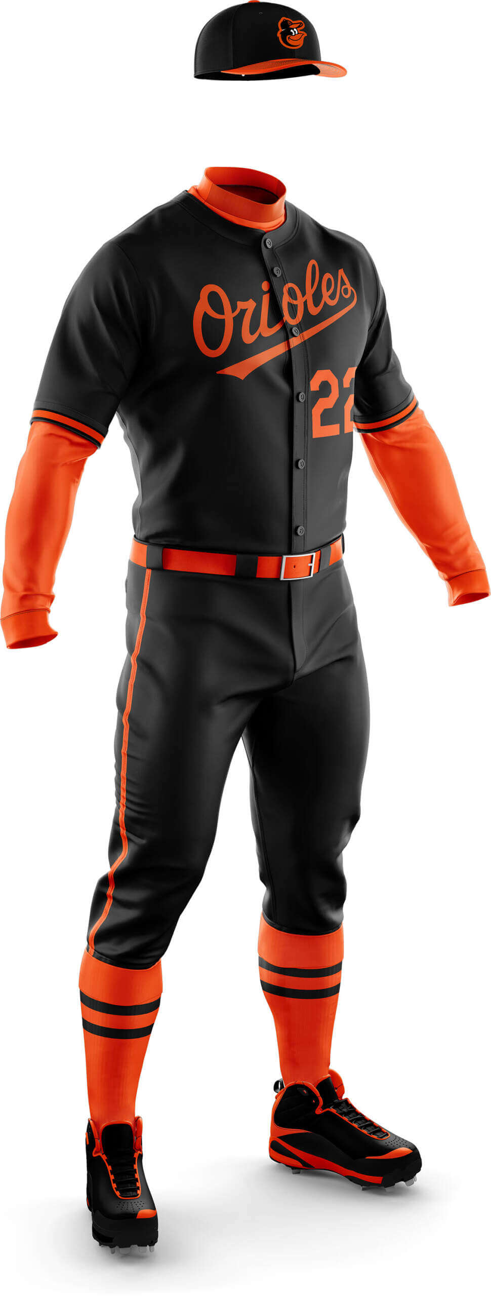
Phil Hecken: I loved these when we first saw them in Part I, and while the Orioles introduced their mono-black City Connect unis earlier this year, I think this look is much more befitting than the CC uni.
Chris Diamond: I liked these before so the same plus a bit of sock tweakery still gets the thumbs up.
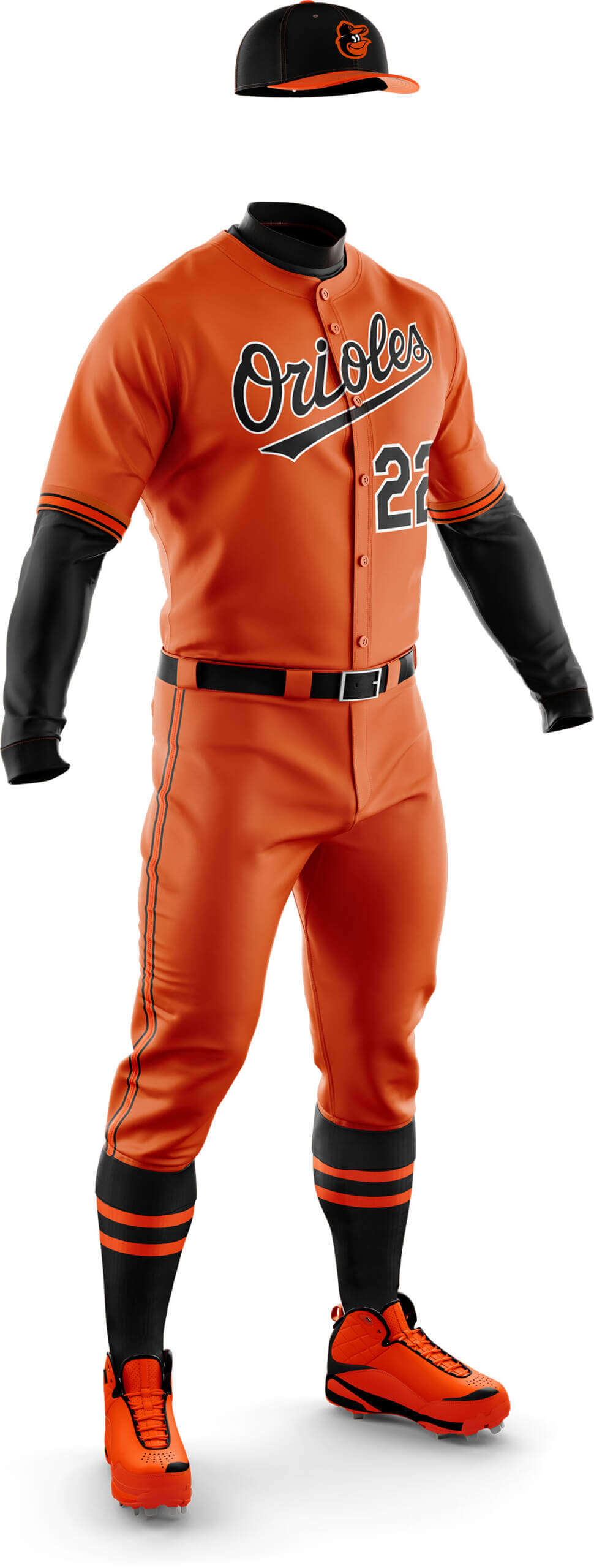
PH: And I think I love these even more than the all-black version above. Plus, these are a harkback to the early 1970s all-orange unis which were worn, I believe, a total of four times. Those were sold to the Orioles by Brooks Robinson Sporting Goods, dontcha know! The team even brought that look back as a throwback a decade or so ago.
CD: Replacing the home cap (I dislike all contrasting front panel hats) has helped, but it’s still a bit too orange as the trim doesn’t provide enough contrast for me.
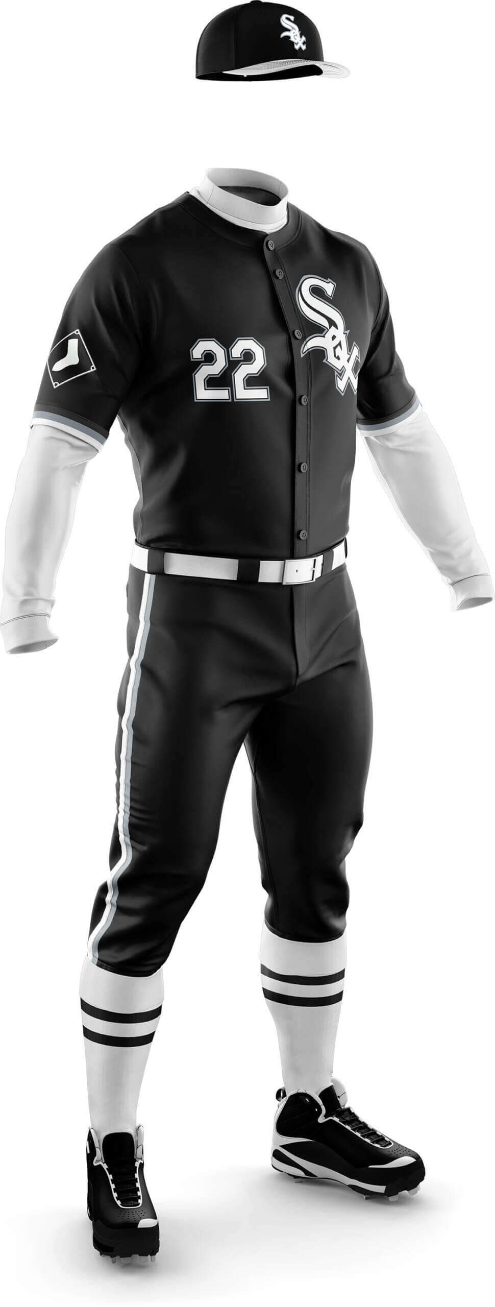
PH: We’ve already put forth a couple mono-black uniforms for consideration, but this White Sox getup, featuring, ya know, white socks, really needs to happen. It’s also a modern take on a previous mono-dark uni from their past (a look they also tried to revive in the mid-1970s. Like the Orioles, the Sox already have a mono-dark CC, but there’s room for both here.
CD: I preferred the all-black look in Phase I, but this one is good, too, and the addition of a white brim to the cap improves things.
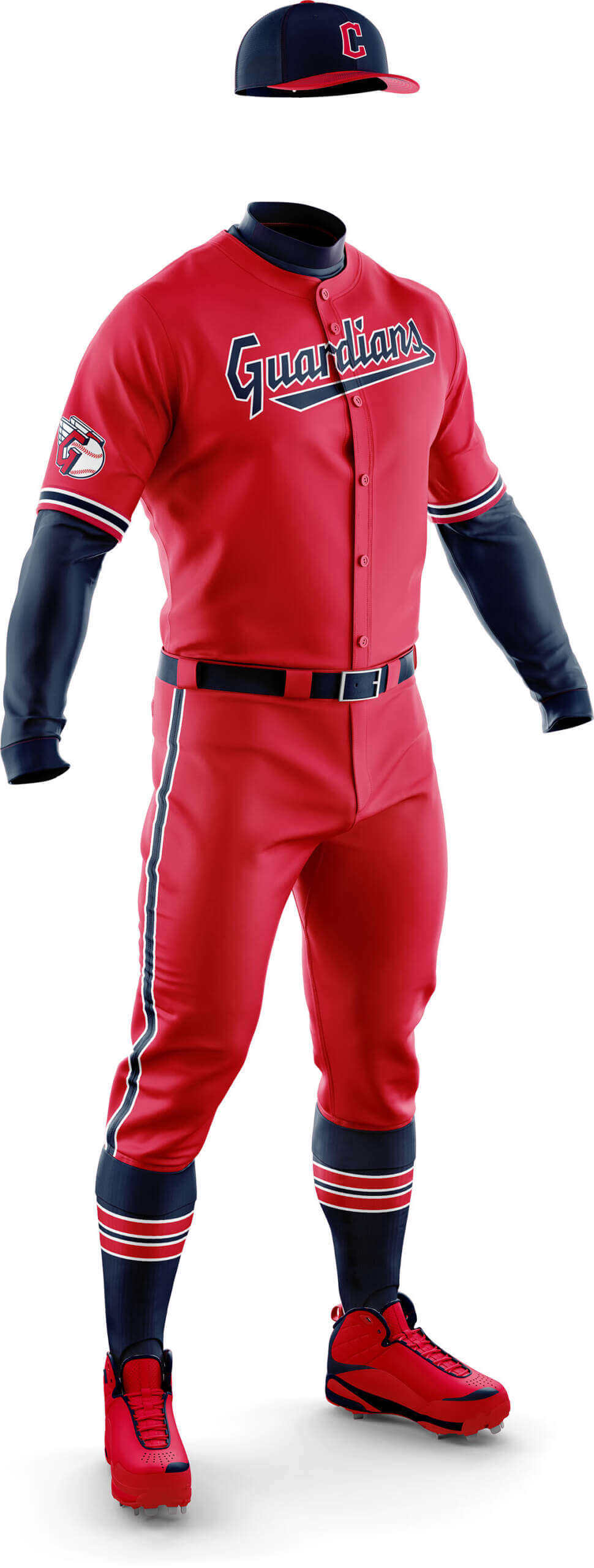
PH: Yet another mono-dark that has historical precedence. Granted, those Caveman uniforms weren’t for everyone (and were clearly of their time), but I grew up when they wore these, so they always have a soft spot in my heart.
CD: I didn’t like this in Phase I but the tweaks inspired by the 1970s Caveman uniforms have changed my mind!
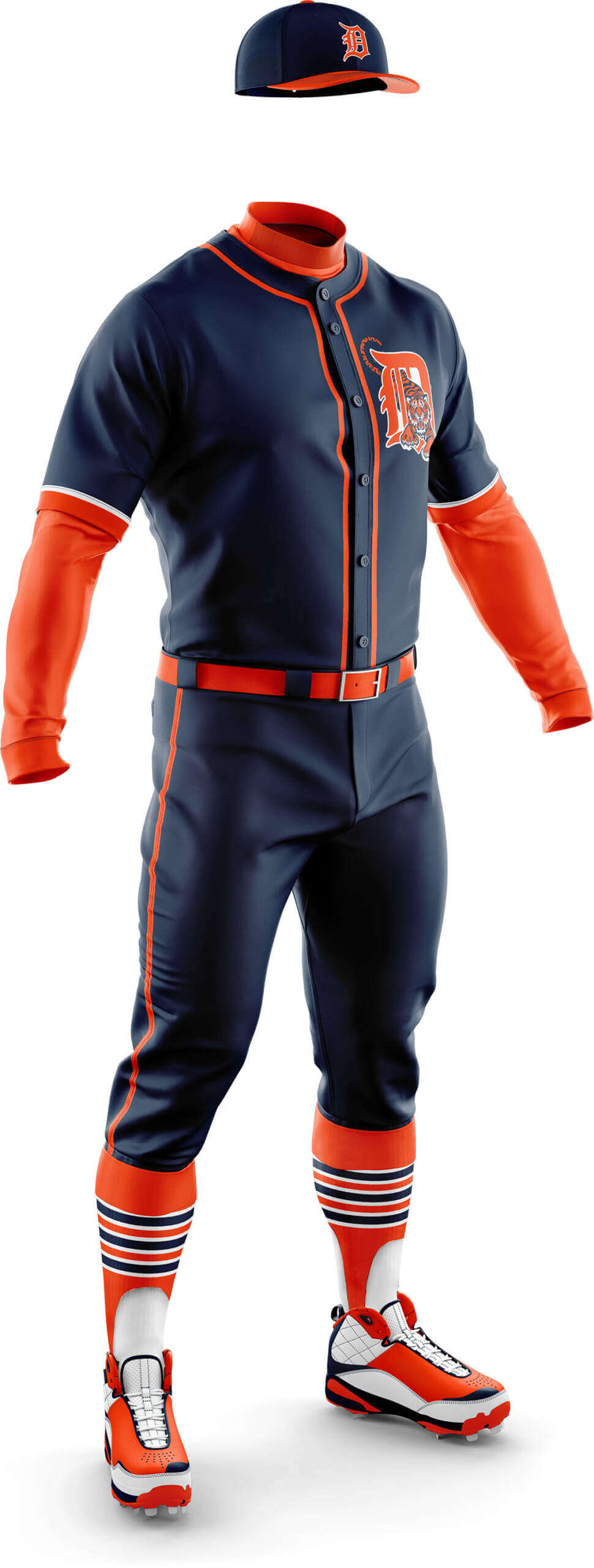
CD: The Tigers currently have no softball top so they weren’t in Phase I. This is my attempt to mix the heavy sleeve stripes from the 80s era jerseys with something based on the 1995 jersey. I’ve also created a new cap to go with the look.
PH: I think teams should have fewer alternate jerseys, not more, but this one is kinda cool. Add in the midnight navy pants and it’s a looker. I don’t think I’d actually want to see this one on the field very often, but if the Tiggers wanted to break them out some Friday night or something, I’d be down.
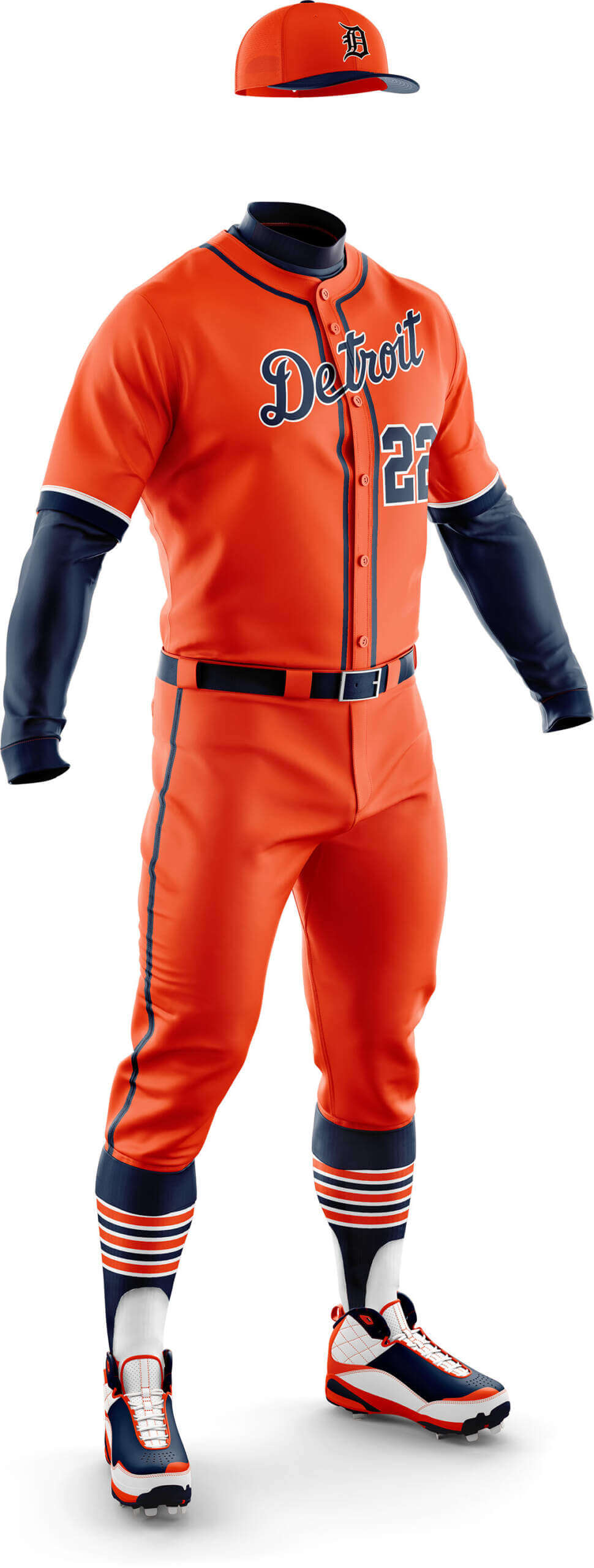
CD: The same concept as the navy one, but with the road wordmark instead of the Tiger and another new cap.
PH: While I can maybe get behind the midnight mono, I can’t with the orange. Orange works for Baltimore and San Fran, but not Detroit.
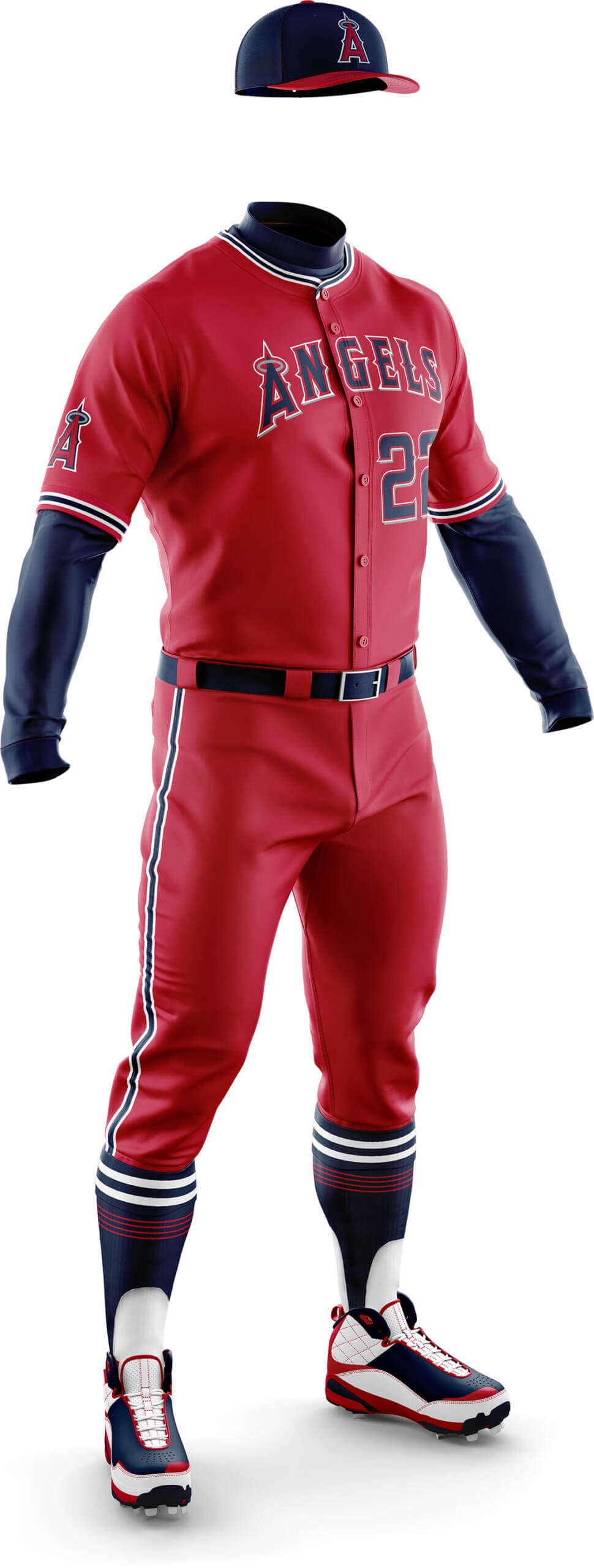
CD: There isn’t much love for the Angels current unis on UW in general. The main complaint is too much red, so I’ve tried to rectify things by bringing in more navy to better match the California Angels era which seems to be most favoured.
PH: I think Chris has done about the best anyone can to try to fix the Angels red jersey, but as Butthead once said to Beavis, “You can’t polish a turd.” The navy blue really helps (I love the cap, sleeve and sock treatment), but it still just doesn’t work for me. That’s not Chris’ fault — it’s just a really rough jersey and it needs major changes IMO.
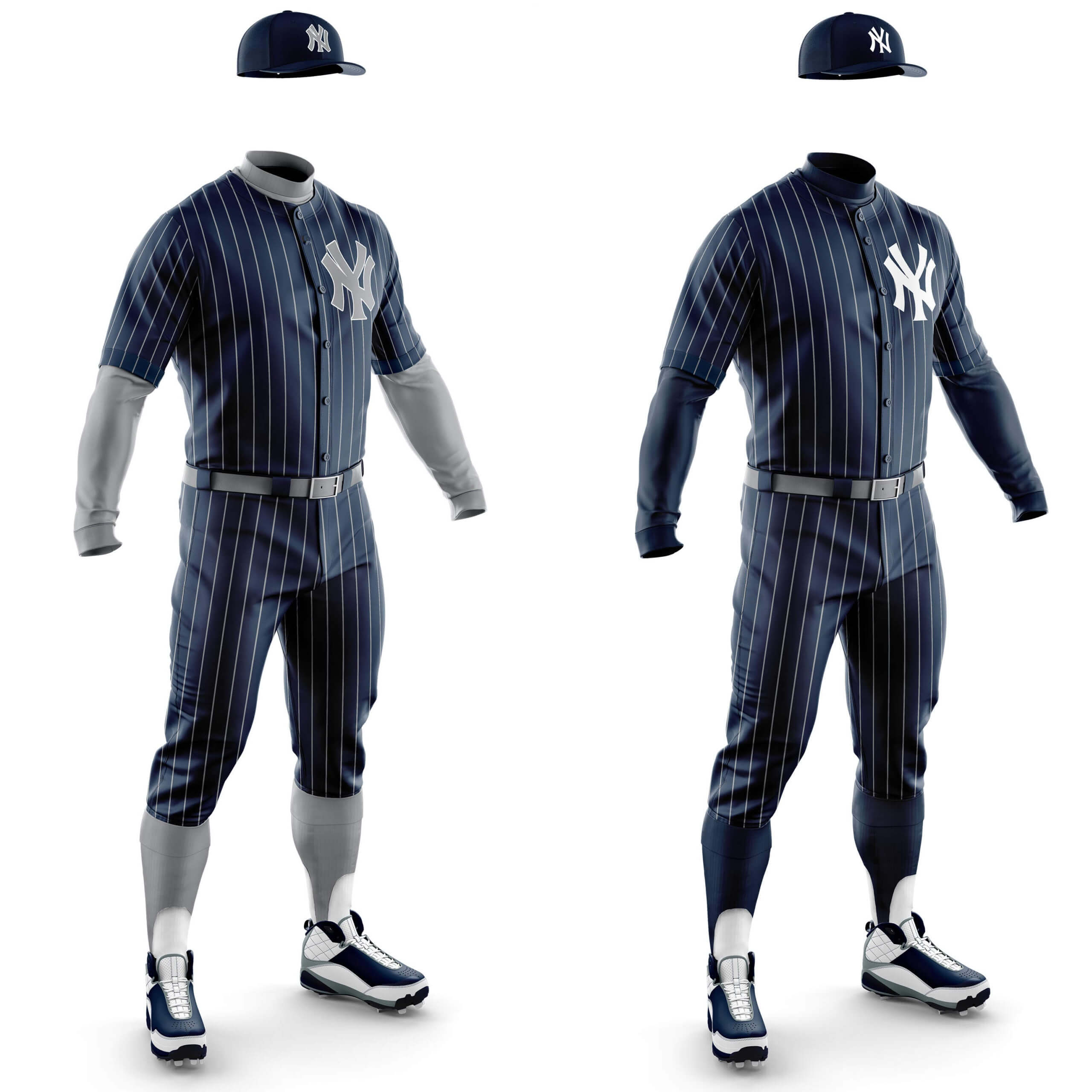
CD: Another team missing from Phase I, a lot of Yankee softball top concepts involve using reverse colour white pinstripes. I feel these look a bit stark and can end up looking too much like something Edward G Robinson might have worn in a gangster film! So here I have softened the harshness by making the pinstripes grey rather than white, then just adding the reversed colour logo. Everything else is the same as the home whites, but the pinstripes stop it looking mono even with all the navy! I also concepted an extension of the previous idea by adding in more grey to make a bigger difference. I like both of the concepts, but I think I prefer this one as it feels like it’s more of an alternate jersey than just a colour flip.
PH: Although I’m opposed to more alternates, I encouraged Chris to create the midnight navy uniform, and after a couple tweaks, he came up with one I absolutely love! To me, this is the vision Gabe Paul had back in 1974 come to life. This should be the Yankees CC uni. Done and done!
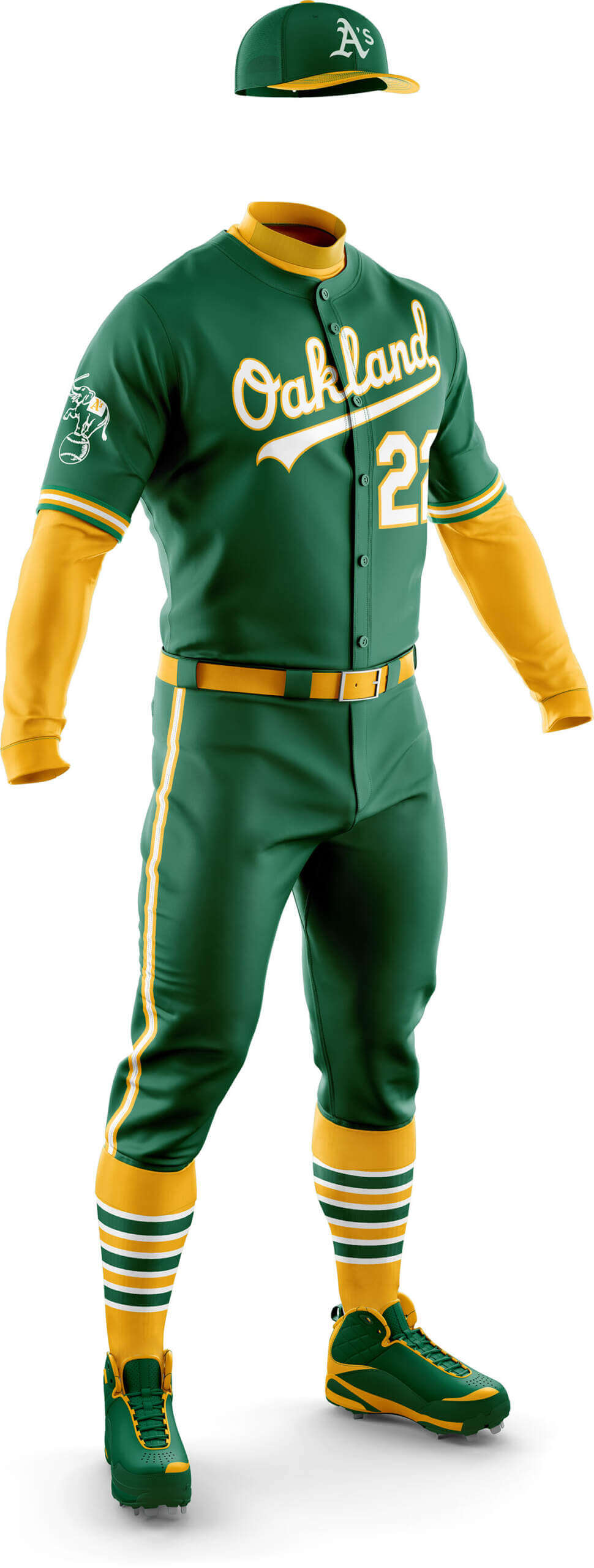
PH: Is anyone sensing a pattern here? The mono-dark uniforms I most like all seem to have a similar uniform worn previously. This is no exception. When the A’s move to Las Vegas, they need to consider making the mono-kelly uniform a reality.
CD: Another gem from Phase I where flipping the cap bill colour has just made it perfect.

CD: Based on their 2014 jersey, just extended to be mono.
PH: It’s hard to believe the A’s don’t currently have a gold jersey. But they have such a rich history in “Fort Knox Gold” that I basically begged Chris to create a mono-gold uni for Phase II. And he has succeeded. And I love it!
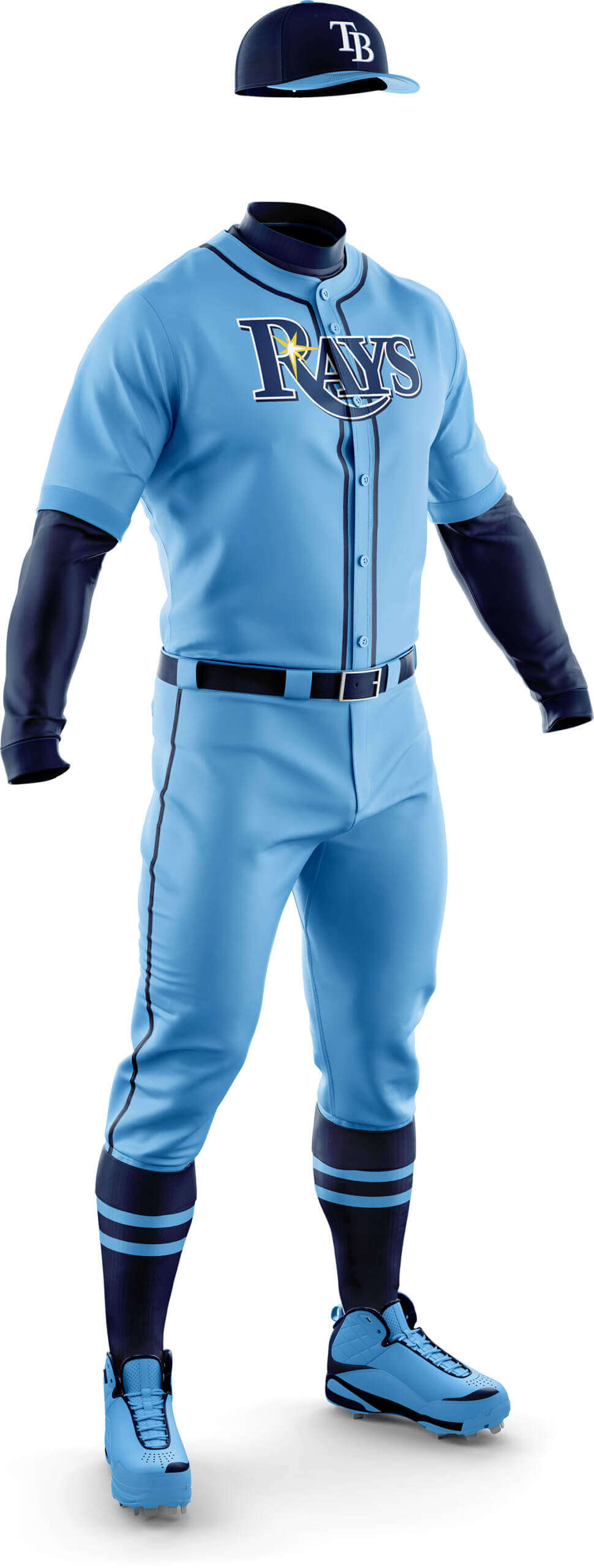
CD: As I mentioned in Phase I, I’m generally not a fan of powder blues, but swapping of the splotch. .. sorry “ray” from the jersey for the wordmark and the other tweaks have actually made me like this now!
PH: I loved this when I saw it in Phase I, but I knew they needed to ditch the sunburst and place the “Rays” wordmark on the chest. Done and done. I grew up in the powder blue era, so of course I’m more partial to it than most. But this one really works well and should be the team’s permanent road uniform.
Let us know what you think: should teams explore any of these mono-dark uniforms as alternates (eliminating the ‘softball’ effect of dark jersey over light pants)? Which of today’s concepts would you like to see on the field?


The monochrome gold A’s uniform is a winner.
Love both the A’s’ looks. I often choose to wear something similar in MLB The Show by pairing the 1970s road pants with the modern yellow jersey and hat, which I think looks amazing.
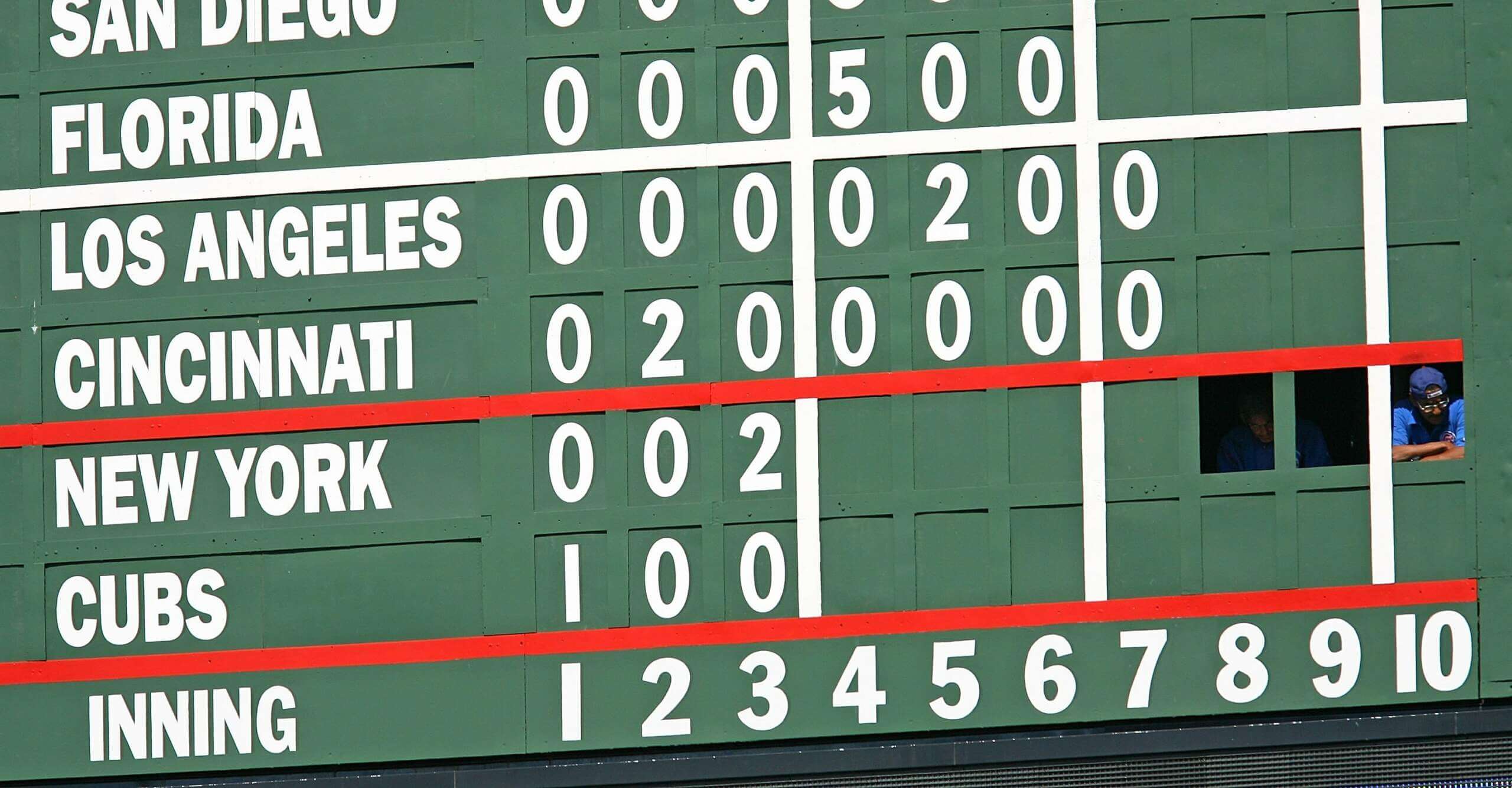
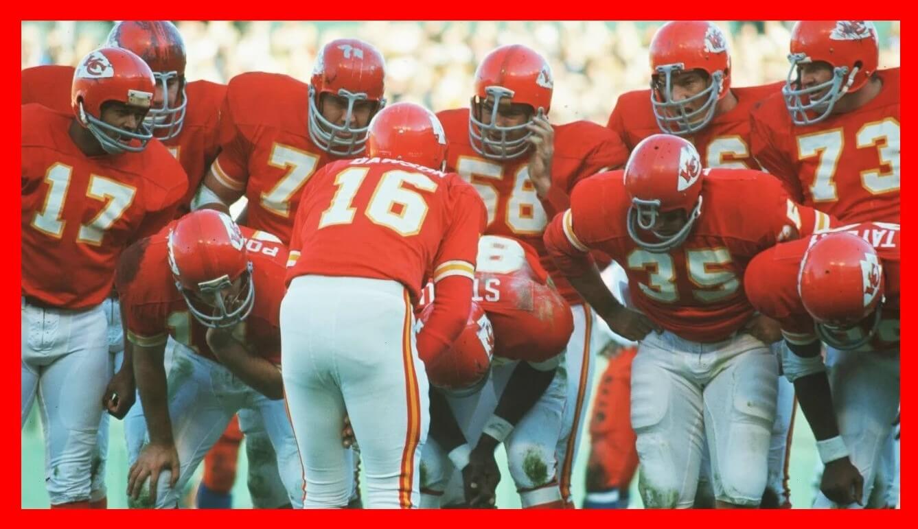
GTGFTS: (11/21/1971) Denver Broncos 10 at Kansas City Chiefs 28; Kansas City Municipal Stadium.
Impressive! How can you tell?
I had to verify a couple of things: (1) What year were all those players in the huddle on the team and (2) What years the Broncos wore the orange pants that coincided with (1).
Well done!
Well done, Morris, I thought there might not be anyone who guesses this one, so I sent Phil additional pictures and explained how I came to the answer that it was played in Kansas City not Denver. I knew it was 1971 just by seeing #17 Elmo Wright, that was the only year he ever played against Denver wearing the orange pants.
U…not S ; )
Wish I could see even less of those orange pants!
I can’t believe I still like you…
I thought about you last night when I watched the Broncos/Cardinals preseason game with my dad. It was one of Nike’s darkest hours, but I kept thinking, if only Denver wore orange pants, this game could be redeemable.
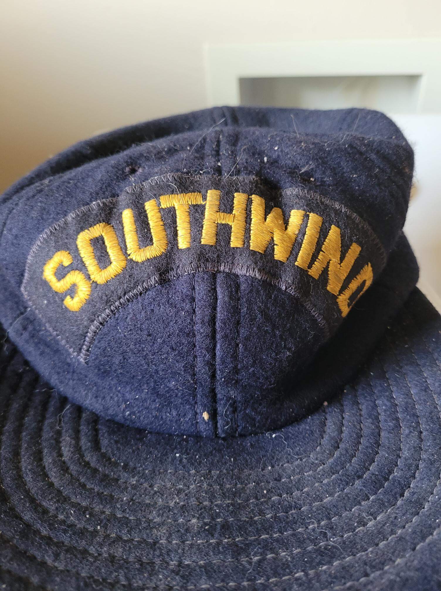
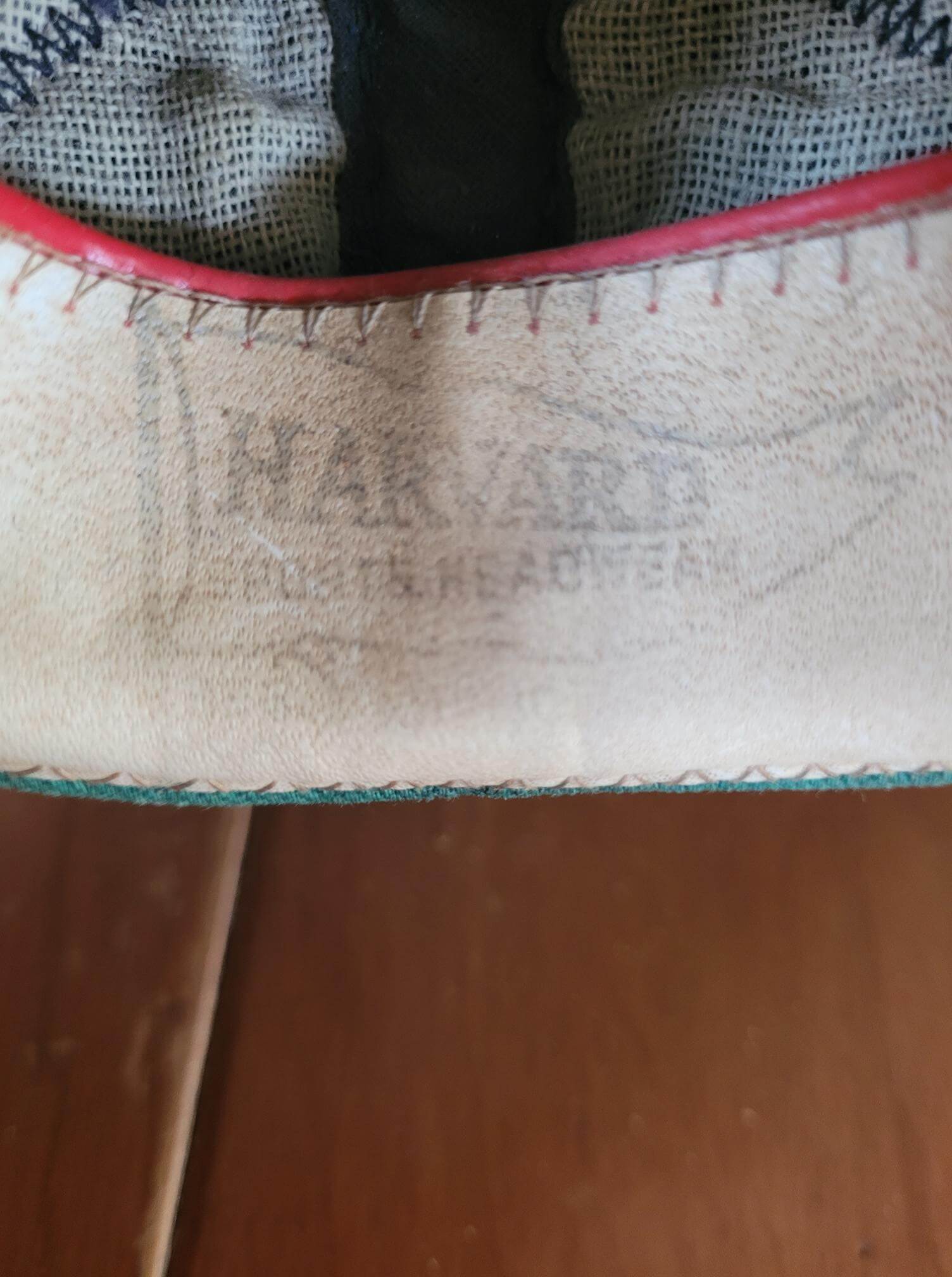
Nothing definitive, but Jeff’s hat has the look and feel of a ship’s crew hat. And there was a Coast Guard vessel named the USCGC Southwind in midcentury, decommissioned in the 1970s. She seemed to mainly sail out of the East Coast, so the manufacturer would make sense too. If that’s what the hat represents, the vessel has a fascinating and impressive history of service for both the United States and the Soviet Union.
From doing a quick google search, the cap might have something to do with Southwind Maritime Center in Indiana. Not sure if there is a connection?
It’s garish to say the least, but if you took the JETS decal off of that car it demonstrates just how gorgeous the Jets’ Gotham Green really is. I may dislike their current identity, but that green is a winner.
Damn, if former UniWatch contributor and uniform expert Terry Proctor was still alive, I’m sure he’d know everything there is to know about that Southwind hat.
Miss ya, Terry!
The monochrome dark project is, on balance, a mix of some winners and some I would not want on a field. One specific thing with the White Sox, though – a white brim on a cap is going to look filthy within a week or two, a dingy brown. White front crown panels? A good look. White crowns and/or brims? Nah.
That’s an interesting thought MJ. How is it that other light colour brims don’t seem to suffer from this? There must be minor league teams with white brims – how bad does it get?
White under sleeves are a no-go by rule. Even when they are team-wide. So that wouldn’t work for the Sox.
“The monochrome dark project is, on balance, a mix of some winners and some I would not want on a field.”
Agreed — the point of the exercise was to see whether teams’ current dark alternate tops (now currently paired with light [white, gray, tan, cream, etc]) pants would look “good” if paired with same-color pants, thereby creating a dark mono uni. We knew at the outset some teams would look AWFUL, but others — like you say — turned out to have a few really good mono-dark looks. We aren’t advocating for or against any of them per se, but offering up visuals so readers can opine on their possible introduction in order to replace the current dark alt over non-matching pants looks most MLB teams currently sport.
YMMV and all that!
I haven’t commented on this project mainly on the basis of “if you don’t have anything nice to say …”* but as much as very few of these seem at all attractive to me, I think they’re almost all more attractive than the softball-top solid color shirts that most teams wear. If baseball teams are going to wear bright color uniforms, this is the way to do it in my book. Useful proof-of-concept for me.
* I do have something nice to say: The concepts themselves seem smartly conceived and very well executed. It’s the underlying concept of full-color baseball uniforms that doesn’t speak to me.
I like the blue Detroit jersey with the Olde English D with the tiger in it. I thought that should have been the road jersey (in a gray colorway with piping), but the team seems to love the cursive Detroit. YMMV, they say.
I know what you mean about the road jersey – I agree I think something like the navy jersey but in grey would look good.
GTGFTS = Mets@Cubs, 8/30/2009
Game doesn’t seem all that significant, but nice photo!
On this date in Anaheim, Angels P John Lackey recorded his 100th W, becoming just the 5th Angel to do so (Chuck Finley, Nolan Ryan, Frank Tanana and Mike Witt were the others).
Thanks for this monochrome dark project. I’m a traditionalist and I love it when teams throw back to the 70’s but I hate the softball look of dark jerseys with light pants. I can’t explain why– but I really really like most of these monochrome dark looks.
Well done yet again, Chris!
The A’s should adopt both options immediately…but these sets need white cleats.
It’s near impossible to improve the Angels (and boy, do they need improvement!), but “bringing in more navy to better match the California Angels era” was smart – great hat!.
I like the Guardians branding very much but the home wordmark doesn’t work for me here…I think maybe the typeface used on road uniforms would have been a better choice and would be more Caveman-y (even though the original ‘blood clots’ never used the city name).
Thanks Chris! I know what you mean about the white cleats, but we chose to not go that way for these two concepts as they are shown with socks, not stirrups and coloured sanis (which is the classic A’s look). I think the hat is the best part of the Angels’ look too. I’m determined to find an Angels uniform that looks good (that isn’t a throwback).
I would bet if the Yankees did a city connect that would be it since that uni is already in their mythos. The A’s need to use this set when they move to Vegas.
I like every one of these monochrome uniforms! The Tigers definitely look better in midnight blue with orange trim than the other way around.
And I’d have no problem seeing the Yankees in that color with the inverse pinstripes; no idea why people think that look is somehow anti-tradition: the Chicago American Giants wore it in the Negro Leagues back when the Yankees were dominating the majors in the ’20s and ’30s. Those Giants were themselves borrowing an all-navy look from the Cubs and White Sox in previous decades. What’s not to like?
I like most of these, with the exception of the Tigers. If you inverted the sleeve stripes, you would be onto something, but leaving them off is another option. I’m reaching the conclusion the Angels should *only* wear white, taking the team name and image into account. The Yankees’ uniforms with the grey “NY” are amazing.
Thanks Walter, I’m glad you like the grey NY unis – they are my fave too! It’s an interesting point about the Angels only wearing white. Especially given their CC is (almost) white too. I’m still not giving up on them yet though :)
Its the Pinstripes…..
Can we just make all MLB unis with Pinstripes???
Nice work – why not throw it back for the soon no longer to be Oakland A’s (Sell the team!) and go with yellow vests. Then maybe they could move to France and rebrand as Les Gilets Jaunes (see stories about protest movement called that).
Good unis, baseball in France, and even we East Bay residents can respect choosing Paris over Oakland!
I dislike all contrasting front panel hats
And yet I still like you…
While I can maybe get behind the midnight mono, I can’t with the orange. Orange works for Baltimore and San Fran, but not Detroit.
I do agree with Phil sometimes.
I have never agreed with him more than right now.
The main complaint is too much red, so I’ve tried to rectify things by bringing in more navy to better match the California Angels era
This is a very good start, but keep going!
a lot of Yankee softball top concepts involve using reverse colour white pinstripes. I feel these look a bit stark and can end up looking too much like something Edward G Robinson might have worn in a gangster film!
In other words, perfect for New York!
Make this happen!
As for your A’s concepts… absolutely fabulous.