Greetings and a good Saturday morning to all. Without getting into it, I’m 99% confident everyone reading this has had a better week than I. Let’s just leave it at that.
Anyhoo. Today I’m once again rejoined by graphic designer Matthew Drake, who (among other things) was instrumental in providing some amazing content during the early days of COVID, when there were no sports being played and as such…not much going on uni-wise in the universe. Matthew returns today with the first in a series he’s calling the “MLB Multiverse,” which he’ll explain below. For each “what if” I’ve included the new “home” uniform inline, with road and additional alternates in the gallery beneath. Enjoy!
Here’s Matthew:
MLB Multiverse, Volume I
by Matthew Drake
I call this series “MLB Multiverse,” it’s essentially collection of “what-ifs”: either relocations of MLB teams that very nearly happened, or what certain teams would possibly look like if they never relocated in the first place.
Obviously referential of Marvel’s recent cinematic dealings with the concept of the “multiverse,” another way of thinking about this is that these teams do in fact exist in an alternate universe, where their respective relocation deals followed through to completion.
The series was heavily inspired by user @SFGiants58’s legendary “MLB: The Defunct Saga” series on the sportslogos.net boards, as well as logo/uniform legend Todd Radom’s “Phantom Franchise” segment on Buster Olney’s podcast.
I created over 60 (!) different alternate-universe teams in this series, my biggest series ever by far. It was fun and exciting to try and flex my creative muscles a bit more beyond simply fixing up the 30 big league teams. I hope you enjoy seeing these designs as much as I enjoyed creating them!
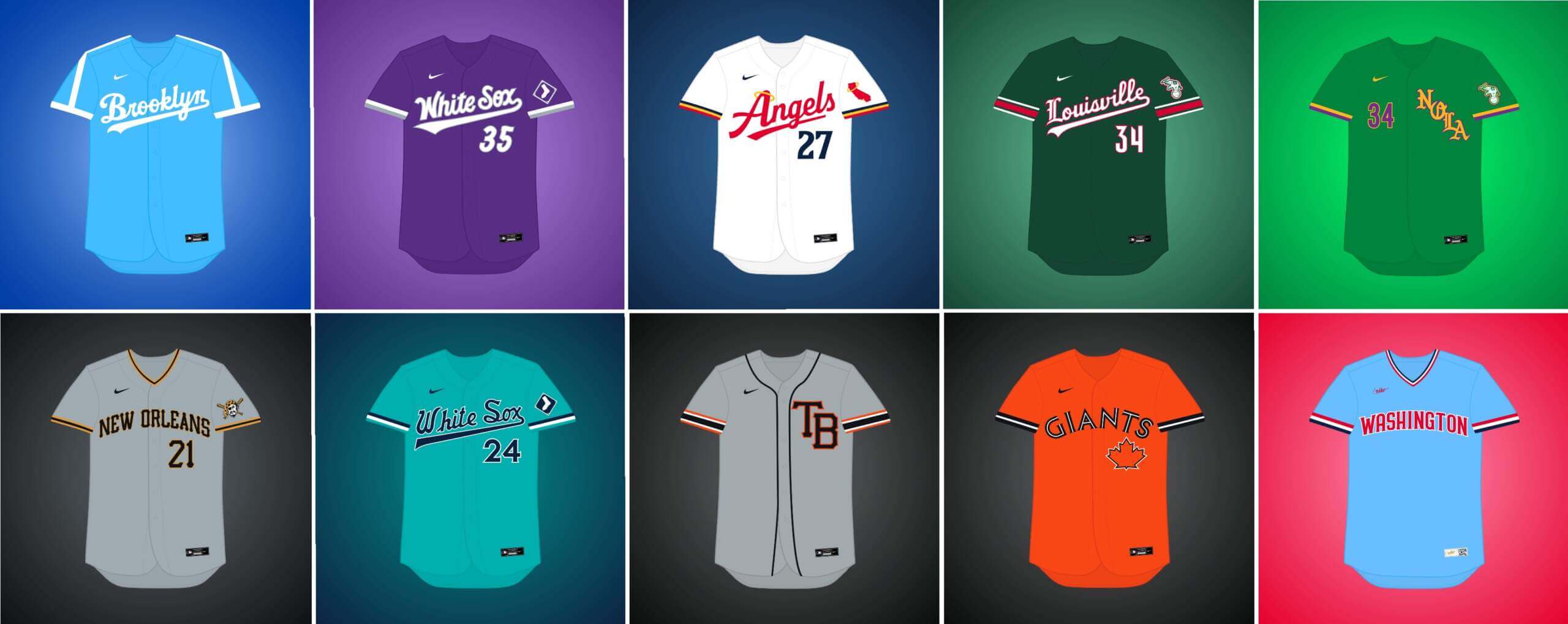
What if… the Dodgers remained in Brooklyn?
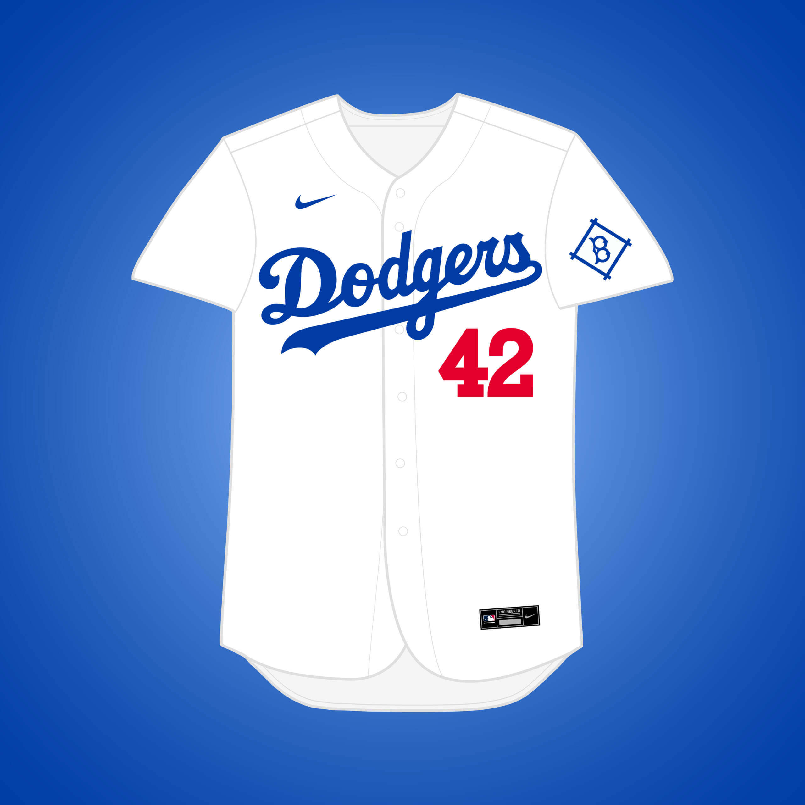
The Dodgers left for LA in 1958, but this is how I imagine they’d look if they never did. They only had the red front number on the home white at the time, so I kept that, & added a heather pattern to the away to keep a vintage feel.


What if… the Athletics relocated to Chicago?
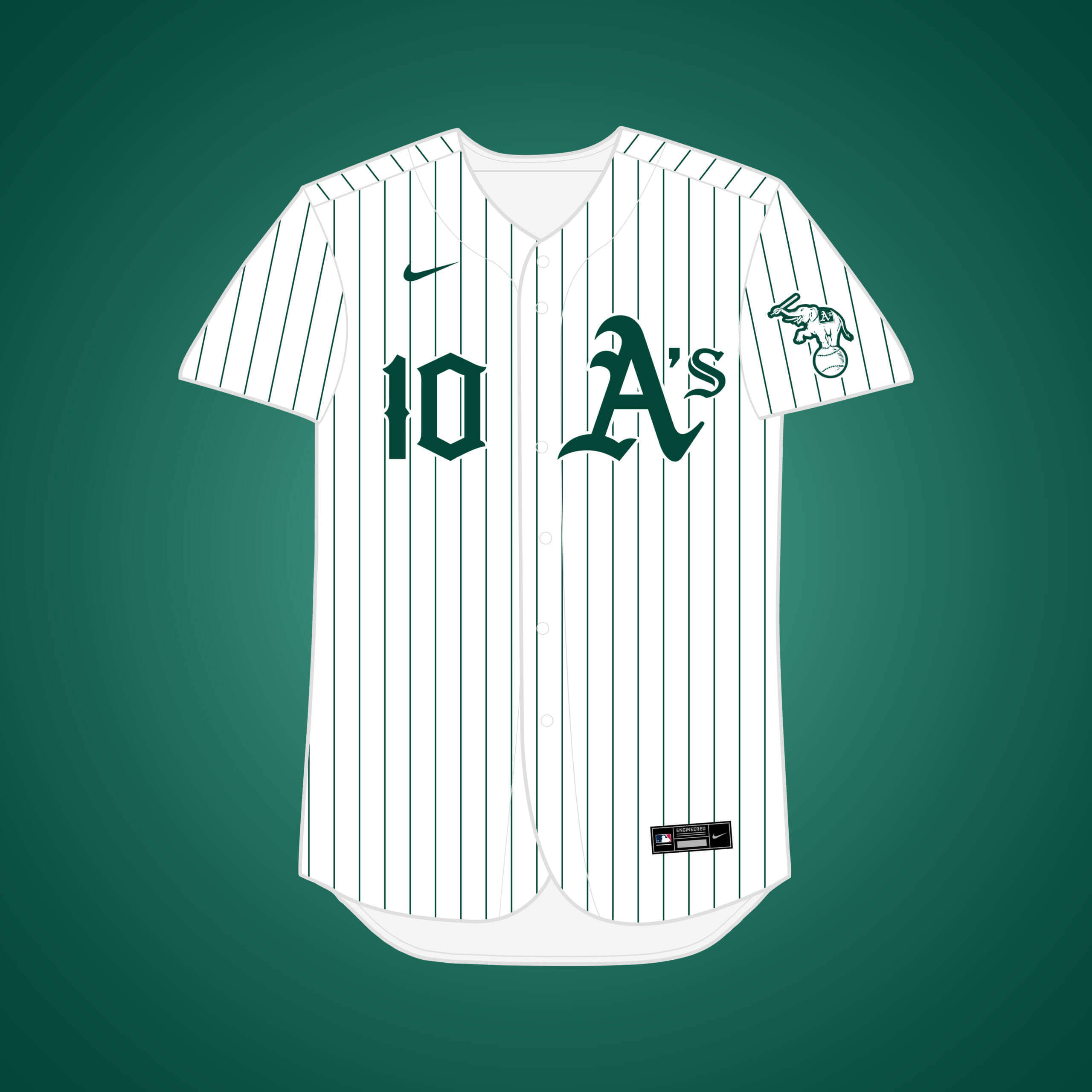
This one is part of a deal that would’ve pushed the White Sox out of Chicago and west to Seattle. Removing athletic gold for a forest green only identity feels more fitting for Chicago.


What if… the White Sox relocated to Denver?
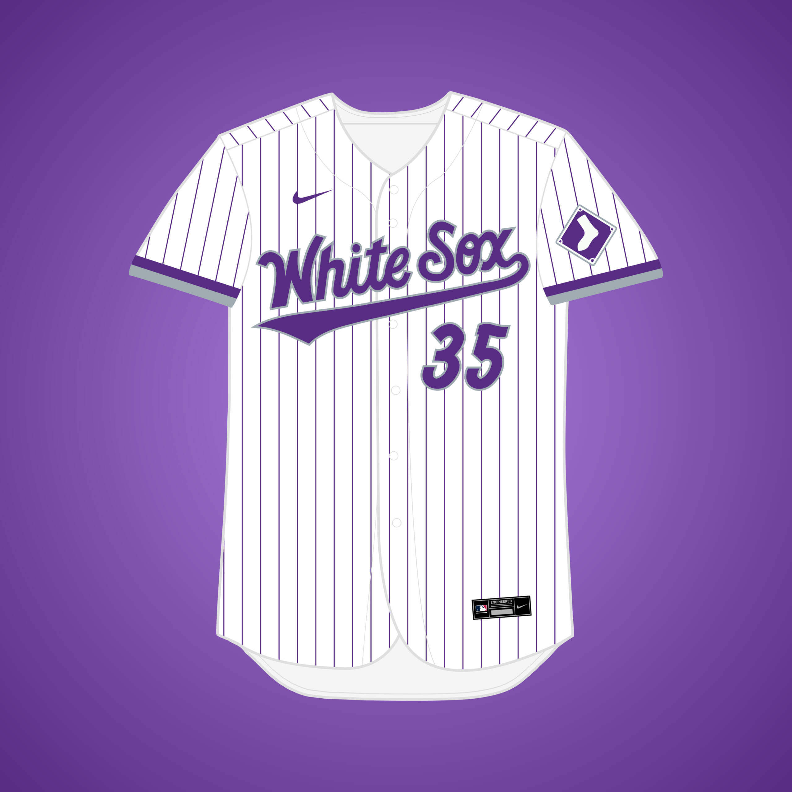
Sox owner Bill Veeck was contacted about maybe moving out west, but apparently no discussions were had. This look embraces purple (which the eccentric Veeck surely would’ve supported), and I gave them the state name like the Rockies.


What if… the Athletics relocate to Las Vegas?
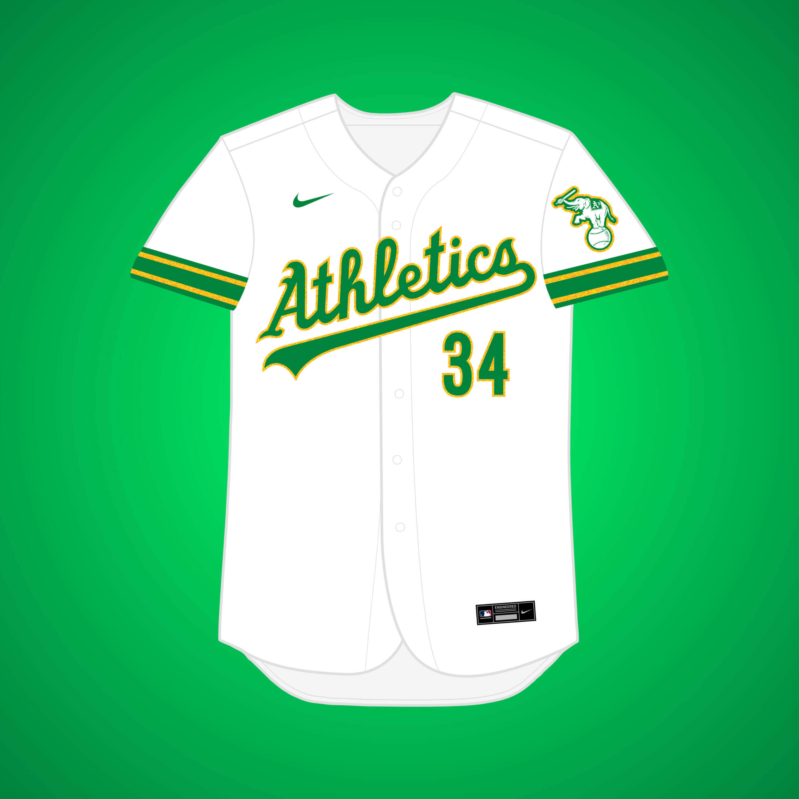
This wasn’t as close to a sure thing when I was working on it as it seems now, but it’s fun to see how it might turn out. Green & gold still works well for Vegas, & I added some ‘sparkle’ to the gold inspired by the Golden Knights.


What if… the (original) Senators relocated to Los Angeles (and changed their name)?
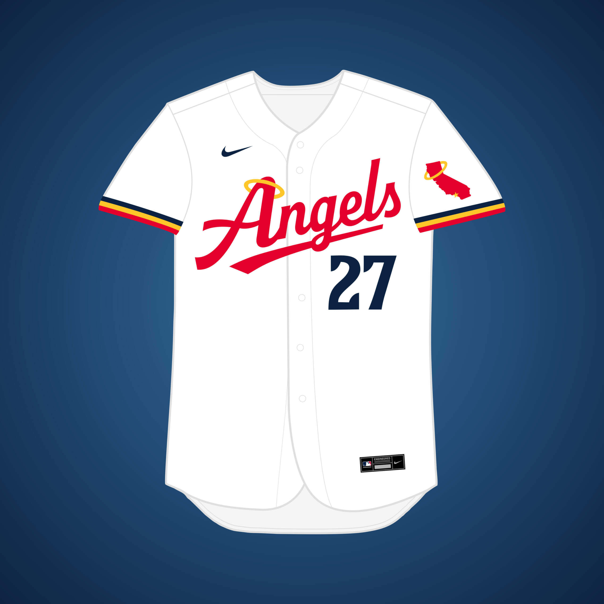
The Senators tried to move to LA in the early 50’s, but after the Dodgers entered the race, they won out. This design incorporates elements of the Twins’ (who the Senators became) new rebrand.


What if… the Athletics relocated to Louisville?
Charles Finley signed an agreement on a two-year lease in Kentucky, but AL owners rejected it on fears of only being temporary before another move to Oakland. Louisville red combines with A’s forest green to make a unique look.


What if… the Browns relocated to Miami (and changed their name)?
This one doesn’t have as much solid evidence behind it, but St. Louis Browns owner Bill Veeck had history owning a team in Miami. The design combines Browns’ style scripts with Orioles stripes & Miami colors.


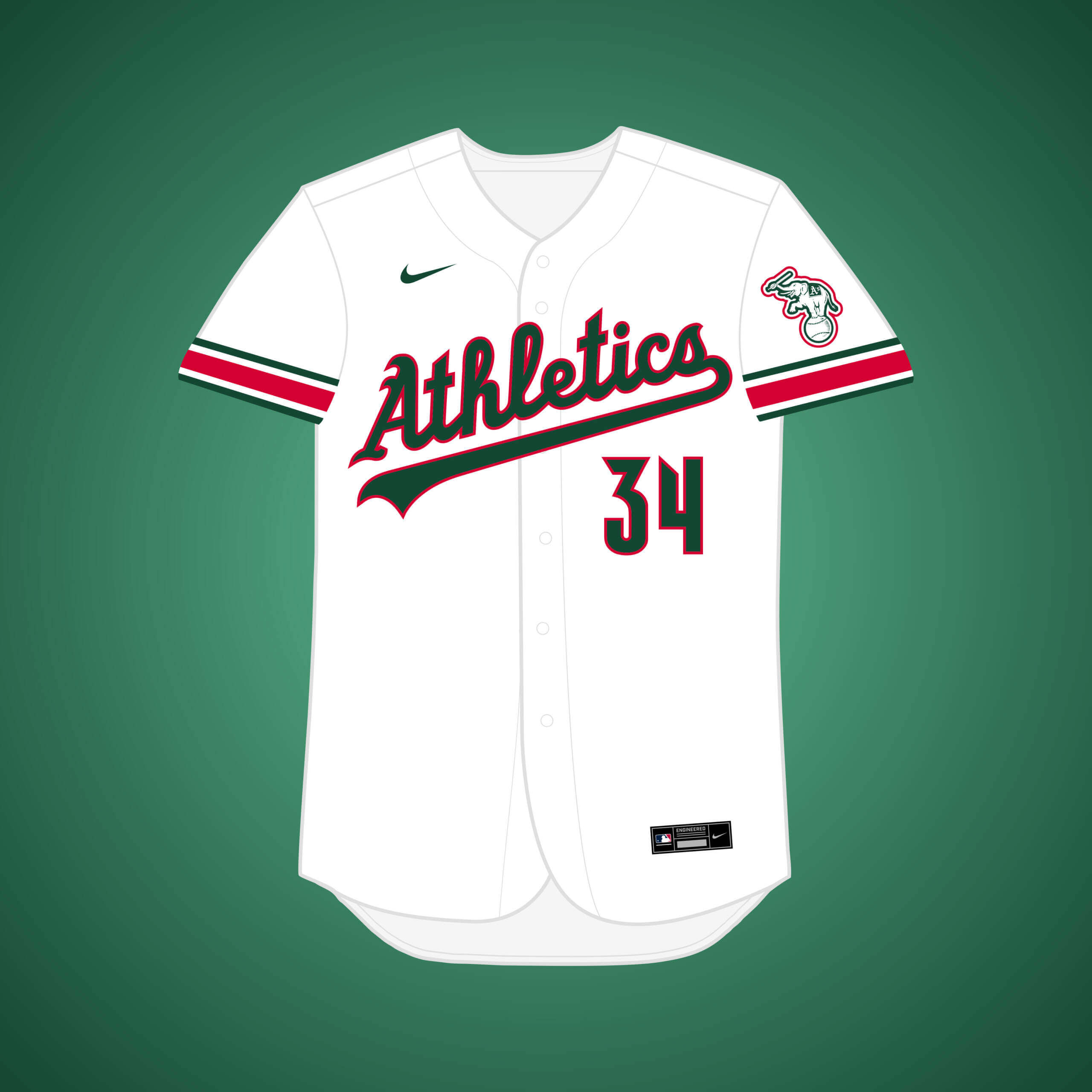
What if… the Athletics relocated to New Orleans?
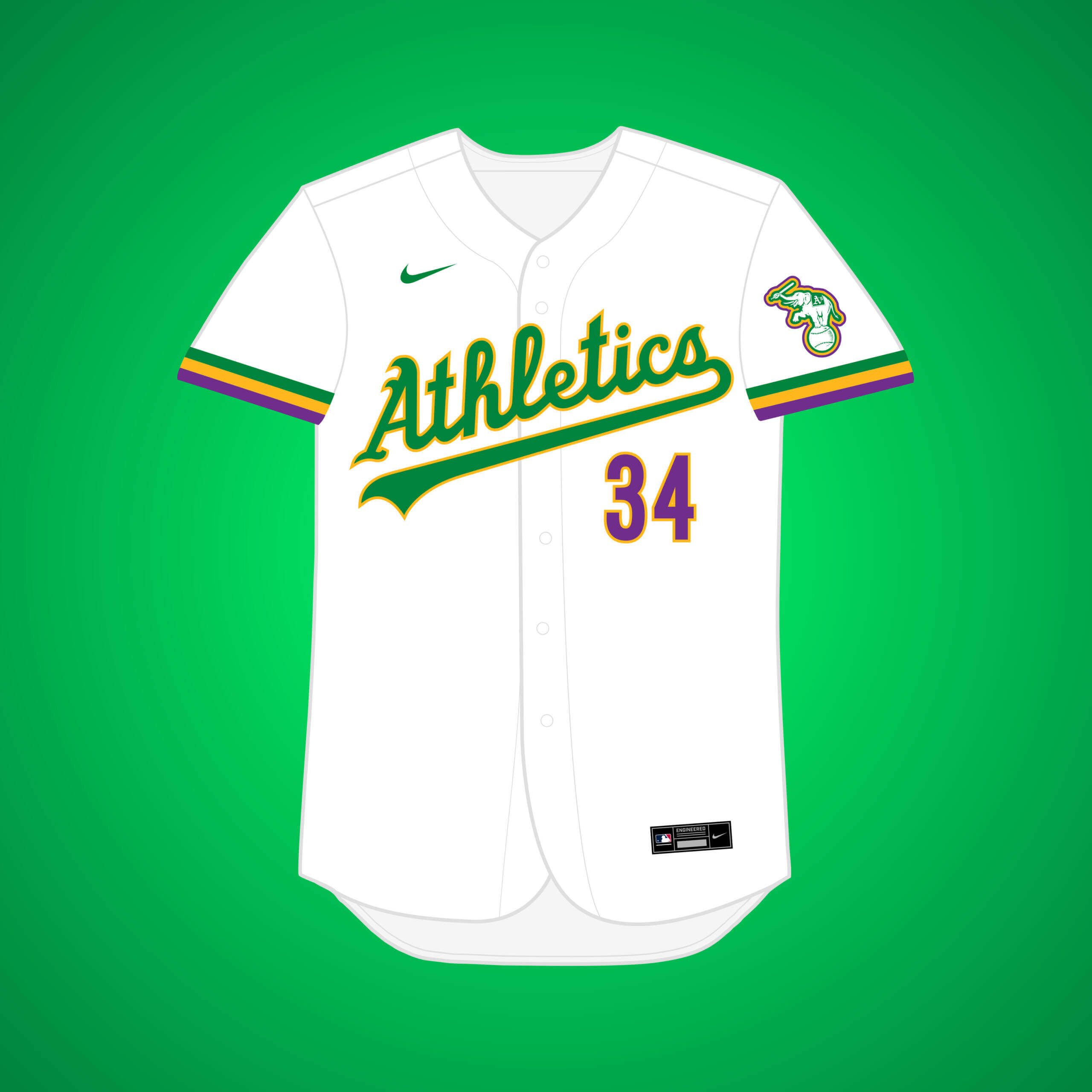
This one nearly happened in the late 70’s, where the A’s would have shared the Superdome with the Saints. I added purple to the classic green & gold to give a Mardi Gras theme.


What if… the Pirates relocated to New Orleans?
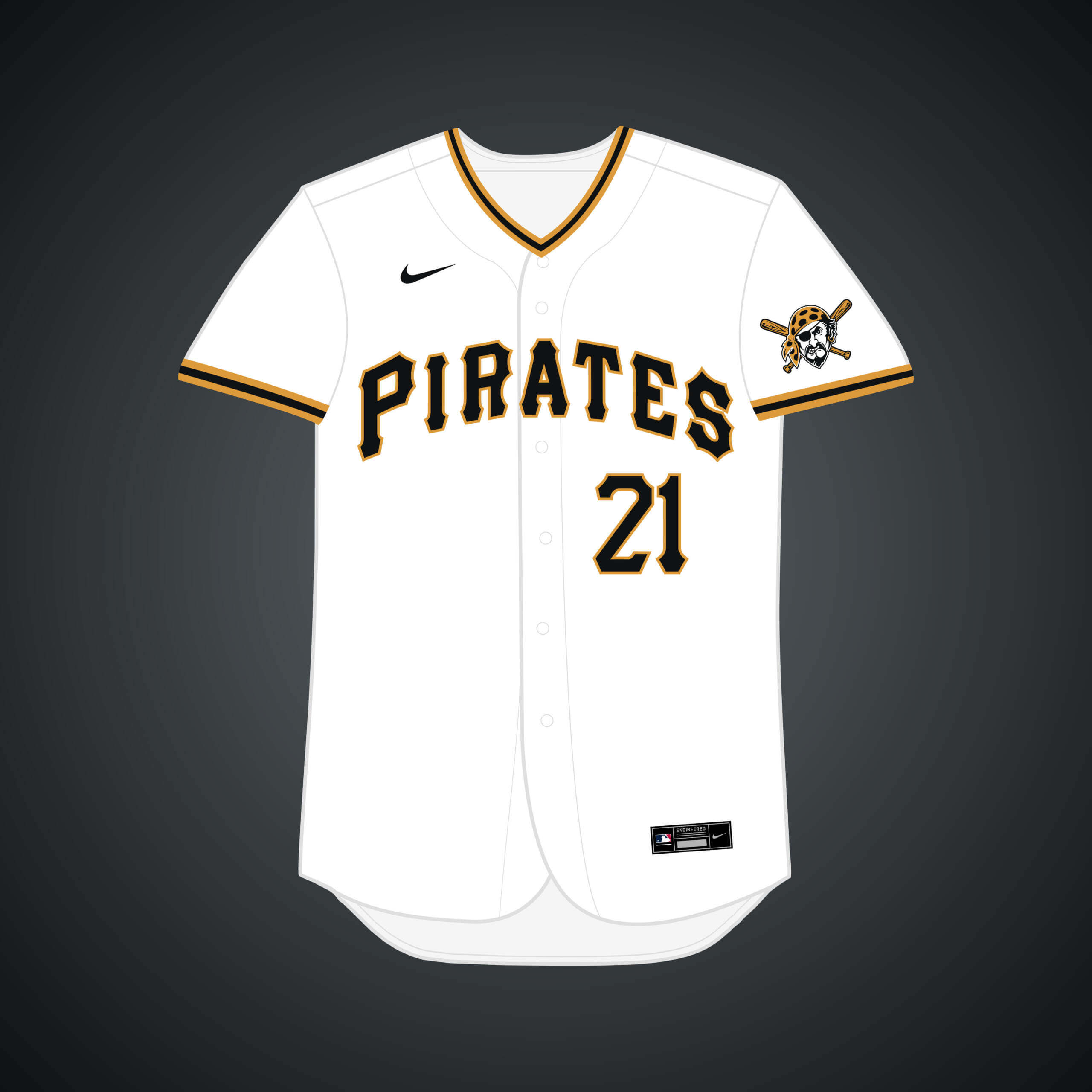
Negotiations happened in the early 80’s, mostly as a bluff to convince Pittsburgh to get them a better stadium. I changed athletic gold to more of an old gold, akin to the Saints.


What if… the Athletics relocated to Seattle?
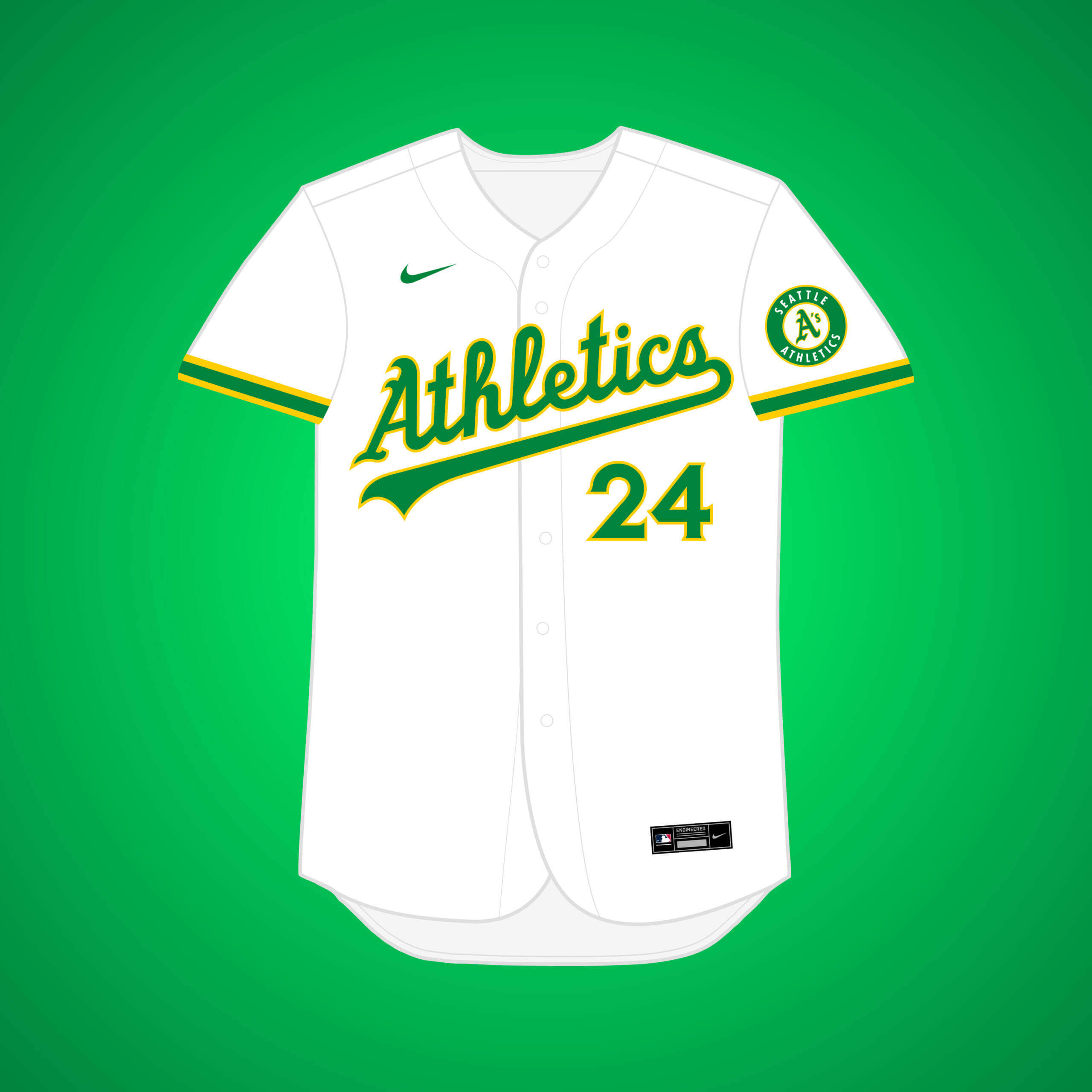
Owner Charles Finley liked the area. I brightened up the yellow to synchronize with Seattle’s former (and hopefully future) basketball team.


What if… the White Sox relocated to Seattle?
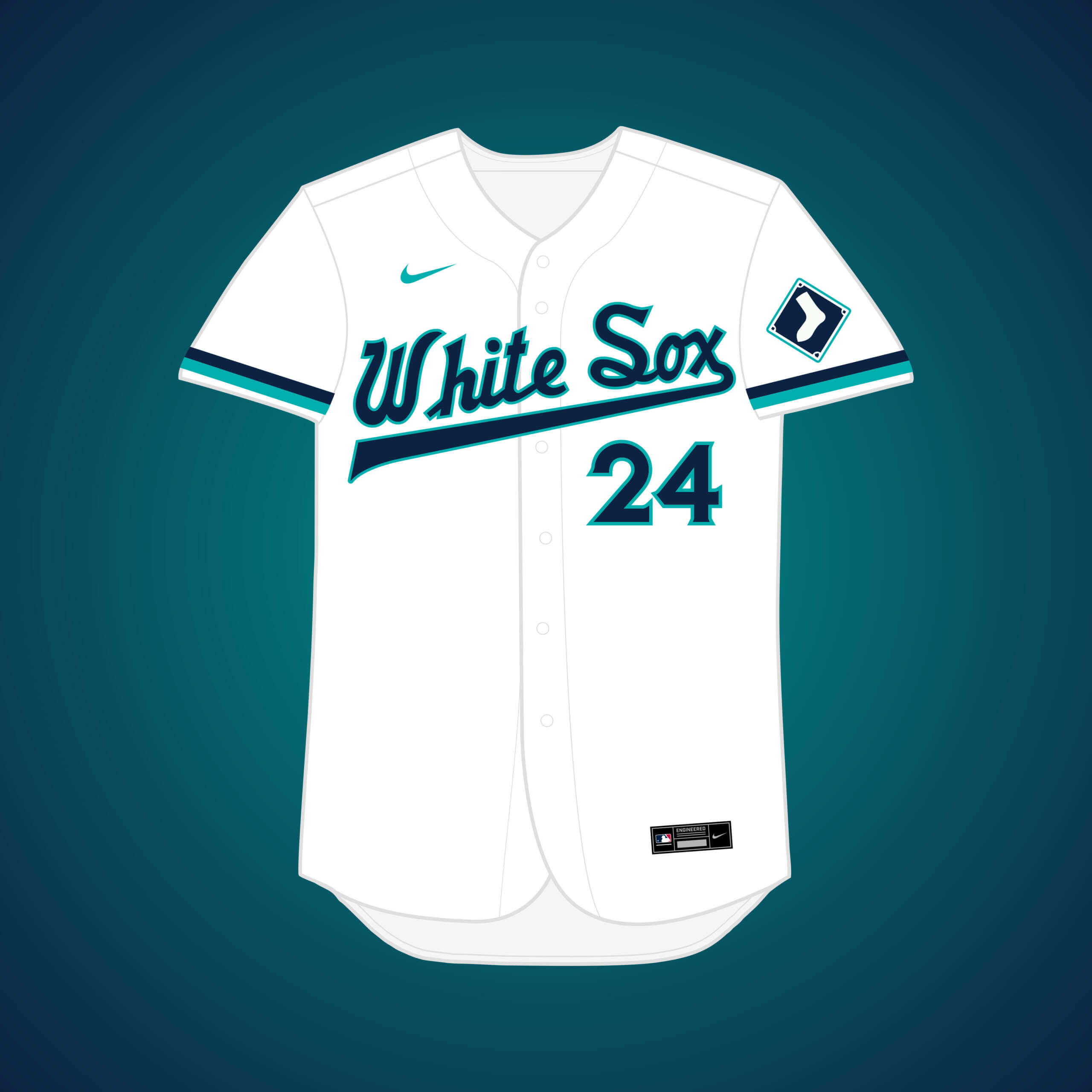
Another Seattle team, this would have been part of the deal in the 70’s where the A’s would move to Chicago, & the Sox would move out west. I combined the Sox’ general aesthetic with the Mariners’ now classic navy & teal. (Technically, the White Sox would’ve rebranded upon moving to Seattle and the A’s were supposed to “become” the White Sox, but I figured that would be unnecessarily complicated, so I kept the names with the teams through the move.)


What if… the Giants relocated to Tampa Bay?
One of the more famous near-relocations, the Giants’ owner agreed to a sale in 1992, but it was rejected by other NL owners. I kept the Giants’ stripes from that era, but went back to the current, more classic-looking logos.


What if… the Pirates relocated to Tampa Bay?
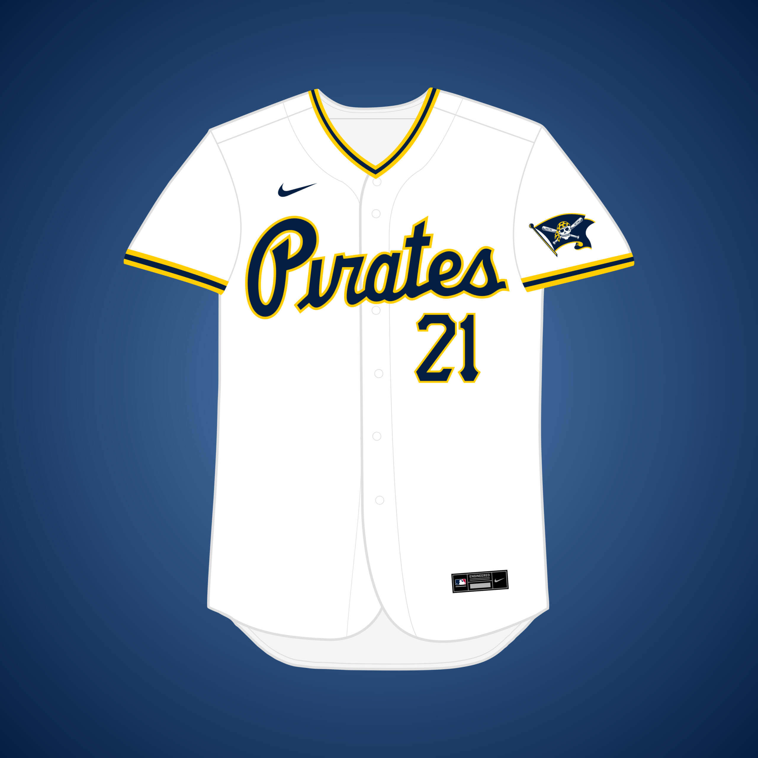
A lot of teams were looking at Tampa Bay in the 80’s, and one of those teams was the Pirates. I replaced black with navy, added a “Pirates” script, and a skull-and-crossbones flag patch that syncs well with another Tampa team.


What if… the Giants relocated to Toronto?
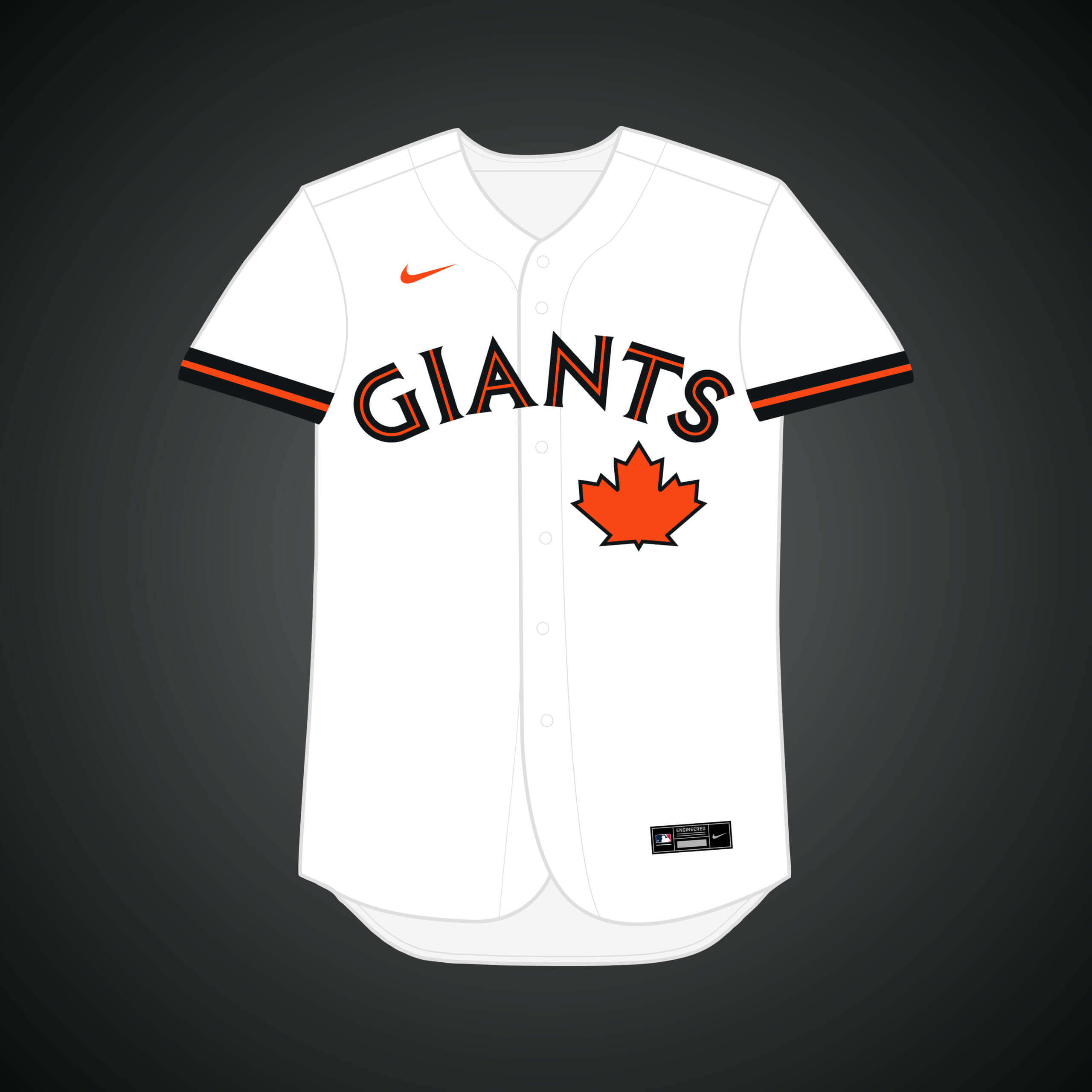
This was very close to happening in the mid-70’s, to the point where a deal was agreed upon and prototype logos + a new color scheme (more on that later on) were generated. This design combines the Jays’ font with the Giants’ colors.


What if… the Padres relocated to Washington (and changed their name)?
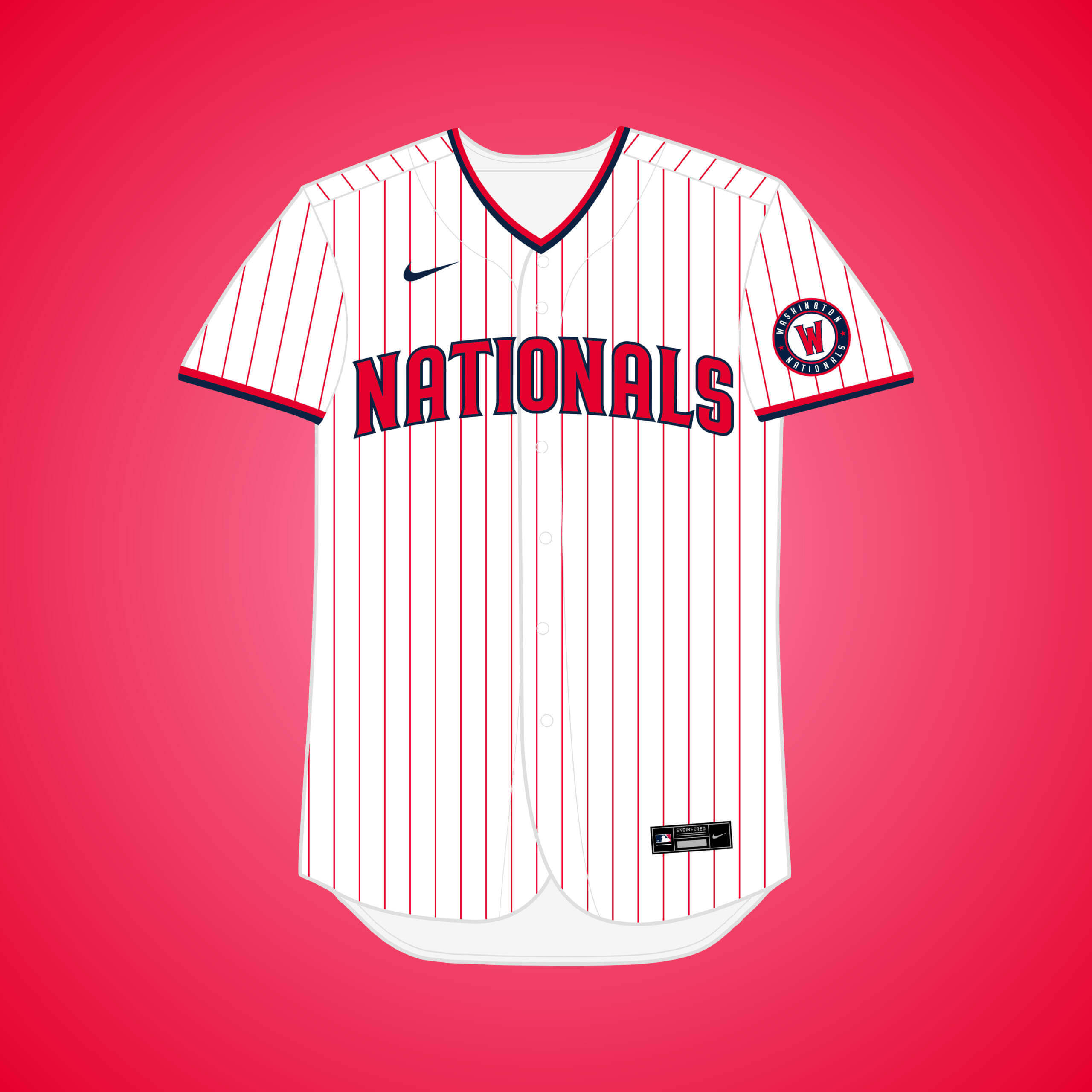
This was so close to reality in the 70’s that baseball cards and a prototype uniform were made. I combined the Padres’ 2020 rebrand aesthetic with a classic DC red white & blue.


Thanks Matthew! A lot of those relocations, as you point out, were if not in the development stages, certainly in the planning stages, and it would have been interesting what alternate uniforms would (or might) have been created with franchise moves. That was a really fun first look at what could have happened, and looking forward to your next sets down the road.


I know that Cal Griffith flirted with LA in 1956-1957, but I had not heard of an earlier consideration.
link
In Ghosts of Flatbush, it was said that Walter O’Malley saw Griffith talking to LA official Kenneth Hahn and sent word “don’t do anything until you talk to me” during the 1956 World Series. It seems O’Malley had pretty much made up his mind by then.
There was an exceptional presentation at SABR Virtual in 2020 that discussed a lot of the franchise moves and possible moves. Andy McCue presented “Franchise Whack-a-Mole: The Expansion of 1977 – Why and How, ” covers many of them and how they led to the 1977 expansion.
link
Hey there William,
Yeah, saying discussions occurred in the “early” 1950s might have been inaccurate, we are likely referring to the same scenario of the Senators almost moving to LA.
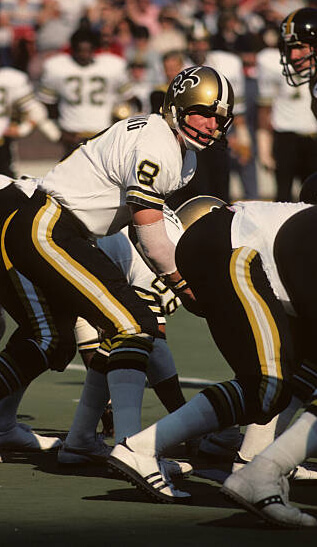
The GTGFTU is the November 5, 1978 game between the visiting New Orleans Saints and the home Pittsburgh Steelers. The Steelers won 20 – 14 to make their record 9 – 1 on their march to a Super Bowl XIII victory. The photo shows Saints QB Archie Manning (8), Saints guard Fred Sturt (68), and Steelers linebacker Loren Toews (51) on the field and Saints running back Kim Jones (32) watching from the sidelines.
That’s when the Saints had good looking black pants!
Hey, Phil… I hope next week is better than this week for you.
People seem to have forgotten that football pants, especially black pants, require stripes, and contrasting socks.
And thanks Jimmer. I can’t imagine a worse two days than the past two, in terms of ineptitude of others and stress-inducing situations. Three separate *incidents*. No good outcomes (though one has somewhat been resolved).
I knew you’d say something positive about those!
: )
You got it, Mike!
You sure saw a lot more details that I did-Submitted this one primarily as a prelude to tomorrow’s “Fathers in Uniform” post.
Ol’ Man Manning switched up his fade masks quite a bit in his career…while I love me a Dungard, this wasn’t a good look fit on Archie IMO.
Not only was the Saints uni super sharp, but I have always liked the turf shoes of that era. White with black soles and the little nubby pattern. It might be because I was in high school around then and my school played on an astroturf field.
GTGFTU: New Orleans Saints at Pittsburg Steelers November 5, 1978 Three Rivers Stadium, Pittsburgh, PA .
Steelers won 20-14 over the Saints
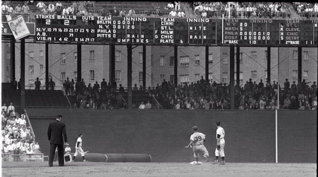
The GTGFTS shows the May 22, 1953 game between the visiting Brooklyn Dodgers and the home standing New York Giants, which the Giants won 5 – 1. The photograph shows Dodger Hall of Fame catcher Roy Campanella leading off the top of the 6th inning with a double.
That Polo Grounds scoreboard really is amazing; there’s so much going on and so much to notice!
– Rather than a dot or arrow pointing at the number of the batter, the batter’s number is raised or lowered into the empty row between the two lineup rows. The Giants are on top with the visiting Dodgers on the bottom, despite them being listed in the “normal” orientation in the linescore to the right
– The strikes are given before the balls! Japanese baseball used to do it this way until just a few years ago when they changed to match the American ball-strike order
– The scores in the other league have the teams in a darker (orange?), less visible color
– The number font is very distinctive, particularly the 6 and 9 with their serif-like tails
– Some unusual team abbreviations, such as “CINNI” and “DETRT”
– Umpires get a *ton* of space across the bottom row, with each base clearly spelled out
– What do C, K, H, and S mean over on the AL side of the scoreboard?
These multiverse designs are GORGEOUS. Such an incredible job! I wish this guy worked for Nike. I’d much rather see this on the field over some of the garbage that Nike puts out these days. Great work!
Thank you, Tom! I wish I worked for Nike too!
In 1967 & 68 after the Braves left, the White Sox played some “home” games at Milwaukee County Stadium. A Milwaukee White Sox uniform would be interesting to see. (link)
You’ll likely see how that scenario would’ve looked pretty soon, even sooner if you follow the series on my Twitter, @MJD7Design!
I love the concept and most of the jerseys. A rare miss for me was the Padres/Nationals white with red pinstripes. The red pins make the white jersey appear pinkish. I instead would have reversed that look for an alternate and had a red jersey with white pinstripes.
Thank you for the feedback. Personally, the Nationals/Padres has been one of my favorite designs so far, and I actually view the “pinkish” tint as somewhat of a positive, as it subtly alludes to DC’s famous cherry blossom trees, which the Nats City Connect uniforms reference.
What about the St. Louis Browns proposed moved to Los Angeles that was shut diwn with bombing of Pearl Harbor? What would the LA B’s look like?
Stay tuned for future deep dives into the MLB MULTIVERSE!
Sorry to hear about your crappy week, Phil.
Nice work on the unis, Matthew!
Thanks, John!
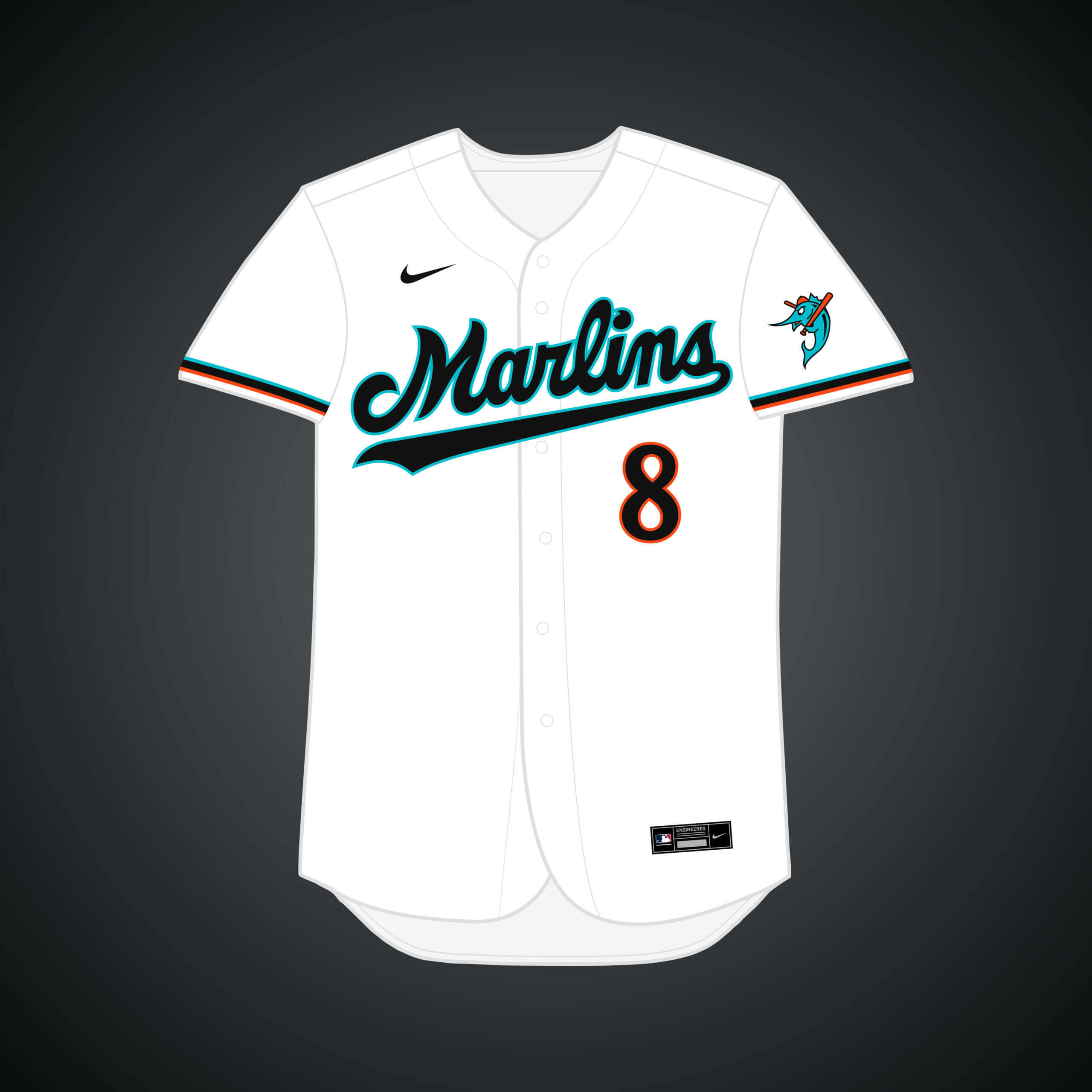
The Mariners do NOT wear teal; this is not a recording. They call it Northwest Green, but regardless of the name, it is a greener shade than what is typically called teal, which is the classic Marlins color. I’d tell you to watch last night’s highlights for a Pantone reference, because it has been their Friday home jersey for years, but the new 4+1 rule and the CC pandemic have ruined that tradition.
And if the Giants had moved to Florida, I think their cap would have altered the SF to SP for St. Pete and added a T for Tampa.
This got me to look “teal” up, just to try to verify what I thought, and I was a bit surprised:
link
It’s funny, I was used to calling the original Marlins color teal myself. But Wikipedia shows it as, to my eye, actually closer to the Mariners “northwest green” than to that original Marlins color, which was considerably brighter and more cyan-ish as I recall.
Hey there,
I am aware that the Mariners’ color is called “Northwest Green” in official capacities, but teal is a lot easier to say/write. Regardless, the color would be the same as it is on the field, I just brightened it up digitally to better match.
The actual definition of teal appears to be way closer to the Mariners’ color than what the Marlins use. I personally don’t think it’s at all unreasonable to call that color a shade of teal.
Always appreciate the content, Phil. Hell week be damned!
Weren’t the Twins rumoured to relocate to Charlotte/Carolinas? Would have made sense to still call them the Twins.
I just remembered I may have a photo for GTGFTU. I just need to figure out the date!
Yes, I remember it well: supposedly Carl Pohlad had a deal to sell the Twins in late 1997 to Don Beaver and move them to the Triad, which I think was contingent on the Minnesota legislature approving a new ballpark. The ballpark was voted down, and then Greensboro, NC, was to vote on a new ballpark…which was also voted down in the spring of 1998.
I’ve read/heard since that the Beaver plan was never that realistic, more of a leverage ploy that didn’t work. Of course, in the end, the Twins did get their ballpark, but as a younger Twins fan in 1997, I recall being really upset that they seemed likely to move.
Hey Patrick, yes they in fact did, you should see that design in a future Volume of MLB MULTIVERSE!
All the possible A’s moves could have filled an entire article. The Pirates name seems appropriate for both New Orleans and Tampa Bay.
Indeed. There were a lot of A’s relocations in this first batch alone, and I’m not even finished with them. I believe there were a total of 16 A’s relocations I’ve done in this series.
What if the Browns had moved *back* to Milwaukee (instead of the Braves) in 1953 and restarted using the Brewers nickname?
Stay tuned for future deep dives into the MLB MULTIVERSE!
Dolphins Reverse Retro is a no go.
Stay positive, Phil…the sun also rises!
Good stuff, Matthew!
Was a bit let down that your MV Angels MV (the home jersey is my favorite of all your designs) aren’t ‘California’, especially since you drew on the Minnesota Twins reality for some of the design touches and you brought ‘back’ the halo-ed state sleeve patch.
Thanks Chris! The main reason I went with “Los Angeles” was because it was inspired by the Los Angeles Angels of the Pacific Coast League, but I also don’t like the Angels being named “California” while there are other teams in the state. I guess a counter to that would be the Texas Rangers and the Astros, but for some reason I think it works there, maybe because “Dallas Rangers” wouldn’t sound as good.
At one point in the ’60s, the A’s were seriously considering a move to Atlanta before Milwaukee pulled the trigger. Now, I don’t know if the green & gold would’ve caught on down there, but it seems like a no-brainer that the club would’ve run with the original blackletter “A” (sans apostrophe-s), pulling double duty as it would have for both the team and city.
The White Sox were a stopped clock by Illinois governor away from moving to The Florida Suncoast Dome in St. Petersburg and becoming the Florida White Sox. I still have the t-shirt.
The Seattle Mariners also were flirting with moving to St. Pete to become the Tampa Bay Mariners. Got one of those t-shirts too.
Good work on these. Looking forward to the next installment.
Great stuff Matthew! All the designs are well thought out and the new wordmark/logos flow from the different teams and histories you’ve incorporated. The only thing is (and this doesn’t just apply to your designs) please #RespectThePlacket! Cutting letters in two across the jersey opening when you don’t need to is now common among MLB jerseys (Pirates, Marlins for example). Sometimes it can’t be avoided (e.g Rays) but especially for teams like the Athletics where the current jersey *doesn’t* break the rule, most of your renderings do. It’s a small thing, but I for one would appreciate it if you tried to honour it like the jerseys of old!
The A’s should leave their colors in Oakland. They won’t, because Fisher sucks and MLB owners seem to want to insult Oakland as much as possible on their way out. But those are Oakland’s city colors. Get a new identity in Vegas. Call yourselves the As, take the white elephant. But leave the green and gold.
Good stuff and great looking uniforms. Looking forward to the next installments. I love that cartoonish Marlins logo!
I hope the A’s keep the same color scheme for the Vegas move, especially since I’ve already purchased gear. Nothing with Oakland on it, obviously.
I think what this goes to show is that these teams could use just about any color scheme, and we’d drink it up happily. Obviously, some team’s brand colors already make perfect sense (e.g., neon colors for Miami, black & yellow for Pittsburgh), but many could be whatever (e.g., Minnesota Twins doesn’t have to be red, white & blue).
Those Angels unis look amazing—and I’m a Mariners fan. It wouldn’t be quite so bad when all their fans showed up in our stadium if they were wearing those :)