A good Saturday morning, Uni Watch readers — I hope everyone has had a good week. Did anything interesting happen this week with MLB uniforms? Seemed kinda quiet round these parts.
Anyhoo.
In a brief respite from the, ahem, sheer excitement of baseball jersey and pants screwups, I’m welcoming back Chris Diamond, who has another “What if?” segment for our reading pleasure. In the newest version of his ongoing think pieces, today Chris will be tackling a helmet design anomaly — there are several NFL squads who are named for birds, yet their helmet designs vary from team to team. But what if they all followed the pattern used by the Eagles?
Here’s Chris. Enjoy (click on all images to enlarge)!
What If All ‘Bird’ Teams Were Like the Eagles?
by Chris Diamond
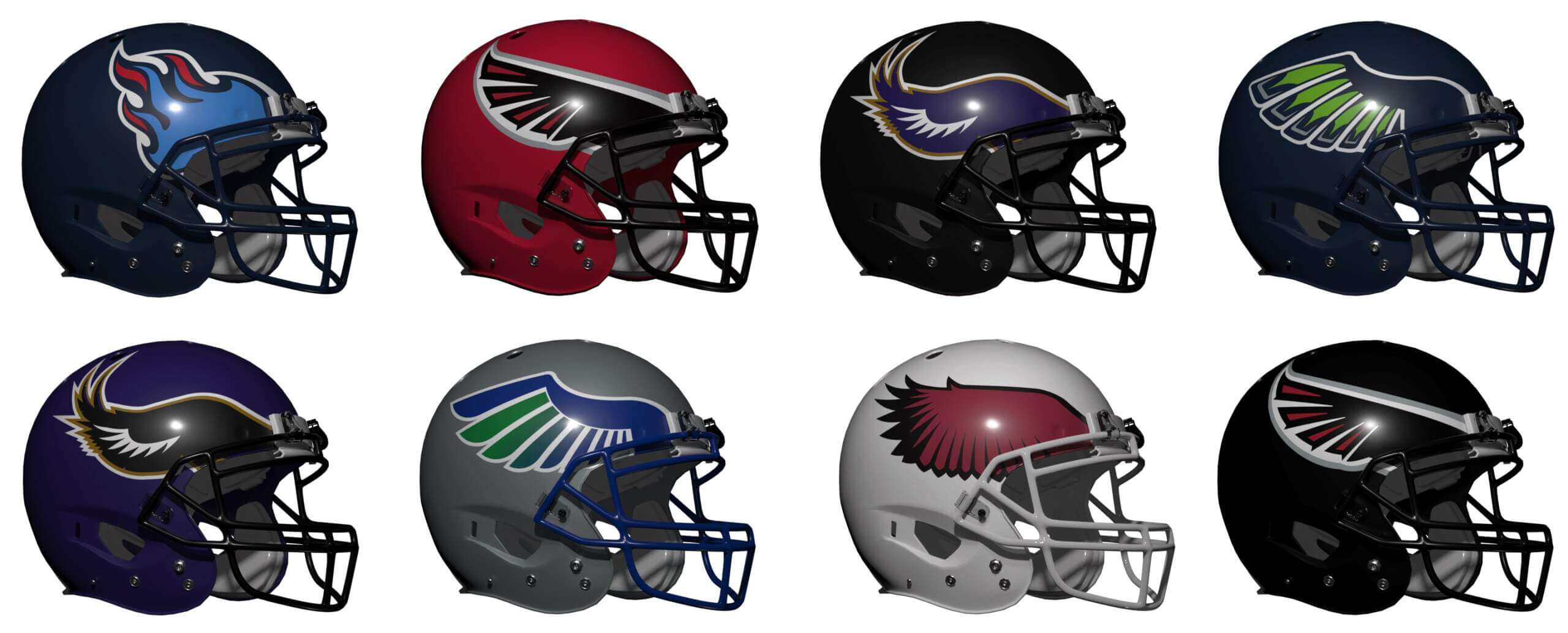
Recently I wrote a What-If? series on extreme uniformity that speculated what NFL teams would look like if they were under a set of strict style rules. One of the casualties of the rules was the Eagles famed winged helmet (only simple side logos were permitted). And that got me wondering… there are several other ‘bird’ teams in the NFL and none of them use that winged helmet style. The Eagles have used it since 1954 and it would be difficult for a team to adopt that style now without everyone accusing them of copying! But what if other teams had used that style so that it didn’t seem to belong to the Eagles? After all, in college Oregon, North Texas and Rice have (or had in the past) a winged helmet. So what might The Cardinals, Falcons, Ravens and Seahawks look like with this style? And are there any other non-avian teams that might work with this look? For each of the teams I’ve taken some liberties with their current set as these concepts aren’t meant to be simple helmet replacements. For each I’ve given my verdict on how they compare with the current set. YMMV as usual of course.
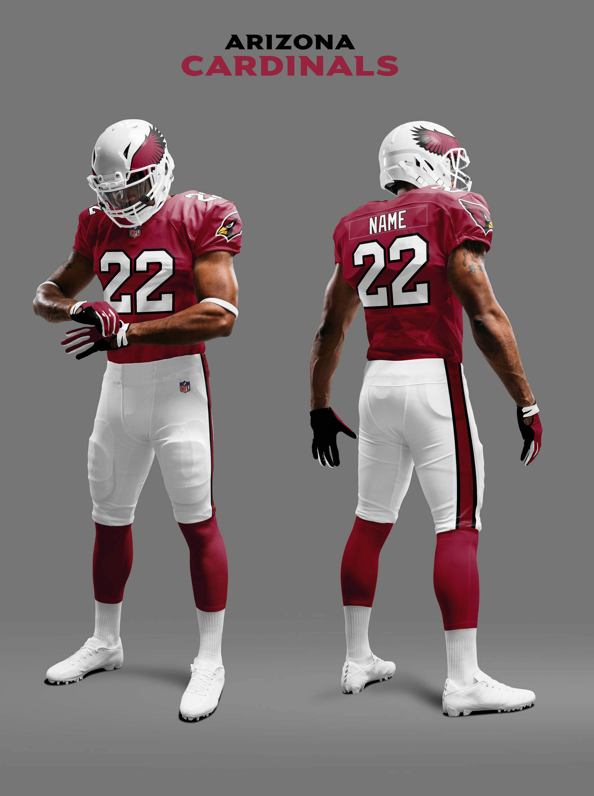
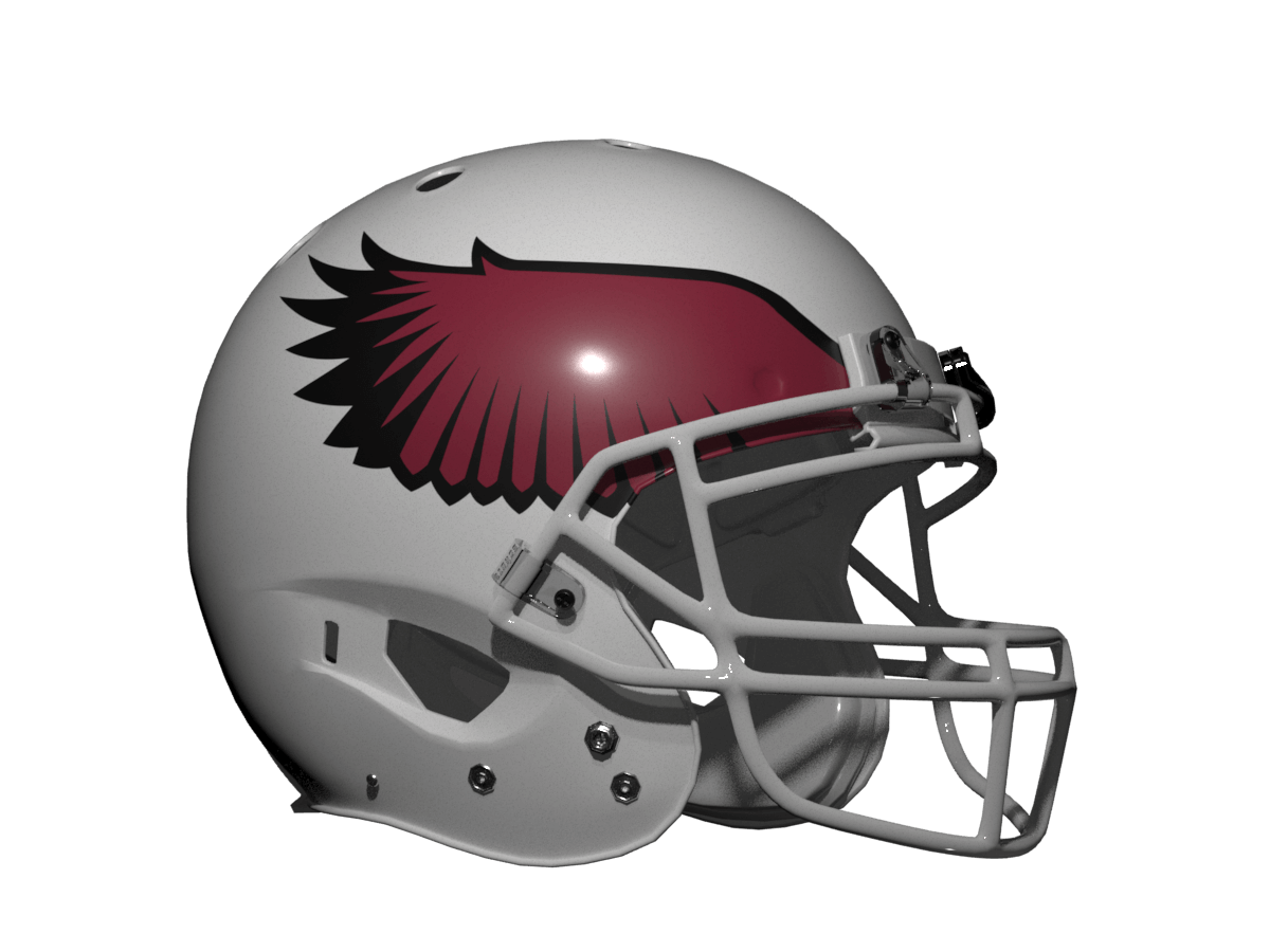
The Cards current helmet logo is of course the Cardinal head so I tried to make the wings in same heavy black outline style. I also kept the uniform as classic as possible, just added the Cardinal head as a sleeve logo as I felt that needed to be on the uniform somewhere. I made the visor white as there is no grey or silver in the uni and cardinal or black made it look too un-cardinal like.
Verdict: I think it looks good, but the Cardinal head is superior.
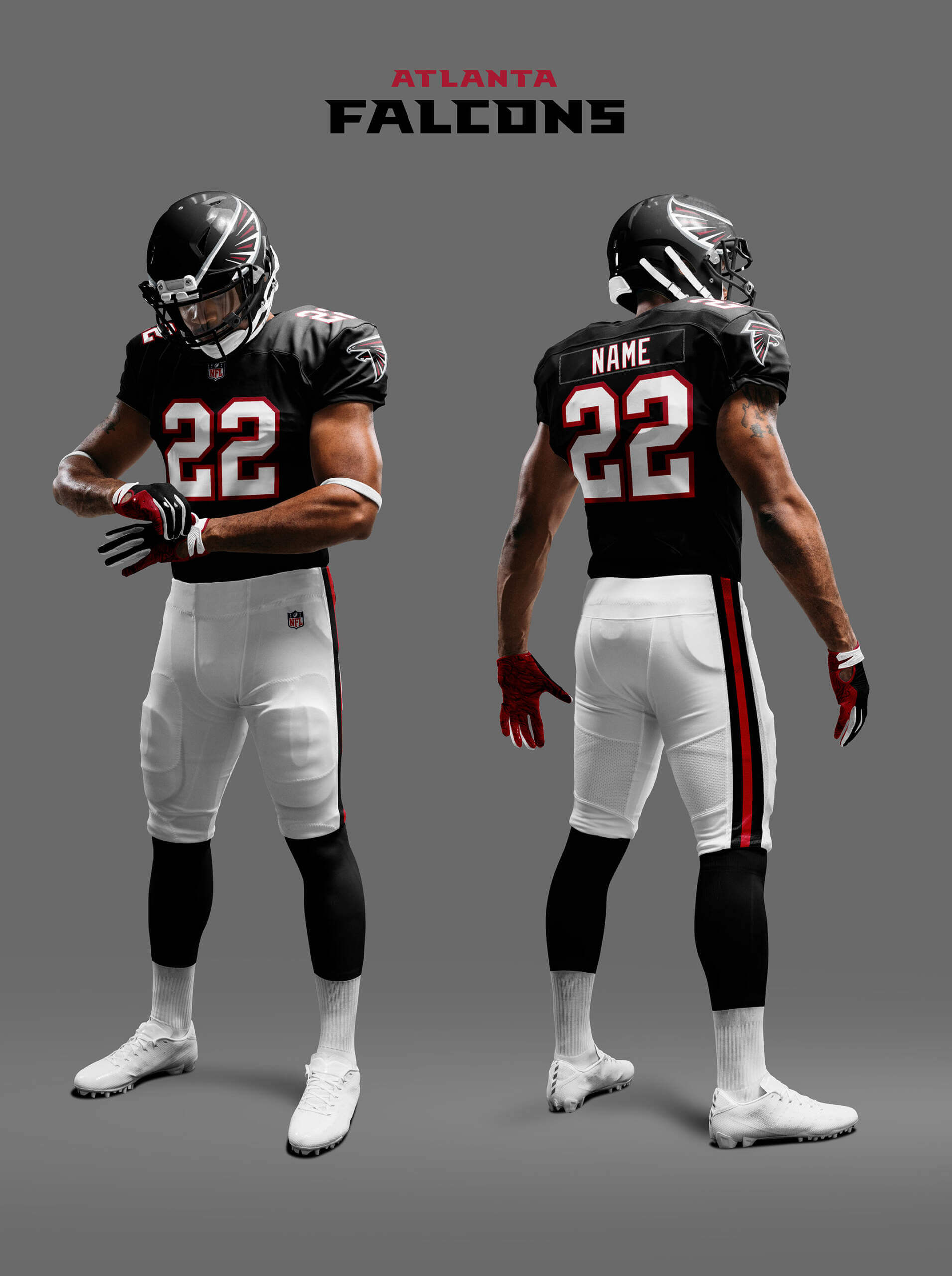
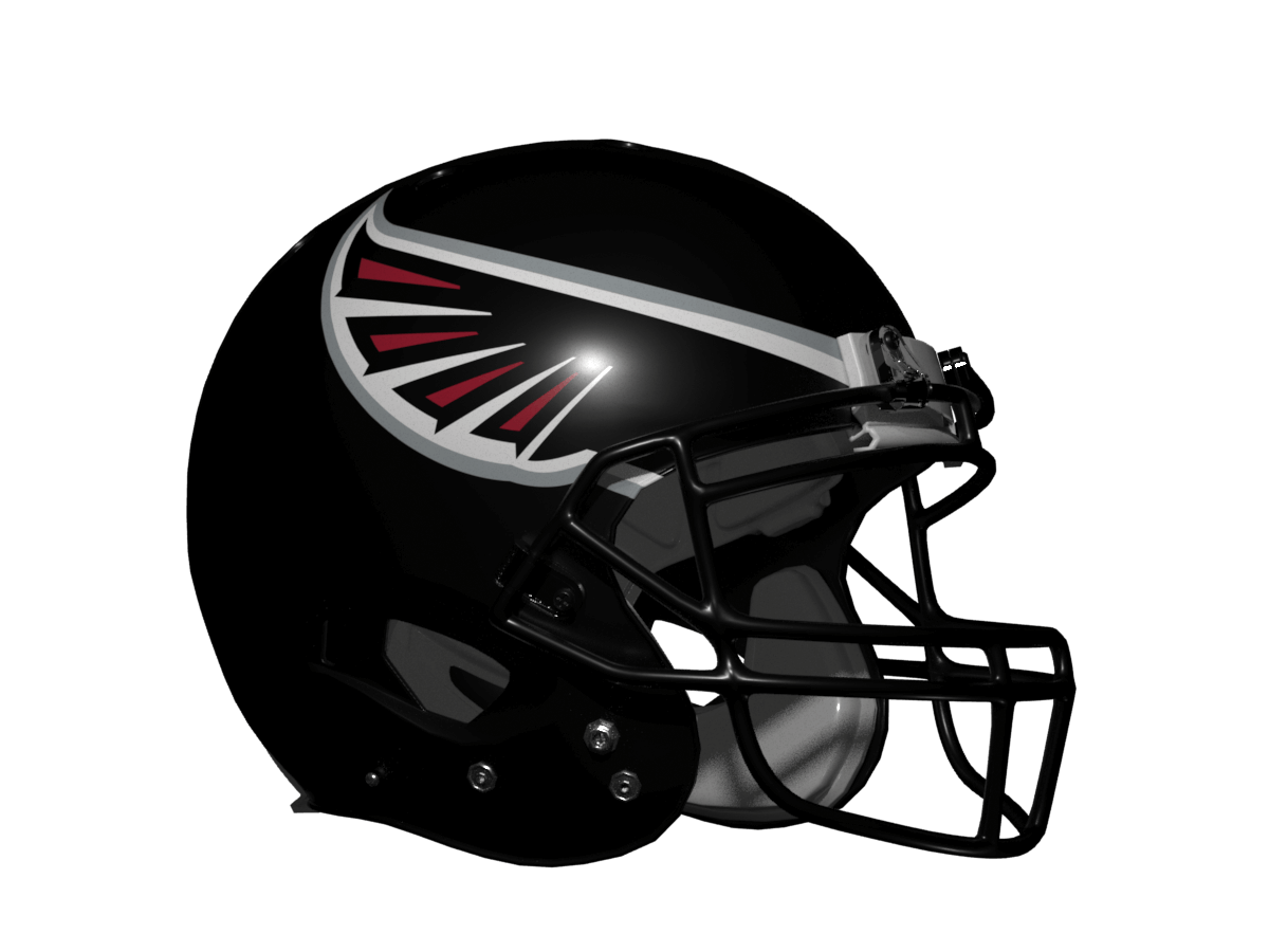
The current Falcons unis are black heavy so this version honours that, but ditches the funky number font and side panels. I’ve made the wings the same style as the wing of the Falcon in their current logo and I think it all looks pretty smart.
Verdict: as good as their current helmet.
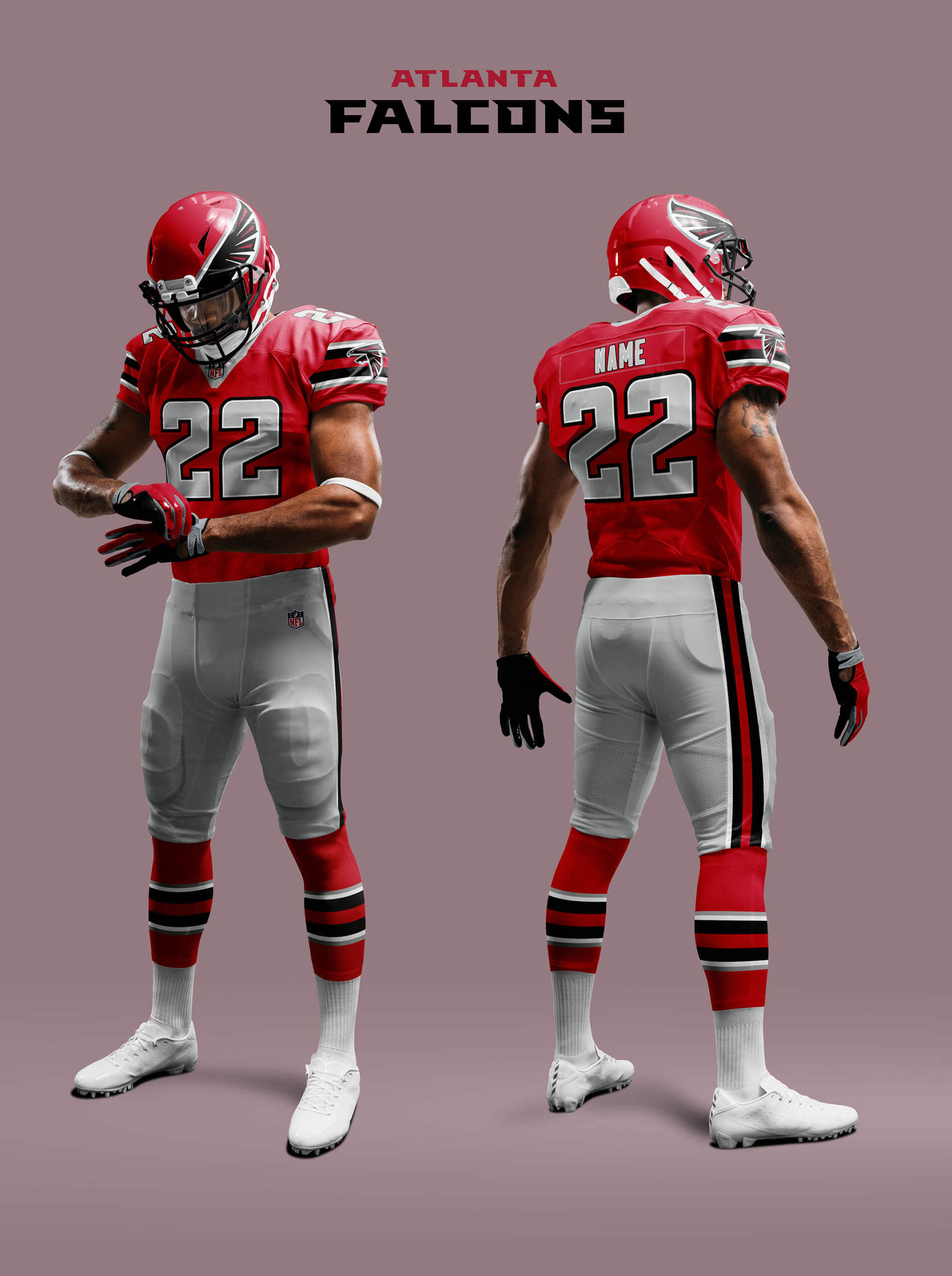
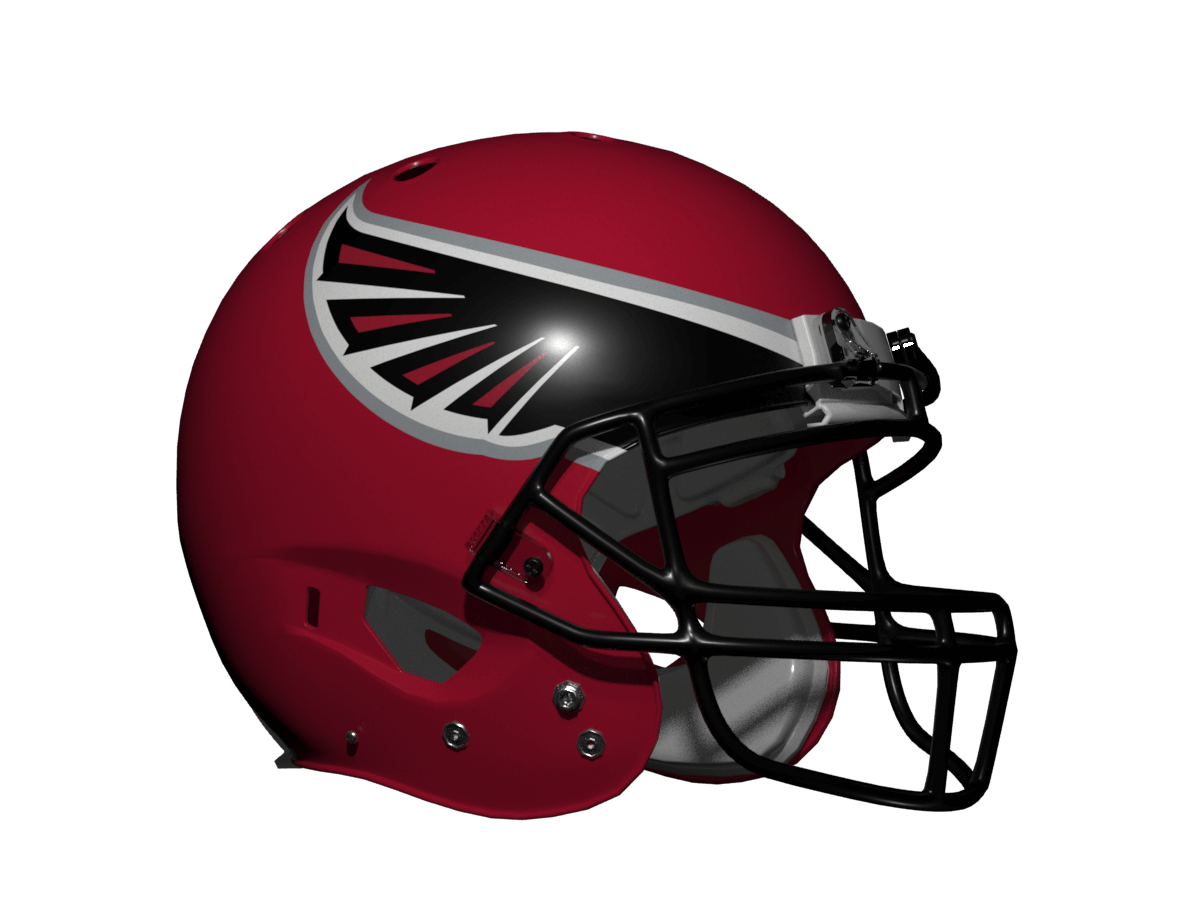
Of course the Falcons also have uniforms that feature more red, so I’ve also done a version based on their 1978-89 set tweaked to go better with the new logo. I have to say I prefer the Falcons in this look and the wings are a lot clearer on a red helmet!
Verdict: definitely an improvement.
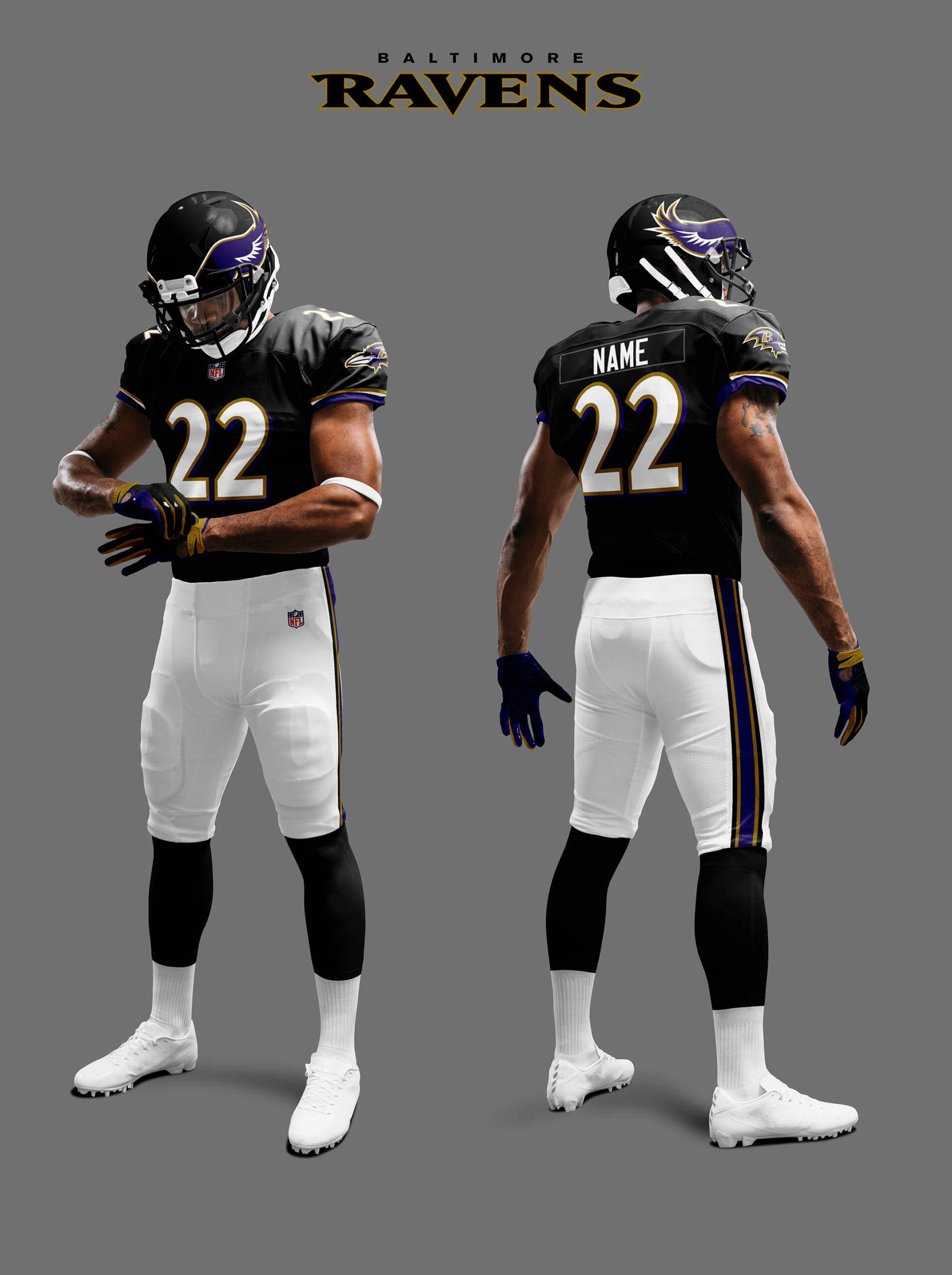
Baltimore Ravens (Purple)
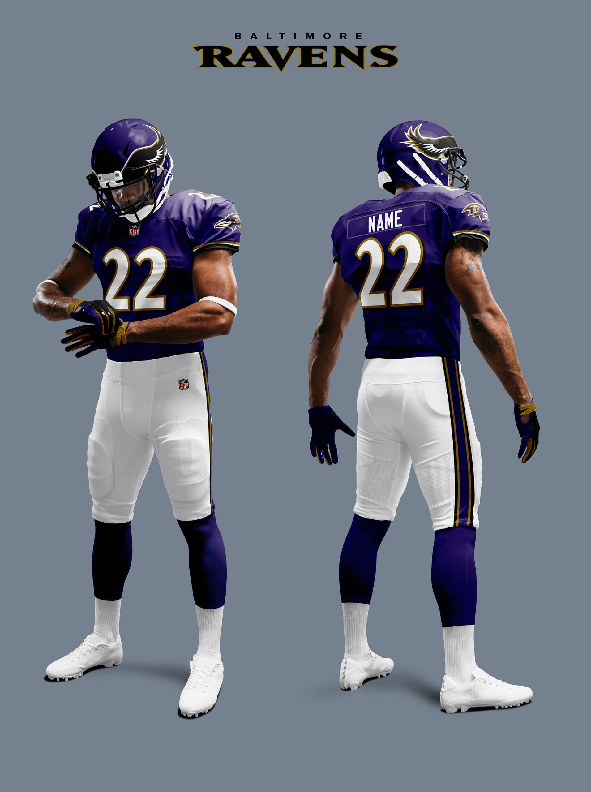
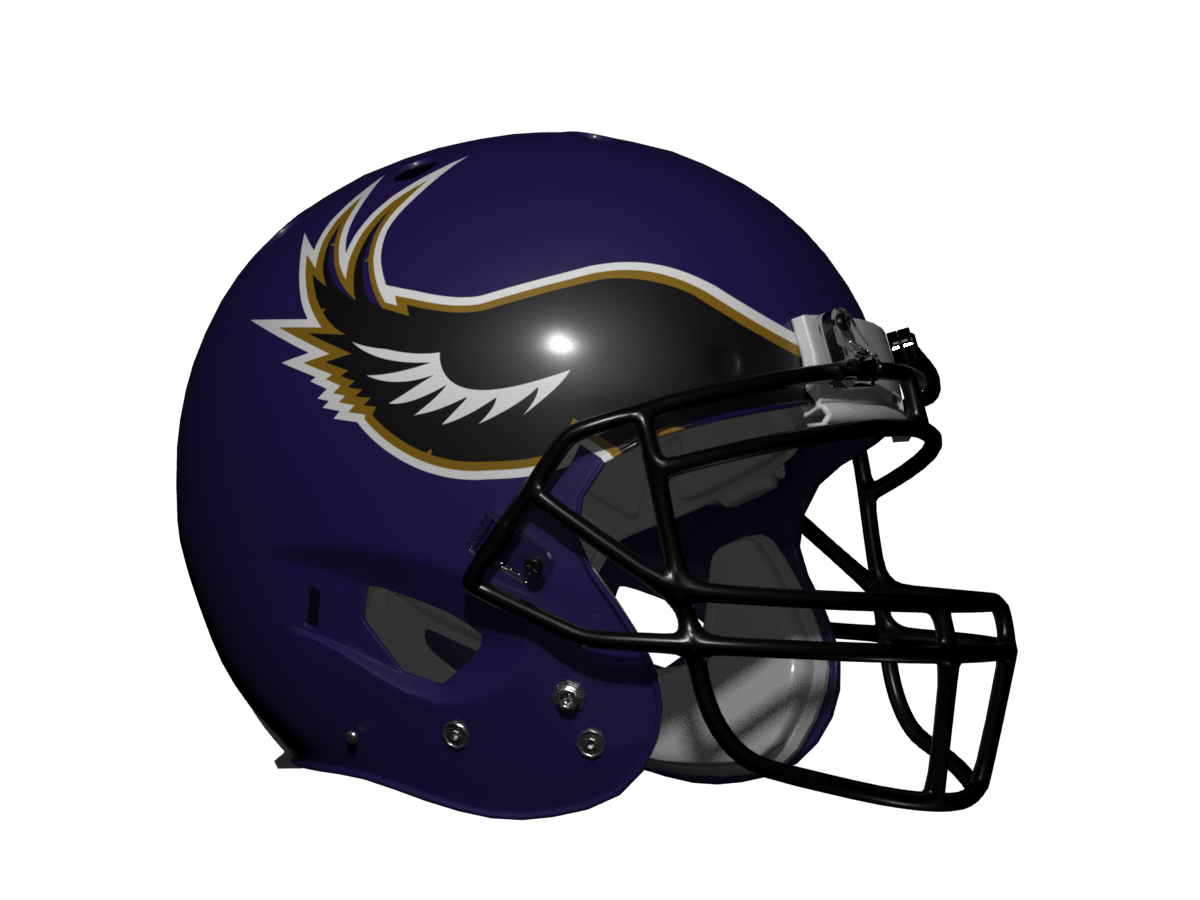
I’ve never liked the Ravens black helmet and purple jersey combination. I’ve always felt they should go for both black or both purple and so I’ve explored these two options here. First is the all-purple look. The Ravens have an old alt logo that has a Raven with wings so I’ve based my wing design on that. I’m sure someone will say it looks a bit too Vikings-like (and perhaps that’s why they never went the all-purple route) but as a design I much prefer it.
Verdict: The current helmet raven head disappears at any distance making the helmet a messy mush so this is a big upgrade for me.
Baltimore Ravens (Black)
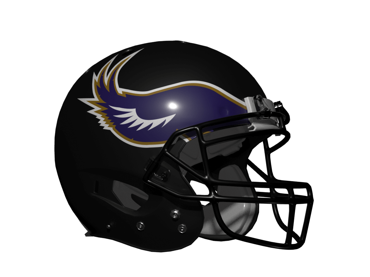
The second Ravens option is the all-black look. Now I know there is too much black around and they are in a division with two other black teams, but I rather like this look. I could have kept the wings black (like with the Falcons) but I thought the purple wings stood out a bit better, and of course the Raven head logo is purple so its wings should be purple really!
Verdict: another upgrade on the current helmet.
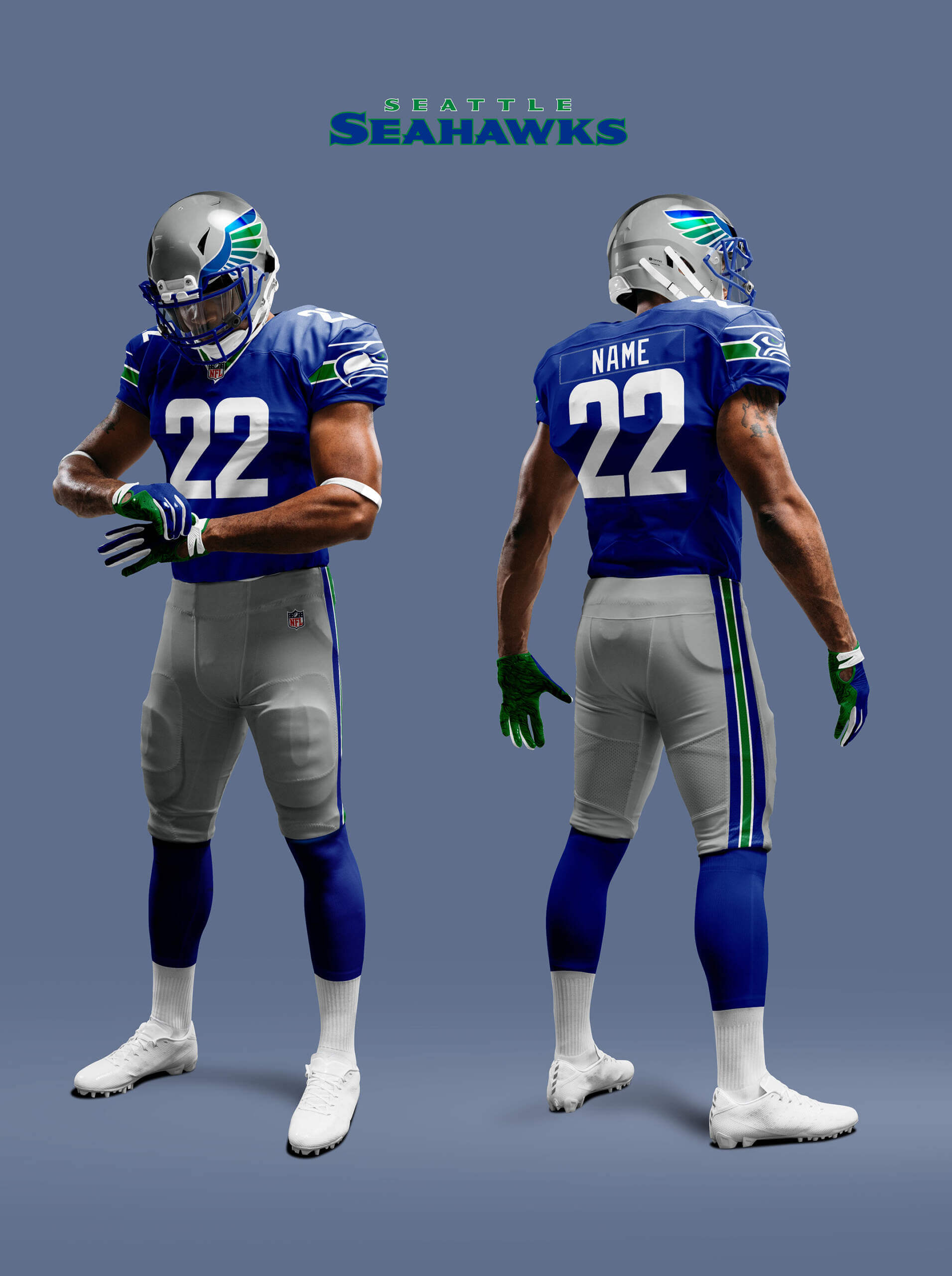
Seattle Seahawks (Navy)
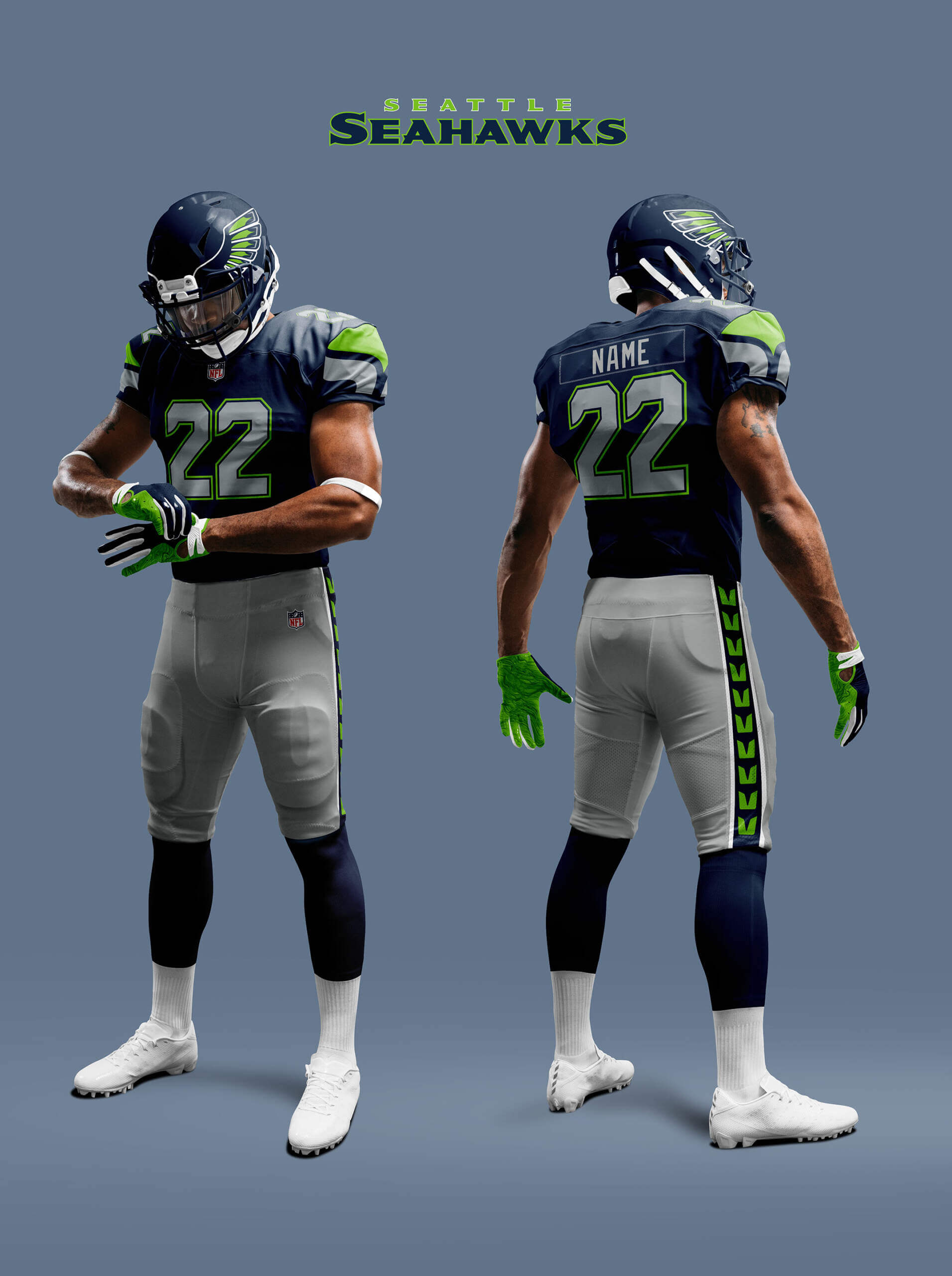
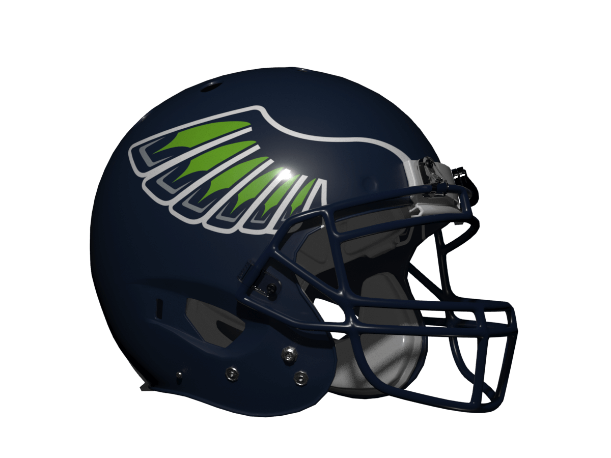
The Seahawks were a bit of a tricky one. They only have ever had one alt logo to feature a full seahawk and I could have gone with that for the wings, but it didn’t feel like it fitted very well. There are a number of full seahawk concepts floating around the web that go better with their native American design ethos, but we’re on rather thin ice here cultural appropriation wise! So I tried to create something based purely on the wings symbol that features heavily in their uniform rather than the seahawk itself. I’ve also tweaked the uniforms a bit. I’ve removed the chest bands and collar stripes, made the pant stripes multi-colour and added a navy inner outline to the number to make it clearer.
Verdict: I think it looks good and would make a nice alt-helmet for the team, but I think the Seahawk head logo just looks better!
Seattle Seahawks (Blue)
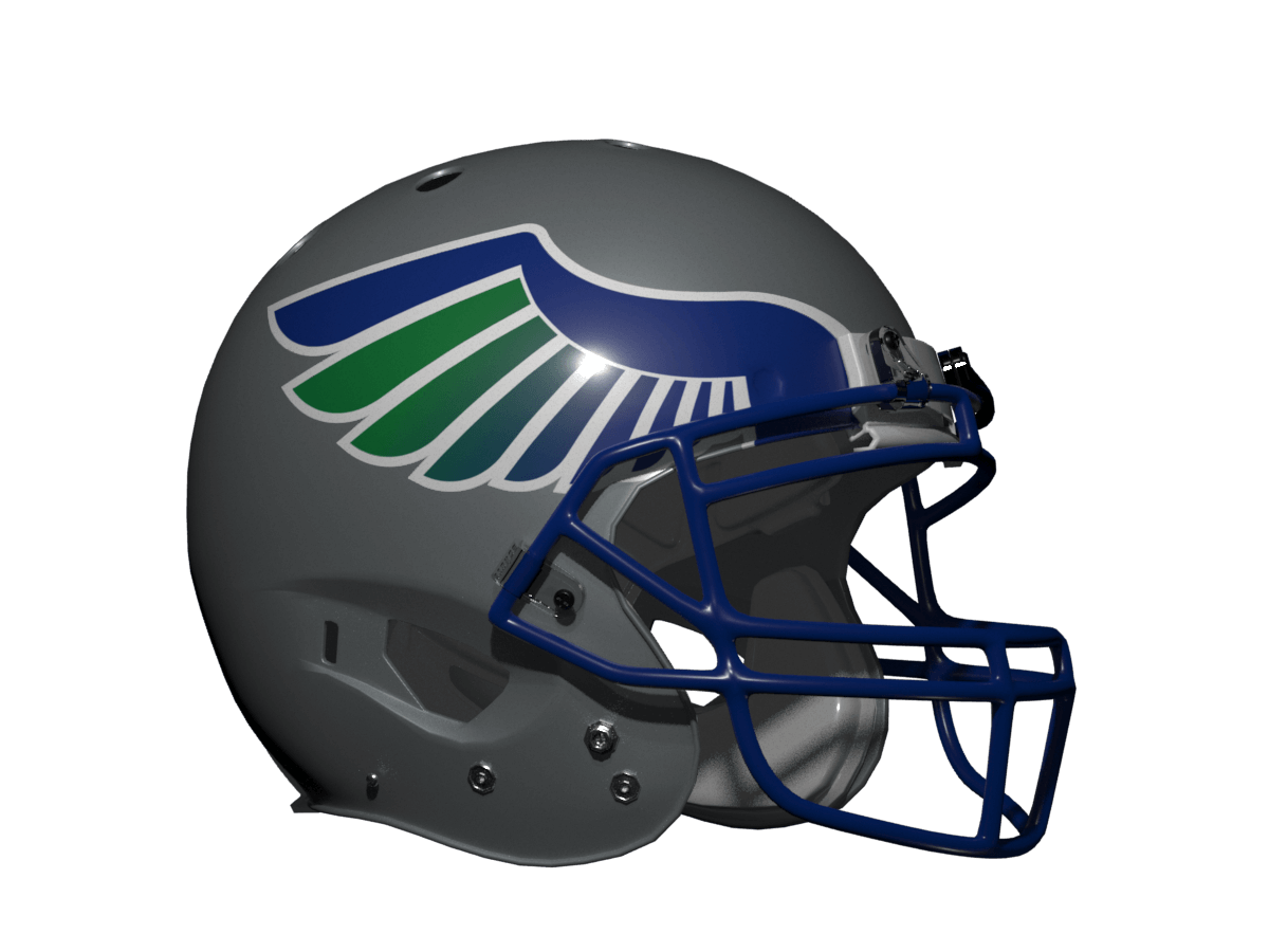
This year the ‘hawks broke out a cool throwback set based on their old blue/green ones so I thought I do a version based on that too. In this case I just went with a very symbolic wing design based on the blue green stripes. I was inspired by an unused design I did for the Seattle Wings from my What If the AFL Never Existed? Piece from last year.
Verdict: Like the navy version although this looks good the Seahawk head just looks better!
So that is it for ‘bird’ teams, but are there any other teams that could use a similar style of helmet design? Well if you think back to the old WLAF there was the Birmingham Fire who had a helmet that featured wing-like flame decals. Now the Tennessee Titans logo also features flames so what might they look like using that style?
Tennessee Titans
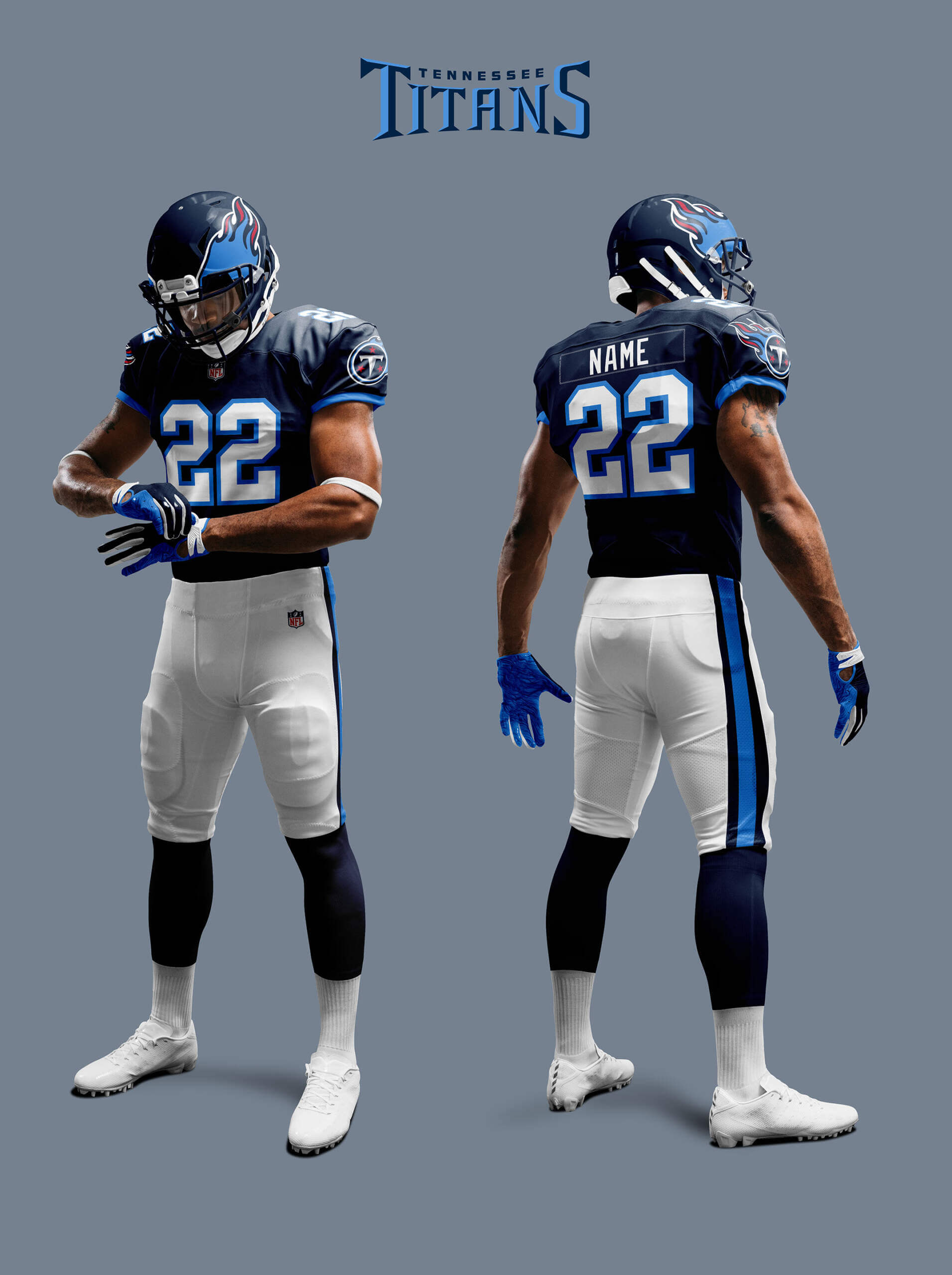
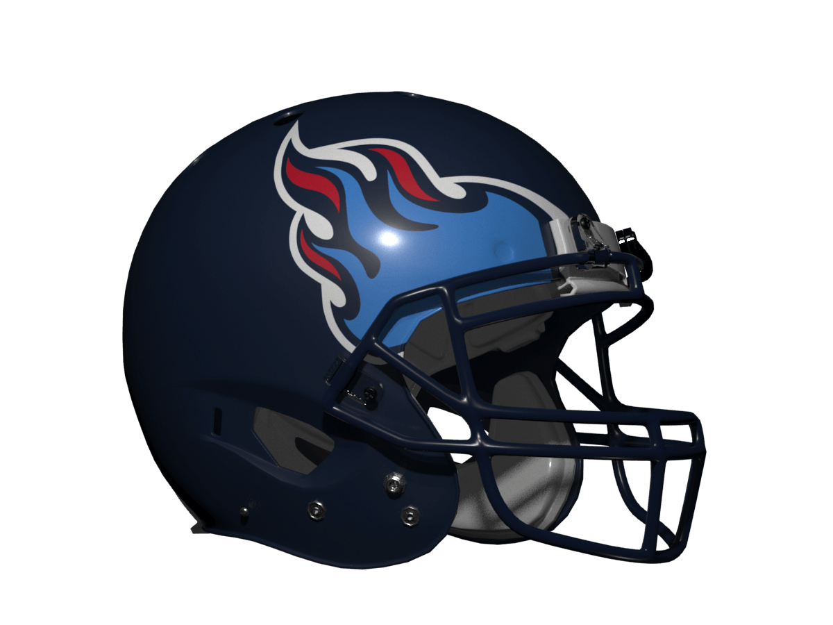
For the Titans I’ve stripped their over-fussy sword-themed, funky numbered uni right back to basics, then added the flaming helmet.
Verdict: A massive upgrade on their current set!
Thanks, Chris! Yet another very fun “What if?” segment — and it’s definitely interesting to see how non-Eagles bird teams look when given the Eagles treatment.
Readers? What say you?


This was a fun idea that gave me another idea.
The horns on Minnesota’s helmet is supposed to make players look like Vikings and the stripes on Cincinnati’s uniform is supposed to make them look like tigers.
You could do a feature where multiple helmets are changed to be more like costumes. For example, Dallas could have a uniform that looks like a cowboy hat and Jacksonville could have a spotted pattern.
Neat ideas!
It would be cool for the Lions to have a white and silver mane that covers the top of their new blue helmets.
Slightly off-topic, and I’m in the minority on this one, but as throwback uniforms go, I prefer the red Steve Bartkowski era Falcons unis over the initial black ones. If the Falcons ever went back to the latter, there would certainly be no cause for complaint; however, there was always something special about that red jersey uni set………
I don’t think you’re in the minority on that, Jeffrey. I definitely prefer the red jerseys, and I’ve heard of plenty of comments here at Uni Watch over the years of people who feel the same.
Good to know. Unfortunately in this age of “sleeveless” NFL unis, there would not likely be enough real estate on today’s jerseys to accommodate those gorgeous stripes.
If by “Steve Bartkowski era” you mean 1976-1977…then I agree:
link
Nothing from the Falcons silver pants years looked as good..not even their terrific time in red helmet/black masks made those appealing.
Atlanta’s best-ever NFL uniform!
I think I have to agree with you here.
But I’ll take ANY pre-Glanville Falcons uni and be extremely happy with it.
Love it! Let’s see every team!
Thanks Kevin! Yes there is more coming in this concept series, just not wings based :)
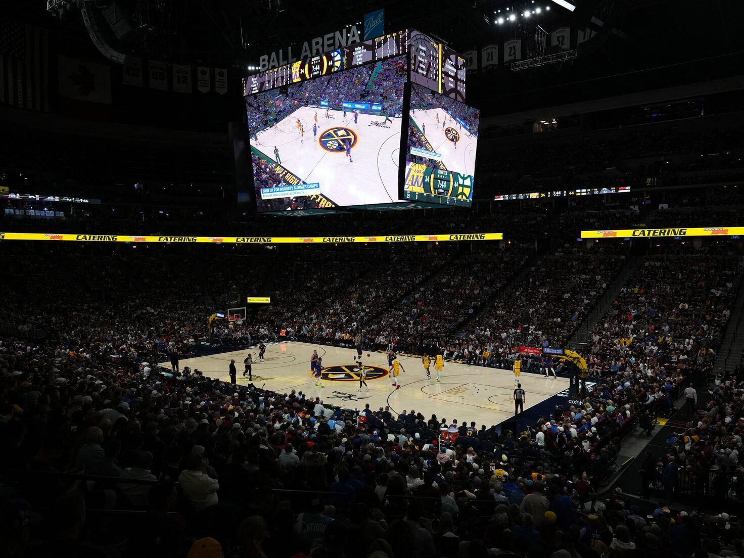
Very Denver games today
GTGFTS
Game 1 of the Western Conference Finals
16 May 2023
Anthony Davis makes 2/2 FT
Nuggets win in the end 132-126
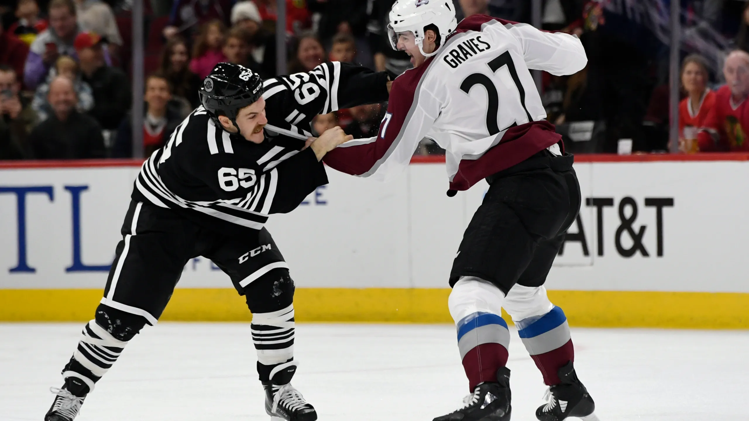
GTGFTU
29 Nov 2019
Avalanche 5 beat throwback Hawks 5-2
Ryan Graves and Andrew Shaw exchanging insurance information at 5:25 of the first period.
“exchanging insurance information.” Nice.
Great stuff, as always, Chris! My favorite of these might be the Cardinals’ winged helmet, but as you mentioned, they start with what maybe the best looking helmet of this group, so there the team that needs a helmet refresh the least.
I’d be curious to see a mock-up of the Atlanta Falcons using their old logo, the one they used from the ’60s through the 90s, as a basis for the wing. I’ve never been fond of the “ragged Falcon” logo they switch to in the early 2000s. I think the simpler, commuter wing design from that old logo might look really nice on a red helmet.
Thanks Kary! Yes, I was in two minds whether to make the red set have the old logo or not. It’s a much simpler form so it would make for a very sleek looking pair of wings! I shall have to give a try and see :)
“Commuter” was a talk-to-text error on my phone. That was supposed to say, “simpler, cleaner.”
I’ve thought about the falcons in this regard in the past, mostly because I hate the falcons logo and the less I see of it the better, so how donee get it off the helmet? My solution was always to do a top-down image of the bird over the top of the helmet so the birds body from beak to tail runs from the front bumper to the back of the helmet and the wings reach down the side of the helmet. Unfortunately this would probably end up looking like mutton chops.
Great concepts! That red Falcons combo and the throwback Seattle helmet are real winners. The color transition with the Seahawk wings on the throwback was really well executed!
Thanks Memal! Yes, not all colour gradients on an NFL uniform are an abomination! In small doses in the right places they can work.
Good designs! I really like the Ravens look purple or black.
“But what if other teams had used that style so that it didn’t seem to belong to the Eagles? After all, in college Oregon, North Texas and Rice have (or had in the past) a winged helmet.”
Can’t forget gridiron teams north of the border that have rocked their distinct set of wings.
Montreal Alouettes wore wings on the helmet 1960-69:
link
The Alouettes have brought back throwback wings with 1960s throwback uniforms in 2009 and the wings for a few games with their regular uniforms in 2018:
link
link
In Canadian university U Sports football, the Mount Allison Mounties currently have the wings:
link
Here is the prior version before redesigning to current look:
link
Sorry Wade I forgot about Canada!
I’ve been suffering from Mount Allison withdrawal. Thanks for bringing them up today!
Cool designs, Chris!
We all can agree that the Titans should really just go back to their Oilers branding, right? But the bucket of fire would be neat…really great in white!
Love that ‘unused’ ‘Hawks logo – a really pity it wasn’t more prominent.
Almost anything is better that the raven head Baltimore uses(mostly because of the off-putting slanted B)…purple wings on black shell for me, please – zoology be damned!
Thanks Chris! I should have done a version of the Titans in Oilers colours for comparison. I’ll add that to my list of re-does along with Kary’s classic era Falcons :)
“Happ.” — Dawn Lazarus
link
The LA KISS of the arena league had chrome flame job helmets. It was about as tasteful as one would expect from a team owned by that band. link
Ron… wow! That is one busy helmet. Jets of flame, yes. Dante’s Inferno level of flames, no thanks!
Great concept exploration. I think the Ravens are the bird team most in need of an overhaul. The Ravens name and colors are great for a team, but their logo is so bad It annoys me every time I see them, because I think there is so much potential but the Ravens probably won’t change because they won a couple Super Bowls with the current set.
Yes I agree totally about the Ravens’ current lid. In general (this applies to baseball caps too) if you can’t work out what the team is from 50m away then the logo isn’t doing its job!
I found the Cardinals mockup to be off-putting, but only because it stirred old memories of when the Eagles were rumored to move to Phoenix at the end of 1984.
1984 ChrisH had dreams that Leonard Tose took his team to the desert and a NFL/USFL merger happened…the Stars would have been a great replacement for the Birds at that time -and a well dressed one too!
1984 Jim agreed with you.
I wish the Eagles had moved instead of the Cardinals.
As an Eagles fan, I always liked that we are unique among bird-themed teams with the winged helmets. That said, I like these!
CARDINALS: no issues or thoughts, nice
FALCONS: red > black and I like the use of the current logo wing. Not sure about the gray numbers on the red jersey, love the gray-silver pants, BUT THE SOCKS!! It’s sad that this was the only striped sock in this concept and sadder that players wouldn’t wear them. (It’s a helmet project, I digress.)
SEAHAWKS: I may be wrong but I thought the Seahawks’ visual identity was done with the blessing of local Native tribes and their totem poles, so I wouldn’t consider it appropriation if the tribes approved. But I like the incorporation of the current design.
RAVENS: not sure how to reconcile this. I like the black wing, maybe with a flash of purple, like a real raven’s wing. But a black helmet would make it tough for the wing to stand out… but I am not sure about a purple helmet.
TITANS: it works!
Thanks MJ! About the socks – as UWers will know from my other concepts I am generally in the more stripes=more camp. But the concept was meant to be “like the Eagles” and I took that to include elements from the whole uni (so a lot of the concepts have plain sleeves with a logo like the Eagles do). And of course the Eagles have plain socks. I made an exception for the red Falcons concept because it felt right for that.
Loophole: throw the Eagles back to the pre-current era. Winged helmets and socks with stripes. And silver pants!
I think the ravens could approach it one of two ways: take advantage of different helmet finishes and do a meter black base with a high gloss black wing and just own that quirk that they agave an “all black” helmet with a “hidden” logo. Or do what the panthers did with their black helmet and just render the wing in purple or white highlights with the rest of the wing being comprised of negative space from the base black color.
The navy blue Seahawks’ helmet really works for me. I love the detailing of the feathers.
Thanks Walter. I was particularly happy with how this one came out as I had less to base it on than with some of the others where full bird wings already existed.
I agree that the Cardinals current head logo looks better on the helmet, but this uniform is a huge upgrade. Black looks better as a secondary trim color instead of the grey they’re now using on the new uniforms. I guess because of the head logo on the helmet, I’d replace it on the sleeve with some stripes.
The *original* cardinal head looks better.
The wings look as good as the current cardinal head.
I like all of these, Chris!
Love the Birmingham Fire look on the Titans…but could you put the shoulder yokes back, pretty please?
I like both Cardinal heads, but I think the original just has an edge. But as far as shoulder yokes go I’m afraid this is my view link ;)
Great concepts!
Like RICKAZ, I think these Cardinals uniforms are far superior to anything they’ve trotted out in for decades.
Really liked the Ravens change to a purple helmet. I’ve always found it odd that they have a black helmet with a purple bird when they could’ve had a purple helmet with a black bird.
I always loved the familiar but unique look of Rice’s helmets in the early 90s. Glad to see them referenced!
Awesome work as always.
Thanks Jason!
Very interesting concept. I enjoy these takes on what these helmets would look like with the Eagles treatment. My favorite is the Cardinal one actually. My least favorite is the red Falcon one. I’m one of the few that doesn’t care for the Falcons to be dressed in red. I’m ok with it being a minor accent color for them, but nothing more than that.
How about a Jets version in the next go around that uses airplane wings?
Doh! I can’t believe I missed that one RG81! I think it must be because I just did a different Jets concept based on jet trails. Add another to the list!
A Titan is a bird? Today I learned…
I mean there are extinct birds with “titan” in the name but that’s not what the word means, no one who says “titan” who wasn’t already talking about extinct birds is referring to a bird and including Tennessee here is a whole lot of a stretch, but I like concept art so I won’t fight it, hah.
Edit: Sorry, my completely clueless eyes just missed the mention of it.
I was shocked that that wasn’t acknowledged in the slightest. Huge elephant in the room :P
Most of these look better than their current actual sets. Especially The Titans..
Since I didn’t see Corcoran chime in, I’ll point out that the WFL’s San Antonio Wings had a pretty good winged – simple yet effective. I wonder if the USFL’s Breakers look to their style guide and said “Hmmm…”.
Just throwing this out there. Jets have wings
I’m not a designer, but the ravens should really have a white helmets with a metallic purple raven feather like a pen.
Great concepts, they work for every bird team! And the Titans as well.
The wing concepts are an awesome idea! I actually became an eagles fan when I was kid because of the wings on the helmet and I still kind of obsess over the wings 30 years later. I initially enjoyed when the eagles redesigned their uniforms back in the 90’s. However, in the past 5 or so years the uniforms have grown kind of stale for me.
One thing that bothers me now is that the wings do not look like actual eagles wings. I like to draw and come up with concepts in my spare time so naturally I might google an image for inspiration or research whatever I’m drawing. One thing I came across is there is a guide that classifies wing types and there are 4 general types:
Passive Soaring Wings – Eagle, Stork
Active Soaring Wings – Alabatross, Gull
Elliptical Wings – Sparrow, Crow
High-Speed Wings – Swifts, Ducks, Falcons
In my opinion, it doesn’t seem like the eagles use an actual eagles wing (the old helmet used what looks like an actual eagles wing, to me), but rather a high-speed wing. I’ve always wondered if this was a design decision since as a football team you might want to be associated with speed. Does anyone else think that the eagles wing does/does not look like an eagles wing?