Good Sunday morning, Uni Watchers. I hope everyone had a pleasant Saturday. It’ll be another full day on UW, as I’ll have at least three additional articles (plus the Ticker) following this post.
Now then.
Yesterday afternoon, the NHL held their annual All Star Game in Toronto, and after the game jerseys were released, many folks were less than thrilled with the designs. Clearly the whimsical nature of the sweaters was a departure from the usual excellent aesthetic from ASG games of year’s past. In fact, Paul’s most recent Substack featured a deep dive into some of the fantastic uniforms the NHL has used for the ASG.
I mentioned when the jerseys were released that I’d need to see the full uniforms on the ice and in action before I rendered a verdict. Having now seen them in yesterday’s games (there were three), I honestly liked them. I’m definitely not in the target demographic these jerseys were designed for, but for an exhibition game that isn’t taken particularly seriously, I thought they were more than adequate.
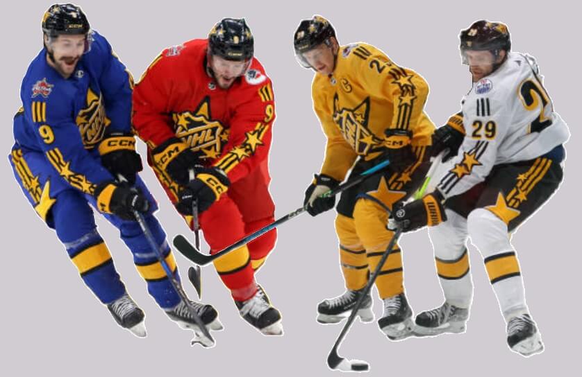
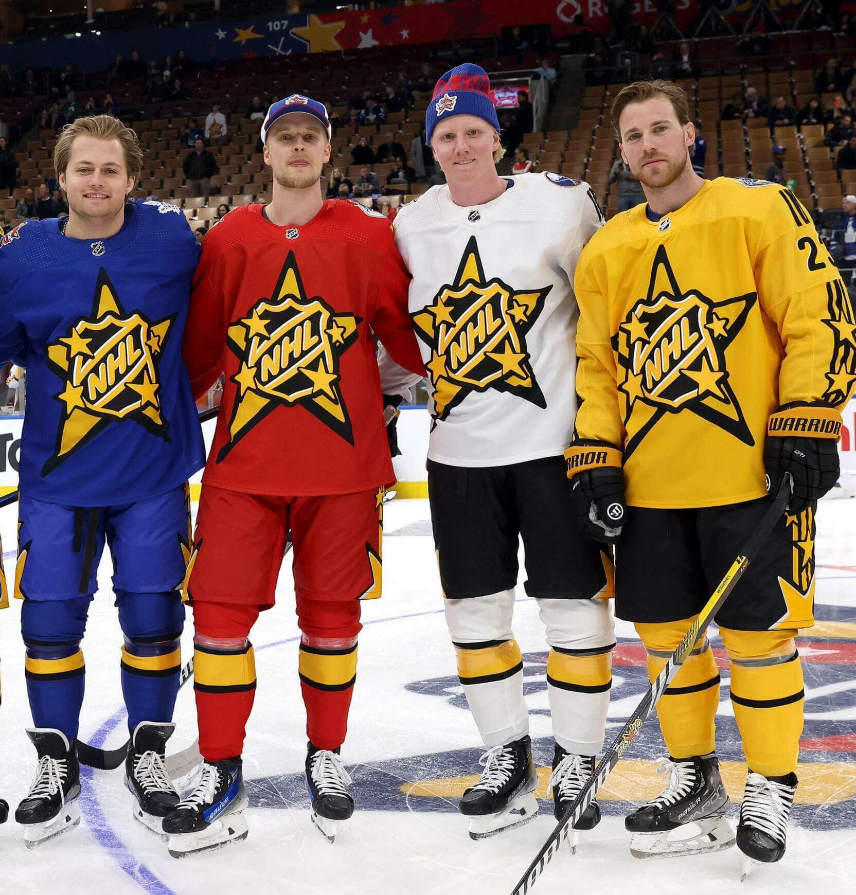
Like past All Star Games, the NHL set up four separate teams, but each team was captained by a different player (who was joined by a teammate and, of course, the obligatory “celebrity” co-captain): Team Matthews (Auston Matthews, Morgan Rielly, Justin Bieber); Team McDavid (Connor McDavid, Leon Draisaitl, Will Arnett); Team MacKinnon (Nathan MacKinnon, Cale Makar, Tate McRae); and Team Hughes (Quinn Hughes, Jack Hughes, Michael Bublé). Players were then drafted for each team, so the teams were not separated by Division (as had happened in previous games). Each team was given a different color jersey: red, white, gold and blue. All teams wore black helmets and each team’s socks contained a black/gold/black striping pattern.
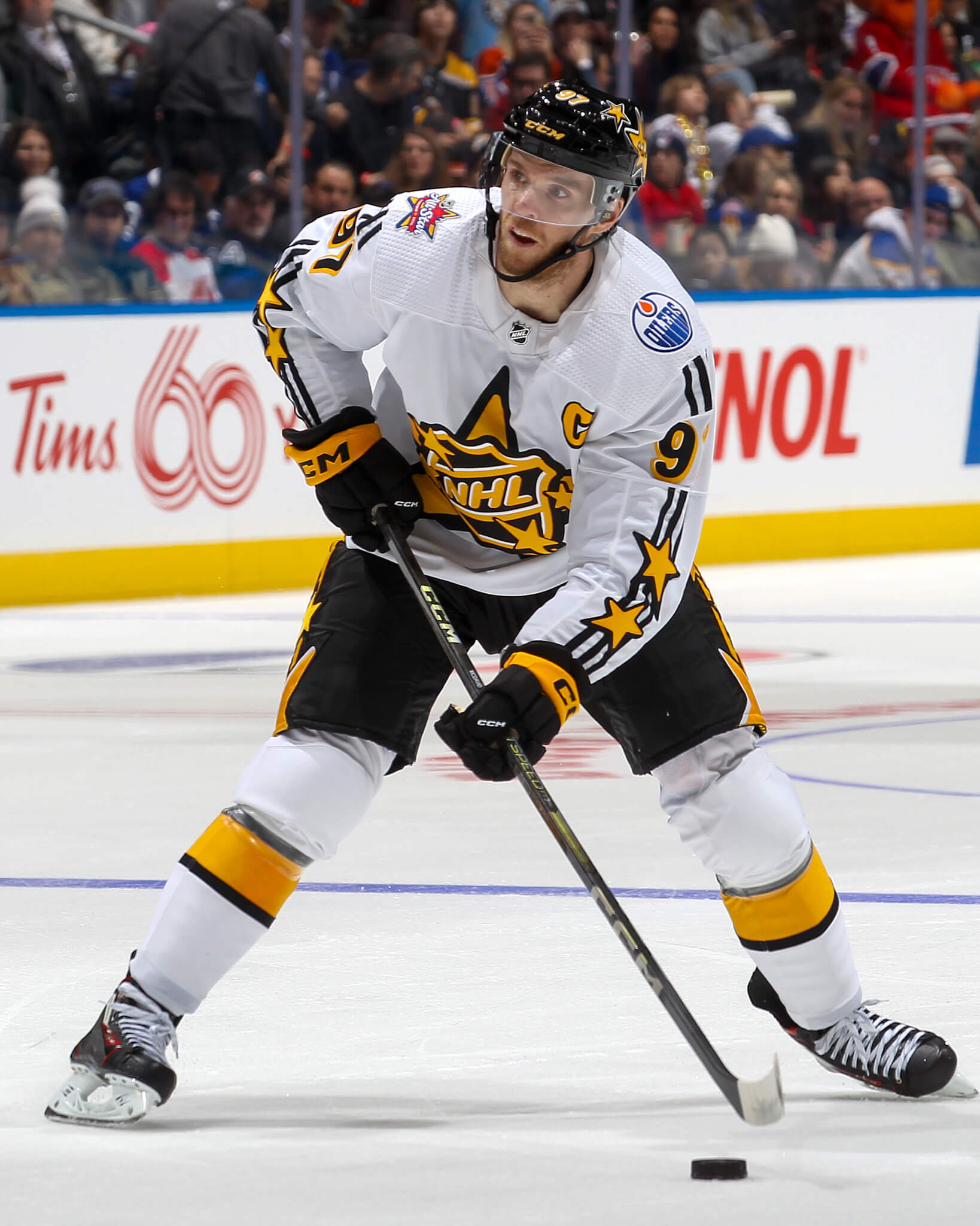
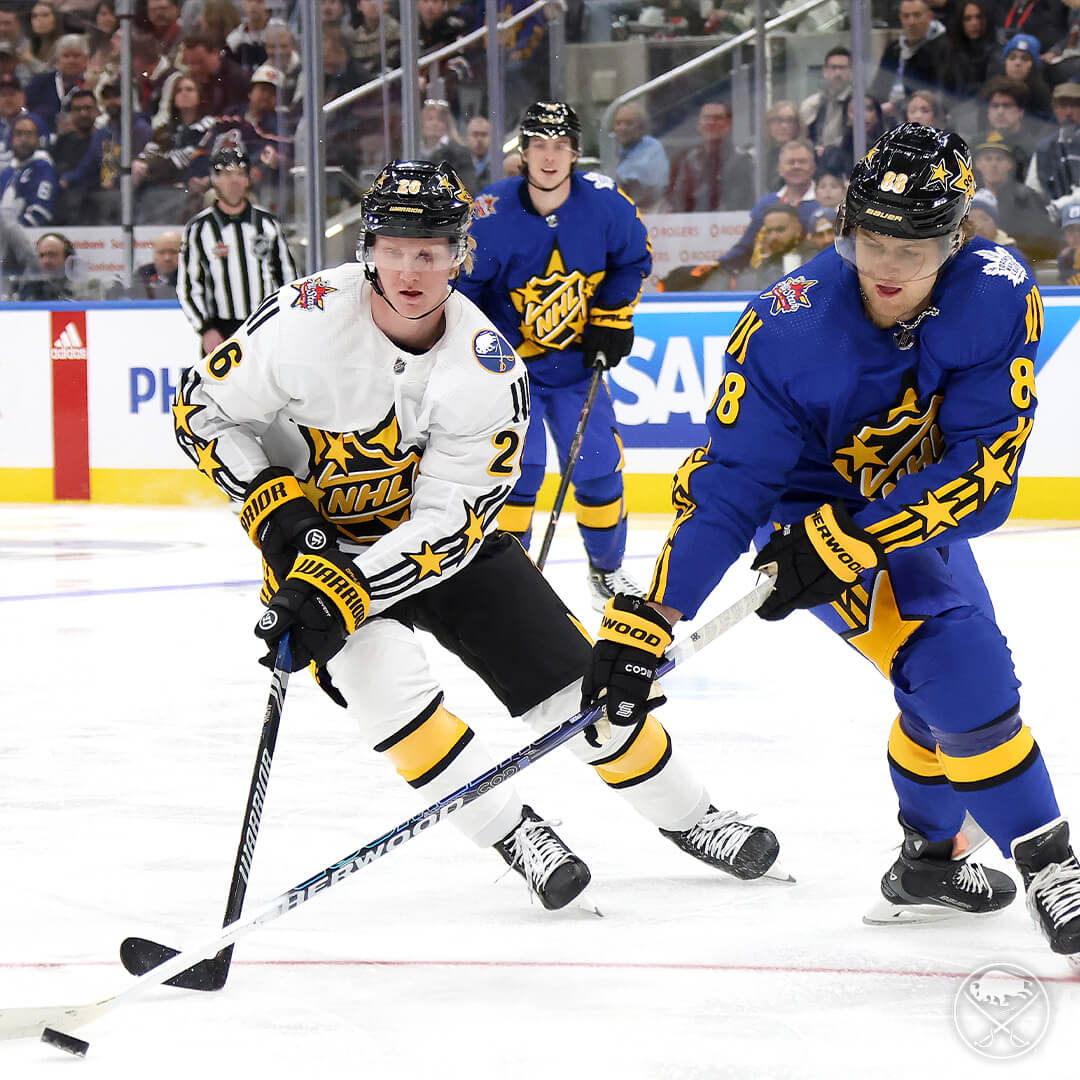
Team McDavid wore white jerseys with black breezers and white socks.
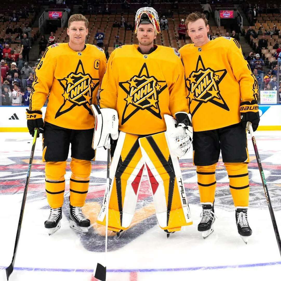
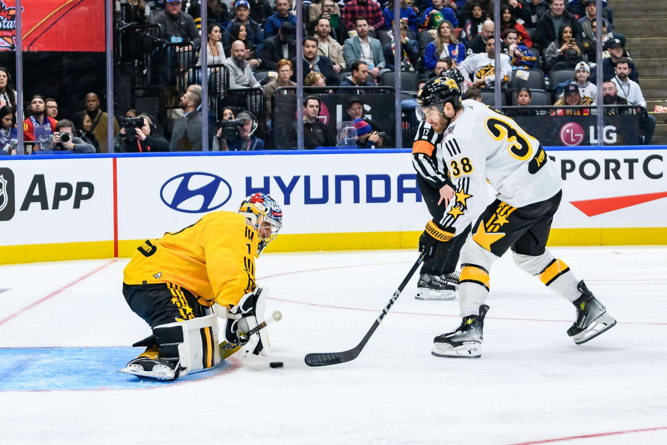
Team MacKinnon wore gold jerseys with black breezers and gold socks.
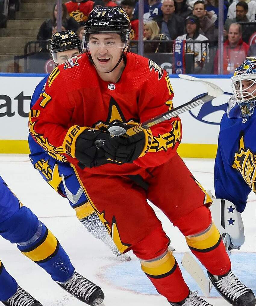
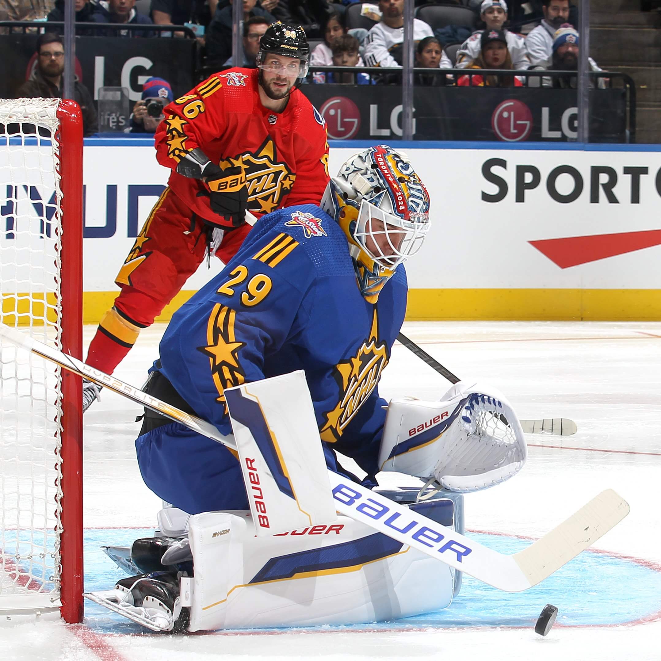
Team Hughes wore red jerseys and pants, as well as red socks.
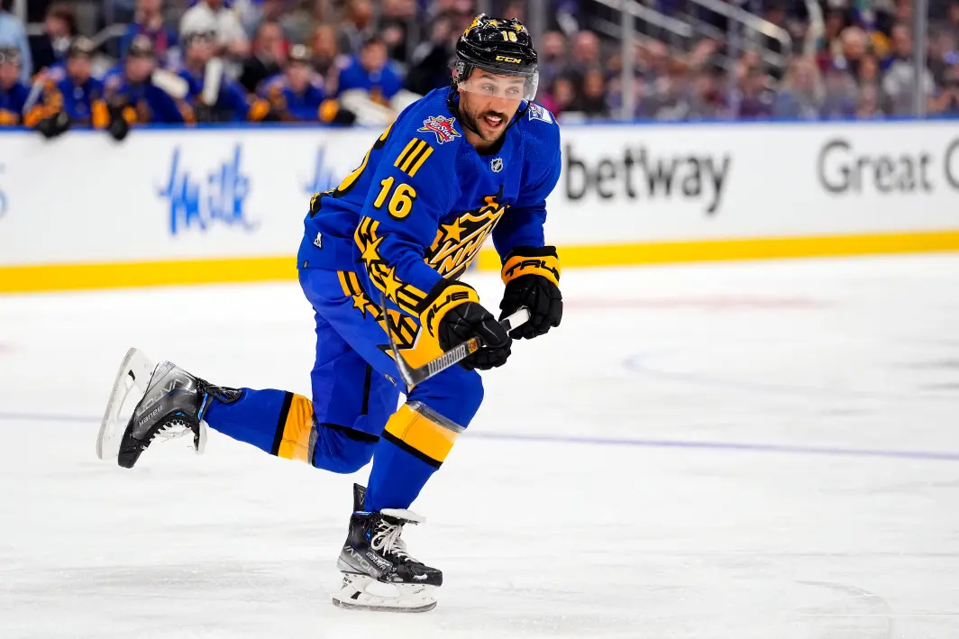
Team Matthews donned blue sweaters, pants and socks.
In the first game, Team McDavid (white) played Team MacKinnon (gold). I was surprised they paired the two “lighter” color teams, but the contrast between teams was fine. McDavid’s squad won the game and advanced to the final.
Here’s some video of the white/gold game:
Childhood Dream Come True 😃
Boone notches his first #NHLAllStar Game goal in his home province! pic.twitter.com/VJQio2BiBa
— Columbus Blue Jackets (@BlueJacketsNHL) February 3, 2024
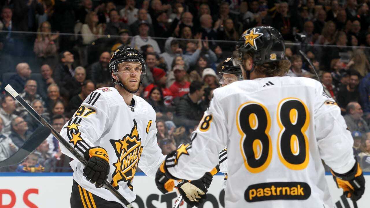
The second game was color vs. color, with Team Matthews (blue) facing off against Team Hughes (red). Team Matthews won to advance to the final against Team McDavid.
And here are those unis in action:
Quick start for Kuch ⚡️@Rogers | #NHLAllStar pic.twitter.com/yPxrXxJd6F
— Sportsnet (@Sportsnet) February 3, 2024
I didn’t have any issues at all with contrast, although as you can see from the above video, the mostly gold numbers on the red team caused some very slight legibility issues at distance. The finals pitted Team Blue against Team White, and looked just fine.
Bob standing on business, even at the #NHLAllStar game 😤pic.twitter.com/vxSorssG8e
— Bally Sports Florida: Panthers (@BallyPanthers) February 3, 2024
As far as the jerseys go, all of them featured a gold NHL shield with white shading and a black outline, atop a five-point star. Four smaller gold stars, outlined in black, sat above the shield to complete the crest. Captains had a gold “C” on the left chest, also in gold outlined in black.
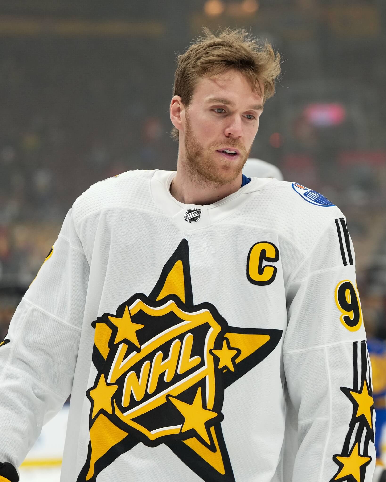
All players had the NHL ASG logo on their right shoulder, and the logo of their current team on top of the left. Unfortunately, all jerseys contained adidas’ signature three stripes running down the sleeves (as did the pants). Player numbers (there were repeats) and two additional gold stars also adorned the sleeves. I thought there might be some legibility issues with the gold crest on the gold jerseys, but even those didn’t look bad.
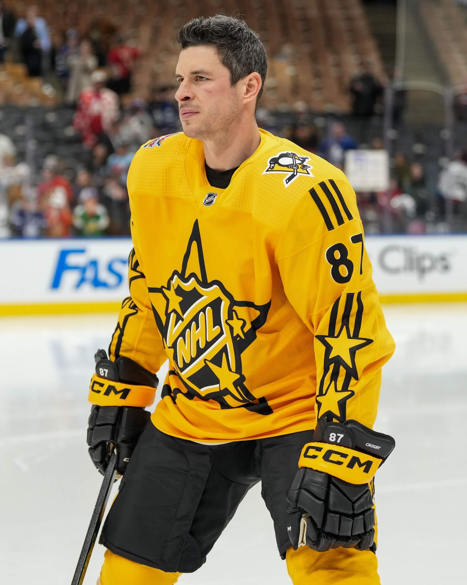
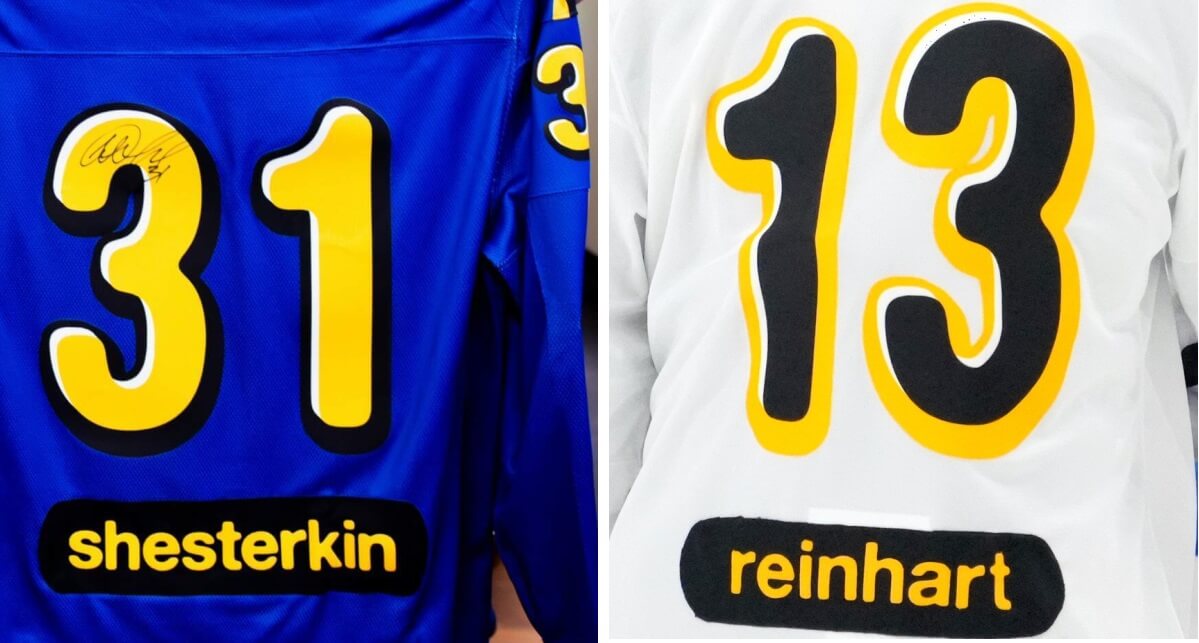
On the jersey backs, the white and gold sweaters had black numbers outlined in gold with some white shading. Those outlines didn’t really show up on the gold jerseys. Both the blue and red jerseys featured gold numbers outlined in black with white shading. In an odd design twist, NOBs were below the numbers, on a black nameplate with gold letters. All letters were in lower case.
Each team’s black helmet was adorned with four gold stars, outlined in white. Player numbers were inside a star. There were two stars on each side, for a total of four. So if you’re keeping track, each player’s helmet, jersey (also two stars on each side) and crest featured four gold stars. Breezers had two smaller stars, as well as one partial larger star (likely to mimic the pattern on the crest)
Here’s one more look at all four uniforms side by side by side by side.
Here are some additional photos:


While I’ve greatly appreciated the usual excellent (and “classic”) NHL uniforms over the past several decades, I honestly didn’t mind 2024’s more whimsical approach. I thought the colors were great, and even watched most of the game (unlike the “Pro Bowl” which isn’t even a game anymore or the NBA ASG). I’m not sure I’d want the NHL to keep doing the less serious motif in future years, but this time around it made for good viewing, and the players clearly enjoyed themselves.
You can see hundreds more photos here.
Readers? What did you think of this year’s uniforms?


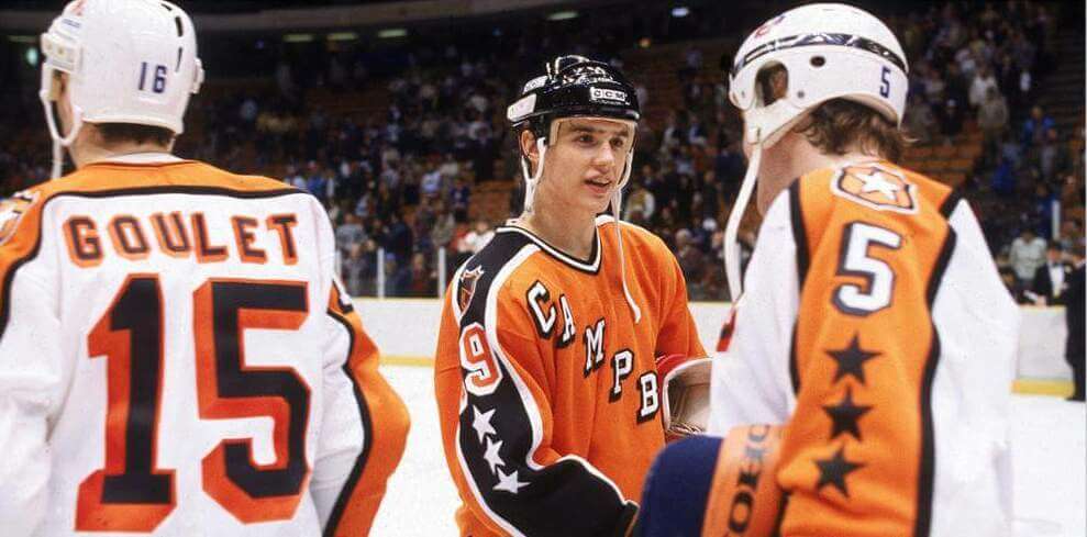
GTGFTU: 1986 NHL All Star Game; Wales Conference 4, Campbell Conference 3 (Hartford Civic Center)
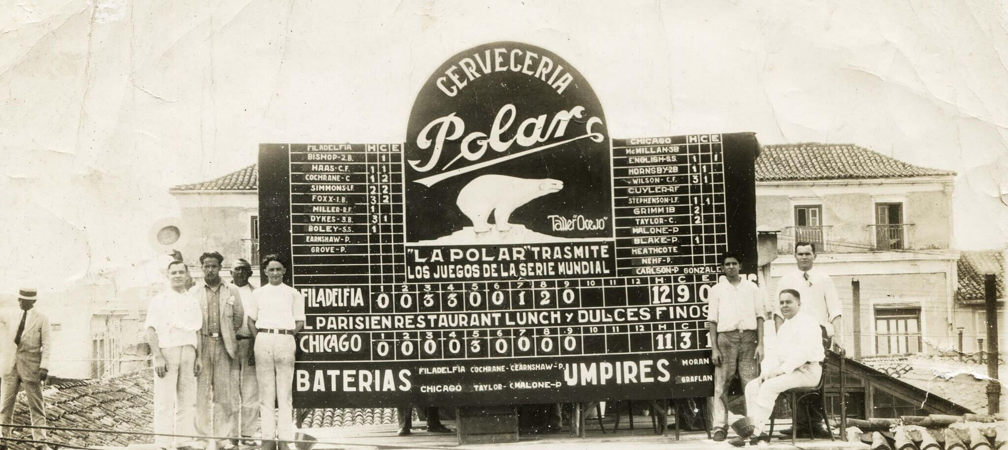
GTGFTS: I want to say that’s Game 2 of the 1929 World Series: Athletics 9, Cubs 3 on 10/9/29.
That said, I have no clue WHERE that picture was actually taken – it’s not at Wrigley Field.
My guess is Cuba.
Polar Beer is a Cuban brand.
You guessed the game – and Marc got the location right…nice work!
A very very oldie, but a very very goodie –
View of a scoreboard on a downtown rooftop…Cafe Parisien in Havana, Cuba…that shows the results of Game 2 of the ’29 World Series between the visiting Philadelphia A’s and the Chicago Cubs, played at Wrigley Field on 10/9.
Jimmie Foxx became the first player to homer in his first two World Series games…and the Athletics would go on to win the Series in 5.
I missed the introductions to yesterday’s All-Star Game, and the NOBs on little patches below the numbers were really hard to read. That’s especially hard for pickup sides where you have no real way to associate players with teams.
I wonder what it would have looked like if they had the breezers for each team be a different color from each other and and not match the jersey for that team. So maybe red/black, blue/yellow, yellow/red, and white/blue, for instance.
I was thinking about this. When I first turned the game on, it had already started, and the white and gold teams were playing each other, each in black pants. I was thinking the red and blue teams would also have black breezers, but that turned out to be wrong. I wonder how that would have looked (and based on the fact that each team had black domes and gloves, it probably would have looked ok). I don’t think gold (or white) pants would have looked good, regardless of who wore them. Not sure mixing blue with red or gold (and vice-versa) would have worked, but would have been interesting to at least see.
U-G-L-Y. The colors, logos, fonts… everything appeared cartoonish. Was the game simulcast on Nickelodeon? And as mentioned by Jerry, if you’re not a die-hard NHL fan, which I’m not, the treatment of the back of the jerseys made it nearly impossible to identify players. Two Gritty-sized thumbs down!
The colors in the ASG teams were flat enough and all accent ended identically enough to be good
I didn’t mind the colors. Bigger NOB and above the number would have been better IMO. I know it’s the ASG but many casual fans may not know everyone and those NOB didn’t help
I’m realizing (now that I look at these closer than I did during their release) that these ASG jerseys are very… iPhone-y? The NOBs are just like text bubbles and, I can’t be certain but, the jersey digits look like an iPhone number pad. My guess is the design was meant to appeal to millennials? I don’t actually mind those elements but it’s the colors that make it weird for me – it’s just too much red and blue and yellow (sorry, it’s not “gold”). If they broke up the red and blue with black pants like they did the yellow and white, that might have made it better – especially considering they all wore black buckets. It’s nice to see a little something different every now and then but I do like a more classic look for the ASG.
Having the player names all in lower case is fun and retro, but I think there would be legibility issues. Maybe putting them over the numbers would have helped.
Amoeba Records! What’s in your bag?
For my money, the uniforms in the GTGFTU are perfect and should have been permanent. They are based obviously on a Rangers jersey, but it all works perfectly. I like Ranger jerseys with straight NOB better than the vertical arching they do today.
When I first saw the ASG unis, I hated them. I grew up in the late 80s and 90s and love all the old Orange/White unis. The more I watched this weekend and thought bout it – were the ones this weekend really any less garish than all the orange and stars on the jerseys back then? If they kept this sort of scheme up would a whole new generation look back on these with as much fondness as orange and black and stars? I think so. I kind of like them now, but certainly some of the details could be upgraded.