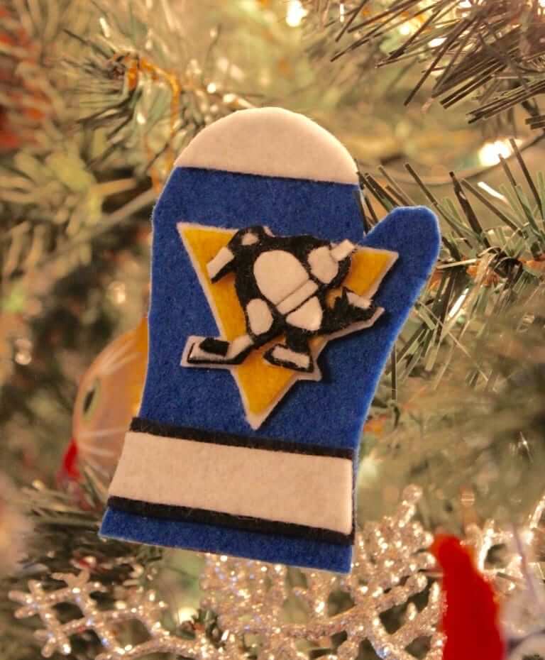
For the second straight day, we have a sensational DIY project centering around hockey-themed tree ornaments. Yesterday’s project was from the great Wafflebored, and today’s is from reader Tim Merkley.
Some quick background: Back in 2016, Tim guest-authored a post about how he made Christmas tree ornaments shaped like mittens, with designs based on hockey jerseys, and got each one autographed on the back by a player who wore that jersey. (I urge you to read Tim’s 2016 post, which is completely amazing and explains the background of the project, so you’ll have a better understanding of what he’s about to show you in this new post.)
Tim recently got back in touch to let me know about two particularly notable developments in the mitten-ornament project. I’ll hand the baton to him and let him tell you about it.
The Glow-in-the-Dark Sweater Mitten
By Tim Merkley
When the Vegas Golden Knights released their Reverse Retro jersey with glow-in-the-dark lettering in 2022, I knew I had to find out a way to recreate that effect in sweater mitten form.
It turned out to be more difficult than expected, however, as I quickly discovered that glowing felt is not really a thing, so I’d have to paint the felt myself with luminous paint in order to achieve the results I wanted. The green and blue paints were relatively easy to acquire, but it was extremely difficult to find paint that glowed a deep red color in the dark, but also appeared red in normal light. The red glow paints I was able to find were a pinkish color in normal light, which was not suitable.
After a lot of experimentation, I eventually found that mixing some red glow powder pigment with red acrylic paint resulted in a satisfying red color both in daylight and in the dark. The finished product, which took at least a year to plan out and complete, is probably my very favorite mitten I have ever made.
As for the autograph on the back, I already had a cardboard base signed by Knights player Phil Kessel, so I used that:
I’ve also recently completed another mitten-related project that Uni Watch readers might enjoy. As you probably know, the six Sutter brothers — Brian, Darryl, Duane, Brent, Rich, and Ron — all played in the NHL in the 1980s, and several of them went on to also become NHL coaches and GMs as well. I received my first autograph from Brent Sutter way back in 2005, and Darryl’s autograph six months later. After getting Ron’s autograph in 2017, I realized that it might be possible to get autographs and make corresponding mittens for all six brothers.
Duane and Rich’s autographs were relatively easy to get, but Brian isn’t much for signing autographs anymore. I found that he was coaching a senior AAA hockey team in Alberta that had an email address, so I gave it a try. A team employee agreed to help me, and I eventually got Brian’s autograph.
For the front of each mitten I decided to go with the jersey that each brother wore during the 1986-87 season, as follows:
- Brian Sutter: Blues home (with captain’s “C”)
- Darryl Sutter: Chicago road (with captain’s “C”)
- Duane Sutter: Islanders home
- Brent Sutter: Islanders road
- Ron Sutter: Flyers home
- Rich Sutter: Canucks home
Here are the fronts and backs of the resulting mittens:
———
Paul here. Honestly, I had forgotten all about this project until Tim got back in touch a few days ago. Please join me in thanking him for once again sharing his creativity with us!


Great work, Tim! Those all look fantastic.
These are sensational!!! That Canucks one!!!!
Great job with all those mittens! I’m going to enjoy rereading the original article again as well. I absolutely love this project!
Very creative! And that can is fascinating: the product looks like a sausage indeed.
Fabulous work Tim! In the piece from a few years back you stated “I usually attempt to cut out letters and shapes freehand, but in this case I used printed guides for the triangle and the outline of the penguin.”
Can you explain that process? How did you cut the Canucks wordmark?
Nothing too fancy, Steve – I print out a copy of the logo on paper and cut it out. I then glue it to the felt and cut out the outline around the paper. It does take some time to get the outline exactly right for very complex logos like the Canucks flying skate!
“We’ve done lots of Cowboys helmet-based cards over the yers”
Paul, I had no idea you are an appreciator of the Slavic languages.
Fixed.
I love flipping through all of the different card designs, even though most of them are unfamiliar to me. I wish they had something to identify them.
Awesome work! Uni Watch membership cards are the greatest. We need to get the movement going again
That Canucks mitten…chef’s kiss perfection! I wish they’d go back to that design.
I’ve heard of jellied cranberry sauce but never jellied cherry sauce. I guess that never caught on.
Standing ovation for you, Tim.
Greatness in this project.