
Good morning — Phil here, pinch-hitting for Paul as he’s at Jury Duty.
This morning the Tampa Bay Lightning unveiled a new third jersey (their wording), and it’s a return to black once again.
For the first time since 2022, black is the dominant color for a jersey (the team had worn a black and gray look as the team’s alternate from 2018-2022).
Black has been featured often in the team’s colorscheme over the years — they primarily wore black from their founding in 1992 through 2011. The team first added a a blue alternate from 1996-99, and a second blue alternate in 2008, featuring a diagonally stacked “BOLTS” wordmark as the crest. During the 2011-12 season, they changed to feature blue as their primary jersey color, and it has remained this way through up until today. They introduced a primarily black design with a “BOLTS” diagonal wordmark in 2014 and wore that until the end of the 2016-17 season. In 2018, the team released the aforementioned black alternate, which was worn until 2022.
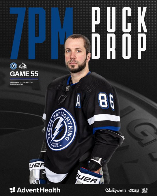
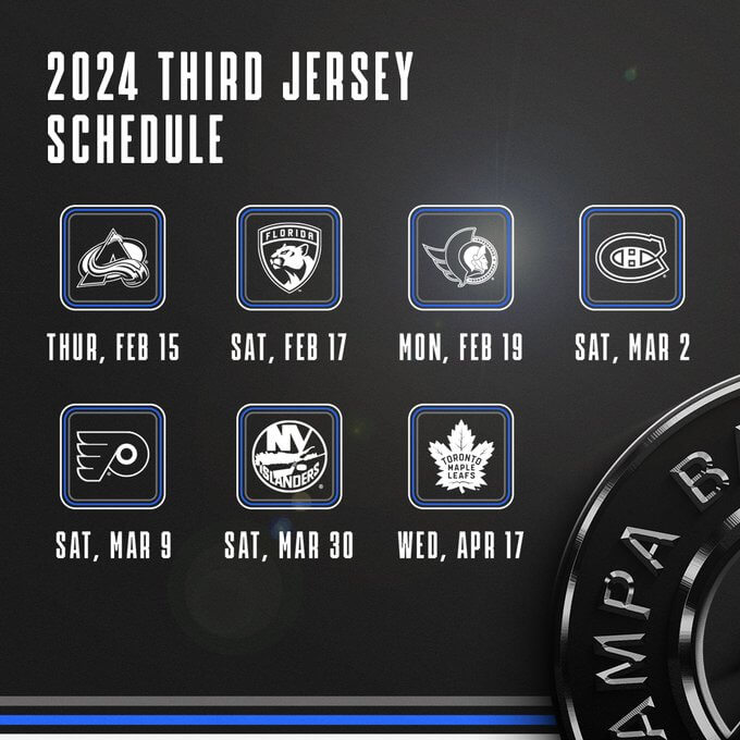
Let’s take a look at the new jersey which was just introduced, and which will be worn this evening (and seven times total throughout the remainder of the season):
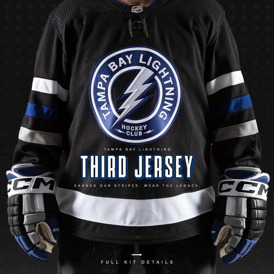
The Lightning are billing this as a “Legacy” jersey, which features several nods to the jerseys they have previously sported.
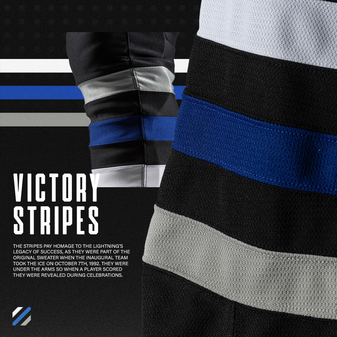
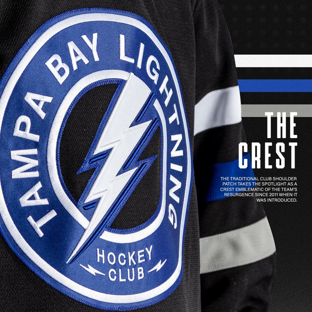
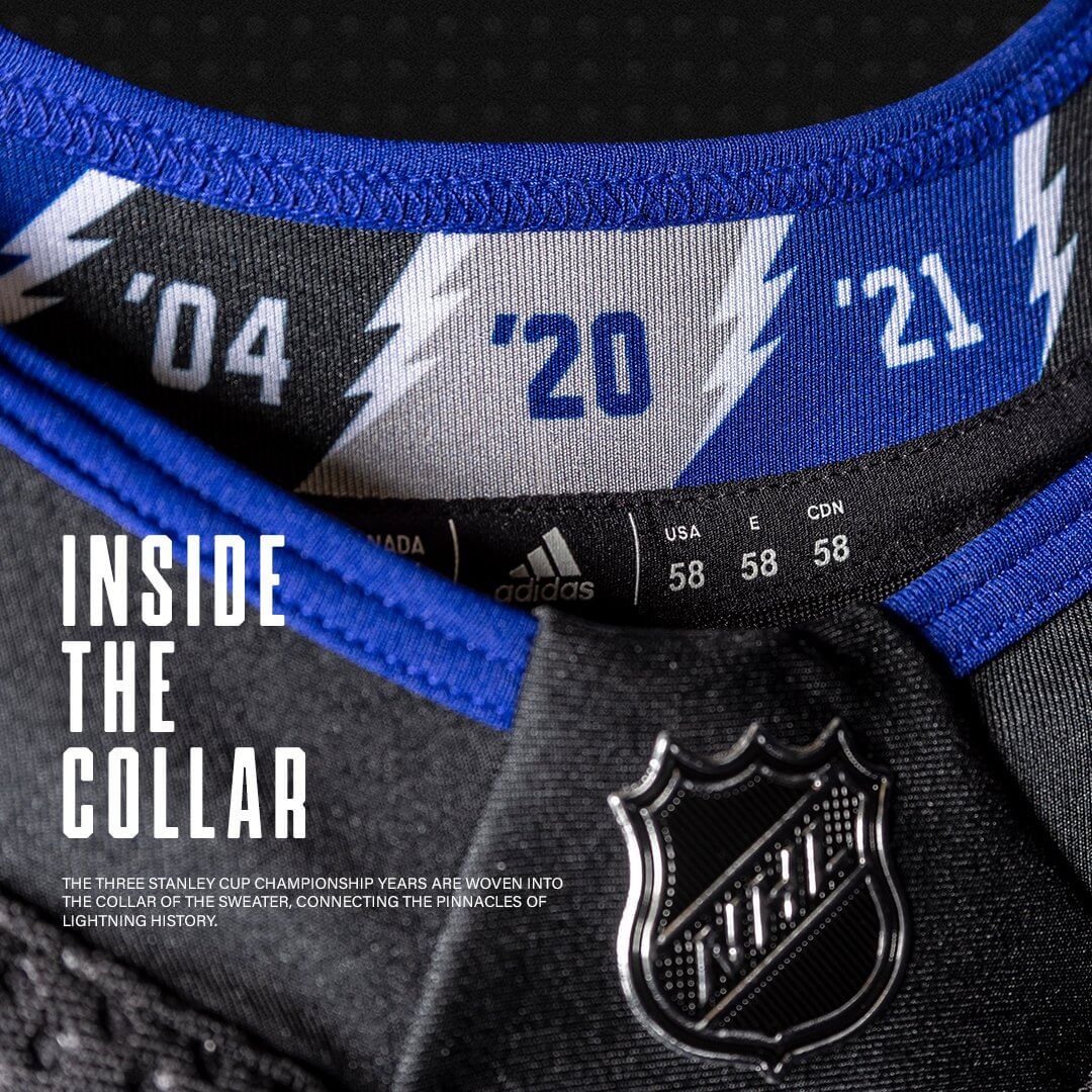
Per the NHL, “A throwback black sweater has the current shoulder patch logo on the crest – a first for the Lightning – with three victory stripes on the sleeves, a nod to the Lightning’s original jersey in the 1992-93 season, which had stripes under the arms. The jerseys also have 3D numbers and neck laces paying homage to earlier versions of Lightning jerseys, the Stanley Cup Championship years woven into the collar of the sweater, negative space in the crest logo, victory stripes on the socks and a matte black helmet to bring in a modern element.”
Tampa Bay revealed the new aspects of the jersey on Twitter earlier this morning:
The collar also showcases Tampa Bay’s three Stanley Cup Championships in different colors.
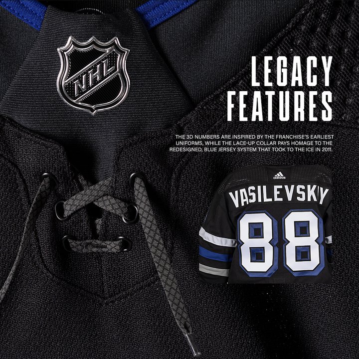
This jersey also features a lace up collar, and the back of the jersey has white numbers with blue block shadow (a harkback to the jerseys introduced in 2011). The team refers to these as “3D” numbers.
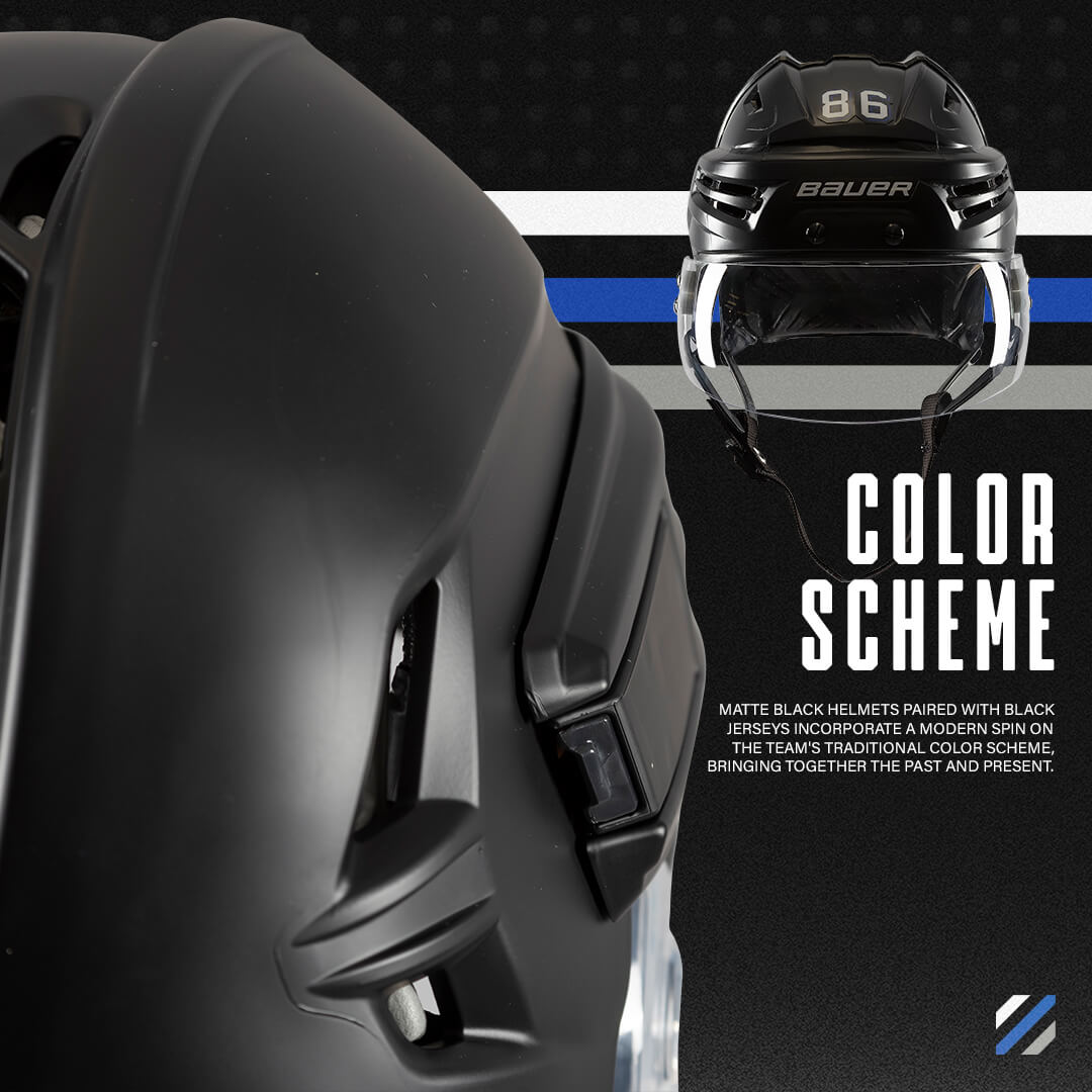
The team is also introducing new matte black helmets to be worn with the new jersey.
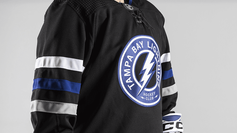
The new crest displays a roundel design with “TAMPA BAY LIGHTNING” in an arch and “Hockey Club” in stacked format at the bottom (which is the same as the shoulder patch on their current primaries). White TV numbers are on the sleeves in the same block shadow style as the rear of the jersey.
The Lightning also released a hype video, which shows some additional views, and also shows some of the previous looks that played a part in the creation of this new third sweater.
The heritage of our franchise. The legacy of its Thunder.⚡️ pic.twitter.com/vWbapzSqkD
— Tampa Bay Lightning (@TBLightning) February 15, 2024
As previously mentioned, the new jersey will be worn seven times: tonight (vs. Avalanche), Feb. 17 (Panthers), Feb. 19 (Senators), March 2 (Canadiens), March 9 (Flyers), March 30 (Islanders), and April 17 (Maple Leafs).
You can read more about the new jersey here.
You mention their first blue jersey was in 2008. They had one 1996-1999
link
Yep. Missed that — thanks. Now added to text.
I didn’t dislike the old black and silver third sweater, but I like this one even more. This definitely isn’t BFBS since their colors have traditionally been black, royal blue and white.
They should create an inverse white version of this and make this the primary home and the white as their primary white.
I agree that seeing Tampa Bay in black is less offputting than, say, Toronto.
That said, the Lightning have dropped black from their palette. So any non-throwback black jersey they wear qualifies as BFBS.
I think they get a BFBS pass. They’ve used it (off and on) since their inception, even if it hadn’t been in their colorscheme since 2022. But if you look at their uni history (link), they really only had two seasons with no black anywhere.
I don’t hate it, but I don’t love it either. It’s a big bag of OK.
It seems odd a team would be rolling out a new jersey this late in the season.
It’$ very hard to under$tand the motivation$ to relea$e uniform$ by team$ the$e day$.
The Lightning still don’t look like themselves as Maple Leaf colored Red Wings. Not sure it’s their best black uniform ever but black is good for them!
I like them in black with blue trim (as opposed their current main uniforms), so these definitely are better IMO than their currents. I also like the drop shadow numbers.
I don’t however, like the shoulder logo as the main crest (I actually don’t like it as a shoulder logo, either).
It looks more like a corporate logo than a hockey logo. Maybe eliminate the blue part of the logo along with TAMPA BAY LIGHTNING HOCKEY CLUB and keep the lightning bolt on the round black background with the blue and white trim around the circle? Just a thought.
Pretty nice. I consider it a big step up from the previous black jersey (which was just too dark for me, not enough contrast on the details). I would like to see just a little extra blue – namely, on the hemline at the waist (which would also be a nod to the original black jersey). Maybe a solid blue collar, too, but if they insist on a lace-up, the black collar with blue trim is fine.
Icethetics does a great deep dive on this!
link
Baker Mayfield of the Bucs was photographed at a Lightning game earlier this year wearing a Lightning jersey that I have never seen before.
I remember that it looked pretty good but I cannot find the picture.
I think he was wearing one of the Gasparilla pirate themed “fashion” jerseys they released this year.
I love that many NHL teams have returned to their original colours as their primary look and feel more should.
I put the Lightning in that category of a team that should go back to their original colours. Maybe not this uniform as their primary, but I am not complaining about this look because it puts the Lightning back in the black with blue and silver trim.
They really should just go back to their 2001-07 look
Major upgrade, this is, for the most part, what the team should look like on a regular basis.
I like the idea of these jerseys, but the execution throws me a bit. I’m not even sure why, as going through each individual element, there’s not one that jumps out at me as “bad” yet together as a package it underwhelms.
The current Tampa Bay chest logo warrants a chef’s kiss; using the shoulder patch design is a regression.
Words do not belong on hockey sweaters.
And, yes, that includes the Leafs.
I kind of wish it looked like the first picture and actually said “THIRD JERSEY” across the stomach.
lol! too funny!
I’m really happy they call themselves a hockey club.
After seeing these on the ice, I’m less impressed. The blue is almost completely lost and looks like a black and white jersey. I think they should have 1 bold white and then the lower part be blue like their original. In the white stripe they could have put thin victory stripes that would be a cool close up detail but otherwise would still look more like their classic uniform