The National Hockey League unveiled the 2024 All-Star game jerseys this evening, following an apparent leak.
Earlier tonight, this tweet appeared:
The 2024 #NHLAllStar jerseys have leaked via Adidas Hockey’s website. pic.twitter.com/Xz1Iu9XjsB
— NHL News (@PuckReportNHL) January 14, 2024
Shortly thereafter, the NHL sent a press release confirming that these are, in fact, the jerseys which will be worn at this year’s All-Star Game. The game will be taking place at 3:00PM on February 3, 2024. As in previous games, four squads comprised of 11 players (nine skaters and two goaltenders) will compete in the annual NHL All-Star Game.
The jerseys were designed in collaboration with drew house, the fashion brand co-founded by global superstar Justin Bieber.
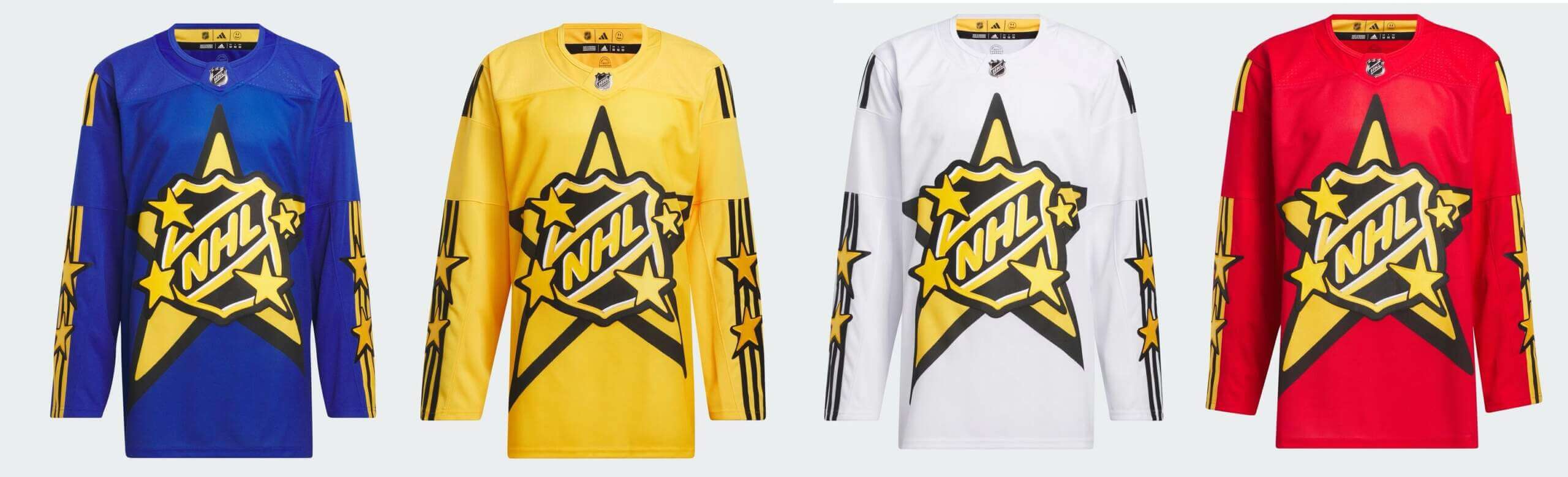
According to the NHL, “The 2024 NHL All-Star jersey collection distinctively features four versions of the jersey (one for each All-Star team) in vibrant colors – blue, red, yellow, and white. The collection brings a culturally-relevant streetwear collaboration to the NHL All-Star Game while respecting the invaluable tradition of each individual NHL team through the incorporation of a team shoulder patch.”
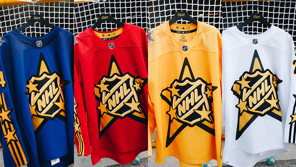
Here are a couple additional looks at the jerseys:
The jersey features the NHL Shield and the design has bubble letters and enlarged dimensions. The crest is one of the largest ever to adorn an NHL jersey at 22 inches high and spans the full width of the sweater, according to the NHL.
“After the tremendous success of our first NHL, adidas and drew house collaboration for the Maple Leafs’ Next Gen jerseys, we have looked forward to another opportunity to bring a bold, fashion forward look to NHL jerseys,” said Brian Jennings, NHL Chief Brand Officer and Senior Executive Vice President. “The All-Star Weekend in Toronto is the perfect setting for a fresh perspective on the All-Star jersey. The vibrant colors in this year’s All-Star collection are both youthful and classic and offer the perfect complement to the young NHL talent set to meet in Toronto for this year’s NHL All-Star Weekend.”
While I’ll need to see these on the ice (and with breezers and socks) to render a full judgment, I rather like them. The ASG is an exhibition, and while I loved some of the more traditional and classic ASG looks…
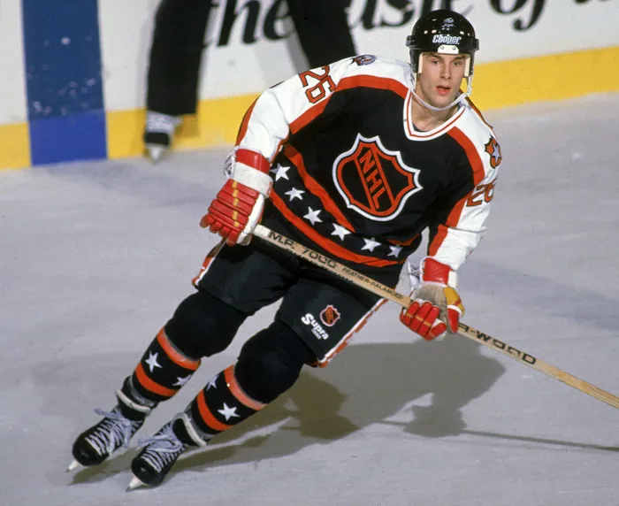
…including some more recent classic designs…
…these appear to be miles better than some of the most recent offerings.
I guess we’ll know for sure how successful (and how good they actually look) when we see the full uniforms — hopefully before they’re worn in the ASG on Saturday, February 3.
You can see a couple additional views in this short video.
Your thoughts?
If the USS Enterprise had an intramural hockey league…
You beat me to it.
And that’s not a bad thing. The Starfleet vibe kind of works for an All Star Game.
Just hope your favorite player isn’t on the red team… because didn’t the Red Shirts always die on the Original Series away missions?
Well, that’s one reason why they reversed command and operations colors for TNG.
link
From a Star Trek documentary I saw recently….
They don’t look like hockey jerseys, and I am tired of the devolution of uniforms in all major sports. The money spent on these new sets must be a lot, and they deliver less each time. No thanks.
There is a consideration that is dictated by the game’s format: Each team must look distinct from the other three, to accommodate any combination of opponents. To that end, the sweaters are well-designed.
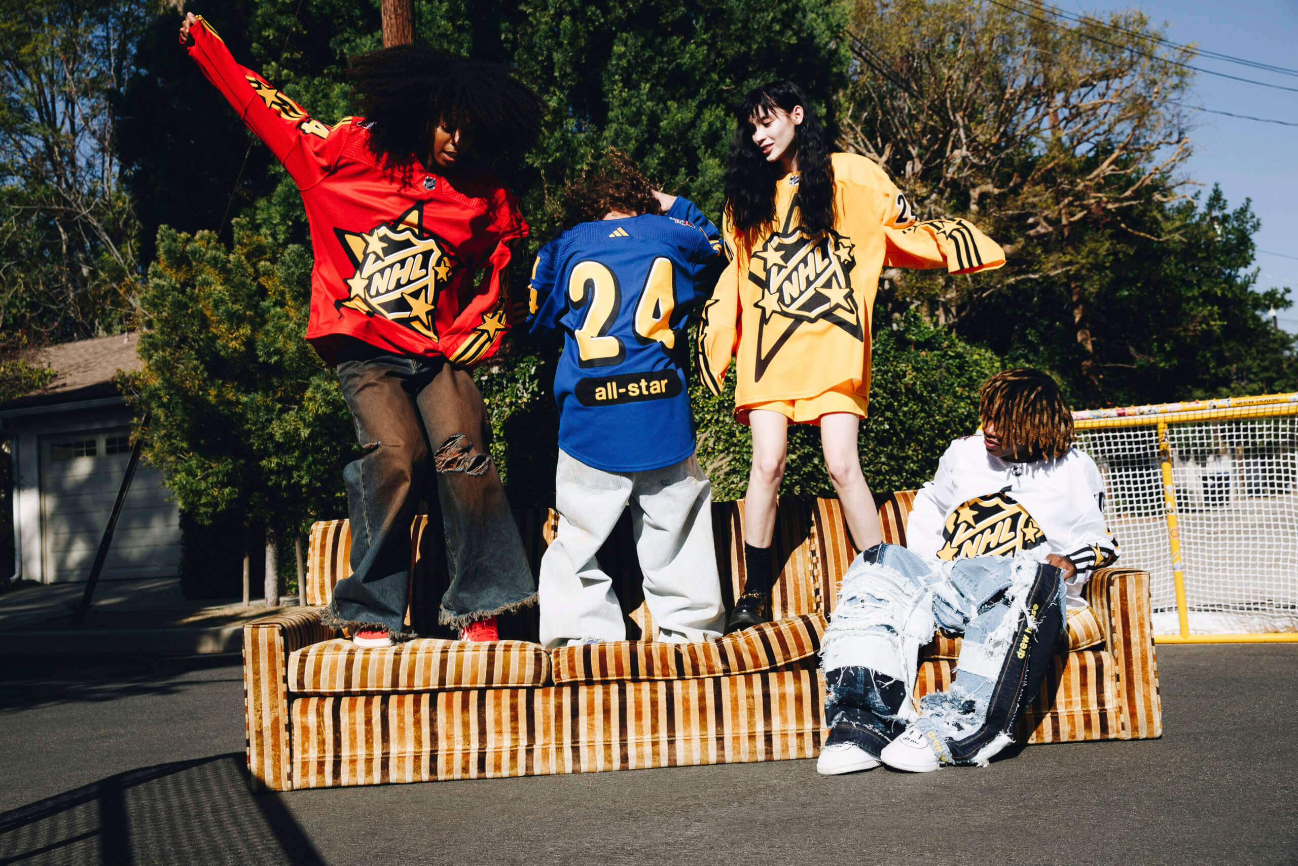
Love the photo of the 4 of people wearing the jerseys lol they have all their bases covered. ✔️✔️✔️✔️
I like them. To me, they’re perfect for the one time a year over the top exhibition that is the All-Star Game. I also like that they’re dominated by their color, as exposed to reflective logo gimmicks or etc.
They aren’t as bad as the 2018 and 2019 look. But these are a big step down from last year and 2022.
Ugh. Like cheap superhero costumes. What is going on with sports leagues?? NFL, NBA, and MLB have all sunk. NHL was the last hope. Guess not.
These are pure trash, and the marketing vomit is worse.
How are these “culturally-relevant streetwear”? To whose culture are they relevant?
This!
Designed to tap the market of people who don’t watch hockey … which admittedly is larger than the one of people who do.
That may be the goal, but if they’re not watching based upon what they’re currently wearing on the ice… these aren’t changing that. There’s more pop culture references and instances in the NHL’s current 32 designs than anything Justin Bieber designed.
I don’t think the goal with these designs is to get them to watch hockey. It’s to get them to buy the jerseys. I don’t know for sure, but there’s probably more money in that
I’m clearly not the target audience for this uniform set. The base colors are a nice set, but if there’s a word for me to describe the design, it’s “childish”. I get a “CalArts animation style” vibe, a real “under-10” feel, like they’ve skewed too young.
Adidas made sure to get the 3 Adidas stripes down the arms.
They’ve had prominent 3-stripe markings on the ASGs before, in (I think) 2018
link
Three stripe look on the couch the kids are sitting upon.
These are absolutely hideous. The front logo is way too large. Looks like something designed for the Nickelodeon hockey team.
I realize that I’m 145 years old and not the target demo… but can we pause for a moment and ask WTF IS UP with the pants for the guy sitting on the couch?
You look good for 145! And he’s only sitting on that sofa because you told him to get off your lawn ;-)
I don’t mind the vivid colors or giant logos. It’s an All-Star Game after all so it will only be worn once. My questions: will the NOB be under the numbers as shown in that photo? And in all lower case too? I also noticed no team shoulder patches as has happened in the past, although they probably didn’t add those for the photoshoot.
The first two words that came to mind when I saw them: Clown show.
The logos are too BIG!!!! There is nothing wrong with a fun, whacky take on the All-Star jersey, but why make the logo enormously big?
“You know what we need, lower case tramp stamp name plates”…said no hockey fan ever.
Bad looks, worst aspect is definitely the lower case “all star” on the back.
Wow…those are hideous
I don’t know why they get so much hate. They look fine. You can see the design, they’re distinct from one another, and they’re simple.
Pretty silly looking but they could be much worse. Though they are doing the same thing Nike did with the international jerseys. “Hey nobody does vertical striping! Let’s try that” and as always when it’s tried it looks terrible.
On the initial front shots that I saw yesterday, I reaaaaaaaallllly disliked these. Today on second look, and I think especially with the marketing photo on the couch, I see what they were going for, which is a very MTV Rock n’ Jock 90s-retro vibe (which is in right now). For an All Star game, one off, cool. I can dig it.
But let’s please keep this design aesthetic for the All Star game and not embrace it on a full time level kthx.
Well, they’re horrible and should be buried in the desert like an Atari E.T. cartridge. But in 5-10 years people will probably be paying big bucks for MIC authentics of them. Remeber how much people hated Mooterus?
My first thought – was Nickolodean or that guy from Sponge Bob. Even if they are trying to reach “outside the demographic” who the heck is going to drop $190 on that crap?
Motocross or BMX vibes but not NHL. Aimed indeed at people who do not care about the game but care for anything Bieber does.
This looks like an 80’s made for tv movie about a hockey team where they wouldn’t pay for the rights so they made up the logos. Kinda like the Ram’s current logo.