
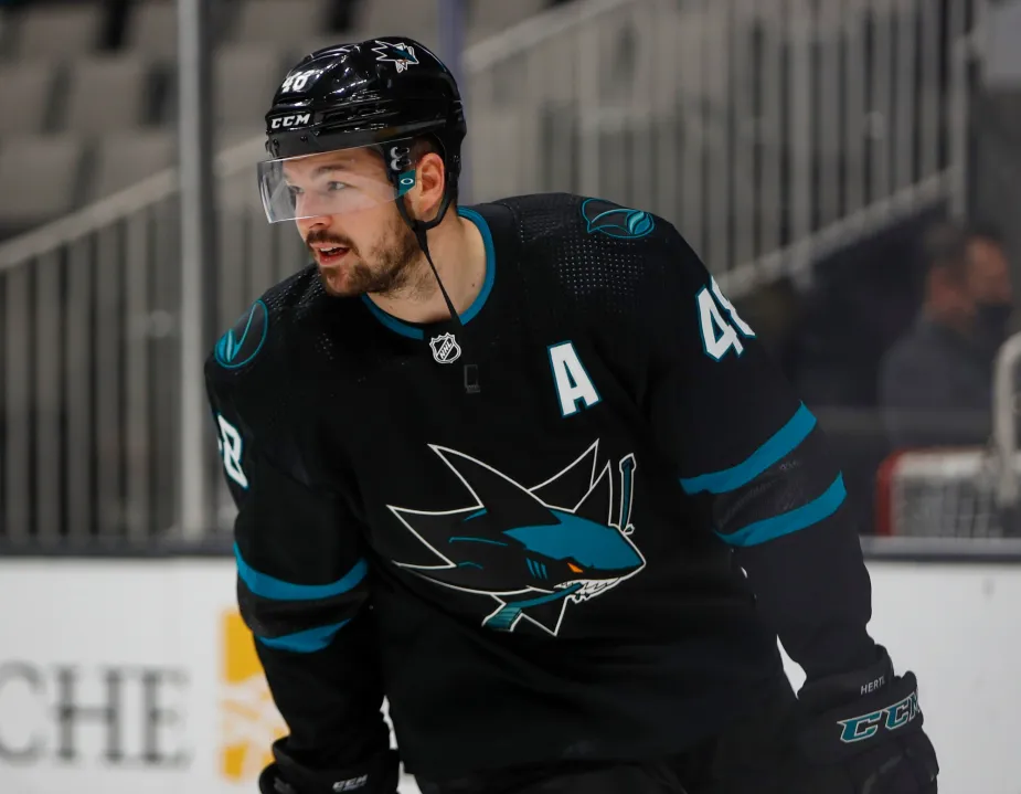
After dropping a lot of hints in recent weeks, the Sharks finally went ahead last night and unveiled their new black alternate uniform. And I have to say, I really like it.
From the crest to the striping, this one’s a winner. Here are some additional photos:


Personally, I wouldn’t mind seeing that crest become the team’s primary logo. Simple, bold, classy.
The team’s previous black alternate, last worn in the 2021-22 season, was just a black version of their primary look:
I much prefer the new design. It will make its on-ice debut on Feb. 17 and then be worn for all of the team’s remaining home games in February and March. Here are the 11 dates:
- Saturday, Feb. 17, vs. Blue Jackets
- Monday, Feb. 19, vs. Golden Knights
- Saturday, Feb. 24, vs. Predators
- Tuesday, Feb. 27, vs. Devils
- Thursday, Feb. 29, vs. Ducks
- Tuesday, March 5, vs. Stars
- Thursday, March 7, vs. Islanders
- Saturday, March 9, vs. Senators
- Thursday, March 21, vs. Lightning
- Saturday, March 23, vs. Blackhawks
- Tuesday, March 26, vs. Stars
There’s some good background info on the thinking behind the design in this article from the team’s website.
Minus the logo/crest I think it is a great design. That logo works great as a secondary logo on the shoulders. Rendered that large as the primary jersey logo just doesn’t work for me. I can’t quite put my finger on why, but that logo says “secondary mark”.
Maybe because it looks like what would be on the poster promoting “Jaws” if it came out now … or was rebooted, remade, etc. Some might think it cartoonish, but I identify the San Jose Sharks with that shark biting through a hockey stick.
Completely agree. Love the black uniform details/striping, but the logo just doesn’t seem complete or meant to be front-and-center.
The base: Love it! The pants and socks: Sure. The crest: Maybe they should have used the same old shark with some color tweaks, maybe the fin logo works. Not sure.
My biggest critique: The Northern California patch. An inedible garnish that I don’t want on the plate. On one level, it’s a leftover stupid gimmick from a Stadium Series. But the big sin? Since the Sharks went with the fin logo as the main crest, I find it quite silly to have the same fin. I have the same critique of the old Buffalo Sabres and the current Anaheim Angels. Either have a different enough logo in a different place, or leave the space empty. Don’t clutter the jersey with too many printings of the same logo.
I like the design overall, but the black dorsal fin says orca to me, not shark.
I like the crest (and overall design) but the black fin is more reminiscent of an orca than shark
Please count me in among those who believe the shark biting the stick is the far superior logo for this team. I’m all for minimalism and implication, but the shark is arguably the best logo in the league.
Love the design but I feel like they missed a huge opportunity to really highlight the yarn-dyed striping style by still using the more traditional stripes right above them. Could have done more yarn-dyed stripes and put them along the center of the jersey behind the crest ala the Habs.
Think the NHL has strengthened its position as the best dressed pro league. Miles ahead of the NBA. Much better than the NFL. And now, superior to MLB (thanks, Nike).
Until Fanatics blows the whole thing up.
Ugh. Forgot about that. The only group that might be worse than Nike.
The official team site mentions the use of the new custom font for names and numbers on the back. Maybe my mistake, but I couldn’t find any photos with the back of the jersey. Not on here, and not on the team’s website.
I did find the design here link
Does anyone in this community have a photo of what they’ll look like?
Or an opinion about it?
link
A couple photos down is a shot of the back.
Sportslogos.net has a picture of the back on their news article.
link
I like this one too. One small nitpick: although others have pointed out that the black dorsal fin evokes an orca moreso than a shark, my issue with it is the white “wave” under the forward 3/4 of it; with the white background, makes it look like it’s been cut off.
I love the stripes on this uni and I like the shark fin as an alternate. I’m one who will always see their primary as the shark biting the stick and I never want to see it replaced.
Since the Jets introduced a logo with a broken circle I’ve wanted to see more teams copy that approach and I like how the fin breaks up the circle.
I’m not a fan of the shoulder patch though. I don’t remember it from the stadium series and that says something.
I like it! Is it perfect? Maybe not. But I think it works well as a third uniform.
Damn, that design is straight cash money. Clean, classic. Love it…
I actually like the alt crest much better than the Shark Biting the Stick logo. May just be its newness. I will say though, it appears “off” to me because the fin is off center in the circle. Not saying it shouldn’t be or wouldn’t look more odd anther way.
I like it!
The San Jose Sharks have always had good taste with their uniforms.
Whenever they are in the playoffs I’m always rooting for them, because of their uniforms.
Love it!
Thank God sock design still matters in hockey. A bastion of sanity in a sports uni world of hosiery hell. -C.
That crest is great as a secondary mark, but looks way too simple that large and in the spotlight.
The Sharks have one of the stronger uniform games in the 4 top leagues. I like this one as well, including the shoulder patch. The whole of Southern California has fallen off or has been devoured by this giant shark. Great!
Okay, I love this. One tiny suggestion… add one more streak of blue all the way across behind the fin to give it a bit of depth. That white chunk under the fin makes it look like it’s about to take off on its own. But again, the overall effect is terrific.
That is a SHARP hockey sweater. I have never been too big of a fan of the Shark’s identity, but man those are fantastic.
At first glance I thought that was a sea lion.
Better than that gawdawful teal getup they have been wearing.
The crest reminds me of the streamlined logo the Miami Dolphins currently use. Something has always felt off about that one to me, maybe it’s too generic or clip-arty? It’s never felt like an NFL logo. I kind of feel the same about this one. Doesn’t feel like a major league logo.
I don’t like the idea of the Sharks in black to begin with, but this is absolutely the best of their four black jersey designs. Perhaps that’s due to it being the least predominantly black of the bunch. I still wish they’d do a Reverse Retro of their original teal jersey, and make that the third; gray seems like a much better fit as a third color for them, despite the shark in their logo being consistently rendered in black.
That said, these jerseys using the circular fin logo makes for an eye-catching feature in the middle, unlike the previous iteration which was just a different blob of black, and they use enough teal and white to make them readily identifiable at speed even against other black-adorned teams (a problem you could otherwise get in, say, a Bruins/Penguins matchup, or even a Flyers/Ducks one.) Very nice work overall.
Fantastic third, but my lord the best thing the Sharks could do is to pair these black pants with their regular home teals. The Sharks have some of the best/most unique unis in the league, but the all teal look they’re currently sporting is way too much. Go back to teal jerseys with black pants!
Is their a slight homage to the old Oakland Seals crest, with the circle being similar to the “O” in the Seals old jersey?
This looks like the sweater a team would wear on a TV show that ESPN was producing and they didn’t have permission to wear authentic NHL uniforms and logos. It is nice and all but if the bar to clear were that it is an improvement… it isn’t for me.
Pros and Cons for this one. There are much worse kits out there, and designs for this team can get cheesy in a hurry.
Most really good sweaters have a really good crest. This one’s great as a secondary patch (should always swim forward imo), but as a center crest I feel it’s missing something. The roundness of the frame combined with the sparse detail might subliminally make me think it was a minor league team called the Orcas if I didn’t already know. I think my eye wants to see an “SJ,” or a “San Jose Hockey Club” or ” Northern California” in microcaps along the rim.
As for the stripes, the pattern they have near the hands and feet would make sense given the subtle low-contrast approach they’ve typically used for their all-blacks, but I feel that the two types of stripes are working against each other. One or the other might have looked better to me. Maybe if it was just the top stripe and then the ripples. Conceptually, I like the idea of the look they’re going for.
I like the colors they used, but I think it relies a little to heavily on the white. In the previous versions, that little tiny orange bit on the eye and/or stick in the crest seems to add so much. I think I’d like the new kit better if there was less white, and some very small, thin elements of that more yellowish orange they used in the 2018-2022 version. Just a tiny bit.
Curious to see what it’ll look like on the ice.
The main logo actually looks good to me. The current main logo looks dated. The rest of the uni looks awesome, with the teal and white on all black, nice contrast. I usually don’t have much to say about hockey unis because most are pretty tasteful but this one I really like.