Good Saturday morning, Uni Watchers. I hope everyone has had a pleasant week. I myself am a bit under the weather — battling the flu of all things — but hopefully I’m on the mend and I feel much better today than I have for the past few. Here’s hoping everyone out there is feeling good!
Back in March and April, I introduced you to artist Anthony “Ant” Giaccone — if you missed that, click here. In that piece, we took a look at some of baseball’s “Boys of Summer,” and that was followed by this piece, which featured Ant’s sketches of football greats from that sport’s golden era. Next we had this piece, which showed off Ant’s chops on hockey, basketball and soccer illustrations. And finally, Ant graced us with a number of his Baseball GOAT sketches, which you can read in this piece.
After a fairly long hiatus, Ant is back again, this time with a concept I think is fantastic (although one that is simultaneously jarring at the same time) — putting old time players in more modern uniforms (a series he’s calling “Back to the Future”). I don’t want to steal any of Ant’s thunder, so I’ll end the setup here. Ant? Take it away…
by Anthony Giaccone
I was watching Ken Burns’ documentary on Baseball a month or so ago — for the 30th time — and I had an idea for a new set of illustrations. (But we’ll get to that in a moment). As I was watching the documentary, I always loved seeing the golden age greats in photo still and jittery newsreel footage. These all-time greats gloriously depicted in crisp shades of grey. Their uniforms almost all identical at is relates to the design styles and simplicity of the era. …and then it dawned on me. What would these hall of famers look like in their teams’ most colorful uniform sets? So that’s what I pitched to Phil and he was kind enough to showcase these images today.
I would like to thank Uni Watch for the opportunity to share these with you and, as an unemployed creative director, should you want a custom illustration of a favorite player, or perhaps your self in your favorite uniform from any of the major sports, please contact me at antnee1515@mac.com or on instagram at: art_x_ant (Anthony Giaccone). Now, on with the show…
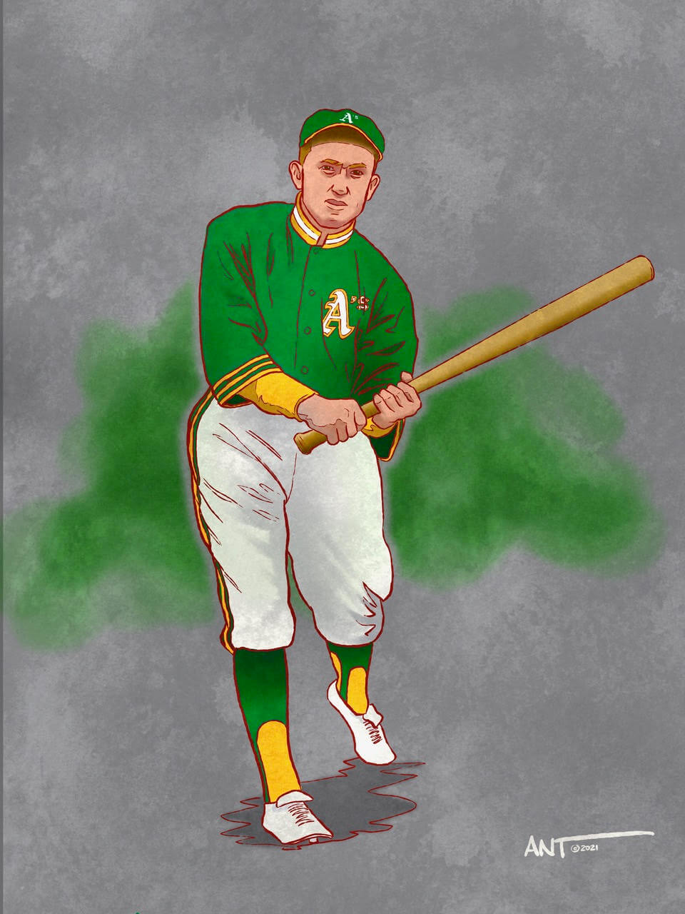
The great Ty Cobb played from 1905 to 1928. Mostly with the Detroit Tigers, but he finished his career with the Philadelphia A’s. As we know, the Tigers uniforms haven’t really changed much over the years, so I went with Cobb wearing an Oakland A’s uniform from 1973. It’s a bit weird to see The Georgia Peach in such a colorful uniform, but that’s what makes this experiment so much fun. As you can see, I kept the basic styling of the uniform true to the era, with just the colors doing all the hard work.
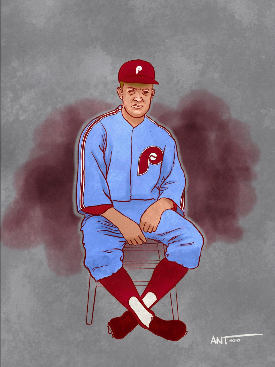
Grover Cleveland Alexander won 373 games over the course of his 19 year career with an ERA of 2.56. His 90 shutouts are a National League record. Oddly, he never threw a no-hitter. He was elected to the hall of fame in 1938. Today, sadly, he is pretty much forgotten but he was a helluva pitcher in his era. He suffered from epilepsy which caused him to drink to excess and therefore bounced around to a number to teams. I have portrayed him in a Philadelphia Phillies uniform from 1976 as the powder blue and maroon was a stark contrast from the B/W images of the 1920s. GCA played for the Phillies from 1911-1917, and retired with them in 1930.
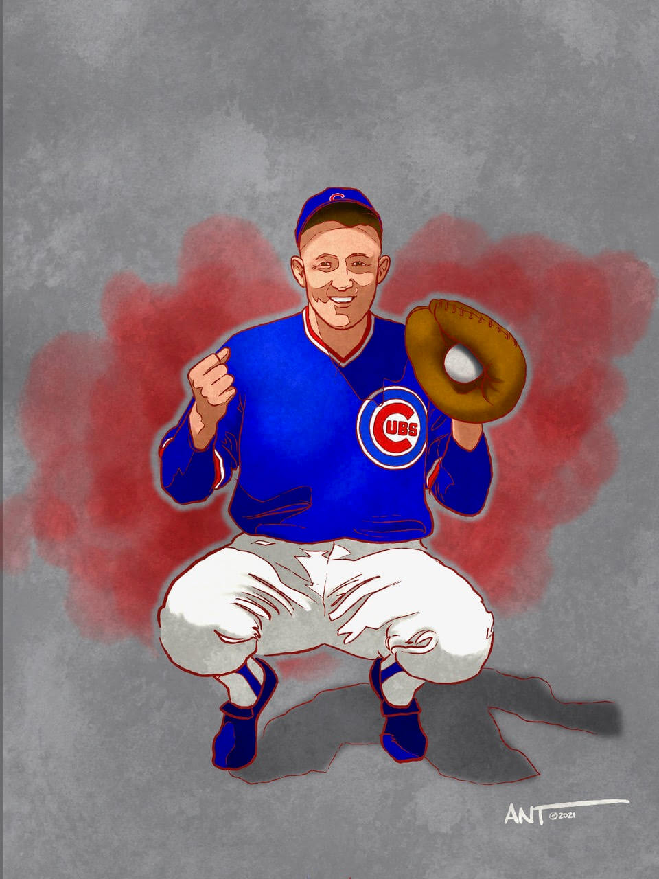
At the time of his retirement, Gabby Hartnett’s 236 home runs, 1,179 runs batted in, and 396 doubles were all records for catchers. His bat and catcher’s mask were the first artifacts sent to the newly constructed Baseball Hall of Fame in 1938 (where he would be inducted in 1955). I wanted to show Hartnett in a Cubs uniform as he played for them from 1922 until 1940. I choose the 1984 Cubs uniform as I always loved the colorful simplicity of the jersey along with the classic — and timeless — Cubs primary logo since 1979.
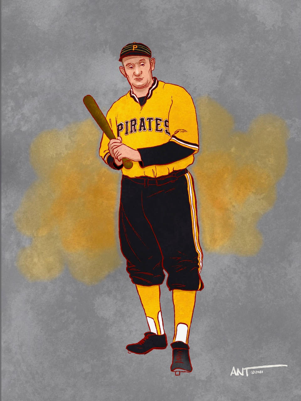
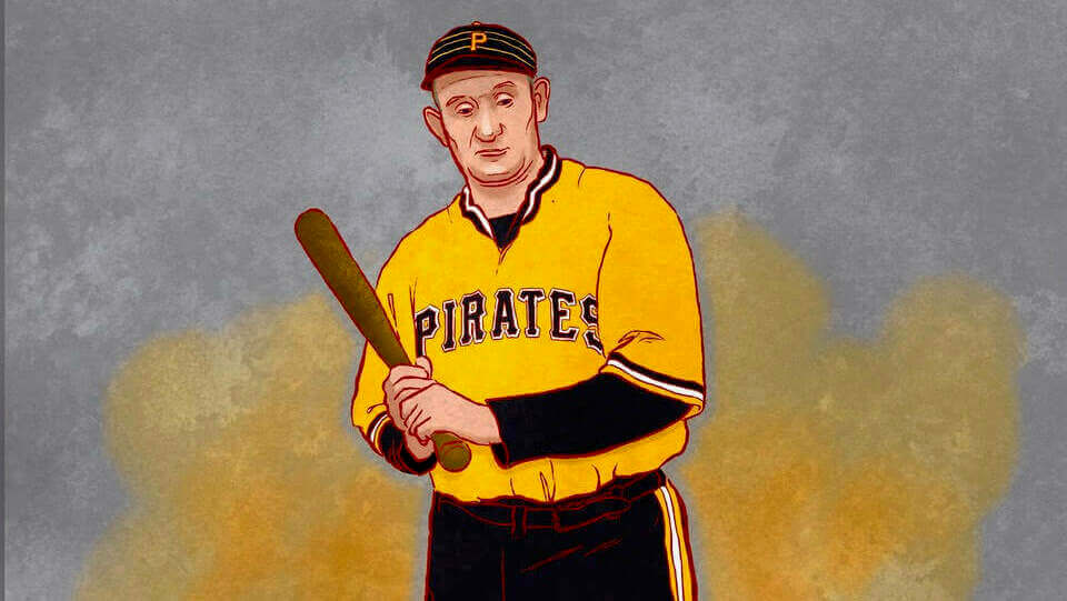
Look up images of the great Honus Wagner and all you’ll see is a giant dude who seems to wear grey. Grey grey grey. Mostly because Wagner retired as a player in 1917. I loved drawing this one as I wanted to put the legendary Pittsburgh Pirate in what is considered one of the most interchangeable uniform sets in the history of baseball — the 1979 “bumblebee” gold and black. This illustration in particular is one of the reasons this experiment was so much fun to draw and equally disturbing seeing the Flying Dutchman in such a colorful way. But somehow it just works. Wonder if he would have thought so too.
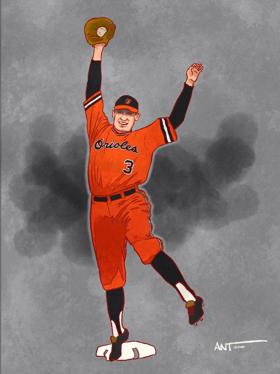
With a lifetime .340 batting average (a 2x .400 hitter), and 2,812 hits (Sisler recorded 1 six-hit game, 4 five-hit games, and 60 four-hit games in his 15-year MLB career), this 1939 hall of fame inductee is largely forgotten by today’s fans as he spent the majority of his career with the St. Louis Browns. Since the Browns relocated to Baltimore in in 1953, I chose to draw Sisler wearing the famous 1972 “pumpkin orange” Orioles uniform that made a small number of appearances in 1971 and 1972. Sports Illustrated said the uniforms looked like “ladies softball outfits”.
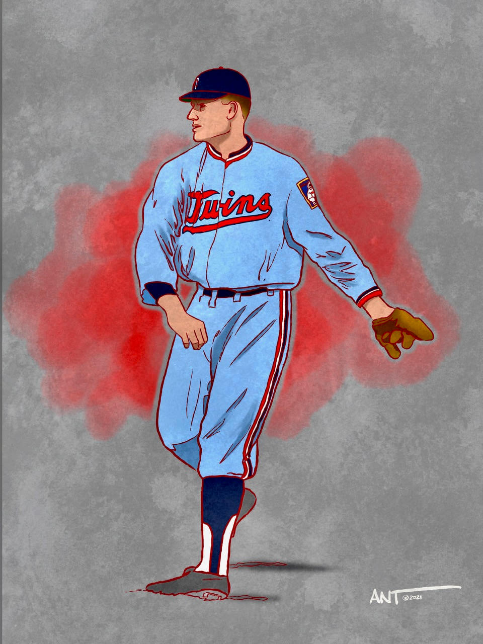
We all know about the great Walter Johnson. 417 wins speaks for itself. But poor Walter played for the Washington Senators. Even his hall of fame plaque reads that he pitched “for many years with a losing team.” But still… 417 freakin’ wins and a lifetime 2.17 ERA. Washington folded in 1960 and relocated to Minnesota effectively becoming the Twins. I wanted to show Walter Johnson in the Rod Carew 1972 Twins uniforms that were “baby blue”. According to the Twins website, “No uniform in the history of Minnesota Twins baseball drives more fan engagement than the old-school baby blues.” With that endorsement, I present “the Big Train” as a Twin… complete with his signature cutting of his throwing sleeve for more mobility.
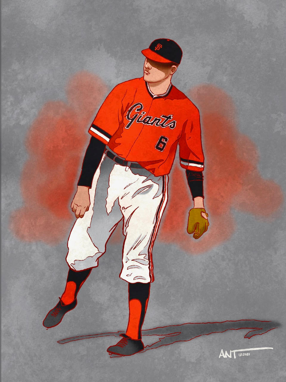
Another legendary pitcher of the era, Christy Mathewson was an original inductee into the Baseball Hall of Fame in 1936. He spent 16 years with the New York Giants who wore mostly grey and off-white flannel uniforms during Mathewson’s tenure. These would have the interlocking NY mostly on the shoulder. So imagine (if you will) “Big Six” in the 1978 San Francisco Giants orange pullover uniform complete with orange socks and black stirrups.
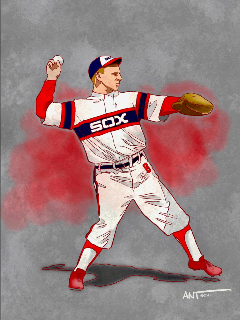
Who is Ray Schalk? Good question. He’s considered one of the best defensive catchers of his era. He revolutionized the way the catching position was played by using his speed and agility to expand the previously accepted defensive capabilities for his position. He played for the Chicago White Sox from 1912 to 1928 and was elected to the Hall of Fame in 1955. Now, the White Sox have worn some amazing uniforms over the course of their existence, from the 1919 Black Sox to the Go-Go Sox uniforms of the 1959 to the “Southside” alternates of today. In trying to pick which uniform to place Mr. Schalk in, I had to go with the 1982 “softball pullover” uniforms which some Chicagoans consider the greatest Sox uniform of all time.


The Babe in a 73-74 Braves blue please!!!!!
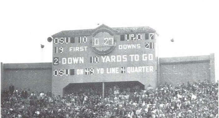
Scoreboard – Jan 1, 1958 Rose Bowl
LOVE the Back to the Future artwork!!!
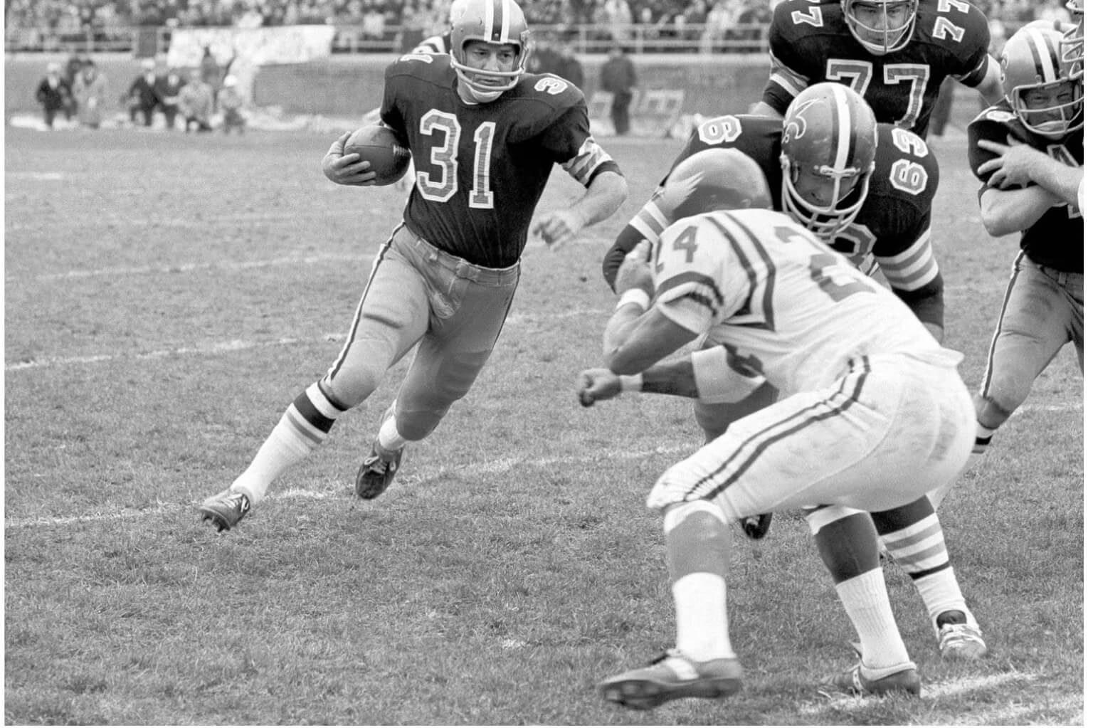
GTGFTU is the November 19, 1967 game between the visiting New Orleans Saints and the home Philadelphia Eagles, which was won by the Eagles 48 – 21. The photograph shows Jim Taylor (formerly of the Packers) carrying the ball and about to be hit by Eagles safety Nate Ramsey.
It had to be the answer from the gentleman below. Was not in Philly because 1) Eagles are in home white and 2) No track shown at Franklin Field
Mike Duet is actually correct. For whatever reason, the Eagles chose to wear white at home that day (perhaps because the Saints went with white when the two teams met in New Orleans on Nov. 5, a bitter day for Eagles fans since Philly was the victims when New Orleans won its first ever regular-season game). I was really big into the Eagles in those days and these are vivid memories, confirmed by the NFL Films ’67 Eagles highlight film and backed up by the Gridironi Uniform Database. As to why the Franklin Field track isn’t visible on the sideline, I’d say it’s probably just difficult to see in that blurry background so far in the distance.
GTGFU: 11/05/1967: Philadelphia Eagles (24) at New Orleans Saints (31); Tulane Stadium.
Ant’s artwork is a great concept well-done. Hoping there will be more of these.
Is that the Pottstown Firebirds??? LOL
I find running artwork through AI has the same feel as any articles “written” by AI.
No substance and no feeling.
Cool artwork, Anthony!
Walter Johnson looks great as a Twin…and speaking of sleeves, Grover Cleveland Alexander’s would make Jayson Werth jealous:
link
Nap Lajoie in a Guardians uniform next go-’round?
Loved Walter in the Twins uni as well!
Great concept, Ant. Now I’m thinking football. Perhaps Jim Thorpe in a Giants Color Rush uniform?
Great artwork, Ant! Love your stuff! Hard to say which one I like the best, but the Christy Mathewson one is a beauty. Thanks for sharing these!
Noah, that reminds me of LSU’s purple helmets that in the right light reflected LSU gold. It never caught enough gold IMHO, but I think that would work beautifully for the Ravens.