A very good Sunday morning, Uni Watchers. Hope everyone had a stellar Saturday!
Back in March, I introduced you to artist Anthony “Ant” Giaccone — if you missed that, click here. In that piece, we took a look at some of baseball’s “Boys of Summer,” and that was followed by this piece, which featured Ant’s sketches of football greats from that sport’s golden era. Finally, there was this piece, which showed off Ant’s chops on hockey, basketball and soccer illustrations.
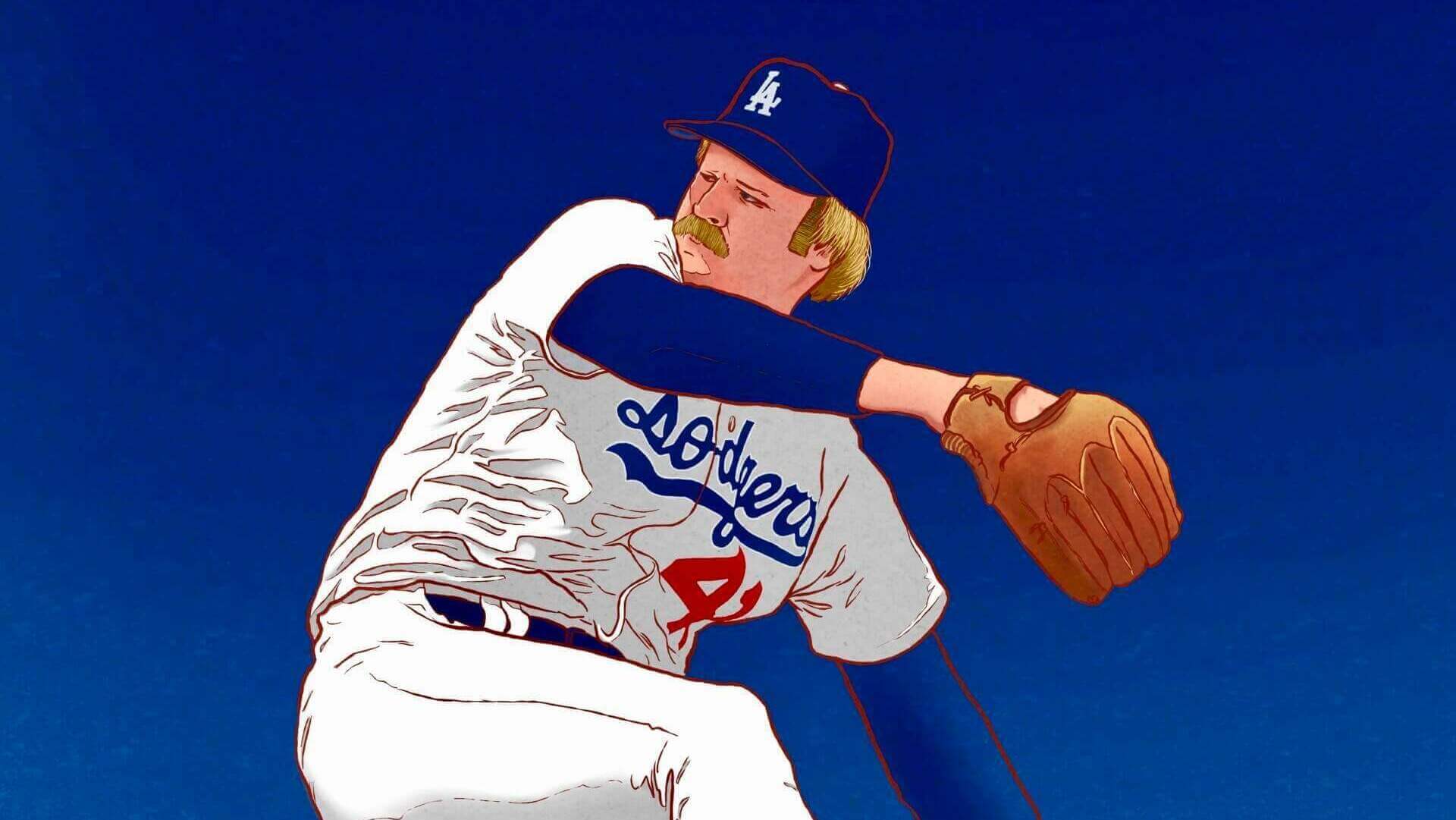
If you didn’t read that last article, in it he asked for “reader suggestions for some more sports personalities — so if there’s a player you’d like to see sketched, drop a suggestion in the comments and maybe Ant can make it happen!” If you notice today’s splash — that baseball player is none other than the great Jerry Reuss, who’s both a reader and friend to the site.
Jerry reached out to me to see if Ant could encapsulate him in one of his drawings, so I got the two in touch, and the full result is below. I’ll let Ant describe that one below, but I want to reiterate Anthony’s offer for readers to make suggestions for players they’d like to see sketched! Thanks, Ant — readers, please post your suggestions in the comments below. (And, if you’d like a custom illustration, Ant’s contact info is below.)
And without further ado, here’s Ant with his next batch of illustrations.
by Anthony “Ant” Giaccone
Hello Uni-Watchers! It’s me again. “ART_X_ANT” (or just Ant) You know… that guy who draws random professional sports stars because of my love of uniforms, design aesthetics, and love of art. This week Phil has been kind enough to allow me to showcase a few more illustrations with comments. Before we start, please know that you can always get in touch and commission an illustration of a favorite athlete …or even yourself in the uniform of your choice. Just email me at: antnee1515@mac.com for more details and prices.
JERRY REUSS:
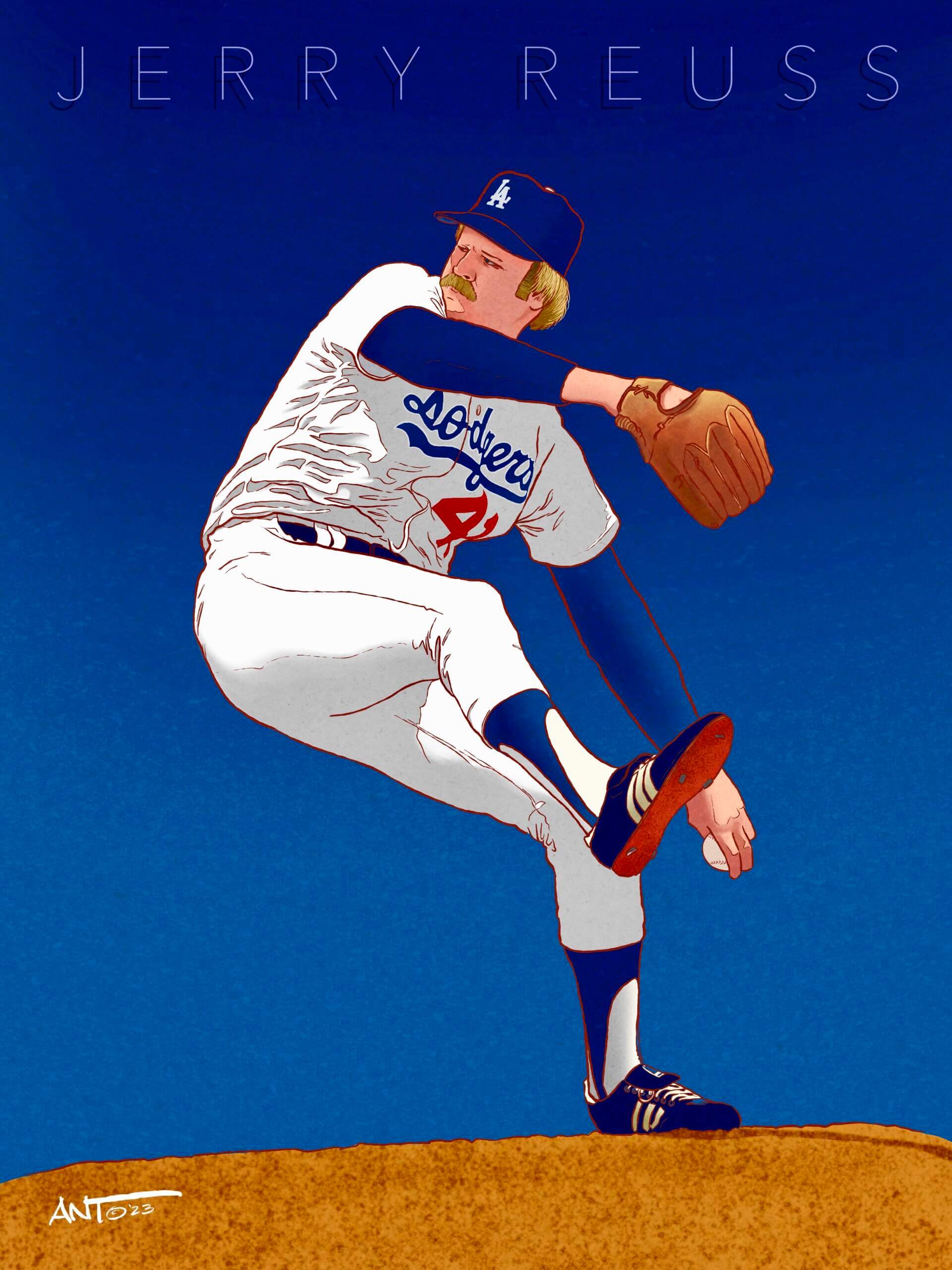
Speaking of getting in touch with me… After my last showcase on Uni-Watch, something really cool happened. 2x All Star and World Series Champion pitcher with 220 big league wins — Mr. Jerry Reuss — contacted me to draw him. I was blown away that he would even consider having me do that. And of course I said “hell yeah” and this is the final version. Jerry Reuss as a Los Angeles Dodger. He played for the Dodgers from 1979 to 1987, where he won his WS title and pitched a no-hitter on June 27, 1980. Thank you for the opportunity Mr. Reuss!
ICHIRO SUZUKI:
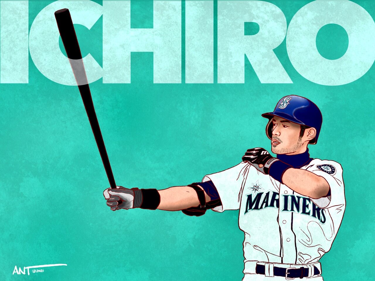
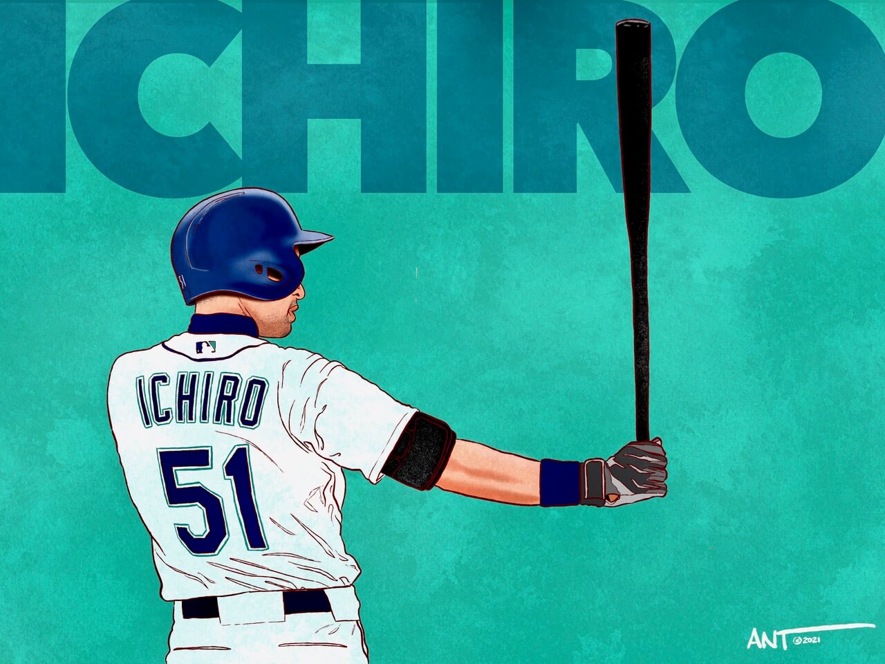
One of the most dynamic players of all time, Ichiro Suzuki was a fun player to draw. In his combined professional career (NPB and MLB) Ichiro played 28 years professionally with 17 consecutive all-star selections and 17 consecutive Gold Glove awards, 9 batting titles, and 4 MVP awards, and 4,367 hits across his professional career. I chose to draw him in his classic Seattle Mariners jersey where he played from 2001-2012, 2018-2019. … and the iconic signature batting stance deserved to illustrated both front and back.
SHOELESS JOE JACKSON:
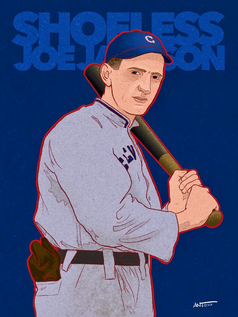
As a little kid, I was always drawn (no pun intended) to this mysterious player who was kicked out of the major leagues for “supposedly” betting on the 1919 World Series. Shoeless Joe had a lifetime batting average of .356 with the exceptional record of batting .408 as a rookie in 1911. I’m not going to get into the dispute of his guilt or association with the Black Sox scandal, but I will say that I’m truly amazed that for a man who couldn’t read or write, a handsigned photograph of Jackson sold for $1.47 million, making it the most expensive sports photograph to date. I chose to illustrate Shoeless Joe in his Cleveland Naps uniform from 1913.
AARON JUDGE:
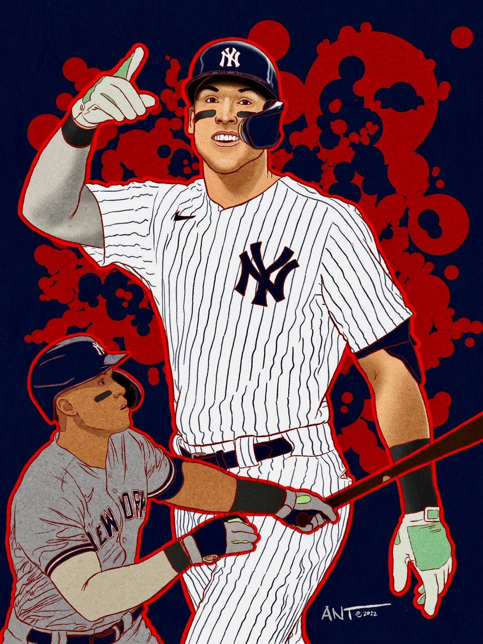
This was drawn as Aaron Judge was chasing the all-time home run record. Judge has been playing for the New York Yankees since 2016 and already holds 7 Yankees franchise records, 4 American League records, and 8 MLB records — and he’s just turned 31 on April 26th. Like Icharo, I chose to pay homage to those old baseball illustrators of the 50s and 60s where they would juxtapose multiple action shots in one drawing.
THURMAN MUNSON:
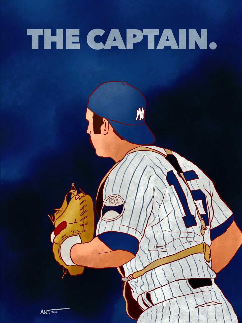
This one is personal. I’ve drawn Thurman dozens of times over the years as he is my childhood idol. I played semi-pro baseball out of high school as a catcher who wore #15 and I can honestly say that it broke my 14-year old heart when he died in 1979. This was a simple 1 hour drawing representing “The Captain” from a 3/4 angle most likely running to congratulate the pitcher in 1973 (the 50th anniversary of Yankee Stadium patch). For this drawing, you don’t even need to see his face to know that it was the Yankee MVP, ROTY, 2x WS Champion and 7x all star. Note: I am an original Uni-Watch membership card holder with my card showing the Yankees away jersey and, of course, #15
BABE RUTH:
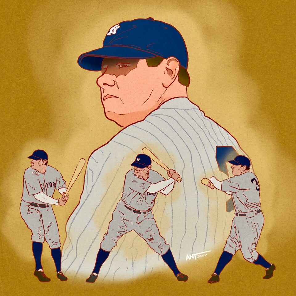
As an artist with a new toy — an Apple iPad — you need to find “your style”. This was one of the first drawings I completed on the iPad and I had fun with the Babe trying to showcase his iconic swing. These are simple drawings but they seem to have a lot of energy for showing minimal lines and shadows.
BROOKS ROBINSON:
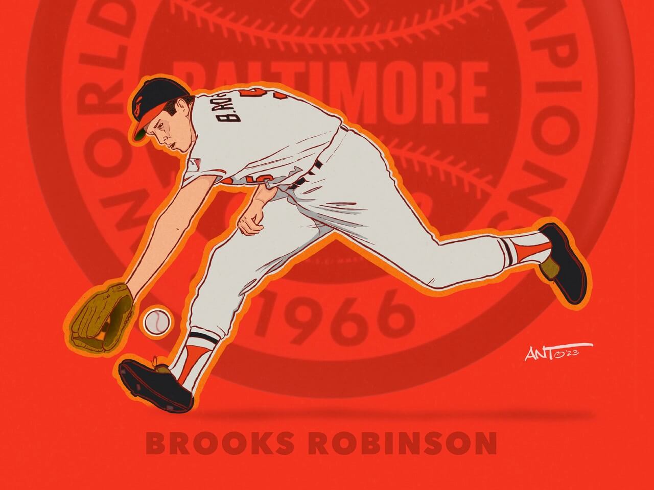
This was a fun series to create (Phil showed Clemente and Ford in an earlier post). I used a logo badge behind the drawing to signify the World Series year and showcased Brooks Robinson doing what he does best — vacuuming up ground balls at third base. Although you don;’t see very much of the classic 1966 Baltimore Orioles uniform you know right away who it is. And because Frank Robinson was on the Orioles as well, you see the “B” before Robinson’s last name on the back of his jersey.
JOE RUDI:
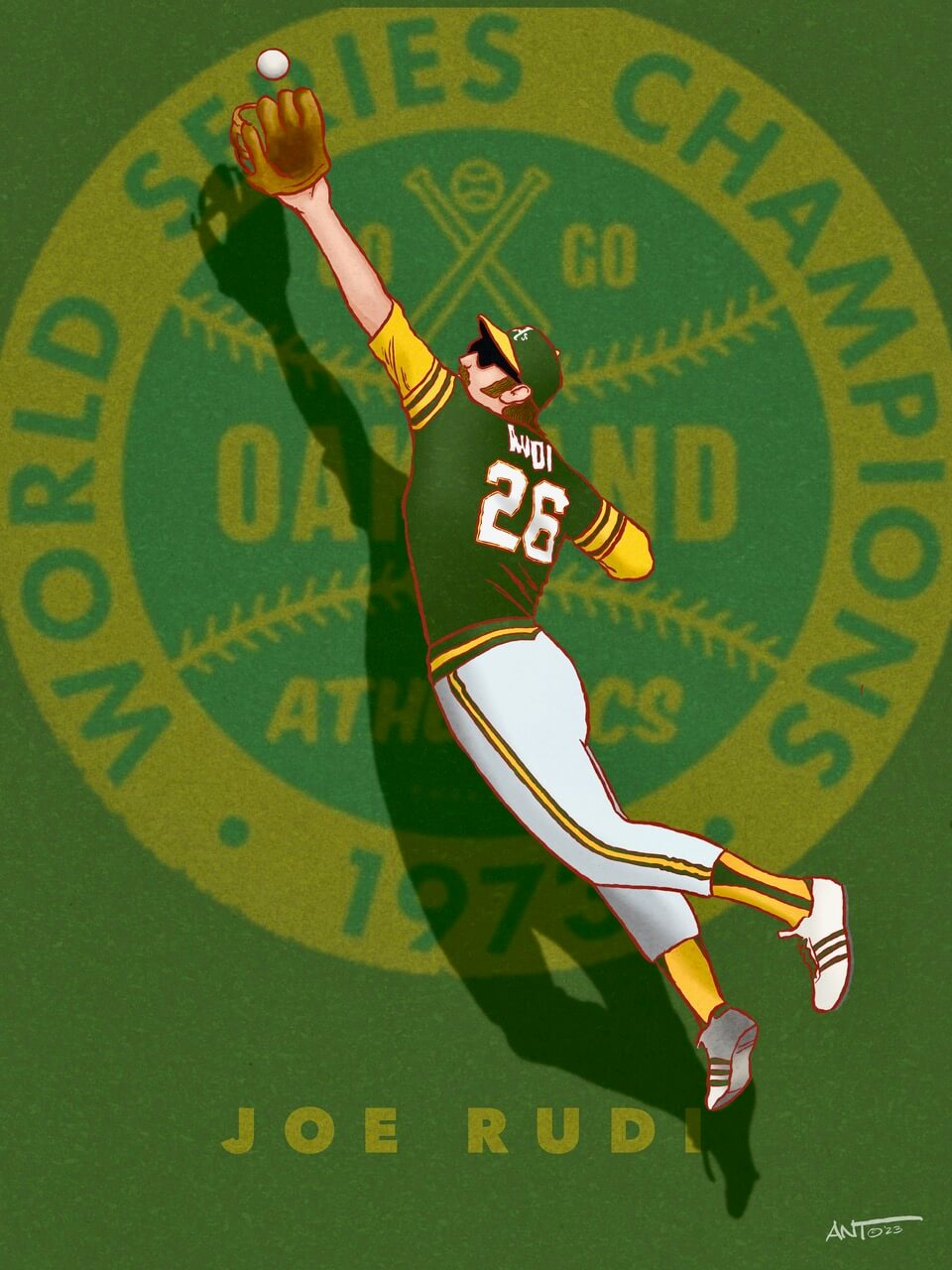
I grew up in a family of devout Yankees fans as my family is originally from The Bronx. But as a 10 year old who was fascinated by baseball, I loved LOVED the uniforms of the “Swinging A’s” of the early 70s. This illustration of Joe Rudi is from his all-time greatest catch in the 1972 World Series. I made the mistake of using the 1973 logo badge. My bad. Regardless it’s a fun drawing that utilizes the shadow to provide depth and energy to the image — and that great uniform!
WALTER JOHNSON:
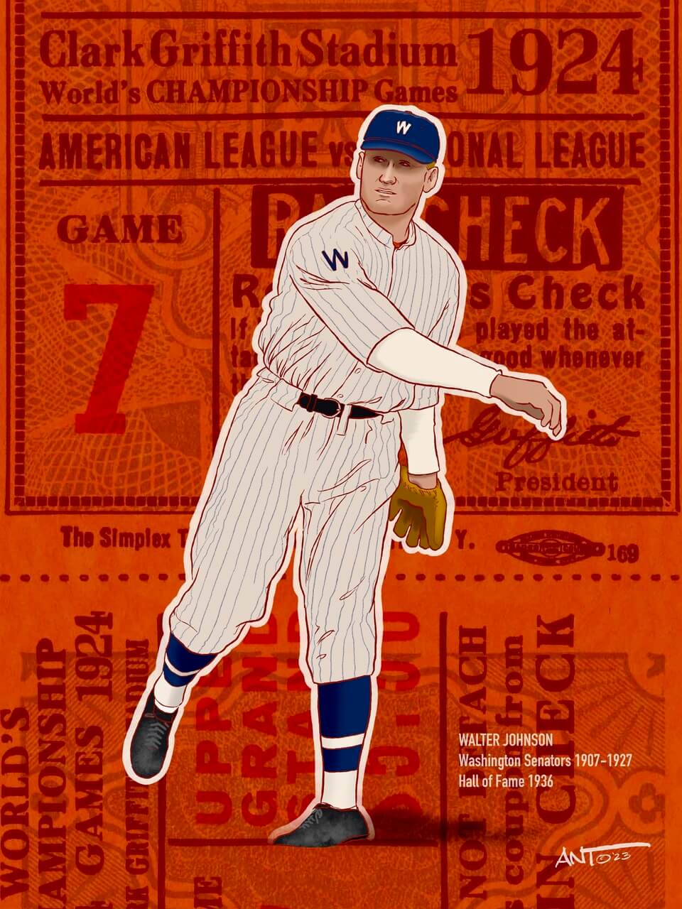
Often regarded as one of the greatest pitchers in baseball history, Walter Johnson established several pitching records, some of which remain unbroken a century after he retired from baseball. For this picture, here is another attempt at finding a unique style and using a graphic design element to make an old black and white image modern and exciting. This is to represent “Big Train in the 1924 World Series Game 7 where Johnson was the winning pitcher.
TY COBB & HONUS WAGNER:
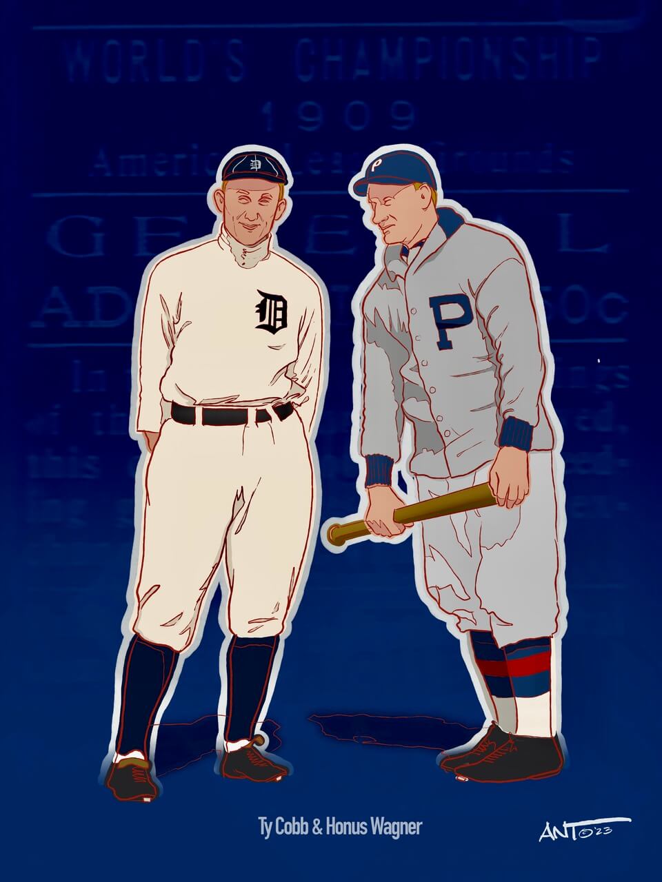
Along with Walter Johnson this was an attempt to create a “series” on World Series ticket stubs featuring two of the greatest players in baseball history. This is from the 1909 World Series between Detroit and Pittsburgh. Spoiler Alert: The Pirates won the Series in seven games to capture their first championship of the modern Major League era.
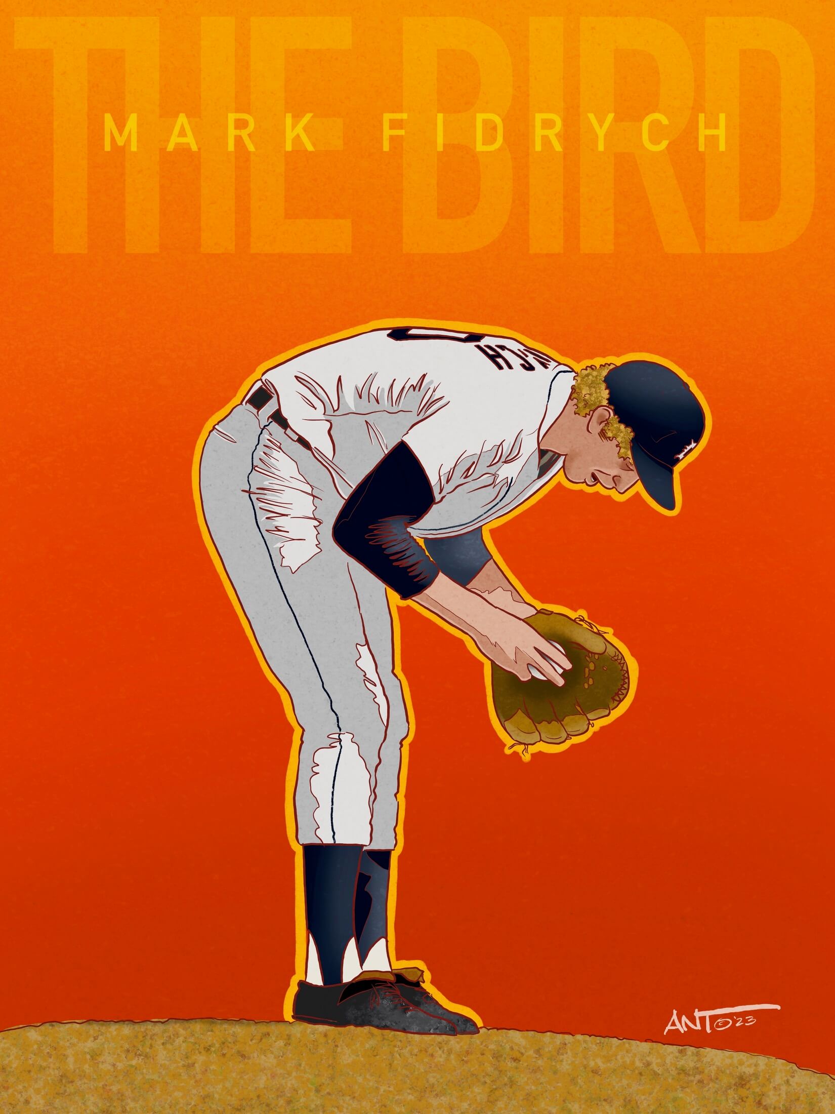
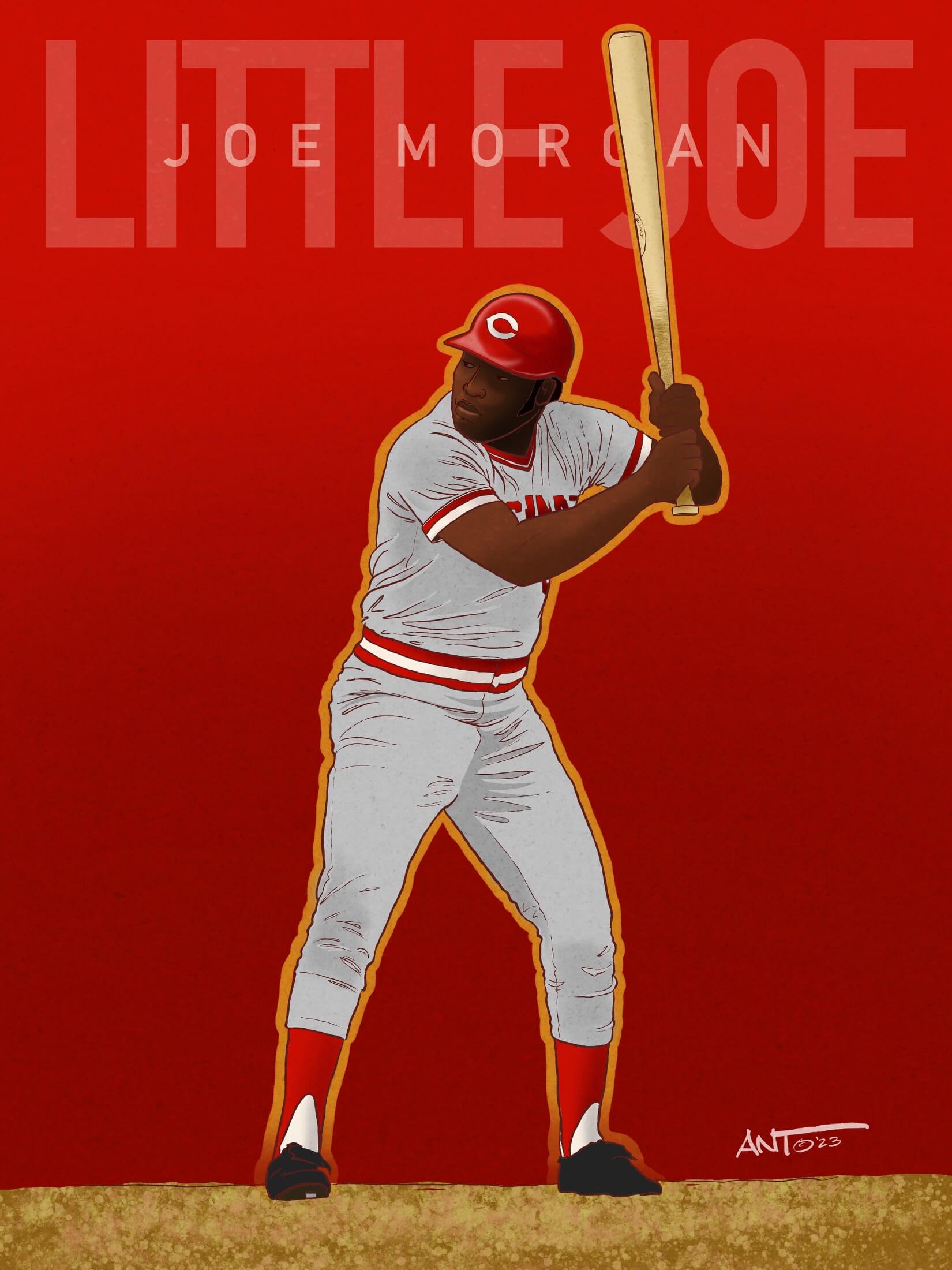
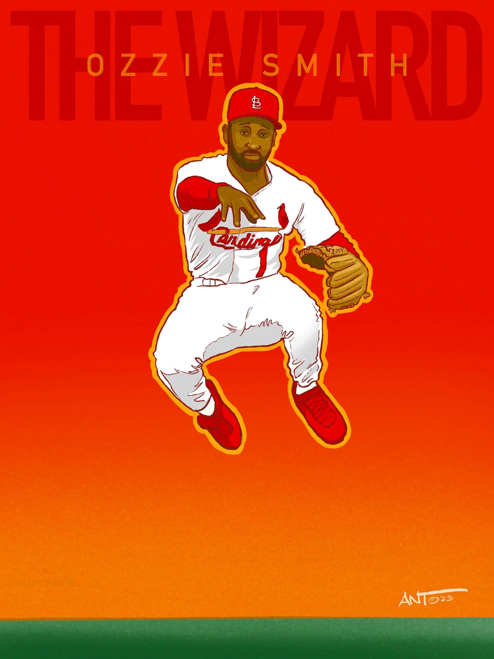
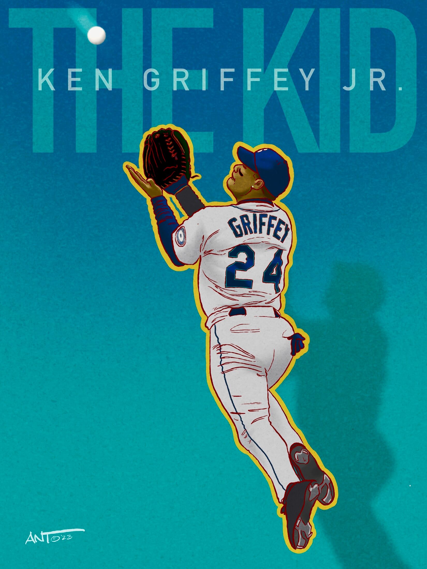
NICKNAME SERIES
Mark Fydrich
Joe Morgan
Ozzie Smith
Ken Griffey, Jr.
Steve Carlton
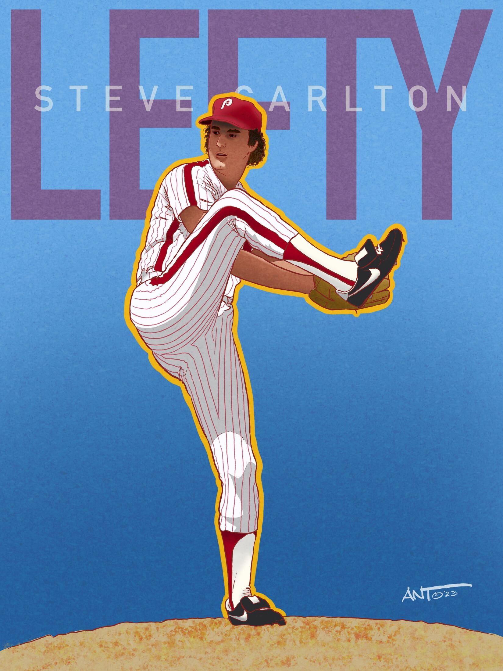
Ahhhh… when an idea comes to fruition — along with a bold design, bright team colors, and iconic action poses.
These five illustrations showcase Mark “The Bird” Fydrich, Joe “Little Joe” Morgan, Ozzie “The Wizard” Smith, Ken “The Kid” Griffey jr., and Steve “Lefty” Carlton. These were created to be shown at a local brewery here in. Stamford, CT and were meant to shown side by side. The colors are in reference to the players’ teams using as simple, yet bold font to highlight their nickname but using a classic pose meant to really show them as we remember them — The Bird talking to the ball, Ozzie’s leaping throws, and Griffey’s dynamic catches. This lead to the series that was shown previously on Uni-Watch of HOF NBA basketball players.
That’s it for today sports fans! Thank you for allowing me to be a part of your day and I look forward to receiving any future commissions and/or suggestions that I can show here at Uniwatch in the future. Like I have mentioned in the past, I do these for fun and practice. I never thought anyone would see these and I’m grateful to Phil and Paul for allowing me this amazing opportunity to showcase my work. Happy baseball season everyone! Cheers! -ant
Thanks (again) Ant! Another great baseball uni-related art show. And thanks again for the offer to have readers pick an athlete in uniform for you to sketch (and also to contact you for any special requests!) — hopefully you’ll get some great suggestions that we’ll showcase at a later time! Readers — have at it!!!


Hello uni-watch community. I am reaching out for some assistance for a project I am working on.
I am looking for the actual names of both the Rangers’ CC and Pirates’ home numeral fonts. I have exhausted my resources, including contacting Paul. Any help or direction is greatly appreciated.
Thanks,
Jon
3/13/83. Stallions vs Invaders.
Well done Jim !!
Stallions wore gold road pants in ’83.
They should have worn them in ’84, ’85, ’22 and ’23.
I’m guessing that change was to distinguish themselves from the Stars.
I liked that the USFL initially had but one team with a 2nd pants option(Invaders) and by ‘85 every team had but 1 set of pants…though Denver and Oakland should have stayed in gold/yellow.
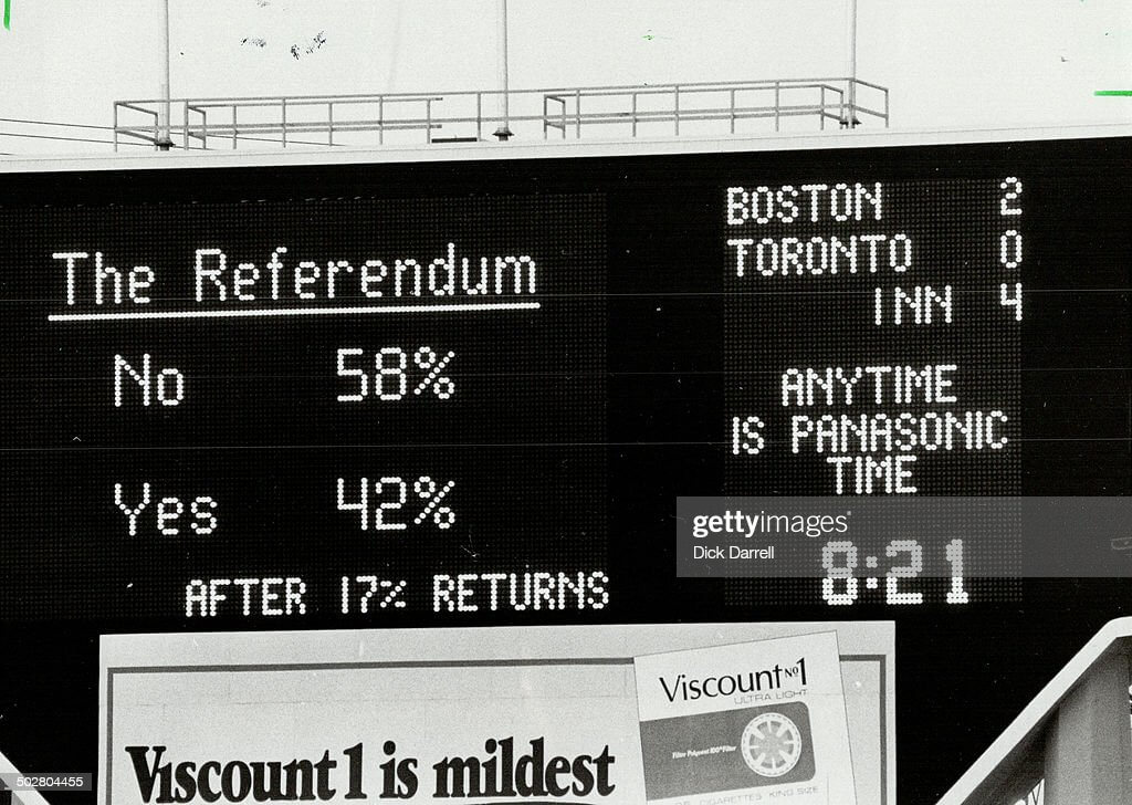
GTGFTS: 20 May 1980, Exhibition Stadium, Toronto, Ontario, Canada.
Red Sox 4 @ Blue Jays 3.
The tip-off is “The Referendum”, Québec’s 1st attempt to gain independence from Canada.
Jerry Reuss is in a few FB groups that I am in. He seems like a GREAT guy! Interacts often with the group members
Great stuff today, Ant! Love your artwork!
On a different note, everything about those Oakland Invaders uniforms is great except that god-awful clipart helmet logo. And it’s not even so much that I hate the logo as much as the incongruity between it and the team name. I debate whether they should have been called something like the Oakland Zeuses or Oakland Thors or something, or had a logo that made more sense with their name.
Never had issue with the derivative/‘lazy’ name or the helmet logo, and yes the color combo is terrific.
But now that you mention it, the pant stripes are sorta busy and they should have been blue-top socks from the start…the 2-stripe numbers look off, just as they did on the SD Chargers when they wore those. Those things take the Invaders uniforms down a peg or 2.
Obviously a polarizing emblem: The hand clutching the thunderbolt is one of my all-time favorites. I bought quite a few USFL pennants and all showed a right-facing helmet with the exception of Oakland’s. Theirs was left-facing so that the hand depicted was a right hand. The Invaders weren’t superstitious, but they were a little stitious.
PROOFREADING: Ichiro’s name is misspelled twice in the text. Happily it’s correct on the art itself!
Fixed
Ant’s art is exceptional! As a Brooks Robinson fanatic I have a few comments about that piece. The logo badge in the background should be the 1970 World Series, not 1966. Broooks was the MVP of the 1970 World Series. Also the 1969 MLB patch on his left sleeve should be deleted.
Great stuff as always, Ant!
Ant’s pictures are amazing! Initiative is everything and when you are inspired by your subjects, work becomes a joy.
Anthony,
What a surprise during my morning rounds to find the finished image posted on Uni-Watch! Many thanks for your time and effort in making it happen. Wishing you all the best!
Jerry
It makes perfect sense that you’d also be a Uni-Watch member! I always enjoy your stories that you post in the various FB groups you’re in :-)
“The Bird” picture is awesome, especially the stirrups. Ant you are talented