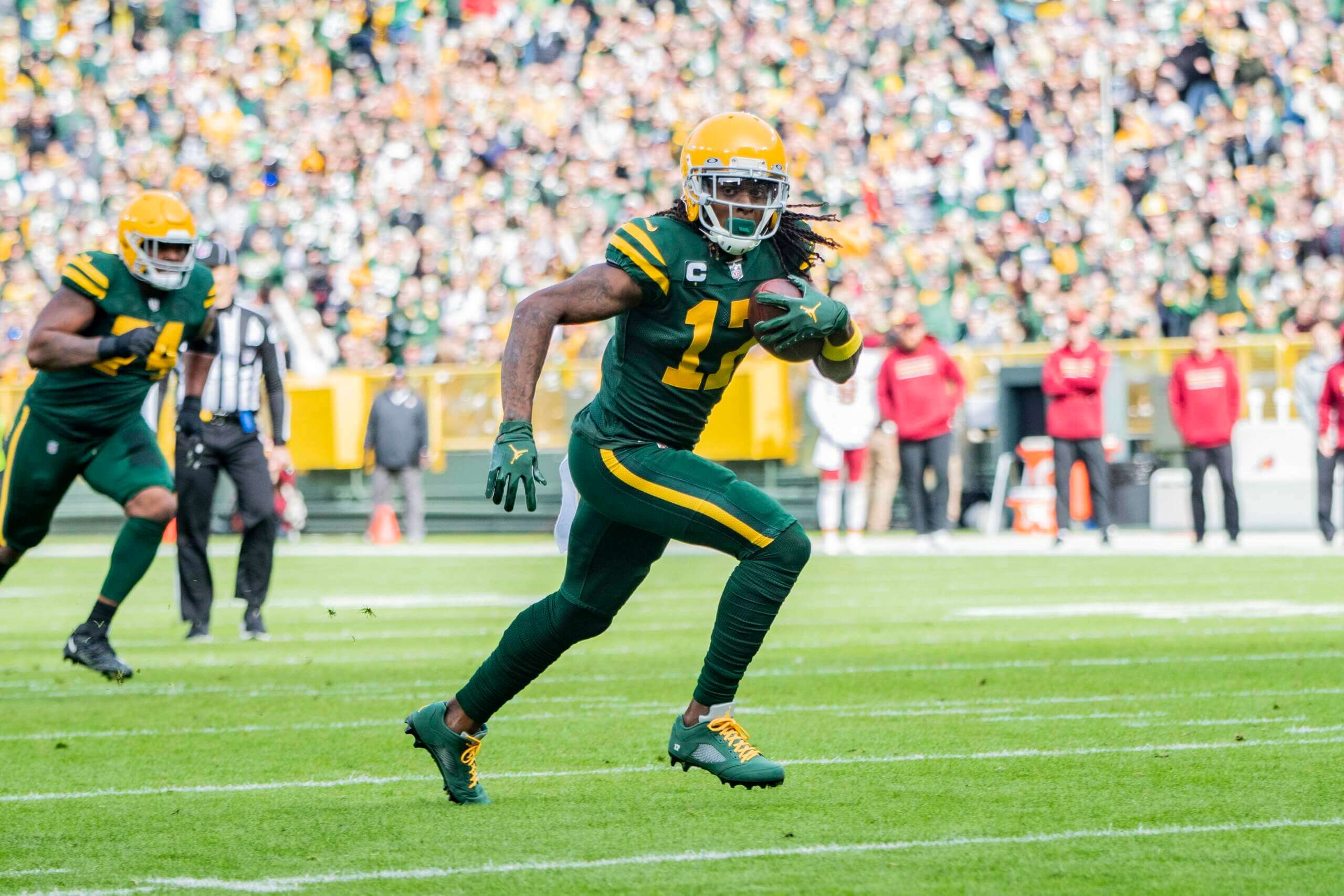
The Packers have just announced that they’ll wear their green early-1950s throwbacks for their Nov. 19 home game against the Chargers.
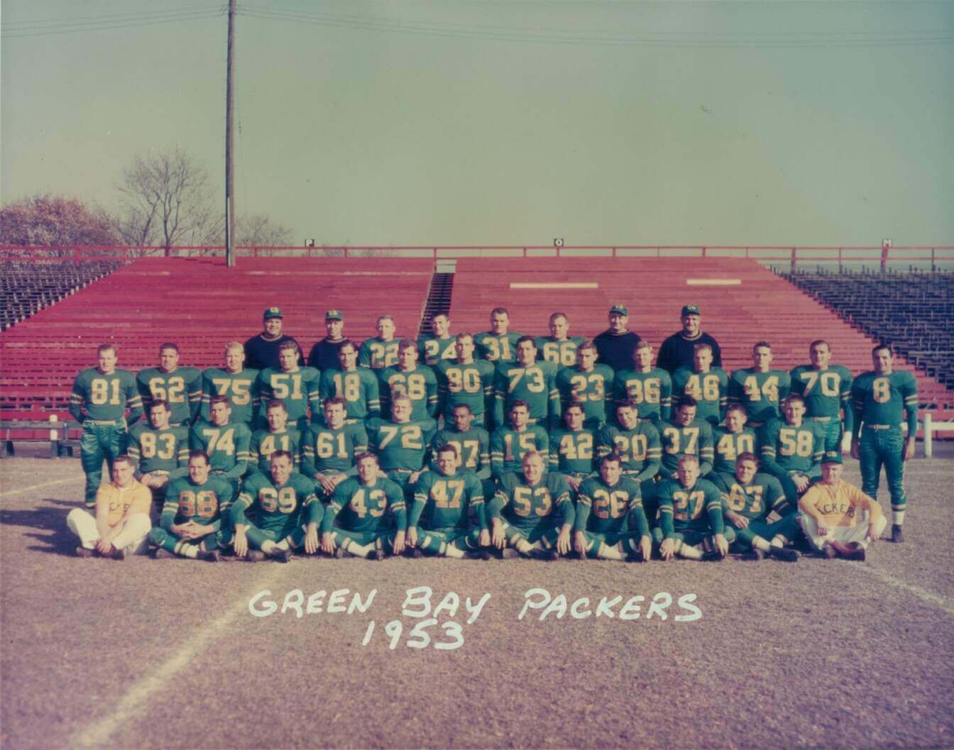
The green retro look, which includes plain yellow helmets with grey facemasks, is based on what the team wore from 1950 through 1953, as seen here:
The uniform made its throwback debut in 2021 (a Packers victory, against Washington) and was worn again in 2022 (a loss, to the Jets). You can see photos of those two games here and here.
The throwback shade of green isn’t Kelly, so it shouldn’t ruffle the Eagles’ feathers.
(My thanks to Brian Kerhin for giving me the heads-up on this one.)


That Packers-WFT game looked amazing.
If the Chargers go white over blue or white over yellow, that’s going to be a pretty wild looking game. If they go white over white, it’ll probably be pretty good.
To anybody that thinks this is a great looking uni, but will complain about modern mono-color unis: explain yourselves.
Mono is a bad look, whether it’s a current combination or a throwback.
As someone who personally prefers their regular unis to these, my opinion on the mono: having a different (complementary) colored helmet and sleeve+pants stripes drastically improves the look. Add the classic block numbers and this looks much better than a lot of the mono “leotard” looks with no striping and sometimes weird fonts and helmets. Not a bad looking uni at all.
Sadly I got responses from someone who doesn’t like these either (can’t fault that. It’s consistent) and some I’m in total agreement with. So I got no new insight there. But I completely agree with you: contrast is key. A different color helmet, and lord willing, white ankle socks at least, or bare shin as opposed to socks that match the pants. Is a fantastic start toward making a “mono” (same color top and bottom) uni look good. Then aim for contrast with patterns and numbers to break up the field of monotone.
Mono-color (excluding white) is always a bad look….
And gosh, who doesn’t remember those classic Packers v Chargers match-ups in the 50s, really set the tone for the rivalry for the rest of the century.
I never noticed the serif number discrepancies from the historical photos on these jerseys before. I’m glad the Packers are choosing to go serif
Ewww, looks like a Pop Warner football team decided to call themselves the Packers. Not a fan, looking at you New England and New Orleans.
This uniform needs some striping on the socks to make it look complete.
Glad to help!
Odd that they would bring back a uniform from an era where the Packers won only 11 +/- games over 4 years.
Old guard Packers, Lions, Steelers, Cardinals, Colts, Browns, Giants all total failures in keeping their look unchanged… They’ve given the title to an AFL team from the 60s – thanks Raiders
Black helmets only a matter of time…
Whoa, easy now. Why you say the Giants are part of in your words “total failures”?
Not a good look, hope that their fans will like it.
i love the look when teams do a solid shell helmet.
Chargers in Powder/Gold would be a great looking game. Plenty of contrast.
Give ‘em yellow socks and we’d be in business.
If only they’d do justice to the original with the socks. I see striping in the 1953 photograph. I do not see it on the field today. The tights in lieu of socks and the cut up & pieced together sock trend is just so off-putting to me. Ugh.