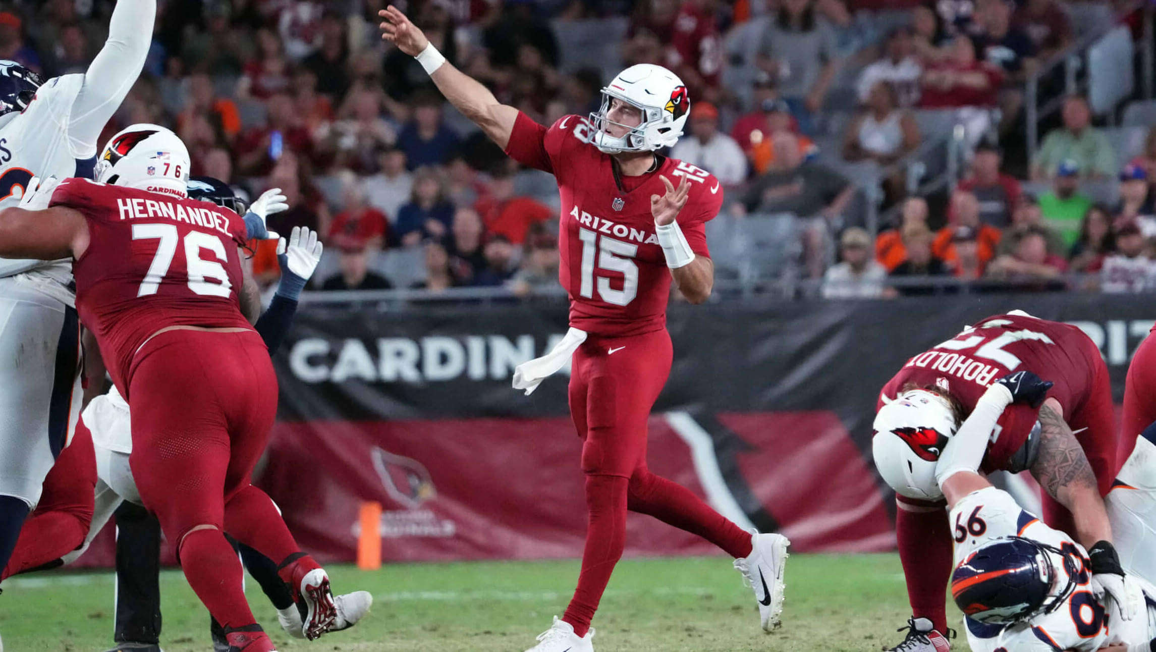
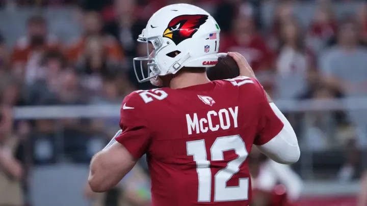
I’ve often said of new uniforms that “I’ll need to see them on the field (or diamond, court, ice) before I render a full judgment,” but that normal codicil probably wouldn’t apply to the Arizona Cardinals, who debuted their mono-red uniforms last evening against the Denver Broncos.
After seeing their unveiling followed by Paul’s detailed assessment, I was already convinced the Cardinals had gone from the worst uniforms in the NFL…to the worst uniforms in the NFL. No easy feat.
Seeing the uniforms on the field last evening confirmed my low assessment. I don’t often agree with Paul 100% on his thoughts about a uniform, but I’m pretty much in agreement with everything he said, and more.
Let’s look at some game shots:
First off, speaking only visually, teams who wear white helmets should NEVER go mono-dark below the neck. Dark helmets over all-white uniforms are fine, but it doesn’t work the other way. And while the Cardinals have a history of going white over mono-red, at least those uniforms had some splotches of color, even if it was black piping and white splotches. The new unis have none of that. But white-helmeted teams, with few exceptions, should almost always wear white pants below a dark shirt.
Then there’s that giant “ARIZONA” wordmark on the chest.
Assuming these are going to be the home uniforms, why say “Arizona” instead of “Cardinals”? As bad as their previous unis were, at least they said “Cardinals” in a relatively small font.
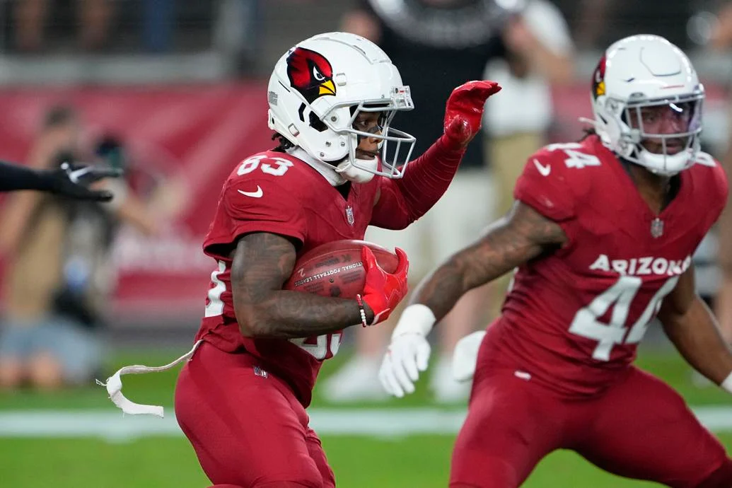
Then there’s the jersey back:
While I’m fine with the NOB and number fonts, the mono-white cardinal head logo looks out of place below the neckline (and is crying out for some black and yellow coloration), plus it also pushes the NOB too far down on the jersey.
If I have to say something good about this new uniform, then I will: at least they didn’t screw up the helmet. On its own, it’s one of the better helmets in the NFL. The new facemask (switching from gray to silver-gray) with a larger (and apparently metallic) bird head logo both look good.
I realize the Cardinals have nothing to do with scheduling, but the team’s first game (even if it’s preseason) came against the Broncos, who may have the second worst uniforms in the game. How sad is it that those almost 30-year old uniforms, in a template that was dated almost as soon as it was released, look better than the new Cardinals?
At the unveiling, there was hope the Cards would at least mix and match the white jersey or pants with the red — and they still may. The white uniform at least features some fairly classic striping (and is a much better looking uni than the mono red). Here’s hoping they’ll start pairing the red jersey with white pants at some point.
Most teams who have redesigned in the past five years or so have gone back to a more classic look. For some reason, the Falcons and Cardinals went in the opposite direction. Let’s hope the team comes to its senses and redesigns these as soon as the five year minimum (like the Jaguars, Buccaneers, and Browns all did).
I think we’re going to tire of seeing the bloodclot look very quickly.
You can see more game photos here, if you dare.
Would it have killed them to pair it with the white pants?
Yes. Nike is doing all it can to end different-colored pants and jerseys in football, which has been de rigueur for decades.
I have the answer to GTGWTDBWTBDTOTF
(Guess the game when the Denver Broncos were the better-dressed team on the field.)
My objection to a white helmet over a dark mono uniform is that the players’ heads look comically oversized.
They all look like Atom Ant. Especially with the smaller pads they wear now.
Now I can’t unsee that. You are correct.
This mono color trend with no stripes or design element on the pants and socks needs to end. It’s hard on the eyes. Pair it up with white pants with red stripes going down the sides!
White pants and it’d reasonable by contemporary standards.
Wearing these with white pants is an easy fix. The huge “ARIZONA” isn’t. Besides the Cardinal head pushing the NOB and number down too low, the same thing happens to the front number because of this ginormous name on the front.
Seconding that; the recent tendency (in seemingly every sport) to move uniform elements downward, particularly on the jersey backs, shoving stuff above the NOB/number, really throws things off balance.
If you want a little Cardinal head logo above the number, put the NOB below the number. I don’t think I’ve ever seen that style in football, but baseball has had it (Cincinnati) and multiple basketball teams have, including in the WNBA.
It’s just so embarrassingly bad…
Yes, the Broncos road whites are awful and have been since 1997. The home orange jerseys look very good however. The best looking football uniforms have a different color helmet, jersey and pants with socks that don’t match pants. White jerseys with white pants never look good for the same reason mono color jerseys and pants don’t look good.
“White jerseys with white pants never look good for the same reason mono color jerseys and pants don’t look good.”
False! W/W is a great road look for many teams, including the Broncos (although all their sets are not great and are thankfully on their way out). Mono also works for a few…all-black Ravens and Bengals for example. YMMV-and clearly does.
Forgot to mention the new Cardinals all-whites is terrific as well…the got those right! Can’t wait to see that in action.
I think Denver’s current look is good. Still looks modern to me; not the dreaded “dated” some have called it.
They don’t really look like any other team. That’s what you want; distinctiveness.
W/W is a great road look for many teams,
includingexcept for the BroncosThere you go!
Compare white over white with teams that have a color pants option. The color pants always look better with white jerseys. Chargers yellow pants, Chiefs red pants, Bears navy, Bills blue, Bengals black, Ravens purple or black, Jaguars teal, Dolphins aqua etc. The Broncos would look fantastic with white jersey and orange pants with continuous navy stripe down the side but could never figure that out.
The silver looks awful on the number outlines and where it appears on the white set. How did nobody in the creative process object to fielding Ohio State clones? Helmet isn’t terrible but I still like the original, before it was decided that mascots, even as innocuous as birds, MUST look angry and menacing.
The white cardinal on the back makes it look like a Walmart tee shirt jersey. They went from having too much striping and busy angles to no stripes and no variance. Why is this so hard?
The NFL trend of no sock stripes continues here and now it’s just red all the way to the top of the cleats. This organization can’t do anything right.
In stark contrast, every single throwback this year has football fans of all ages gushing. And again, every team looks better with striped socks. Makes the whole uniform unwittingly pop.
Compared to the old set, this is still a major improvement. I’m sure we’ll see this paired with white pants sometime in the regular season.
Agree. It’s bad enough that a CFB school copies a NFL team, Iowa and Steelers, but it’s embarrassing that a NFL team is copying a college team.
“Major” may be a bit of a stretch.
Yeah, came here to say this. These aren’t that bad. It’s not the exact direction I’d have gone, I’d have gone back to the 90s era, very simple white numbers on red jerseys, that’s it. But these are still a massive improvement. It’s still night and day. They went from arguably the worst uniforms in the league to at least middle of the road.
It’s like they’re TRYING to be ever more ridiculous.
These aren’t quite as bad as the Falcons and Jets but they are right there. Add some piping to the pants!!!!! And the mono look is just putrid.
Yes to this needing white pants, but at the very least they need some white socks. SOMETHING other than red to break it up even a little bit.
this is the laziest design ever…..they went from bad to worse. lol. even throwbacks would be an improvement and those were fairly plain. also, in my opinion, all NFL pre-season games should experiment with different uniform looks (alternate helmets, jerseys and different pant combinations to see what works and what doesn’t (and what the fans like and don’t like). always thought a home and away helmet would be an interesting idea, especially with alternate helmets now in place for most teams.
and able to experiment myself using madden…..so at least can do that.
The helmets do look nice. The rest is dogshit.
Y’know… there’s an actual bird native to Arizona that is known as the “desert cardinal” link
This team should look at those birds for inspiration. Gray pants, gray alt helmets, gray jerseys (all of these need a decent amount of red trim, of course).
Hell, how about removing white from the uniforms altogether? Make the primary helmet red.
I don’t even like the helmets. The logo is too shimmery.
I was trying to be nice – kind of like a compliment sandwich – because that uniform is so bad.
Am open-faced compliment sandwich?
The desert cardinal seemed to be obvious if they were going to switch things up. For a “storied” team with only a Super Bowl loss to their legacy, I might have suggested going desert cardinal for the the main look. Make silver the primary color, Cardinal Red the secondary. Keep the current helmet as a secondary.
If you’re going to go brand new, at least make it provocative
The pajama look is bad and the huge Arizona word mark is unnecessary. It will look better with white pants. As for the white jersey and pants, I wish the striping was black and red like the classic ibis instead of silver.
*classic unis not ibis
I find it really bizarre they went this way with the red home set, because the white away set is perfectly satisfactory with sleeve and pant stripes and no giant wordmark, so if they just used that design on the red set it would probably be fine.
Also, for some reason the black alternate set uses the same basic design as the white one, with the home one the odd one out. No idea what the reasoning is there.
“No idea what the reasoning is there.”
Because they can.
People will hate the red one and prefer the black. So It will give them an excuse to designate black as the primary as soon as possible.
They are getting a lot of hate and rightly so but let’s not act like these are even close to the worst unis in the nfl. The commanders, falcons, ravens, titans and broncos are worse by a mile. if you want to take away points for a great helmet but awful jerseys/pants. The rams and lions are also pretty bad
Things have degenerated so quickly from a uniform standpoint in the NFL, the Rams unis now looks sort of normal and classic just because they don’t have any absurdly out of place elements, like giant wordmarks or inherent threat of mono-pajamas (they did use that look a couple of times last year but it seemed more an aberration.) Also, since the Rams shunted their ghastly “bone” jerseys to alternate and elevated the quite decent “modern throwback” to their regular away, they’ve elevated somewhat.
teams who wear white helmets should NEVER go mono-dark below the neck
This is saying a lot when it comes to you, but you have NEVER been more wrong than you are right now.
No, the Cards didn’t look good last night. That doesn’t mean you can apply a blanket rule to all teams who go white/dark/dark.
My book, my rules
link
Hey, that was my old 5&1 book!
It’s so very simple, people…plain pants are OK…with contrasting pants.
If your shirt and britches match, y’all need some striping.
Lose the ARIZONA, shrink the NOB, raise and enlarge the numbers, then you’re getting somewhere.
Yes… somewhere
Not somewhere good, just somewhere less bad
“plain pants are OK…with contrasting pants”
Which pants are going where the jersey goes?
I was tired when I wrote this.
Plain pants are OK with contrasting jerseys.
The Broncos should have never gotten rid of the classic uniforms they wore prior to 1997. NEVER. If they wanted to darken the shade of blue, okay. But we’ve been forced to watch the Broncos play in these affronts to fashion all because they won the Super Bowl the first two seasons wearing them.
The Cardinals should use the USFL’s Arizona Wranglers colors. They are the colors of the Arizona flag, one of the best in the nation.
I hate to be that guy, but what about these jerseys is “nontraditional”? They’re plain jerseys! Throw white pants on them and they are Stanford.
Where did I say they’re nontraditional?
Sorry, shouldn’t have put in quotes. But you said, “Most teams who have redesigned in the past five years or so have gone back to a more classic look. For some reason, the Falcons and Cardinals went in the opposite direction.”
And perhaps I could have explained or worded it better. I don’t mean to say the Falcons and Cardinals went all crazy modern (although you could argue that with the Falcons, especially the now-defunct red/black gradient jersey). I meant the Bucs and Browns (in particular) returned (almost threwback/fauxedback) to prior looks, while the Cards and Falcons went for completely new looks. The Jags didn’t return to anything resembling a former look, but they got rid of all the doo-dads and bumper stickers from their previous set and went with a very basic look. But the point (if I had one) was that all three dumped their “Nikefied” shitshows after the minimum five-year requirement. My hope is that the Cards do the same.
Clear(er)?
They didn’t go back to _their_ traditional was the point, I believe.
It’s be like if the Browns introduced a new set that didn’t include any stripes anywhere on the uniform. Traditional? In a sense. But it’d look incredibly alien for the Browns to wear this.
I had to chuckle when my first thought was “they gave us nothing in which to judge this uniform” as if they were saying “there, we tried nothing fancy, so you can’t complain” but then I looked longer and realized they did plenty, and sadly most of it misses the mark.
I don’t like that they made the helmet logo metallic flake. I don’t like these with red socks, I don’t like the white bird logo on the back, and the arizona wordmark makes this look like a UofA uniform. Some sleeve trim, a contrast collar, or a stripe or two down the pants would greatly improve this set. White socks almost makes it worse unless there’s some red stripes on them maybe.
I like it!
Gawdawful. Absolutely brutal. How can it be that hard to come up with a decent uniform? Nike has an army of supposed designers and this is what they come up with? Is this crap player-driven? Are they to blame? So many questions…all depressing. White pants. Striped socks. This isn’t difficult. Jeez.
If only they would have put some stripes on those pants, it might not have looked so bad. But, they look like a poorly outfitted college team.
These are Pac-12 quality uniforms. And yes, that is an insult.
Pac-4 even worse
If they had worn the white pants with the red jersey would you complain that the striping doesn’t match? Red jerseys have no stripes while the white pants have the Northwestern style going on. We can’t win with this get-up! I also find the cardinal head on back obviously redundant. Perhaps replace it with an Arizona flag patch.
The shade of red coupled with the white helmet gives the appearance to a nasty outbreak of acne. It’s reminding me of those radio commercials from the 1970s, featuring the announcer who was pretty much the master of the pregnant…..pause….. whose final line was “What would you rather have?…. A few more cents?…… Or a few less zits?”
This is a huge mistake from head to toe: the helmet needs a normal decal, not a disco version, the jersey needs Cardinals instead of Arizona in a smaller print on the front, the numbers need no outline, the cardinal on the back needs to move to the sleeves and look like the helmet version (without glitters), the pants with this jersey should be white (with a cardinal stripe in any width), the socks should be white. The fans should boycott this look and not buy these jerseys.
If you’re a true fan, the uniforms don’t really matter. My preference would be contrasting pants and jerseys, but not something to complain about! There are other things more important in football than fashion – and fashion is not something I care to read about at a legit sports site!
Nevermind. I just realized this is a fashion site! Critique on!
Quite the indictment of the Chargers’ alt unis