The Winnipeg Jets have introduced a special uniform — which will be worn just three times this upcoming season — to honor the Royal Canadian Air Force (RCAF) centennial.
There’s a lot to get to here, so let’s start with the hype video.
It’s time to FLY THE ‘FOURTY-EIGHT’ ✈️ pic.twitter.com/JH72EJEgOz
— Winnipeg Jets (@NHLJets) September 23, 2023
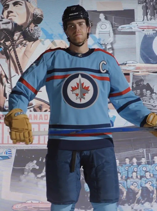
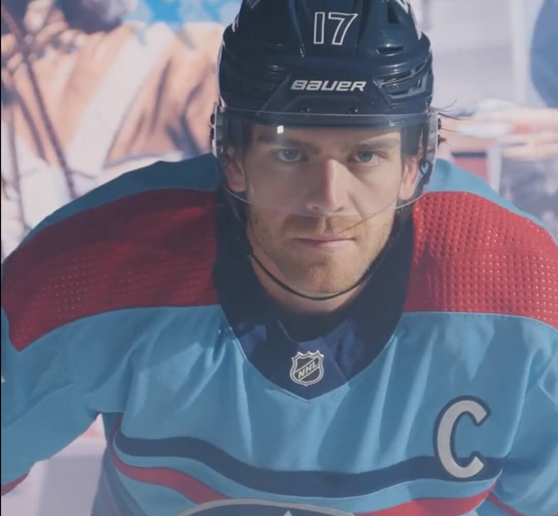
As you can see, the new uniform is a baby blue, with a thick red stripe on the shoulders.
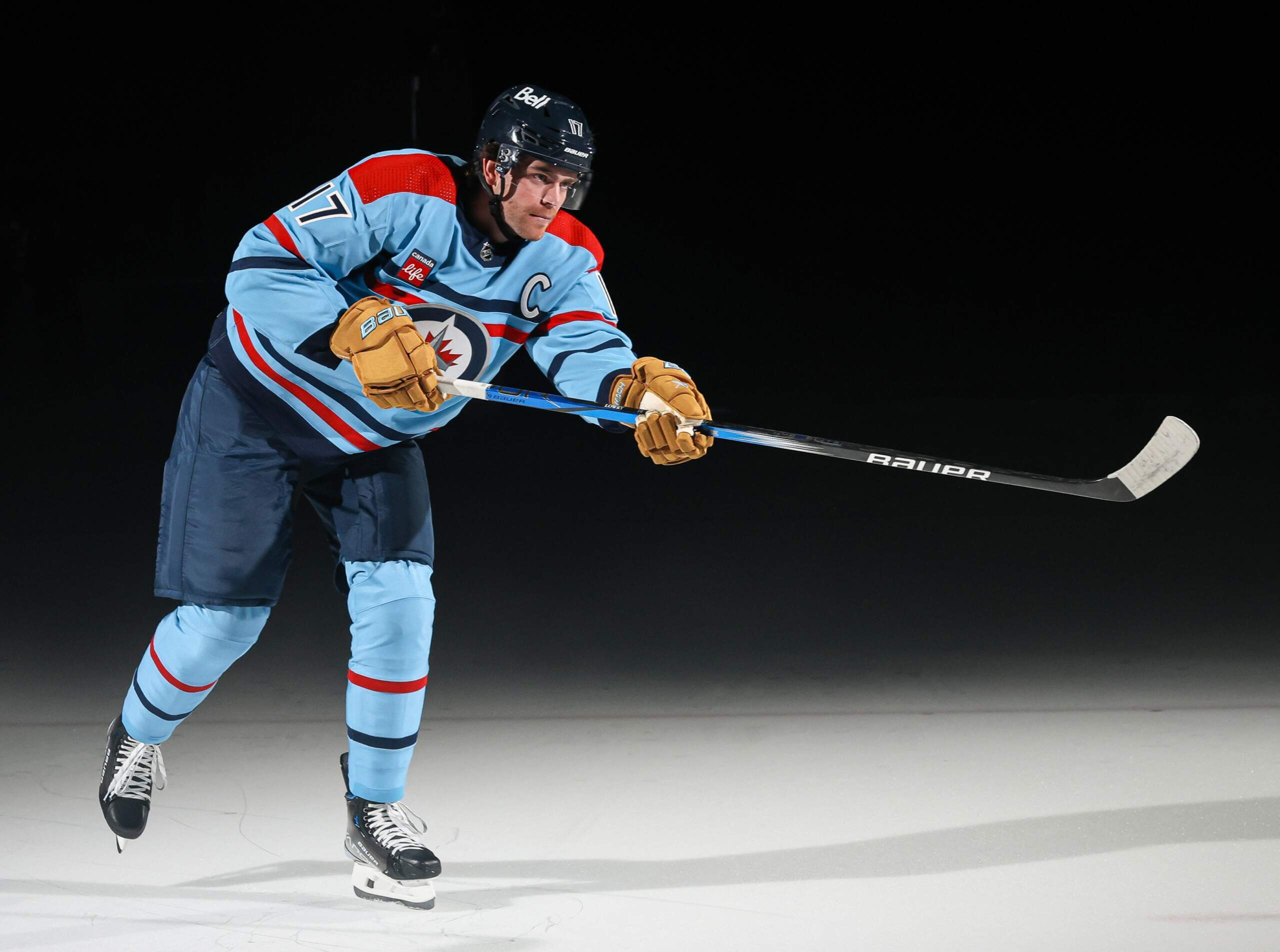
Alternating red and navy stripes adorn the sleeves, and are also present above and below the crest. Pants are navy, with baby blue socks featuring the same single red and navy stripes found on the sleeves. Numbers on the jersey sleeve are navy blue outlined in white.
The uniforms are meant to evoke those of the 1948 Ottawa RCAF Flyers, an amateur hockey club which represented Canada during the 1948 Winter Olympic Games in St. Moritz, Switzerland.
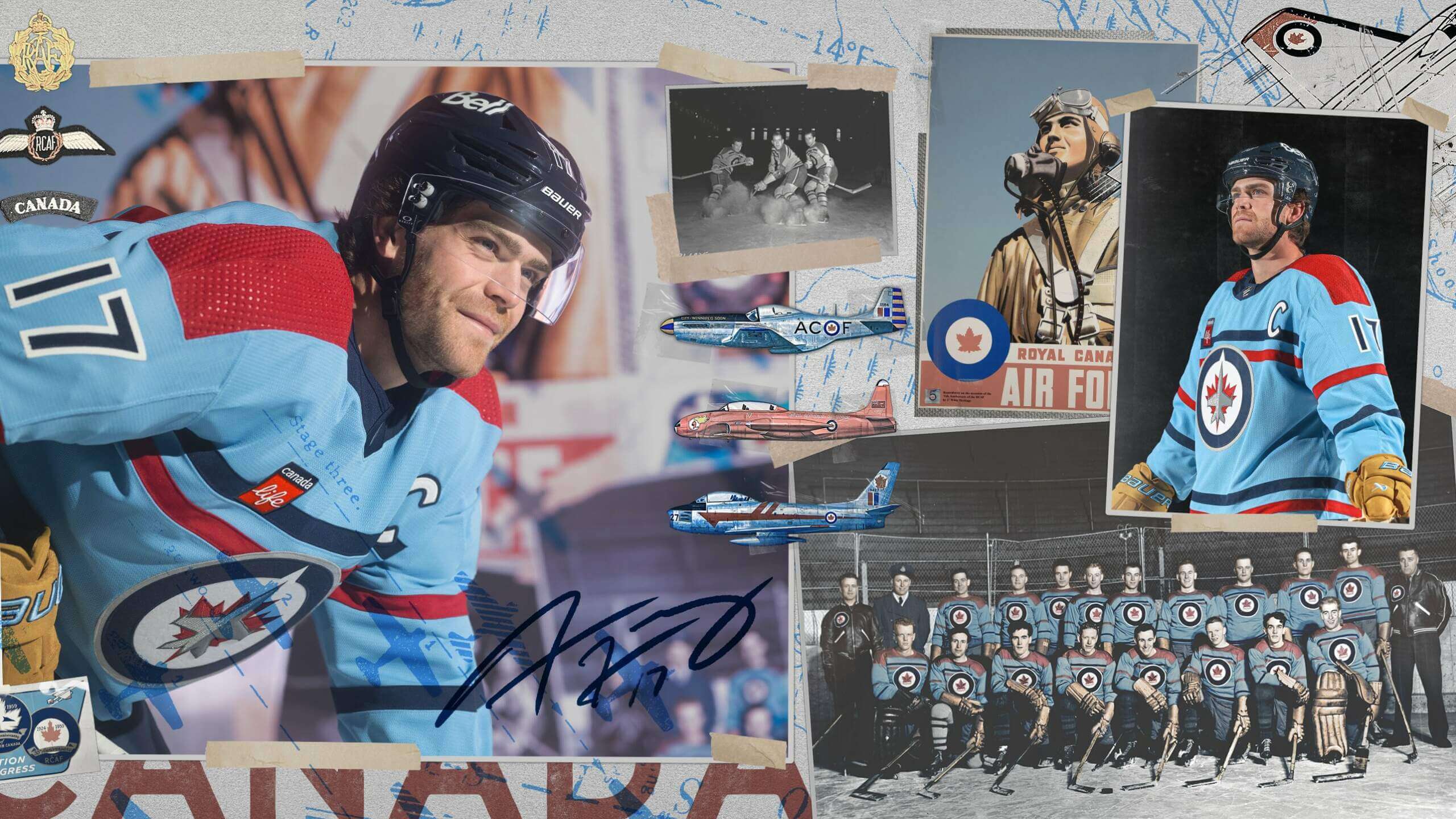
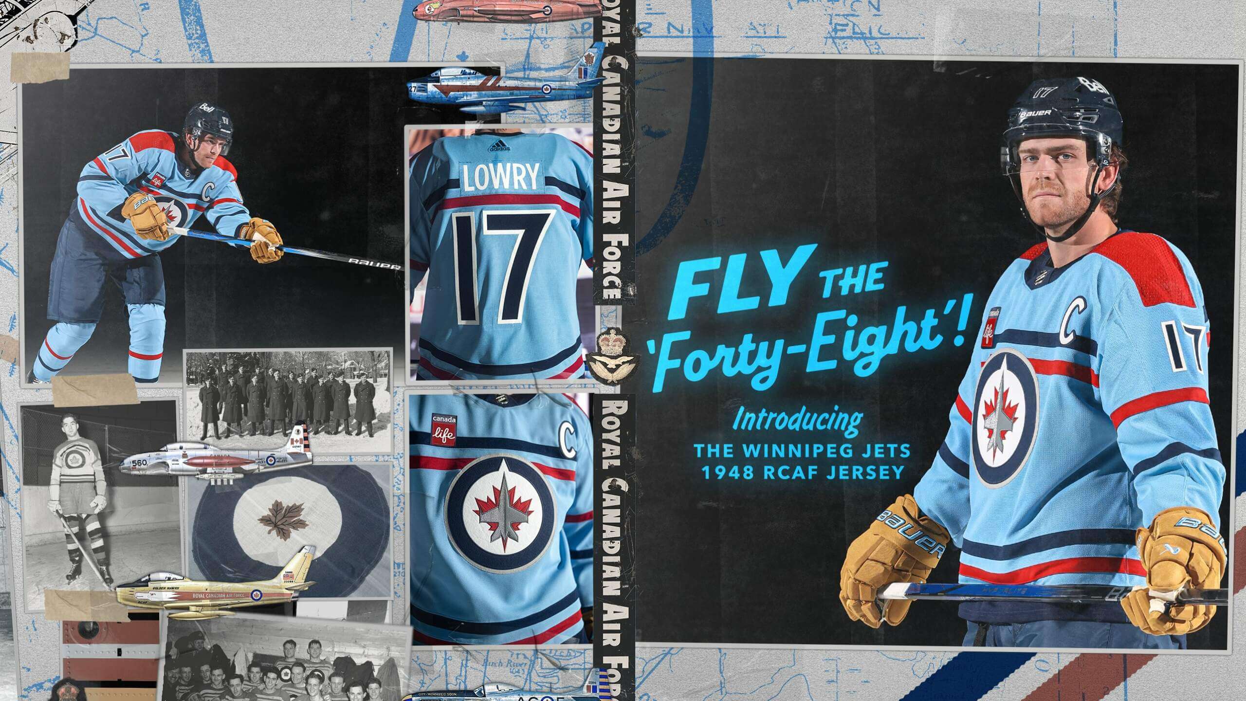
If you look at the photo of the 1948 RCAF Flyers, you will note the similarities in uniforms: colors and striping are almost identical. The main difference is the crest, which in 1948 featured a navy blue roundel, with a stylized Canadian maple leaf and “CANADA” inside a white ribbon below. The crest on the new jersey uses the Winnipeg Jets logo.
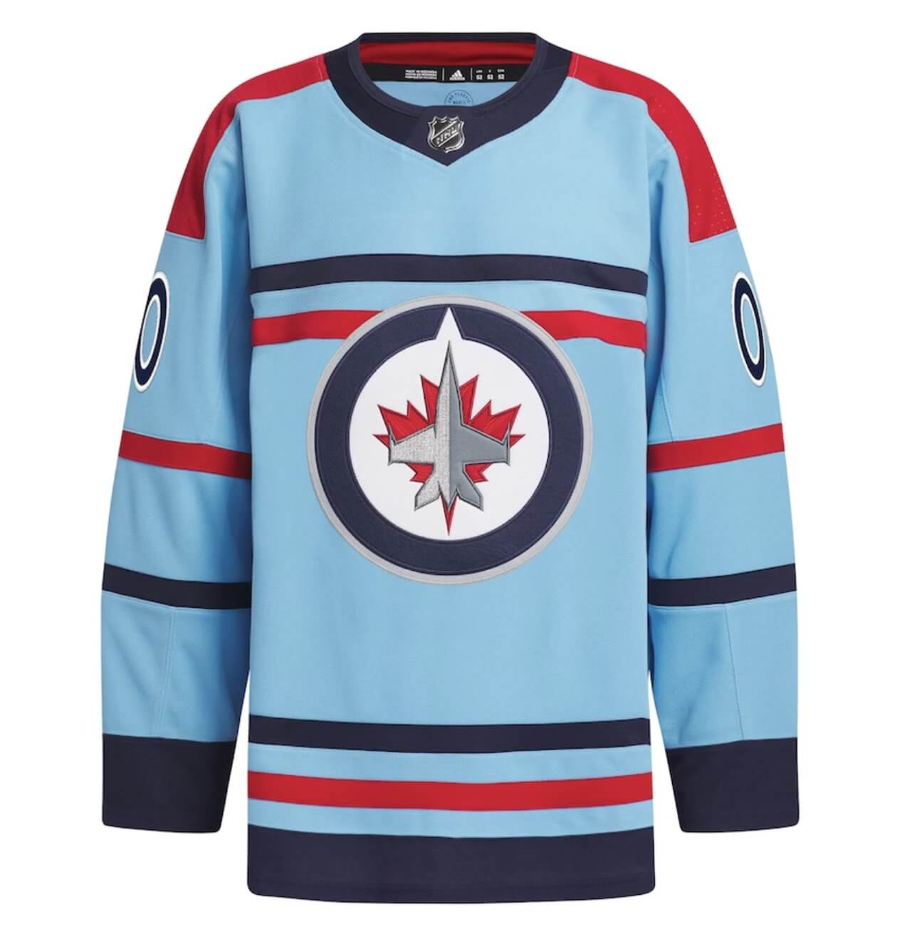
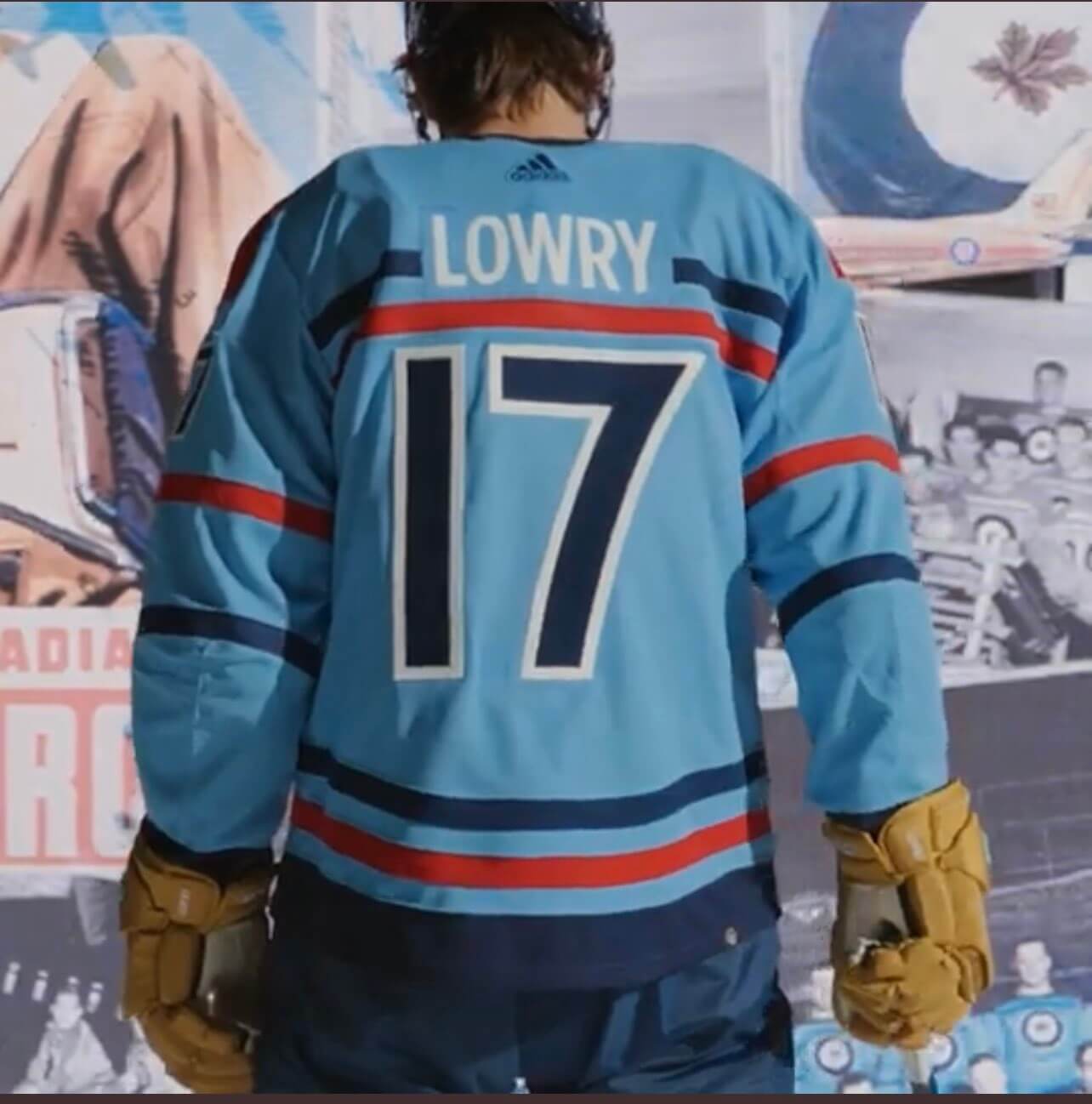
The back of the jersey features white NOB on a baby blue nameplate, with navy numbers outlined in white.
The Jets will debut the new unis at Canadian Armed Forces Appreciation Night, against the Carolina Hurricanes, on December 4, 2023. The other two times they’ll be worn will be against the Maple Leafs, on January 27, 2024, and against the LA Kings on April 1, 2024. That date is significant as it marks the centennial of the RCAF.
Love this! I had liked the baby blue color of the Jets’ so-called “Aviator” uniform, but other than the color, that design was sorely lacking. This one is cool. Looking forward to seeing it in game action!
Just to clarify, in case anyone’s wondering… The “baby blue” on their Aviator uniforms was actually quite a bit darker than this and really only looked “baby” in the context of being adjacent to a navy color. This is the first time the Jets have used a true “baby blue” (or “powder blue”).
An excellent uniform!
I’m a huge Jets fan and I’m kind of on the fence on this one. My initial reaction was negative but I love the honoring of history and how true to the ‘48 jersey they are.
All that said, I was hoping to hear what YOU thought of them. No offense intended but this reads a little like a press release.
I love them.
Appreciate the clarification. It’s growing on me.
3 times is 3 too many.
You don’t like (love?) these?
I’d love to see them 20 times a season.
Exactly! I personally would love these to become their third jersey.
Sorry. I can say these are pretty decent replicas of the jersey it’s paying homage to. That’s about it. The original jersey isn’t much to look at either. I won’t say I hate these by any means. That’s reserved for unis like the sabres and predators motocross style piping heavy sets of yore, or the buccs alarm clock unis. But it’s like… aggressively meh. If people like it I won’t try too hard to change their minds, because it’s not definitively bad and of course, you like what you like. But it is my opinion that it does nothing to improve upon or up the average of the current wardrobe, in fact i think it’s their worst current uni (though I’m not sure what unis are currently still officially part of their wardrobe, I’m basing it on the navys and whites with current logo, and reverse retro navys). The jets are presently a pretty well dressed team, though. So I can’t rag on them too hard.
loves these, especially how the gloves look like vintage leather. canadian hockey history is so fascinating on how teams represented in international competitions.
Having been in the RCAF for 26 years and counting this is a beautiful nod to the history of the RCAF and I must have one. The Manitoba Moose did a similar colour scheme for a military appreciation jersey years ago.
HTML issue right at the end (closing tag)
Thanks. Now fixed.
An RCAF tribute – very good!
Not a WHA/Jets 1.0 knockoff – also good.
Not a Thrasher throwback – not surprised.
Love them. Gorgeous.
These are stupendous.
These uniforms are *beautiful* and I even like the color!
The number font is distinctive and timeless (it looks like what Rutgers had on their football jerseys in the ’90s, and whatthe Cubs put on their 1910 throwbacks a few decades ago except for the “1”, which the Cubs probably should have removed the serifs from too). I also like how the NOB is inside the shoulder yoke instead of going below it like so many sweaters have. Really it should go over both of the stripes, and that silly manufacturer’s logo shouldn’t be at the top.
Love it! The 1948 roundel didn’t feature a “stylized Canadian maple leaf,” that was the roundel of the RCAF from 1940-65, and that more representational maple leaf was the common national symbol at the time. The maple leaf on the current Canadian flag is a stylized, somewhat abstracted, version of that older, more realistic maple leaf.
Love them! This organization has the introduced several nice jerseys over the years. Keep it up!
The Jets 2.0 have consistently put out excellent alternate unis while stubbornly holding on to one of the worst primary sets in the league. But hey, no need to focus on the negative when this beauty is out there getting attention. I even love the weird striping. (Has there ever been another NHL jersey with stripes under the logo but not centered with it?)
The Jets shouldn’t bother with a throwback until the Hawerchuck unit come back.