[Editor’s Note: Paul is on his annual August break from site (although he’s still writing his weekly Substack column). Deputy editor Phil Hecken is in charge from now through the end of the month.]
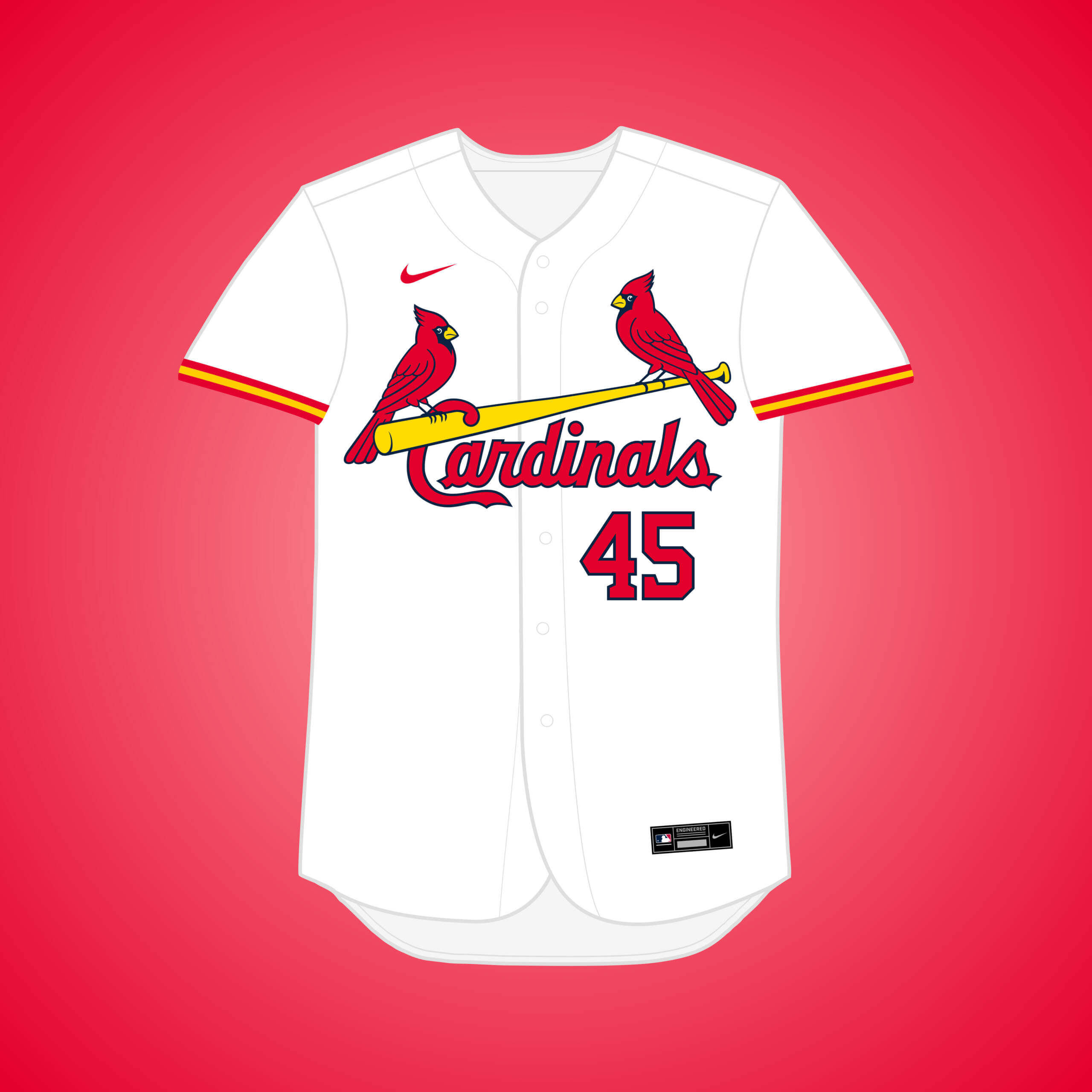
Good morning, Uni Watch readers. I hope everyone had a good weekend. If you missed it, on Saturday I had an article on Utah State’s new blue uniforms as well as a look at the debut of the new Arizona Cardinals mono-red uniforms. Yesterday, I had a fun quiz (and answers) on obscure MLB caps and unis, from Leo Strawn. Also yesterday, the Minnesota Timberwolves unveiled a new alternate, and I’ll have coverage of that later this morning.
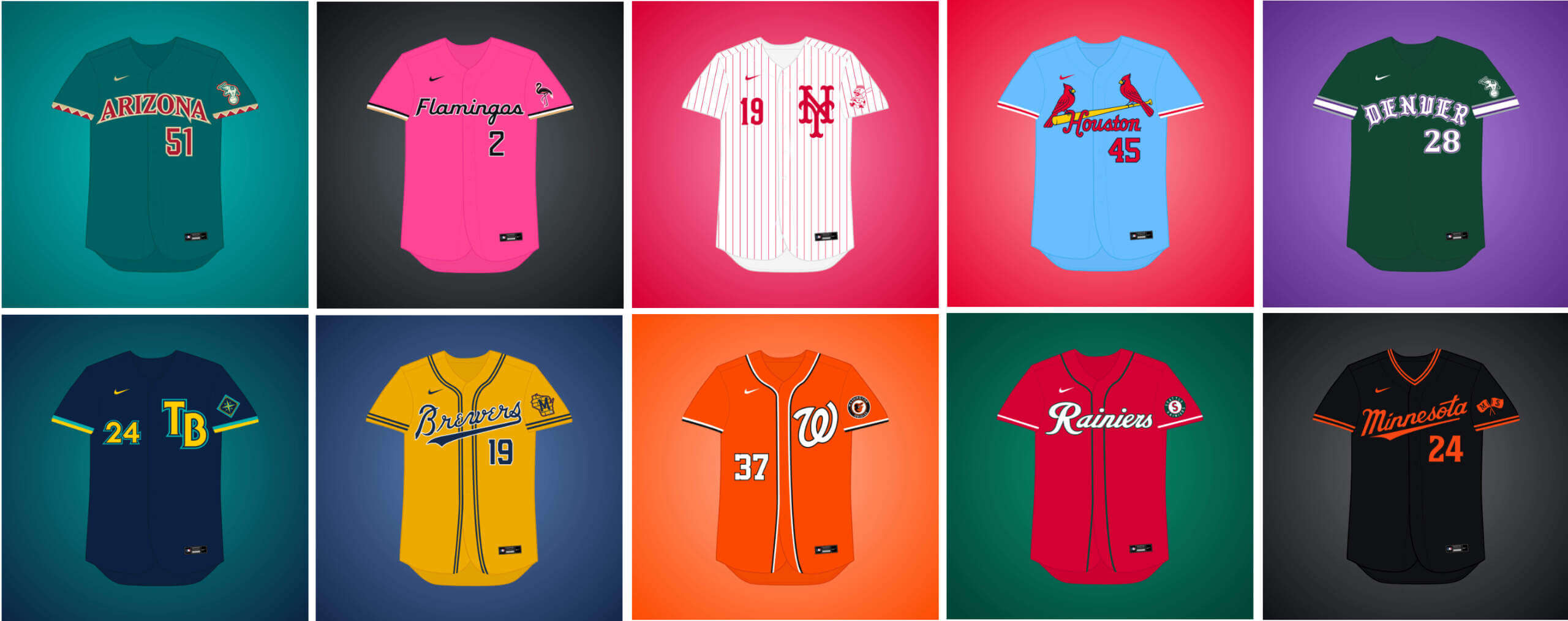
Weekend readers will be familiar with Matthew Drake, who has embarked on a project he’s calling the “MLB Multiverse.” If you missed either of the first three posts, you can click here for Volume I, click here for Volume II, and click here for Volume III. As in previous posts, I’ve included Matthew’s introduction from his introductory post below, so you don’t have to click on Volume I, II or III for an explainer. And as in previous volumes, for each “what if” I’ve included the new “home” jersey inline, with road and additional alternates in the gallery beneath. Enjoy!
You can follow Matthew @MJD7Design on the Twitter, and check out his progress on this project as well!
Here’s Matthew:
by Matthew Drake
I call this series “MLB Multiverse,” it’s essentially a collection of “what-ifs”: either relocations of MLB teams that very nearly happened, or what certain teams would possibly look like if they never relocated in the first place.
Obviously referential of Marvel’s recent cinematic dealings with the concept of the “multiverse,” another way of thinking about this is that these teams do in fact exist in an alternate universe, where their respective relocation deals followed through to completion.
The series was heavily inspired by user @SFGiants58’s legendary “MLB: The Defunct Saga” series on the sportslogos.net boards, as well as logo/uniform legend Todd Radom’s “Phantom Franchise” segment on Buster Olney’s podcast.
I created over 60 (!) different alternate-universe teams in this series, my biggest series ever by far. It was fun and exciting to try and flex my creative muscles a bit more beyond simply fixing up the 30 big league teams. I hope you enjoy seeing these designs as much as I enjoyed creating them!
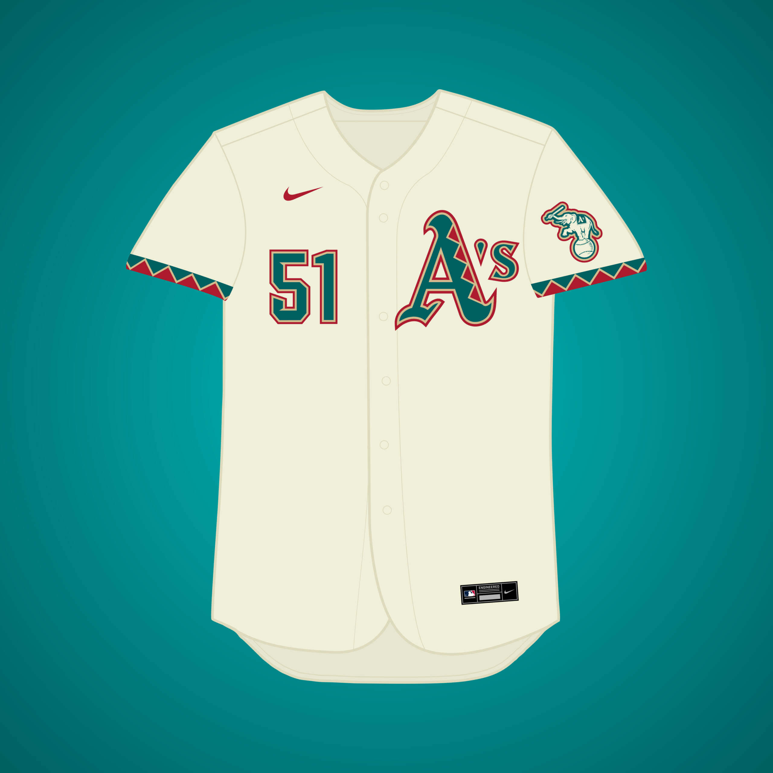
This one doesn’t have much evidence at all behind it, just a brief remark in one article. Still, it provided a fun premise. The design is pretty similar to sportslogos.net Concept Board user @SFGiants58’s original concept, just trading copper for sand.


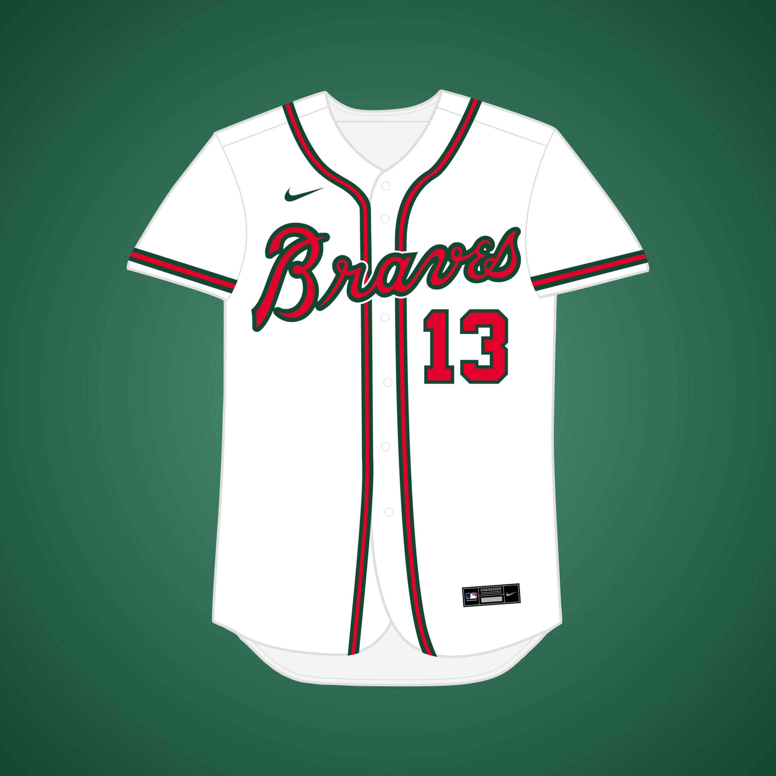
The Braves left Boston for Milwaukee in 1953, but what if they stayed? I figured the Braves would want to change their color scheme to differentiate from the Red Sox, so I replaced navy with forest green.


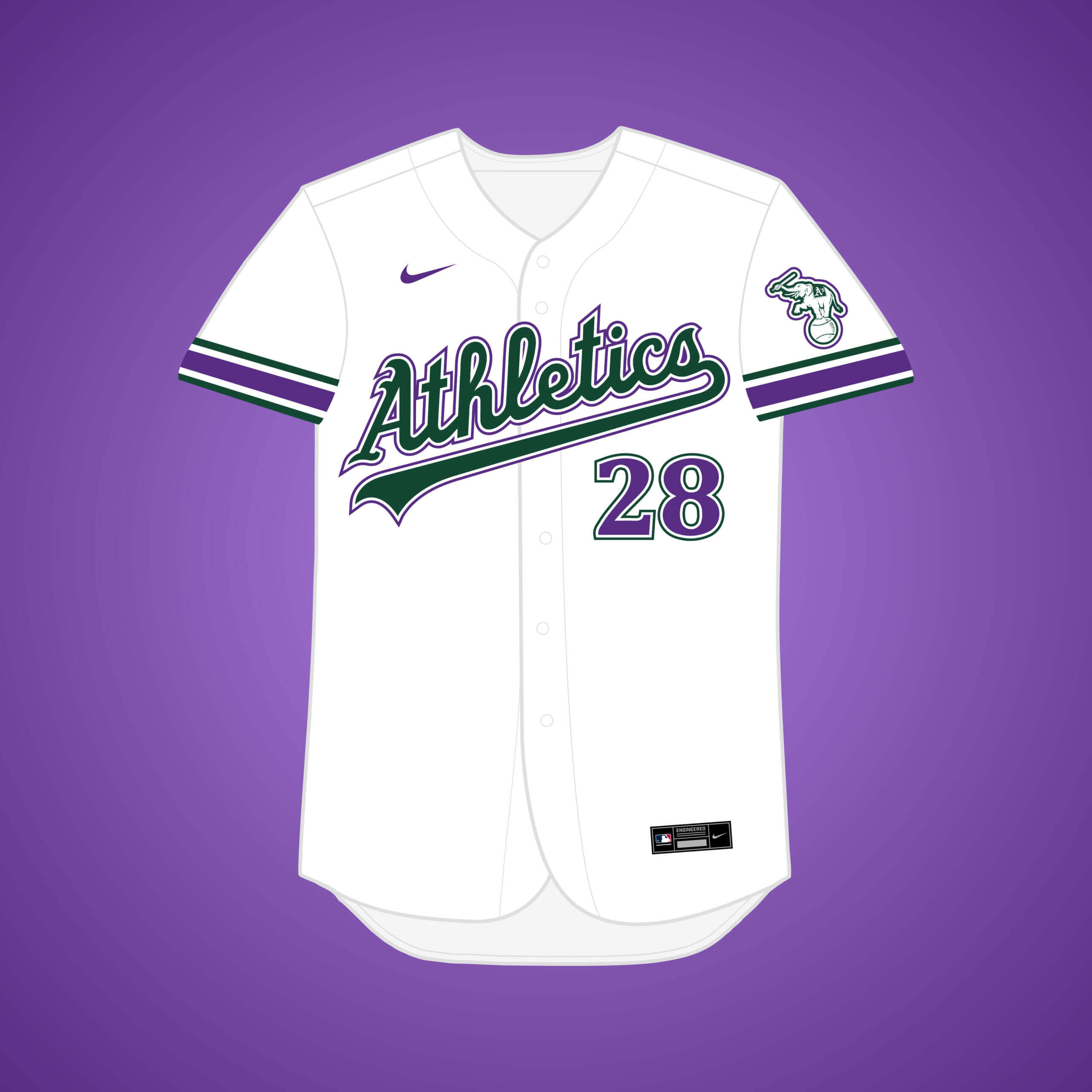
In the early ’80s, Charlie O. yet again tried to move the A’s, but since Oakland was losing the Raiders at the same time, the City Council nixed the deal. A’s forest green pairs with Colorado purple for this scheme.


Owner Fred Saigh had to sell the team due to tax evasion, so Houston (home of their AAA team) expressed interest, but he sold the team to Anheuser-Busch to keep them in StL. I brightened the red for the Houston variant of the team.


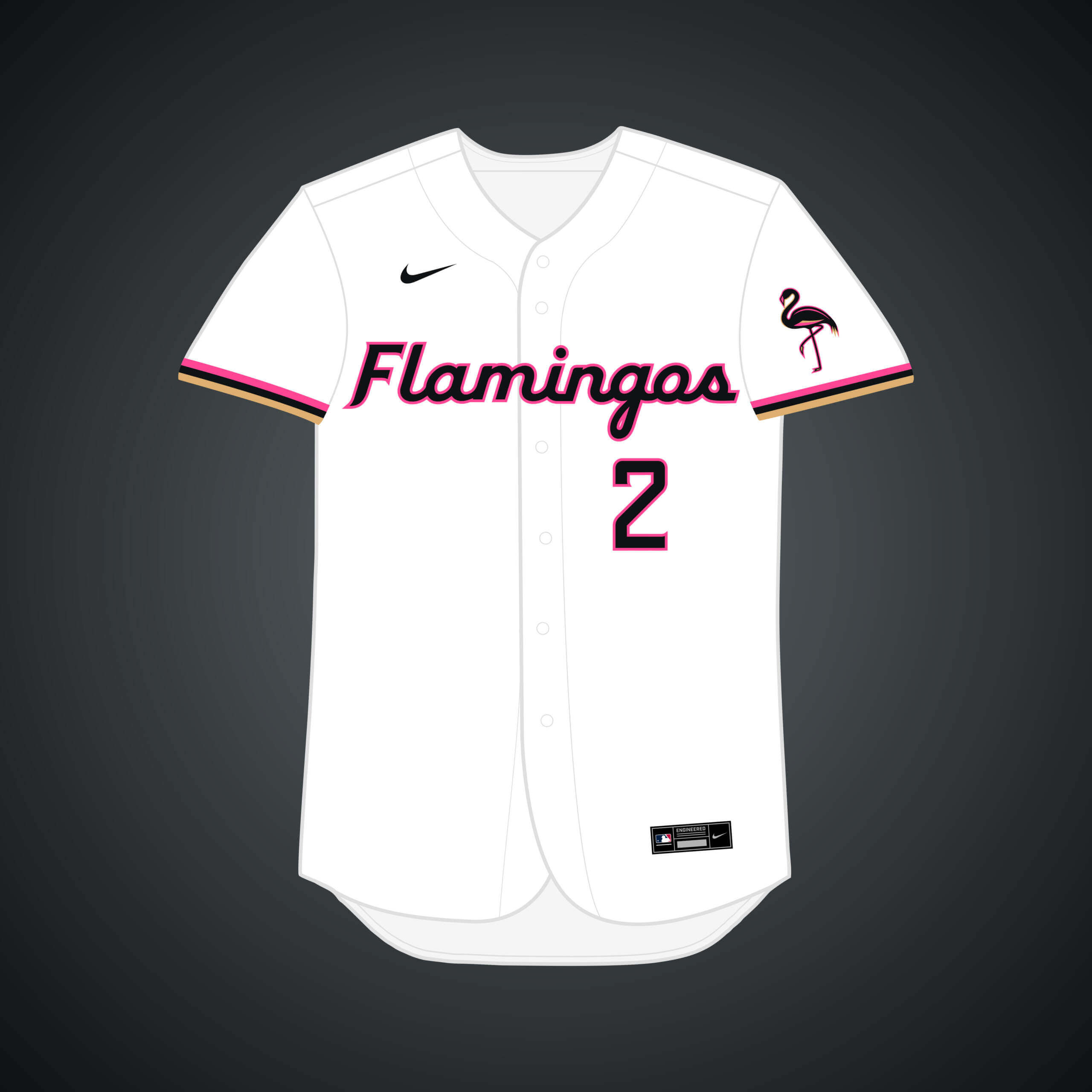
In 2004, the team met with Las Vegas Mayor Oscar Goodman to discuss relocation. “Marlins” doesn’t really work for a landlocked city, so I went with the name they almost originally went with: the Flamingos.


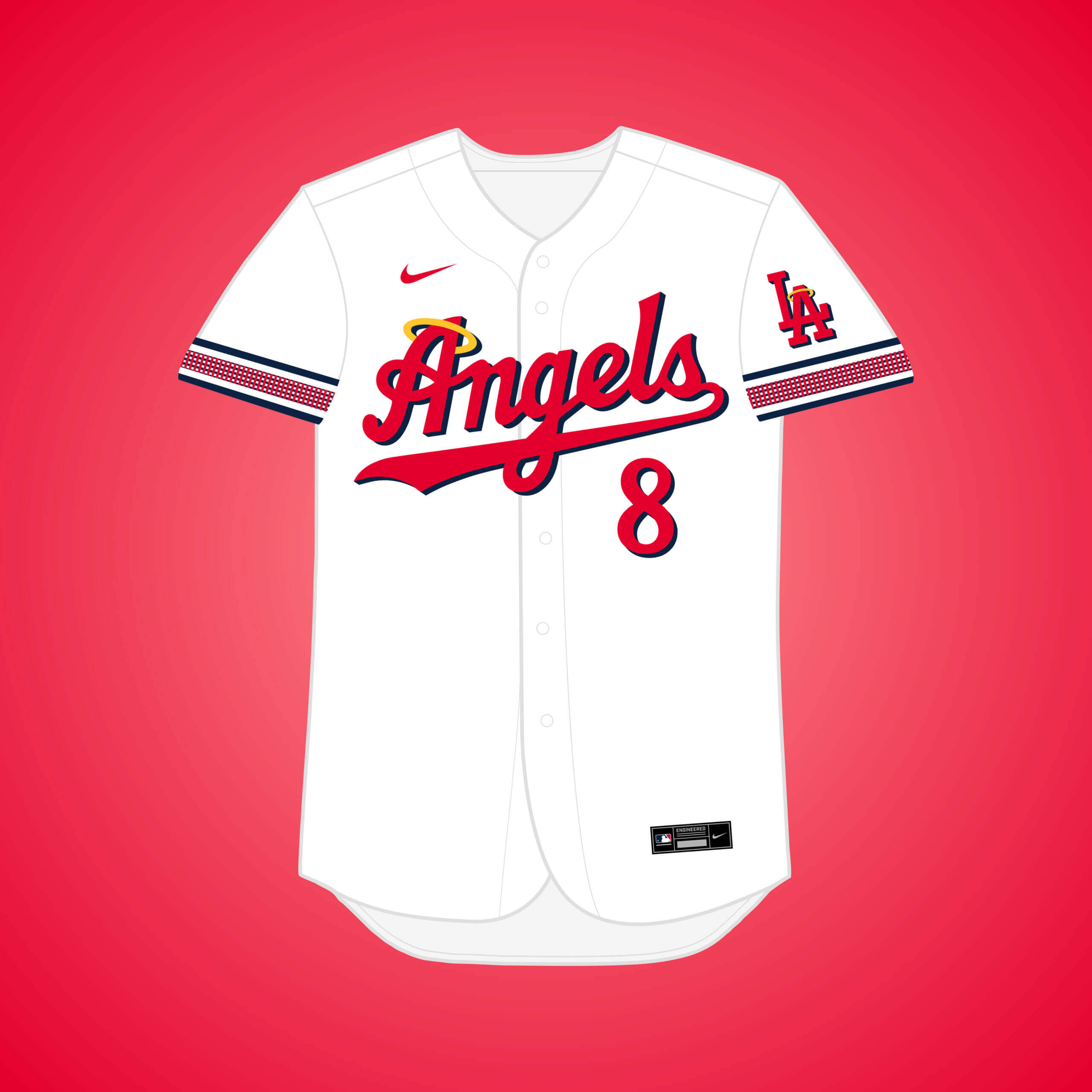
This is the same premise as my first Browns → LA design, but if they changed their name to the PCL team they agreed to purchase: the Angels. The “waffle-weave” pattern is from one of the Angels’ jerseys.


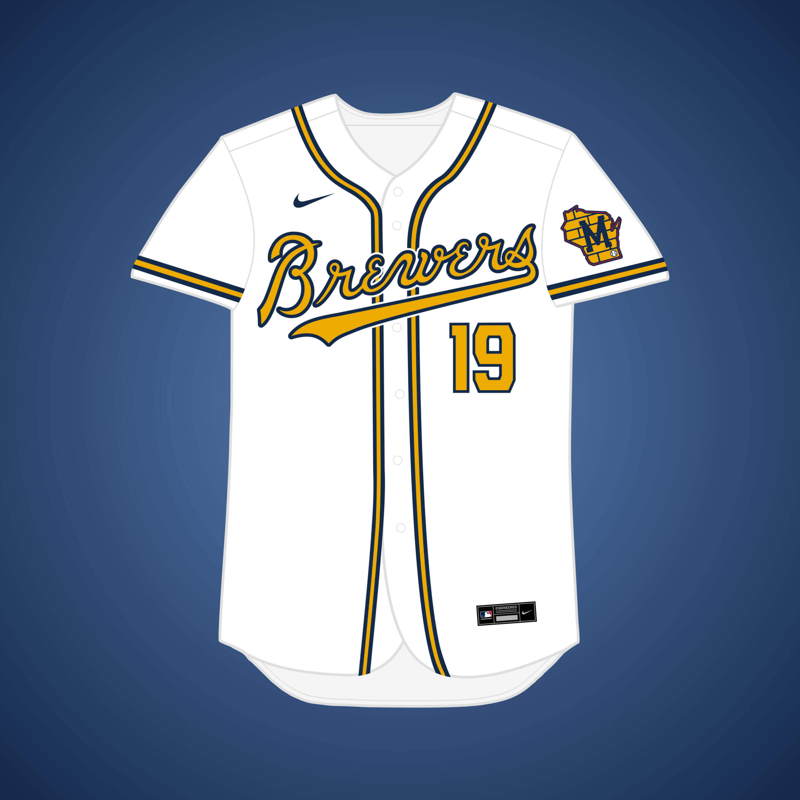
This is the same premise as the original Braves staying in Milwaukee design, but if they eventually changed their name to match the Minor League club. The Braves’ golden yellow is elevated to primary status.


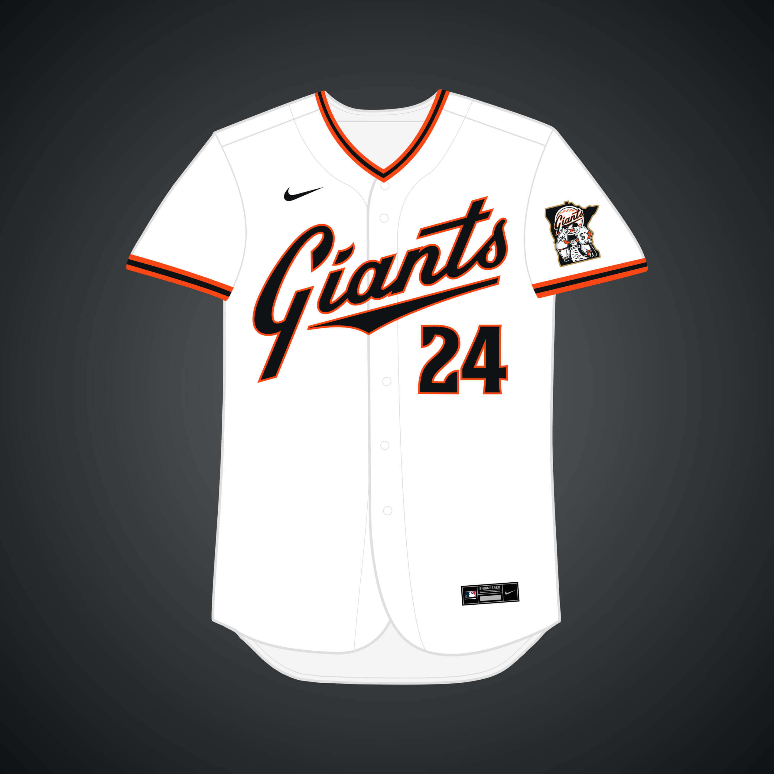
This is the same premise as the original Giants → Minneapolis design, but if they kept their name and went with the state moniker.


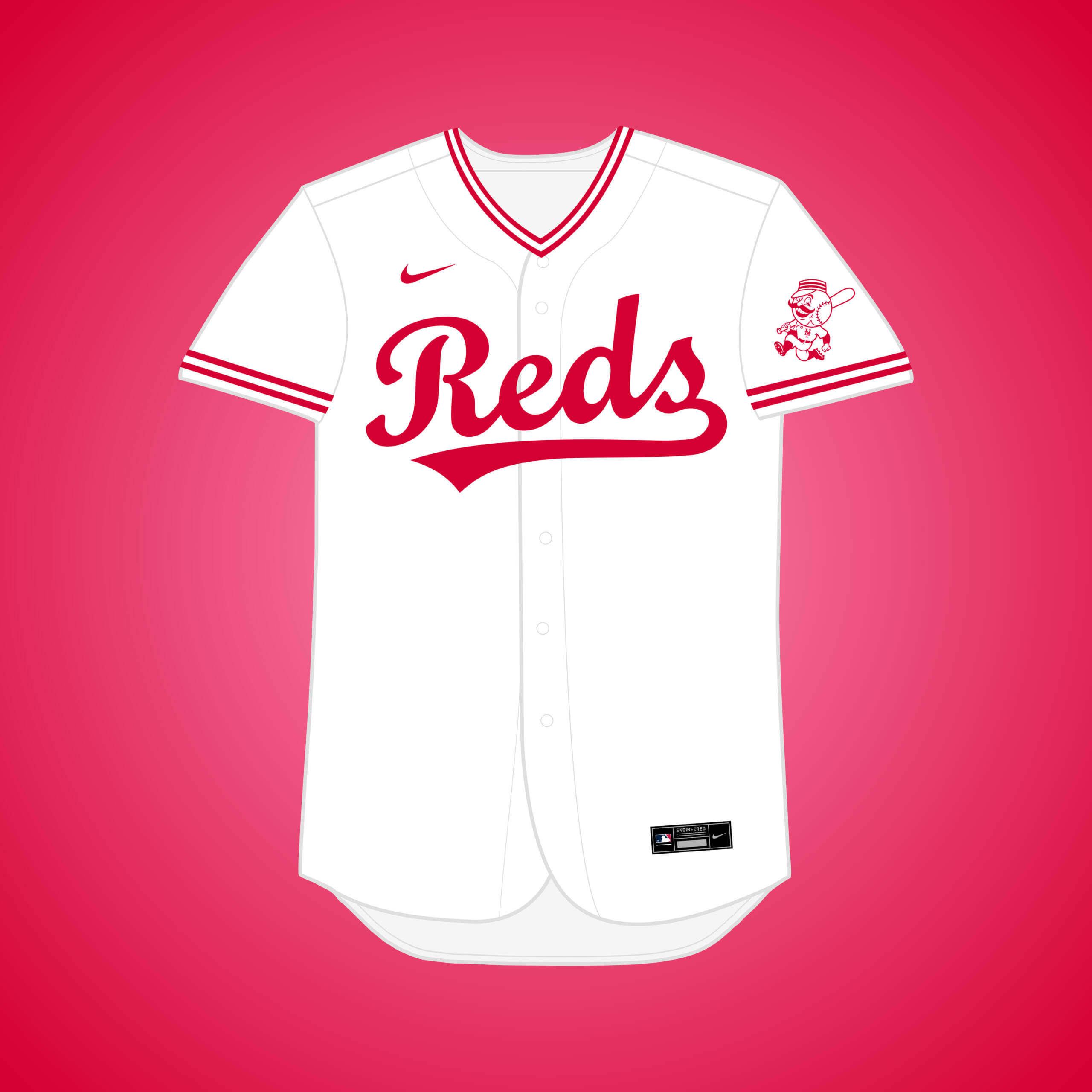
Stadium parking issues in the ’50s caused their owner to consider moving, & NY was eager for NL baseball to return, but Cincy struck a deal to keep the team. This would’ve been interesting, setting them up as sort of the anti-Yankees.


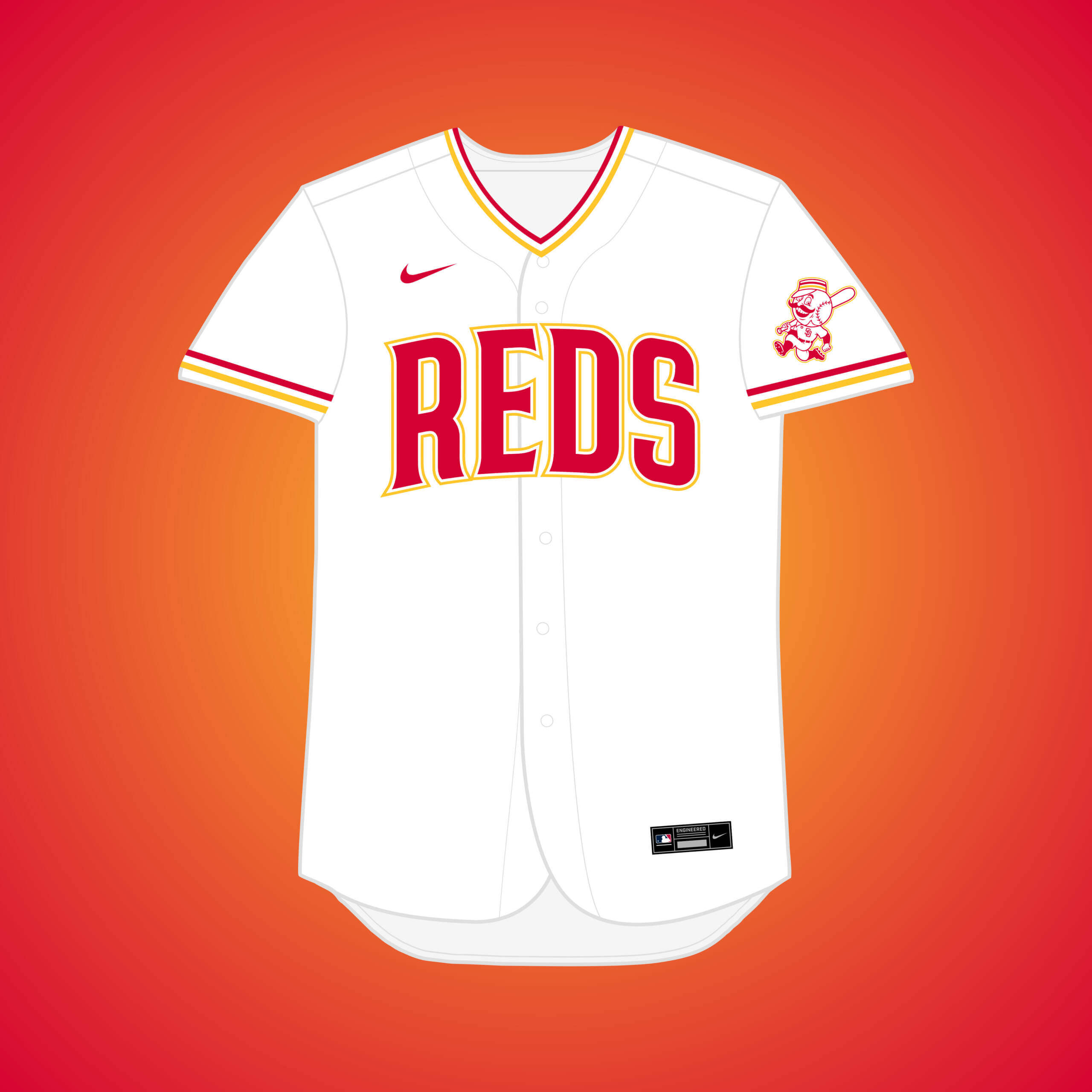
Stadium issues prompted owner Bill DeWitt to “consider” moving out west, and their affiliation with the PCL Padres made the most sense. Yellow is paired with red as a reference to the San Diego flag.


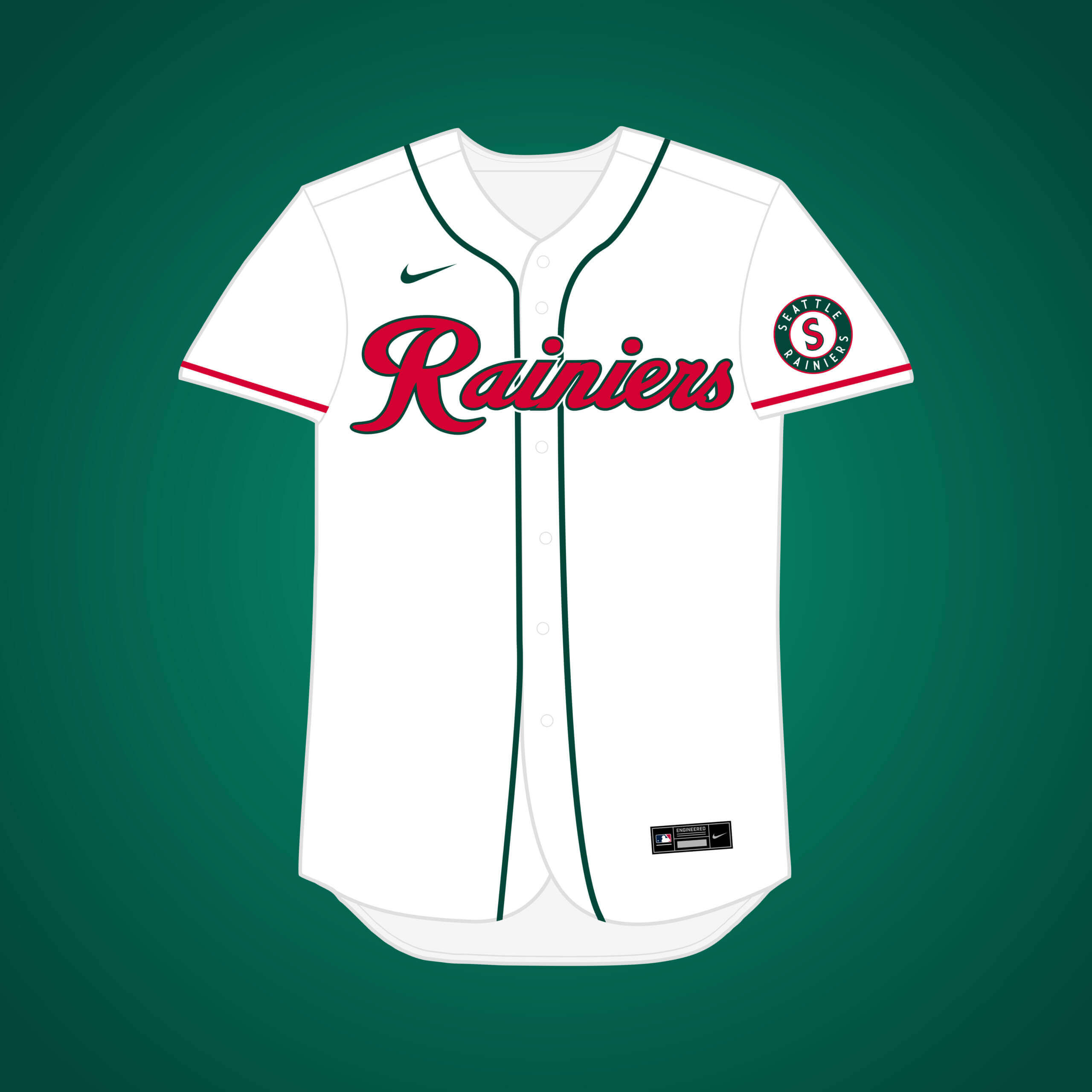
With Cleveland’s stadium lease expiring in 1964, the team looked at possibilities out west, likely just as leverage to get stadium upgrades. The forest green & red is inspired by the 2001 ASG.


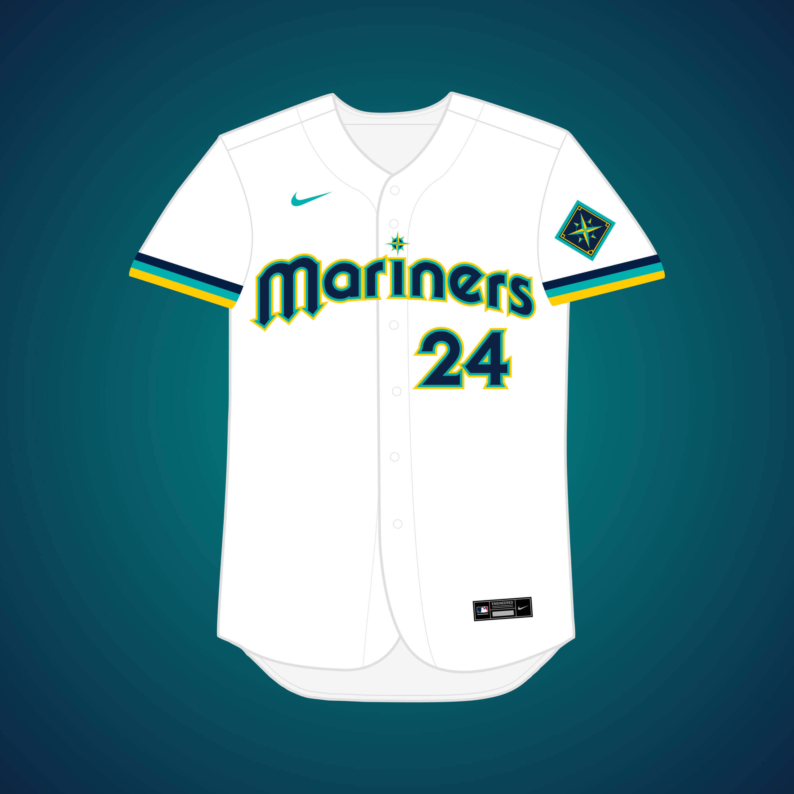
Per recommendation from Jerry Reinsdorf & Bud Selig, the M’s looked at relocation in the early ’90s & Tampa was probably the best fit. This was my chance to try the navy/teal/gold scheme from the 2023 ASG logo.


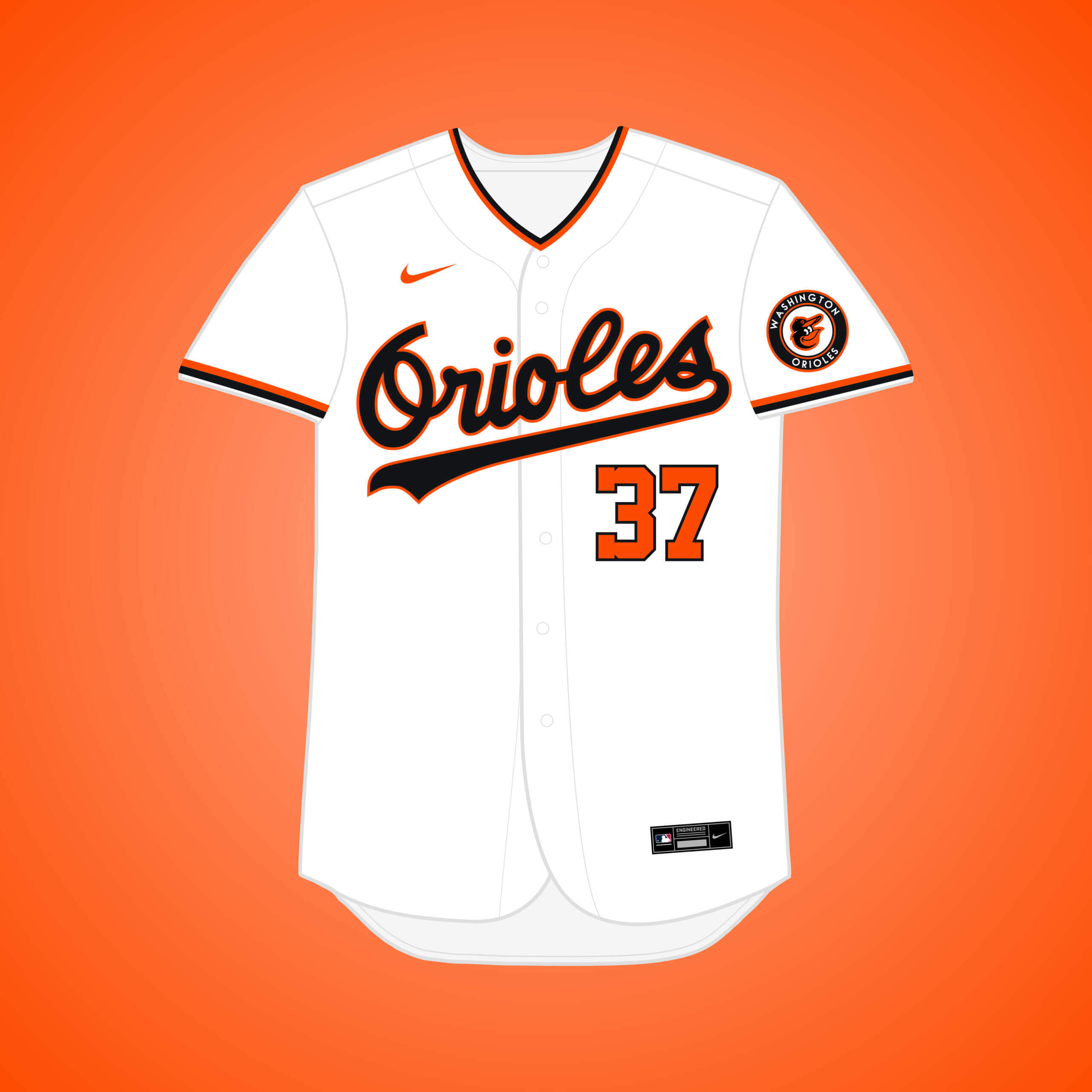
In 1976, the AL & NL adopted resolutions for the O’s to play 13 home games at RFK Stadium, former home of the Senators. 3 years later, Edward Bennett Williams bought the team, & rumors swirled that he would move the team to DC.


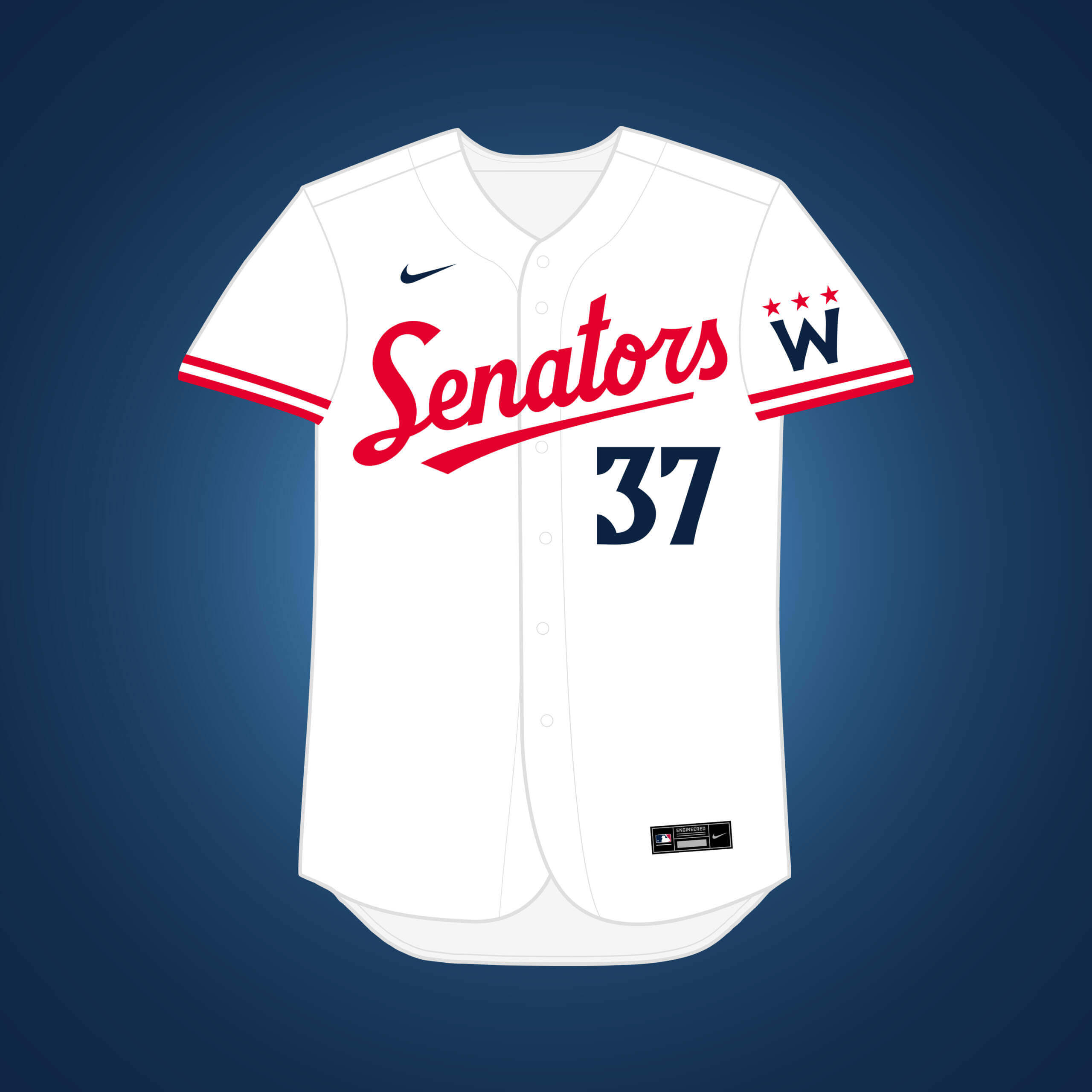
The Senators moved to Minnesota in 1961 and became the Twins, but what if they stayed in DC? This set takes a Twins-inspired approach to their branding evolution.


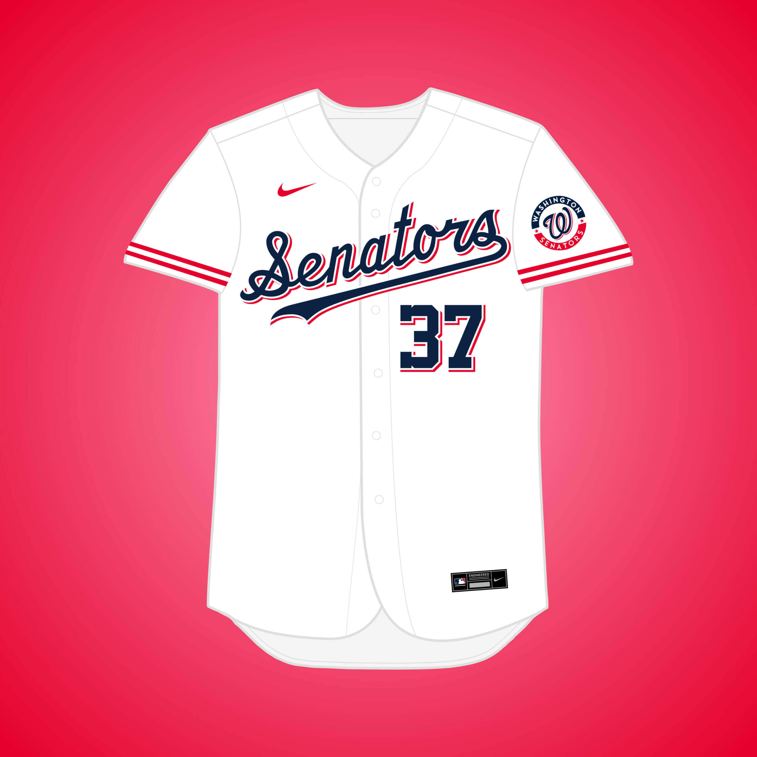
After the original Senators moved to Minnesota, Washington got an expansion team that lasted 10 years before moving to Texas to become the Rangers. The drop-shadow look takes inspiration from the Rangers.


Readers? What say you?

The Brewers should use that jersey that Drake created. Anything’s better than the set they use now, which makes them look like Boy Scouts. And for gods sake please drop the baseball glove MB.
First, Milwaukee looks like Cub Scouts. Boy Scouts wear olive/khaki.
Second, the current set are much better, IMO, than the blue-green era, and many others they’ve worn.
Third, the logo is a classic.
Thank you, David! Funny enough, I actually love the Brew Crew’s current set personally, there’s not much I’d change with it.
Great work Matthew! Have enjoyed the alternate universe perspectives.
Thanks Rick!
I love the multiverse project and the concepts are expertly rendered, but I feel like the material has been exhaustively mined from this concept. We’ve gotten to the point that we have “Orioles but with Nationals number font” or “Giants with current Twins number font” instead of breaking new ground. A lot of mixing and matching current elements, where one could reasonably predict, say, “What if the Phillies moved to Seattle?” And it presumes an awful lot, that a team that moved (or didn’t move) in the 1950s would wind up with Nikefied nonsense based on our timeline.
With that criticism as pretext, I have to call out my absolute favorite of all of these thus far: the Las Vegas Flamingoes. Holy crap, it is brilliant on every level! The name, the color scheme, the design – it is all perfect for Vegas! It is imaginative, creative, logical and thought out from beginning to end. AND… if implemented in real life, it would be a pragmatic answer to giving Vegas a team, keeping a team in Oakland (and allowing the Bay Area to solve their stadium crisis not under threat) while moving a team out of a market that doesn’t seem to care much for their team in South Florida.
The Flamingoes are why this project kicks ass. Great stuff!
“What if the Phillies moved to Seattle?”
Folks in Philly used to say the wrong team left town!
Today…not so much.
Thank you MJ! To be completely honest, I totally understand your criticism about the premise starting to feel exhausted, as I’ve started to feel that myself, as well. With examples such as the Washington Orioles & the Minnesota Giants, I get what you mean about it feeling like some of them result in a mish-mash of the two teams involved. I feel like the alternative to that, however, is just slapping a “Minnesota” wordmark on the current Giants set, for example, which to me felt even less inspired & was kind of creatively limiting. Given that there were a multiple iterations of the Giants (and other teams) in the series, I wanted to make each version feel unique & distinct, & part of that came by taking inspiration from the current real-life club that occupies the city.
I appreciate the kind words about the Flamingos! Funny enough, that set actually came together pretty quickly, and I didn’t even have them planned in the original set of teams. I think part of the reason that one works so well is that it forced a name change – and quite a few of the teams have in the final batch will share that necessity, so hopefully you’ll like some of those teams more! Thank you for the feedback!
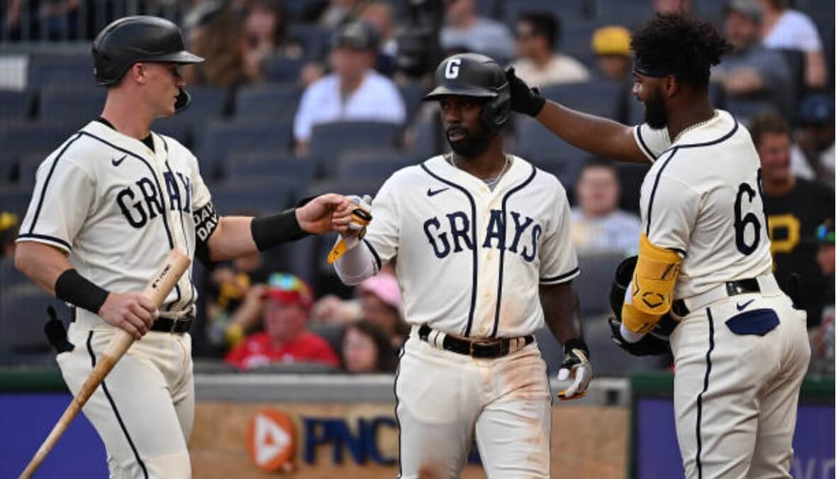
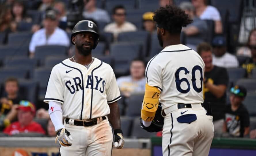
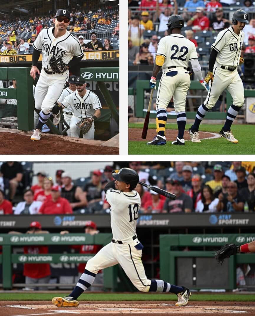
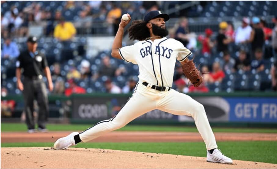
All of these what if jerseys look very good, even the Reds in NYC. Those Grays uniforms should be worn at least once a year by both the Pirates and the Nats to remind us of the travelling that the Grays did between the two cities. They are timeless and very cool.
Thank you! Yeah, I’m glad most of these “Multiverse” teams didn’t end up becoming reality, but the Washington Grays are one I kind of wish did happen. Although, even then, I wouldn’t sacrifice the Pirates’ brand for it.
The Nats also frequently wear Negro Leagues throwbacks, most often Grays gear. Including basically the same uniforms seen in Pittsburgh last weekend. As with the Pirates, the Grays uniforms always look better than the Nats’ regular home uniforms. The Bucs are a better-looking team to begin with, and they have a longer, richer uniform history, so the Nats are the team I want to see adopt the uniform stylings of those beautiful Grays almost-throwbacks.
I recently came to the realization that it’s a real shame that there is no MLB team that uses the name Grays…so I’d lobby for the Nats (a team known to borrow from other franchises from time to time) to re-brand – provided that they also acknowledge their true Montreal roots on occasion.
Agreed! I would almost definitely be willing to trade the Nationals’ brand for the Grays.
I’m very high on the glorious colors and crisp graphics of the Tampa Bay Mariners. It’s good to see Todd Radom’s lettering again on that Washington Senators jersey. To some baseball magazines, the A’s move to Denver was all but a done deal, and one publication mentioned orange was to be added to the colors,, as Broncomania was sweeping the city. And every rendering of the Angels has been a winner.
Thank you Walter! I’d be interested to see that article about the Denver A’s adding orange.
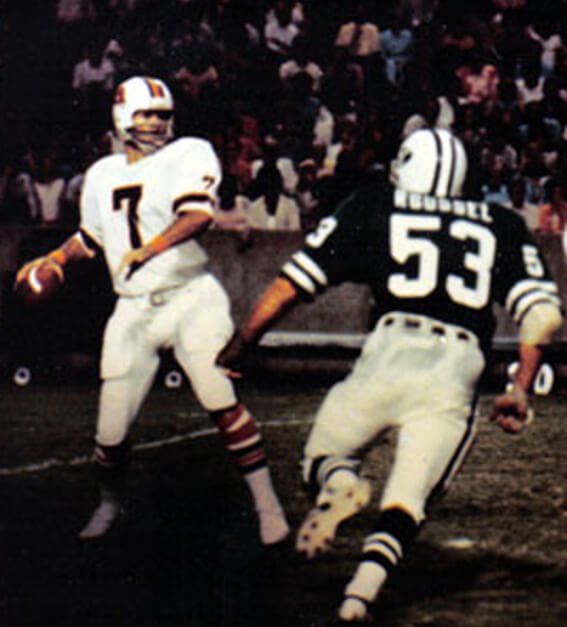
GTGFTU is August 30, 1975, WFL’s Chicago Winds v Memphis Grizzlies/Southmen at the Liberty Bowl. Memphis won 31-7. QB is Heisman Trophy winner John Huarte being rushed by Tom Roussel of the Winds.
And that would be the last game for the Winds, as they were kicked out of the WFL days later after investors had pulled out of the team, coming after their failure to land Joe Namath and essentially costing the league a TV deal in the process. Of course, it wasn’t enough to save the chronically undercapitalized WFL.
I was a teen when the WFL debuted. I loved ABA and WHL, so WFL was a natural love for me, especially with all of the great unis in the 1974 season. At one time I owned a 1974 Sun game worn helmet and a brown Hawaiians jersey, along with media guides, pennants, bumper stickers, etc. I have a friend (who is also a UW reader) who still has his white game worn Bell jersey.
Was sad to see it fail so quickly.
I was in grade school at the time, but I had been a football fan since I was three. And yet I don’t think I watched a single WFL game.
My only exposure to the league was a magazine I had which showed a picture of the Chicago Fire vs the Jacksonville Sharks. I thought the Fire were from New York, because the flame looked like a cleverly scripted NY to me.
For some reason, even to this day, I don’t have an attachment to the league the way I did for the original and current USFL.
Right-o, Leo!
Chicago’s 1st game with the Jet-esque helmet logo (as Rob S states below, this was where the WFL was hoping Broadway Joe would go)…and the last game for the franchise!
Ahh…Memphis in white-over-white! So pleasing that they never opted for orange pants.
Even though a correct guess was made, I’m still hoping that UW’s resident WFL expert/GTGFTU creator will have some additional yarn to spin for this one!
^ Above…not below!
Sorry, Rob
I remember the Memphis Southmen well, my father got WFL player of the week against them in 1974. If I wasn’t such an honest kid I would have a Memphis game helmet, game socks and Memphis travel bag. The day after the game I helped pick up the trash in the visitors’ locker room, I found a Memphis bag with a helmet and dripping wet game socks, I took the bag to the parking lot and put it by my father’s Lincoln. I went into the Bell lockeroom and had to interrupt my father in the middle of telling some King stories to the players. I asked him for the keys so I could put the bag in the car. He said what do you want them for? I said I found a bag with a Memphis helmet in it. He said I can’t keep it, that I have to turn it over to Bob Colonna the equipment man. Bob actually called the Memphis guy and arranged to send the helmet back.
Ahh…Memphis in white-over-white!
It looks like a night game, so I’ll let you enjoy this one.
Mono-white is permissible at night, in a dome or on a cloudy day.
If it’s sunny or snowy, get it out of here.
Regardless of the conditions, though, Denver still looks bad in white over white.
The WFL teams only had 1 set of pants, I thought the Sun looked great in their white jerseys with the orange pants, but I thought the magenta jerseys would have looked better with white pants in fact a few years ago Uni Watch had a redesign WFL uniforms contest, and someone did the Sun with white pants, and it looked great.
My father would rate every WFL uniform of the team he played against to me after the game, he said Memphis was nothing special to him. He loved the Sharks unis.
Those Grays unis are SO sharp! This game was originally supposed to be played Friday night but was rained out, so it was a nice treat to have a rare Sunday evening non-national game to begin with, but see those uniforms was even better!
Matthew’s choice of colours and overall design ethos is amazing. Even when the idea has been well exhasuted, I’m always happy to see new entries to the series, purely because the uniforms are so pleasing to the eye.
Thank you very much, Charlie! Although I’m starting to feel ready to wrap up this series soon, just because there are so many teams, I have enjoyed trying to flex my creative muscles a bit beyond just redesigning the current MLB how I would see fit.
“What if… the Braves remained in Boston?”
I’d be glad to see them come to a town near me because that road gray jersey is terrific!
How is it that you and just about every other concept artist can dress the Angels better than the designer(s) of record? Drop the waffle-weave though…makes me think of the Washington Commanders white jersey numbers.
I’m not sure I’d like a world where MLB didn’t have a team that used the wishbone C, but having your take on the Rainiers in the league would soften the blow.
Awesome work, Matthew!
Thank you, Chris! Yeah, I honestly wasn’t huge on the “waffle-weave” pattern either, but since the original PCL Angels had it, I felt like I had to include it.
Love the Cleveland to Seattle unis. I wish this is what they would have rebranded to as the Forest Cities.
Thanks Jon! Although the Mariners probably have my favorite color scheme in all of sports, I don’t think that Rainiers set would be a bad alternative.
Here’s an idea for a “what if…” project: What if the A’s had relocated to every city in North America with a population of 250,000 or more?
This series has pretty much felt like that at times!
Nice Giants Jerseys. I think the current Giants should make that the Sunday White set.
Thank you Brian! Personally I love the Giants’ cream home jersey, so I don’t think they have the need for a white alt, but I’m glad you like it!