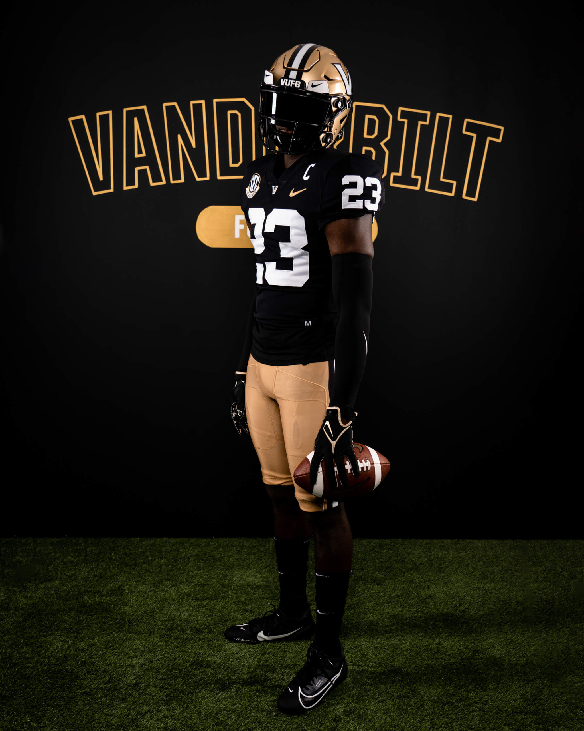
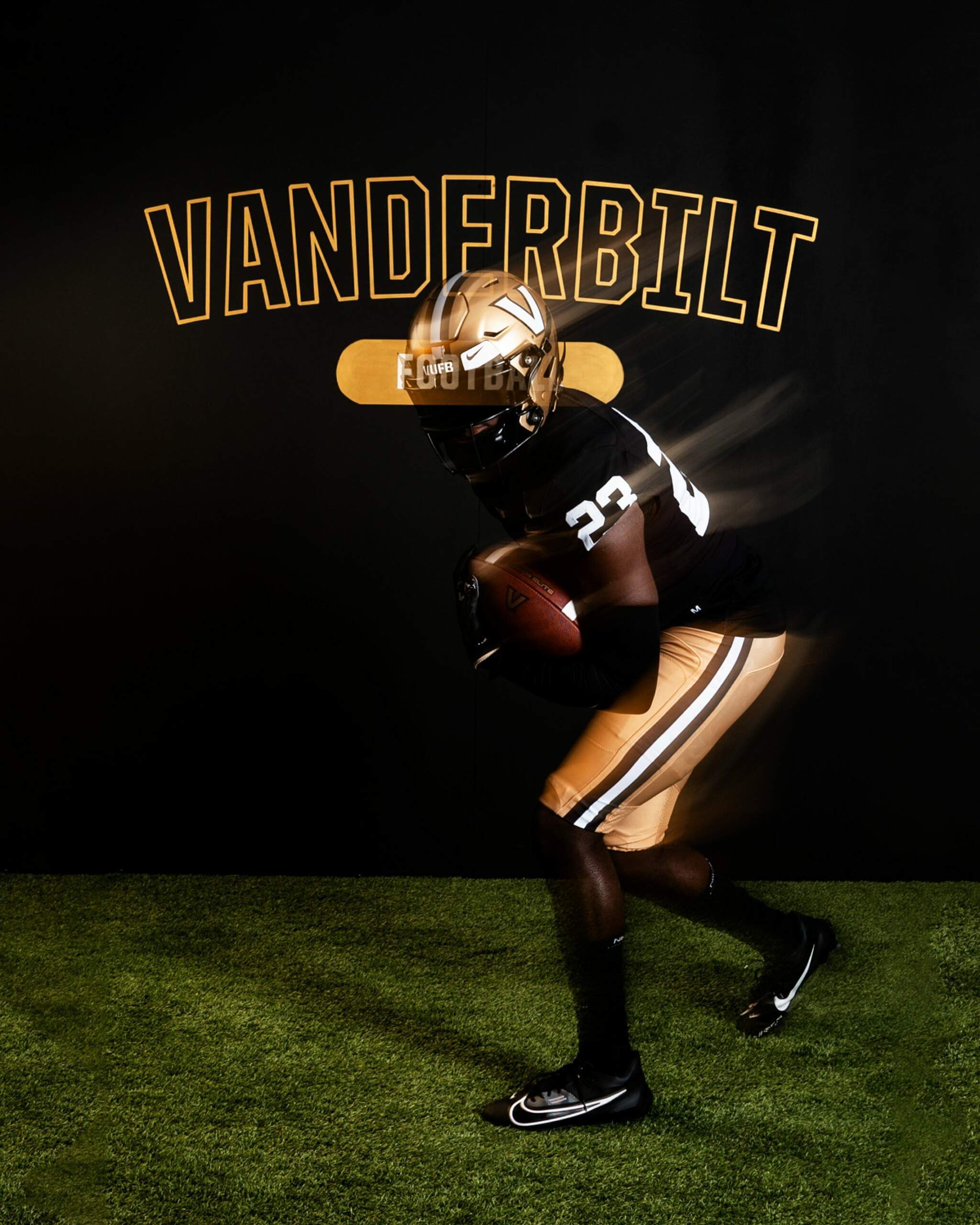
Very quietly, the Vanderbilt University Commodores have introduced a new shade of gold helmets (and pants), and a new black jersey for the 2023 season, with a social media appearance last night. This follows a very successful redesign in 2021 that returned the classic striping to Vandy’s uniforms. But it looks like they’ve turned it up a notch with this new look:
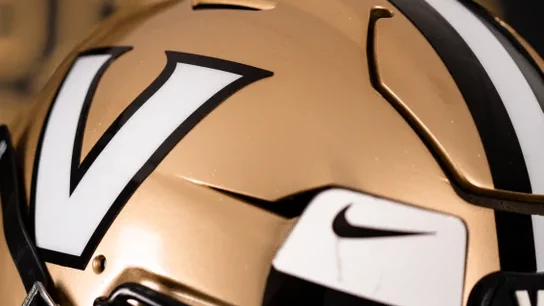
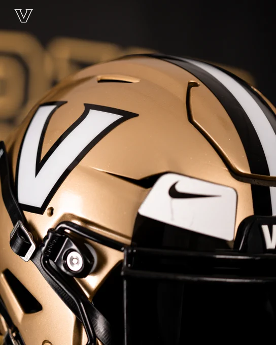
It may be difficult to tell for certain how this looks in the lighting, but the shade of gold has definitely changed from a metallic gold to what looks to be old gold. For the past decade or more, folks have complained that “Nike can’t make a good old gold uniform.”
I think that opinion may now change. Unfortunately the team only released two photos of the full uniform, the one above and the one below.
The jersey is new. Here’s a comparison with the previous shirt.
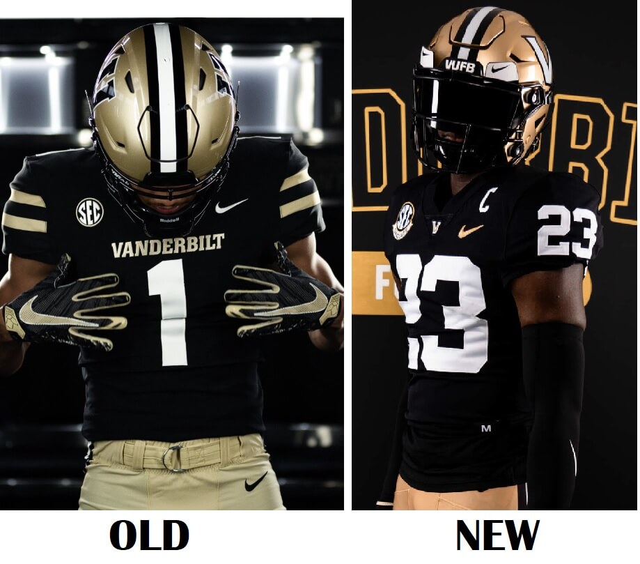
You’ll notice that not only are the helmet and pants a different shade, the “V” on the helmet has gone from a black V outlined in white, to a white V outlined in black. Additionally, the stripes on the sleeve caps are gone, replaced by TV numbers (TVs had previously been located on top of the shoulders). The old “VANDERBILT” wordmark beneath the neck is gone, and in its stead is the “V” logo.
Here’s a better view of the new helmet.
I hope the team will release additional photos of this uniform, but just from what we’ve seen so far, I think fans and uniform aficionados alike are going to like these updates. If indeed Nike is able to render a decent old gold color, and it looks to be the case, that is certainly a very positive development.
Kudos to Vanderbilt for pursing this subtle, yet important, tweak!
Let’s see, we’ve got a black jersey to photograph. I think it’ll really pop on black!
Done.
Anchor Down!!
I wish they would have added an anchor on the uniform somewhere. Maybe on the collar instead of the V. Looks great though.
Great job.
These look fantastic, but I kinda wish the jersey had shoulder stripes.
So did Vanderbilt change their color of gold university-wide or just for the football team?
I don’t know if this is 100% up-do-date, but it looks like both metallic and something they call “flat” gold are official colors.
link
I honestly do not know if the helmet/pants color in that photoshoot is supposed to be “flat” gold, or a slightly darker shade we’d refer to as “old” gold. It *looks* to be the same shade as the original Saints had.
link
May be the lights, but looks like UAB’s new “copper” Gold helmet, lighter though…
Notre Dame could do this for a better old gold…
So Nike really can pull off “old gold” pants……
Saints would look great with these updated colors.
(You read my mind.)
I didn’t want to *say* that in the article (at least not until we get additional looks), but damn…if that’s the color it sure appears to be, then they gotta do this:
link
Totally agree! Saints need to go back to their original old gold colors….pants included! It was one of the sharpest NFL unit ever!!
AMEN!!!
Fourthed.
Call into Nike HQ, “Phil, it’s the Saints on Line 1…”
I hope this happened today.
Interesting. I like it. But then again, I like both. And neither is really what I would consider “gold”. The old is like a shiny tan (with a tinge of green in it, actually), and the new is more like a copper color (like a brand-new penny).
IMO, copper is more orange than this. This looks like old gold, like what the 49ers and Saints used to wear.
And Nike… I mean… you CAN do it. You proved it. So why do you fail to get it right so often? If you could just resist your impulse to screw things up so much, we’d all be fine.
PRO: shade of gold; Block Varsity number font instead of the not-quite-Block-Varsity-because-we-gotta-get-every-school-its-own-proprietary-font; traditional helmet stripes (though in a weird way, I loved using the anchor chain as a stripe detail); the Vanderbilt V over the generic Block V or V-in-the-star.
CON: it could use shoulder stripes, or maybe gold trim around the numbers so the jersey doesn’t look like a practice jersey.
I love it when
PurdueVanderbilt looks likePurdueVanderbilt.Very nice upgrade!
The 2021 set was good, but everything about this update is better. Old Gold >>>>>> Vegas Gold.
This looks really nice, good job vanderbilt. I wish my alma mater, western michigan university, would take note of this
Love the simplified look, eliminating the team name on the chest (I understand many college teams do this but few really need it, and certainly no nfl teams need it *cough* jets and cardinals), and replacing the awkward stripes (which didn’t match those on the pants or helmet) with big tv numbers. A really solid uniform hopefully the gold is truly changed. And in regards to the pictures, of course i’d like to see more, but i’d still prefer this rollout to the awful hype videos everyone else does (where you still can’t see the uniform)
One picture the new pants don’t look shiny metallic, and another they kind of does. Thinking it’s the lighting. Even if they aren’t shiny, I still like the new gold color better.
Nike should apply this gold to all gold wearing teams in all sports. And buy out the UA contract with Notre Dame. I do miss the anchor and/or the star on this uniform, otherwise it is very good.
Did Nike actually make a nice-looking uniform?
Nice Vandy duds for a change – but do not get stuck in that hospital. It’s vile.
I’ll never be a big Vandy fan but these are really good looking uniforms. Kentucky would do well to see these and simplify in a similar fashion.
Looks like Vandy is still the only Power 5 Nike team to wear catalog jerseys full time. One photo shows the jock tag marked “M” for medium.