The Tennessee Titans won’t be the only football team celebrating the uni-awesomeness that was once the Houston Oilers and their “Luv Ya Blue” period uniforms.
This morning, the University of Houston Cougars unveiled a new, Oilers-inspired uniform they will debut this weekend. The Cougars open their 2023 campaign this Saturday evening, taking on the University of Texas San Antonio (UTSA), in a game that will be broadcast on FS1.
We’ll start with the hype video, and then take a look at some stills I pulled from that video.
Love you, Houston. This one is for you. #GoCoogs | #TEAM pic.twitter.com/X2Ul4SWwf5
— Houston Football (@UHCougarFB) August 31, 2023
And here are a few looks at the uniform:
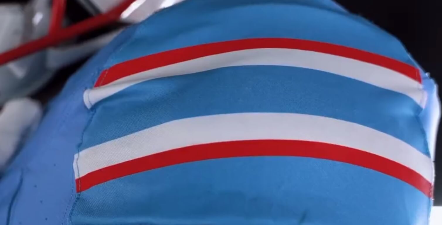
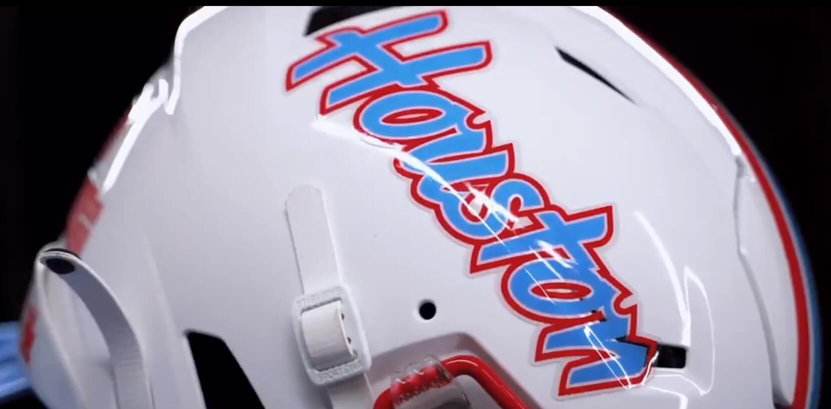
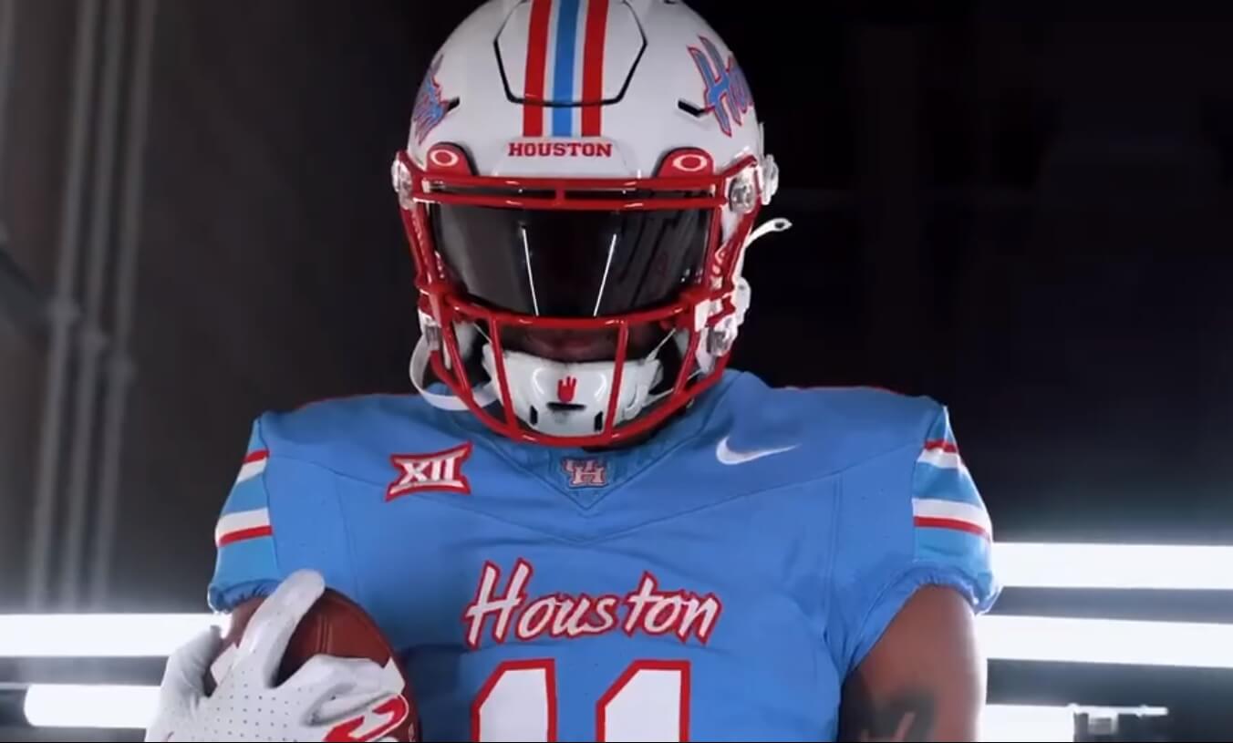
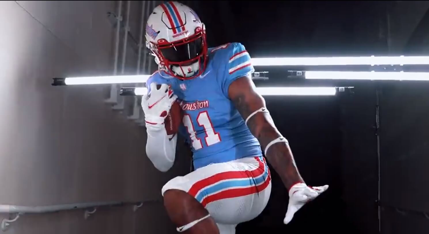
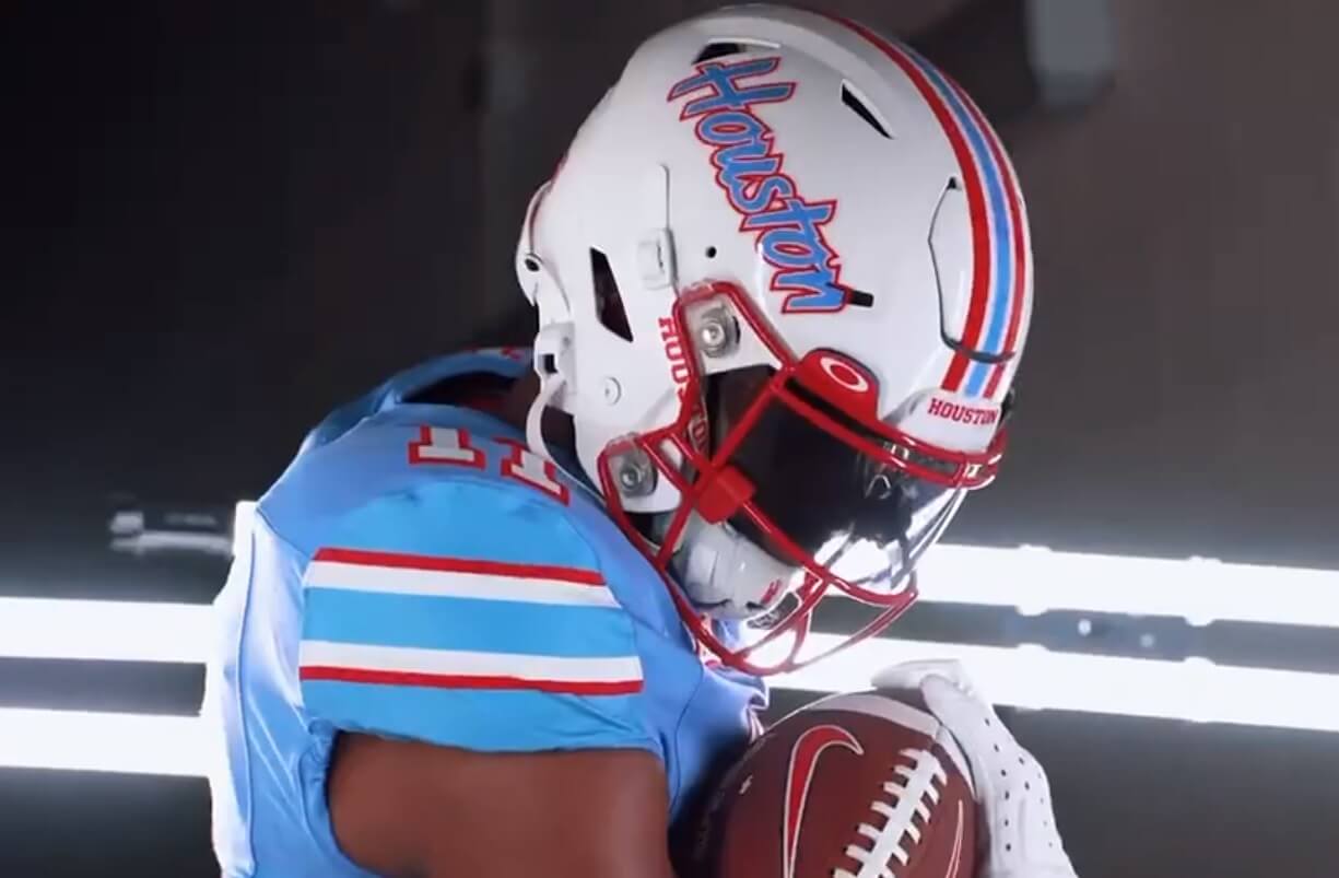
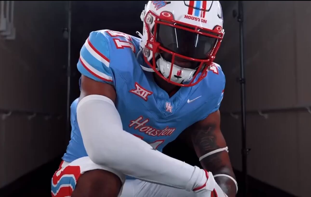
As you can see, it’s a pretty good representation of the Oilers uniforms from the 1980s. The white helmet has red/white/blue/white/red striping and “Houston” in powder blue script, outlined in thin white/red. Facemasks are red. Sleeve stripes on the caps have the red/white/blue/white/red pattern.
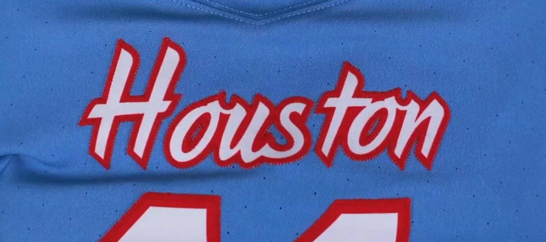
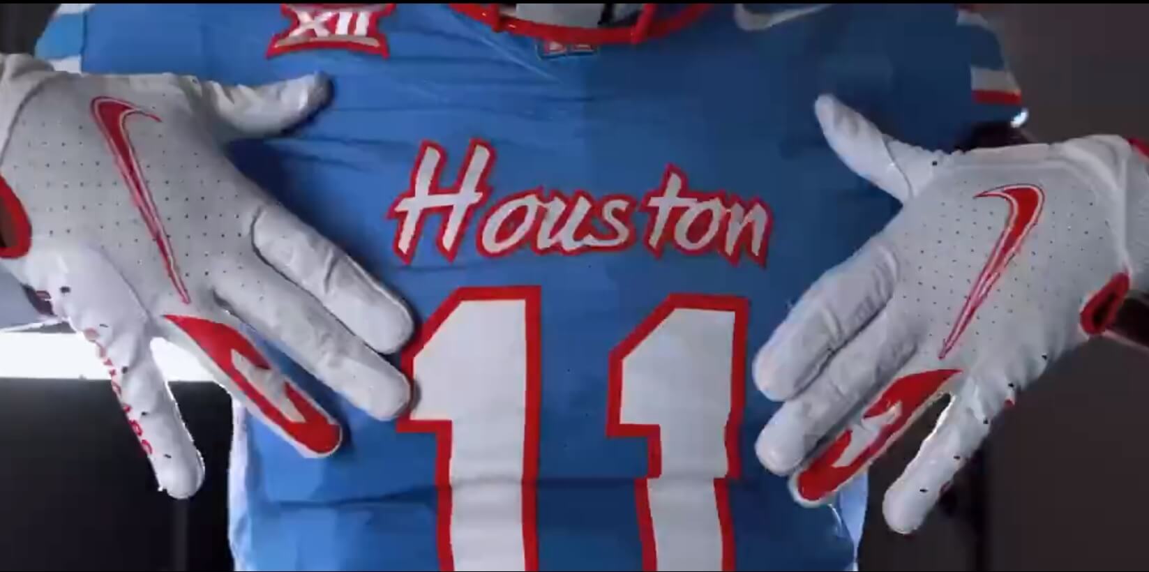
“Houston” is written in script, in white outlined in red, on the jersey. Numbers are also white with red outline and are a standard block font.
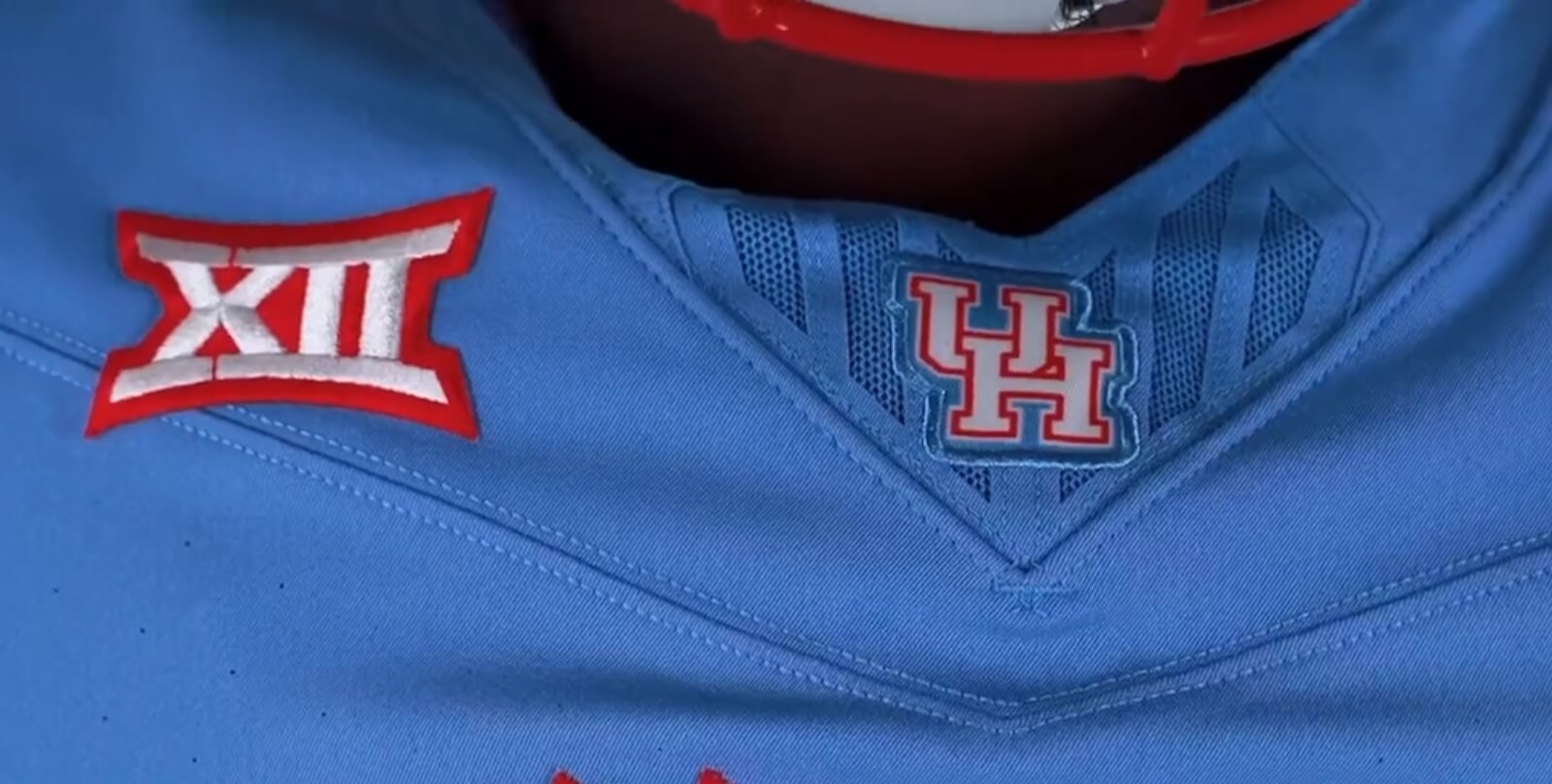
The jersey is also in Nike’s newest template, and a new “XII” (Big Twelve) logo appears on the right side of the chest. Houston is one of several teams who are joining the Big XII conference this season.
Pants are white, and feature fat red/thin white/fat blue/thin white/fat red striping (which is different from what the Oilers wore, but in the same pattern).
And here’s the best look at the full uniform from that video.

While (obviously) not an exact replica of the classic Oilers uniforms, these are more than close enough to evoke memories thereof. Since Nike makes the uniforms for the NFL and those of the Houston Cougars, I am wondering how much coordination there was between the Cougars designers and the Titans. (As I’m sure you’re all aware, the Titans will be throwing back to the Oilers this season, and Paul had all the deets).
I also wonder if this wasn’t a conscious effort by UH to “return” the Oilers look/colors to Houston, since they probably had to know Tennessee would be throwing back to the Oilers uniforms this year.
So at least Houstonians will be able to see Oilers fauxbacks in Houston in 2023. And of course, they’ll also get to watch the Titans sport them in a game against Houston’s current NFL team later this year.
I love these — the colors are great, and it’s fantastic that we’ll get a “taste” of Luv Ya Blue duds a few times this year, both on the College and Pro levels!
This is fantastic! I’m usually not one to be in favor of schools, teams, changing their colors, or in this case adding a color, but Houston should consider adding this blue to their palette. This could be their primary uniform!
At least Columbia Blue For Columbia Blue’s Sake looks better than their usual BFBS…
I am all for Columbia Blue becoming UH’s trim color on its red uniforms, replacing its history of oscillating between navy and black trim. Sky-blue trim on red uniforms is relatively rare in the USA.
Very nice for going back down memory lane but my preference would to get rid of the black unis and go with the the red and white exclusively.
What color will the underskirt be that half the players will be disrespectfully leaving out?
Lol, disrespectful
It’s just an undershirt, friend, I don’t think it’s so offensive.
Lighten up Francis
I’m with you, could they:
(Not give DBs more to tackle/grab?)
Tuck the undershirt in…?
Put pantstripes on the undershirts…?
Not wear an undershirt…?
Or make the jersey and undershirt equal lengths…?
And if it’s “justa trend”, may it follow New Coke. the Wildcat, and urban meyer
It’s just a trend (thankfully). As they say, “This too shall pass.”
Each generation handles fashion differently (and that goes for on-field fashion, especially). They don’t want to dress the way the generation before them (aka their dads) did. Pretty soon (and likely already) they’ll have children who don’t want to look like the generation before them and we’ll be on to the next fashion trend at which we can scream at the clouds.
Within a few years I predict we’ll have undershirts that are either tucked in or short enough not to conflict with the jersey length, and biker shorts will again return to a more respectable length.
This is good stuff.
I’ve always believed the Texans should do something similar. A fauxback to the Oilers original, AFL championship years uniforms Wouldn’t even need to go with the powder blue jersey, but white jersey with red numbers / blue outline, white pants, and then a powder blue helmet, and instead of the oil derrick just throw an image of the state of Texas on there in white, with a red star marking off Houston.
It would be enough of a departure from the signature Oilers look the Titans are throwback to now, but at the same allowing the Texans to honor the history of pro football in the city.
“…instead of the oil derrick just throw an image of the state of Texas on there in white, with a red star marking off Houston.”
The Hunts were kind enough to let McNair use the Texans name…now you suggest Houston NFL essentially crib their ol’ Dallas logo too?
There’s more significant ways to celebrate Houston’s pro football history – playing dress up isn’t fitting.
I seem to remember a time when the Houston Cougars wore a lookalike to the Houston Rockets … mid-80s, I think.
Some dreadful kerning on the jersey. Way worse than on the helmet.
One of the first things I noticed as well. Overall, it is great, but I cannot unsee H_ous_ton.
Yep the letter spacing is horrific especially since the helmet and jersey are not the same. With that script all the letters (or their strokes) should bump up against each other
Agree. Otherwise I think that this is a great nudge and wink to the Titans.
Whatever.
Exactly. A throwback to a team that played its last game before any current UH players were born.
I was wondering if UH was ever going to do something this. Those are awesome.
This is a big F-you to Amy Adams Strunk, who controls the NFL rights to the Oilers’ image and refuses to let it be used by its Houston team. Strunk can’t stop UH except by suing. So no, there is no cooperation between UH and the Titans. This is UH exploiting the popular anger here against the Titans.
Strunk, in turn, is continuing a generational feud with the city of Houston that goes back to the tax-funded stadium referendum where the voters essentially fired her father as Houston’s NFL owner by not caving in to his threats to move.
I’m not convinced (and could be wrong) that the “anger” in Houston at Titans ownership is all that popular…though the excitement over the return Luv Ya Blue is at a fever pitch.
The Oilers moved for the ’97 season, the Texans have been around since ’02.
An entire fan-generation has never seen the Houston Oilers but has had the chance to cheer for the Texans 2 decades. Uni-wise, while it’s impossible to top the Oilers look, is the Texans branding that inferior? I say it’s not (and consider them to be really good…they ‘must’ be since they haven’t really changed things up since they were born, and I don’t recall anyone complaining about their appearance.
Bud Adams (who made Houston a big-league city in the first place) wanted to stay and was going to put up a good amount of $ to fund a stadium. That certainly would have been cheaper then than it was to build the current domed home of the Texans…just ask the taxpayers who helped/continue to help finance it.
And why should Adams-Strunk cooperate and surrender the Oilers branding? Because a few vocal (non?) Houstonians want it? Sorry but no. McNair didn’t want/make overtures to buy it (did he?), Houston fans call for it (or at least there was no clamor to persuade Adams to relinquish it).
There were a lot of people here who hated Bud Adams. The fans had their reasons, and the Houston establishment had its reasons.
No people are not protesting out in the street, but any of us who were around back then feels the Titans are sticking it to us should not be wearing Oiler colors.
These are rad! That said, will this now discourage the Texans to go with a similar colour scheme when they design their new uniforms?
Am I wrong, or has Houston had some elements of Navy blue in its uniforms in the past? Maybe in basketball or just in TV logos but I swear I’ve seen it before.
During the Phi Slamma Jamma era, the basketball team wore red and navy trim stripes. There was also dark outlining on the football uniforms but it’s hard to see that it’s also navy.
Of course, black came in later like it did everywhere.
Those Phi Slamma Jamma uniforms go back to the 1960s; they were already wearing them for that “Game of the Century” in the Astrodome when Elvin Hayes’ them ended the Lew Alcindor UCLA team’s long winning streak.
You are correct and they still wear them a couple of times during the year.
Only fun part about this is the big F.U. to the Adams Family.
Adams still own Oilers look and marks, got new stadium when they rebranded, getting new stadium in a few years.
And the local college in H-Town pays homage to the old look that the Adams’ took with them when they left.
Masterful.
Houston answers back.
As a kid from Washington state who fell in love with Luv Ya Blue after watching Earl Campbell score five against the Dolphins on MNF, this just… it’s nostalgia done right. Thank you UH for knowing that Luv Ya Blue lives on in many hearts.
kudos to UH to bring this beautiful uniform back. it’s not the oilers, but the college team and unis will do.
Love it! I’m a Coog, but was not an Oilers fan (Cowboys fan before I moved to Houston in 1978).
Maybe the Texans should switch to this uniform [UPGRADE] and slap their logo on the helmet…
that would PO the Titans, L
Where can one buy the Univ. of Houston blue jersey, hat, etc.?
Love it. The colors belong to the city, not some rich owner that fled. I wonder (and kind of hope) if this will cut into sales of the “throwbacks” that the Titans are wearing this year – assuming folk in Houston we’re thinking of buying one anyway, I’d assume they’d go with the local team over the one that plays in Tennessee