The Mississippi State Bulldogs have unveiled throwback uniforms to celebrate the the 25-year anniversary of their 1998 SEC West championship on November 4th, against Kentucky.
Here’s a look at the unis (with an explainer):
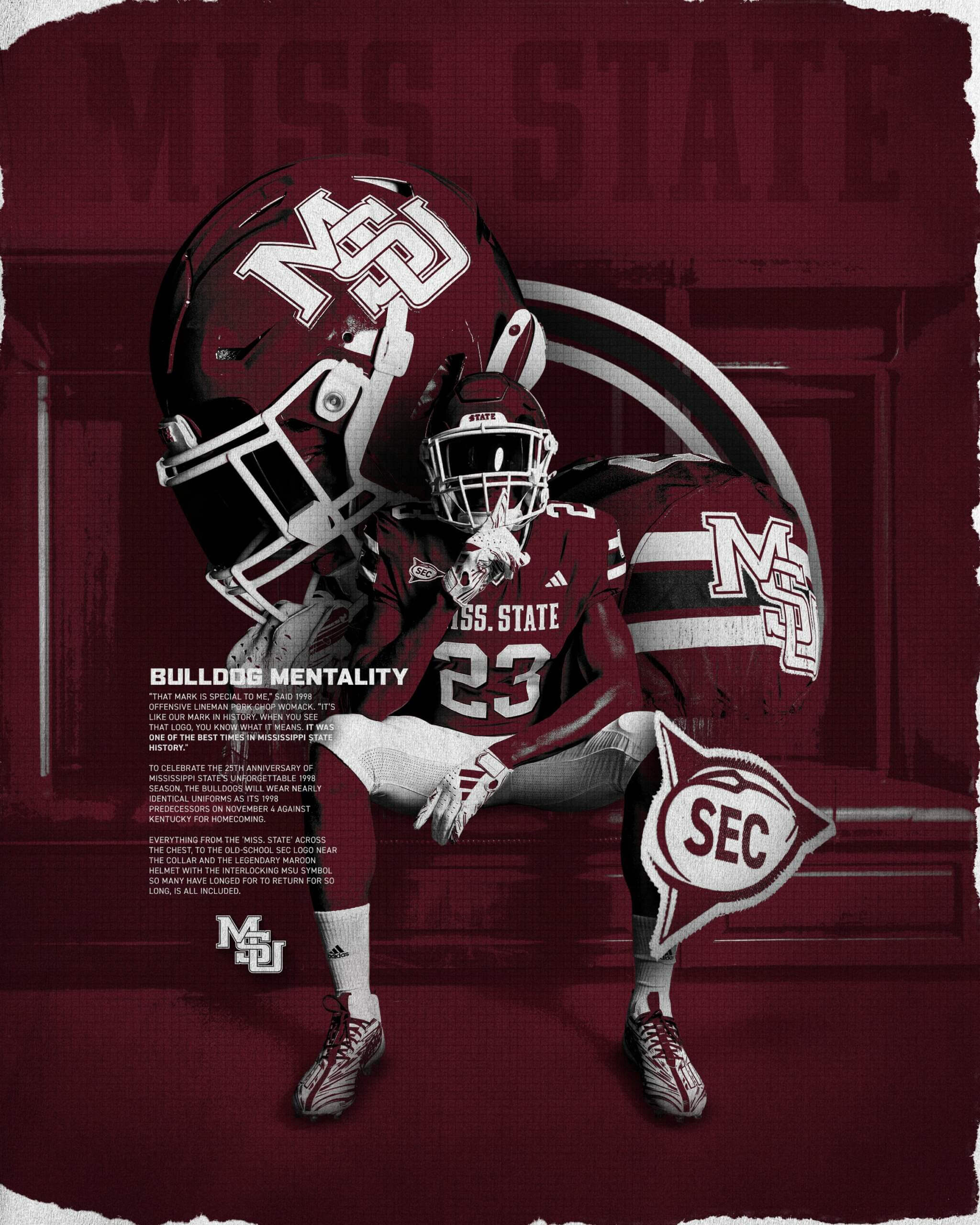
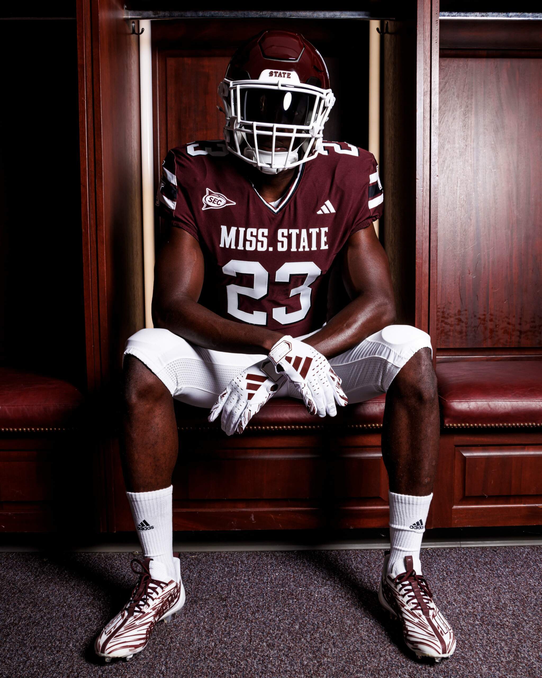
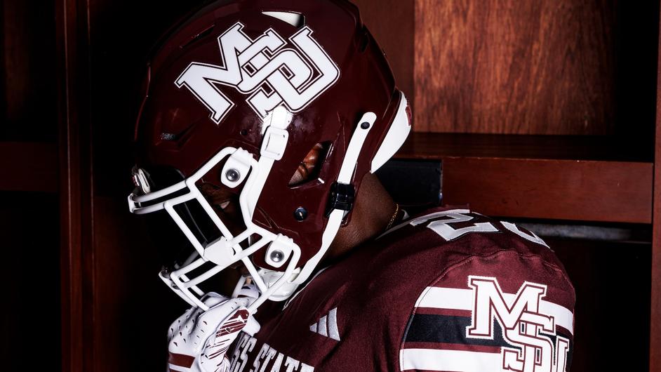
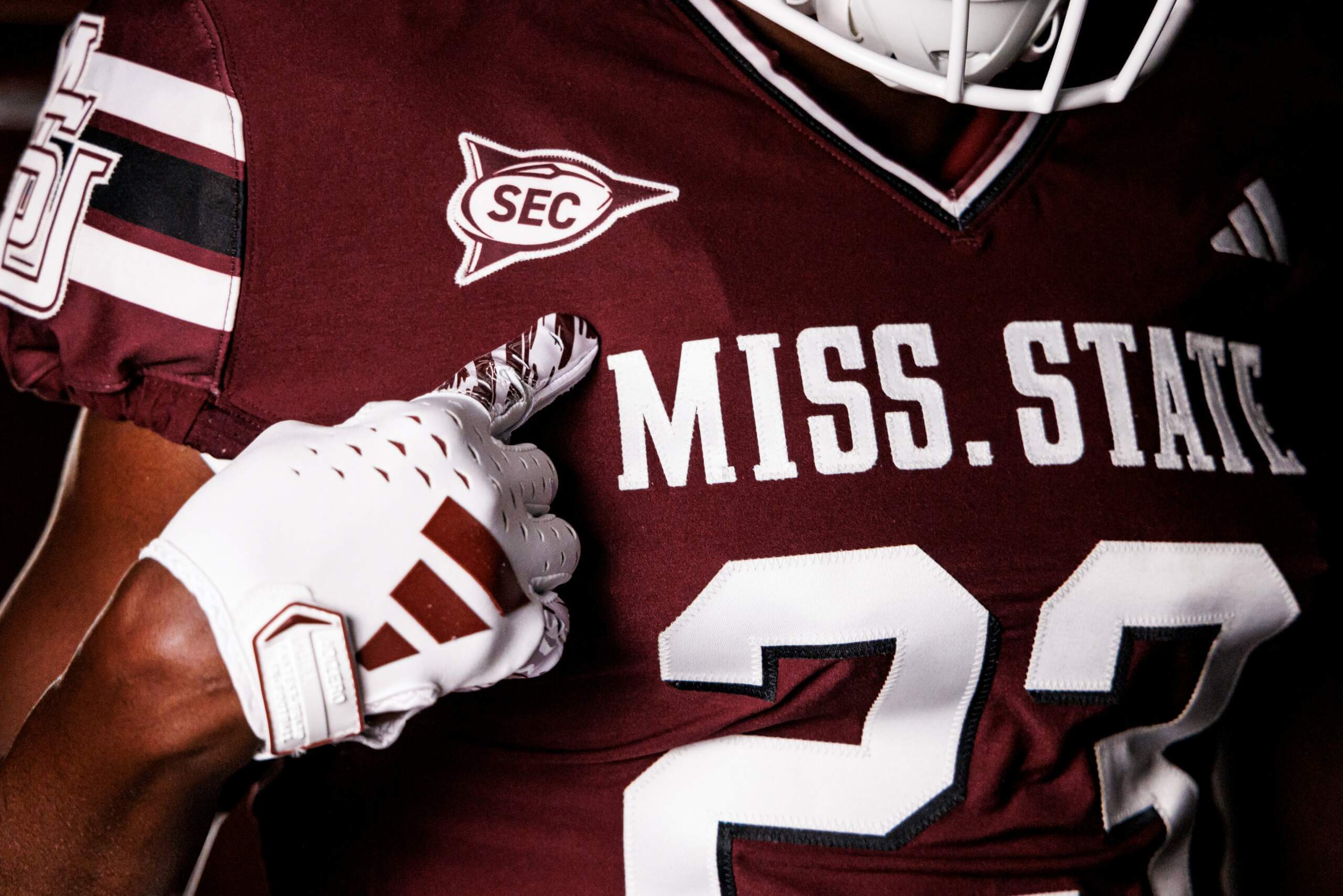
As you can see, helmets and jersey are maroon, with white, stripeless pants.
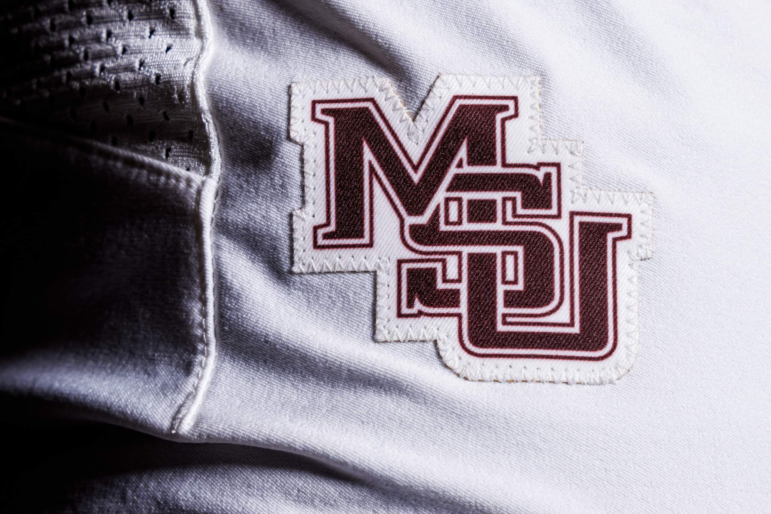
The maroon helmet features the interlocking “MSU” logo worn by the 1998 team. The same logo is worn on the sleeve caps. The sleeve caps have a thick white/black/white striping pattern, separated by two thin stripes of maroon.
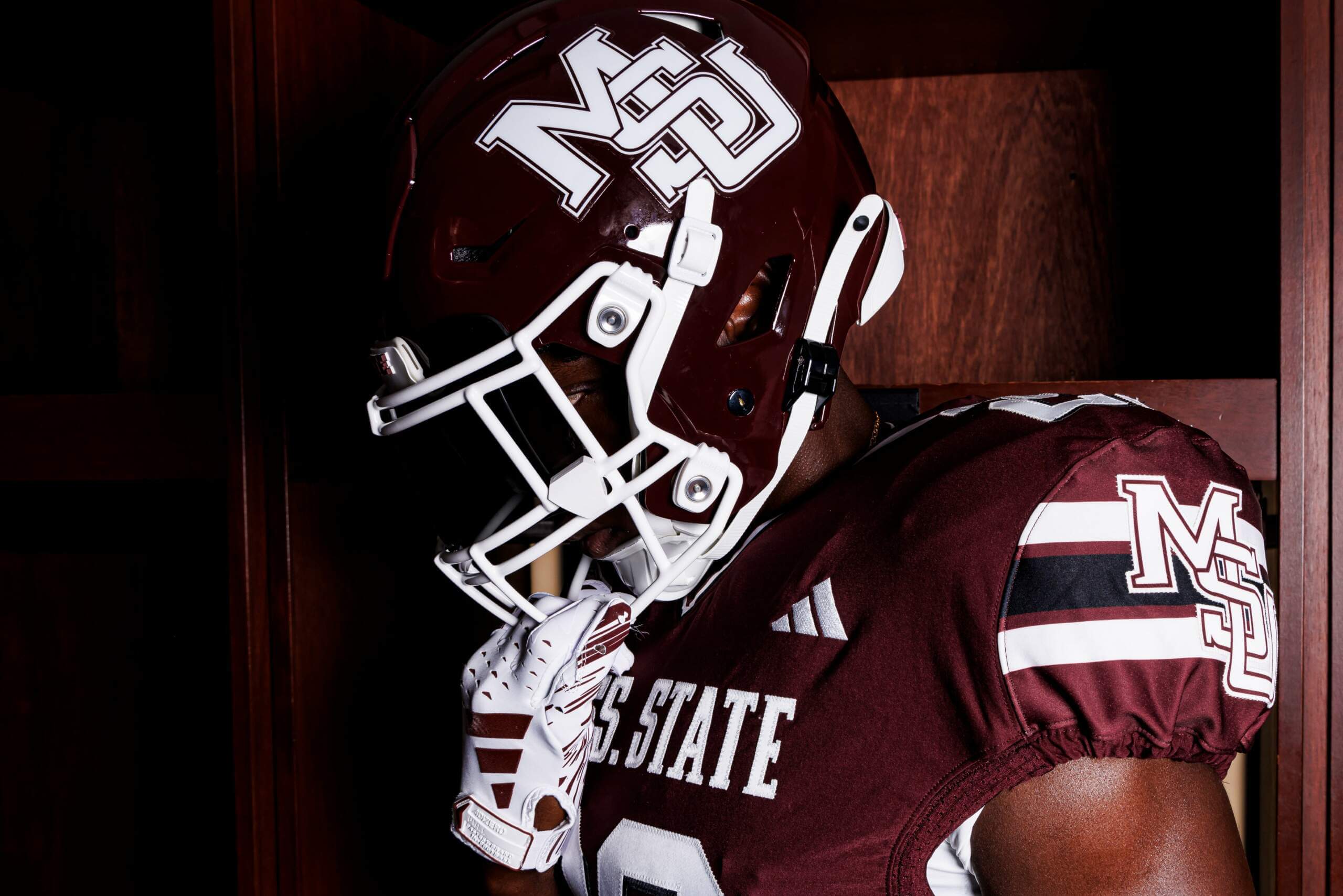
The jersey features a “MISS. STATE” wordmark in capital white letters, and jersey numbers are also solid white. White TV numbers grace the top of the shoulders. The numbers also have a very thin black blockshadow. Note the SEC jersey patch is the one worn in 1998 as well.
The white pants will also feature a maroon interlocking “MSU” logo on the left thigh.
While we won’t know for sure until the game, the model is shown wearing low white socks and black cleats. Let’s hope the entire team adopts this look for the Kentucky tilt.
Earlier today, the team issued a press release giving more details.
While the uniforms will obviously have a different cut from their 1998 predecessors, how closely do they resemble what the team wore in 1998? Take a look:
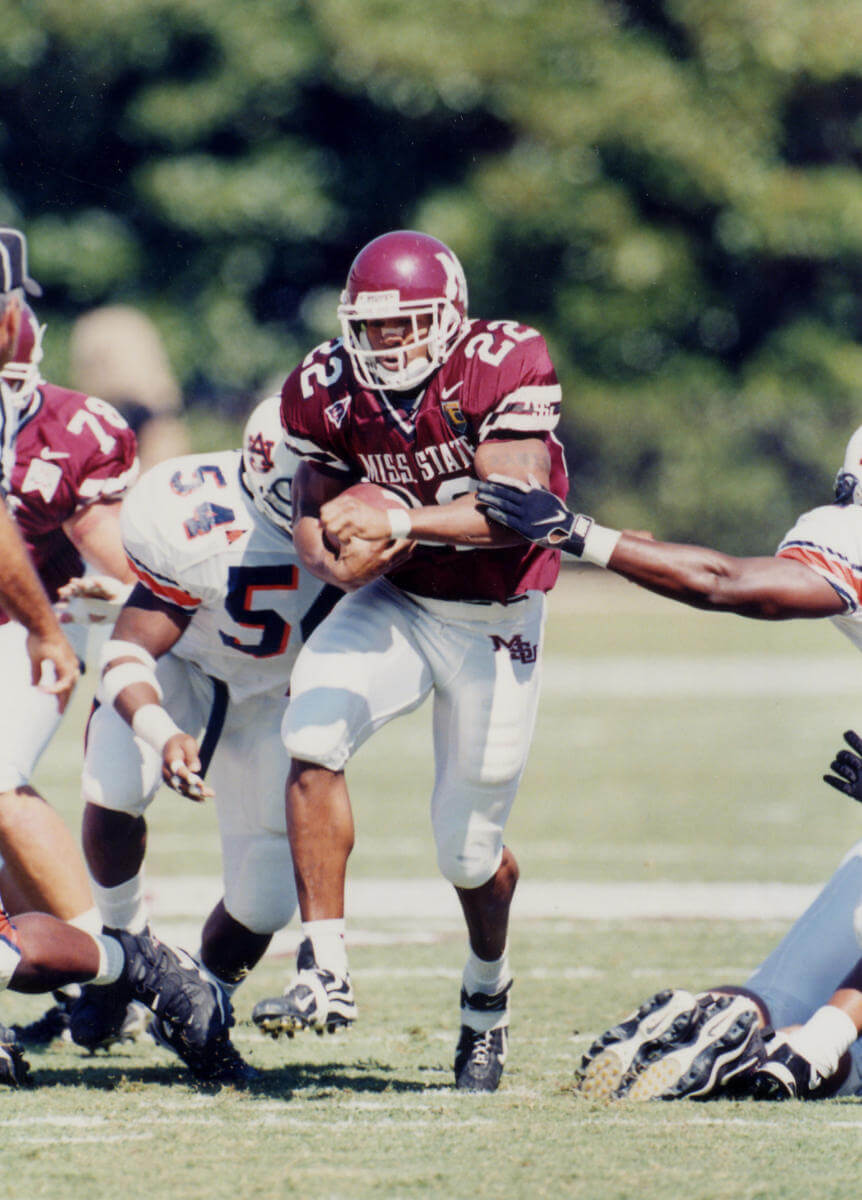
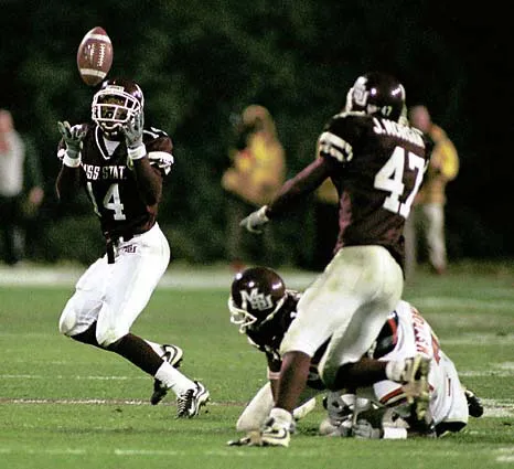
Pretty spot on!
The team helpfully included a hype video which shows both the 1998 team and gives a few additional looks at the throwback uniforms.
11.4.23 🔒#HailState🐶 pic.twitter.com/HEb038KmOi
— Mississippi State Football (@HailStateFB) August 15, 2023
Slight drop shadow on the numbers, too
Good catch! Now added to the article main text.
It looks like the numbers have a thin black drop shadow instead of solid white.
Loving the throwback SEC patch
I have a blue and a white authentic Tebow jersey. They both have that same SEC patch, but at the base of the collar (due to the Gator patch on the left side and the Nike logo on the right side. Although I like the new SEC logo and how it looks on the field in each teams colors. I was a fan of this one as well.
It’s actually not an accurate SEC patch. The “SEC” letters were more in a “ESPN” style font. link Interestingly enough, it looks like they pulled this logo from an, also inaccurate, post about the SEC patch from Auburn link Close. But no cigar.
Love that throwback SEC logo. Teams should do that more.
Well done MSU!
Nicely done and a very good uniform.
When I think of Mississippi State, THIS is the uniform that comes to mind. Always loved the interlocking letters. Never have been a fan of the “M” with the banner through it. Would love to see this come back as a full time set. Well done Bulldogs!
I’d love to see a deep dive on how these came about, specifically since I believe former AD Larry Templeton had mentioned that Nike owned the interlocking MSU design.
Very cool to see!
I believe you are right. They dropped the interlocking letters when they switch uniform manufacturers. That was when the “Banner M” was introduced. Although today it is slightly different. Think there was a pending lawsuit from the designer of the first “Banner M” and Mississippi State over it’s design and usage.