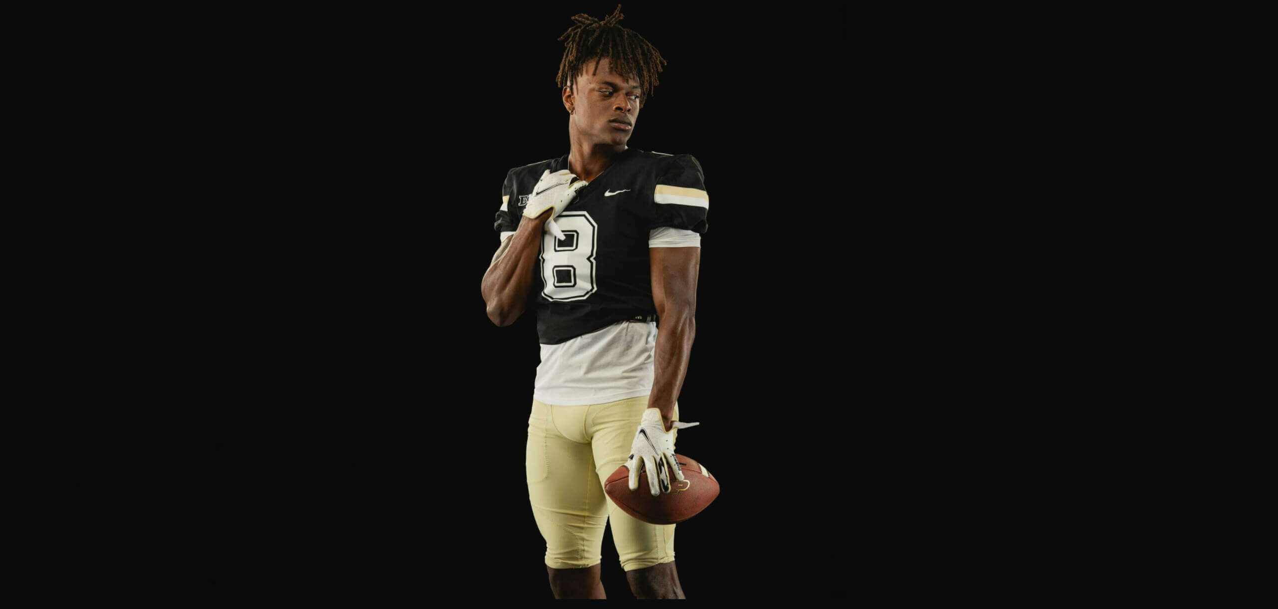
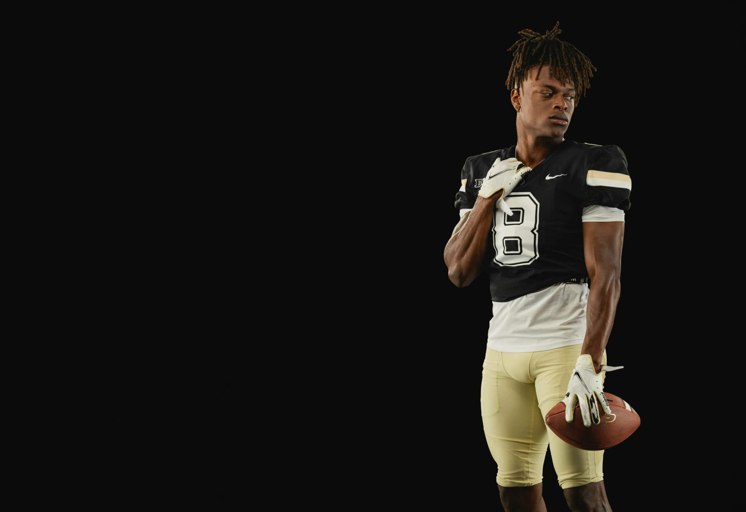
If you’re one of those who’ve felt that Purdue’s football uniforms have somewhat lost their way over the past couple decades, well, here’s some good news. The Boilermakers will be bringing back the uniforms worn during the 1990s/2000s, and most notably worn by Purdue alum and NFL great Drew Brees.
“Vintage is in,” read a tweet from the team on Friday.
The team showed off a few looks at the “new” uniforms:
Yeah, that’s more like it!
The uniforms are from the same era as the ones worn by Brees when he led the Boilers to a Rose Bowl appearance following the successful 2000 season.
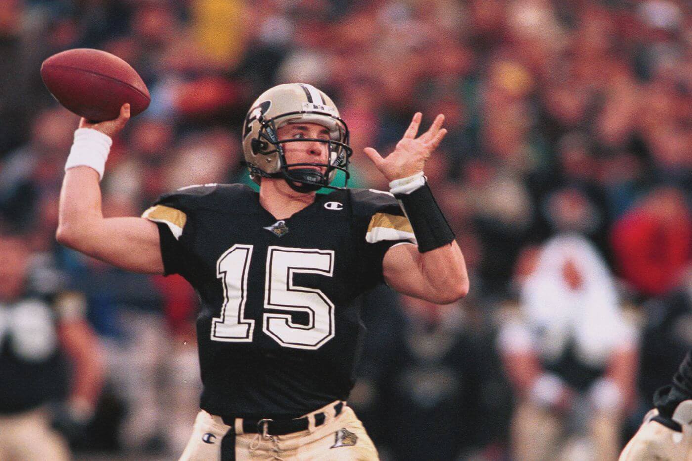
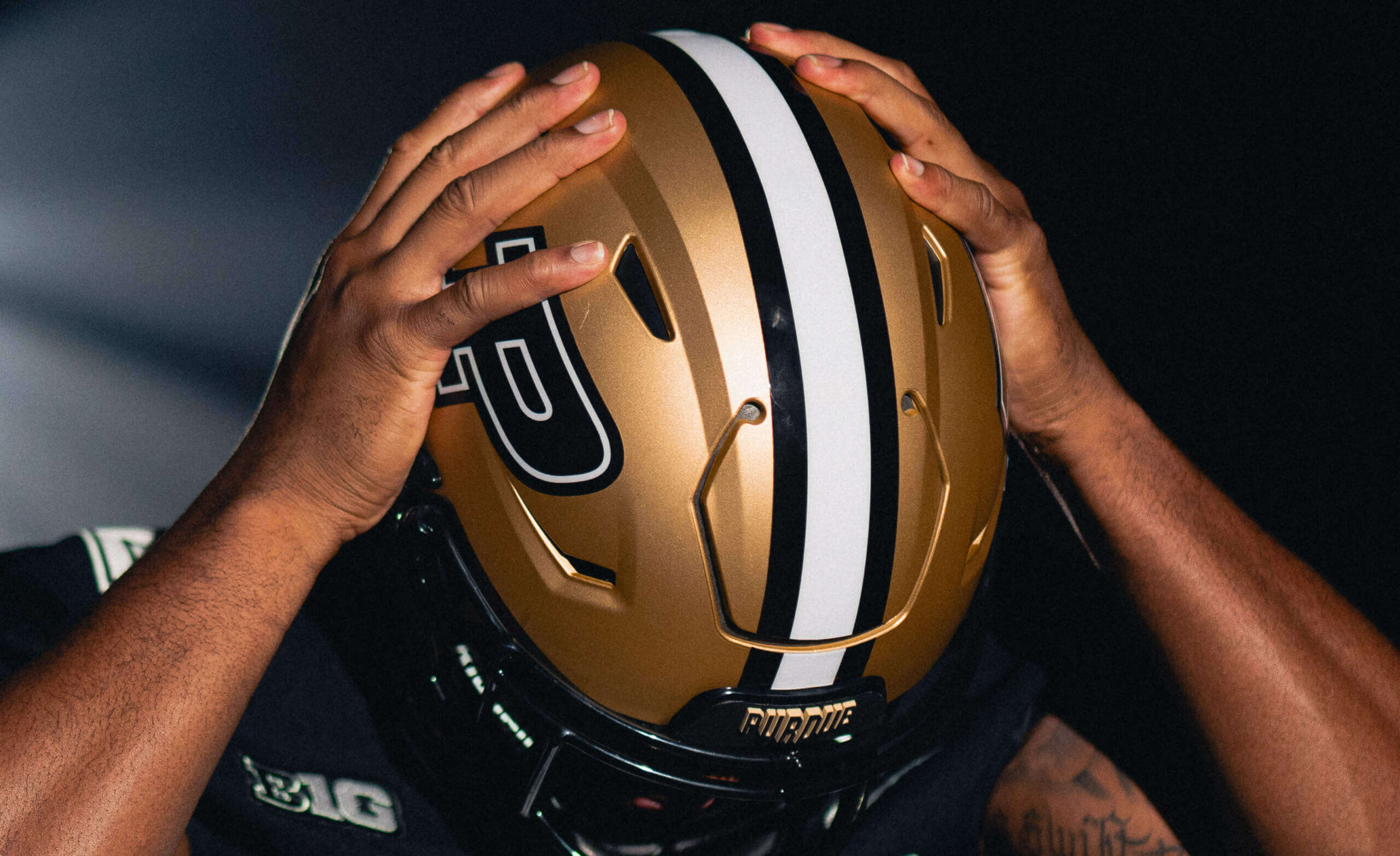
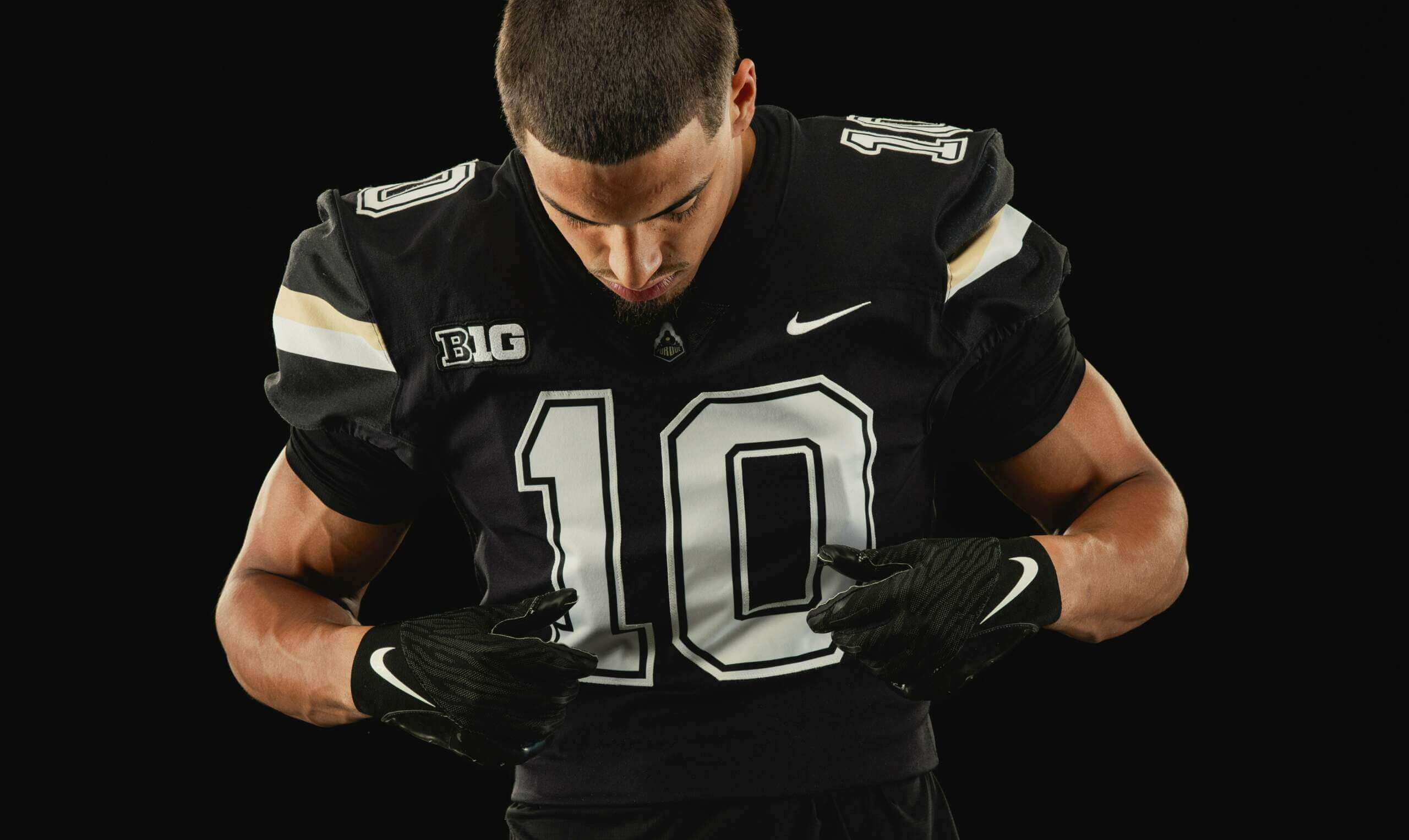
The classic uniforms feature a gold helmet with a black/white/black stripe and the Purdue “P” on the sides, black jersey with white/gold stripes on the sleeves, and giant block white numbers outlined in black and white, and solid gold pants.
The team additionally released a hype video featuring the new throwbacks, along with the message “Classic threads for a new era.”
Classic threads for a new era#TheTimeIsNow pic.twitter.com/YmZbUONISJ
— Purdue Football (@BoilerFootball) August 11, 2023
Left unsaid was whether these would be new permanent uniforms or alternates, although the tweets seem to indicate these will be full-time. As has been the case with a lot of NCAA football unveilings this summer, if there is indeed a road (white jersey) uniform to go along with the throwbacks, the team didn’t release it. Here’s hoping this is more than just a one off!
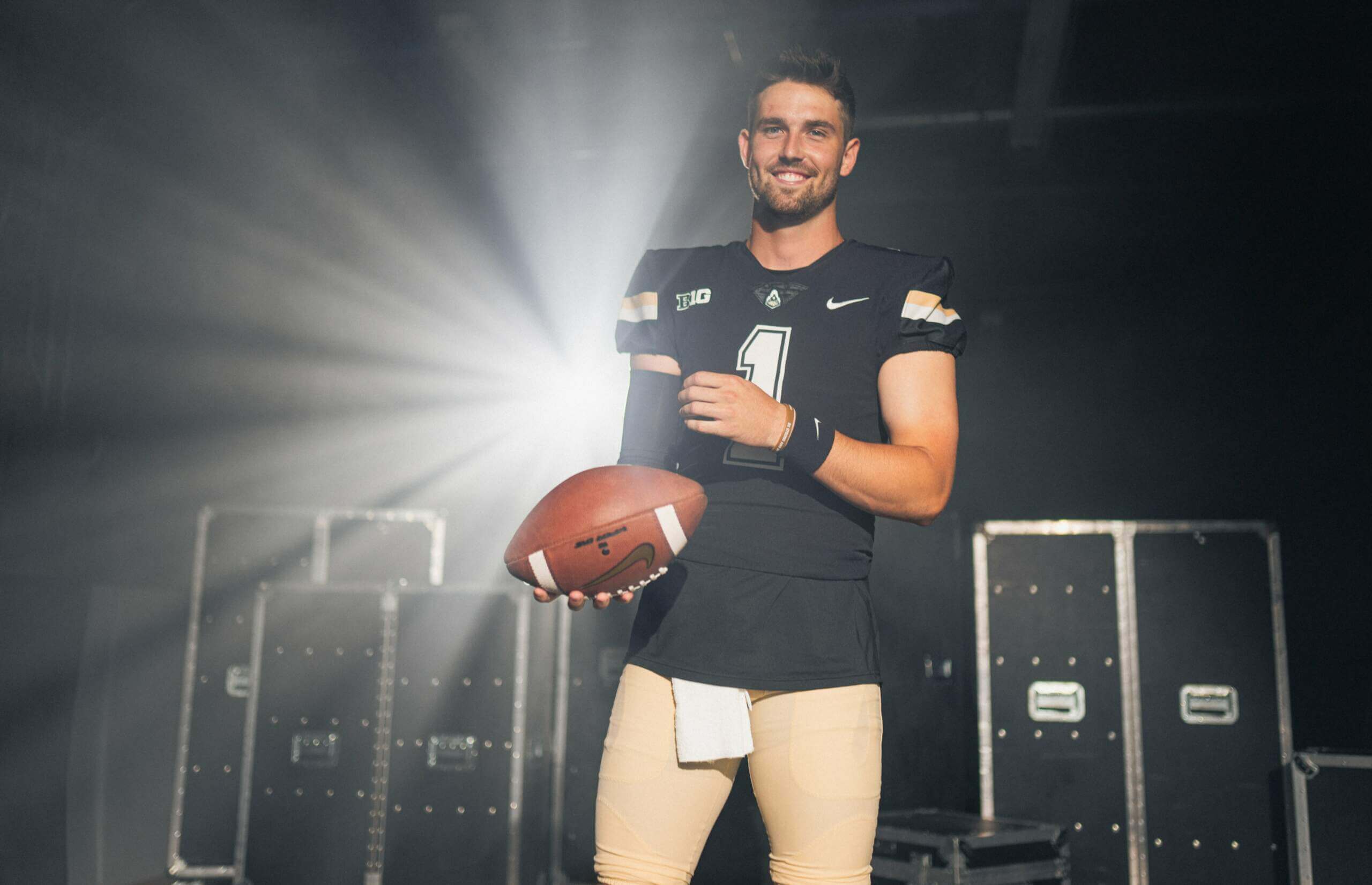
What is the deal with the short jersey and the long untucked undershirt? It looks weird.
It’s a dreadful look but unfortunately it’s also a common one in recent years at both the college and pro levels. To me it looks very sloppy.
I don’t understand that trend now either? Jerseys have been designed to fit tight to make it harder to grab on to. But, then have a loose fitting t-shirt hanging out? Kind of defeats the purpose.
Don’t assume logic when it comes to college-age kids.
Even with the stupid untucked look, that is a vast improvement.
As I say in the 5&1, I love it when Purdue looks like Purdue. I really hope this is the everyday look.
It’s a nice design. But Nike once again cannot produce a good old gold color.
I was just going to say this. The pants and arm stripes look tan.
Such an improvement over whatever those “stripes” were on their shoulders lately.
I *think* those are supposed to resemble the cow catcher attachments on the front of old trains.
link
Was it the cow catcher or railroad tracks? I could see it being either. Regardless, it was a mess.
Think it was tracks on the hat and cow catcher on the shoulders
link
As someone who attended a rival Big Ten school in that era, I love that these are coming back. They’re my favorite Purdue look.
The Indy Star also published a nice little retrospective on Purdue football uniforms: link
I agree that the Brees-era jerseys are the best, but I might be biased because that’s when I was there. Let’s hope we never see gold jerseys again!
Purdue played in the Rose Bowl following the 2000 season, but it wasn’t a victory. They lost to Washington. Glad to see these uniforms coming back, though. If only Nike could produce the sheen on the pants…
Ah, yes — my bad — made the adjustment. I had actually forgotten the outcome and came across a photo of Brees with a rose stem clenched between his teeth (that was, I believe from their victory over Indiana? to get them to the Rose) and mentally I mis-rememberd they won the game.
Thanks!
I always feel like when the helmet has stripes, the pants do too.
*that the pants need stripes too
Much, much better than what they have been wearing. 3 small nitpicks:
Helmet stripe should be on the pants
(Sleeve?) stripes should be separated so there is black between them
Either the number or outline should be gold
All good critiques (and i agree) but they’re throwbacks, so they’re trying to be faithful to the originals. Now…if only the originals had those fixes…
Yeah I should have specified that my nitpicks were with the original uniform
The stripes seem a little narrower that on the originals. There’s plenty of room on the shoulder – why use thinner stripes?
Oddly, they have a direct sewn swoosh like Nike’s catalog jerseys for non Power 5 jerseys.
One of the pictures clearly shows it’s not the newest template. Maybe that’s why? I’m just spitballing because that most likely has nothing to do with it. And on that note, if my eyes are correct, why wouldn’t they use the newest tech?
I am glad that it is not the latest template, this is a nice retro uniform with its original mistakes: solid numbers and tripes on pants to match the jersey or the helmet is what I prefer). A better look.
Here we are with the undershirt again. Nike and/or whoever is pushing this BS obviously.