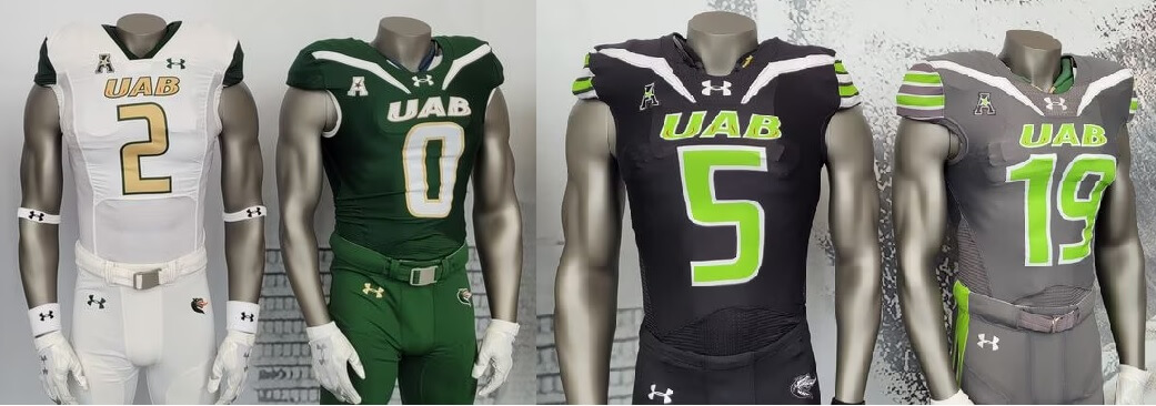
The University of Alabama-Birmingham has unveiled a new set of uniforms for the 2023 season.
The team will feature a solid dark green home jersey, which can be paired with either white or green pants, as well as an all-white road uniform. (The jerseys appear black in the photo below, but the second photo confirms they are indeed dark green.)
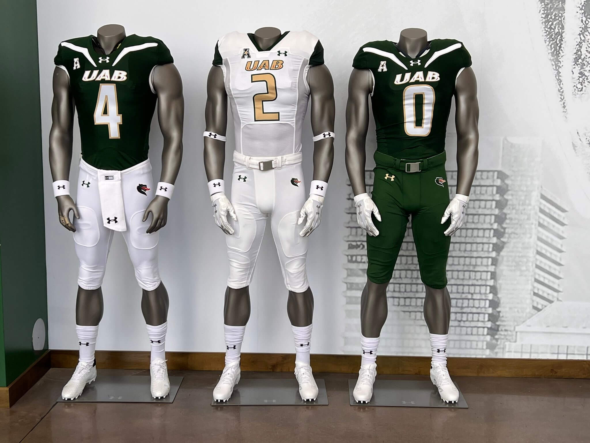
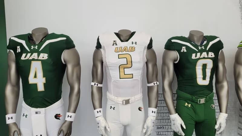
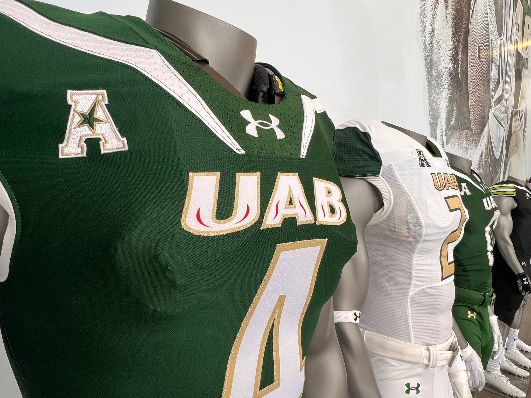
The green jersey features a white shoulder stripe, while the white jersey is plain, with a green sleeve cap. Both jerseys read “UAB” in large letters (white with a gold outline on the green jersey and gold with a green outline on the white jersey). The UAB wordmark features a thin red stroke within the letters. Numbers are white with gold outline for the green jersey and gold with green outline for the white.
Additionally, the team unveiled two alternate uniforms: a mono-black and a mono-gray:
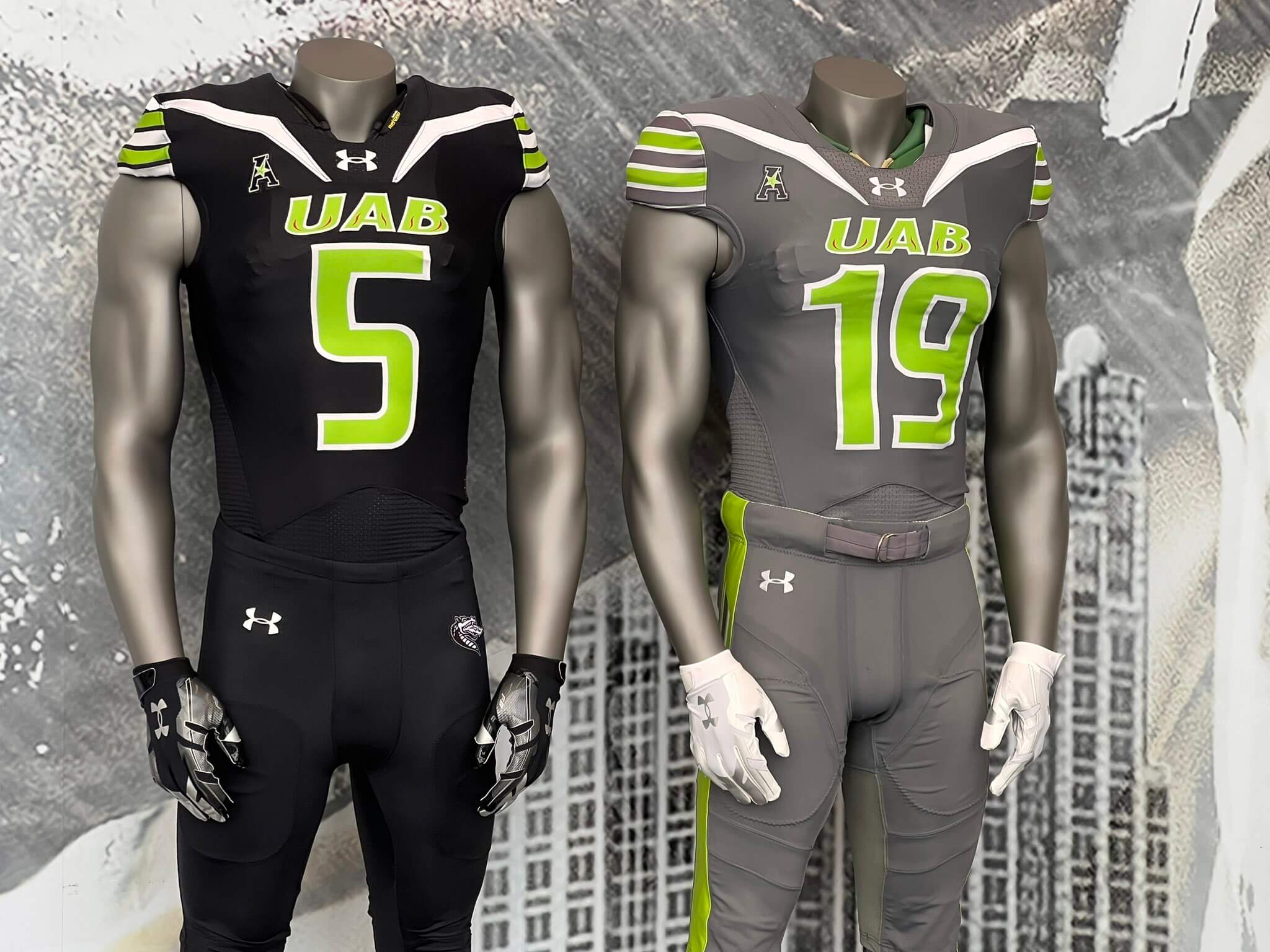
The wordmark and numbers are in the same style as the home and road jerseys, but both of the alternates feature lime green wordmarks/numbers (outlined in white), and both feature lime green sleeve stripes on the sleeve caps. On the black alternate, the sleeve caps are white, and the lime green stripes are outlined in black. On the gray alternate, the sleeve caps are also gray, with white outlines on the stripes. The gray uniform is the only one with a stripe on the pants, which is rendered in lime green. It is an updated “Children’s Harbor” uniform, which the team has worn previously. All the pants have the UAB Blazer dragon logo on the left hip, except for the gray pants.
The team showed two different color shells (white and gold), with the white helmets having several different logo options, depending upon which uniform with which it is paired.
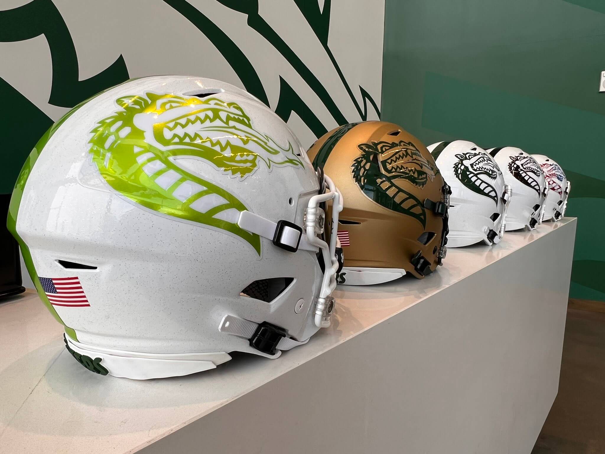
In the unveiling hype video (which follows below), all uniform combinations were shown with a white helmet (and different striping), but it appears the gold helmet will be an option as well.
Speaking of which, here’s the hype video (your much more “traditional” video showing players debuting the new uniforms in front of their teammates, who give their approval, especially to the final BFBS one):
New Era – New Drip 💧🔥 pic.twitter.com/xZTnkXcRh6
— UAB Football (@UAB_FB) August 9, 2023
If the coach in that hype video looked familiar, that’s because it’s former NFL QB Trent Dilfer, who is beginning his first season as head coach of UAB.
Love the gold (Copper?) helmet….
Hope its not just the lighting…love the hue, shade, very nice….
All white unis with the gold shell is a natural…
God awful.
Ick. What’s with the bug antennas on the collar bones? What’s with the red veins on the UAB mark? Just ick.
I think the red is meant to mimic flames. It was that way on their previous uniforms too.
Either I’m getting old, or these uniforms are horrendous.
In my case, both.
The white, with the gold numbers/letters, and the solid green sleeve caps is not bad…the other design is terrible. The huge modern stripes across the collar bone paired with the traditional shoulder cap stripes is a really weird mash up that is just really bad.
This is what I mean with UA not being able to produce good looking uniforms in any sports. The white uniform is OK, but those Jets stripes are horrible. But this also proves that players have a totally different taste from many of us: they think these black uniforms are great. I think that they look horrible. Players want to play in mono black, if possible every single game. As that is impossible they prefer mono gray as the alternative. So UA got that part completely right.
“This is what I mean with UA not being able to produce good looking uniforms in any sports”
This may be true now but was not always the case:
link
I tend to place most of the blame on the customer.
Having gone to UAB and being there when they ended the football program…. I’m just glad we have a team. The white uniform doesn’t look any different to their old ones.
The team looked better when they didn’t exist.
Terrible. The jerseys look like a generic high school design.
Everyone else has already said, yet it still bears repeating: Mother of Pearl, these things are just about as dreadful as Trent Dilfer.
A high school budget and high school coach getting a high school uniform. I wonder how their on-field results will go.
If you make your primary green so dark that it can’t be differentiated from black, why make a black uniform? And let’s be real for a second: UAB doesn’t have the fan base of Alabama or Ohio State. how many consumers are going to shell out big money for 4 UAB jerseys? I think they need to have a serious talk with their marketers and understand who they are and what they are, this seems like a waste of money and effort… I could be wrong but I don’t think I am.
Jerseys # 5 and #19 in the top graphic look like they were scribbled on with magic markers. I’m not even kidding.
Everything about these is so bad I’m actually kind of impressed.
nah
Garbage! The only thing missing is side panels.
These are god awful. There was nothing wrong with their old uniforms, and this looks like some sort of fad wannabe look.
Just terrible.