In the midst of all the breaking NFL uni/helmet news, coupled with a few B1G football unveilings, the Nevada Wolf Pack rather quietly introduced a new set of jerseys and helmets for the 2023 season. Nevada’s not really a football powerhouse, and their uniform reveal didn’t really generate much buzz. To an extent, that’s understandable, since the changes the school has made were more minor tweaks than wholesale revisions. In fact, if you are only a casual observer of the Mountain West Conference, you might not even notice the changes.
Let’s take a quick look at what the Pack unveiled.
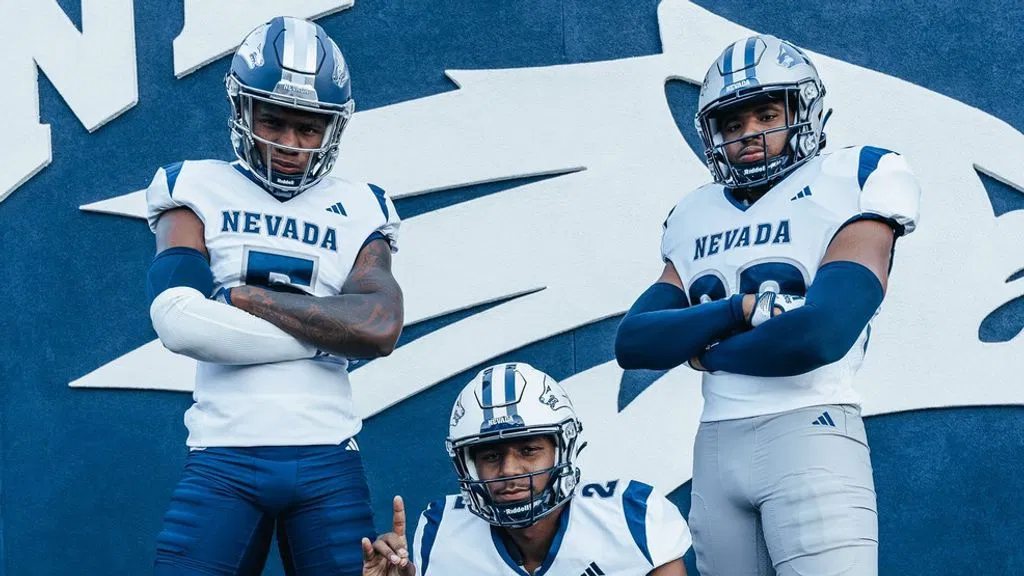
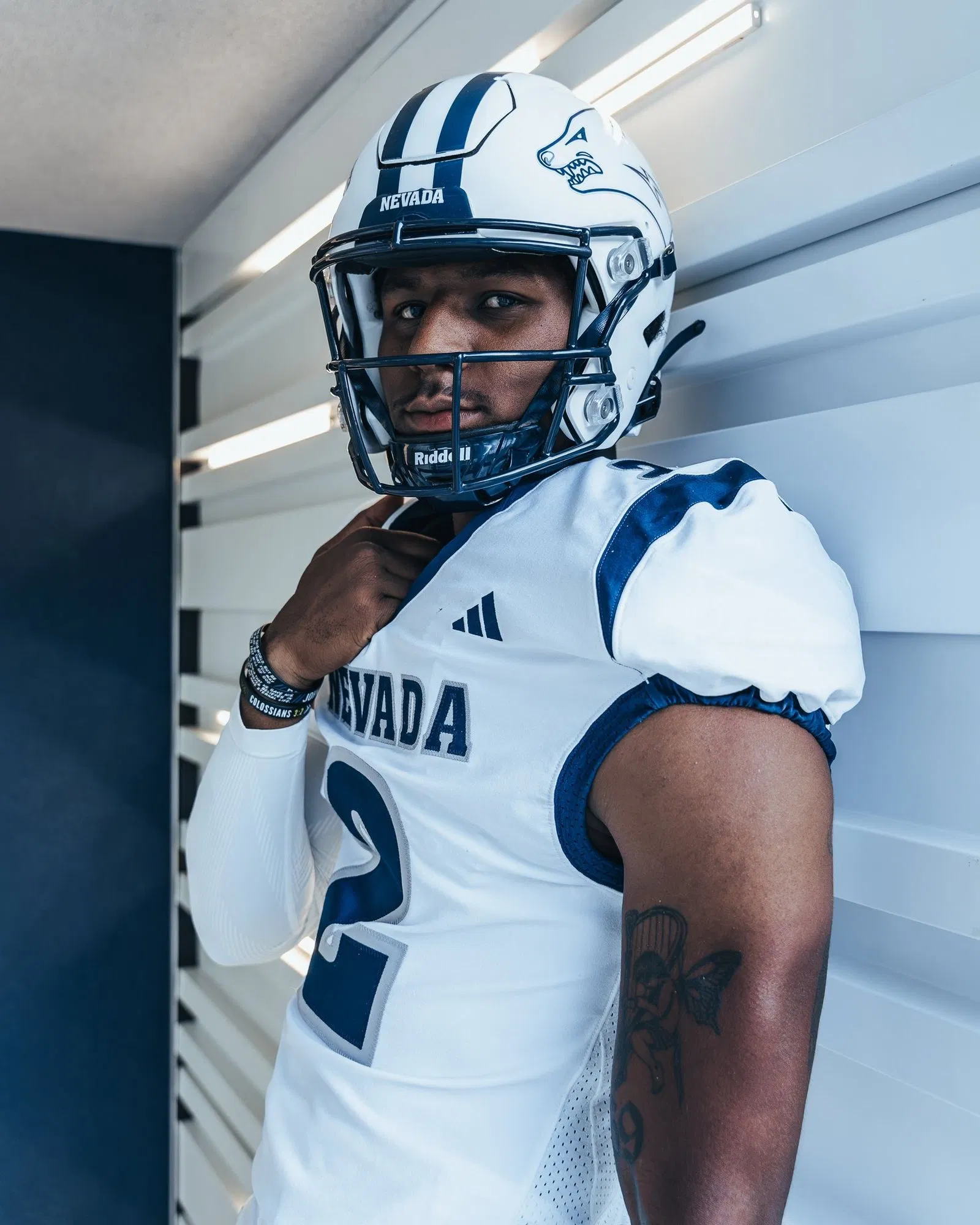
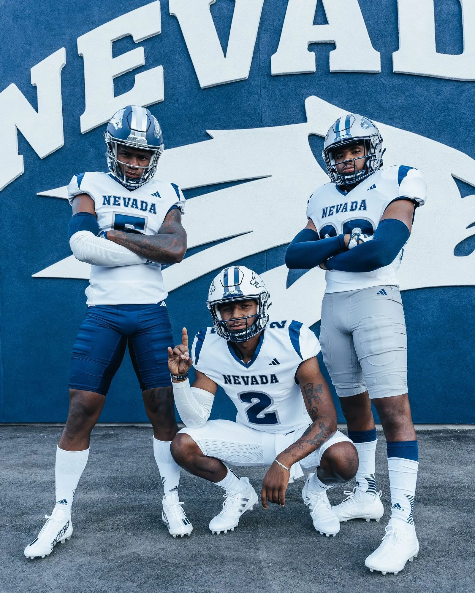
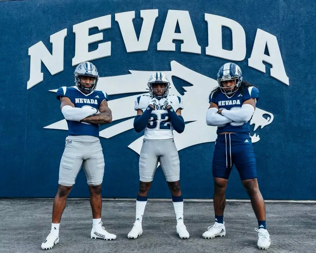
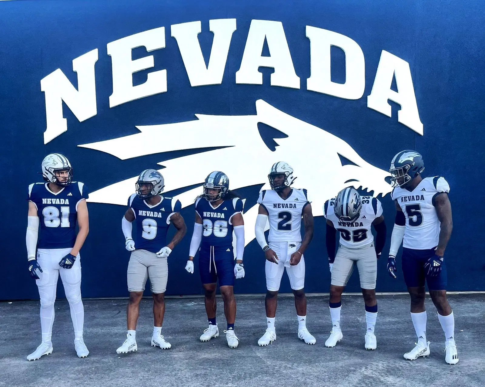
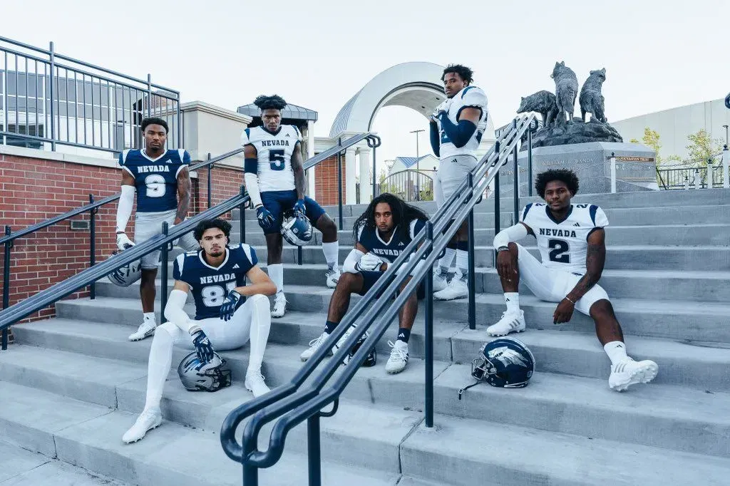
HOME JERSEY:
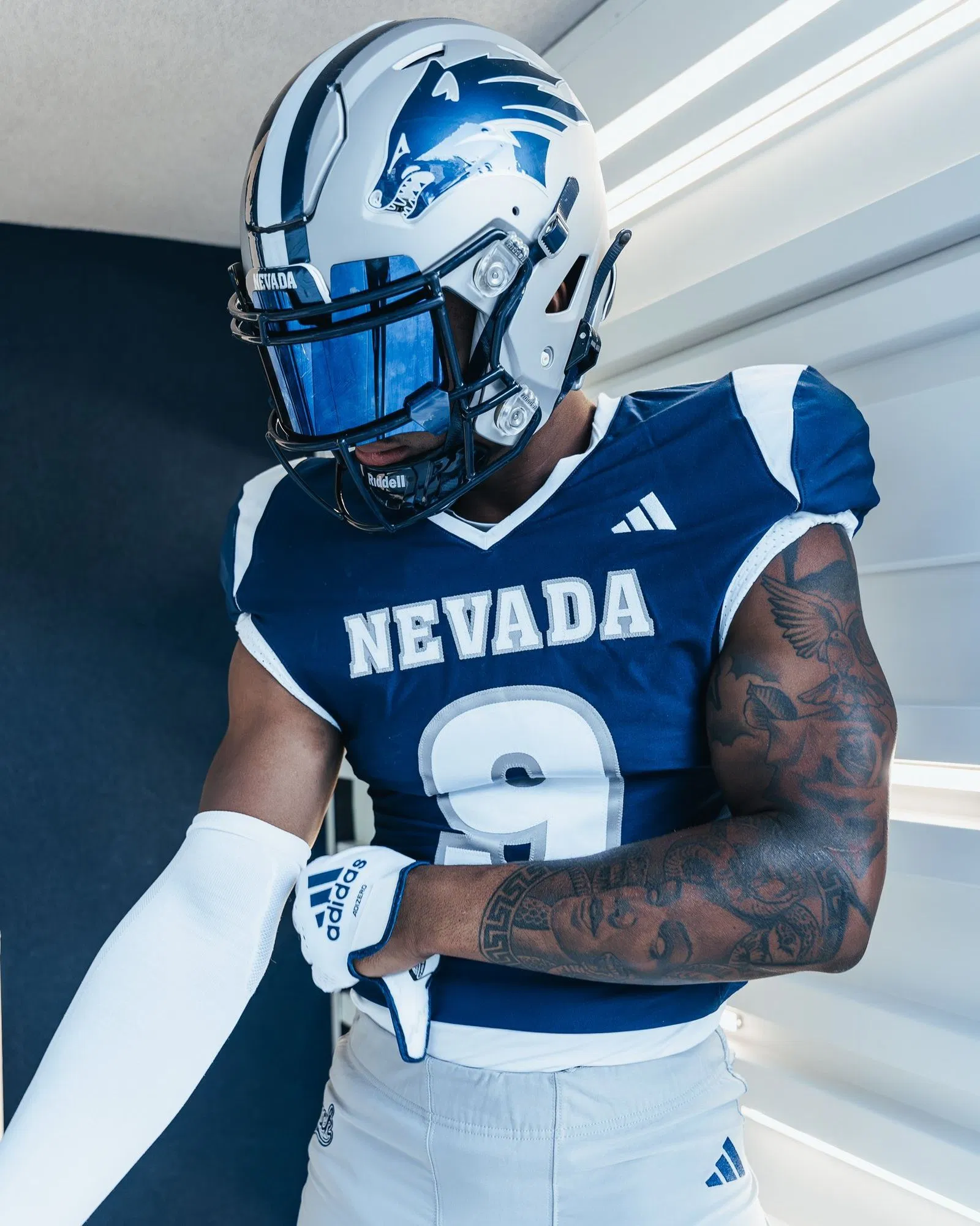
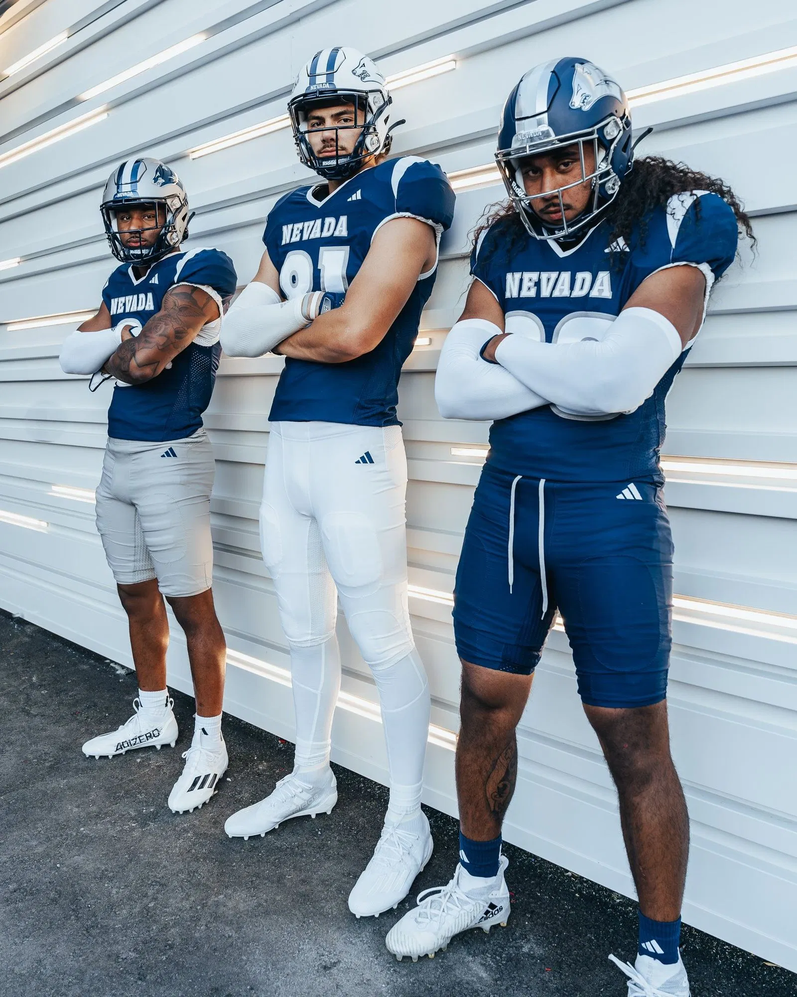
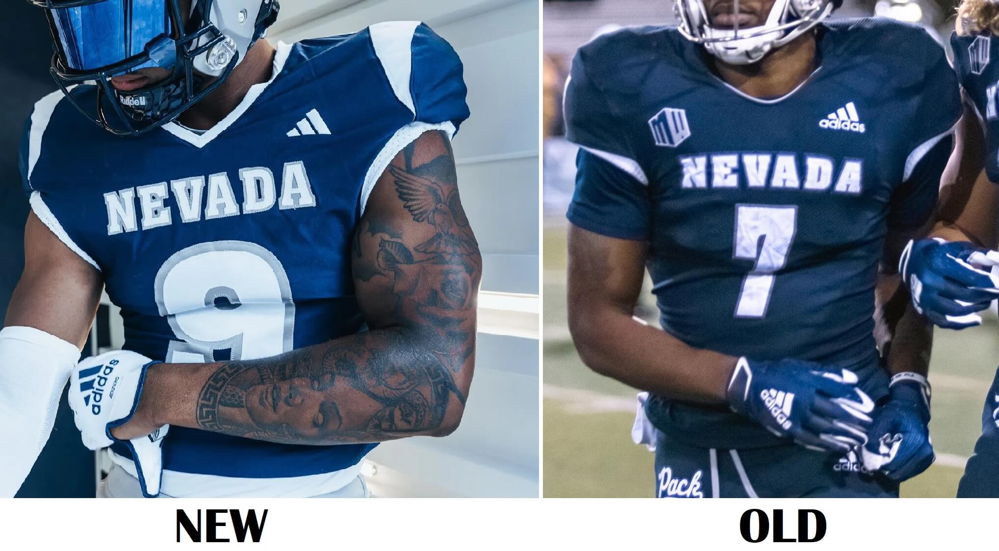
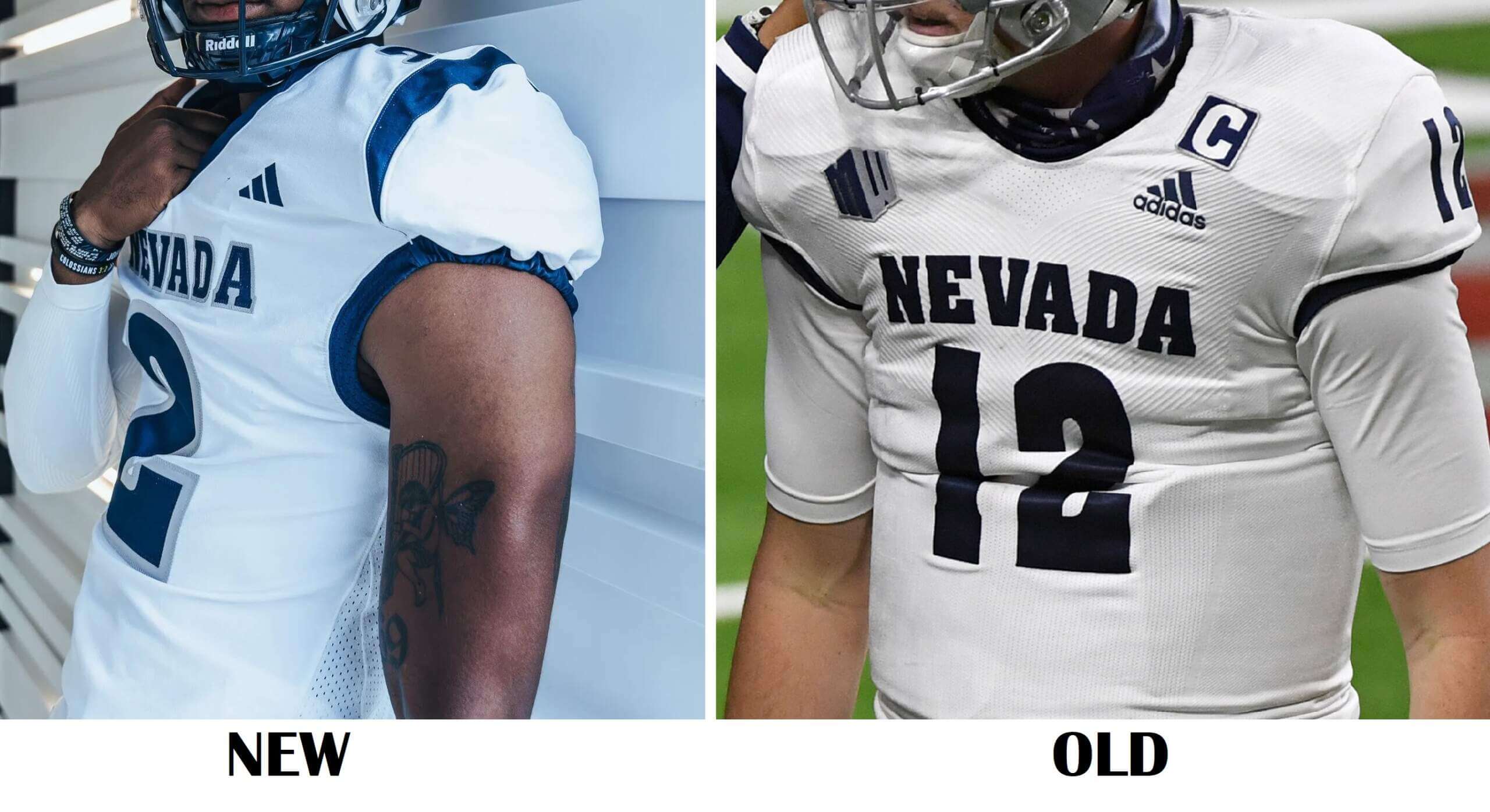
The new jerseys feature some slight differences from the old: thin white stripes have been added to the shoulder caps, and the neck and sleeve hems also have thin white piping. “NEVADA” is in a slightly enlarged block font, outlined in silver/gray. Numbers appear to be a thicker rounded font, and also outlined in silver/gray. The previous jersey had no shoulder stripes nor white surrounding the collar, and the wordmark and number were both outlined in blue. The new jerseys feature silver/gray stroking.
AWAY JERSEY:
The new road jerseys have been given a similar treatment to the blue: blue stripes on the shoulders, blue piping around the collar and sleeve hems, and new wordmark and number fonts outlined in silver/gray. Previously the white jersey had no outline on the wordmark or number (and while the color looks slightly darker on the old jersey, both colors are “Nevada Blue”).
HELMETS:
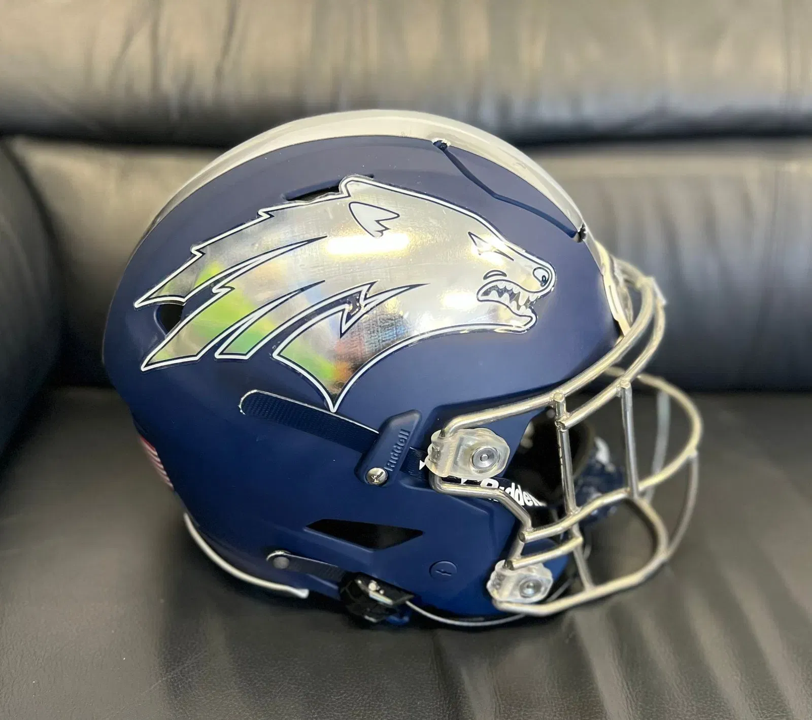
The helmets, which are available in blue, white and silver/gray, now have standardized patterns and helmet logos. The white and metallic silver helmets previously had a single stripe; the new gray helmet has more of a matte finish, and all three helmets feature three stripes (though the white helmet has blue/white/blue striping, making it appear as though it’s only two stripes). All three helmets will also feature the Wolf Pack logo.
All three sets of pants are stripeless, and the uniforms are designed to be worn with interchangeable helmet/jersey/pant, allowing for a larger number of possible combinations and looks:
As is par for the course with college football uniform unveilings, the team produced a hype video, which gives a better look at the uniforms:
there’s history in the new threads 🧵 #BattleBorn | #HomeIsNevada pic.twitter.com/BA7icNpZx3
— Nevada Football (@NevadaFootball) July 28, 2023
Not bad, right? Nevada had some pretty good uniforms prior to this, and the new ones aren’t all that different. If anything, they’ve introduced a slight bit of conformity across the different sets.
both look great
Good recap. One thing, though:
“The previous jerseys also featured TV numbers on the sleeve caps, while the new jerseys have no TVs at all.”
It does appear that both jerseys do have TV numbers on the top of the shoulder (only visible from certain angles). Unless I’m a bit rusty on my definitions and those aren’t technically “TV numbers”.
Good eye — it’s obvious (face plant) on the white jerseys, but harder to ascertain on the blue…but both have them.
I’ve removed that from the article — thanks for the correx!
Nevada is one of those schools that no matter the changes they make, the just look like the same uniform as before. Not sure if this is a good or bad thing.
No, this is a big upgrade.
No more tiny jersey numbers…no more chrome helmets… the Wolfpack really put themselves into Top Five consideration.
Nevada Wolf Pack
NC State Wolfpack
I’ve always found that odd…
Every time I write about either team, I always have to double-check to make sure I’m spelling it properly. Especially NC State…they’re not the “Pack”…they’re the ‘pack. Why one team uses one variation and one uses another gets confusing (and there are other sports teams who are either Wolf Pack or Wolfpack). Both (at least according to wiki) are correct
link
I might be completely wrong, but I’ve always thought that NC State has a copyright on that particular spelling. The only reason is that I remember reading that the old nWo Wolfpac from WCW spelled their name that way to avoid conflicting with NC State. I thought I had read it was due to copyright, but it also could’ve been just to have a slightly more distinct brand identity. If NC State doesn’t have a copyright and the reason for the distinctions have been the latter, that’s honestly annoying.
I went to NC State and I’ve never seen it shortened to ‘pack with the apostrophe. I have always just seen Pack as in “Go Pack” when not saying Wolfpack (which is more common). I agree that using ‘pack instead of Pack seems more correct grammatically since the apostrophe is replacing the “wolf” but I cannot recall seeing it in 15+ years of reading about their sports teams. Of course I could be wrong and many writers could be as well.
Yeah, I also graduated from NC State and have never seen “‘pack” either…
Very odd: Saskatchewan Roughriders
Ottawa Rough Riders
These teams once played at the same time.
Dang, these look very clean. I like the bigger numbers, looks much cleaner than the previous iteration
What no homage to Kaepernick on the Nevada unis?
The Dallas Wolfpack?
Nah. Nevada doesn’t have 17 different shades of blue.
B -D
New Nevada unis good.
New OSU unis bad.
Enough said.
Nevada is an improvement, but those tiny TV numbers are unnecessary and those biker shorts…. The helmets are very good, I always liked their wolf logo. As for OSU: also an improvement over the previous mono gray, with the scarlet and black accents added, but still: I am not a mono guy except for mono white, like the Miami Dolphins or Penn State.
I’ve grown to like it when Group of 5 teams have elements in all their school colors, especially when the other parts of the uniforms are simple and complement the whole, and Nevada delivered all of that with this set! Great job!