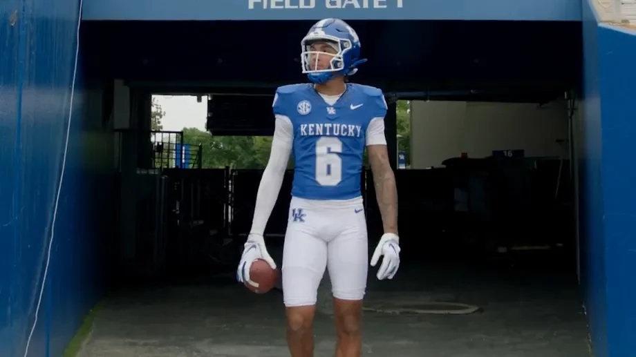
The University of Kentucky Wildcats have unveiled a new uniform for the upcoming season.
While the new uniform (a blue helmet/blue jersey/white pants combo) is similar to the previous iteration, there are a few subtle (and not so subtle) changes for 2023.
Let’s take a look:
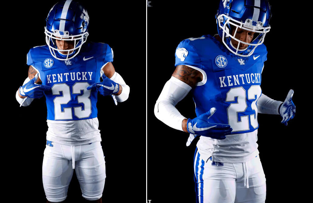
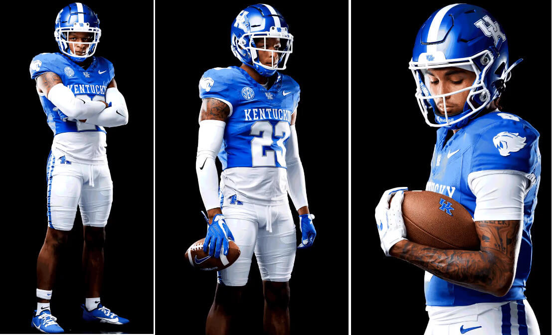
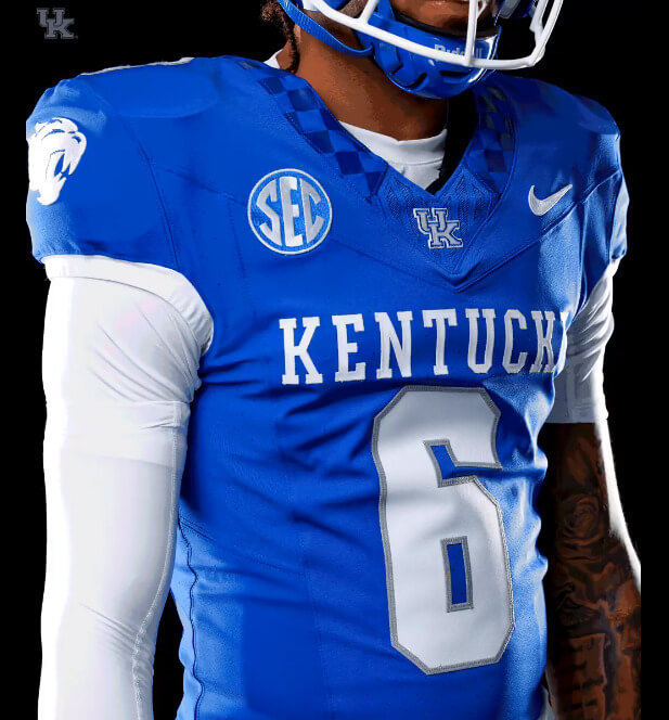
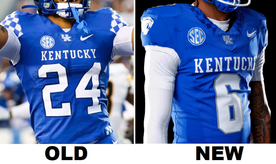
The helmet is not new. But both the jersey and pants differ from the prior set in a few ways. The biggest change is the removal of the checkerboard pattern on the sleeve caps. Instead, the team has placed a new Wildcat logo on both sleeves. But the checkerboard isn’t gone completely — it’s been sublimated onto the collar in contrasting blue squares.
If you look closely at the above image, you’ll also note the jersey is on Nike’s new chassis template.
In addition to the sleeve and collar changes, the numbers are now thicker and outlined in silver/gray. Previously they were thinner and had a black outline. The “KENTUCKY” wordmark appears to be a bit larger as well.
Here’s a side by side:
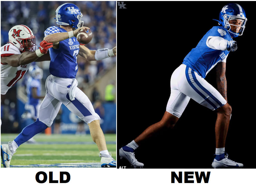
Also new for 2023 are the pants. Whereas previously, the white pants contained a thick solid stripe that didn’t quite start at the waist, and didn’t quite end at the hem, the new pants feature a much more traditional blue/silver-gray/blue pattern.
Here’s a side by side:
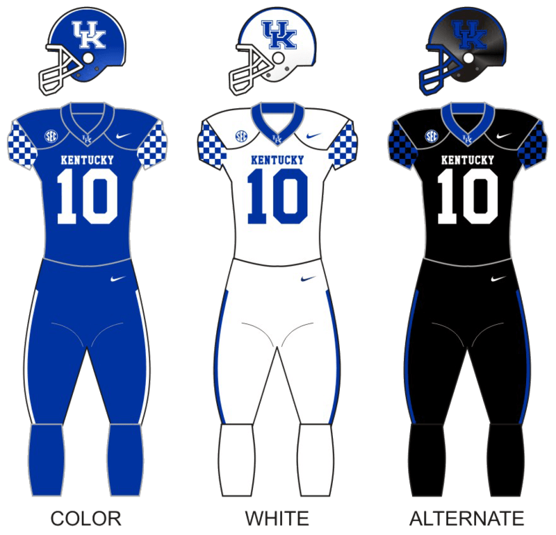
Like Weber State yesterday, the UK Wildcats only unveiled one new uniform. No word yet (but one can probably assume) that at least a new white jersey (and blue pants) will join the new blue jersey/white pants.
UK has worn mono-blue, mono-white and mono-black, mixing and matching uni elements and helmets as well, so it’s probable they’ll also introduce a black set.
Of course, the team released a hype video, which gives some more looks at the uniform (including the back).
Did someone say to drop the new unis? pic.twitter.com/66xovbcCy2
— Kentucky Football (@UKFootball) August 3, 2023
So far, I’m a big fan of this uniform combo. The elimination of the shoulder cap checkerboards — despite those being a signature uniform element — is a huge improvement, and the team still kept the checkerboards in a much subtler way. I also like the Wildcat logo on the sleeve. But the best change has got to be the pants changing from that really dated (almost full) stripe to a more traditional pattern.
The changes aren’t big — but IMO they’re all for the better.
Now we’ll just have to see if the add a white and black set.
I think this is a push in terms of improvement. I liked the checkerboards better than their wildcat logo on the sleeves, but dropping the black elements is an upgrade. At least they found a very nice way to keep the checkerboard somewhere.
KY Jelly would be the perfect Uni-ad for this team.
Will never not see 2 birds having sex in their alternate logo
Hell yeah!
First thing I thought of. The checkerboard is meh, and I associate it more with their conference rivals in Knoxville. But sex birds isn’t the answer either.
Big downgrade, imo. The checkerboard shoulders were really cool and really unique. There’s nothing wrong with the new ones, they’re just kinda there.
The checkerboard on Kentucky’s unis always seemed like a blatant ripoff of Tennessee’s style.
Kentucky even admitted so themselves, that is why they were already gone on last year’s UK basketball uniform.
Hopefully they get rid of the chrome helmet as well. Make no sense with their uni set.
The pants look great. The jerseys should drop the wordmark and use the interlocking UK instead of the wildcat on the sleeves.
i agree kevin, the alternate logo always has seemed like a default from a generic high school catalog. the uk has depth
Get out of here with that checkerboard stuff. That’s Tennessee’s thing.
Round of applause for Kentucky!!!!!! Those checkerboard caps/interrupted pants stripe were hideous on TV. These will look MUCH better. Still not liking the placement of team names with the new template though. Feels like they are on their belly rather than on the chest.
As a Kentucky alumnus I am glad that the checkerboard is being de-emphasized. While Kentucky had it first, using the pattern in end zones as early as 1930 they ceased using it at some point in 1940s or 1950s. Tennessee started using the checkerboard pattern in 1964 and has constantly used it since then. As Kentucky abandoned the design and their arch-rival has used it consistently it always came off as a copy.
The Nike storytelling invoking Secretariat was weak also- Secretariat was a Virginia-bred horse who didn’t come to live (permanently) in Kentucky until he was retired.
The elimination of the shoulder cap checkerboards — despite those being a signature uniform element — is a huge improvement, and the team still kept the checkerboards in a much subtler way.
You can tell college football season is right around the corner because Phil and I are back to disagreeing big time.
Farewell, highly visible checkerboards. I will miss you dearly.
Since Tennessee doesn’t own that look, and they don’t even incorporate it on the uniform, I hope some other school fills the checkerboard void in my heart.
Croatia playing that other version of football doesn’t quite fit the bill for you? link
It helps, but I watch way more football than futbol.
What if it were Slovenia or Poland wearing that?
You mean Slovakia, Phil…
I always Vilk that up. 50/50 shot.
Since 2016, our BFBS alternate is technically anthracite. Very popular among fans so I assume that stays. I love the new uni set! Reminds me of the mid-2000s Rich Brooks era!
Can’t wait for the long untucked undershirt fade to go away. Worst football uniform element.
Agreed–it’s beyond terrible. On top of looking atrocious, it gives opponents more cloth to grab ahold of and tackle with. The kids I used to coach loved this look so much and it never made any sense to me.
God Yes! The model looks like a damn slob.
As a lifelong fan and UK alum, I think these are a huge upgrade. I do have some minor nitpicks though.
– Helmet and pant stripe not matching.
– The checkerboard on the collar is awkward (but at least it’s deemphasized, thank God)
– The “Kentucky” wordmark across the chest is a little too large.
– I don’t like the “fast cat” logo on the sleeve. I’m not against the logo on the sleeve, I just don’t like *that* logo. If it was the classic wildcat it’d be fantastic.
– Bring back the Power K on the helmet.
Other than that though I think these are a major upgrade. I particularly like that we’ve moved away from the black/anthracite accents and are using more of the light grey from our official brand standards. It’s subtle but in my opinion it brightens the uniforms just slightly and makes them more energetic/lively (also I think black and royal rarely work together). There are rumors we’re still going to have a black/anthracite alternate and I’m not exactly thrilled about that, but I’ll survive I guess. Hopefully we ditch the chrome domes though.
All in all a solid effort at creating a modern classic!
Yes, the blue K on the white helmet is the best look. Unfortunately, it’s associated with some really bad teams (1981-89). Man, I loved that white helmet.
I like checkerboard patterns as a uni element, and in a vacuum I thought Kentucky’s use of it provided some visual interest to the uniforms, but I’m inclined to agree with Phil and others that UK is right to eliminate the checkerboard from its uniform program. For starters, it never seems to have been embraced by UK fans, who associate it with the University of Tennessee.
UT may not use it on their current uniforms (although it has made appearances in the past: link), but it’s still a significant part of the Vols’ visual identity (link). Kentucky’s use of it always has felt to me like they’re just aping their border rivals immediately to the south.
My other issue with UK’s use of the checkerboard is that is incongruous with the rest of their branding. I know that the checkerboard was introduced as an homage to Kentucky Derby and Triple Crown legend Secretariat (link) and as a way to honor the state’s rich horseracing legacy. And that would work quite nicely if the university’s sports teams boasted a horseracing-themed name like “Thoroughbreds” or something. (Frankly, I think that would have been a much better and more apt choice for Kentucky than the rather generic “Wildcats.”) But that ship sailed far too long ago to reverse course now.
Because Kentucky is well-entrenched in its Wildcats identity, efforts to incorporate horseracing themes feel forced and like mixed messaging. Maybe Murray State, with its “Racers” mascot, can pull off the checkerboards, but not a team with a feline name.
Quick edit: I realize they didn’t eliminate the checkerboard, but rather deemphasized it by placing it on the collar with a two-tone sublimation treatment. I prefer the subtlety, but I’d still be fine with it if UK just dropped the checkerboard them altogether, for the reasons I mentioned above. Nice uni element; wrong team.
Do we really need both the UK logo and KENTUCKY spelled out on the front of the jersey?
No. No, we do not.
Otherwise, it’s nice to see that a new look is not the usual complete abomination.
Good for you, KU KENTUCKY!
I noticed new Nevada kits got their own article too. Good for them.
Leave the checkerboard to the Vols, indeed. Their basketball team looks great in it, UK never really did. As for this new UK football uniform, I think it is an improvement but I would have preferred the UK monogram on the sleeves and the Wildcat on the collar. The blue on blue checkerboard on the collar is OK for now but needs to go as well.