
Because the Jets and Giants share a stadium, the teams have not had their own team logos at the 50-yard line. The turf has instead had the NFL logo at midfield.
But that is changing this year. Fresh off of the unveiling of their throwbacks earlier in the week, the Jets yesterday announced that they will have three separate midfield logos, depending on which uniform they’re wearing. When wearing their awful primary uni, they’ll have their standard logo on the field:

The black alternates and new throwbacks will be accompanied by their own midfield marks:


The team said that the midfield logos would each get matching end zone designs.
The Jets’ announcement comes two weeks after a similar news release from the Giants, who will have their “ny” logo at midfield this season:

The only other NFL teams to share a stadium, the Rams and Chargers, have both had team-specific midfield logos since their stadium opened in 2020.

Oh, I remember the days when the New Jersey Sports and Exposition Authority’s logo was at midfield.
So, I’m guessing the paint technology has gotten better in terms of putting the logos down so that the center won’t be a crummy mess in November?
I could be wrong, but I think that section of the turf is simply replaced? I seem to remember something about how FieldTurf replicates what basketball courts do and sections can be swapped out rather than repainting. Can anyone confirm?
Here’s a time lapse video of them replacing the end zone sections link
I would assume they would do the same for the mid field logo.
Wow I never knew that! Thanks for sharing!
They won’t swap out the center section; there was a previous report (I think I saw it here when the Giants plans were leaked) that said they would not do that for player safety reasons.
This video is obsolete, they replaced the entire Metlife Stadium field surface this summer (including the zip-out end zone and midfield sections, which were annoying to maintain). The Jets logos are all photoshops but the Giants logo is clearly painted.
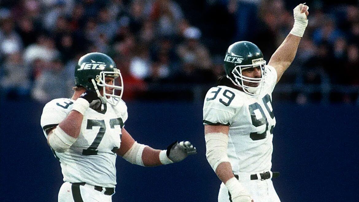
The Jets never had their own midfield logo at Giants Stadium either, IMSMC. Meaning, this would be the first time in 40 years (!) that the Jets have had their own midfield logo.
Thats not true. the Jets used a midfield logo for several years at Giants Stadium… link
Even when the Jets played at Shea, I can’t say they used a midfield logo/helmet all that often (if at all?, especially in September)…seem to remember just logos in the endzones and behind the goal posts.
i was watching an old clip the other day from one of their last seasons at Shea and they had a large Jets helmet painted at midfield. It was also still baseball season so half of it was in the infield dirt. LOL!
There was one game where the Jets helmet was painted at the 50, but not centered because of the infield dirt. Wish I could remember which game… I just saw it recently on YouTube.
Late 70s/early 80s.
Thanks for sharing those photos, MP!
It was interesting that the only facility that used a generic midfield logo were the Giants/Jets at the Meadowlands.
The only other one with that issue, until a change in ownership a few years back, was the Carolina Panthers. Founder Jerry Richardson, a former NFL player, was a traditionalist … to the extreme that he insisted the NFL shield be on the 50-yard line long after others had gone with their team logos and long after paint technologies had made changing such logos easy on short notice.
Good to see the Giants and Jets getting their own chances. Didn’t even take a change in ownership.
If memory serves, Kansas City had an Arrowhead Stadium insignia at midfield, but I’d be hard-pressed to tell you when.
The Arrowhead logo was from 1972 (when Arrowhead opened), until sometime in the ’80s when they went back to the original midfield logo (the helmet).
That black logo is just brutal.
That can is terrific but what is the product it contains? A complete mystery to me.
Details here: link
Its a greyish goo that you smear on threaded metal pipe and plumbing connections before you tighten them up.
link
Hence the “seal” “tight as a drum” iconography.
They should just use the NFL logo at midfield for both teams. Upgrade for the Jets at least.
A BFBS (sorry, black “alternate”) mid field logo. Puke. Not bad enough that the black uni components blow chunks. They drove me nuts last season with their insistence on wearing the green helmet with white jerseys and black pants. Looked redonk.
Seconded. It was like the Mets wearing black caps and accessories with their white “alternate” home unis (and road greys) for over a decade. Blecch.
Both logos are cool. It’s the best part of ther uni.
I don’t know what shape you’d switch to, but using the “modern” football outline on the throwback midfield logo is kinda disappointing.
The seal on the can is s singing …
“I don’t wanna fish, I just wanna bang on the drum all day.”
The black logo is just dumb.
Once again, to quote my dad: “Do we really need all this shit?”
When the Jets are in the throwbacks, they should have put the old red Meadowlands medallion at the 50.
Absolutely, and they should bring it back for the NJ high school state finals.
I’m sorry, but the Giants really need to make the “ny” logo read “nj” or go back to the underlined italicized “GIANTS”. They’ve been in New Jersey for nearly 50 years. Also, the Jets need to find something that says either NJ or New Jersey, if not, go back to New York. I’ll never forgive the Jets for the demolition of a perfectly good stadium.
You do realize the team is named for New York City, not New York State, right?
And, yes, while physically located in the state of New Jersey, it’s still only 15 miles from NYC (link). That’s a LOT closer than the 49ers are to San Francisco. In fact, the Giants play closer to NYC than do the Patriots, Cowboys, Cardinals, Dolphins, Commanders, Bills, Rams and Chargers to their respective city centers. (link)
Now, if you want to refer to the Jets as the East Rutherford Jets (or the Santa Clara 49ers, Arlington Cowboys, Orchard Park Bills, etc.) I’m all for it. But the Giants (and the Jets) were both named for the City in which they once played, not the State. So, it’s never New Jersey Jets/Giants. East Rutherford, eh… Doesn’t roll off the tongue.
As a New Jersey native and founder of Footyware(link), the Giants and Jets need to update their logos after decades in NJ. The Giants’ “ny” logo makes no sense for a team not in New York. An updated logo embracing their real New Jersey location and fans is overdue. Same for the Jets – with no NY home since 1984, it’s time for a logo actually representing New Jersey.
I’m going to direct you to my reply to a similar sentiment (above).