By Phil Hecken
Follow @PhilHecken
Good Sunday morning, Uni Watchers. Hope everyone had a pleasant Saturday.
Got an e-mail a little over a month ago from reader Jonathan Martin, who has an interesting set of concepts — interesting because they were actually college basketball uniform concepts for a movie, but the movie never made it into production. Here’s the deets:
Heya, Phil,
Hope you’re well. You did some Astros concepts of mine a while back, and I’m back with a few other concepts for you. These come from a film production that was supposed to be filmed out in Utah I was going to produce on, but the film never happened… and I feel confident it’s never going to happen, so I felt I could finally share these designs. Plus, they never paid me for them, so they can stuff it!
Jonathan Martin
And with that, I’ll let Jonathan take it away:
College Basketball Uni Concept for Film Production
by Jonathan Martin
My main goal with the designs was to make the uniforms look clean and realistic, avoiding anything gimmicky and hokey. The idea was that we wouldn’t “date” the film through the designs of the uniforms and give the design of the film a more timeless flavor for the on-court action. They also had to feel like they belonged to “real” schools, as if these were schools that could actually exist and create an authenticity to the story, as it was highly unlikely we would have gotten any university to license their image due to fees and the production’s lack of budget to get those licenses.
Finally, outside our main school (Mountain Valley University), there were only going to be about a dozen schools total that were going to be seen in the film, and while I didn’t do a design for all of them as we didn’t get that far, we also would only need a home or away for each school featured outside our key school. We even included fake conferences like the “Big 6” and the “GCC.” The idea was to have a different color palette to make each school unique, although there was crossover with two concepts.
Mountain Valley University Wolverines (white, green and gold):
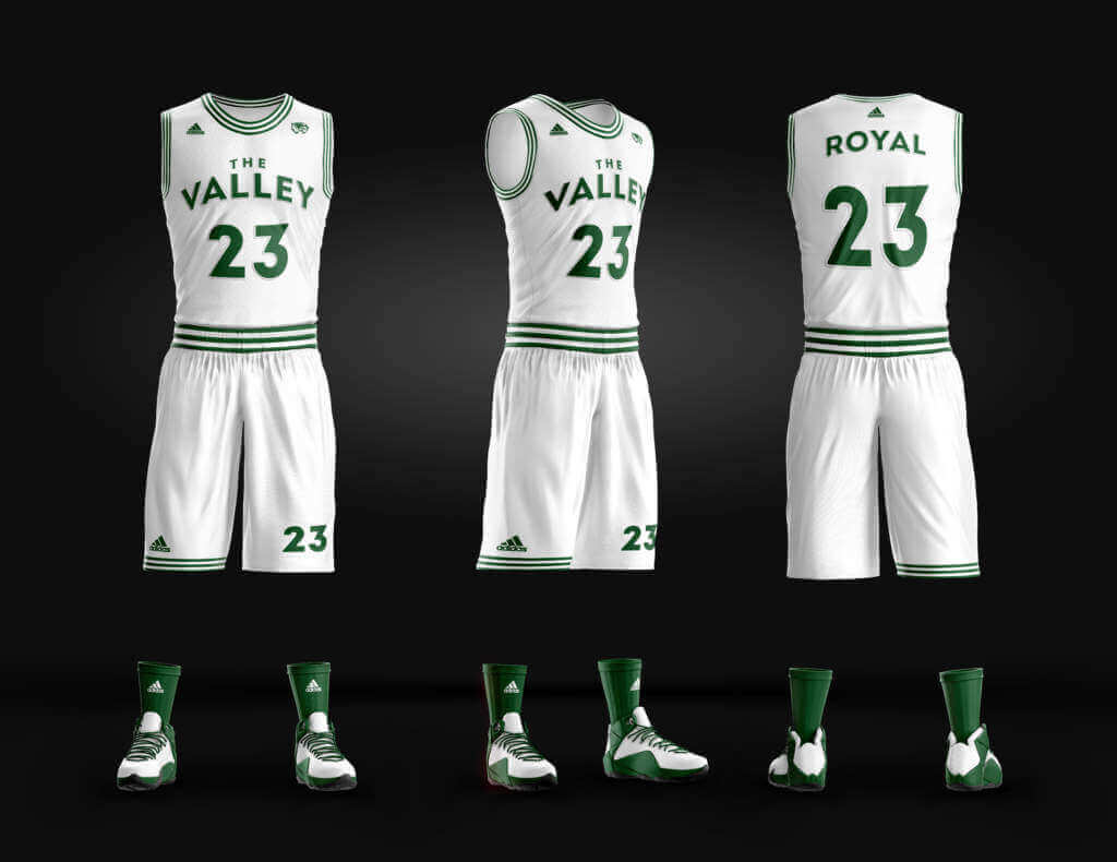
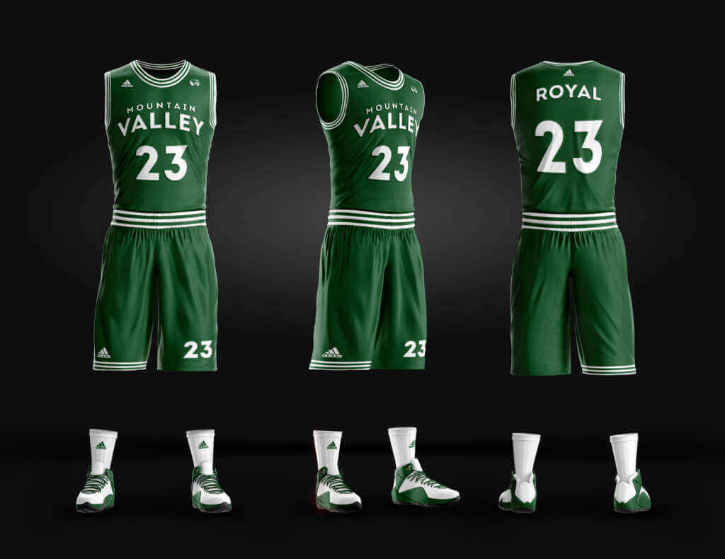
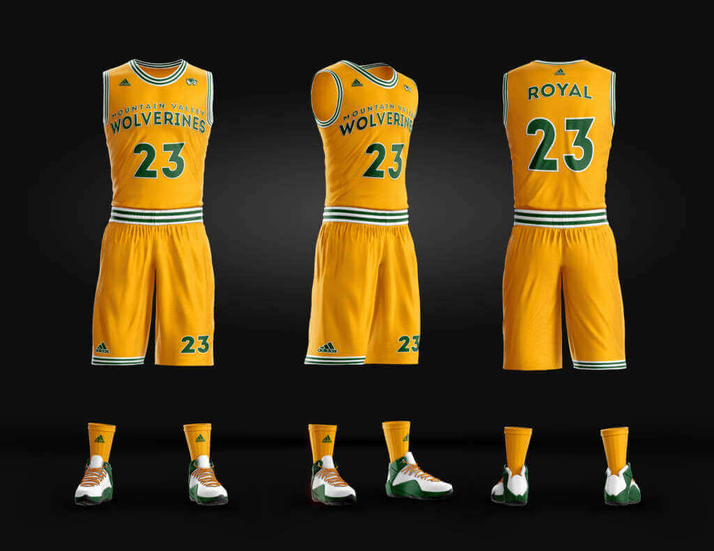
We were scouting Utah Valley University for the location and main school for the shoot, and as such, we were looking at keeping the school colors of Green and White, adding gold (the school used to be green and gold), and incorporating their mascot – Wolverines – into the uniforms as well,since the mascot is seen all over the campus. The idea is that this was a mid-major school that just scored the #1 recruit in the country, and is going to go on its run to the national championship.
Utah Tech:
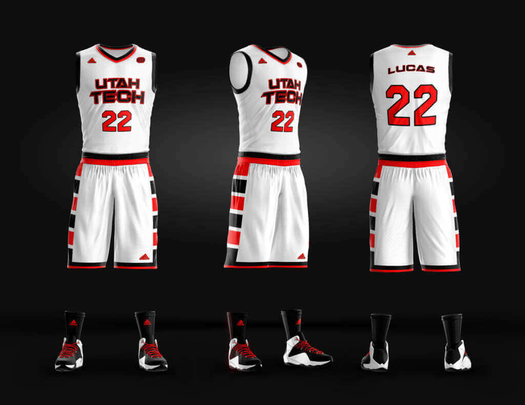
Interestingly, Dixie State just renamed itself Utah Tech and will become known as such later this year, but at the time of the development of the film, that hadn’t even become an issue yet. So perhaps we nailed this one in terms of the authenticity. I quite like the block stripes down the sides of the shorts. Perhaps we’ll see something exactly like this in the real world sooner rather than later?
Big State:
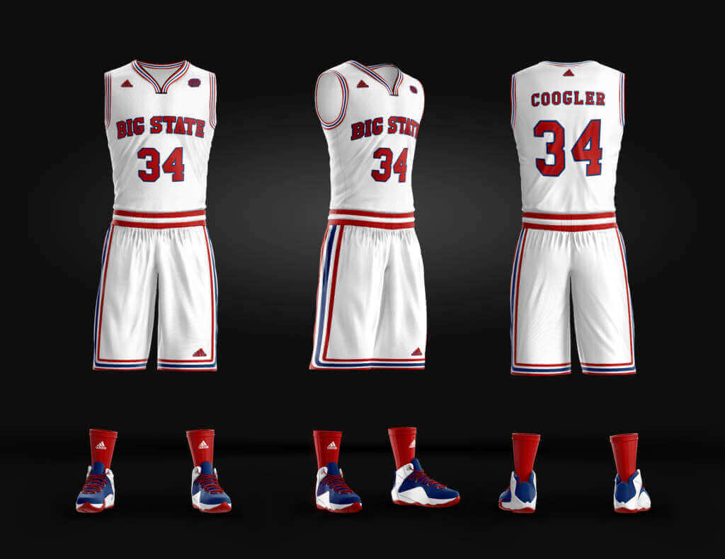
Pretty generic name, and I’m certain we would have probably renamed the school and found a state that didn’t have a “(insert state) State University” already. That said, I think these were my favorite uniforms of the lot, as they homage University of Houston’s phi slamma jamma era, and would have been the team Mountain Valley meets in the championship.
MLKU:
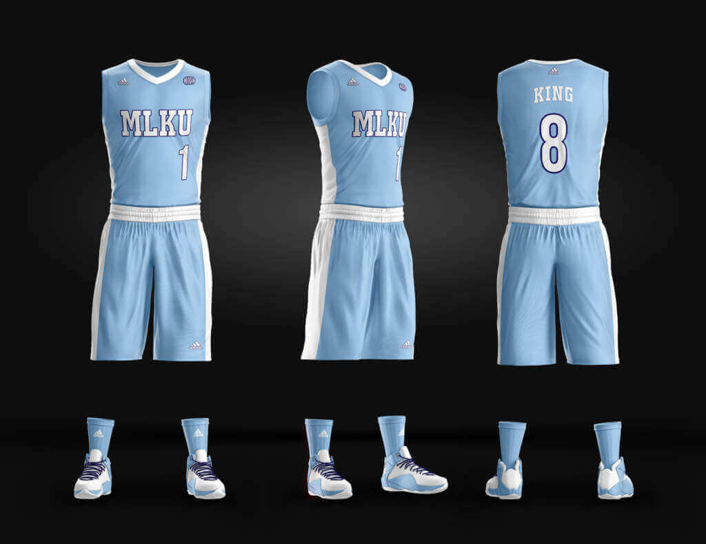
Named for Martin Luther King Jr, and an homage to North Carolina. Very simple, but wanted to highlight the MLK of the uniform and not make it too distracting from his initials and the name it was honoring.
Foxes:
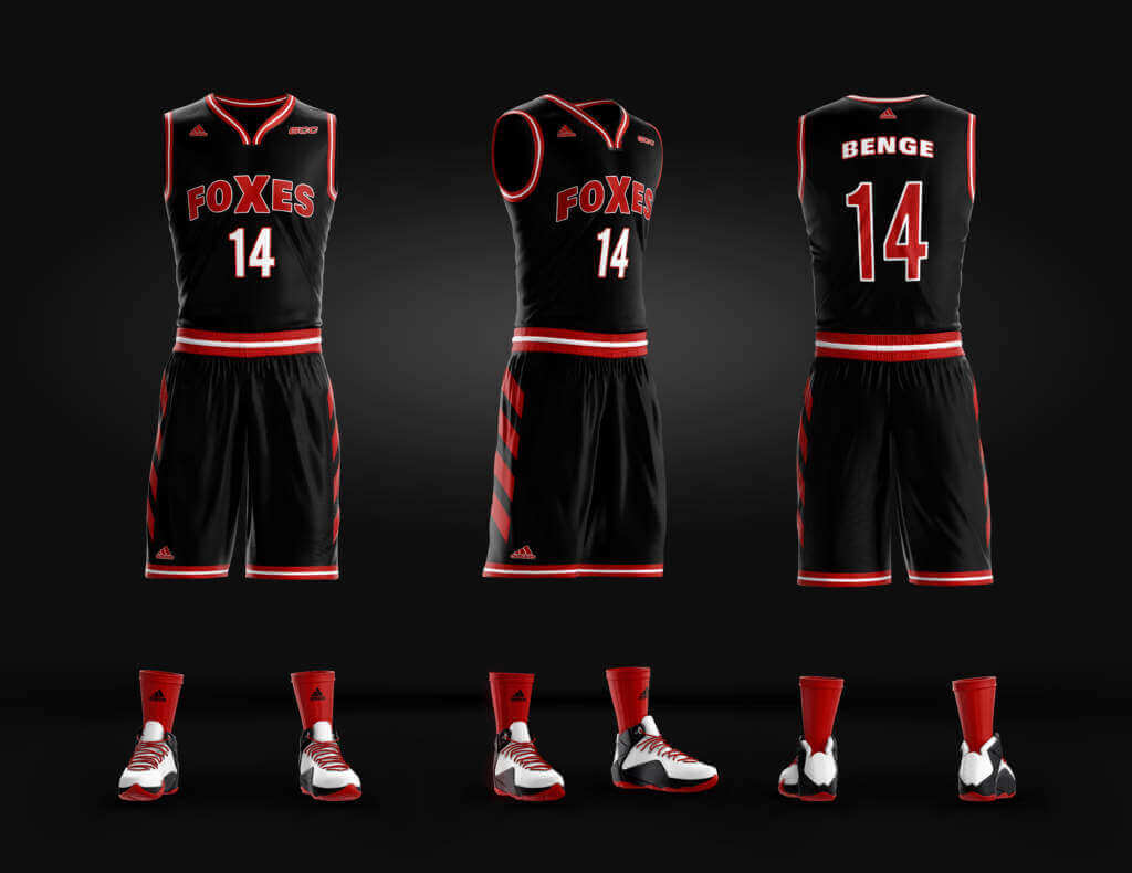
An example of when we would have “cheated” forgoing a school name and just putting a mascot on the jersey instead. Foxes felt fun, but generic enough – and actually made me wonder if any D-1 or D-2 school has the Fox as a mascot without doing a deep dive.
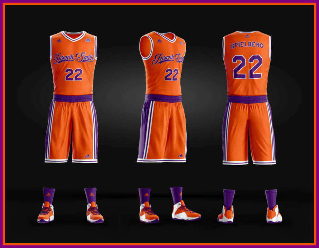
Joseph Smith U:
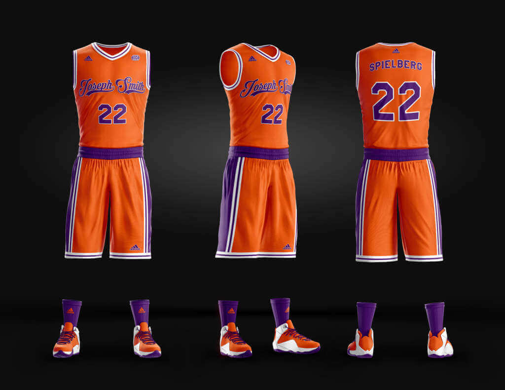
A sneaky reference to the fact we would be shooting in Utah, heavily influenced by the LDS culture and the LDS church’s founder. I mean, there was already Brigham Young University, so why not a Joseph Smith University representing a private religious school in the film. The colors are clearly based off of Clemson, and I really dug the script on this one.
CSU:
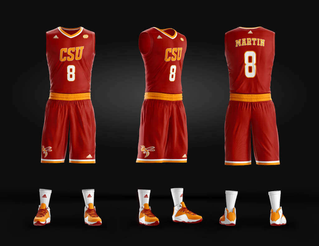
Who is CSU? Anything you want them to be! That was part of the fun of the project, just making up schools and names that have no real meaning for the most part and could be from anywhere or represent anyone. As a design, it works on screen, but wasn’t my favorite.
And that does it!
Nice job Jonathan. Pretty fun project, and too bad it never made it to production. I really kinda dig the orange/purple combo of “Joseph Smith.” Thanks for sharing.

Indian Wells — Tennis’ unofficial Fifth Major
by Brinke Guthrie
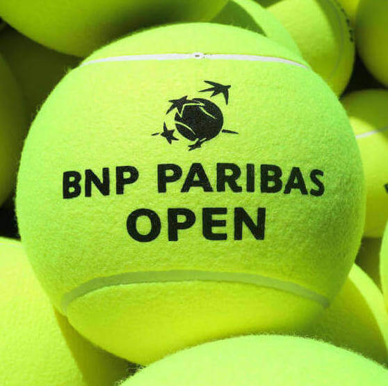
The BNP Paribas Open kicks off Monday in Indian Wells, California. The pandemic has played havoc with this prestigious event’s tournament dates; it was canceled in 2020, and in 2021 it was moved to the fall. Now it’s back on a fast turnaround, in its regular March slot. Let’s see what the tennis gear folks have in store, OK?
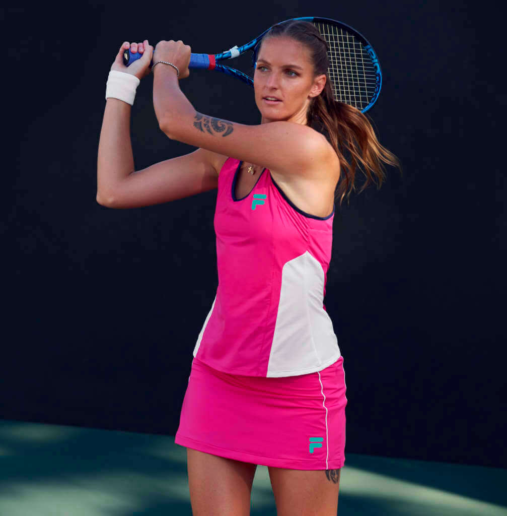
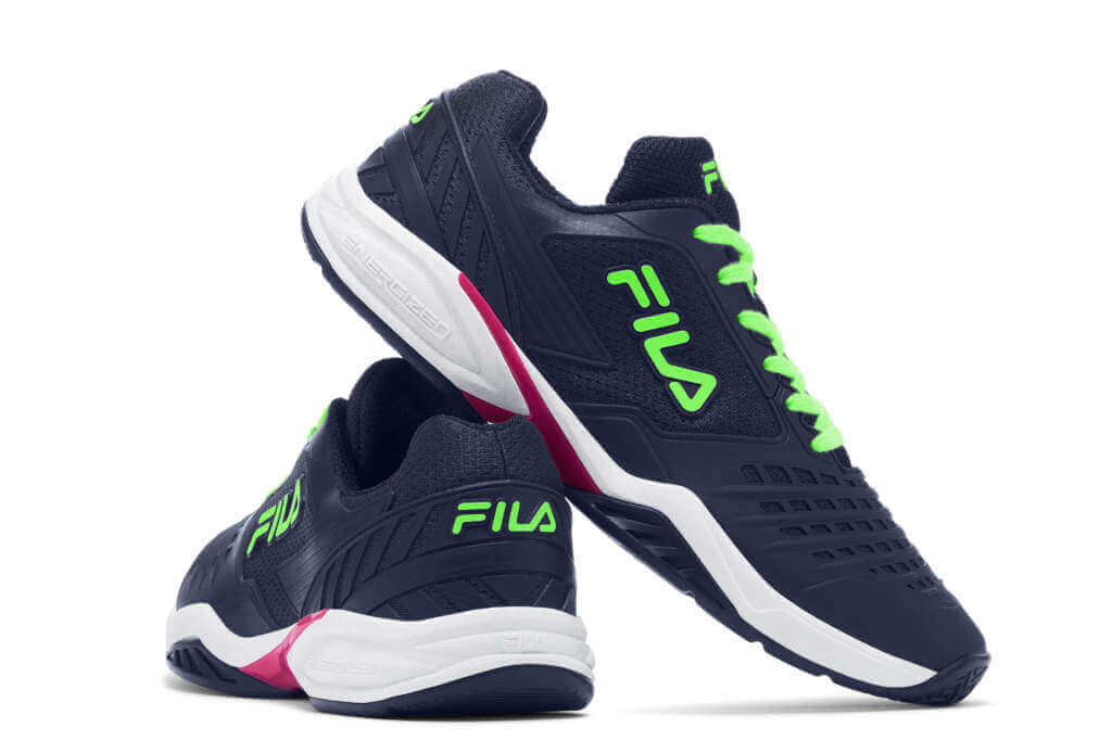
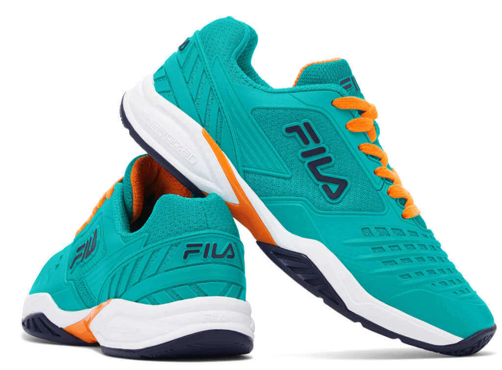
🌵🎾🇮🇹Fila
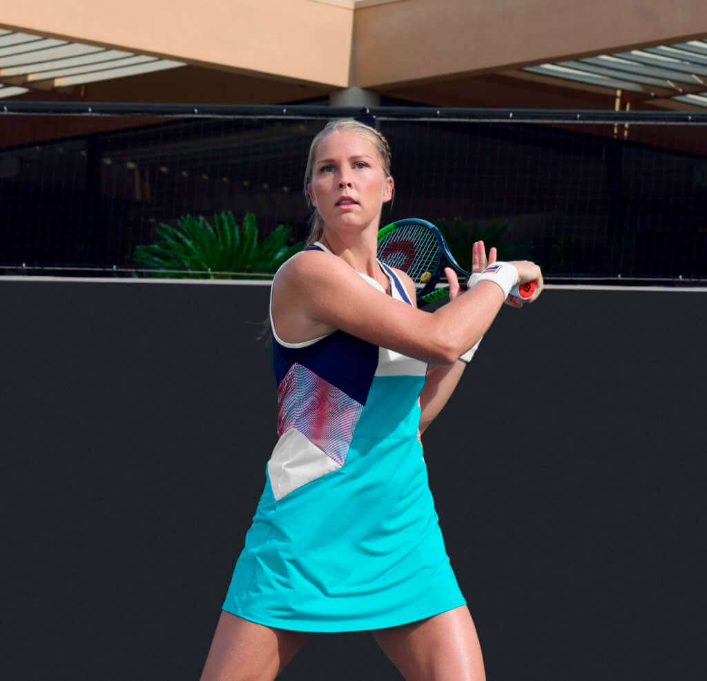
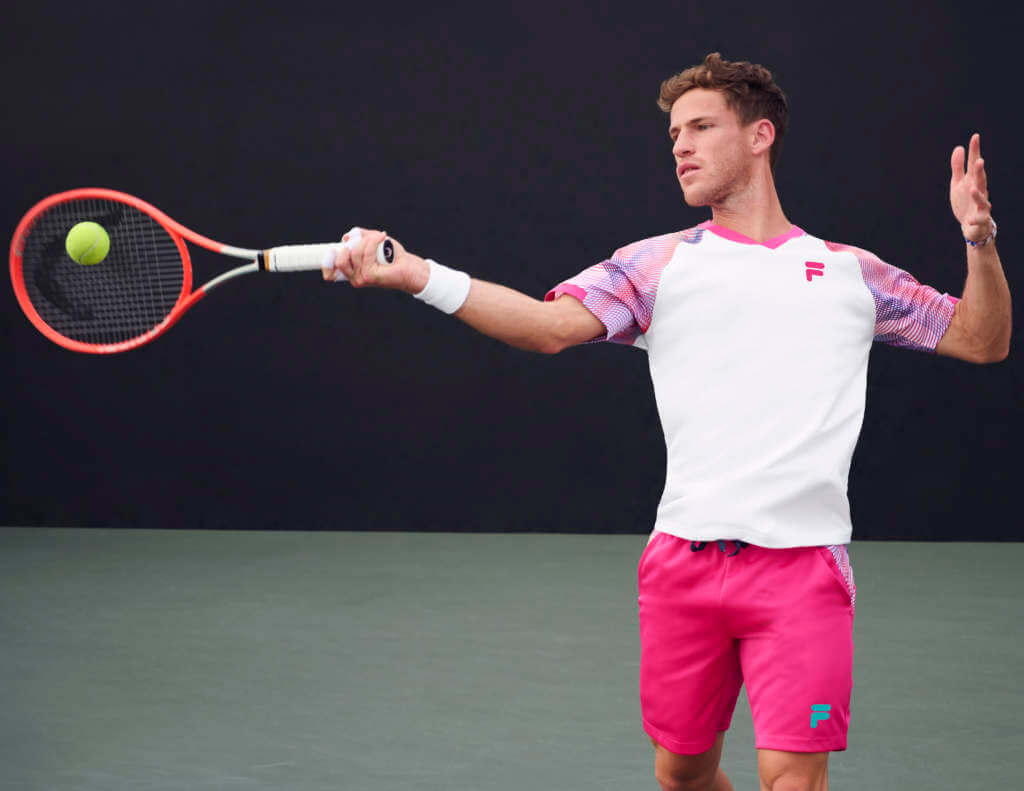
Fila is an official event sponsor and has a prominent on-site tent for tennis fans. They’ve partnered with award-winning fashion designer Christopher Bevans to launch a new spring tennis line, the “Bevans Park Collection.”
Crank up the PR-speak: “Bevans Park shines with a nature-inspired palette, eclectic prints and high performance fabrics. In a palette of white, navy, green, pink, teal and hints of orange, the collection features geometric patterns and sonic wave designs, which are meant to highlight the expression of energy as it relates to a player’s game.”
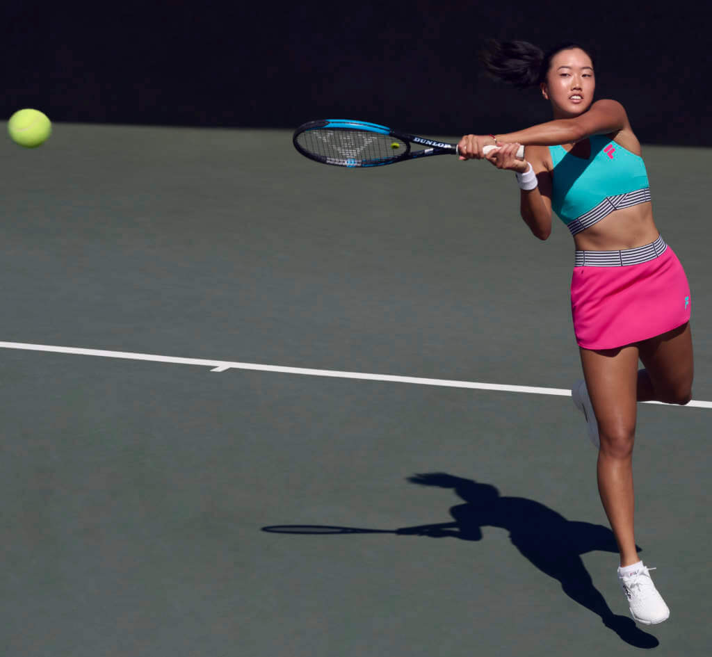
Get all that? Right! Moving along. The 26-piece women’s collection features a range of silhouettes including tennis dresses, tanks, skorts, shorts, a long sleeve tee, a jacket, and pants. World No. 5 Karolina Pliskova, Shelby Rodgers and Ann Li will compete in this line. World No. 1 Ash Barty would’ve worn this style but pulled out of the event on Thursday.
For men, the 16-piece assortment ranges from crews, polos, henleys to shorts, pants and a jacket. World No.13 Diego Schwartzman and Reilly Opelka….
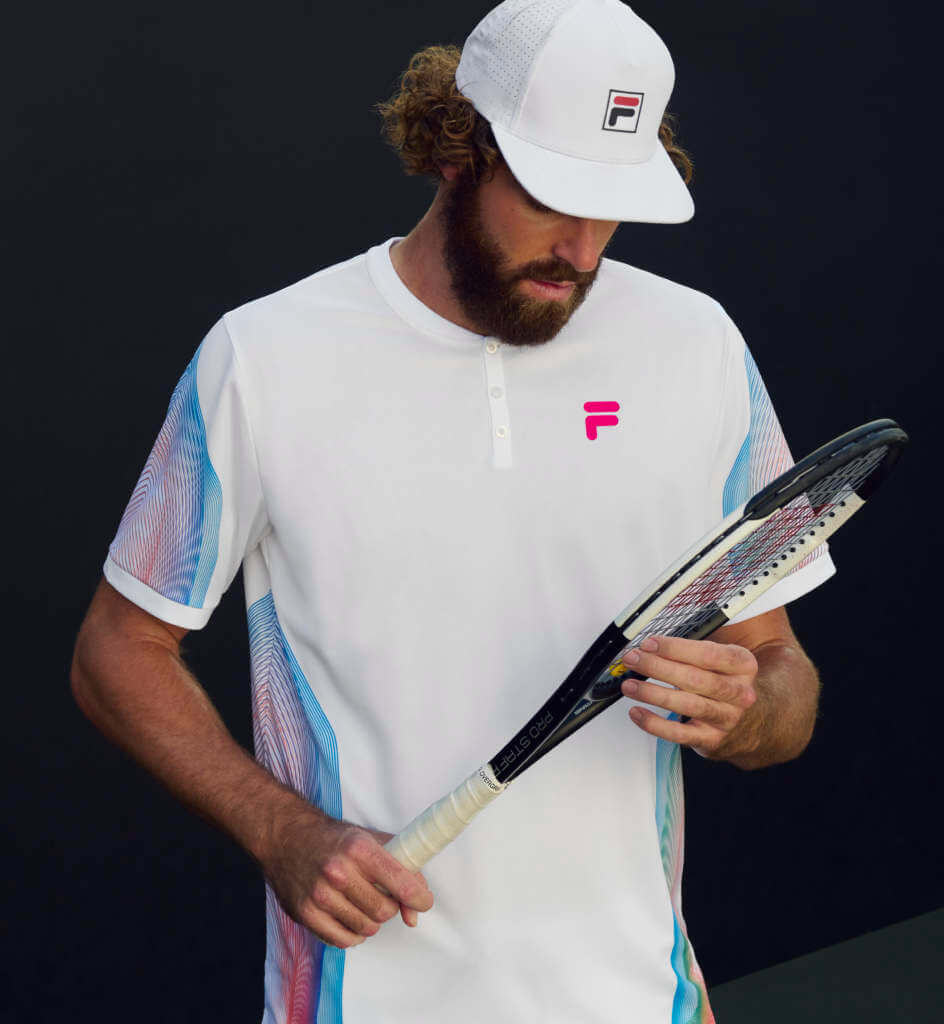
…along with Brandon Nakashima and John Isner will debut pieces from the men’s lineup, matched with the Fila Axilus 2 sneakers.
🌵🎾🐊Lacoste
Le Croc has just signed Venus Williams; she still has her own brand EleVen, so I don’t get this signing. She’s ranked #467 in the world, and clearly headed towards retirement.
🌵🎾🍋Lululemon
Leylah Fernandez is now wearing the popular athleisure brand on court- still in her old Asics as the rumored Lululemon sneakers are still vaporware at this point. Notice there’s now a prominent logo on the top so fans can tell what she’s wearing:
Round 1: 🏆
Round 2: Let’s go!We're cheering on that girl—and our girl—@leylahfernandez tonight. https://t.co/qEH6FzFALf
— lululemon (@lululemon) March 2, 2022
As a side note, as I was looking around about Fernandez and Lululemon, for some reason, I looked at their logo and (lightbulb moment) suddenly went, “Oh, now I see it; that’s Mary Tyler Moore or Marlo Thomas’s hair.” It’s certainly not an “L.” So what is it? here’s one theory, and here’s another, notable for being the first time I’ve ever visited “Seventeen.com.” (Hey, Google gave me the link, you know?)
A Brief History of Iowa Basketball’s Framed Jersey Incompetence Indifference
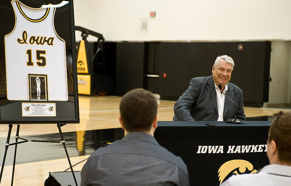
by Kary Klismet
I went to grad school at the University of Iowa, so I tend to spot Hawkeye-related Ticker items. Last Wednesday, I submitted one about the Iowa men’s team giving its departing seniors framed jerseys in a template the team hasn’t worn in three years. That sparked my realization that this wasn’t a one-time occurrence for Iowa. In fact, the athletic department also gave out framed jerseys in this template in 2020 and 2021, despite switching to new uniforms at the start of the 2019-2020 season.
But the issues don’t end there. It seems like just about every time Iowa has a chance to recognize its players or high-profile alumni with a framed jersey, it manages to get it wrong. For example, Iowa honored former all-time leading scorer Roy Marble with a framed jersey in 2015 after he was diagnosed with terminal cancer. The jersey was in a template the team hadn’t worn since 2008 – not even the one the team wore at the time — and didn’t look anything like Marble’s uniform when he starred for Iowa in the late ’80s.
And when Hall of Fame NBA coach and former Iowa All-American Don Nelson came back to receive his diploma in 2012, fifty years after leaving school, Iowa gave him a framed jersey that, once again, looked nothing like the uniform he wore in his heyday at the school. Rather, it looked similar to a throwback uniform the team wore that same season (an homage to uniforms from the ’80s), but in a base color – white – the team has never worn with that script wordmark.
How is it that Iowa keeps messing up these jersey presentations? I’d venture a guess that it stems from an athletic department that prefers to do things on the cheap and use up old jersey stock rather than have an eye toward accuracy. Contrast that with Kentucky, who showed impressive attention to detail last week when they used an era-appropriate framed jersey to honor late equipment manager Bill Keightley (also featured in last Wednesday’s Ticker). It seems like Iowa would benefit from having someone in their athletic department who Gets It™ as much as Kentucky’s athletic department does.

Guess The Game…
from the scoreboard
Today’s scoreboard comes from Billy Merchant.
The premise of the game (GTGFTS) is simple: I’ll post a scoreboard and you guys simply identify the game depicted. In the past, I don’t know if I’ve ever completely stumped you (some are easier than others).
Here’s the Scoreboard. In the comments below, try to identify the game (date & location, as well as final score). If anything noteworthy occurred during the game, please add that in (and if you were AT the game, well bonus points for you!):
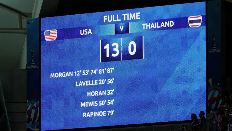
Please continue sending these in! You’re welcome to send me any scoreboard photos (with answers please), and I’ll keep running them.
A Vintage Uni Watch Uni?
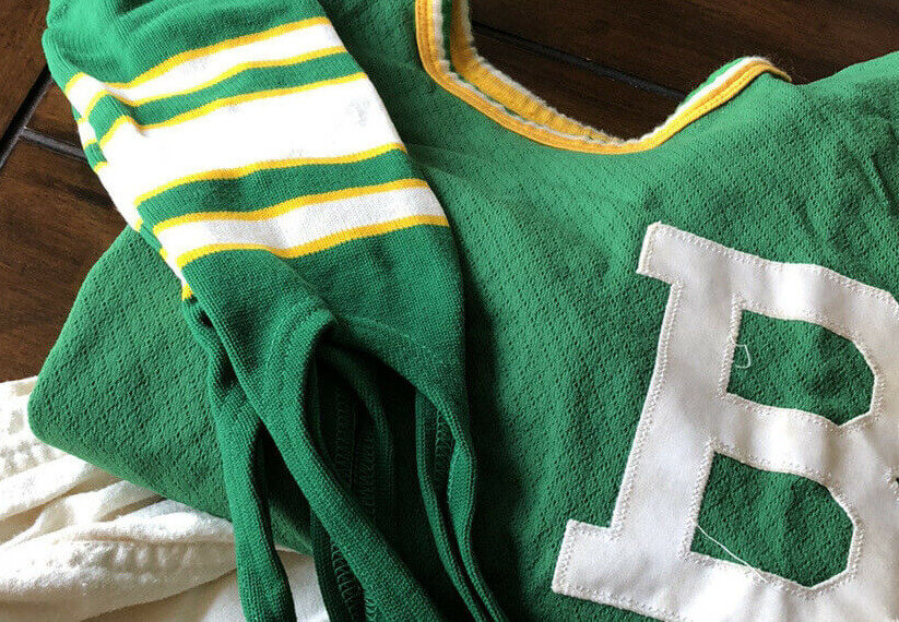
Got a note from UW pal Jimmy Corcoran earlier this week, who found a tremendous uniform for sale on eBay. I’ll let Jimmy take it from here:
Phil,
I don’t know if you saw this on ebay, but if you put the chain stitched Uni Watch patch on instead of that B you would have a vintage Uni Watch softball uniform. What is odd is it looks to be from two different eras? The cloth pants have a 60’s look and it was worn with a mesh jersey that has a 70’s or 80’s look? Those socks would look great in any era.
Jimmy
Thanks Jimmy! Too bad Wafflebored isn’t doing jerseys anymore…and that seems a bit pricy, but what a gorgeous uni — could definitely be a vintage UW softball set!
Uni Watch News Ticker
By Phil

Baseball News: Leak? “The Rockies and Padres Stance City Connect socks have leaked. How do we feel?” asks Eli Broz. Paul questioned the source, and Eli replied “Stance put them on their website as the “2022 City Connect OTC Socks” but quickly took them down.” That’s another thing the lockout has put on hold: any announcement of which teams will be getting “City Connect” uniforms this season. … Interesting font pattern (a la the Vikings) for the Washington State Cougars (from Frisco Classic). … The Dub Sea Fish Sticks, a summer collegiate baseball team, have a pretty chill cap logo (from MiLB Promos). … The Jacksonville Jumbo Shrimp will have a few interesting jerseys this season (from MiLB Promos).

Hockey News: The WHL’s Edmonton Oil Kings wore special uniforms on Friday for Superheroes Night (from Wade Heidt). … Also from Wade Heidt, the BCHL’s Coquitlam Express will be wearing special uniforms on March 9 for Kwikwetlem First Nation Night. … The Arizona Coyotes wore what look like Pride-themed gear for their warmups yesterday (Wade again). … Same with the Florida Panthers (from Josh Claywell). … The Manitoba Moose sported some Autism Awareness Acceptance jerseys “to celebrate the shift from “awareness” to “acceptance” and the incredible work done by our friends at @StAmantMB” (via Paul). … Check out the beautiful Trainer’s jacket in this short clip from a Blackhawks game (from Vintage Oilers). … San Jose Sharks Hockey is for everyone (from Brandon Weir). … Wade Heidt doesn’t think the Calgary Hitmen don’t have enough pink in their uniforms. I say it’s plenty.

Basketball News: Some impressive 1972 unis: UW stalwart Jerry Wolper writes, “I saw this tweet. Going to the newspaper archive, I pulled this version from the 3/5/72 Pittsburgh Press. You’ll note that in the third full paragraph down, it says ‘Albert Gallatin (High School), wearing blue and white striped uniforms with white numbers that looked like prison garb with short sleeves and short pants…’.” … MASN had a confusing score bug, with Virginia Tech wearing orange but Clemson having an orange score bug (from Andrew Cosentino). … Hmmm, thought we’d solved these issues: Cole Streeper writes, “Might be hard to tell on this grainy photo, but 55’s (Ingram) uniform is a darker shade than the rest of the Stanford team. Been bugging me all game.” … Check out this bizzaro Vikes/Pack logo match up for the North Dakota Girls Class B (smallest division) title last evening (from Tim Purdon). … After a one-year hiatus, the Northwestern men’s basketball program has revived its “By The Players” uniform series for Sunday’s game against Minnesota. … Not sure if it was a “blood” jersey, but one player on Columbia went NNOB while his teammates all had NOB (from Brad Apps).

Soccer News: Real Salt Lake has made some upgrades to its stadium ahead of the 2022 season (from Kary Klismet). … Bury A.F.C. of England’s North West Counties Football League Division One North is asking fans to vote on one of six new designs to be its new home kits for next season (also from Kary). … New uniforms for Miami FC of the USL Championship (Kary Klismet, again). … You need to read this whole heartwarming thread. That is all (from James Gilbert).
Ukraine News: Bundesliga scorebug this weekend is featuring all games with Ukrainian colors (from André). … In view of the war in Europe, FC St. Pauli and its partners have decided there would be no perimeter advertising at yesterday’s home game against Karlsruher SC (from St. Pauli English). … German Bundesliga side FC Köln will wear replace their shirt advertisement with the message “Stop War” for their match against Hoffenheim on Sunday (from Kary Klismet). … Also from Kary, Italian Serie A side Napoli have announced that they won’t wear the red Maradona special jerseys they unveiled last week and will instead have players sign them and auction them off to raise funds for Ukrainian war refugees.

Grab Bag: Princeton is unveiling what looks to be a new lacrosse jersey with lots of storytelling (from Princeton Equipment). … Brinke wants us to know a giant ‘parachute’ spider that rides the wind is ‘set to cover the East Coast’. … New stadium being built for the University of Hawai’i. Submitter James Gilbert adds, “That there don’t appear to be fantastic views of anything from inside this stadium is a travesty.” I agree. … Beaufort (S.C.) High School in S.C. has replaced its old logo on its football field with a new one introduced in 2019 while also updating the colors of the band uniforms, to the very public dismay of several alumni (from Kary Klismet). … Enatai Elementary School in Bellevue, Wash., has a new eagle logo designed by a fifth-grade student (Kary, again).
Uni Tweet of the Day
If they can make this jersey in old gold, and not metallic, I’d be on board…
Can we get some new uniforms pic.twitter.com/cviO7v4HNZ
— AcidRapper (@AcidRapper877) March 5, 2022
And finally… that’s it for today (and for me for this weekend). Big thanks to the contributions from Jonathan, Brinke, Kary and Jimmy! Good stuff by all.
Everyone have a good Sunday and a better week, and I’ll catch y’all back here next Saturday.
Peace,
PH
The correct term is Athletic Trainer, not trainer, in regards to he person wearing that Chicago Blackhawks jacket.
Got it. Thanks
John Deacon wears a similar Blackhawks jacket in the video for “We Will Rock You”. Just with leather sleeves instead of all wool.
link
Those Utah Tech striped shorts are production ready!!!
Foxes felt fun, but generic enough – and actually made me wonder if any D-1 or D-2 school has the Fox as a mascot without doing a deep dive.
Marist College (Div 1) Red Foxes
One of my biggest gripes with made-up uniforms for sports movies is they usually feel amateurish or fake. It’s one of the reasons I love “The Bad News Bears” so much; they look real.
Today’s concepts look very authentic. Not all cut from the same template, some flashier than others, nothing crazy or too over the top. Great typographic variety.
I would probably enjoy the heck out of this movie based on that criteria.
Agreed, these are all excellent, individually and as a group
Kary’s discussion of Iowa’s framed jersey protocol is in stark contrast to Marquette’s. On their senior night Saturday, they presented players with a double-jersey frame. Front and back on their black alternate jersey (I won’t call it BFBS, because the black uniform did become a symbol of racial and social justice for the team). I don’t think they de-commissioned the black uniform for the framing – instead Marquette had extra jerseys ordered and lettered for the framing. That’s going way above and beyond, in contrast to Iowa, and engages both the name on the front and the name on the back.
link
Great find on this, Patrick! I would say Marquette is definitely more in the “Kentucky camp” as opposed to the “Iowa camp” when it comes to attention to detail on framed jerseys. I wish Iowa would do something similar to this.
Speaking of Iowa, I uncovered another layer to Iowa’s framed jersey laziness. If you look at Connor McCaffery’s framed jersey:
link
…you’ll notice the jersey is a different tailoring cut than the jerseys given to the other graduating seniors:
link
Notice the white maker’s mark on Connor’s jersey instead of black on the others’. Also, Connor’s jersey has wider shoulder loops and a deep v-neck as opposed to the wider, rounder neck opening on the other jerseys.
Connor’s is a template the team wore from the 2014-15 through the 2017-18 season:
link
The others received jerseys in a tailoring cut used during the 2018-19 season:
link
Interestingly enough, Connor played in just four games in 2017-18 before redshirting. That means he received a jersey that represents only 3% of the 128 games he’s played in his college career.
I though momentarily that perhaps that meant that Iowa saves a jersey from players’ freshman season with the team to give them when they finish their careers. However, fellow senior Jordan Bohannon, who started his career in 2016-17 before taking a medical redshirt in 2019-20 and using his extra “Covid year” of eligibility this season. But Jordan’s jersey is the 2018-19 template, so that suggests no such forward planning on Iowa’s part.
It should be noted that Bohannon went through Senior Day festivities last year before deciding to come back for one more season, but the jersey he was given then was also the 2018-19 template:
link
What does all this mean? I guess it just reinforces my presumption that Iowa’s athletic department just doesn’t care what jerseys they give departing players or alumni and that their first instinct is to simply clear out their supply closet. Enjoy that surplus jersey, Connor! :^)
Jonathan nailed the jerseys! Some fictional teams unis in movies/television will either end up on the boring bland end or so radically different they are clown costumes. These would play today and be classics in 10 years.
RE GTGFTS:
2019 Women’s World Cup Group F Opening round match (USWNT v. Thailand) June 11, 2019. Stade Auguste-Delaune, Reims.
If my math is correct, this was the first competitive (non-friendly) match for the US Women after their lawsuit against USSF asking for equal pay. Political pundits complained about the team not being gracious after the 10th goal.
My favorite show as a kid was The White Shadow, but those Carver uniforms were tough to look at. They looked like those t shirts you get at the boardwalk with the iron on felt letters. Coolidge was the Moses Malone of the TV show universe! Salami could have been another Pistol Pete if he just worked on his ball handling skills. Maybe someday someone will update what the Carver basketball uniforms should look like today?
Warren Coolidge was my favorite orderly on St. Elsewhere.
And I always thought Salami was Tom Bradford’s son, not his brother.
I guess Coolidge didn’t make it in the NBA, so he became an orderly. Thank God he had something to fall back on. Too bad the ABA was gone by then, I would have loved to see Warren teamed up with David Thompson on the Denver Nuggets, not to mention those classic Nuggets uniforms of 1976.
Great stuff from everyone today! Jonathan, I love your classic design sensibilities. Let’s just say several college and pro hoops teams would benefit from your input. :^)
Brinke, nice job on the uni-rundown on Indian Wells. I appreciate learning everything I can about the aesthetic cultures of sports outside the traditional American “Big Four,” and you your tennis content never fails to disappoint.
Jimmy, great eyes on that softball uniform! Definitely the perfect look for a throwback Uni Watch softball team.
Finally, great job, as always, Phil, on The Ticker and on being a phenomenal uni-content curator and presenter! I appreciate all you do!
Thank you that’s most kind of you to say!
Stance socks make me thankful for pajama pants, and I hate pajama pants.
Washington State has been using that asymmetrical font for quite some time, preceding the Vikings use of their own. Nike designed that custom font back around 2010/2011, the Vikings rolled theirs out in 2013.
I’d say about all of these concepts for the Movie:
I’d wear them all!
and Marist are the (Red) Foxes.
Appreciate the love y’all gave to the uniform concepts, everyone! I had been sitting on them a while and felt the time was finally right that they could be shared – and you all encourage me to share more of what I’ve done down the road! Thanks!
Loved the uni concepts. The alternating blocks on the shorts is a nice look.
Iowa….woof. On the other hand, I have only been able to read this site a handful of times in the last 4 months and this entry featured a link with a high school friend of mine, Tony Freeman Jr. He was a superstar in high school but misused while at iowa. He finished his career at Southern Illinois then unfortunately blew out his knee before his NBA tryouts. Was just out with a buddy reminicsing about high school hoops in the Chicago area too. A sign from the basketball gods…