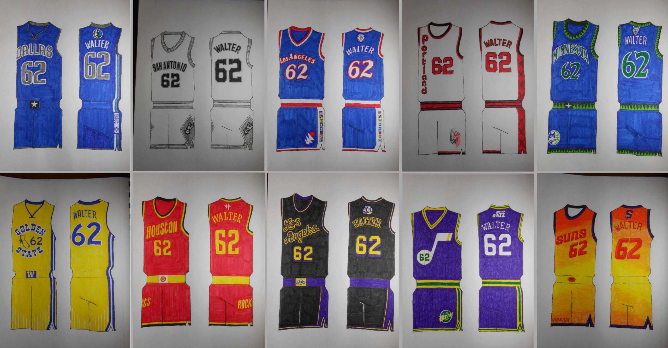
Last weekend, I ran a set of concepts designed by Uni Watch reader/contributor Walter Helfer in which he concepted NBA “Tournament Uniforms” to replace those “City” editions introduced by the NBA this past fall. Those designs covered the NBA’s Eastern Conference. If you missed that, please refer to the above link to check out that first set of designs.
Walter returns today with Part II, which encompasses the Western Conference. I’ll add in the introduction Walter provided to the previous post below.
Enjoy!
NBA Tournament Uniforms Redux: Part II
by Walter Helfer
Frequent visitors to Uni-Watch know I’m not one to suffer in silence when professional leagues who ought to know better foist misguided and ugly uniforms on consumers of its product. I took on the City Connect project of Major League Baseball some time back, and now I turn my attention to the NBA’s in-season tournament. I tried to draw on what I find to be team’s trademarks, as well as their appearance when they enjoyed their greatest success. A hefty chunk of B-ball teams have never grabbed the brass ring, which gave me a degree of freedom not found in football and baseball. And, for your pleasure, I included the shorts and the backs; I’m nothing if not thorough. I can’t wait to read your input, and when necessary, correct my mistakes.
Western Conference
DALLAS MAVERICKS
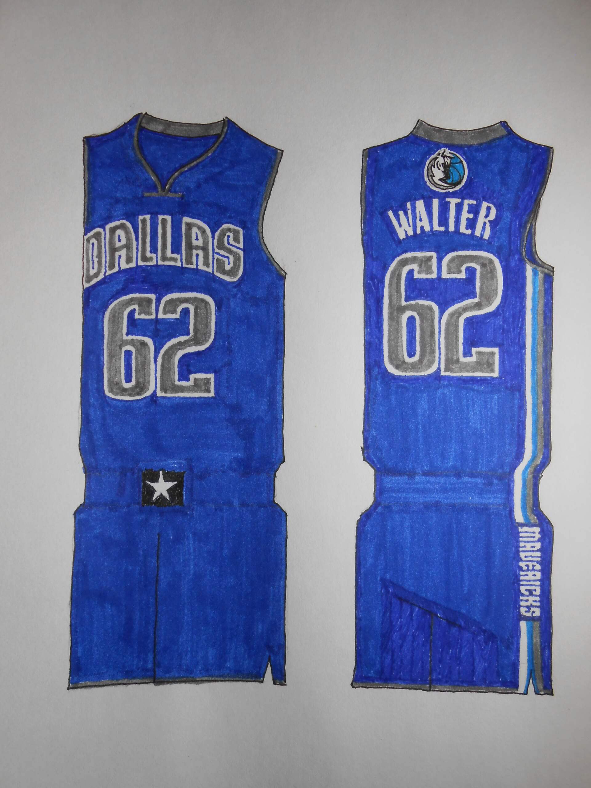
Pretty close to the uniforms worn when the team won its title, and not all that different from now. The fans can’t get enough of the green uniforms, but multiple shades of blue I see as a “Dallas” kind of thing.
DENVER NUGGETS
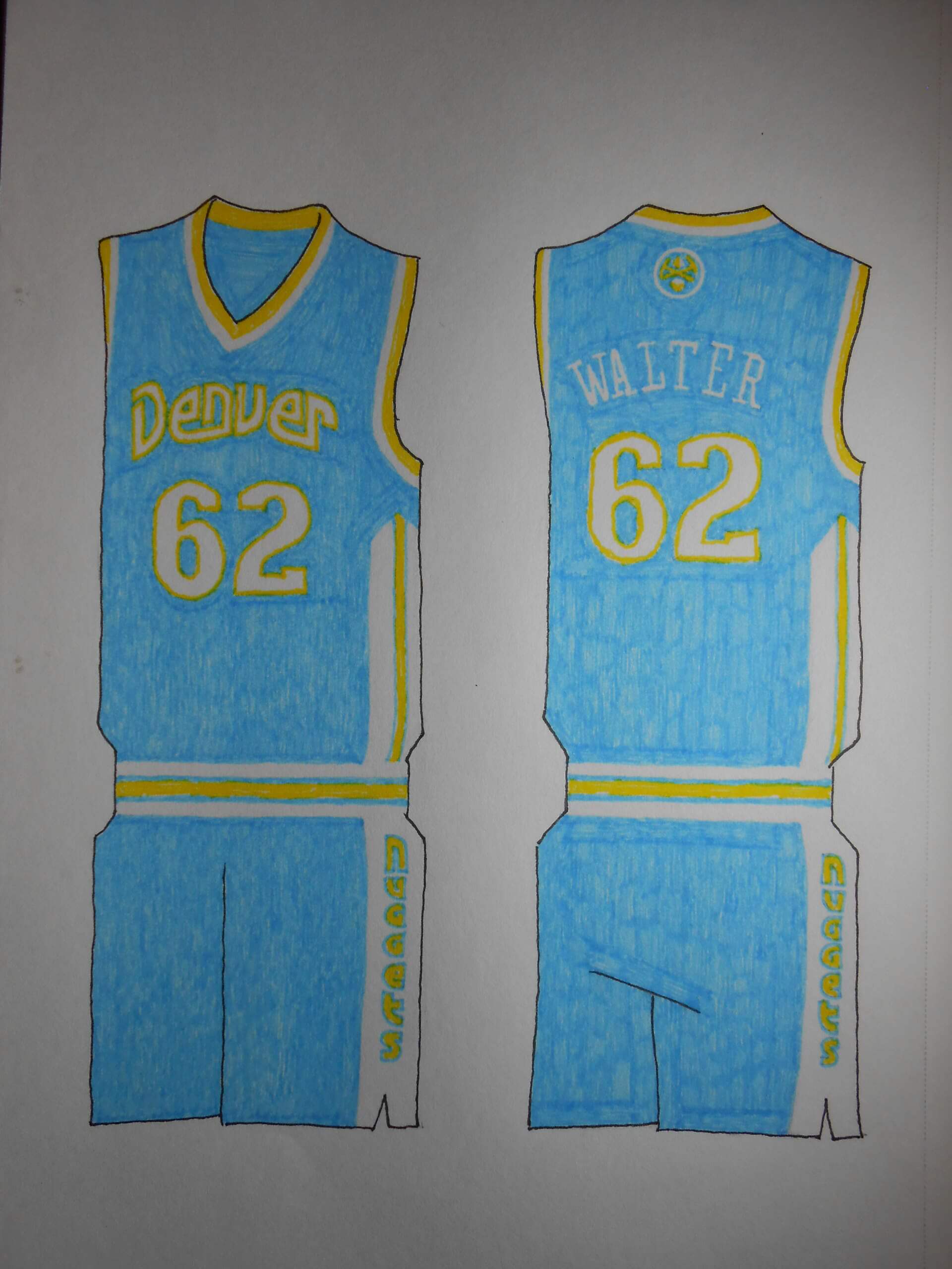
They wore a sensational powder blue uniform with shimmery fabric a few decades ago. That deserves an encore. The Nugs have oodles of great uniforms to choose; the rainbow design got plenty of consideration.
GOLDEN STATE WARRIORS
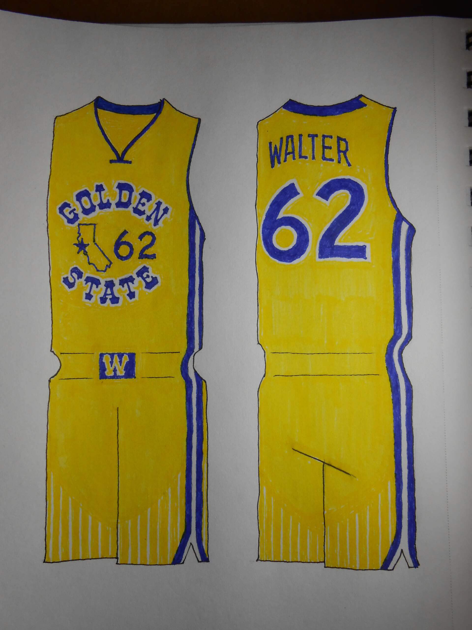
This was a joy to design, taking heavily from the ’70s look which the team wisely reprised in the 2010s. My favorite detail is the white pinstripes on the gold shorts.
HOUSTON ROCKETS
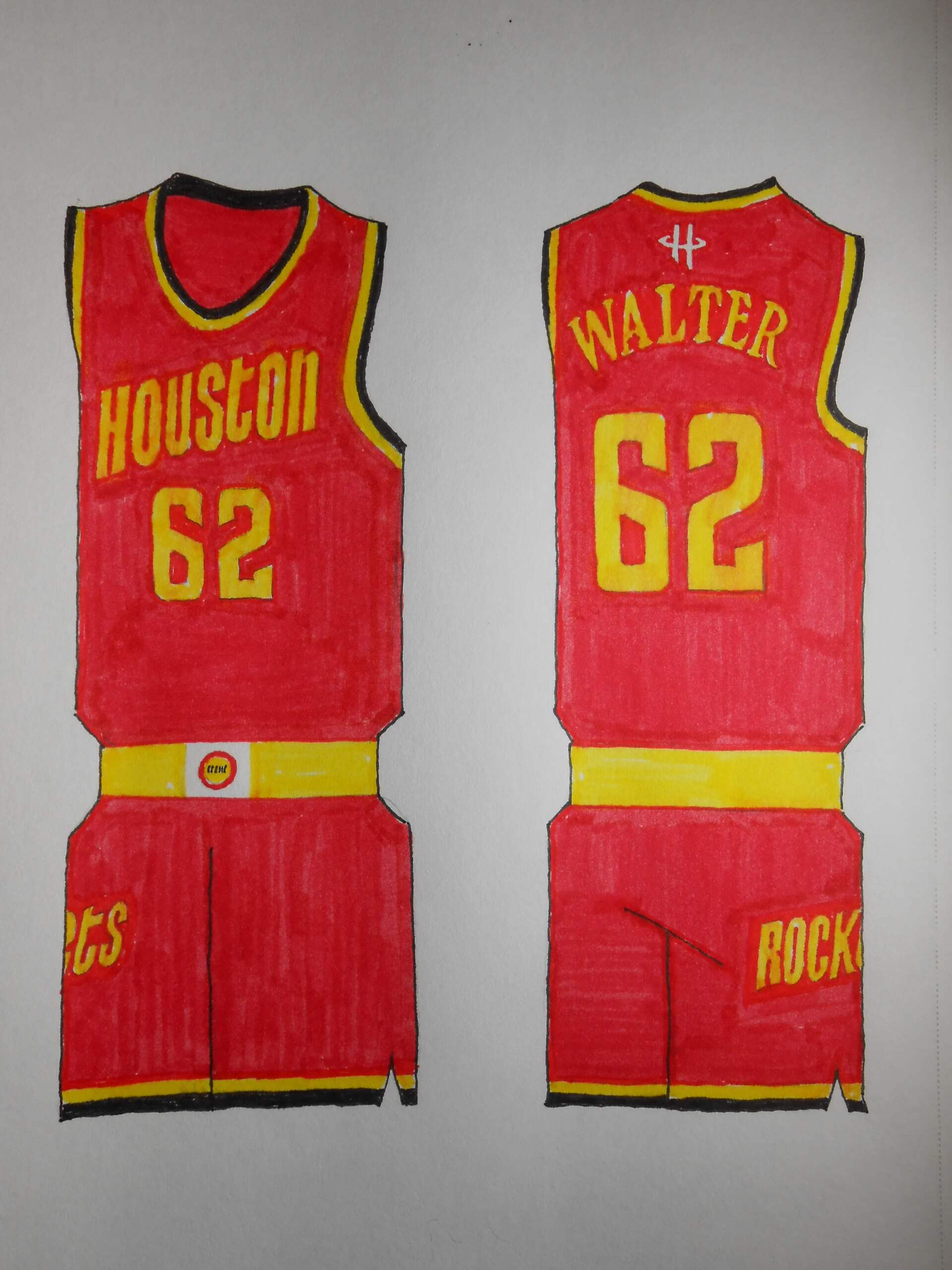
Two NBA titles were won in the solid red uniforms, so that’s how we’re gonna roll. I always thought they could’ve used more color, so here’s some mustard with your ketchup.
LOS ANGELES CLIPPERS
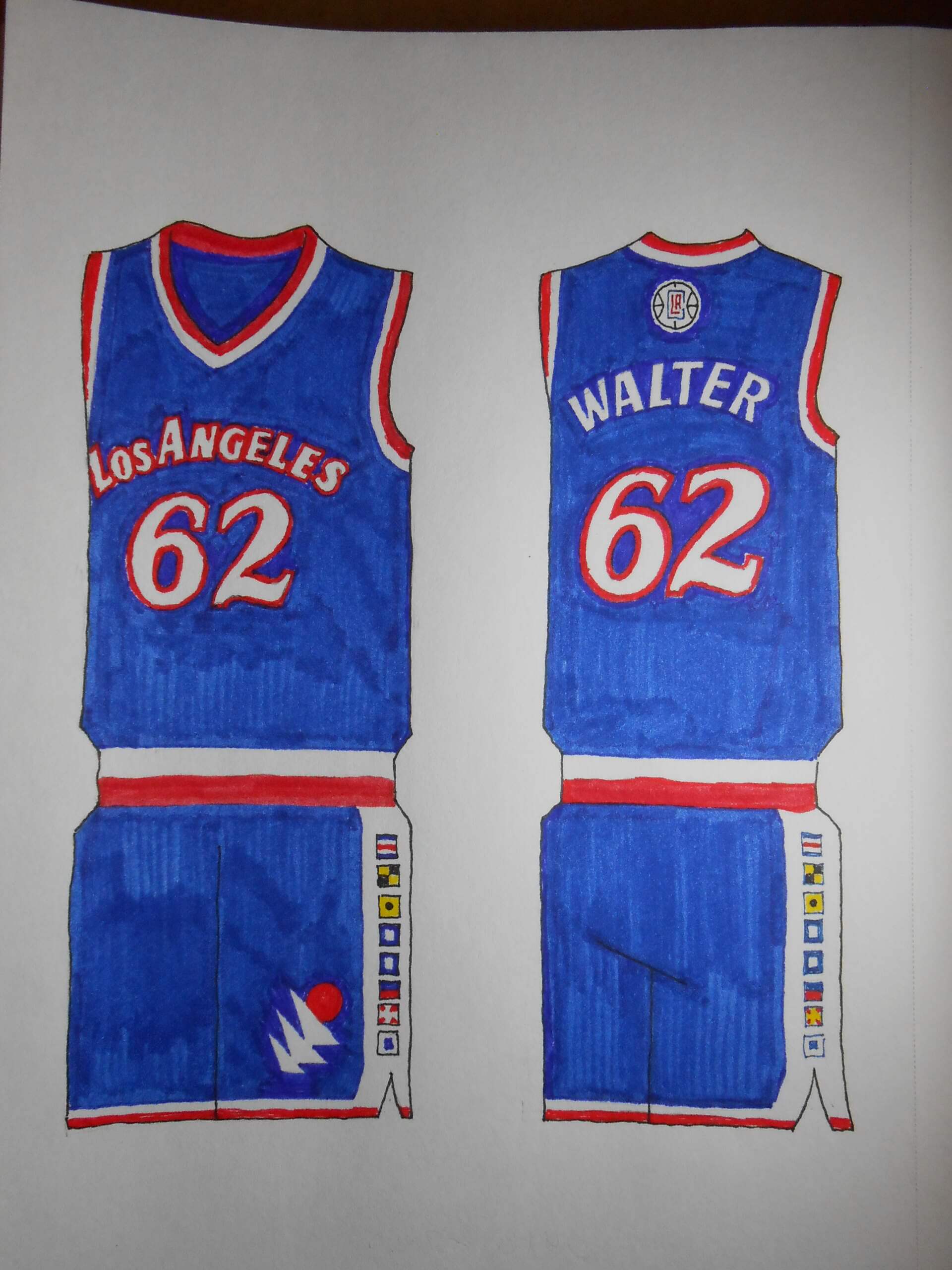
A team still waiting for its ship to come in. I used the first San Diego uniforms with the current color scheme; it’s distinctive, which you can’t say about their current get-ups.
LOS ANGELES LAKERS
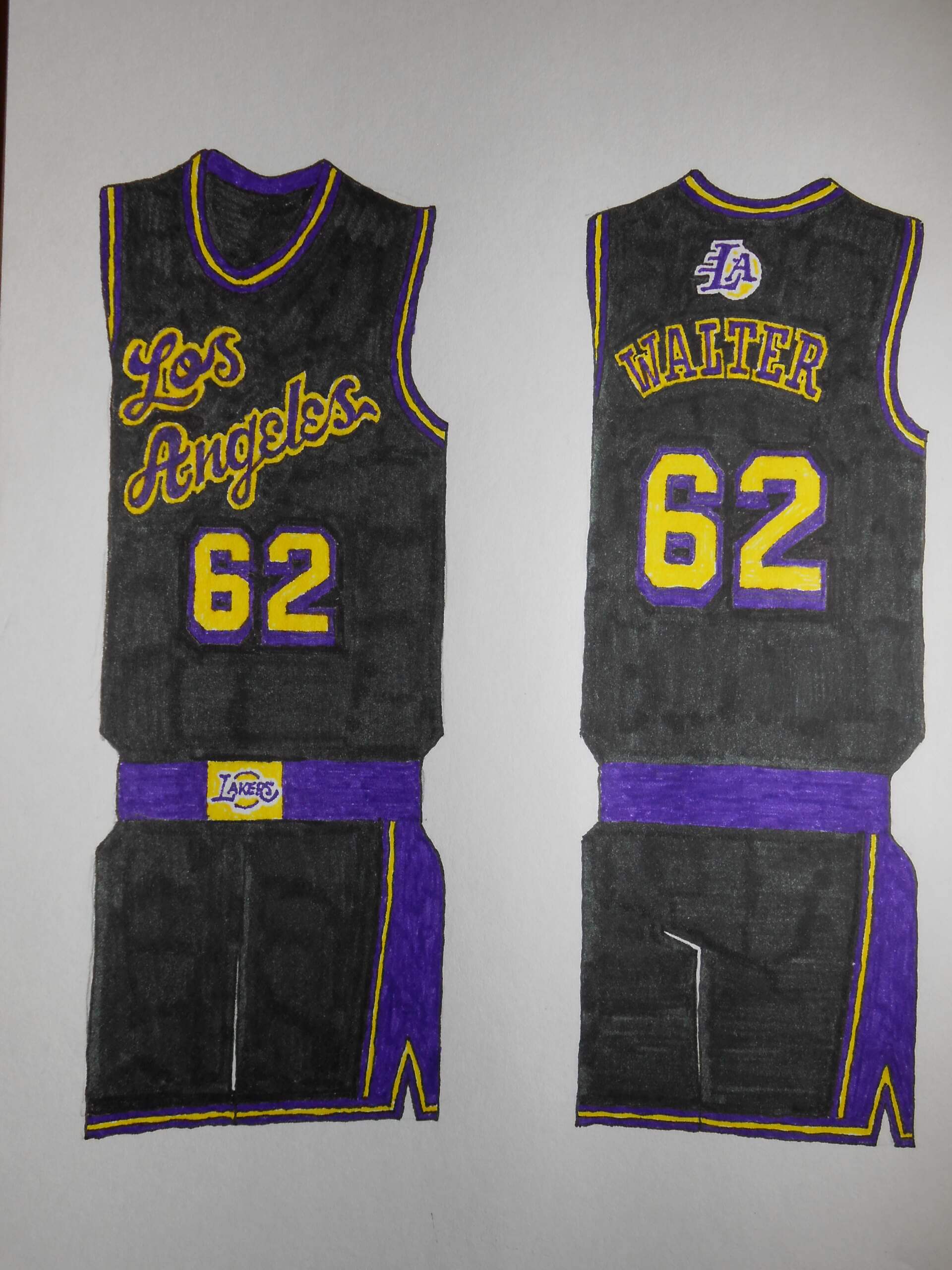
The NBA’s most glamorous team takes the black well, so much better than the white home uniforms which look pale and dull. Certainly a team that calls for brash and inspired ideas. It is literally the face of the league.
MEMPHIS GRIZZLIES
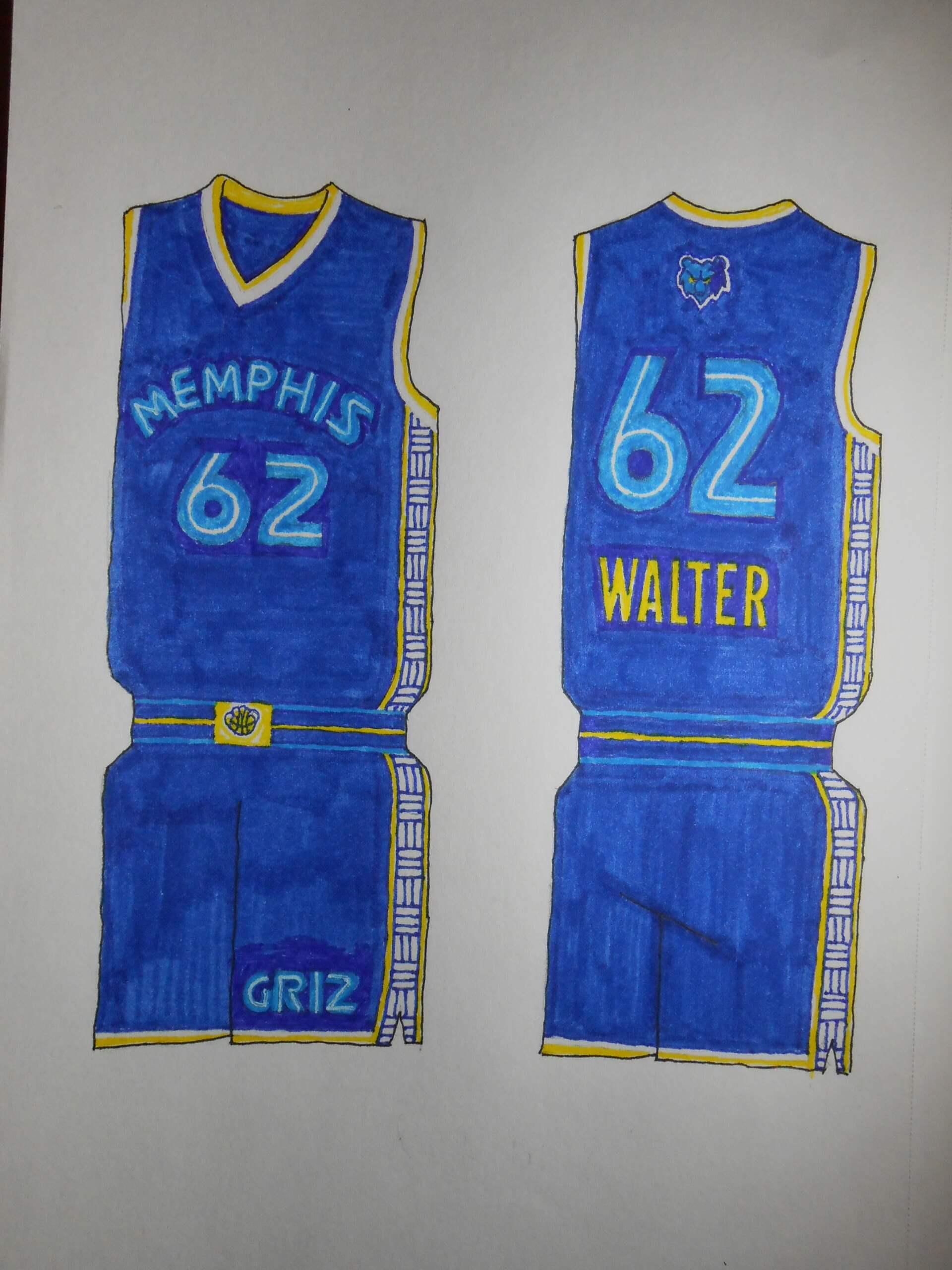
I was tempted to roll with their Vancouver uniforms, the ones with the Haida-designed trim. But that really doesn’t apply to Memphis, so I doubled down on their warp+weft pattern.
MINNESOTA TIMBERWOLVES
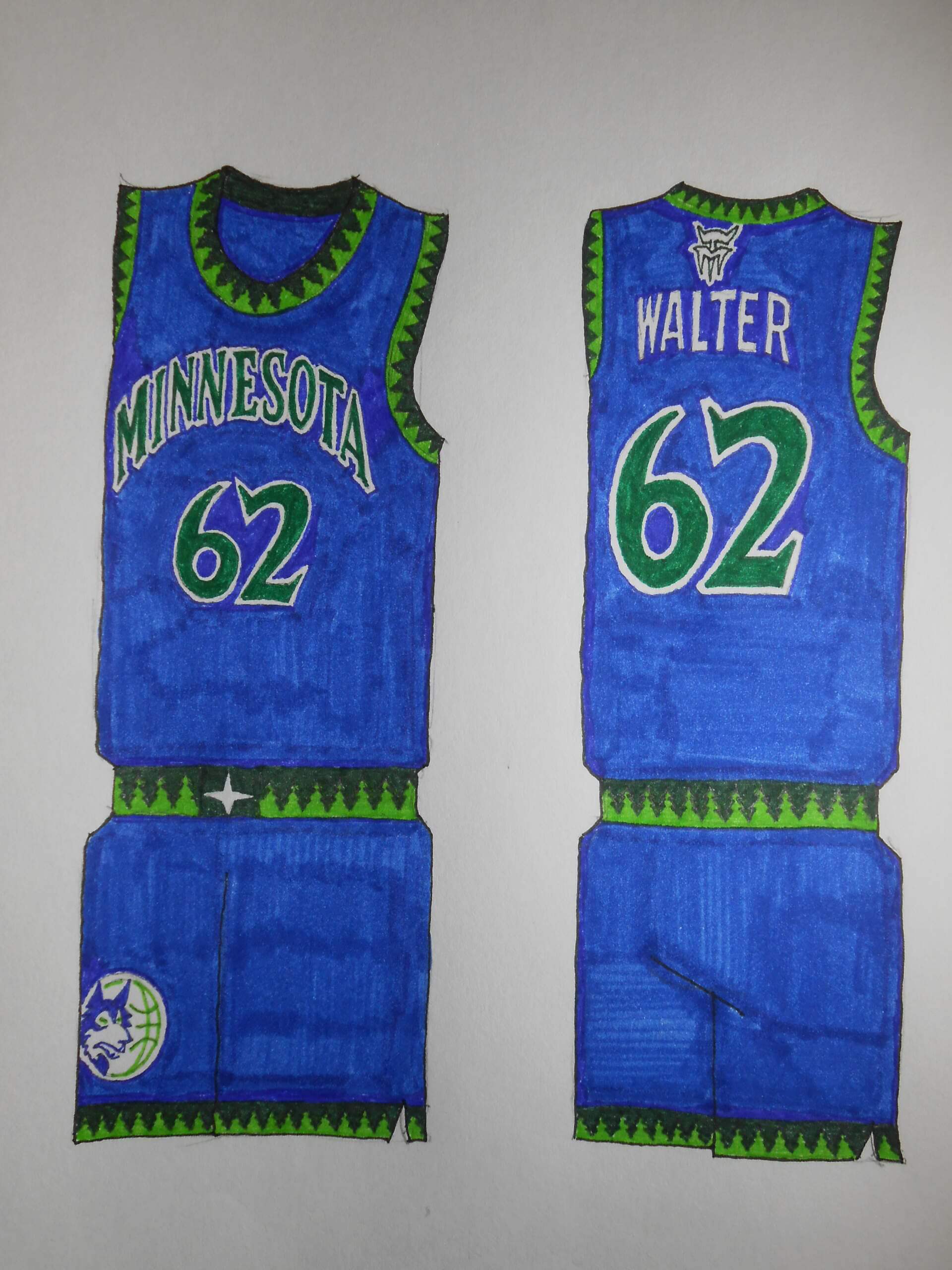
Someday this team’s going to amount to something… but perhaps not during my lifetime. A motif I liked were the repeating evergreen trees on their cuffs.
NEW ORLEANS PELICANS
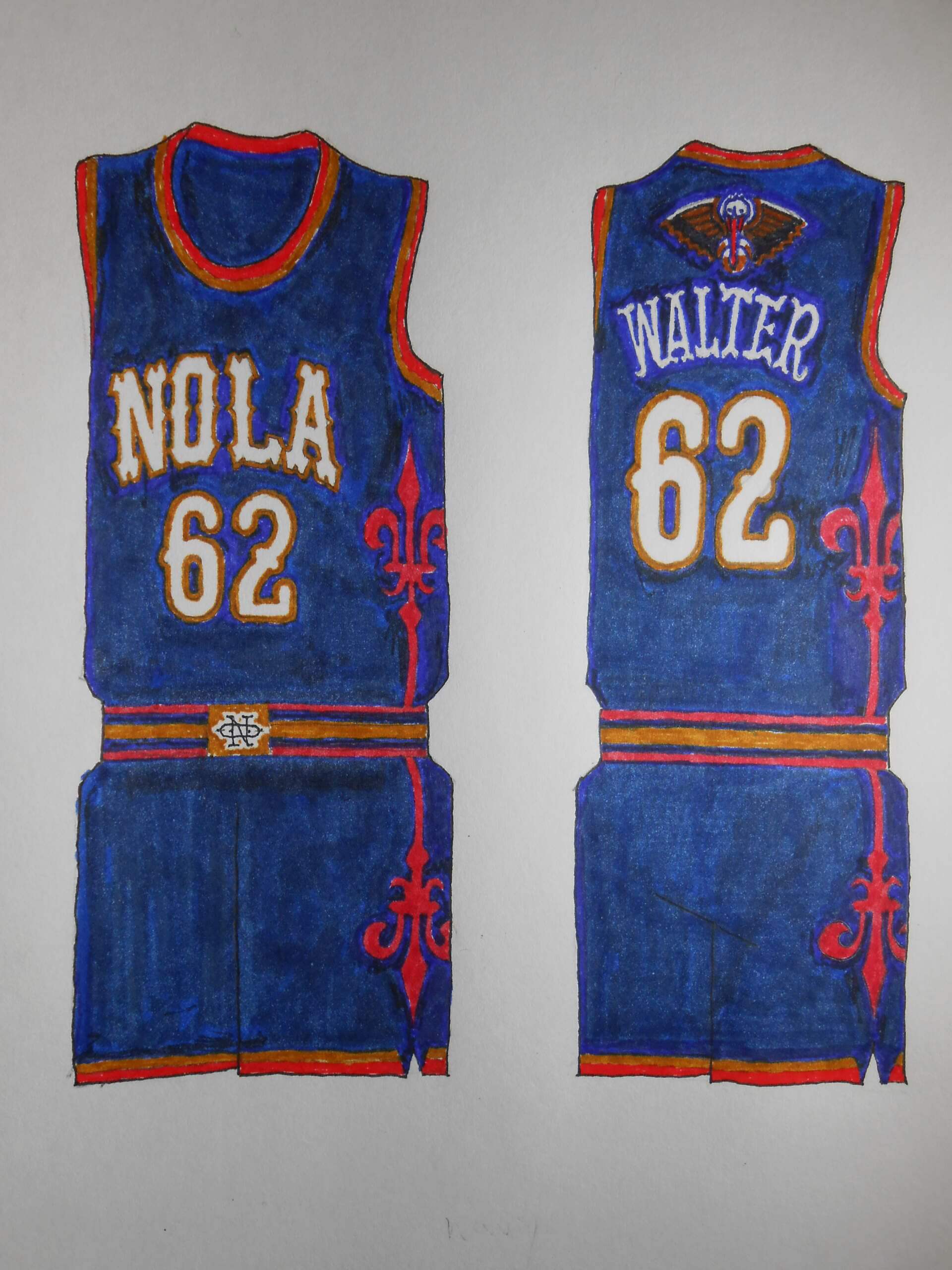
Well, of course there are going to be fleur-de-lys. I think of New Orleans as having plenty of ironwork and it is reflected in the lettering and side panels.
OKLAHOMA CITY THUNDER
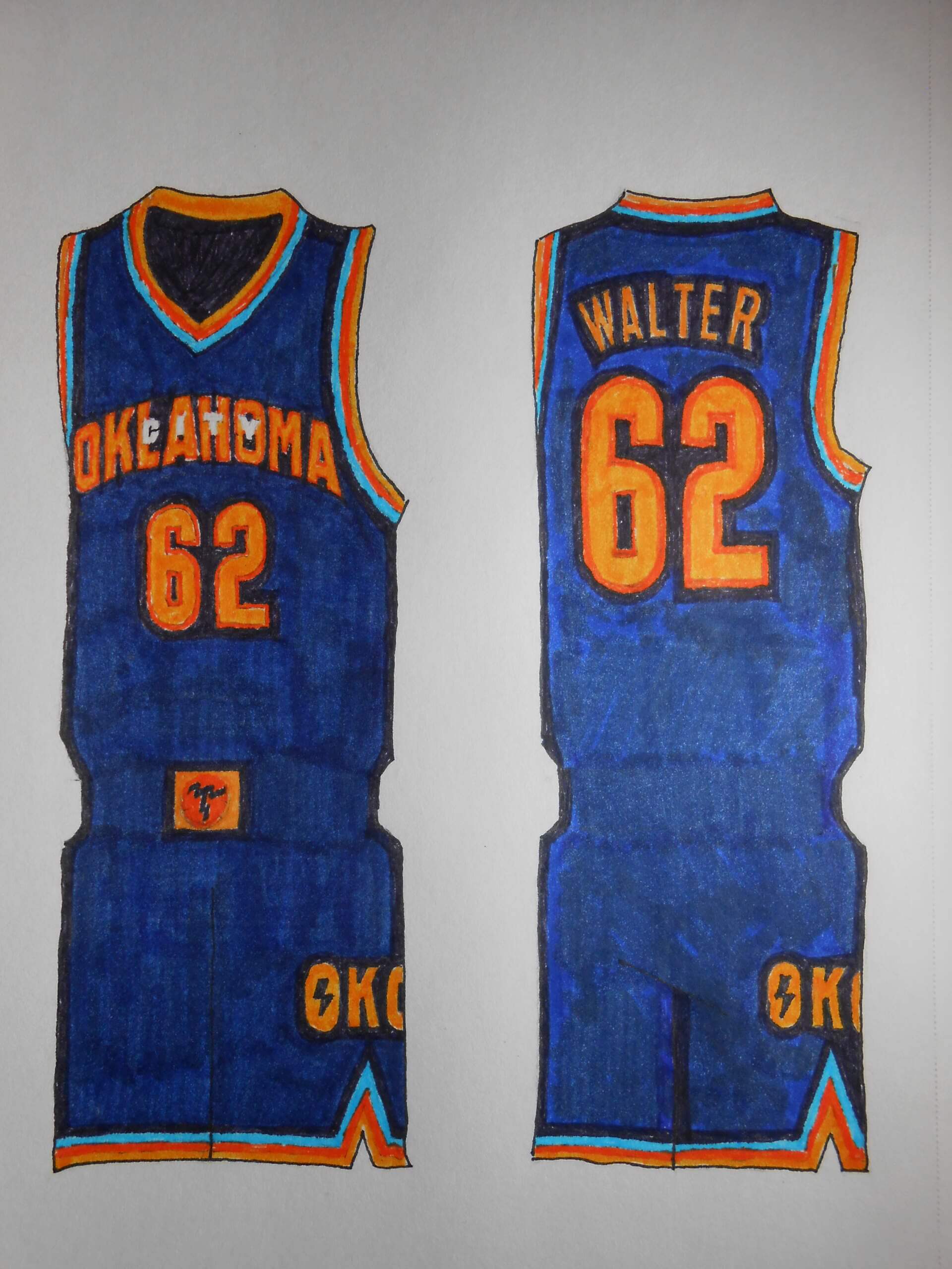
The only thing I saved was the color scheme. It’s hard to fit OKLAHOMA CITY on the front of a jersey, so I used a treatment employed by Illinois State in the 1970s.
PHOENIX SUNS
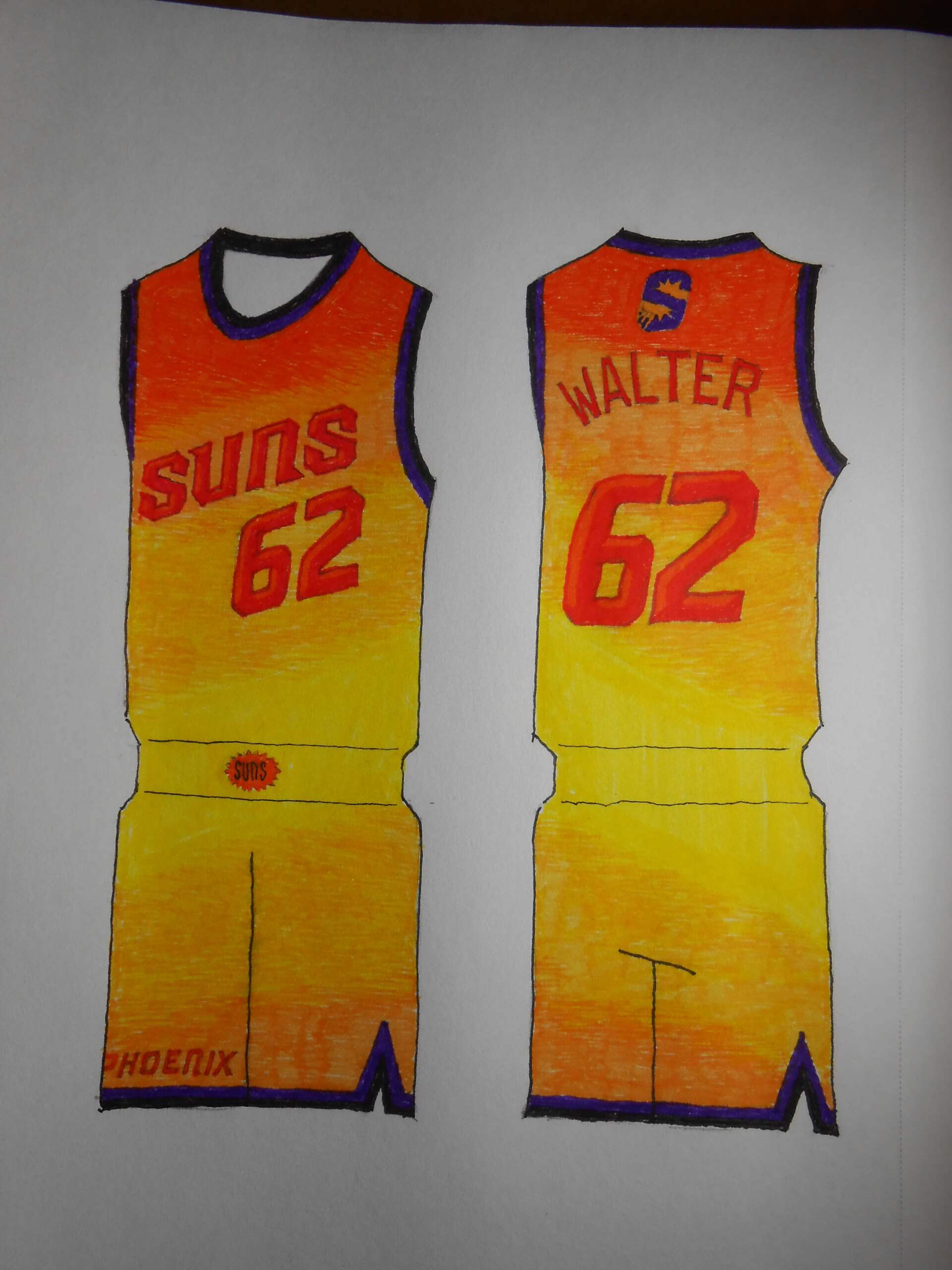
Your team is named after the King of the Solar System: Go bright or go home. I thought long and hard about putting the 1977 PHOENIX lettering on the jersey, but it seemed a shotgun marriage with the vivid color scheme and pattern.
PORTLAND TRAILBLAZERS
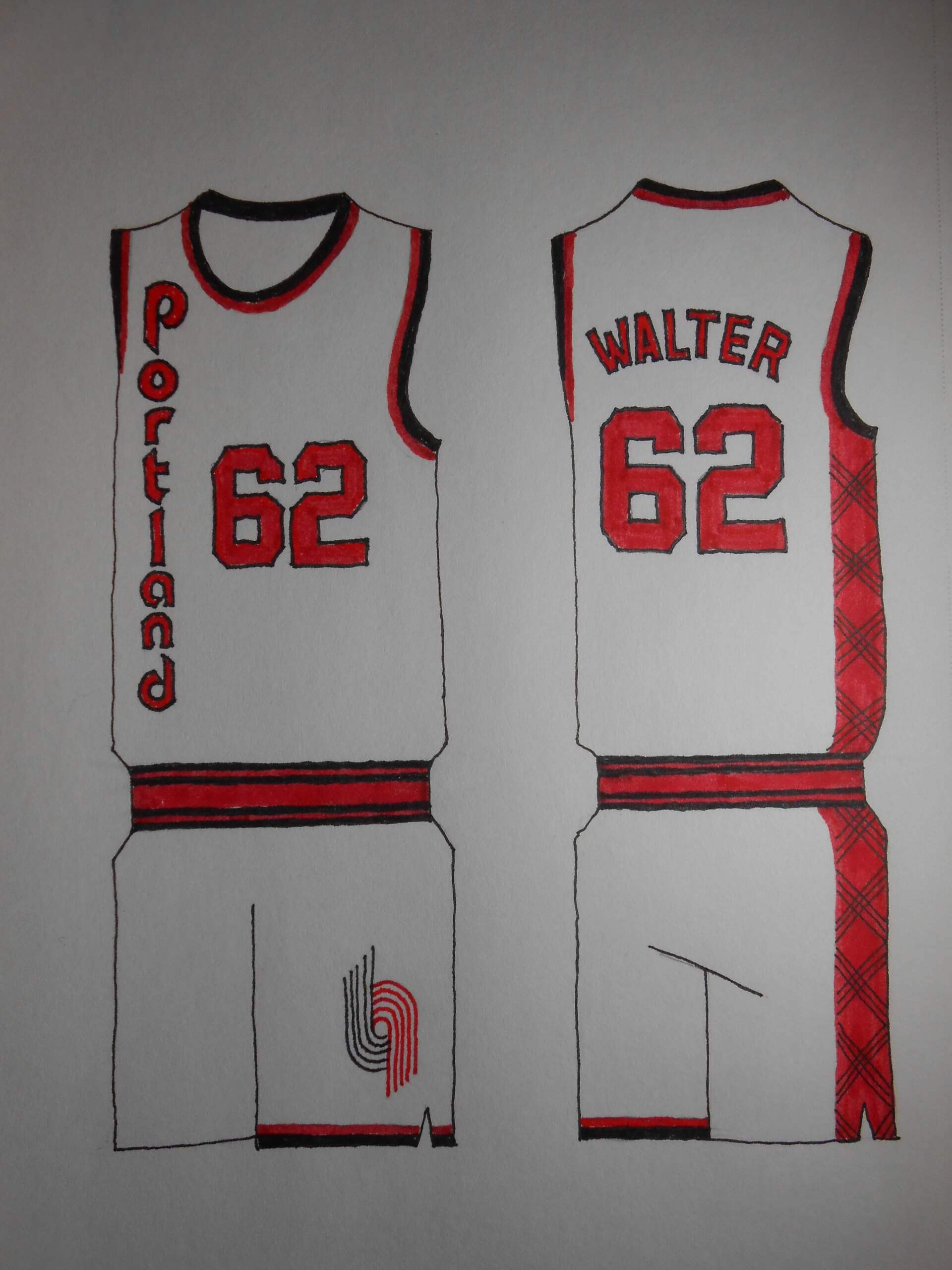
One glorious year. Of course, a redesign was in the pipeline beginning the Blazers’ trademark diagonal jersey graphic. But if they had it to do over, might they have stayed with the vertical word? Let’s assume yes. Jack Ramsey’s sport coat lives on in the side panel.
SACRAMENTO KINGS
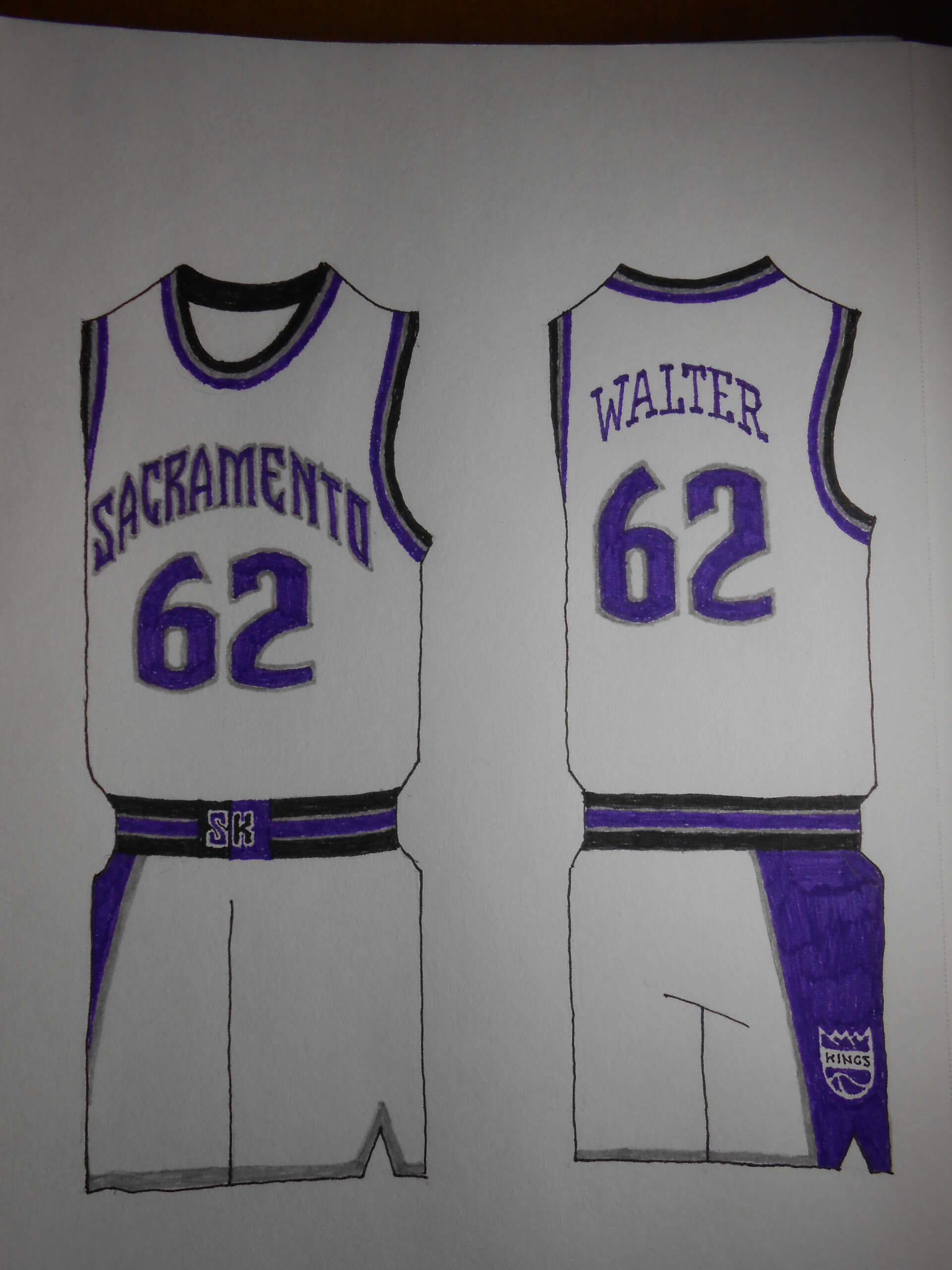
They had very distinctive SACRAMENTO lettering and I was happy to bring it back on what amounts to a Reverse Retro uniform.
SAN ANTONIO SPURS
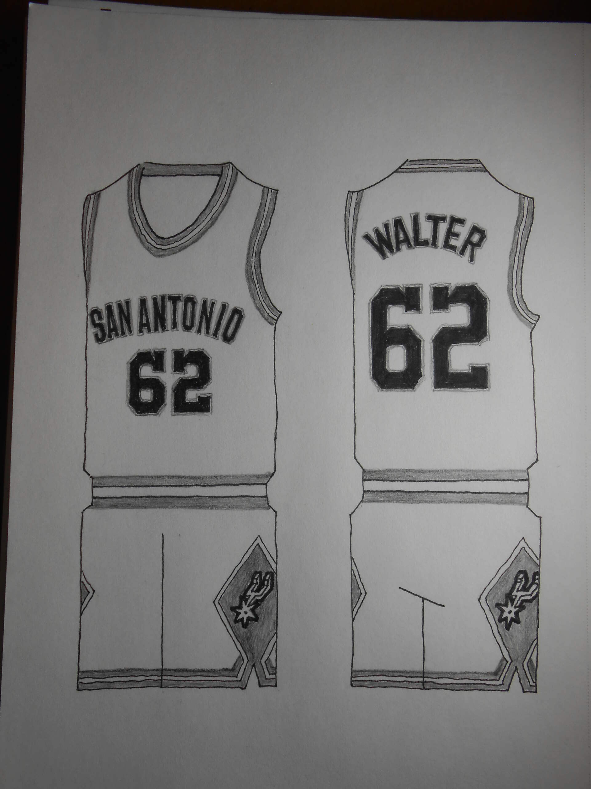
Very much in the spirit of the Reverse Retro NHL program. This is based on my favorite San Antonio uniform, and only the background color is changed.
UTAH JAZZ
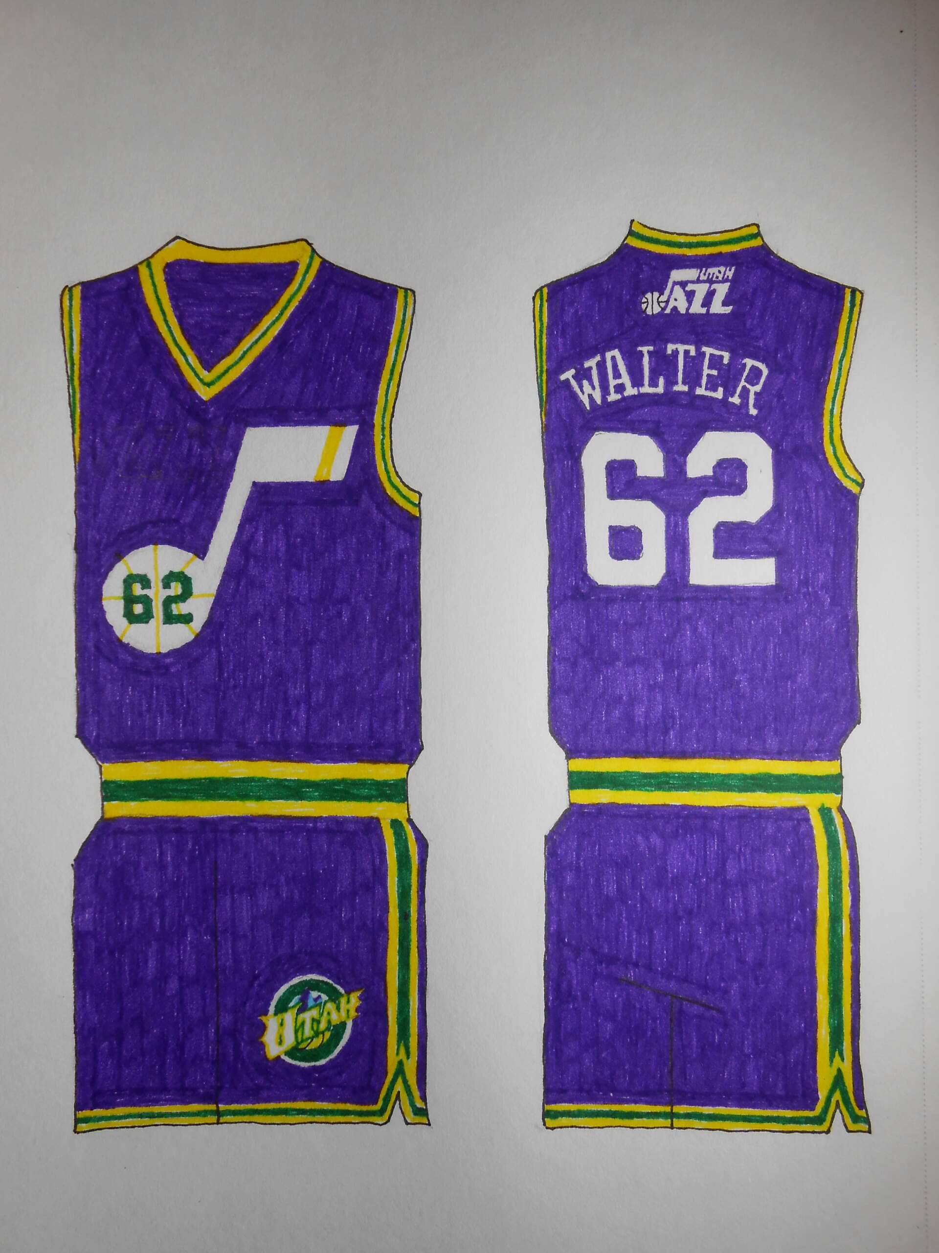
Sadly, this team really has no golden age. So I took the expansion year uniform and simplified the jersey graphics. A multitude of redesigns hasn’t improved on the Mardi Gras colors. I really like their red, orange, yellow, and black suits of recent vintage, but ultimately they were indicative of the flailing the Jazz have done. Purple, green, and gold make me think of their honeymoon, and Pistol Pete.
Thanks Walter! Another fantastic set of designs! We’ll have the final part very soon.
These NBA concepts are almost perfect. Minor nitpicking: Lakers should not have black on their unis (just my opinion), and the orange “SUNS” wordmark is not very legible. Otherwise, an excellent effort.
I too love just about all of these concepts, except for the Lakers. Their BFBS are the worst of all of the BFBS unis if only because their purple, yellow, and white unis are gorgeous.
The devil is in the details, after all, and if I had it to do over, I might have put a yellow outline around the titles.
As far as the Lakers are concerned, when you walk the walk, you are free to talk the talk. Their pixie dust and white-hot spotlight earned them a BFBS uniform. Kobe’s thumbs-up didn’t hurt either. As with the Suns, I might have relied more heavily on yellow outlines as purple doesn’t create the contrast I was hoping for. Of course, a white uniform would be improved by using more yellow trim.
Count me in as not being a fan of the Lakers in anything that isn’t purple and yellow. And I also wasn’t a fan of the shimmery powder blue of the Nuggets. I miss their pickaxe jerseys.
For the Suns, only thing I’d do is outline the letters and numbers in purple for a little more contrast.
Everything else is fantastic. Thanks for sharing these!
Great job on these, Walter! I love how well-thought-out your designs are and, as always, your hand-drawn execution is flawless! I love the attention to detail on each one, especially on the the logos.
With all that said, I have what I think may be my first quibbles with any of the work you’ve done for Uni Watch ever! The powder blue and gold Nuggets uniforms, while nicely rendered (of course), feel like a slight missed opportunity. Since these are City Connect concepts, I would have loved to have seen a design with the rainbow logo that featured the city skyline in front of the mountains.
The other one I’d like to see a redo on is the Lakers. The BFBS looks they’ve worn have never worked for me, which I admit may be partially due to the eye roll-inducing “LA Nights” branding schtick they have used for them. I’d love to see a purple version or even a white. (Yes, I realize you consider them dull, but you’ve done such great work with other white uniforms in this series, I’m sure you could put something together for the liquors that would look respectable.)
I look forward to these design suggestions in a future volume of your uniform designs. ;^)
Count on it! The feedback I got made me realize I’d missed some opportunities with the Nets, Wizards, and Knickerbockers. Issuing so many versions of the rainbow duds walled me in, to an extent. I lovelovelove the original version with the navy blue and green trim. Really, the only thing left is to put the rainbow on a yellow uniform, which would greatly diminish its power, or to resort to using the rainbow for the waist and armhole trim, which has the potential to be disappointing. My greatest ambition was to revive the chunky ’70s lettering, and make sure “Denver” was front and center.
Is “Liquors” a local nickname, or were you undone by your autocorrect? :)
Autocorrect fail! (Insert facepalm emoji here )
Seeing all these makes me miss the SuperSonics even more.
Hopefully soon they’ll be back.
Your wish will be granted with the next batch of uniforms. Stay tuned!
Walter Helfer never disappoints.
I try… thanks, Marty!
Fact!
The only critique I have is that the photos of these pages were not well-lit. Using a flash would’ve helped a lot here, as it would increase the contrast between the pages and their images. I’ve actually advised people at work who’ve sent me photos to print off of documents coming from their clients that they should have their clients use the flash on their phones, because sometimes the documents come out too dark to print off clearly.
I know, my photography is slovenly. To be honest, I have trouble judging exposure and using software on my digital camera. My computer software is no-budget, and I constantly coast on my artwork to rescue the project. Things looked very nice when I could PhotoShop them at work, but I don’t have that job anymore.
Love the semaphore “Clippers” on the shorts! Inspired! Why haven’t they done it already?
They did! Back when they were the San Diego Clippers (the semaphore was on the pants from 1978 through 1983)
link
Love how you ‘made lemonade’ with OKC!
In a perfect world, I’d have used Letraset’s “Shatter” typeface for all the graphics. It would be a nightmare to stitch, and I hate sublimated uniforms that have printed numerals and names. My favorite detail is the word “CITY”; the only white object on the jersey.