For all photos, cick to enlarge
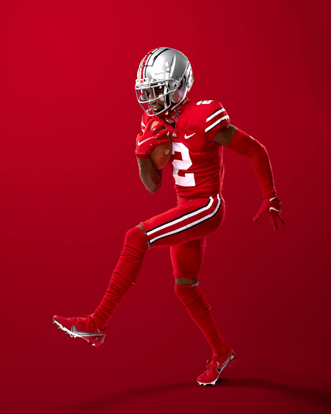
Things will look a little different for Ohio State’s matchup against Penn State on Oct. 30, as the Buckeyes yesterday announced that they’ll be going mono-red for that game. (Yes, I know, OSU prefers to say “scarlet,” but come on — it’s red.)
On the one hand, this is a drag. Ohio State’s standard home set is one of the best uniforms in college football, and doing the mono/rash/etc. thing seems like a lame-o capitulation to predictable Nikefication trends.
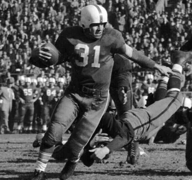
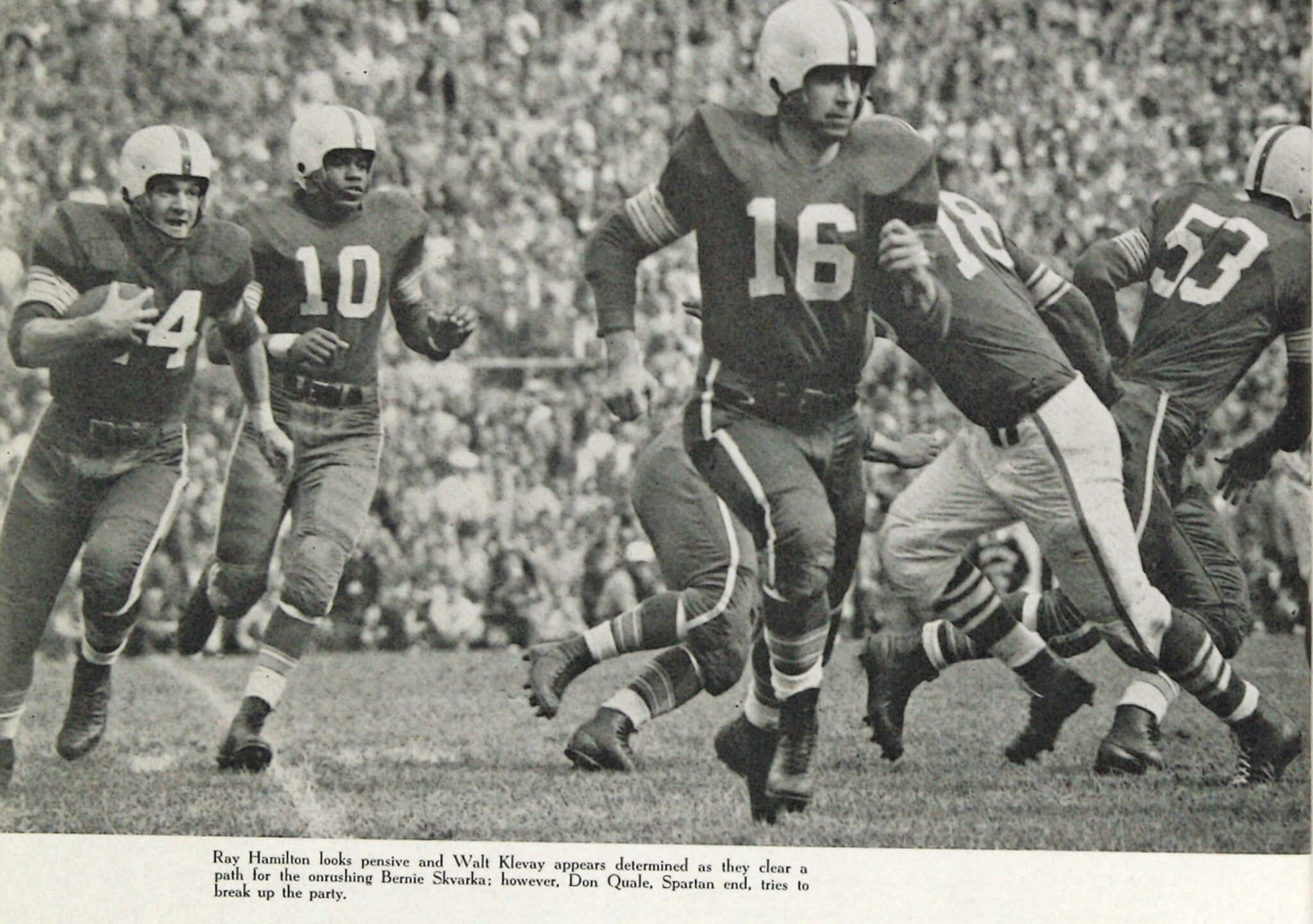
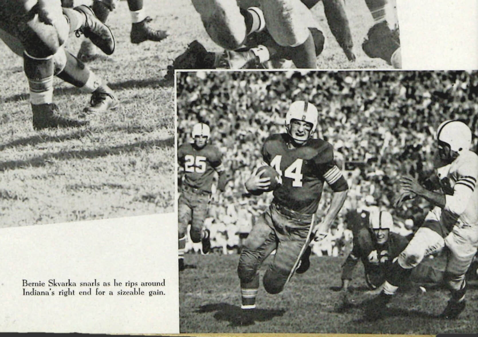
On the other hand, however, there is historical precedent for OSU wearing red pants and even going mono-red, although not in the modern era. In fact, in 1951 — Woody Hayes’s first season as head coach — the Buckeyes wore solid-red uniforms (helmet notwithstanding) for most and possibly all of their games, as seen in this photo of running back Vic Janowicz eluding a Pitt tackler:
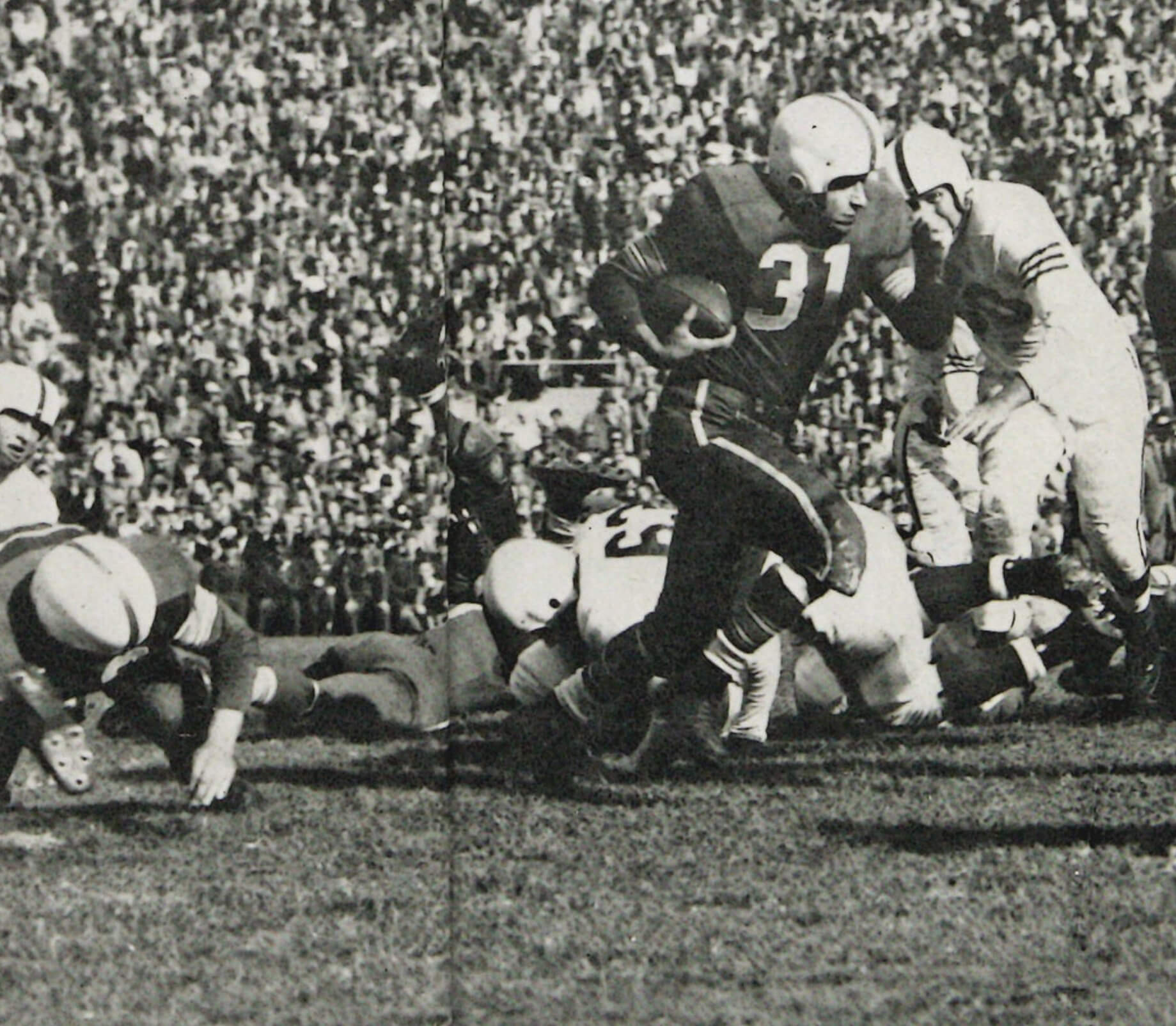
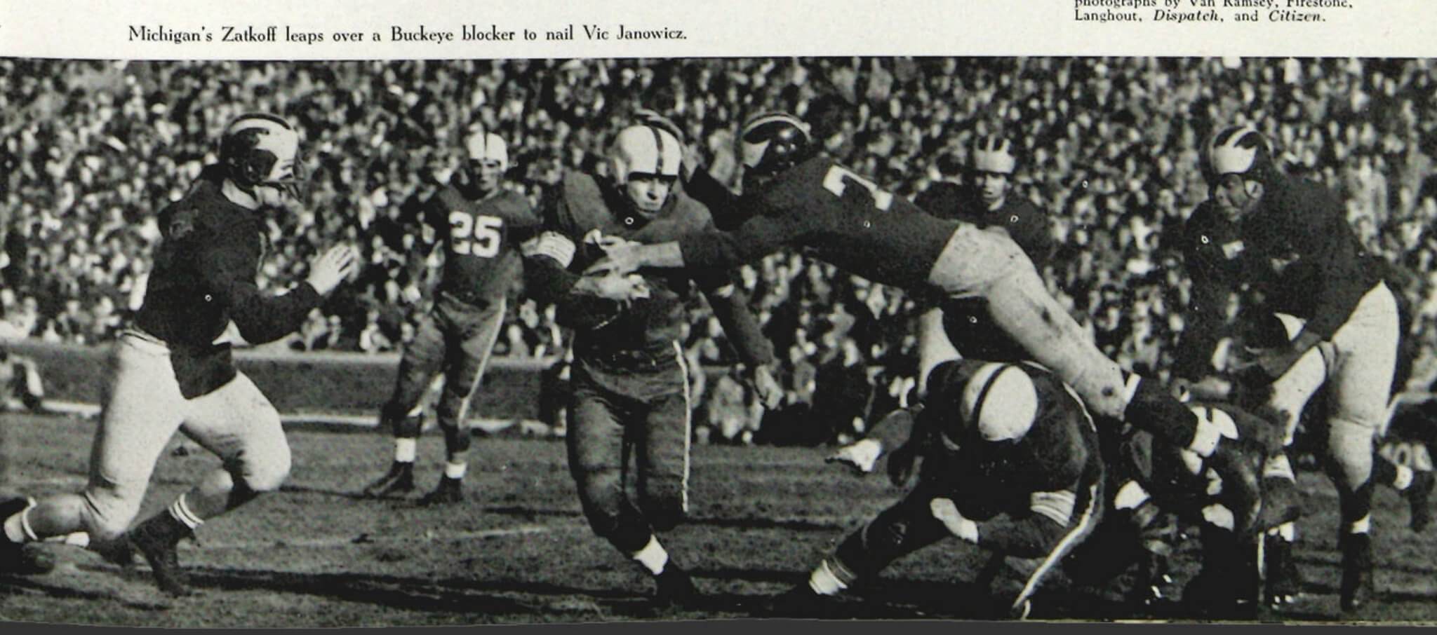
Here are some additional photos from that season:
In addition, OSU wore red pants with white jerseys quite a bit from 1947 through 1950. Here are some examples of that:
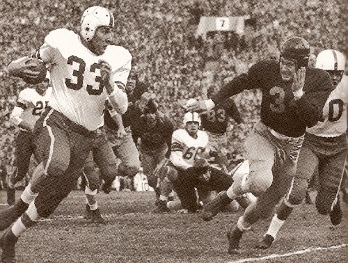
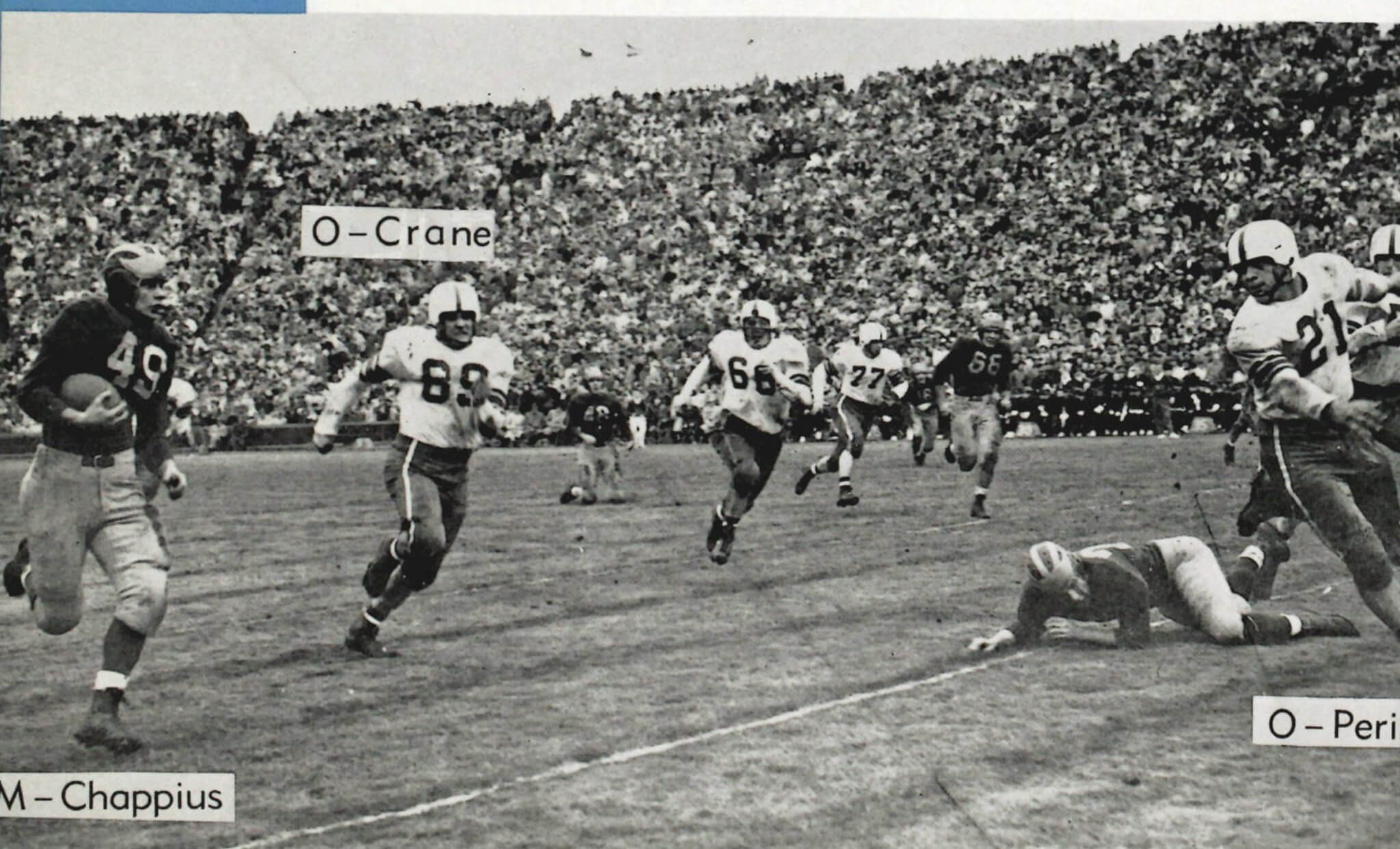
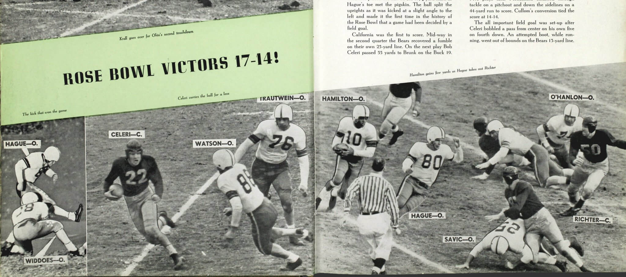
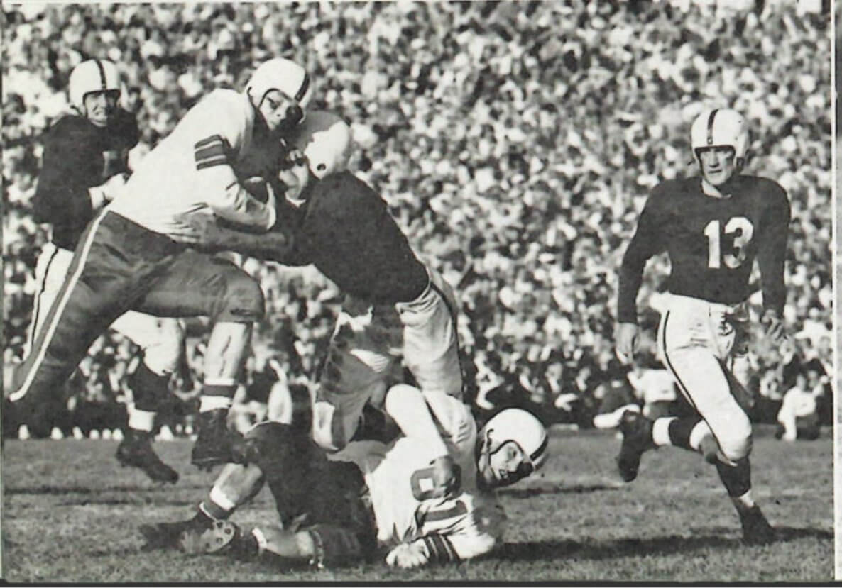
(Most of these photos come from old yearbooks. If you want to investigate further, look here.)
The school’s announcement of the new all-red uni didn’t mention any of this history, which is really disappointing. Would’ve been a nice way to tie the past to the present.
Anyhoo: The new uni still feels too much like a costume to me. But if you can’t wear a costume on Halloween weekend, when can you? Plus I’m invigorated by learning about the history of the red pants (which I hadn’t been aware of until now), so I’m in a charitable mood. Okay, Buckeyes — have fun with it!
(My thanks to George Ashburn and, especially, the great Blaise D’Sylva for their research/photo assistance.)
🚨 VAZOU!
Trago aqui a primeira imagem completa da nova camisa alternativa do Philadelphia 76ers.
Esse uniforme ocupa a vaga do City Edition e resgata elementos importantes da história da franquia. pic.twitter.com/n70Bo7p6wa
— Camisas da NBA (@camisasdanba) September 27, 2021
NBA leaks, continued: The 76ers’ latest alternate surfaced yesterday via multiple sources (including, as shown above, NBA leakmeister Igor Coelho).
Lots to like here, including the 1970s-era chest lettering and the rainbow-striped side panels, the latter of which are inspired by the team’s 1980s center-court logo.
I’m sure we’ll be seeing a lot more of these leaks in the weeks to come.
Click to enlarge
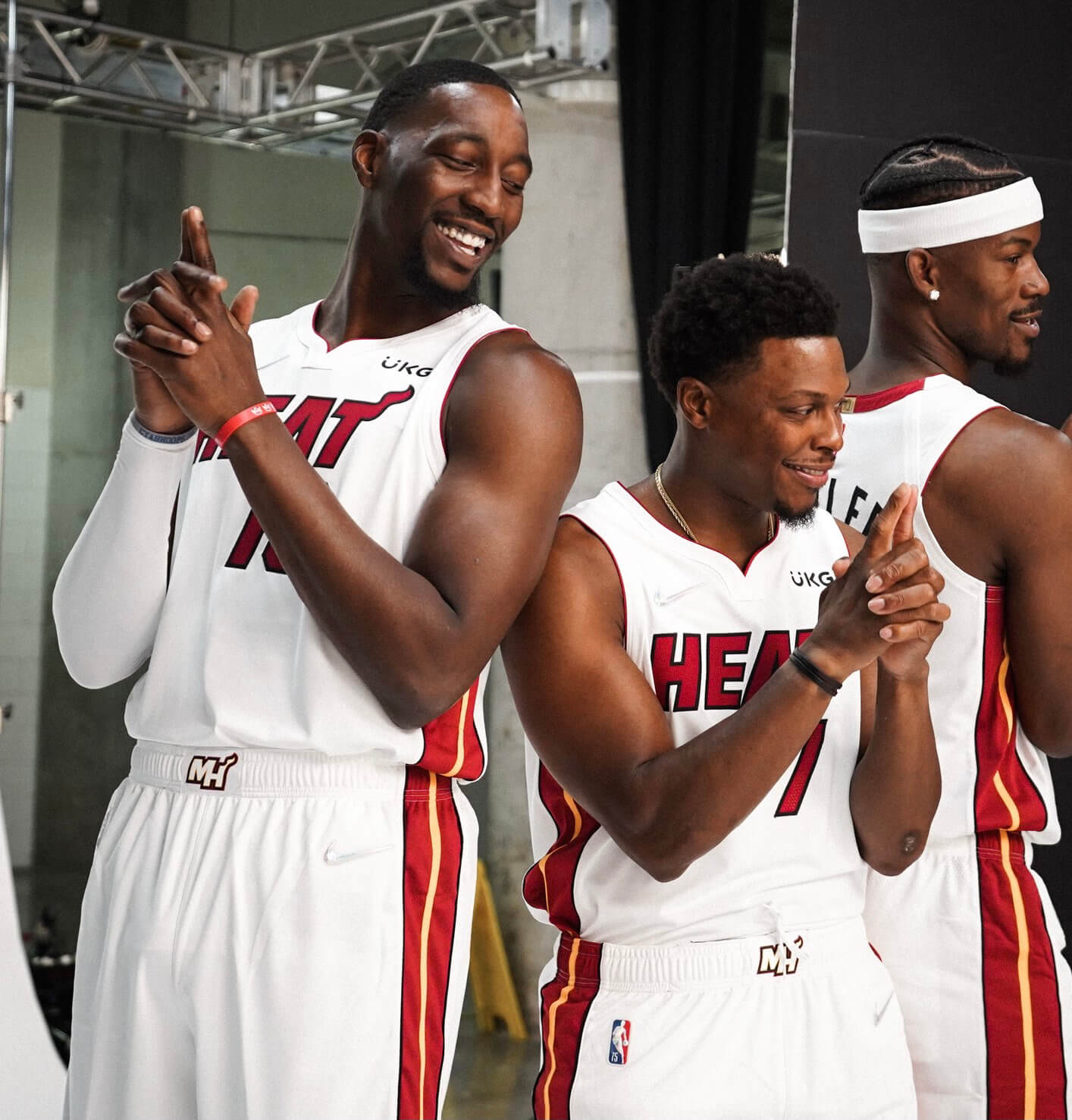
Early anniversary gift: We’ve known for a while now that the maker’s marks on NBA uniforms would be diamond-themed this season (part of the league’s 75th-anniversary celebration), but up until yesterday I don’t think I’d seen how that would look on white uniforms.
As you can see in the Heat promo shot above (one of many pics that emerged from yesterday’s NBA Media Day sessions), the crystallized swoosh largely blends in with the white background fabric and is much harder to discern. I count that as a plus!
Only question now is whether this will prompt a directive to reduce the use of white uniforms.
(My thanks to Twitter-er @livensleazy for this one.)
Click to enlarge
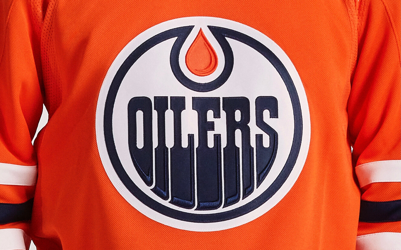
Into another dimension: Notice anything different about the crest on this Edmonton Oilers jersey? If you’re a keen observer of NHL jerseys, then you probably spotted the raised-embroidery highlights on the lower-right edges of the oil drip and the letterforms.
The NHL is calling this “dimensional embroidery,” and it will apparently be used on every team’s crest this season. The league, oddly, has barely promoted or even mentioned this new development (I’ll be asking them for more info later today), but SportsLogos.net has a good breakdown of the details for many teams, which I encourage you to check out here.
Click to enlarge
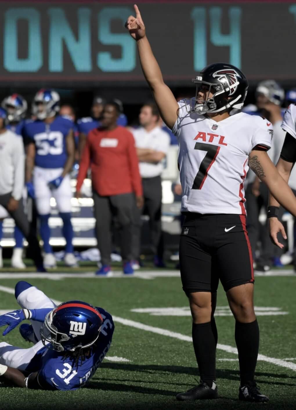
ATL FC: Falcons kicker Younghoe Koo has been wearing short pants for years now. He used to make the effort to wear full-length hosiery, but at some point he stopped bothering with that, leaving a pretty fair expanse of exposed skin. As I looked at this photo of him from Sunday’s game against the Giants, it suddenly hit me: He looks like a soccer player. The shorts, the socks, the exposed knees — he’s playing the wrong kind of football!
For those who are wondering, Koo gets away with this because kickers and punters are generally excused from the NFL’s usual rules regarding pants, socks, thigh pads, and so on, so he won’t be fined or anything like that.
Click to enlarge
Collector’s Corner
By Brinke Guthrie
Follow @brinkeguthrie
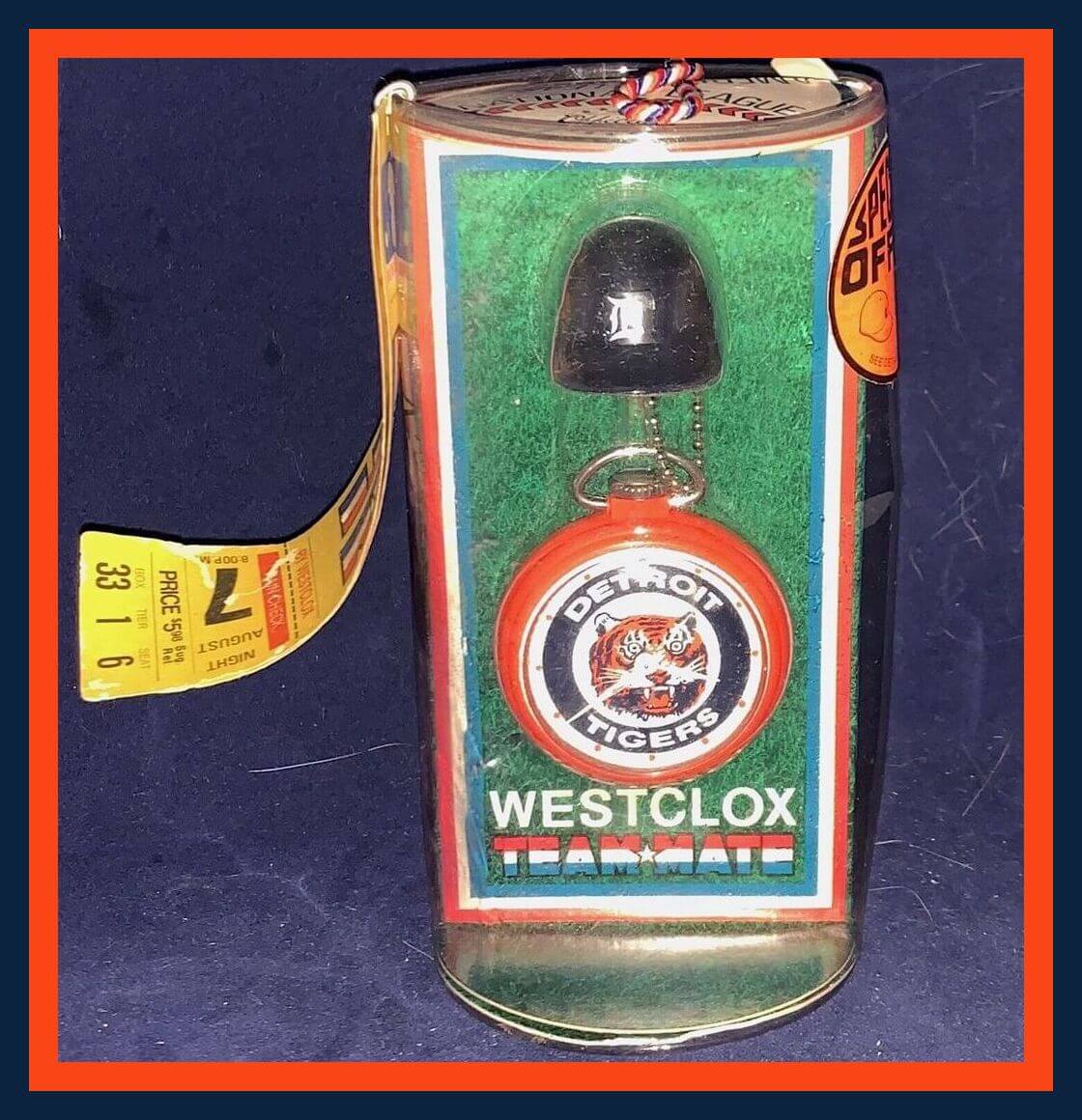
Leading off this week with this dandy little item, a Detroit Tigers pocket watch by Westclox. Got a little helmet key fob there, too. The box says copyright 1968; I don’t recall ever seeing these, though Westclox also made these in a companion “Lollipop” design, as seen here, also for the Tigers, that I remember fondly. I had a Reds version of that around 1972-1973 and loved it.
Now for the rest of this week’s picks:
• Here we have Boston Bruins salt and pepper shakers. Because, why not?
• I am including this Clyde Drexler desk souvenir for two reasons. One, I like that little Spalding basketball. And two, “The Glide” ranks up there with the best sports nicknames ever.
• Here’s a glass mug for the 1974 Birmingham Americans WFL team. (Is it me, or does that logo remind you of what you might see at a local quickie-stop place? Fill ’er up at your local Ameri-Mart!”) Also reminds me of this abandoned Houston Astros logo.)
• The 1964 “Go-Go Phillies” recorded this 45-rpm record, and it was a smash hit.
• White Riddell cleats are featured on the cover of this 1969 Oakland A’s scorecard. I wish Riddell would start making cleats for pro sports again, such a cool look.
• The smilin’ mug of Los Angeles Dodgers star Steve Garvey is shown on this 1975 Pepsi Fan Club application form.
• The logo for the 50th MLB All-Star Game, held July 17, 1979 at the then-new Seattle Kingdome, is shown on this paper beverage coaster .
• Franco Harris is featured on the cover of this 1980-81 Monday Night Football calendar.
• One more Monday Night Football item: This MNF 20th-anniversary pin (1990) is done up in the NFL shield design.
• And finally, the Royal Premiere of the new 007 movie No Time To Die is tonight in London. As a big Bond fan, I’ve waited a long time for this one. With that in mind, check out this vintage 1965 Aston Martin DB5 from Corgi. Had one of these, and yes, I probably lost the little guy who shoots out of the ejector seat! If that one is too rich for your blood, they’re doing a reissue.

Raffle reminder: In case you missed it yesterday, the good folks at FOCO, who are among America’s premier designers and manufacturers of bobblehead dolls, have generously invited me to raffle off one of their bobbles to a lucky Uni Watch reader. The raffle winner will be to choose any bobble shown on this page (well, except for the ones indicated as Sold Out, obviously).
This is the last day to enter this raffle. USA mailing addresses only. To enter, send an email with your mailing address to the raffle in-box by 8pm Eastern tonight. One entry per person. I’ll announce the lucky winner tomorrow. Big thanks to FOCO for sponsoring this one!
The Ticker
By Alex Hider

Baseball News: Reds P Reiver Sanmartin made his Major League debut yesterday. While he is identified on the roster as not having a space in his last name, the jersey he wore included a two-word NOB. Even more curious is the fact that he wore a one-word NOB during spring training (from Joanna Zwiep). … Speaking of the Reds, in late September 1997, two sets of brothers — Barry and Stephen Larkin and Brett and Aaron Boone — took the field at the same time to play the four infield positions. Interestingly, Aaron Boone was the only player to wear FIOB (from Daniel Donell). … Royals C Salvador Pérez broke the single-season home run record for catchers on the road in Cleveland last week. Pérez didn’t get the ball back, as the fan who caught it took it home — reportedly without authentication. Pérez says he thinks the fan will have a hard time selling the ball. “That ball’s not gonna [be worth] anything anymore after you get out and leave and go home,” he said (from Chris Mattox). … The Twins have changed the color of the jacket they present to their team Hall of Fame inductees from the navy used in years past to powder blue (from Luke H.). … Speaking of the Twins, they didn’t wear a World Series sleeve patch in the 1987 Fall Classic — even though the Cardinals wore one (from Paul Quinn). … Cleveland has started putting up Guardians branding at their ballpark. Yesterday was their final home game as the Indians (from Eric Berkey). … The West Virginia Power of the Atlantic League of Professional Baseball will unveil a new team name today, though the team has confirmed that they will continue to occasionally wear Charleston Charlies throwback jerseys next season (from @BallparkHunter and Dan Siegel). … New logo for the Puerto Rican winter league, or the LBPRC (from Tyler Maun).

NFL News: If you were watching Fox on Sunday and thought that analyst Daryl Johnston was looking a bit like WKRP in Cincinnati’s Herb Tarlek, you’re not alone (from Glenn, who didn’t give his last name). … Browns P Jamie Gillan wore the team’s regular home white pants, not the throwback pants, on Sunday against the Bears. Note the center brown stripe, which is much wider on the throwback pants (from @realisticbrowns). … Staying in Cleveland: There’s a lot going on in this video from the Browns/Bears game Sunday — with former Ohio State QB Justin Fields starting for the Bears in Cleveland, TV cameras caught a few fans playing both sides and shedding Fields’s college jersey to reveal Browns gear. Those fans were also standing next to Browns superfan “Pumpkinhead” — who wasn’t wearing his trademark pumpkin head, giving the strange visual of a fully-uniformed football player in the stands. … More from Cleveland: While we’ve seen former Browns like Josh Cribbs repurpose socks into arm sleeves, I don’t think I’ve seen a player repurpose them into an armband, like LB Jeremiah Owusu-Koramoah did Sunday (from Jesse Evers).
College Football News: BYU will wear white helmets and jerseys with royal blue pants on Friday against Utah State (from Phil). … Also from Phil: Miami will wear orange jerseys and white pants on Thursday. … The ACC Tracker is updated through week 4. … Here’s a great piece on the history of non-traditional numbers in football (from Phil). … I’m not sure where this photo was taken, but I’m quite sure I’ve never seen a mono-plaid football uniform (from Paul Palmer and @CarsonFentz).

Hockey News: All NHL jerseys this season will be made from 50% recycled content (thanks to all who shared). … The Rangers will retire Henrik Lundqvist’s No. 30 on Jan. 28 (from Phil). … Syracuse’s club men’s hockey team unveiled a new logo after the school announced that club teams could not use the school’s “Block S” logo. The new logo, featuring a skating orange, proved to be a hit, and the post went viral. But social media sleuths quickly pointed out that the logo bore some resemblance to the Milwaukee Admirals’ “skating fridge” throwback logo from 2019. The Syracuse club team then acknowledged that its skating orange was indeed based on the skating fridge. After checking with the fridge’s designer, the club team then announced that it’s scrapping the new logo and going “back to the drawing board.” … North Carolina’s club hockey has the player of the game wear a helmet with ram’s horns in the locker room (from James Gilbert). … The Hurricanes have unveiled a new (and extremely loud) helmet ad (from Michael Smith).

Basketball News: We have our first look at the updated championship tab on the back of the Bucks’ jerseys (from David Hanson and Chad Lehman). … New ad patches for the Rockets (who made theirs even more obnoxious by re-orienting it from a roundel to a larger rectangle), Knicks, Kings, and Nets (thanks to all who shared). … Meanwhile, the Grizzlies appear to have dropped their ad patch, at least for now (from Phil). … With many teams holding their media day availability yesterday, NBA numerologist Etienne Catalan was busy. See the latest number assignments for lots of players over on his Twitter page. … Speaking of media day, Warriors G Steph Curry came up with a creative spot on his uniform for stashing his cell phone (from Phil). … Rejoice, Hoosiers fans — sleeve piping has returned to Indiana’s basketball uniforms, along with a few other minor changes (thanks to all who shared).

Soccer News: Minnesota is getting a new USL W-League club, and yesterday the team revealed four names that its ownership group is considering: Arctic Minnesota, Iron Minnesota, River Minnesota and Minnesota Aurora (from our own Jamie Rathjen). … Also from Jamie: The NWSL’s Orlando Pride wore suicide-prevention-themed warm-up shirts, supporting the local mental health charity To Write Love on Her Arms. … New shirt for German club Hertha BSC’s esport team (from Ed Żelaski). … SC Freiburg of Germany’s Bundesliga have played their last game in historic Dreisamstadion as they prepare to debut their new stadium next week (from Kary Klismet).

Grab Bag: Your tax dollars at work: Uni Watch proofreader Jerry Wolper noticed that one of Professional Bull Riders’ uni advertisers is the U.S. Border Patrol. … New logo for automaker Volvo (from Phil). … Two of the highest-profile candidates in Boston’s mayoral race — Michelle Wu and Annissa Essaibi George — are using purple and pink for their campaign colors. Not something you see in most elections (from Paul Friedmann). … The White House has its own custom traffic cones (from @PhillyPartTwo). … The Space Force hopes to lock down the design of its service dress uniform by the end of the year. … Atherton High School in Kentucky has changed its team name from “Rebels” to “Ravens” (from Josh Claywell). … New men’s volleyball uniforms for Russian club Zenit Kazan (from Jeremy Brahm).
So, does that Simmons Sixers leak turn into another instance of “uniforms never worn by the player?”
Would have liked it better with a single-color white name treatment on the back, but that is a minor nitpick.
Love the nod to the Spectrum on the side panels. And if you wanted to stretch the meaning further, you have colors that go with the non-Sixer pro teams representing Philadelphia.
– Red: Phillies
– Orange: Flyers
– Green: Eagles
– Blue: Union
My first thought was, is this a nod to PRISM? But then remembered the Spectrum court design.
I agree about the PRISM reference. Prism and the Spectrum (and the Flyers) were owned by Spectatcor/Comcast back in the day.
Why do all of those college football players in the lead look like they’re in their middle 40s? I guess thats=’s what playing without a facemask will do to you.
I’ve written about this:
link
Incredible …
Looking back at that link, did anyone else wonder if Y.A. and Robert Duvall were separated at birth?!
-C.
tOSU’s normal set is one of the best in the game, but if they’re going to wear red pants, how about pairing it with the white jersey, or even a gray one? At least the latter choice wouldn’t be GFGS.
Regarding the Larkins and Boones, I also found it interesting how much more the letters were spaced out on Stephen’s jersey compared to Barry’s.
In the second paragraph on Younghoe Koo, he’s referred to as Kim.
Fixed.
“The school’s announcement of the new all-red uni didn’t mention any of this history, which is really disappointing. Would’ve been a nice way to tie the past to the present.”
This would assume the school / Nike was even cognizant of the Buckeyes’ red pants history when coming up with this uniform. My money is on the design is mono-red for mono-red sake.
Also notice how much more tolerable the mono red looked in the 50’s with sock stripes.
>Also notice how much more tolerable the mono red looked in the 50’s with sock stripes.
Along with black shoes instead of red shoes.
on the raised embroidery front for the Blackhawks, the link is wrong. It says the hawks face graphics have been flat forever. It always been chain stitched and dimensional. Maybe they accentuated it with this method but it was not flat.
As an OSU alum, I can’t stress enough how much I hate the color rash all red uniforms. It’s not like Nike or the university stands to make any extra money from sales of red pants. They are called the “men of scarlet and gray” for a reason. Just stick to your usual look Buckeyes.
As a Michigan alum, I felt the same way 3 weeks ago against Washington. The mono-navy look was not good.
I feel that Michigan, OSU, Penn State, and Wisconsin have an obligation to withhold what the Big Ten represents, and these gimmick uniforms ain’t it.
Can’t wait to see an all Maize treatment…to include a Maize helmet with blue striping.
I have no horse in this race. But I will demonstrate how context is everything: That solid red Ohio State uniform would make an incredible Arizona Cardinals’ uniform.
Super strong blog today. It seems like three days worth of stuff. Thanks!
Thanks, Jim. One of those days!!
I know the Cowboys slightly changed their pants color last year, but they looked even more blue to me last night. Was it just me/lighting?
From one Patrick to another, it was not the lighting. They did look more blue, almost like a dark powder blue, if that makes sense.
My first thought was Ohio State is a brand that really shouldn’t be playing in these reindeer games. Then I think about how Notre Dame has participated in the alt crazy lately. And the uniform definitely looks like tOSU, so I guess have at it. I think I may be biased because I’ve never really been a fan of mono red.
Second point, BYU does more with less better than almost anyone. They look sharp and traditional every week without getting too crazy and you always can tell it’s them.
*alt craze
OSU has done the alt thing for years now, the worst is when they do it against Michigan too. A beautiful looking game ruined by mono-grey and whatnot
There are a few schools that shouldn’t mess with their uniforms: USC, Notre Dame, Ohio State, Michigan, Oklahoma, Penn State, Texas, and Alabama. I now believe only USC and Alabama haven’t worn an alternate uniform.
Nike design team: Hold my beer
Alabama wore houndstooth alternates Nov 13, 2010.
Just leaves the men of Troy
What alts have PSU and Texas worn that aren’t throwbacks/fauxbacks? Both of the ones I’m thinking of for either team are barely not their regular uniforms. Iunno that I would put them in the same group as the Adidas years of Michigan or Ohio State’s few non-throwbacks that have ventured into newer territory, like the grays and blacks. They are alts, yes, but iunno that I would call them out as “messing” with anything in particular (same applies to Alabama’s houndstooth alt, frankly).
i can see biker with the big thighs and tight shorts, but i do not in the least see a soccer player when i see that atlanta football place-kicker. his shorts are too tight, and too short for one. his socks are too thick, and the wrong style, they more resemble a business man in sandals on the weekend. not to mention the sock length is waaaaay shorter then standard soccer socks.
throw into that the helmet and pads, and he doesn’t look like the players i watch. and i have not even brought up that at 5’9″, he would be the smallest, squattest player on that pitch too; the average height for a bundesliga player is 6″(as an example). he looks like a football player who kicks instead of ramming his head into people. he pretty much looks like every football player who kicks for the last 40 years, he’s short with massive thighs.
Very simple. It looks stupid and he should be fined.
^^^ 100%.
Fine him, for the good of the game.
And then fine Larry Fitzgerald for making a mockery of football pants all those years ago.
-C.
It was nice of that guy to suit up in a Falcon’s uni and kick a FG after delivering the mail all day. Neither rain, nor sleet, nor approaching defenseman…
tOSU in mono red? Puke-o-rama.
UM in mono blue? Vomit-o-rama.
Hate both.
all i said is he didn’t look like a current era soccer player, and looked more similar to a tour rider. i wasn’t really making a judgement either way on how right proper he looked.
frankly, he is a specialized player i see twice a game, his personal choice on how best to kick isn’t worth my outrage. hut-hut, but maybe you guys are right, why allow the actual workers to decide what’s best for doing their job. heck, why allow any positional/individual modifications just to improve the performance of the team? i blame carl harriston, bob golic, and al baker for cutting off their sleeves on the browns defensive line in the 80’s. wah-wah, people are grabbing you? freaking hippies.
Unfortunately I won’t be surprised if they add a thick black outline to that diamond nike logo.
He looks like a soccer player from the 70’s, I’ll give you that:)
Is there a link or backstory to the UNC Hockey helmet? I play at that rink, wanted to share with the fellas.
This weekend, the University of Maryland is asking its supporters to wear black to the game against Iowa.
But the photo accompanying the Facebook ad for tickets shows a player wearing a battleship-grey version of the current uniform with the Crossland and Lord Baltimore flags on the sleeves.
Terrapin teams have worn black, red, white, and even yellow versions of this jersey (the latter was from the soccer team). Is this going to be another colorway?
“Yes, I know, OSU prefers to say “scarlet,” but come on — it’s red.”
Isn’t scarlet just a particularly bright shade of red? It would seem to me that referring to Ohio State’s shade of red as scarlet is simply being more precise, but that calling it red wouldn’t be inaccurate.
Are there any Buckeye fans who care to weigh in? Do you bristle if people refer to your team’s predominant color on most of its uniforms as red rather than scarlet?
Michigan blue Rash vs Ohio State red Rash in November imminent.
End of world shortly to follow, no doubt. :-)
I would not mind seeing this. Red Wings and Maple Leafs went blue vs. red a few years ago and it looked good to me. Plus USC and UCLA going color-on-color is a great contrast game. Being from Michigan (but not a Wolverines fan) it pains me to say that Ohio State has one of the best unis in college football. Easily top five.
I meant to mention it earlier but forgot – Pumpkinhead had the throwback stripe on his pumpkin head this past weekend. Nice touch.
Wow, I feel a bit embarrassed pointing this out, as I’m a spelling disaster, and I’m also surprised I’m the first to notr it, but Sunday is misspelt on the blurb about the Falcons kicker.
Thanks, Laurence. Fixed!