Click to enlarge
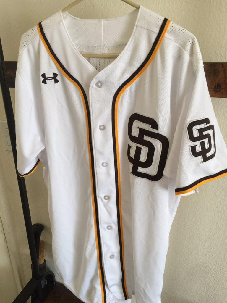
The Padres hold an annual “garage sale,” in which they sell off assorted gear. This year’s was on Sunday, and reader Justin Tyre came away with the Under Armour jersey shown above — an apparent variation on the team’s 2016 home jersey.
As you’ll recall, Under Armour was initially slated to become Majestic’s replacement as MLB’s uniform outfitter. The deal was announced in December 2016 and was originally supposed to go into effect for the 2020 season. Then it was moved up to 2019, then pushed back to 2020, and then scrapped altogether as Under Armour backed out in May 2018 and Nike stepped into the breach.
Somewhere in there, Under Armour presumably produced lots of prototypes. Could this be one of them?
The fact that the jersey is similar to the Padres’ 2016 home design is a promising sign, since it matches up with the period when Under Armour’s original MLB deal was being worked out. And of course we know that the UA maker’s mark was going to be included on the chest of the company’s MLB jerseys (just as Nike’s eventually was). Hmmmm.
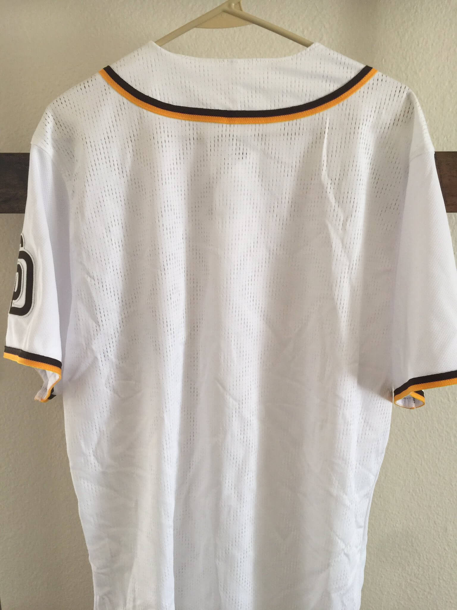
I asked Justin if the garage sale staff said anything about the jersey’s background. “I asked the person there if they knew anything about it, but they didn’t,” he said. “It was on a rack that had a lot of Majestic jerseys from various seasons with ‘Player’ and random numbers on the back.”
A-ha! MLB Style Guide mock-ups routinely use “Player” NOBs, so a rack full of those might well be prototypes or samples. If this Under Armour jersey was included on that rack, it too might be a prototype.
But this jersey is blank on the back — no “Player” NOB, or anything else. But the back fabric has an odd mesh pattern:
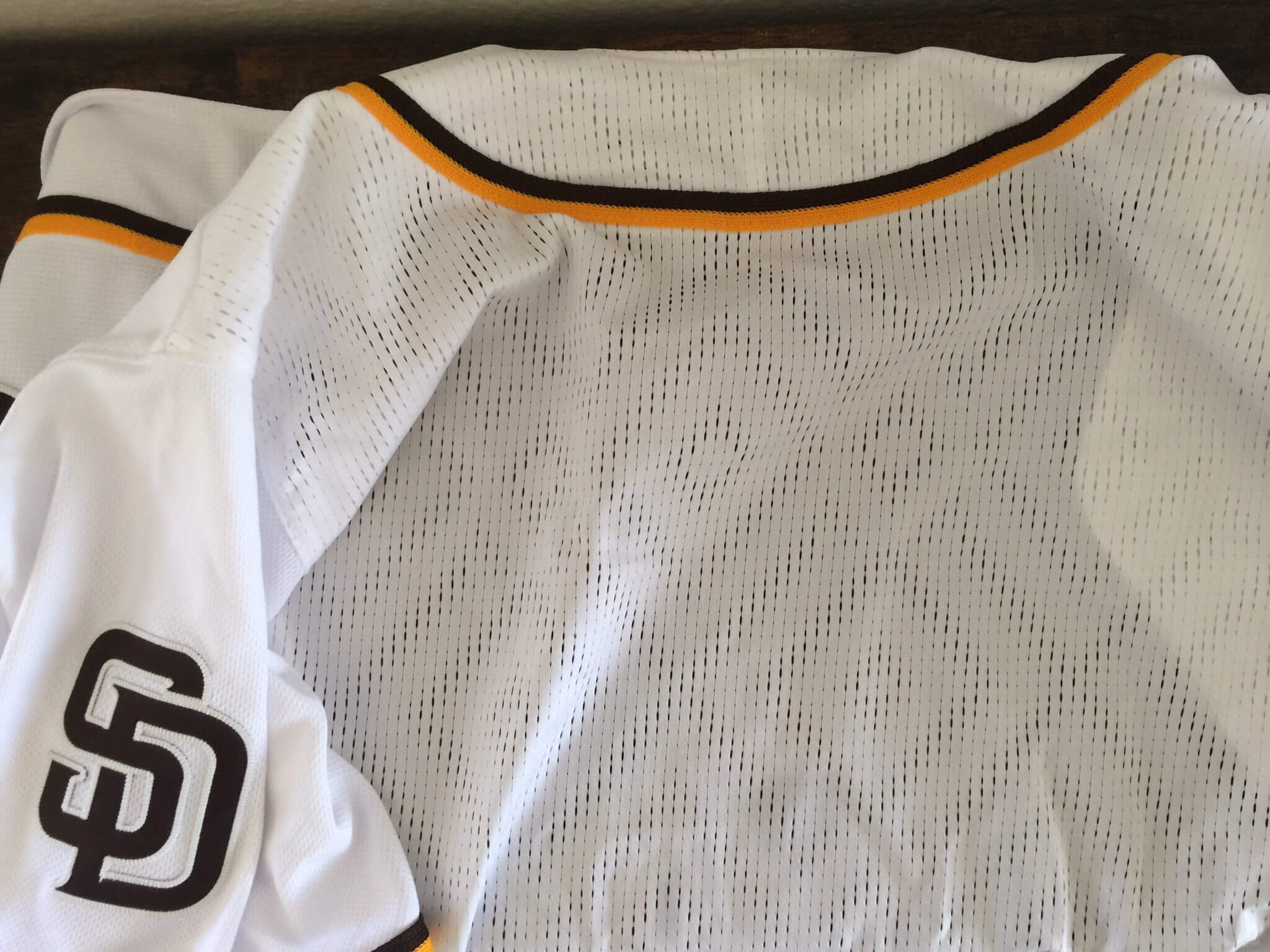
Yikes. Was Under Armour really planning on that fabric template for all of MLB? Was this really a Under Armour prototype?
I asked Justin about the jersey’s tagging. He said there was no jock tag, no inner collar tag — just a standard care label with an “Inspected By” sticker on the other side. But then he said there was also a sticker on the front of the jersey, which he had removed but saved:
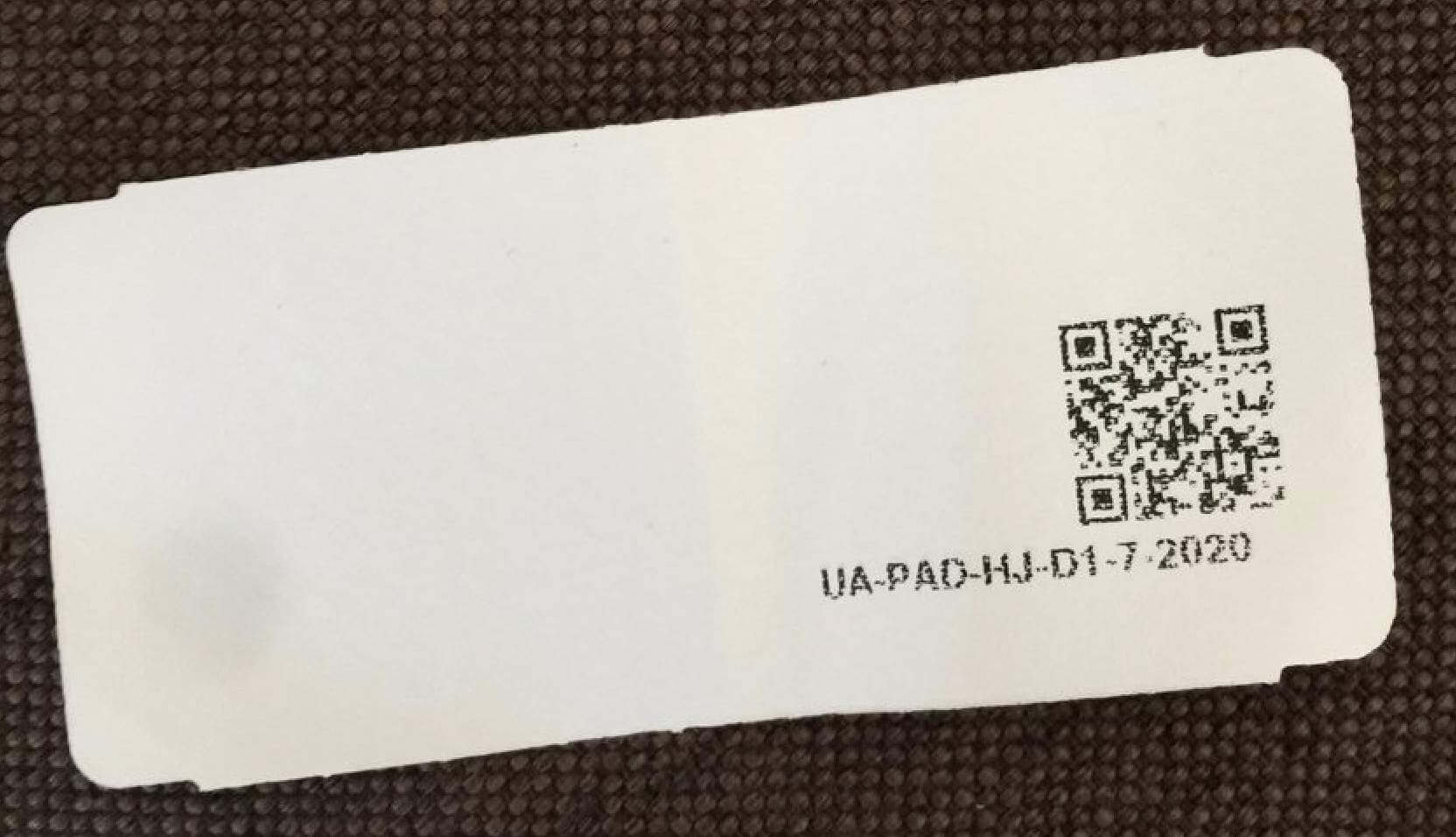
Hmmmm. Note the date on the sticker — “7-2020.” At first I thought this meant the jersey couldn’t be a prototype, because the time frame didn’t make sense. But then I realized that there’s no way Under Armour would be making a 2016-ish design in 2020. The sticker probably had nothing to do with when the jersey was produced — more likely it was applied by the Padres, perhaps when they inventoried the jersey for later sale.
I’d like to know more, so I’ll make some additional inquiries this week. But for now I think we can say this is possibly — perhaps even probably — a prototype of what Under Armour was planning. And at the very least, it’s a very interesting discovery! Great find by Justin.
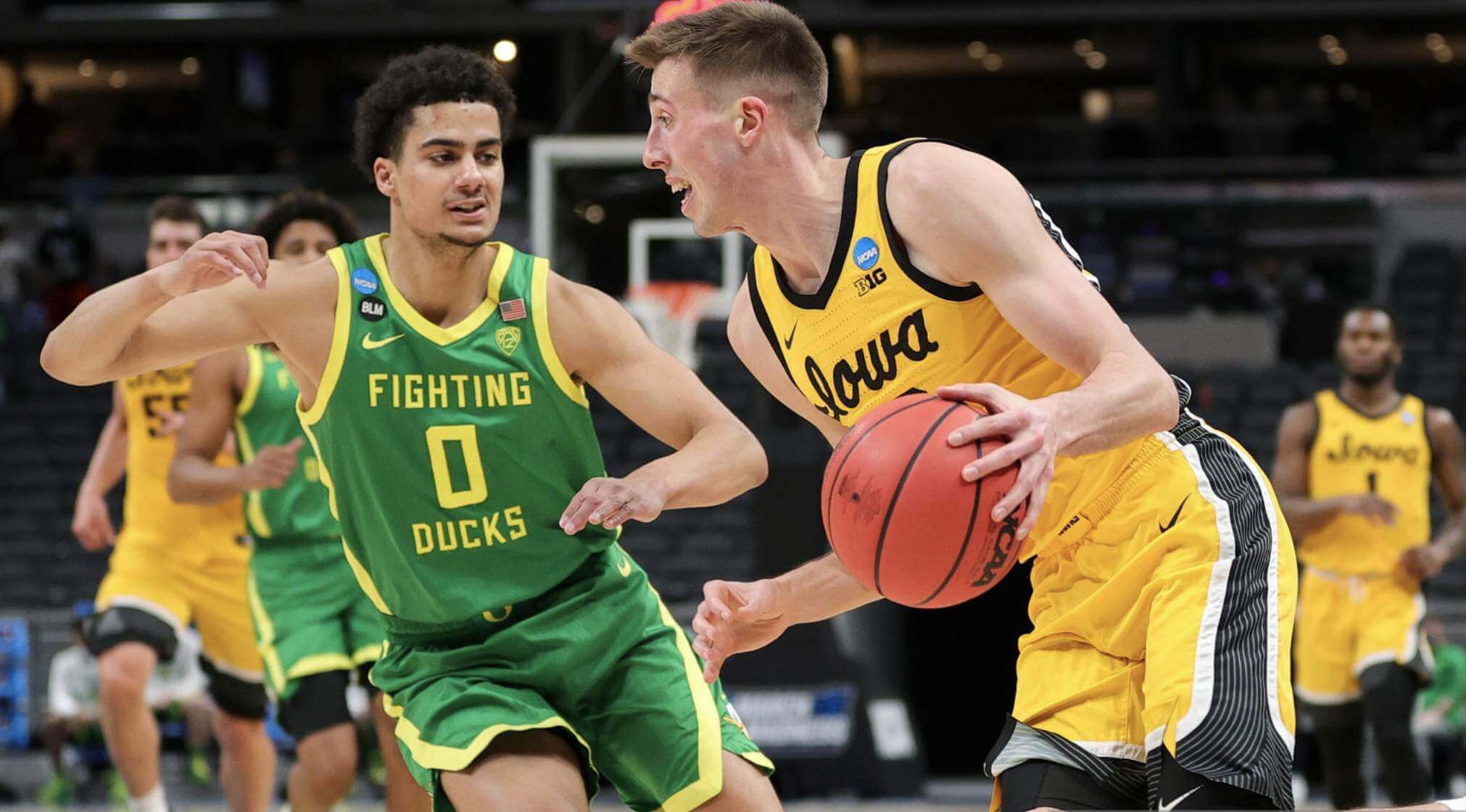
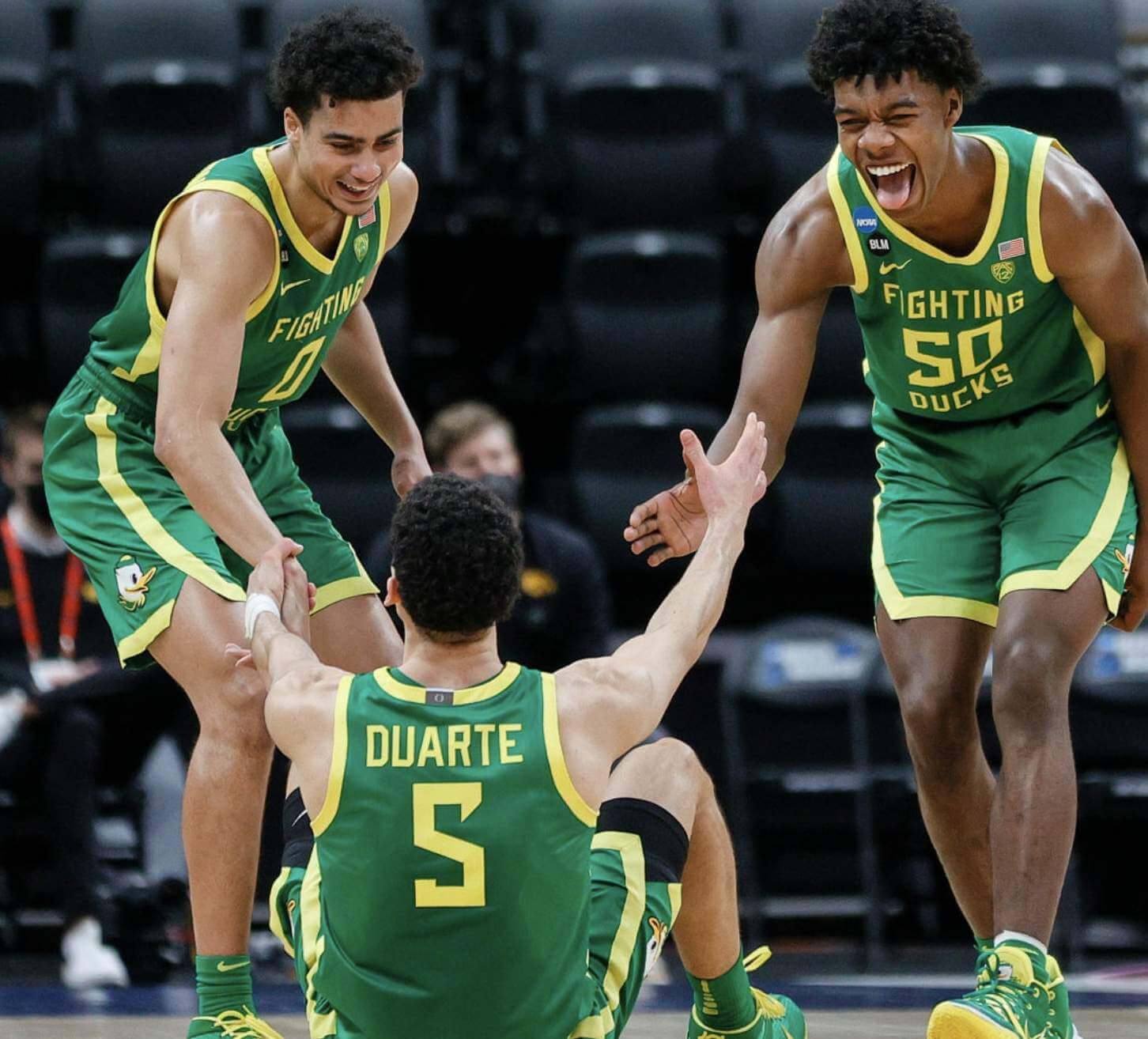
Eye candy: Doozy of a color-on-color game yesterday, as Iowa and Oregon went at it. Love that color combo!! Lots of additional photos here.
Also: One Oregon player — either guard Chris Duarte or forward Eric Williams Jr. — had an upside-down 5. Hmmm, which one was it?
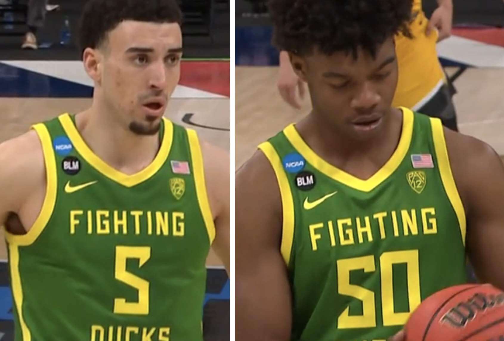
They both look pretty bad to me. But based on the official typeface, Duarte’s 5 (the one on the left) was wrong, and Williams’s (on the right) was correct.
Interestingly, the 5 on the back of Duarte’s jersey was upside-down as well, so at least his uniform is consistent with itself, if not with the rest of the team:
(Big thanks to Nate Adamski for spotting the mis-oriented numeral.)
Click to enlarge
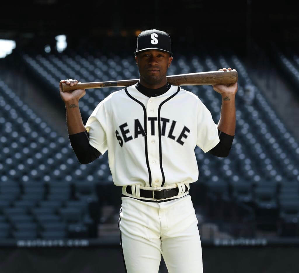
Better late than never: Remember how the Mariners were supposed to dress as the Negro Leagues’ Seattle Steelheads on June 20 of last year? That game got wiped out by the pandemic, but a Mariners exec tells me that the Steelheads throwbacks will make their belated debut this year, on June 19 (a great call on the date, as that’s Juneteenth).
One change from 2020: Unlike last year, when the visiting Royals were also slated to wear Negro Leagues throwbacks, the visiting team this year, the Rays, will just wear their regular uniforms.
In other M’s news, the team will now wear its green-brimmed cap, rather than the solid-navy cap, with its navy alternate jerseys:
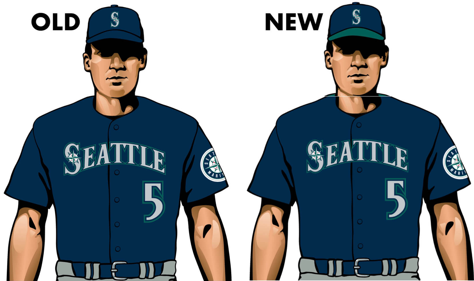
I count this as a nice little upgrade.
Click to enlarge
Collector’s Corner
By Brinke Guthrie
Follow @brinkeguthrie
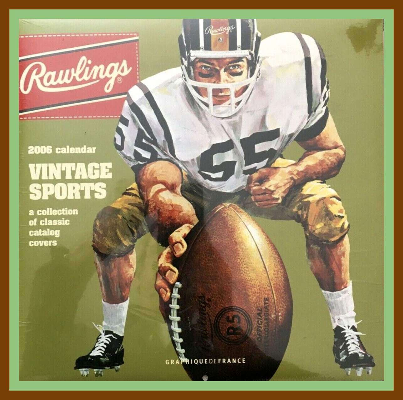
Leading off this week with this 2006 Rawlings Vintage Sports Calendar. Each month of the year shows a different vintage sports catalog, such as “Fall & Winter Athletic Equipment 1942-1943.” As the back of the calendar says, “Rawlings catalogs have always sold more than sports equipment; they sell dreams.” Give that copywriter a bonus!
Now for the rest of this week’s picks:
• This San Diego Chargers bobblehead is from 1965 and is in great shape. Notice two things, though: the rather funky lightning bolt and the “ear pad” design.
• Arby’s sponsored this Cincinnati Stingers hockey puck from Dec. 17, 1977. The “Soviet All Stars” team visited Riverfront Coliseum for an exhibition with the WHA Stingers, with the visitors winning, 5-4. I vaguely recall this event, and I loved going to Stingers games at that venue — the seats reminded me of The Brady Bunch and the place always smelled of buttered popcorn! (Fun fact: the venue is still there, now on its fifth name.)
• Here’s a Coca-Cola “Great Hockey Moments” counter display. You get the signage and four cups.
• Eagle was the maker of this 1959 “Pro” Hockey Table Top Game. This model includes “Authentic Montreal and Toronto N.H.L. Teams,” and is “Endorsed by Leading Hockey Coaches.”
• Thirteen years later, Tudor would release this game called NFL Strategy. See that little navy blue “Playbook” marked “Confidential”? I learned a lot about pro ball from that!
• Nolan Ryan is shown with his Astros, Angels, and Rangers unis in this Nesting Doll. What, no teeny Mets version?
• But wait, as they say on TV — we have more nesting dolls! This set is for the 1970s Pittsburgh Steelers and includes Lambert, Greene, Bradshaw, Harris, and Swann.
• Esskay Quality Franks sponsored this 1985 Baltimore Orioles seat cushion. Not at O’s fan? “You’ve Got the Best Seat in the House” with this promo cushion for the Toronto Blue Jays.
• Jim Beam released this Ceramic Decanter in 1969 for MLB’s 100th-anniversary season.
• Love the 1960s logo on this Green Bay Packers drinking glass. And speaking of the Pack, here’s something I’ve never seen before: I suppose if ya wear a big block of cheese on your head every fall Sunday, you’ll want this inflatable coffee table for the living room.
Got an item to include on Collector’s Corner? Tweet submissions to @brinkeguthrie.
Click to enlarge
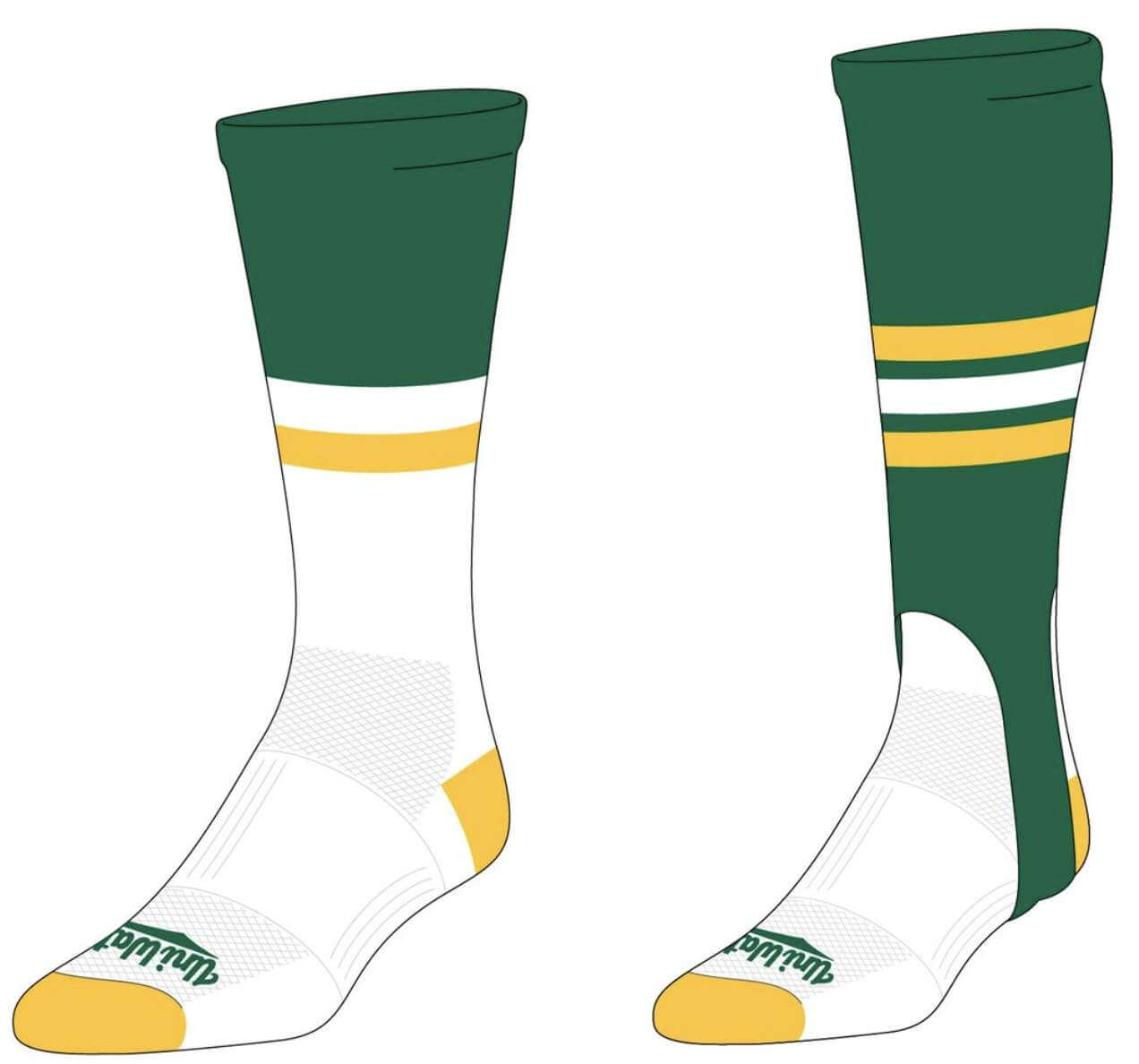
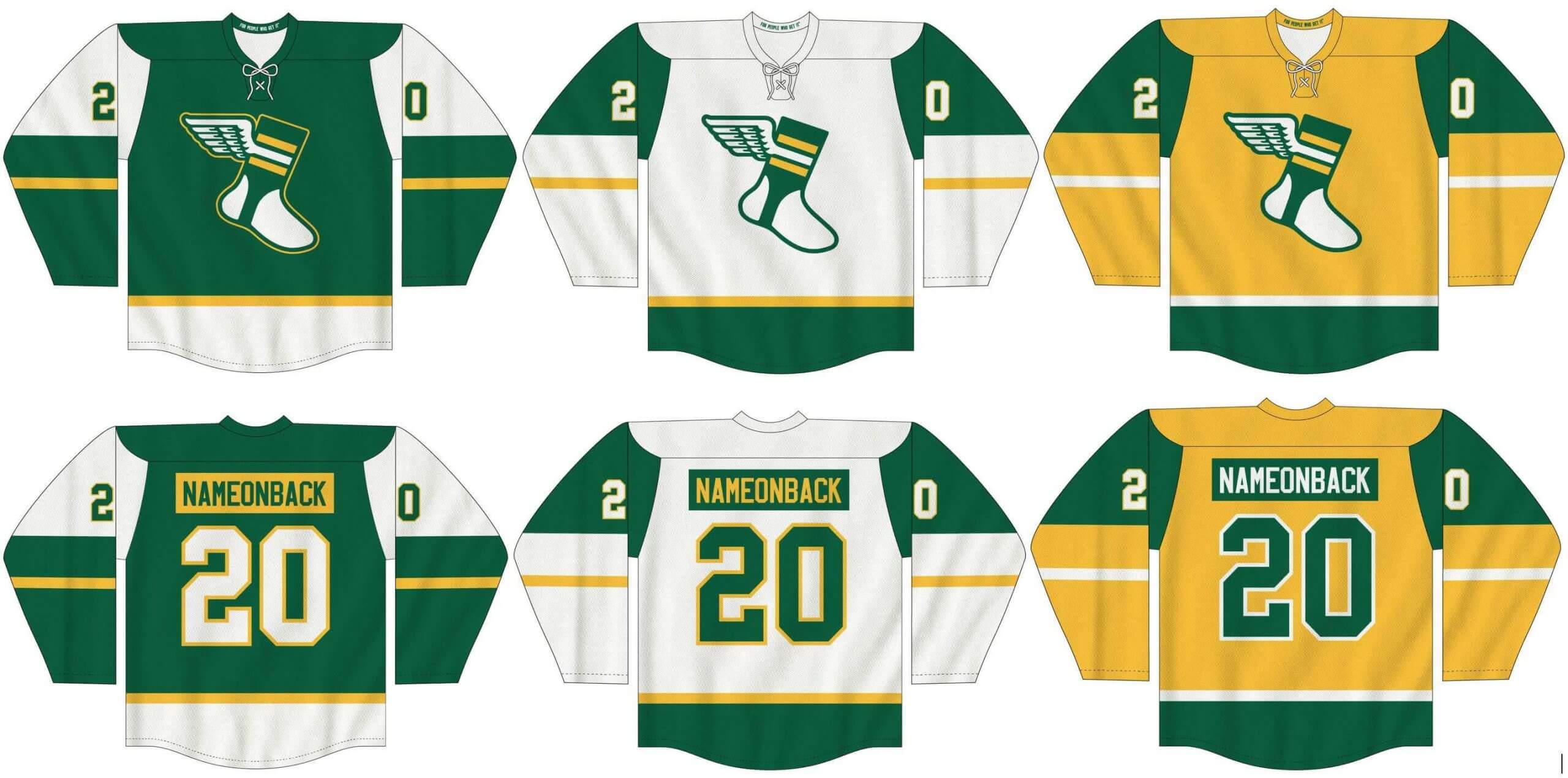
Assorted merch reminders: In case you missed it last week, I’ve teamed up once again with Adelph Wear — the brand run by longtime Uni Watch reader Nathan Haas — to create a new line of Uni Watch hockey jerseys (customizable with your choice of number and NOB, of course), as well as new Uni Watch socks and stirrups. We’re taking pre-orders on them now.
In order to get in on these items, you must place your pre-order by March 31 (that’s one week from tomorrow). You can do that here. We expect the finished product to ship out by the end of April.
Also: Todd Radom and I had recently found a small stash of our limited-edition 2018 “Rain Check” print that we had set aside for promo purposes and then forgotten about. These are all signed by both Todd and myself:
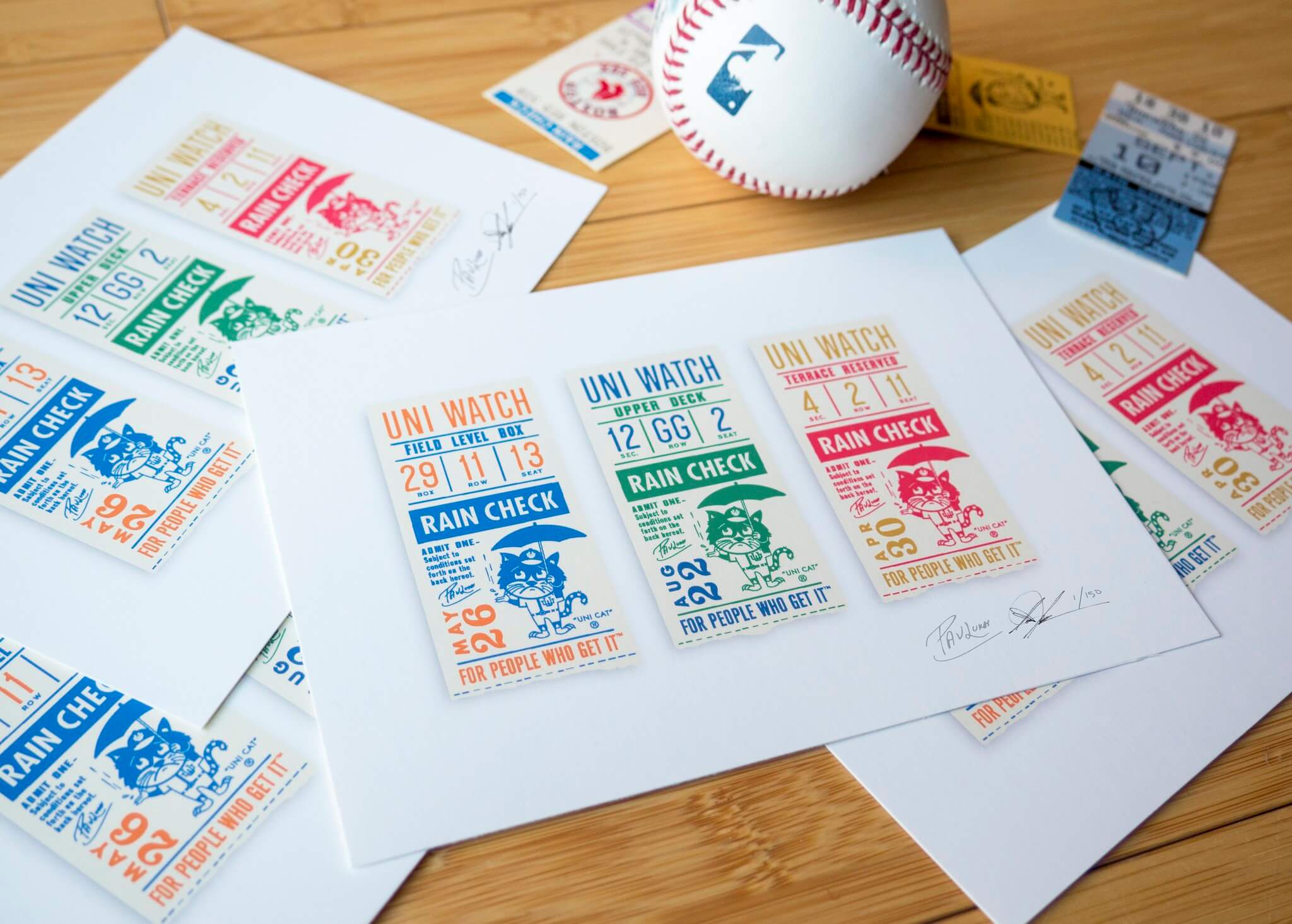
These are available while supplies last on Todd’s website.
My thanks, as always, for your consideration.
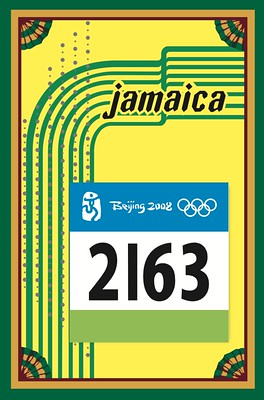
Membership update: Card designer Scott M.X. Turner had some computer issues that slowed him down for a bit, but now he’s back in the saddle and plowing through the orders we got during the membership drive from earlier this month. That includes Michael Brantner’s card, which is based on sprinter Usain Bolt’s jersey from the 2008 Beijing Olympics.
Ordering a membership card is a good way to support Uni Watch (which, frankly, could use your support these days). And remember, a Uni Watch membership card entitles you to a 15% discount on any of the merchandise in the Uni Watch, Uni Rock, and Naming Wrongs shops, plus the discount also applies to our Uni Watch Classic Cap. (If you’re an existing member and would like to have the discount code, email me and I’ll hook you up.)
As always, you can sign up for your own custom-designed card here, you can see all the cards we’ve designed so far here (now more than 3,000 of them!), and you can see how we produce the cards here.
The Ticker
By Paul (switching Ticker days this week with Alex)

Baseball News: What is it about Chicago and uniform memorials? First the Bears opt not to wear a patch or decal for Gale Sayers, and now a White Sox spokesman tells me that the team will not have a memorial patch for Dick Allen — a surprising move (at least to me), given that Allen won the AL MVP award while playing for the Sox in 1972. … SUNY-Oswego has a doozy of a tequila sunrise design in Uni Watch colors! (Big thanks to Paul Rizzo.) … Smithsonian Magazine has a good article on how the baseball cap went from sports gear to fashion accessory (thanks to all who shared). … A palmetto tree and a crescent moon, like the ones on the South Carolina flag, have been mowed into the U. of South Carolina’s outfield (from Moe Khan). … The Ballpark Digest website is hosting a bracket-style tournament to choose the best college baseball stadium (from Kary Klismet).

NFL News: Newly acquired Dolphins WR Will Fuller will wear No. 14 (from Marek Brave). … Madame Tussaud’s in Orlando has a wax figure of former Dolphins QB Dan Marino with a period mismatch between the helmet and jersey.
College and High School Football News: Oooh, check out the great officials’ cardigans in this late-1920s LSU/Arkansas shot (from Stephen Millet). … If you liked that photo, you’ll love this blog post that shows lots of really gorgeous officials’ uniforms from decades past. … Georgia Tech has new chinstrap sleeves emblazoned with Atlanta’s area code (from @TheLumberJacket). … Early uni watching: 84 years ago today — March 23, 1937 — the UNC student newspaper described the football team’s new uniforms as “flashy, yes — but not loud.” … A couple of businesses in Corbin, Ky., pitched in to buy championship rings for the local middle school’s football team, which won the state title for its division last fall (from Kary Klismet).

Hockey News: The QMJHL’s Gatineau Olympiques have been wearing throwback jerseys this year for different eras of the team’s history. Last weekend they wore this 1997 design (from Wade Heidt). … Also from Wade: Hurricanes G Petr Mrazek’s new mask features depictions of some of his favorite athletes, including F1 driver Charles Leclerc and tennis pro Roger Federer. … And yet another from Wade: The Canucks used rainbow-patterned stick tape last night to support LGBTQ pride and inclusiveness. … Meet the Henderson Silver Knights’ new costumed mascot, Lucky (from Kary Klismet). … We’ve seen lots of logo-emblazoned masks over the past year, but not a logo-emblazoned

NBA/WNBA News: The Lakers have made a uni change and will wear their white City alternates for tonight’s game against the Pelicans. The white unis were conceived as a tribute to Elgin Baylor, who died yesterday. … New primary logo for the LA Sparks (thanks, Jamie). … New 25th-anniversary logos for the New York Liberty (from Geoff Magliocchetti). … With the NCAA women’s tourney taking place in San Antonio, the Spurs saluted great women’s college hoops players by wearing their jerseys when arriving for their game last night (thanks, Phil).

College and High School Hoops News: Interesting (but paywalled) article about how the NCAA opted not to use the term “March Madness” for the women’s tournament (from @spiralJ). … BYU has been wearing the NCAA tourney patch in an odd spot (from Matthew Wolfram). … Ohio F Ben Vander Plas blew out one of his sneakers during last night’s game against Creighton. He then played with one black sneaker and one grey (thanks, Alex).

Soccer News: Tottenham Hotspur Stadium will be lit yellow today for a “national day of reflection” because it’s the anniversary of the start of the U.K.’s first lockdown. Wembley Stadium is also participating (thanks, Jamie). … Here’s an article arguing that La Liga side SD Huesca has the sport’s best captaincy armbands (from Jeremy Brahm). … Here’s Argentina’s new shirt for 2021 Copa América (from Germán Cabrejo). … Austin Bold FC is now being outfitted by Puma (from Ed Zelaski). … Also from Ed: New shirts for Romania. … Spain has a new logo, which will debut on the team’s 2022 kits (from Trevor Williams) … Also from Trevor: New away kit for Russia.

Grab Bag: New mascot — a bull named Perry — for the 2022 Commonwealth Games in Birmingham, England (thanks, Jamie). … Gross: The National Rugby League’s Penrith Panthers have sold their stadium name to an online betting company (from Timmy Donahue). … Imperial Valley College in California will no longer call its teams the Arabs (from Kary Klismet). … New wrestling singlet design for UNC (from James Gilbert). … Here’s more on that sneaker scandal involving a Nike exec’s son who was reselling kicks for big money (from Trevor Williams). … Fun note from Andrew Schmidt, who writes: “I’m pretty proud of this highly upvoted post on the Aussie rules football subreddit where I used Beanie Kids to show the standings from ‘flag’ (a term AFL fans use for ‘championship’) to ‘wooden spoon’ (the fictional trophy for the last-place team). I own all the Beanie Kids because it’s more practical than buying the actual AFL uniforms.”

Our latest raffle winner is Spencer Seaner, who’s won himself a Unified T-shirt. Congrats to him, and big thanks to Max Weintraub for donating and shipping this shirt.
Scanning a QR code can sometimes reveal some information, but alas, the label on the UA SD jersey was foreign to me.
You’re probably right that the sticker was not from UA.
Typo: in that paragraph “…perhaps when they inventoried…”
Sorry if I’m being dense, but what is the typo?
The real sentence says “the,” should say “they.”
Team work
Ah, I see — fixed!
The QR code reads “CM115879”. Nothing interesting there.
Good thing the Padres didn’t go with that design. The interlocking SD on the left chest AND repeated on the left sleeve, yikes.
Tell that to the Nationals, please.
Reminds me of the “Who Will Be Fallout Boy? (Who Will Be Fallout Boy?)” headline from the Springfield Shopper.
In soccer: Argentina, not Agrentina.
And I love the Padres’ concept jersey, but what’s with the fabric?
Typo fixed.
The mesh pattern on the back of the Padres jersey is pretty consistent with what Under Armour has used in recent basketball templates, yet slightly different. I haven’t seen any baseball teams outfitted by UA sporting this look just yet, but wouldn’t be surprised if they went to it at some point soon.
is that Padres uniform blue and yellow? i guess its the lighting, but it looks more brown and yellow to me. or i have color blindness. or its like that dress that was blue to some and gold to others.
It looks brown to me too. I think UA probably knew back in 2016 or 2017 that the Padres were gonna go back to brown by the time they were planning on taking over the contract, and wanted to showcase prototypes to reflect that eventual change.
re-reading what Paul wrote. he said “similar to the 2016 design”. which it is, but if it were brown, i guess that makes sense then.
The Seattle Steelheads uni is fantastic! That is all.
That’s some pretty interesting piping on the trousers. It circumscribes the player’s waist at the base of the belt tunnels, and marks the starting point of the side piping.
That is a TRULY nice looking uniform.
Great article on the Padres jersey. That mesh pattern is something, to say the least. Ugh. Looking at that jersey, I will never accept having the makers mark on the front. It belongs on the sleeve and that is about it. Will there be ads on jerseys? Who knows? MLB has sullied so many things at this point, why not ads? As far as there not being a Nolan Ryan Mets nesting doll, an easy explanation. Ruth Ryan hated New York and it is very likely Ryan would have retired had he not been traded to the Angels. So it is easy to see why no Mets Ryan doll.
Regarding Dick Allen, I am about the same age as you, Paul, and likely due to that his time with the White Sox, winning the MVP and those uniforms really stands out to us. In general, though, he seems to be more thought of as a Phillie. As such, I can understand the White Sox not wearing a memorial patch for him.
Oh, for sure — the Phils have a greater claim on him. But there’s nothing preventing multiple teams from uni-memorializing a player. I’m still surprised that the Sox aren’t doing it.
Especially when you consider how he felt about his time with the Sox. I found the item below from one of the news reports after he died. The Sox need to do the right thing.
“…. Dick mentioned to his close friends that if he ever was inducted into the Hall of Fame, he wanted a White Sox cap on his plaque.”
Yet, the only team that retired his number is the Phillies, last August, and Allen was delighted.
That’s the first thing I noticed, Greg. Why go with it in 2 places. Should be the swingin’ Friar on the sleeve IMO
Proofreading: “…the UA maker’s was going to be included…”
Should that read “maker’s mark”?
Also, the QR Code on label seems to read CM115879. Probably not relevant, unfortunately.
Yes, thanks — fixed.
Waiting on Oregon BB to follow Oregon FB and break out something with Silver and Black, with no green/yellow.
They already did
link
Championship rings for middle schoolers? Oh please.
I used Beanie Kids to show the standings from ‘flag’ (a term AFL fans use for ‘championship’) to ‘wooden spoon’ (the fictional trophy for the last-place team).
Very nice!
English cricket also has/had the “wooden spoon.” Didn’t realize other sports used it…even Major League Soccer has gotten into the act.
Filip Gustavsson wears #32 for the Ottawa Senators got his first win last night. His facemask has his minor league number 30 on it.
link
Those seat cushions are probably rarer than most people think. In 1985 I was at the seat cushion game. The Orioles got off to a terrible start, and got worse as the game went on. Not sure exactly when it started, but fans started throwing their seat cushions onto the field. I kept mine, but noticed that they flew well if thrown like a frisbee.
Ha! I went to a White Sox game as a kid and experienced the same fan rejection of our seat cushions. I thought this was normal behavior (it probably was in 1985).
I got Ozzie Guillen (a rookie) to sign mine, so I obviously didn’t throw it. Also my dad would have not been happy- he’s a curmudgeon fan that detests whatever the rabble-rousers are doing.
It’s too bad the Dan Marino wax statue got the uniform wrong when the artist did such a great job on getting Marino’s facial details right. One of the rare wax figures that looks nearly lifelike – most of the ones I’ve seen fall into the “uncanny valley” and some barely look like the individual in question. But I guess it wouldn’t be too hard to replace the decals on the helmet if they’re so inclinded.
“A palmetto tree and a crescent moon, like the ones on the South Carolina flag, have been mowed into the U. of South Carolina’s outfield”
“That’s no moon”
; )
Does anyone else think the Mariners should go back to the teal brimmed caps as their primary home cap? It just looks better than the solid navy lid.
Preach.
I have to say I like the interlocking Padres uni-look (but not the overzealous repeat on sleeve).
Mariners look sharp when they wear Steelheads throwbacks EXCEPT when they use that boring-ass block lettering…I will never understand why they don’t use the original lettering type. (and use it as a template to overhaul their uniforms altogether) Death to Teal.
link
That Orioles seat cushion has quite the apostrophe catastrophe. An apostrophe after the number? Like, huh?