[Editor’s Note: Paul is on his annual August break from site (although he’s still writing his weekly Substack column). Deputy editor Phil Hecken is in charge from now through the end of the month.]
A good Friday morning to all you Uni Watchers. Hope everyone has had a good week!
I’m back again with Chris Diamond, as we continue our “mono-dark” project. When this began (Phase I), we wanted to see how every team who wears a dark colored alternate jersey would look if we paired them with same color pants. There’s a lot more to it, of course, and if you missed it or forgot, that encompassed Phase I (Part I, Part II and Part III). For Phase II, we took it up a notch, creating mono-dark unis for teams who currently don’t wear any alternates, and tweaked some unis from Phase I to address some issues we had with those (Part I and Part II).
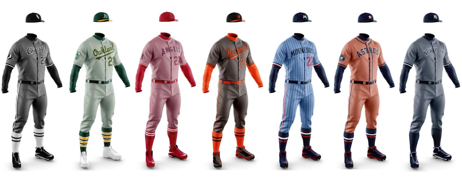
Phase III is a little different. For years now, almost every MLB team has a light gray road uni. It didn’t used to be that way. Back in the day, teams had a variety of colorful roadies — in both leagues. Powder blue abounded. Even the gray uniforms didn’t all seem to be the same light shade. So Phase III is a concept where we try to see how teams would look in “lighter dark” colors, based on each team’s primary color. So, if a team’s primary color is red, the road uniform might take on a reddish hue. Blue teams would have a bluish (but not powder) tone.
Now, there are some teams that have really good road uniforms right now, and should be kept as is. But we thought a few teams might really look sharp if we changed their current gray away unis to something else. I think some of what you’re about to see are really great concepts, while others — well, you’ll see.
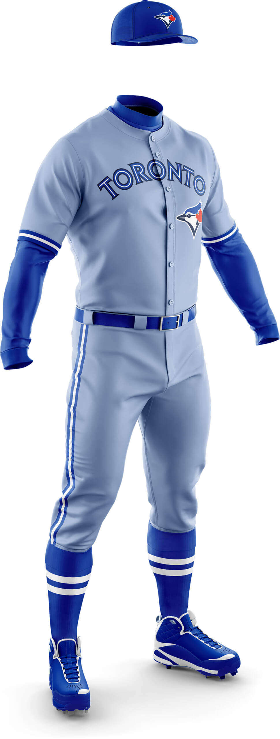
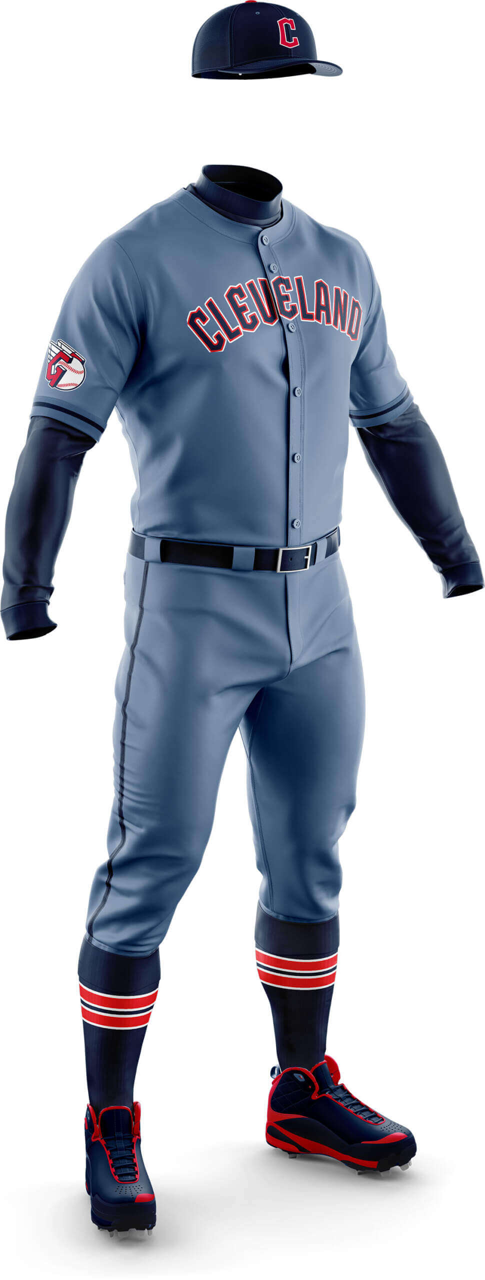
Today we’re bring you the “pastels(?)” of the American League. They’re not really pastel in the classic sense, but for lack of a better term…here we go.
Baltimore Orioles
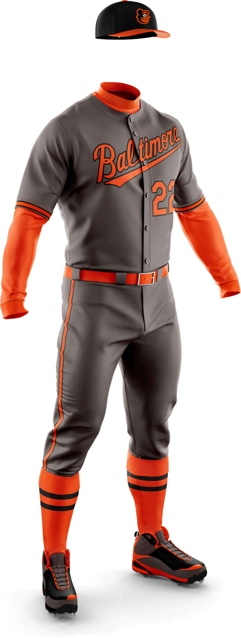
Chris Diamond: I’ve gone with a warm dark grey to contrast with the bright orange. This is my favourite of all the pastels so far!
Phil Hecken I know we’re trying to simply change the color, but I really love a thicker black outline around that “Baltimore” wordmark, or even have the wordmark in black with orange outline. The dark gray & bright orange look great, but I’d just like that Baltimore to pop a skosh more.
CD: This needed a white outline to stop the wordmark disappearing. Still a bit plain for my liking.
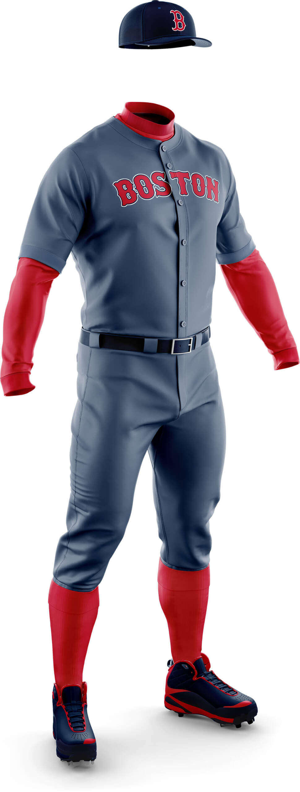
PH: To me, the BoSawx are another team with a perfectly fine roadie right now, so I’m gonna say “Pass” on this one.
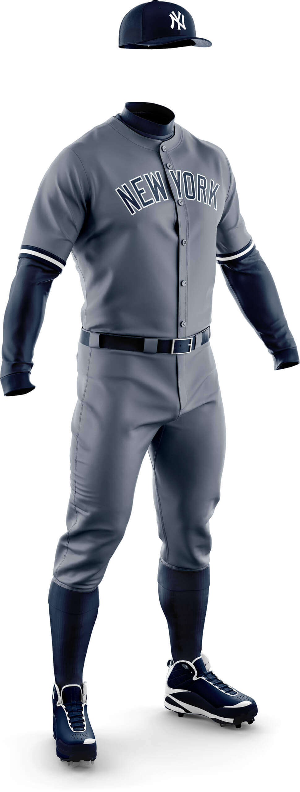
CD: This dark steel grey just works so well for the Yankees. I much prefer this to their standard greys.
PH: Now we’re cookin’ with gas! I think there are several teams who can “stay gray,” but use a darker shade. This is one of them.

CD: Obviously the Rays already have Columbia blue as a secondary colour so it made more sense to go with that colour for the pastels.
PH: I loved this when Chris basically created this same look in Phase II, and I still love it. This needs to happen.
CD: I prefer these to the standard greys – somehow it just feels right.
PH: I like these a lot more than I thought I would (or should). I’d love for them to swap their grays for this.
Chicago White Sox
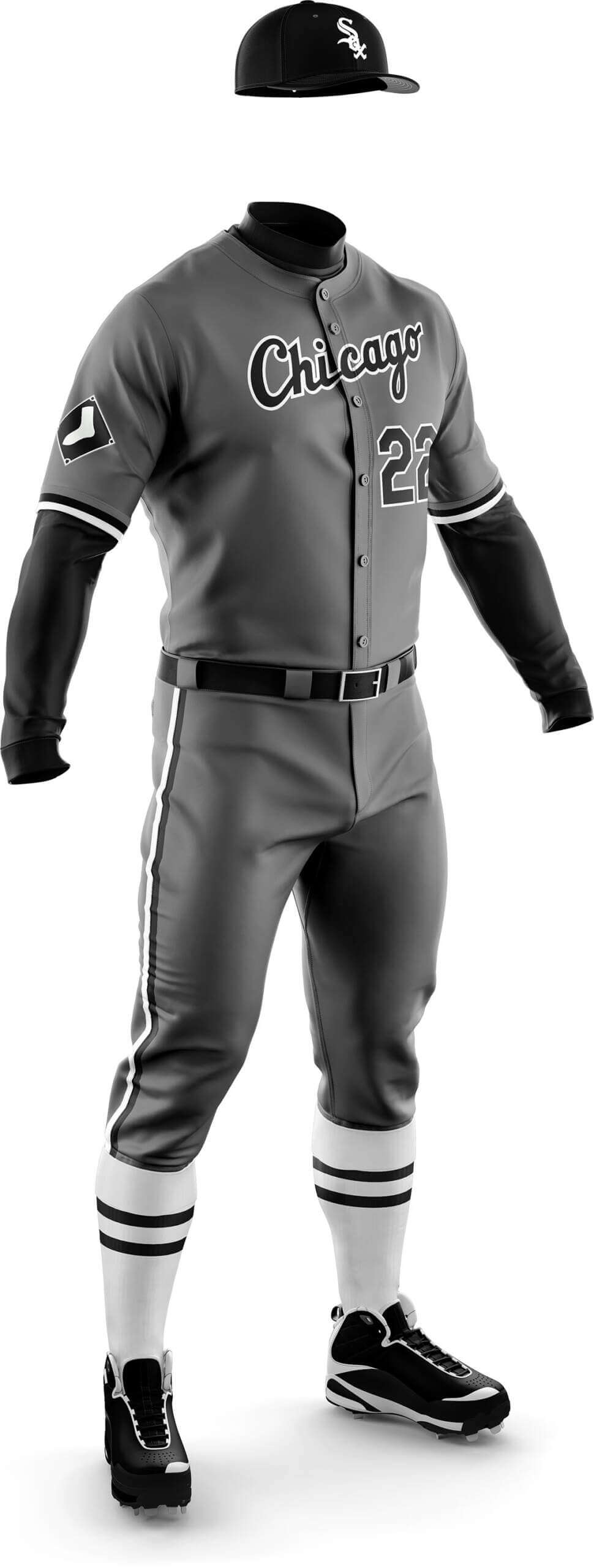
CD: At last a uniform where the White Sox socks can be white! The darker grey looks really good to me.
PH: I loved every White Sox concept Chris has created in this series. This is another home run — it’s funny, the white sox really stand out in this concept, which almost looks off (probably due to the black cap and sleeves), but for a team named for their hosiery…they gotta do this.
CD: Another team that needed a white outline to the wordmark. Nicer than their greys but a bit meh.
PH: I’d rather they bring back the bloodclot red than see this. (I like the mono-red!) But I’m not really feeling the blue-gray.
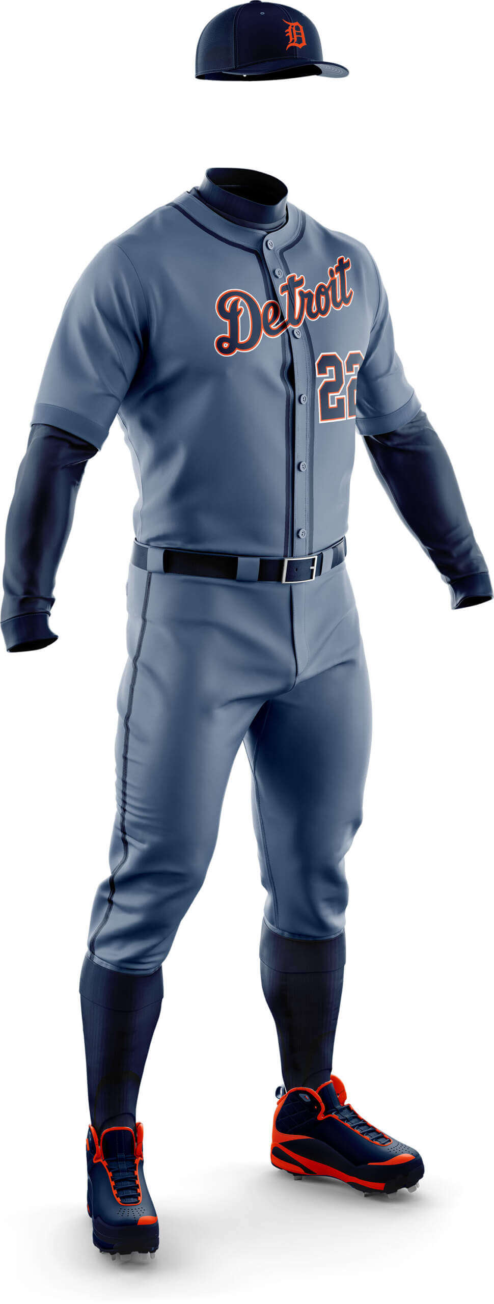
CD: Like the Yankees, this one just works really well.
PH: This one is fine, but what I really want is for the team to return to their ’60s roadies; manufacturers have been able to create a really great faux flannel for more than a decade. That’s what I’d love for Detroit.
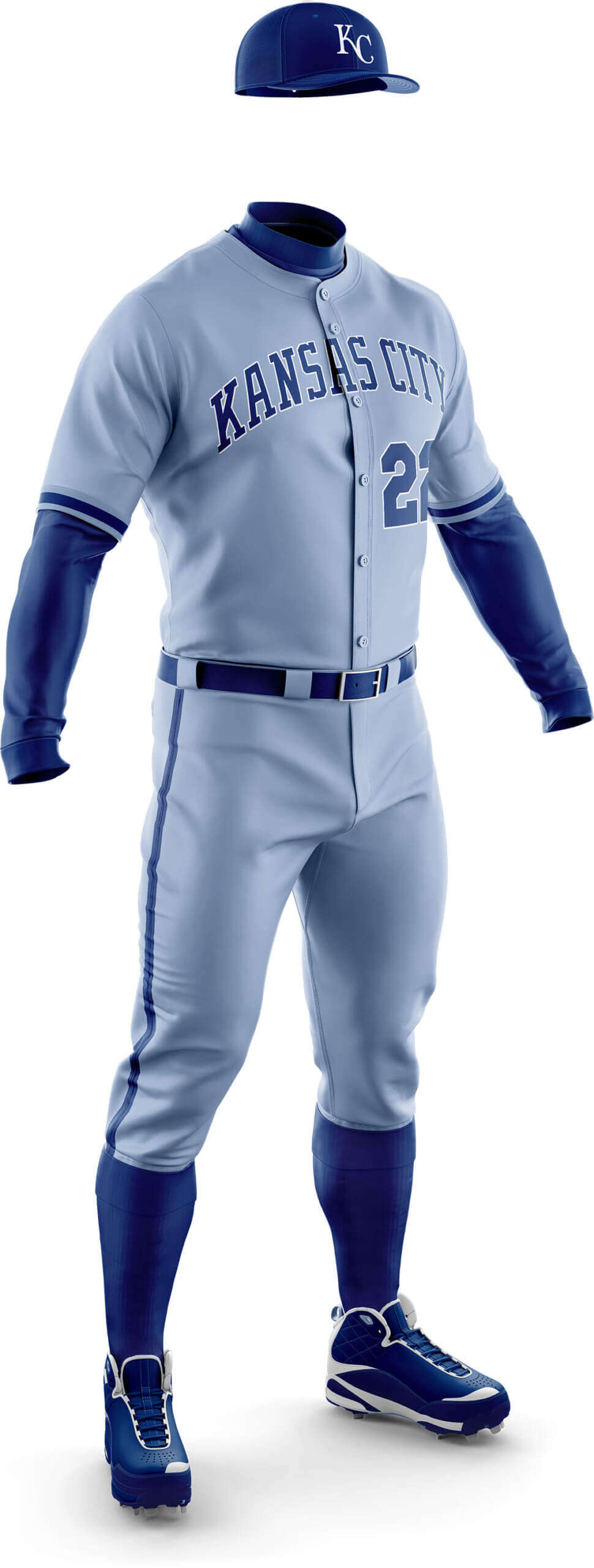
CD: The Royals already have powder blues, but this is more a sky blue and I feel it looks better than the powders.
PH: I’d still love for them to go mono-powder (instead of mostly wearing that jersey over white pants), with proper hosiery and cuffing of course. But I really like what Chris has done here — it’s much better than the current grays.
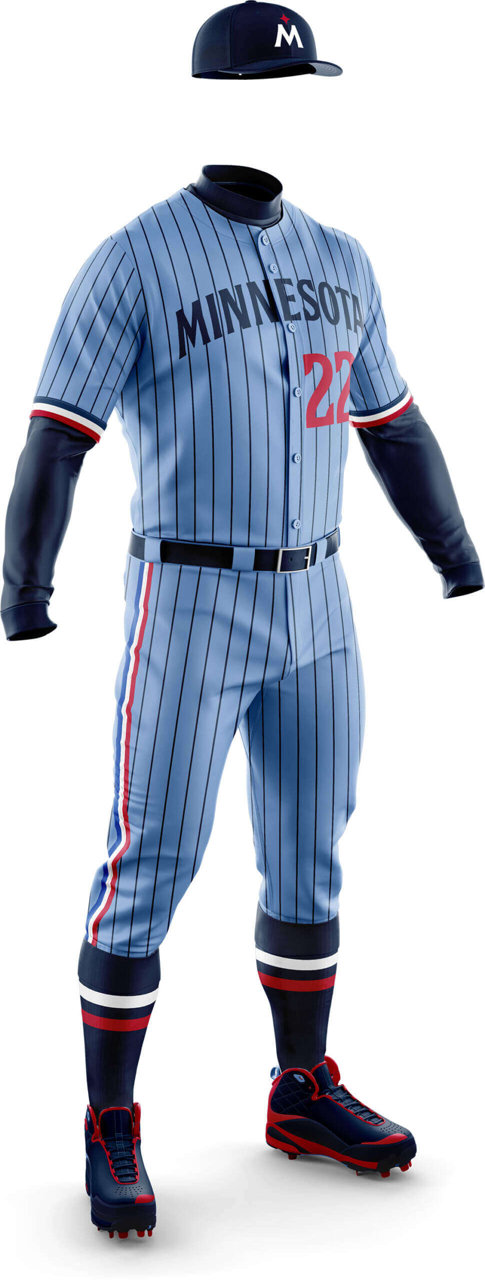
CD: The Twins have a history of wearing powder blue, and this is a nice look for them too.
PH: I should hate everything about this (pins on a roadie, stripes on top of pins, different color wordmark from front number)…and yet. I. LOVE. THIS. You ever just love something and you can’t explain why…and it defies all reason? Yeah, that’s what I got here.
Houston Astros
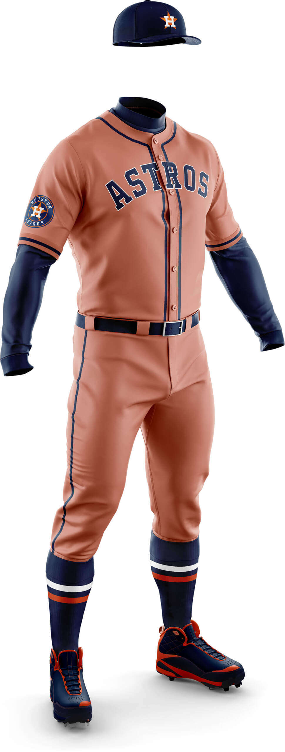
CD: Where dark blue-grey worked for Detroit (another Navy/Orange team) it just looked brutal for the Astros! This is one case where using the secondary colour made sense.
PH: I don’t think I’d wanna see them in a blue-ish version of this uni either. And certainly not whatever that shade of orange is.
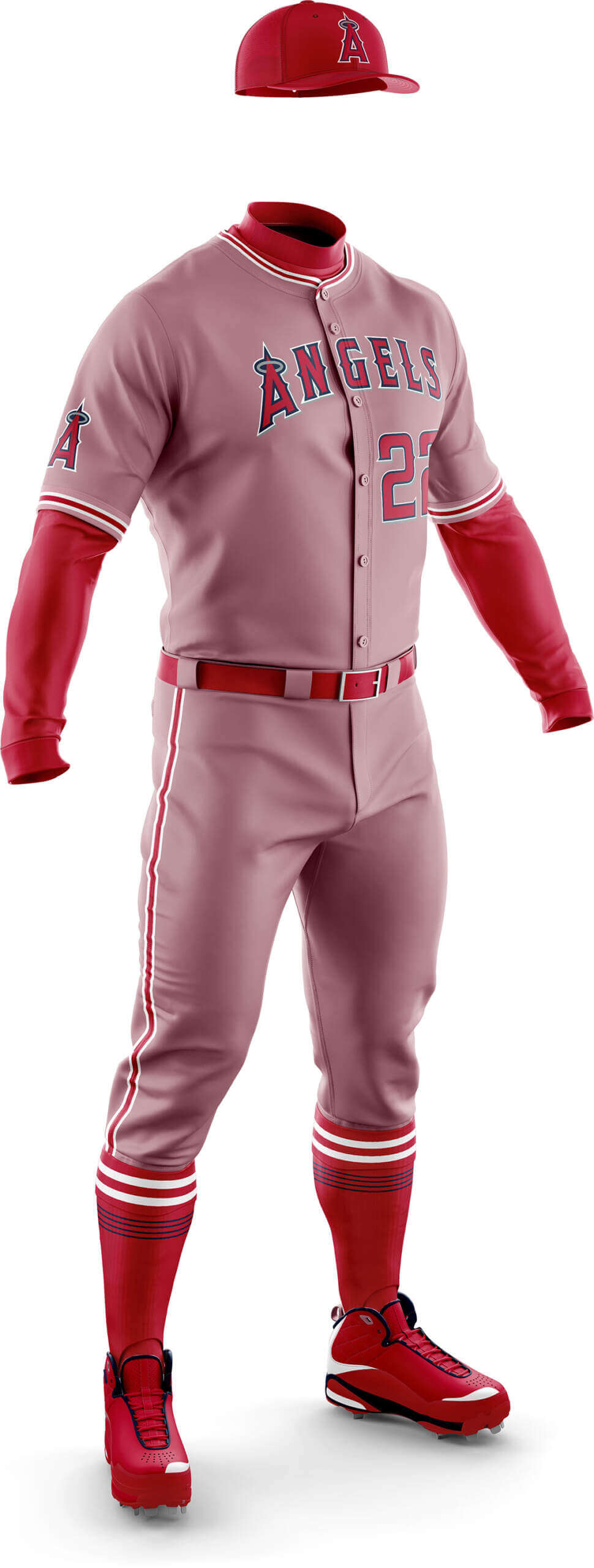
CD: Yeah, yeah, everyone hates the Angels’ current unis. But I rather like these dusky pink duds!
PH: I’m sorry, Chris. There’s just no saving these unis. I think I’d like this for the Reds (hint, hint), but not for LAA.
CD: I’m really not sure about this one. It sort of works, but something bothers me about it.
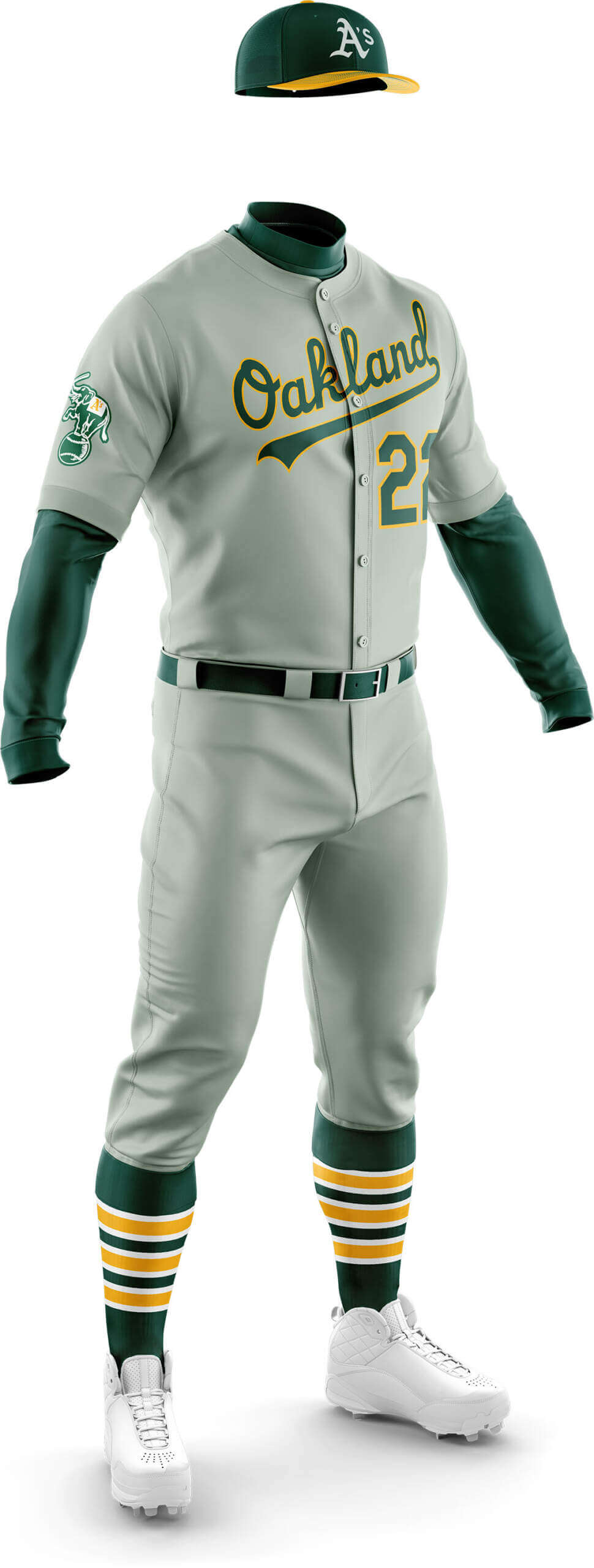
PH: This was the uniform I had in mind when I asked Chris to do up this Phase of the project. It’s perfect (*chef’s kiss*), and it definitely reminds me of the shading on the KC A’s greenish-gray vested road uniform. I think this is my favorite in the AL.
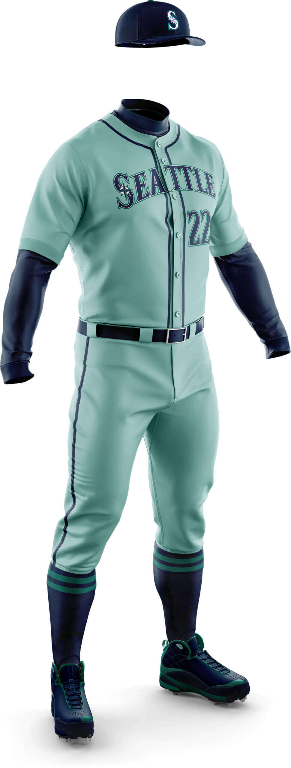
CD: Like the Astros, the Mariners were another team where using their secondary colour looked so much better.
PH: And as much as I love the A’s concept, I don’t like the M’s in mint. Their gray road uniforms are perfectly fine.
CD: Are they blue? Are they red? Who knows?! But I think this looks a lot better than their greys.
PH: It’s marginally better (to me) than their current grays. I wouldn’t be opposed to swapping this for those.
What do you guys think? Please let us know in the comments below.

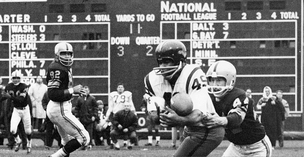

GTGFTS: 11/18/1962 Washington (21) Pittsburgh Steelers (23) Forbes Field.
I believe that is the Steelers” first victory with their new helmet logo. Such a great look.
Correct, Morris!
The pic captured early action of the Week 10 ‘Skins/Stillers game.
Uni-wise, this marked the 1st appearance of the Steelmark logo on the helmet. It looked OK on yellow, but way better on the black for the Playoff Bowl some weeks later.
One of my all-time favorite helmet designs is the ’59-’64 Washington design, as seen (barely) here on Bobby Mitchell in his first season with the team – the last NFL squad to integrate.
But what stood out to me in this photo was the ground-level, partially-obscured-by-the-sideline Forbes Field scoreboard – not sure I’ve ever seen Detroit abbreviated like that!
I still preferred the yellow helmet.
And since they lost that Playoff Bowl, they could have ditched the black helmets. But no, they kept them, because unlike the 2009 green Seahawks jerseys, adding black (or in this case more black) gets a pass no matter the results.
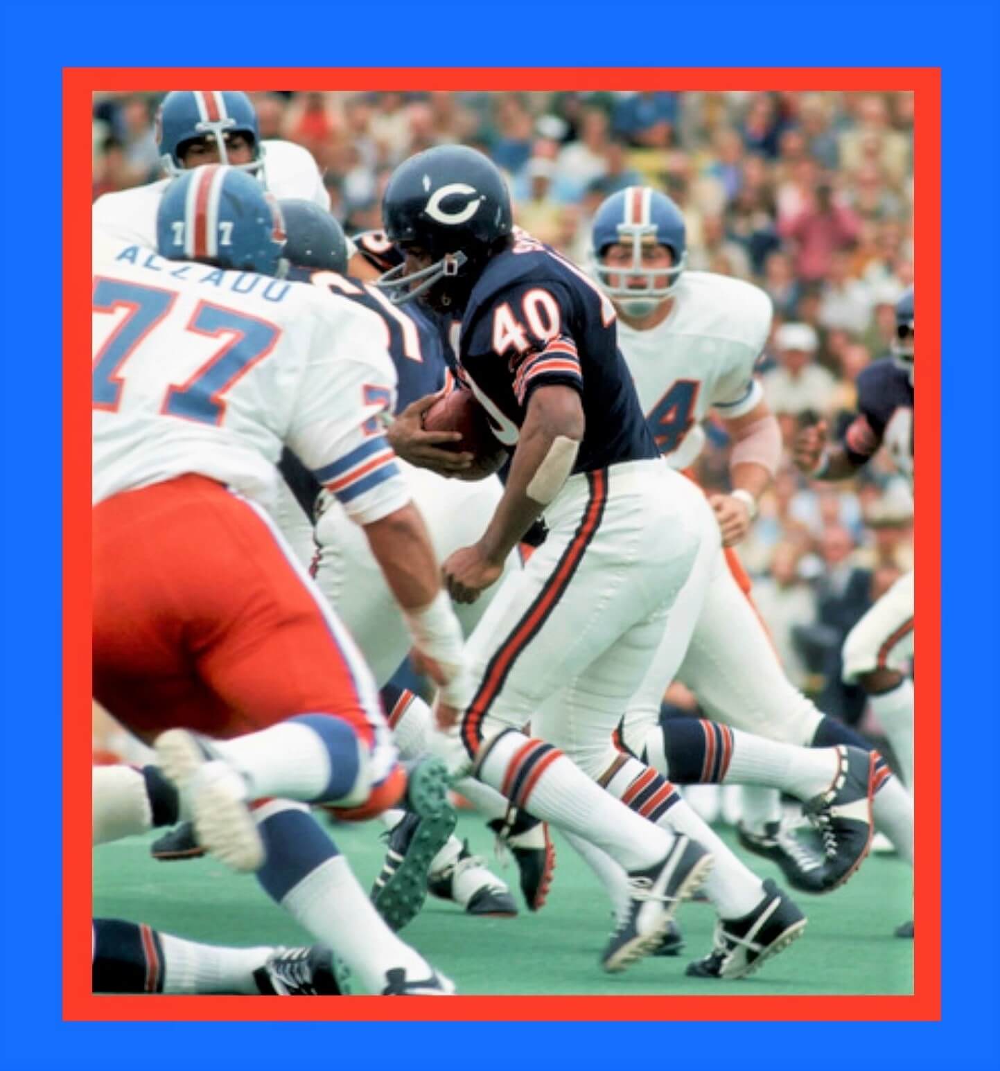
GTGFTU: 12/05/1971 – Chicago Bears (3) at Denver Broncos (6), Mile High Stadium.
How cool to see Lyle Alzado in a Denver Broncos’ uniform!
It is actually the September 12, 1971 preseason game between the Broncos and the Bears which was played at Soldier Field in Chicago. The giveaways indicating that it was this game are the artificial turf field (Mile High Stadium in Denver used natural grass) and the rushing attempt by Bears Hall of Fame running back Gale Sayers. Sayers did not have any rushing attempts in the regular season game between the Bears and Broncos.
You got it Mike! and number 54 in the background for Denver is my father’s best friend and roommate at the University of Maryland, Chip Myrtle RIP.
Be honest…this was just another attempt to trigger me by showcasing the Broncos orange pants.
It worked!
Love the Denver Dungards (even if they are gray) – dislike the white wishbone C.
Sayers is wearing 2 different socks, yes?
Chris, Chris, Chris…
Once again we’re on opposite sides. The Bears never should have added orange to the wishbone C.
The logo really popped on that helmet. Now? Meh.
Well ChrisH, I prefer Denver in the white pants too, but it seems all the good pictures I find with them against other teams in the early 70’s they are wearing the orange pants?
Great concepts once again! The A’s, Twins and White Sox should adopt these right away! Dirty pink should be reserved for the cherryblossom Nationals outfit.
“Wash with like colors.”
“Dirty pink”:
About ten years ago I proposed something like this and called it powder red.
Thought of it for Cincinnati, though I think it’s better for the Angels. A LOT better than them wearing head to toe devil red.
The Nats should adopt “powder red” for road uniforms like yesterday. Such a no-brainer, even before the team started adopting elements of pink-hued Cherry Blossom Season imagery.
Agreed.
Never mind the Reds… either the Nats or the Angels need to do this.
For the White Sox, yes as to the actual white stockings. I’d normally like the darker gray (which the Yankees should use), but for the White Sox, the light gray they currently wear represents the silver in their color set.
I love that Twins concept! The Nippon Ham Fighters used to have a uniform like that: light blue with widely-spaced dark blue pinstripes. It looked great, and so would the Twins if they went with this.
Unlike Phil, I know exactly why I love it. Two of my all time favorite road unis are the late 70s/early 80s Cubs and the late 80s Twins. This combines them gloriously.
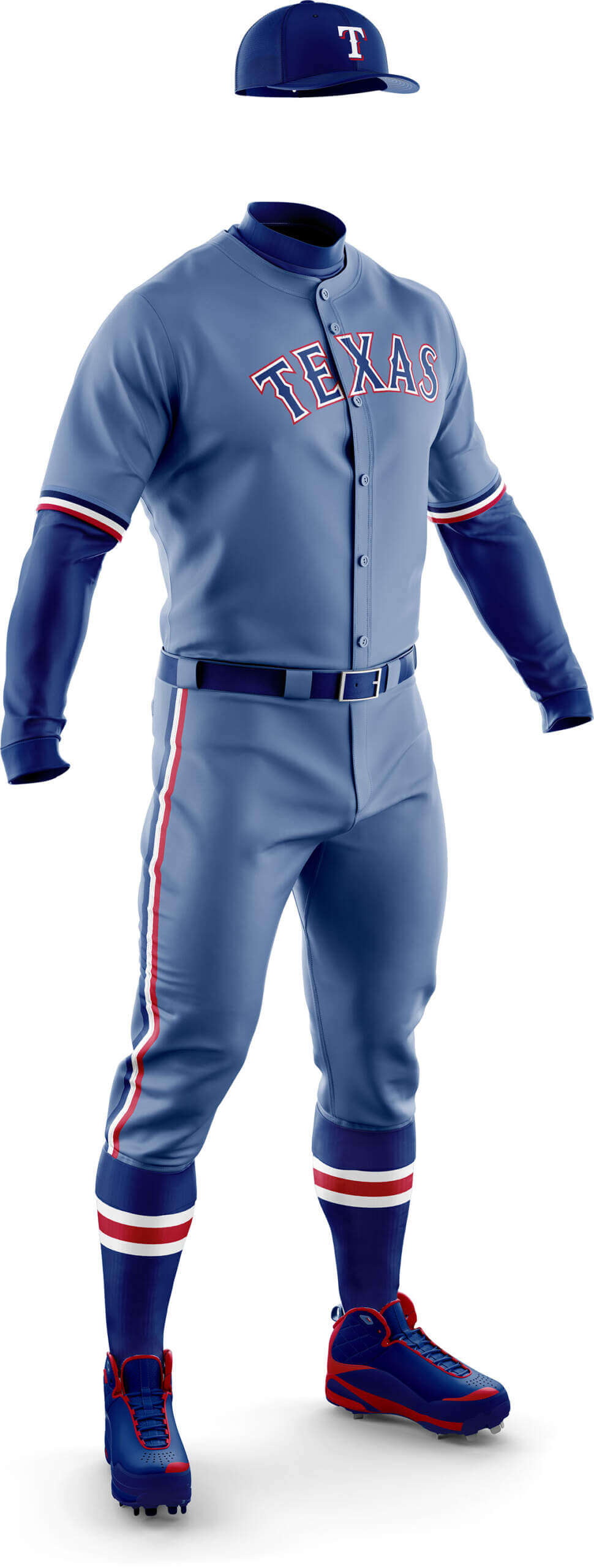
Great job all around… but the Rangers need some more red. Don’t make them pick a primary color.
I love that 1978 Cubs road uniform, but I’d like it almost as much if it had dark blue pinstripes like on this Twins concept. Plain blue numbers, or maybe with a white outline.
If you want to see the Nippon Ham Fighters ’70s uniforms in this style, here’s a blogger who has collected just about everything Ham has ever worn, including the crazy pastel colors of the recent years in Hokkaido:
link
Missed opportunity to do the A’s’ uni in some shade of yellow. I hope that means it’s going to be used for the Pirates and/or Padres.
We gave the A’s a mono-gold uniform in Phase II. link
For Phase III, Chris was basing his “pastel” shading on the team’s primary color (you could certainly argue for Oakland that’s both green and gold), but they don’t currently have a gold jersey, and they have a green cap and green alternate. So that’s why they got the green shading.
Frankly I absolutely LOVE what he created here.
As for other teams having a “shade of yellow”? You’ll have to wait and see.
I knew about the mono-gold – it’s probably my favourite uniform in this whole series! I’ve just always wondered how a pastel yellow uni would look.
A lot of great concepts. I never considered teams using a darker shade of gray before, but I think it’d look great out on the field.
I think the Diamondbacks had a darker grey among their soon forgotten set before the current one. It was the only one I slightly liked. But these dark grey ones are much better, but not as good as the pastel green of the A’s, the dark grey of the White Sox and the stripe on pinstripe fiesta of the Twins.
My issue with dark gray uniforms (like the ones the Arizona rolled out a few years ago) is that from a distance (say, the upper deck of a baseball stadium) they make it very difficult to distinguish baserunners from umpires, who are also wearing dark gray uniforms.
Why does the Yankees concept look so good? Because every team would look better in darker gray than the currently fashionable soiled-off-white shades of “gray” ubiquitous in the league.
I’m wont to agree with you Scotty, and way ahead of you too (although I don’t think *every* team that wears gray needs a darker shade, it helps MANY of the current looks). If you scroll up to my comments on Detroit, you may see where this will be going in another phase.
If you go dark gray (or anthracite, like my guilty pleasure the Washington State football alts), you need to go with white numbers and letters.
Other than the Rangers not having enough red, my only other quibble would be the legibility of some of these from a distance. Reversing the letters/numbers and the trim would help.
Spot on Jimmer! As Phil noted above, these are based fairly closely on the current road greys which of course are a light grey. We may do a second pass where we loosen up the rules a little to fix this issue for some of the designs.
These worked out better than I would have thought. The biggest trouble areas seemed to be the dusky navy roadies with red lettering. The wordmarks do get lost.
Agreed! That’s the thing for me too — look at the graphic at a smaller resolution (and picture that on your TV screen or from the seats). Like say, this: link
When seen “at a distance” it seems several of the teams have difficult-to-distinguish wordmarks. However, click on any of the individual graphics (then enlarge further) and the wordmarks are crisp and clear. But we have to take into account that on the field, and from distance, we need a few teams with “bolder” wordmarks and numbers. Some tweaks would easily fix most of those, but for Phase III, Chris tried to stay “true” to their current road gray looks, just with a different shade.
We often comment on this site about which teams in the major sports leagues are most in need of an overhaul of their uniforms. In MLB, I think the Angels are at the top of that list. But if I’m arguing the franchise that is most in need of a color refresh, I say it’s the White Sox. Am I the only one who, after twenty years, finds their black and white uniforms really boring? And their Southside City Connect set, to me, only reinforces that point. Kind of like when the Denver Broncos premiered their unis a couple decades ago, what was once visually unique and interesting is no longer so. And the White Sox have a long history of drastic color changes. They’re well past due for another refresh.
I don’t necessarily agree, but if they were to change their colours I would recommend basing it on the Chicago flag. I know that’s increasingly becoming an overused trope in sports, especially for City Connect unis (or whatever justification Nike/adidas come up with for their other sports), but when the Titans released their throwbacks a ton of UW commenters remarked that light blue/white/red is a sorely underused combo in the modern age.
I know that would add another blue+red team to an already oversaturated roster, but at least they would be differentiated by not having royal or navy blue like the rest of them.
As I’m typing this I now realize that might be a little too similar to what the Cubs have…
I think Todd’s redesign worked well at the time link
but it hasn’t aged particularly well. I do like the Angels home and gray roads, but the red on red is terrible link
Their CC link
is whimsical and fun, but it’s definitely not an everyday uniform.
Honestly, I feel they need to return to their California Angels days/look link
which featured blue much more prominently that just the red they currently feature.
Todd’s unis were a welcome reprieve from the Disney era link
which was brutal.
All of which is to say: yes, the Angels are one of the teams most in need of a redesign. Maybe the most.
(Me to myself:) “Is that a MAGA hat? Oh, it’s just an Angels fan.”
Agree that the California look is their best.
Disagree about the Disney era – I think it looks great. That could just be nostalgia though.
No, no, no. Black with white is ideal for the White Sox. Stability, after all those changes, is a good thing.
Hopefully the White Sox will change their color scheme when they move to Nashville. The NFL’s Raiders black/silver/white look is an all-time classic. The NBA’s Spurs also look outstanding in those colors. The NHL’s Kings with Gretzky in black were chic at the time, but looked dated fairly quickly and black never seemed like a Los Angeles color. The White Sox were way ahead of the trend when they picked black, but that was over twenty years ago and, despite some college football teams thinking predominantly black uniforms are still in vogue, that time has passed.
B&W for the White Sox is the best thing they ever did. I’d rather they keep the iconic (WS-winning) uniform instead of wandering around the desert in all sorts of colors, wearing pirate shirts and shorts and leisure suits, like they did for 80 years. Black as perfect contrast to white–it’s like they finally figured it out. One thing I would do is bring back the oSx logo (sorry can’t depict it well–where the o and x fit inside the spaces of the S). Classic, really hot logo that would make a great alternate.
The Yankees and White Sox concepts look so much alike. Maybe they’re using the same chassis? I do like the Twins one a lot, maybe the best of the bunch. I would love to see the Tigers get rid of the script wordmark and return to the 80s lettering.
I love everything about the Twins concept, but I think my favorite thing is that it subtly reinforces that the Twins are a navy team with red highlights. I liked the current uni set when it was revealed, and it’s grown on me seeing it on the field, but my one complaint about it upon release remains the case for me: Red and blue are too coequal. Sure, the navy predominates, but not by enough. Blue up the base color of the road pins and problem solved.
I’m a Seattle Mariners fan. I would like to see some shade of light blue instead of mint color for these monochrome jerseys. I really like a lot of these concepts. The Angels’ concept seems like it would be suited for the Phillies, in my opinion.
The NL has three “red” teams so expect more “powder pinks” on the way!
I’m not counting the Nats who can’t decide if they are red or blue these days!
The Twins one is fantastic, they should switch immediately.
The darker gray in general looked good, I really liked the Bal, NYY & CWS.
NYY especially looks great in the dark shade. Plus, a wonderful opportunity for some Nike storytelling…. “Dark Gotham Nights Edition”
Side note I noticed in the descriptions Chris uses “grey” while Phil uses “gray”?
That’s the English (“grey”) spelling of the word. Americans, Paul excluded, spell it “gray”
I knew it is American vs British spelling. I just found it interesting you each used a different one in the same post.
I actually never remember which is which myself, I usually end up googling it.
Thanks for sharing these concept, Chris.
The “warm dark grey” you put the Orioles in makes the uniform look ‘almost’ brown, which I like since it sorta ties into the franchise’s St. Louis roots.
You put a red visor on the Rangers cap and that uniform is ready for action.
Thanks Chris! Yes you’re right it does have a brownish tinge and I’d not spotted the link to the Browns – nice one!
Remember when the Angels had two shades of blue in their uniforms (1998ish)? I don’t know why they’re so obsessed with the red. When they came out with it, it seemed like RFRS to me. A nice powder blue (or even navy) might be nice for the Halos.
I think it’s NBND – No Blue Not Dodgers! The Disney era uniforms are a bit kitsch but I’d prefer they revisit that than go back to the California Angels look. I know most everyone seems to revere it, but it feels clunky now – like a left over from the 70s pullover era.
I mostly just want to say how much I’ve enjoyed this series of posts. I always enjoy thinking outside the box, and a lot of these concepts have been nice.
Also, I don’t know what the hell that Astros color is, but I honestly don’t hate it.
Thanks Daniel! I think when I pitched the Houston one to Phil I called it peach! I know Phil doesn’t like it but I feel it has something going for it.
I like these WAY more than I thought I would. Awesome job.
Chris did an outstanding job taking my “vision”(?) and turning it into a very good estimation of how I envisioned many of these in my mind. On several (like the Twins), those were his own instincts — I certainly never would have been in favor of what he created until I saw it. I, too, am very pleasantly surprised how good some of these look and how well Chris did to create them.
Problem with all of the powder blue uniforms is that they really aren’t. Came up yesterday in a TwitX thread; years ago, road uniforms were a heather gray, as seen in the photo of Bill Freehan above. The gray wool was interwoven with white, and created the heathered look. When Montreal and Seattle decided to go with light blue instead, the flannel manufacturer replaced the gray with blue; the more white was added, the lighter the shade of the material. It created a muted color that looked wonderful.
When doubleknit polyester took over, all of the material was the same color, and the ‘powder blue’ looks so garish. Under Armour developed the faux flannel material someone mentioned earlier; shame that they couldn’t honor the MLB contract, because that would have been a nice upgrade.
Actually, the grey wool was interwoven with blue threads. Almost all “grey” team’s jerseys in the last ten years of the flannel era have a light blue tint, which shows up in bright lighting:
link
link
I should say, “also” had blue threads. There’s plenty of white thread, too. You’re right abut that.
This is why I hate today’s gray so much; it is truly colorless with no “flavor”.
I often suspect that the almost-immediate explosion in colored uniforms in the ’70s is that as soon as doubleknits came in, gray became a new level of dull. Then in the ’90s when gray came back into fashion, people had forgotten that pre-’70s gray was something different and better-looking.
Hate the “orange” in the Astros uni above, their actual gray road unis look much better. Love the orange outline of the blue letters and numbers. For this, I would have like to see a full navy uni, but I guess the CC is close enough to that.
I didn’t like the dark over dark batches (I think for baseball I just don’t like dark pants no matter the combo), but these…these I like.
I really like the darker gray for the Yankees. The darker gray didn’t go over well a few years ago for the Diamondbacks. They looked too much like the umpires when they wore the dark gray bants and black jerseys. But the all dark gray really popped with the teal/aqua trim.
The Mariners don’t wear their road grays anymore. Went with the navy top and gray pants. As a Seattle fan, I was sad to see them go but understood why. Didn’t want to sacrifice their Sunday unis or the Emerald Fridays. This mint road jersey should replace the dark tops, I’ve never liked them over the gray pants