By Phil Hecken
Follow @PhilHecken
Greetings everyone! Hope you and yours are staying safe.
For those who have been reading Uni Watch for some time, you are aware I’ve run a series of “What’s Your Sign(ature)” articles where I look at a club’s uniform history and attempt to establish what I call a “signature” look. Now, the signature look is not one the team has worn the longest, or the team’s “best” uniform set (although either could qualify). Nay, the team’s “signature” look is one that when you see it, you KNOW the team wearing it. It could be a unique look (usually the case) or even a classic one. But it’s the uniform that most stands out as being the look for that team.
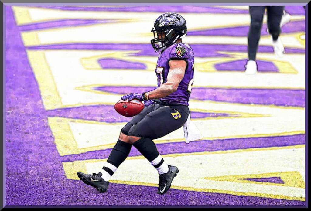
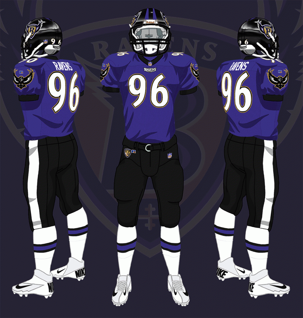
Today we’ll look at the Baltimore Ravens, who’ve remained remarkably consistent in their uniforms over the years, and have established a look that they definitely “own.”
As most of you know, the Ravens were “born” in 1996, but only in the legal sense: the Ravens were born as the result of their transplantation to Baltimore from Cleveland, when the Browns owner Art Modell moved the team. Famously, Modell reached deals with Baltimore and Cleveland allowing Cleveland to keep the Browns’ name, history, and colors for a future replacement team, so the newly renamed Ravens (whose name comes from the famous poem “The Raven” by Baltimorean Edgar Allan Poe) were technically an expansion team.
Let’s take a look at some of the various uni machinations the team has had over its history, and determine their “signature” look:
1996
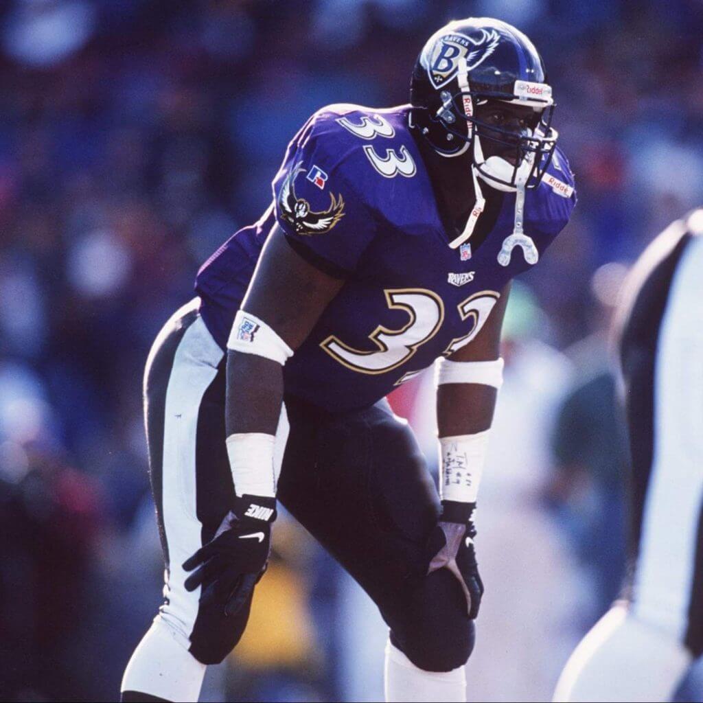
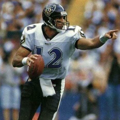
The Ravens burst on the scene dressed remarkably like ravens, which are mostly black and purple. Their inaugural uniforms, particularly the homes, would reflect this, as the team wore black helmets and pants, with a purple home and white road jersey. They were one of the first teams to use a custom number font, and the Ravens’ used a pointy, sometimes-oddly-kerned set. The numbers were double-outlined, with gold/black outlines on the purple jerseys and black/white outlines on the white jerseys. The helmet featured a stylized B on a shield, with white, purple and black feathers. The pants featured a single, solid wide stripe, a feature the team still uses on certain pants to this day.
1997
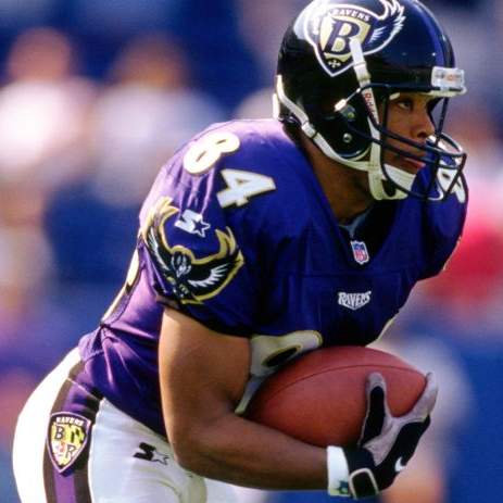
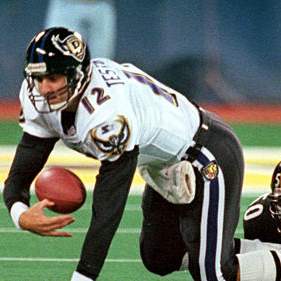
After one season the Ravens changed uni suppliers and uniforms as well. For the home uniforms, the numbers were given a gold outline with black blockshadowing, which gave them depth; the team also seemed to fix any kerning issues. For the purple jerseys, the team added white pants with a black/purple/black striping pattern. The white jerseys also changed up the look of the numbers, adding the gold outline and black dropshadow as well. The team would continue wearing black pants with the white jerseys, but the black pants now had a white/black/purple/black/white pattern. Both jerseys featured black collars and sleeve hems.
1998
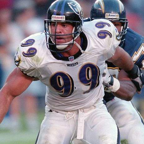
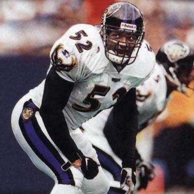
Not much would change in 1998, but the team ditched the black road pants. They would wear black/white/white uniforms for the first time — a look they have featured almost ever since.
1999
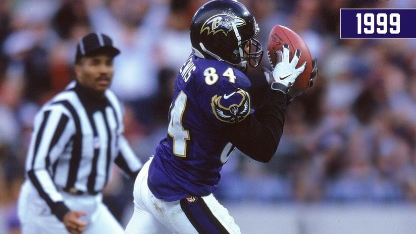
There would be no changes to the uniforms in 1999, but the team was basically forced to change their helmet logo, after a court case ruled the team used the original logo without permission (there’s a lot to this story — the link gives not only the details of the original suit, but subsequent filings). The new helmet logo, informally known as the “purple bird head,” remains their helmet logo to this day.
2004
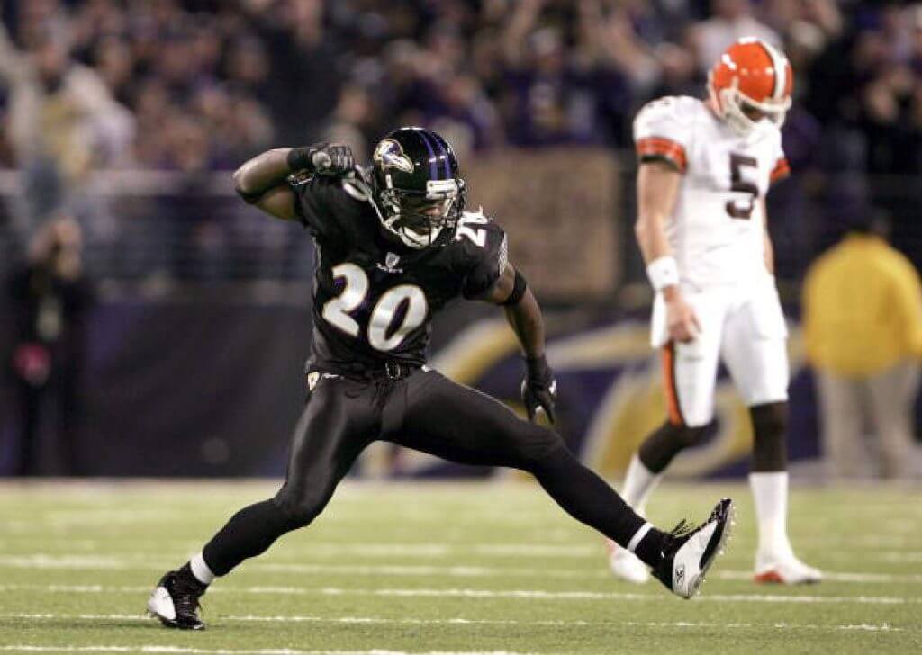
The Ravens would make no changes to their uniforms from 1999 through 2003. That would change in 2004, when the team added an alternate black jersey and solid, stripeless black pants. The black jersey was identical to the purple, with the exceptions of swapping the black neck/arm striping to purple, and replacing the black blockshadow on the numbers with purple. The mono-black look would prove popular with fans and team alike, and it was rumored to have been introduced at the behest of Pro Bowl linebacker Ray Lewis. One small change also occurred this year. The Ravens began wearing high black socks with all their uniform combinations.
2008
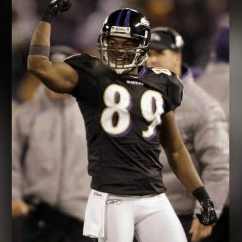
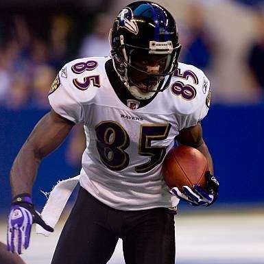
Two slight changes occurred in 2008: the team stopped wearing white pants on the road, so their black/white/black look (new for 2008) would be a feature from that year forward. It would be the only year the team didn’t wear white over white since their early days. The white over white would return in 2009. The team also did not wear their alternate black jerseys with the black pants, instead wearing them over white pants. It’s somewhat surprising the team never combined the black and white uniform elements before this. The purple over white remained their main home look, as it had been since 1997.
2010
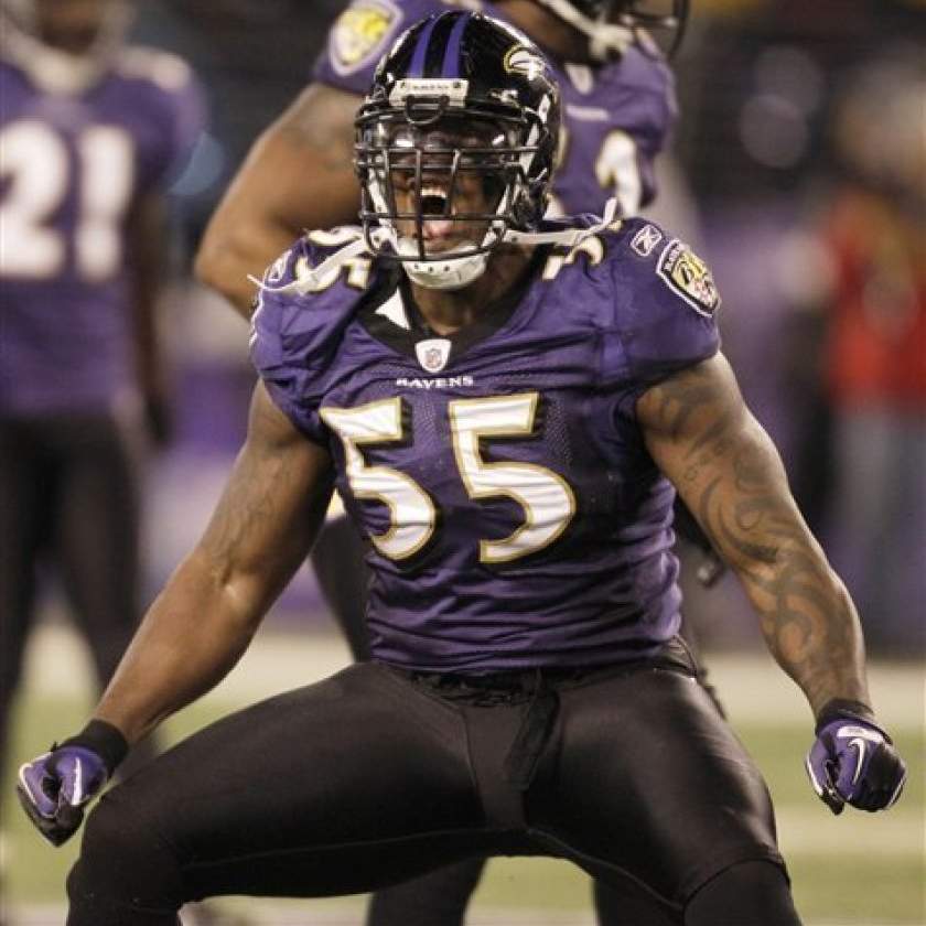
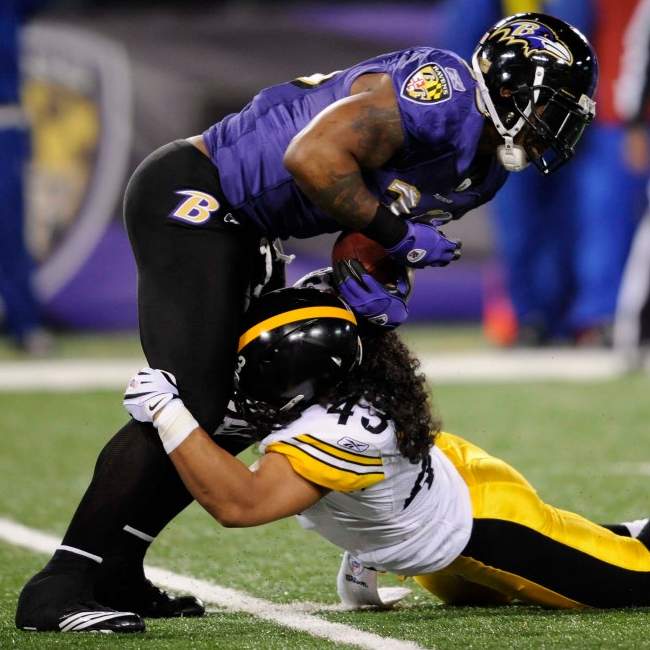
2010 saw the Ravens wear six different combinations, five of which they had previously worn: purple/white, black/white, black/black, white/black and white/white. This year saw them “return” to their original home uniform of purple over black. While there are significant differences between the 1996 and 2010 versions, it definitely harkens back to the original. And it strikes me as their “signature” look.
The team would continue to wear all six combinations through the 2013 season. In 2014, the team “retired” the black jersey/white pants look (but this would not be permanent).
2015
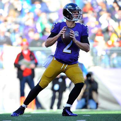
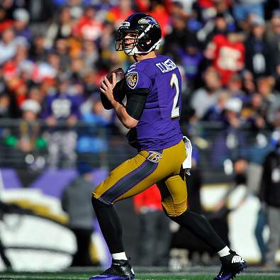
In 2015, for one game only (and without any prior announcement), the Ravens broke out a pair of gold pants, with a wide purple/black/purple stripe, against the Kansas City Chiefs. The surprising look was met with mostly scorn and the team lost convincingly, 34-14, at home. The would never wear gold pants again.
2016
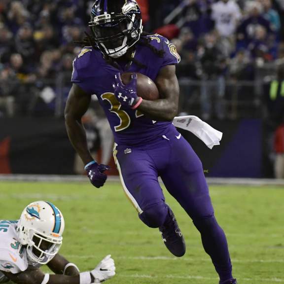
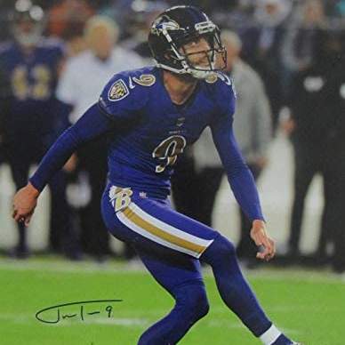
In 2016, the Ravens would join the rest of the NFL in adding a “color rush” uniform to their stable, and this one featured an all-purple look. The numbers on the purple jersey changed from white to gold, and had a white outline and black dropshadow. The pants were new, and contained a white/gold/white stripe. They would wear the “color rush” uniform from 2016 through 2019.
2018
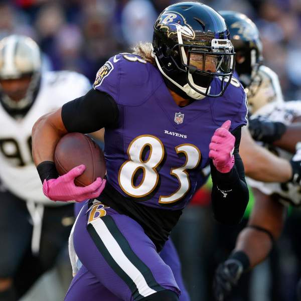
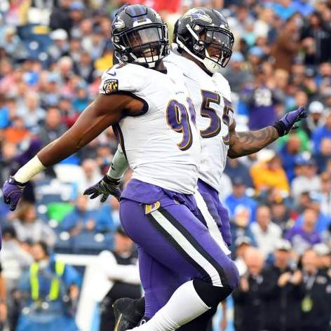
The Ravens would make one final addition to their uniform set in 2018, adding a pair of non “color rush” purple pants. These would be similar, except the striping would be black/white/black. The team wore these with both their purple and white jerseys. But they weren’t done mixing and matching — they also paired the new purple pants with the black jerseys.
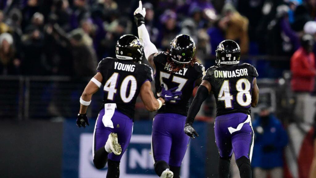
The three new combos added to the teams already prolific number of choices, including color rush, allowed the Ravens to wear an incredible 10 different uniform combinations in 2018! In 2019 they would drop the black over purple, and in 2020, dropped the color rush combinations.
So there you have it. A pretty remarkable (and mostly consistent) uniform history since “entering” the league in 1996. But what is their signature look? While it’s not my personal favorite, I have to say the black helmet/purple jersey/black pants is easily the choice. Why? No other team has ever worn such a combination (and lets hope it stays that way), it was their “first” look as well as a current one. Even though I detest the stripeless pants (especially when worn leotard-style with black socks), it still screams “Ravens” in a way no other look does.
What say you?


Guess The Game…
from the scoreboard
Today’s scoreboard comes from Hammer Time.
The premise of the game (GTGFTS) is simple: I’ll post a scoreboard and you guys simply identify the game depicted. In the past, I don’t know if I’ve ever completely stumped you (some are easier than others).
Here’s the Scoreboard. In the comments below, try to identify the game (date & location, as well as final score). If anything noteworthy occurred during the game, please add that in (and if you were AT the game, well bonus points for you!):
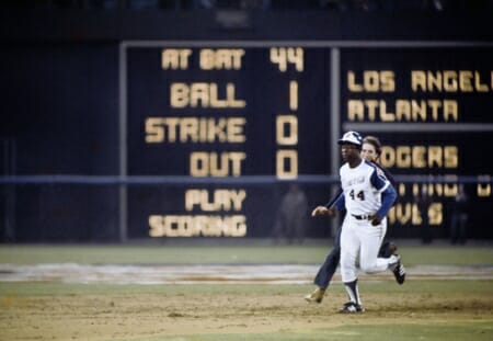
Please continue sending these in! You’re welcome to send me any scoreboard photos (with answers please), and I’ll keep running them.


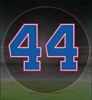
The King is Dead…Long Live the King
As I’m sure you’re all aware by now, the great Henry Aaron passed away yesterday. The Hammer was 86. I won’t go into much of his on or off-field heroics here, or his importance not just to baseball and social and civil rights. I know Paul will have more about the man on Monday, and he’s far better than I at tackling that sort of thing. But I do want to offer a few words.
Henry Aaron had already had a tremendous career by the time I started really following baseball in 1972 as a six year old. I knew he was a great player, and as the 1973 season played out (when I really started getting into the game), I knew he was approaching one of those records that many thought untouchable: passing Babe Ruth’s MLB record of 714 home runs. My interest that season was much more devoted to my beloved New York Mets (the team hadn’t begun to break my heart multiple times at that point in time), and I followed their every game as they rose from near the cellar of the NL East to clinching the division on October 1 in Chicago; they’d eventually beat the Reds three games to two in the NLCS and damn near knocked off the reigning World Series Champion Oakland A’s later that month. After the season ended, I remembered reading Aaron had finished 1973 with 713 home runs. My pop, who was a big a baseball fan as I’d become, told me “if Aaron plays next season, he’ll have the greatest record in (baseball) history.” It never occurred to me as a seven year old that players didn’t play forever, so I kind of dismissed the comment, and turned my thoughts to 1974 and a return to the World Series for my Mets. Did I mention I was seven?
As the 1974 season began, Willie Mays was no longer playing. “He retired” my dad told me. What? I thought these guys played forever. Anyway, Aaron was still playing and I watched the news to see he had hit number 714 in Cincinnati. I didn’t know the Braves had wanted him to sit so he could break the record in Atlanta. He did sit the second game, and I believe went hitless in the third. Then came April 8, and fortuitously, the Braves/Dodgers game was nationally broadcast — and I watched it with my dad. You guys all know what happened in Aaron’s second at-bat. The immortal Vin Scully beautifully captured the moment:
One ball and no strikes. Aaron waiting. The outfield deep and straight away. Fastball. It’s a high drive into deep left centerfield. Buckner goes back to the fence. It is gone.
True professional he was, he was silent for about a half minute, allowing the moment to fully sink in. Then, he spoke:
What a marvelous moment for baseball. What a marvelous moment for Atlanta and the state of Georgia. What a marvelous moment for the country and the world. A Black man is getting a standing ovation in the Deep South for breaking a record of an all-time baseball idol. And it is a great moment for all of us and for particularly for Henry Aaron, who was met at home plate, not only by every member of the Braves but by his father and mother. He threw his arms around his father and as he left the home plate area, his mother came running across the grass, threw her arms around his neck, kissed him for all she was worth.
You can see it all here:
Truly amazing — and it was really one of the first EVER “greatest” moments I ever watched live. I’ll never forget where I was (at home), watching with my pop.
None of it seemed as historic to me as it was. Even the two guys who raced out to shake Aaron’s hand and pat his back didn’t seem out of the ordinary to me. It would only be later that I would understand everything that Aaron had faced leading up to that point. And it was truly amazing. It was one of those things that only got better and better as I learned Aaron’s history, story, and the guts, determination and will to get to that point. The racism, the death threats, the adversity — none of that I knew or understood at the time. I was just happy for the guy.
One last thought — Aaron was a five-tool player before they paid you eight figures per year to be one. But what has always amazed me is this one simple baseball fact: even if Henry Aaron had never hit a single home run, he’d still have over 3,000 hits. That’s how good he was (and that doesn’t count his batting titles and gold gloves). And yet, he never once hit 50 or more home runs in a season.
We lost one of the greatest baseball players (easily top 3) yesterday, but we also lost an amazing human being. I’m glad I got to see him play, even if it wasn’t in his prime, and I’ll never forget that April night with my pop, watching history unfold.
Henry Aaron wore many a uniform throughout his professional career, but surprisingly, with only two professional teams (Braves, Brewers), didn’t wear that many different ones. Sadly, the Braves unis had rather problematic imagery associated with them. Here’s a look at some of the unis he wore:
Rookie issue
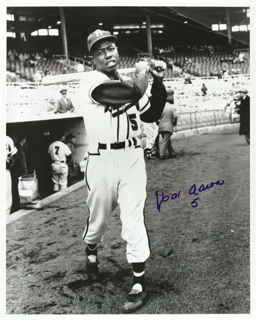
Most people think of Aaron and immediately the number “44” which he wore for the majority of his career comes to mind. But that wasn’t the first number he was issued.
1954-1962
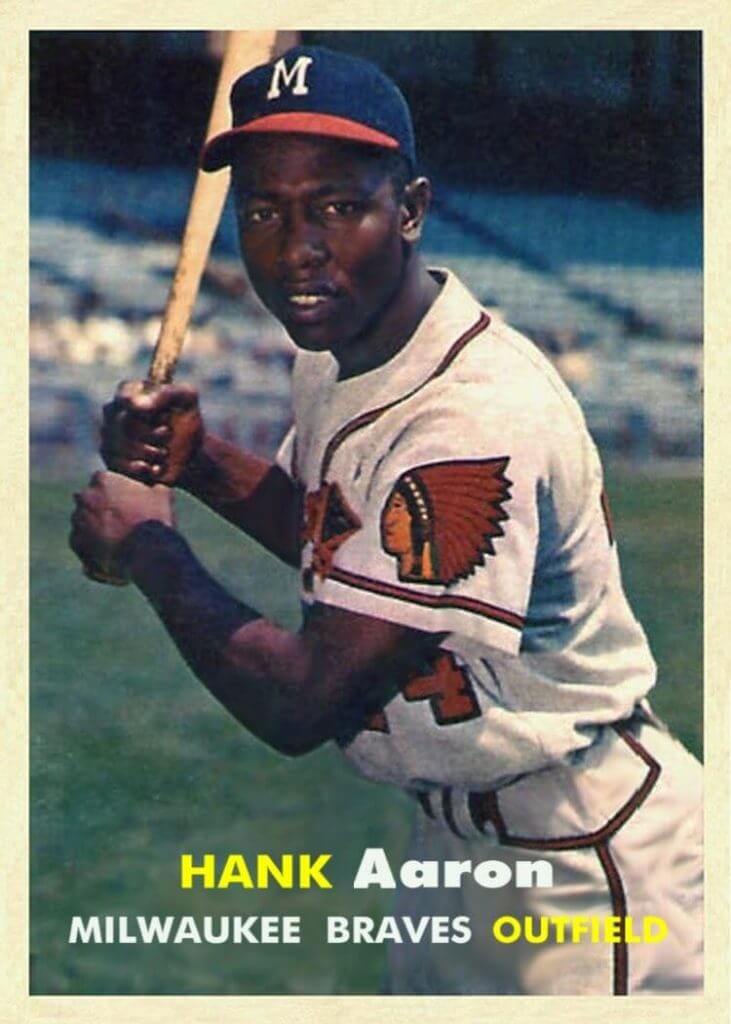
1963-65
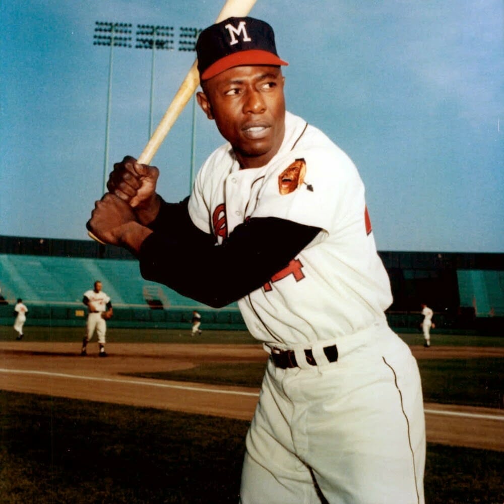
Aaron’s Milwaukee years were basically all in the same uniform (which is quite similar to the uniforms worn by the Braves today). The Braves changed shoulder patches to the one seen above in 1957, but kept the black tomahawk. In 1963 they removed the tomahawk but kept the patch.
1966-67
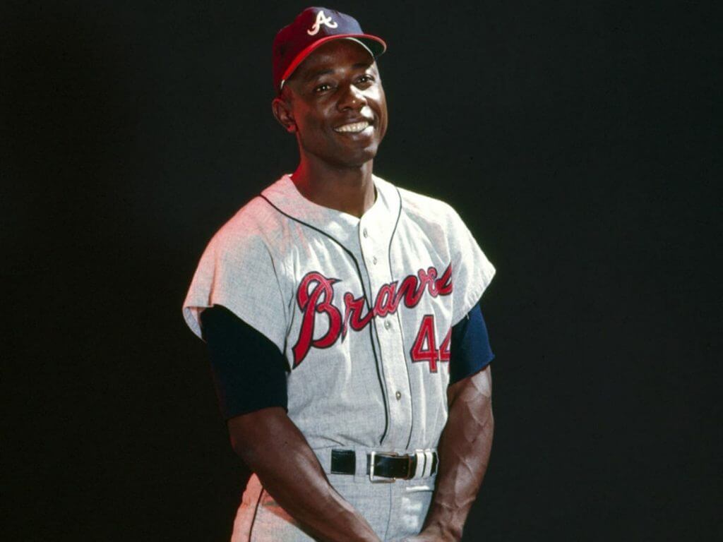
When the Braves moved from Milwaukee to Atlanta, they wore the same uniforms for the first two years as they had in Milwaukee, changing only the “M” on the cap to a cursive “A.”
1968-71
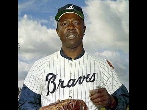
The Braves changed their uniforms slightly in 1968, adding pinstripes and eliminating most of the red. The road unis were similarly plain.
1972-73
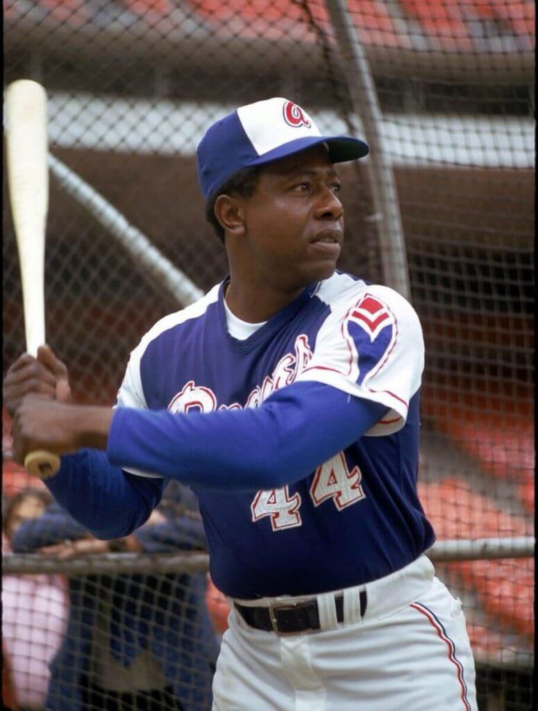
Most people think the 1972-73 and 1974-75 uniforms are identical, but there were subtle differences (and uni makers), with the earlier uniforms having a slightly different script and wavier numbers than the 74/75 jerseys.
1974
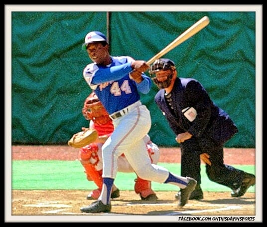
That’s Aaron in Cincy tying the Babe’s HR record.
1975-76
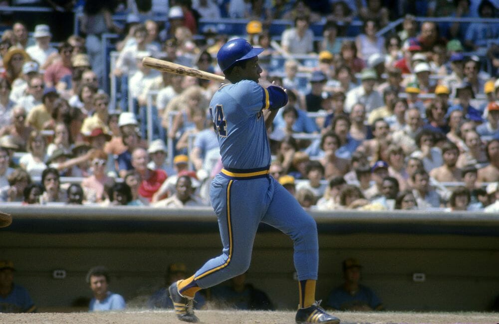
Like Mays before him (returning to New York from San Francisco), Aaron returned “home” to Milwaukee and played his final two seasons with the Brewers. He’s seen above wearing one of my favorite uniforms of all time. I love the gold sanis!
RIP Henry Aaron. The world has lost one of the greatest humans ever to walk the planet.
Feel free to post your thoughts (especially if they’re uni related) on Hammerin’ Hank in the comments below.


The “BEST OF” Kreindler’s Korner
Hey guys & gals. You’ve enjoyed Kreindler’s Korner for several years now, mostly on the weekends, on Uni Watch, but with the recent coronavirus outbreak, Graig’s time is just too precious and he needs to tend to other things besides coming up with a new writeup each weekend.
So, going forward, for as long as the COVID-19 situation is bad in New York, I’m going to run a few “Best of’s” until Graig returns.
Here’s today’s offering:
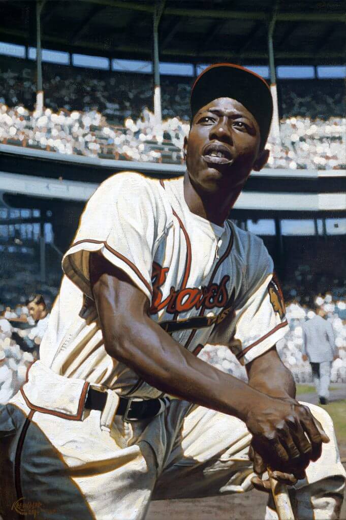
Title: “Henry”
Subject: Hank Aaron, 1956
Medium: Oil on linen
Size: 16″ x 24″This painting has always been a favorite of mine. Something about the combination of an amazing jersey, the low vantage point, Hank’s arms and him gazing to the heavens just really tugs on my heart strings. He was a truly great man, both on the field and off. We will not see his like again.
There are few jerseys that look cooler than the old Milwaukee Braves togs from the 1950s. When you mix that with beautiful light, an engaging composition, and one of the greatest ballplayers of all time, you get a special piece.
Thanks, Graig! You can (and should!) follow Graig on Twitter.


Click to enlarge
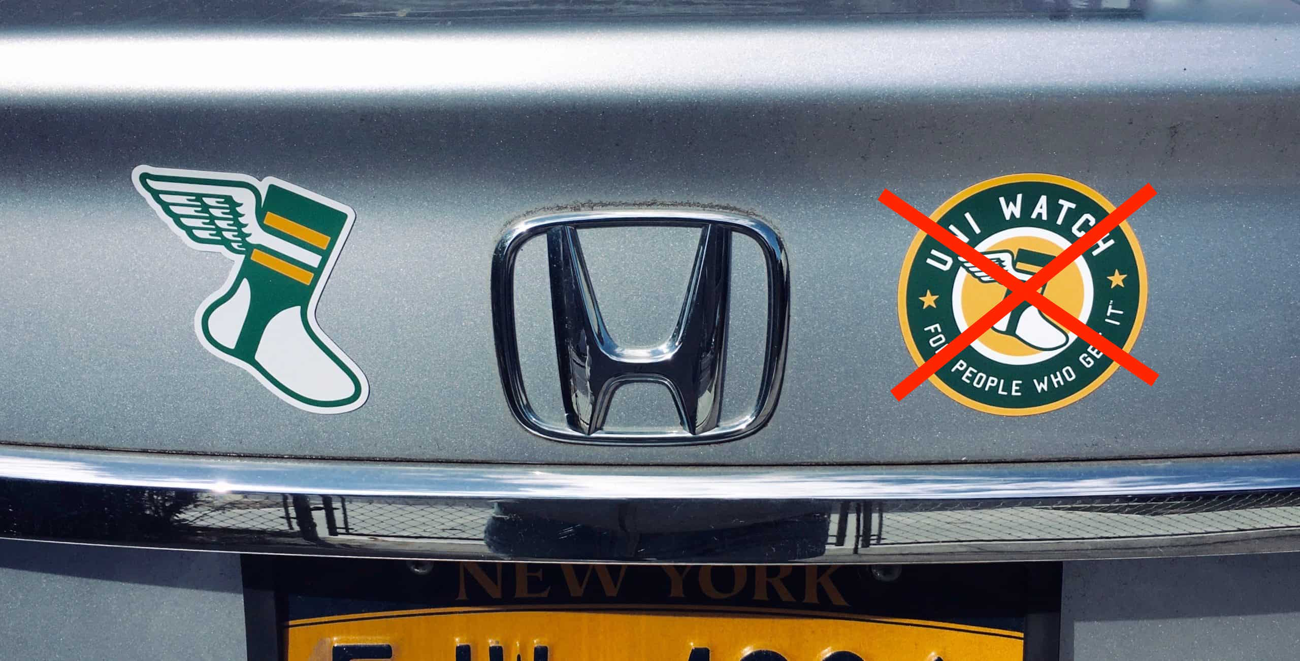
Magnets back in stock: Paul here. I’ve procured another small supply of winged stirrup magnets (but not the round ones, sorry). They measure about 3″ x 3″, and they’re thin and flexible, so they’ll conform to curved surfaces as well as flat ones.
I have a very limited supply of these. They’re available here.


The Ticker
By Anthony Emerson

Baseball News: MLB.com has published an article on the history of the Brewers’ ball-in-glove logo (from Kary Klismet). … The Somerset Patriots, who have joined the Eastern League as the Yankees’ Double-A affiliates, will get new uniforms to go along with their new league (from John Cerone). … Western Kentucky unveiled new uniforms yesterday, and that “W” looks a little bit too close to the Nationals’ “W” (from Erick Kriewaldt). … A Maine-based bat manufacturer, Dove Tail Bats, is distancing itself from a man who purchased a bat from them and had it customized with “Trump Won Period” before taking it to the Jan. 6 insurrection at the Capitol. Facebook posts indicate that the purchaser intended to use it to assault “communists.” Dove Tail says they’re now introducing “additional safeguards” to ensure “incendiary language” is not used on their bats. … An actor on a recent episode of Law & Order: SVU was wearing about the closest thing possible to a Mets logo without the producers having to actually pay for the rights to use the Mets’ actual logo (from @artofscorebug).

NFL News: All year the Pats had trouble keeping their NOB font consistent. It appears the Pro Shop at Gillette Stadium is also having the same issue.
.

Hockey News: According to reader Tom Roddy, Golden Knights owner Bill Foley said in a televised interview that he hopes the team’s gold jerseys become the primary home look if “the powers that be” allow it. Don’t know if he means the NHL or the hockey operations side of his team. … New Devils G Eric Comrie has a new mask (from Wade Heidt). … The NWHL is wearing an “End Racism” sleeve patch this season (thanks, Jamie). … It appears the yoke on UMaine’s jerseys this year is too large, and makes the NOB and uni number cluttered and small (from @Long_Tall_Foxy).

Pro Hoops News: New Rockets G Dante Exum will wear No. 5 (from Etienne Catalan). … Yesterday, we ticker-linked to a package of Cookies brand marijuana, featuring Gary Payton. Today, reader Daniel Klempner sends along this Lakers jersey-themed package for a pre-roll. … Here’s an article about the evolution of WNBA jerseys in the 24 years since the league’s founding (from Kevin Brown). … Sixers mascot Franklin dressed as Meme Bernie Sanders during last nights Celtics/Sixers game.

College/High School Hoops News: Ohio State unveiled new black alternates which will make their on-court debut in today’s game against Wisconsin.
.

Soccer News: Belarus has unveiled plans for a new national stadium to be completed by 2023 (from Kary Klismet).
.

Grab Bag: The Cleveland Clinic has unveiled a centennial anniversary logo (from John Cerone). … Also from John: Pfizer has a new logo. … Valparaiso University is looking into retiring its “Crusader” mascot (from Kary Klismet). … NBC will shut down NBC Sports Network at the end of the year. Regional sports networks like NBC Sports Boston and NBC Sports Bay Area will remain. … One of President Biden’s granddaughters, Maisy, wore a pair of Air Jordan Mid 1 “Sisterhood” sneakers to the inauguration, leading to a spike of more than 200% on StockX. Vice President Harris’ niece’s husband, Nikolas Ajagu, wore Air Jordan 1 OG Diors to the inauguration, leading to a similar spike. More details here (from Jason Hillyer).


And finally… that will do it for today. Lots of good stuff on tap for tomorrow, so be sure to check back then. Everyone stay safe!
Peace,
PH
It’s not pictured, but didn’t the 1972 Braves jerseys have a couple of buttons at the neck, and a later edition just the v-neck pictured here?
“Aaron liked the color blue. Although red was traditionally used in Braves uniforms, the team changed to a blue-dominated motif in 1972 after Aaron said he was partial to that color. He was wearing the blue-and-white uniform when he broke Ruth’s record in 1974.” link
So glad he was able to break the record wearing their Best Uniform Ever.
Farewell and thank you, Hank
GTGFGS: 8 April 1974, Fulton County Stadium, Atlanta.
Very nice piece on Hank Aaron. I am not a Braves fan and Aaron retired while I was a toddler, but I was always a Hank Aaron fan. Would have loved to have met the man. And that painting is outstanding.
Re: the Ravens – the number font is not an issue of kerning (the space between letters or numbers), they actually changed the font after the initial uniforms. The original font was the same one the Diamondbacks originally used. The second and current one has fewer serifs.
Lifelong Braves fan, grew up in Florida before the Rays and Marlins came around. Hank Aarron retired before I was born, grew up seeing him around the organization. The world not only lost a great ball player but a great person as well. After baseball he was very involved in charity work. Great ambassador for the game, for civil rights and for the Atlanta Braves.
Usually don’t get upset over celebrity deaths, but was kinda gutted yesterday. You always thought of “Hammering Hank” as some folk hero and a legend. Think how the kids on the sandlot talked about Babe Ruth.
One thing you missed on the Ravens, which I wasn’t aware of until I read this and saw the photo of the 1999 uniforms. In 1999 when they had to switch the helmet logo, they kept the same jersey. The following year they changed the jersey sleeve logo from the flying bird to the crest, which has remained unchanged since. I was always under the impression that when the helmet logo changed the jersey sleeve logo changed as well. Apparently that first year was a transition.
Personally I have always preferred they wear black pants with both purple and white jerseys. With the caveat they would pair it with solid purple socks, and put some white/purple/white stripes on the pants.
I was just going to post this. Also if you look closely they had to tweak the shield logo in 2000 – they had to slightly change the “B” and “R” because the original font matched the font used on the original helmet logo. Also they changed the word logo on the front of the jersey – the original matched the first helmet logo as well. Plus with moving the shield logo to the sleeves they put the “B” from the bird logo on the pants.
It may not be a popular opinion, but I really liked the single white stripe down the side of the black pants on the 1996 uniforms. We would ponder why just a white stripe on black pants when the team had purple jerseys. It had a mysterious, ominous feel to it that fit well with the Ravens theme and identity.
Purple/White or White/White is my pick.
Oops
I honestly hated those pants. They reminded me of late-80’s spandex. I only like single-fat pants stripes when it’s a darker stripe on lighter pants. Very similar to my yoke theory.
I hope the “powers that be” don’t allow the Golden Knights’ owner to switch to the gold jersey as the primary. Gold jersey fits really well as an alternate to be worn only a few times per year. Unfortunately, depending on how the light hits it, the colour reminds me a bit of the unpopular mustard Nashville Predators third.
The dark grey primary uniform is a jersey colour unique to the Knights and looks goods. They should keep that as the primary look. They have only been in the league a few years so let’s not make a primary uniform change so soon.
I generally agree, i.e. too early to change and the grey is unique. I will say what I saw of the gold in live action (on television) , it looked great and surprisingly different.
Don’t forget about the change from the Bird on the sleeve to the shield in 2000
Was there no mention of all the Atlanta teams retiring #44 or did I miss it?
Maybe Paul will cover on Monday, but here is a link to the story:
link
The Dream, of the WNBA, are not retiring #44. Presumably it’s because they want to re-sign Betnijah Laney, who wore that number for them last season and has used it throughout her career.
Hank Aaron’s passing reminds me of the first game I ever attended. June 5th 1974, Braves-Phillies at the Vet. I think it was some special event night for my dad’s work. I was only 4, but I had a plastic blue Hank Aaron bat at home and definitely knew who he was. I remember asking where he was (he didn’t start that night) and was kind of bummed i didn’t see him play (he got a pinch hit at bat later in the game, but we were long gone at that point). Always wished I’d had the chance to see him hit.
And I’d vote white pants, not black for the Ravens signature look. I never liked the black and don’t really think of them wearing it with the purple jersey.
Purple/White or White/White is my pick.
GOAT discussions don’t happen as much with baseball as basketball, but Henry Aaron has to be in the discussion for this. During his era I was more partial to Willie Mays, but you get no argument from me if you preferred Hank.
I’ve always been partial to Aaron over Mays. Very slightly. But as long as you have these two as #1 and #2 in either order, fine with me.
Maybe it’s because, even though it happened a year before I was born, Aaron toppling Ruth’s record… that highlight reel has just been seared into my memory.
Even tho most of us never saw him, the stats show that the GOAT may have been Ted Williams, whose stats are similar, despite serving on TWO wars (the big one and Korea). No telling how big his numbers may have gotten had he not missed those years.
Note – as a kid, this Chicago boy thought that Billy Williams was the next “Hammerin Hank”.
LF Teddy Baseball
CF The Say Hey Kid
RF Hammering Hank
You can argue that Williams was the greatest hitter, but I don’t believe he was as good a fielder or base runner as Mays and Aaron. IMHO there is no question Mays was the greatest CF, though Mantle may have challenged him if he could have stayed healthy. There is an argument that Ruth was a greater player than Aaron, though he didn’t play with and against black players.
Even though I detest the stripeless pants (especially when worn leotard-style with black socks), it still screams “Ravens” in a way no other look does.
I detest them on the Saints. Not in this case.
In fact, the all-black is my signature look for Baltimore. Ravens are black with a hint of purple…why not have the team dress the same way?
I have yet to see a blue and silver lion in the wild.
Or a green and silver eagle….
Apples and oranges.
What I’m saying is, *if* your team colors happen to match what your mascot looks like in the wild, why not go all out?
I think the Ravens signature player is Ray Lewis, and I always see him in the white jersey with black pants rising to the occasion in the play-offs, so while it’s not a particularly attractive uniform, it does spell Ravens.
Over time Lamar Jackson may make the white jersey with purple pants more of a signature look, but he needs a little more play-off success.
I wish the Ravens’ black pants had two pointed purple stripes on each side, matching the helmet.
The University of Maine could unclutter things by putting the player name inside the shoulder yoke. It’s been done before.
#44: Hammerin’ Hank was a great player and an even better person.
As a lifelong resident of Wisconsin, I think it’s a shame Aaron couldn’t have played his whole career in Milwaukee and broken the record there. I love the Brewers, and was born well after they were established, but there’s always the feeling the Braves were stolen from us.
Odd comment considering Milwaukee was not the original home of the Braves – or the Brewers, for that matter.
I remember watching the game on TV (as we lived in LA and at that time in our family, we had all become Dodger fans). Was a great moment. In my mind, he IS the home run king.
Any thoughts on an MLB-wide retirement of No. 44? I like it.
I was wondering how long it would take…
NO.
People want to retire Clemente’s number…now this. And there will be others. Surprised no one has suggested Gehrig’s number.
They should have found a better way to honor Jackie Robinson, because this can’t become an ongoing thing.
I’ve seen calls previously for 3 and 21 to be retired, and now 44. I like the concept of teams retiring numbers, but leaguewide retirements should begin and end with Jackie’s 42.
I may be mistaken, but I think the Ravens were the first NFL team to match dark jerseys with dark pants. I’m not counting the Browns of the 70’s/80’s with there brown jersey-orange pants look.
Can anyone confirm????
Well, there was the Vikings “purple mistake” in 1964, when they went link vs. the Lions. The Vikes wanted to wear their link at home, but the Lions didn’t get the memo to wear their honolulu blue tops, so the Vikes were forced to change link to their link over purple pants.
So, technically, the Ravens weren’t the *first* to do it, but it wasn’t something the Vikings had actually planned on doing…
Thanks Phil, I had no idea that took place
for me Hammerin’ Hank will *always* be the greatest home run hitter of all time.
if he never hit 50 homers in a single season, I would bet it was because he was swinging for the gaps to drive in base runners, not swinging for the fences….
what a great man & great ball player!
Nice tribute
Hank hit #715 on my 10th birthday. Had a 9pm bedtime on school nights but of course my Dad let me stay up and watch that one more at-bat which took place a few minutes later. Very grateful for that memory.
My dad took me to Milwaukee County Stadium in 1976, when I was 6, and I don’t remember much other than how big it seemed, and Dad saying “see that guy, now you can say you saw Henry Aaron play”.
RIP Mr. Aaron!
The 1972-73 (first feather shoulder) Braves jerseys were made by Sand-Knit and they changed the Braves word-mark, not for the better. Most noticeable is the “B” and the curve before the “v.” The Braves switched back to Wilson for 73’s home uniforms and they fixed the word-mark and had the varsity numbers. But the Sand-Knit roads remained in 73, not getting replaced by Wilson until 74.
Logging in, there were exactly 44 comments. Appropriate. RIP Hank. (Greatest I’ve ever seen, and I’m a diehard Cub fan.)