For all photos, click to enlarge
Good morning! Greetings from Uni Watch HQ, where all three inhabitants continue to be safe and well. Hope the same is true for everyone at your home.
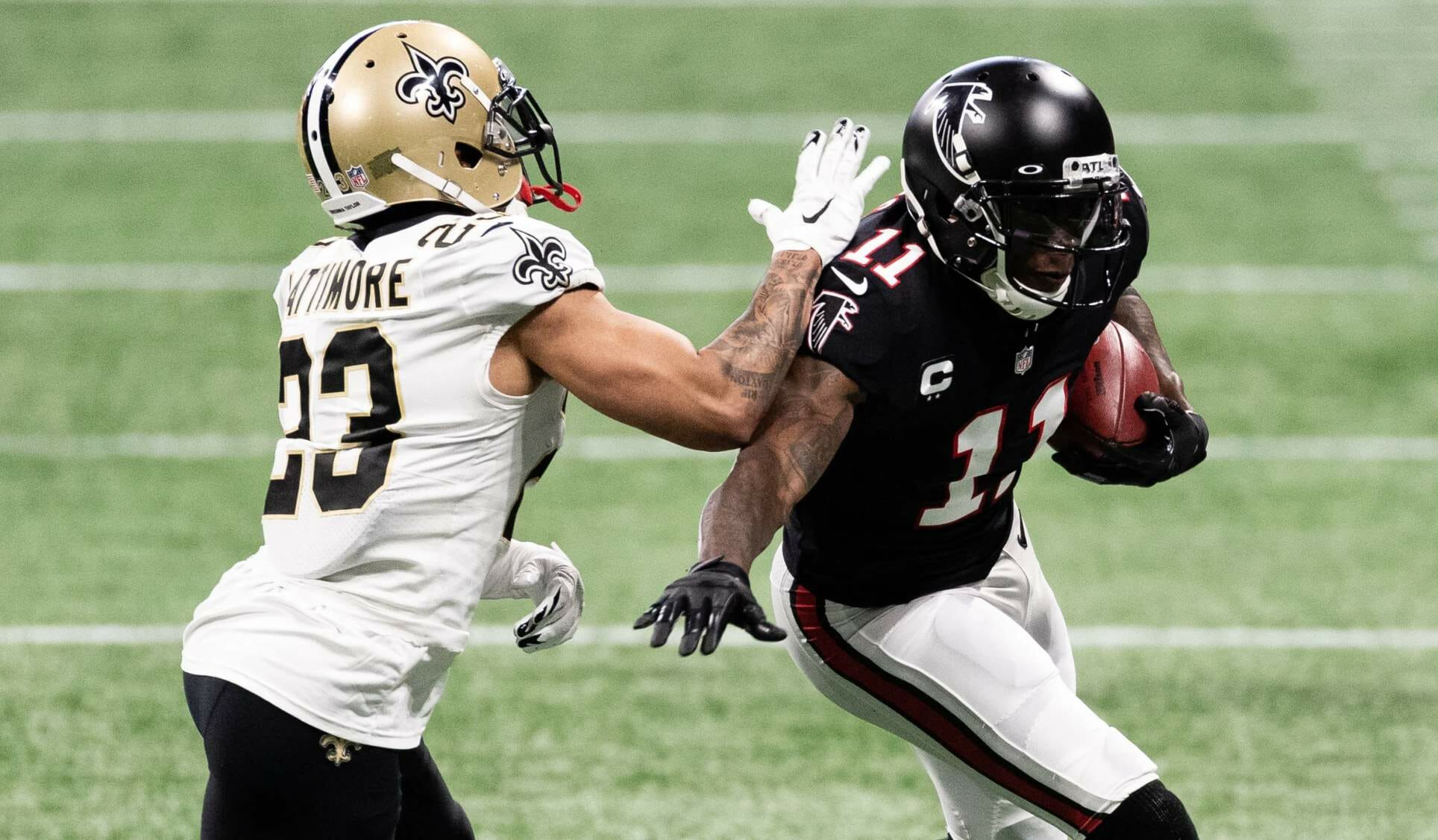
Now then: The Falcons wore their throwbacks yesterday for the first and only time this season. Since they switched from glossy helmets to matte this season, the one-shell rule forced them to maintain the matte look for the throwbacks. They had shown this as part of their unveiling photo shoot back in April, but I had forgotten all about it. I’m pretty sure yesterday was the first time this uniform has included a matte helmet.
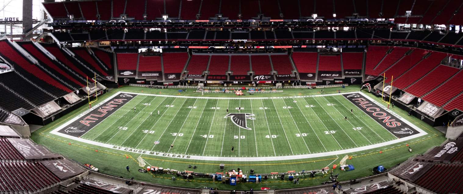
To their credit, the Falcons also put the throwback logo at midfield and in the end zones:
And as long as we’re talking about the Falcons, quarterback Matt Ryan looked particularly ridiculous in his “My Cause/Cleats” footwear:
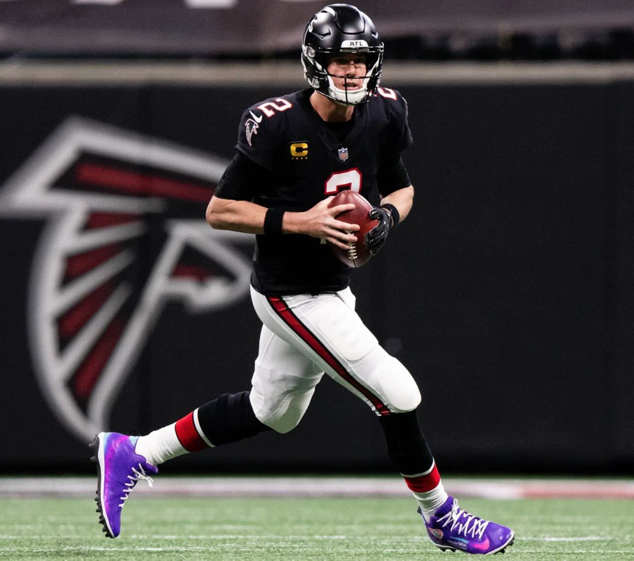
I’d like to think that even people who are more purple-tolerant than I am would agree that Ryan’s look was visually discordant, like a needle scratching across a record. I get that the “My Cleats” thing is well-intentioned, but it looks terrible and no longer generates any buzz. Surely there has to be a better way to bring attention to worthy causes.
In other news from around the league yesterday:
• When I saw that the night game on NBC featured KC playing at home, I thought to myself, “They’re not gonna be stupid enough to go mono-red just because it’s a nationally telecast game, are they?” Alas, I gave them too much credit:
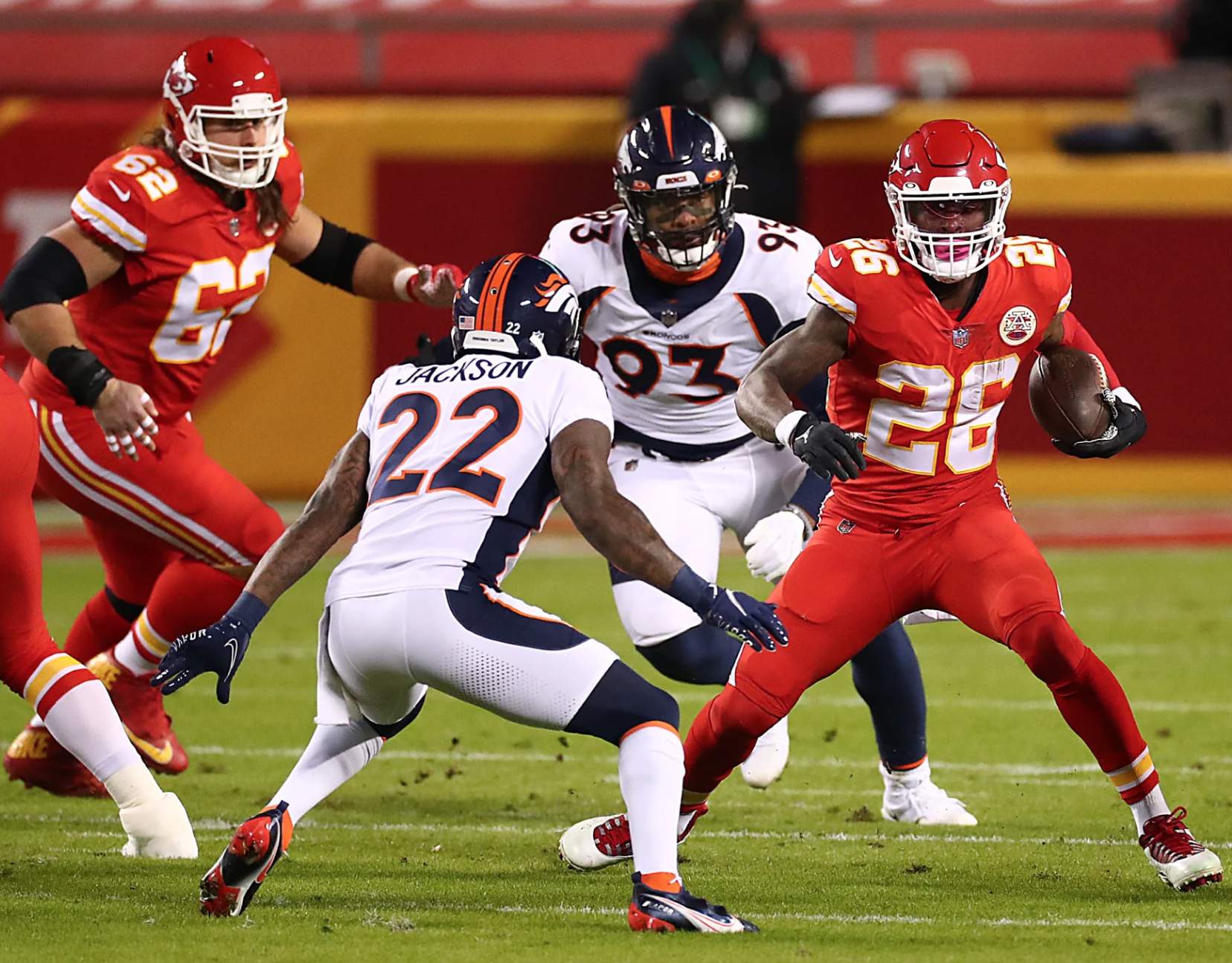
For the life of me, I can’t understand why teams do this. The thinking appears to be something along the lines of “It’s a national game, we have to do something different!” Never mind whether different is better or worse (and it’s almost always the latter). Disappointing.
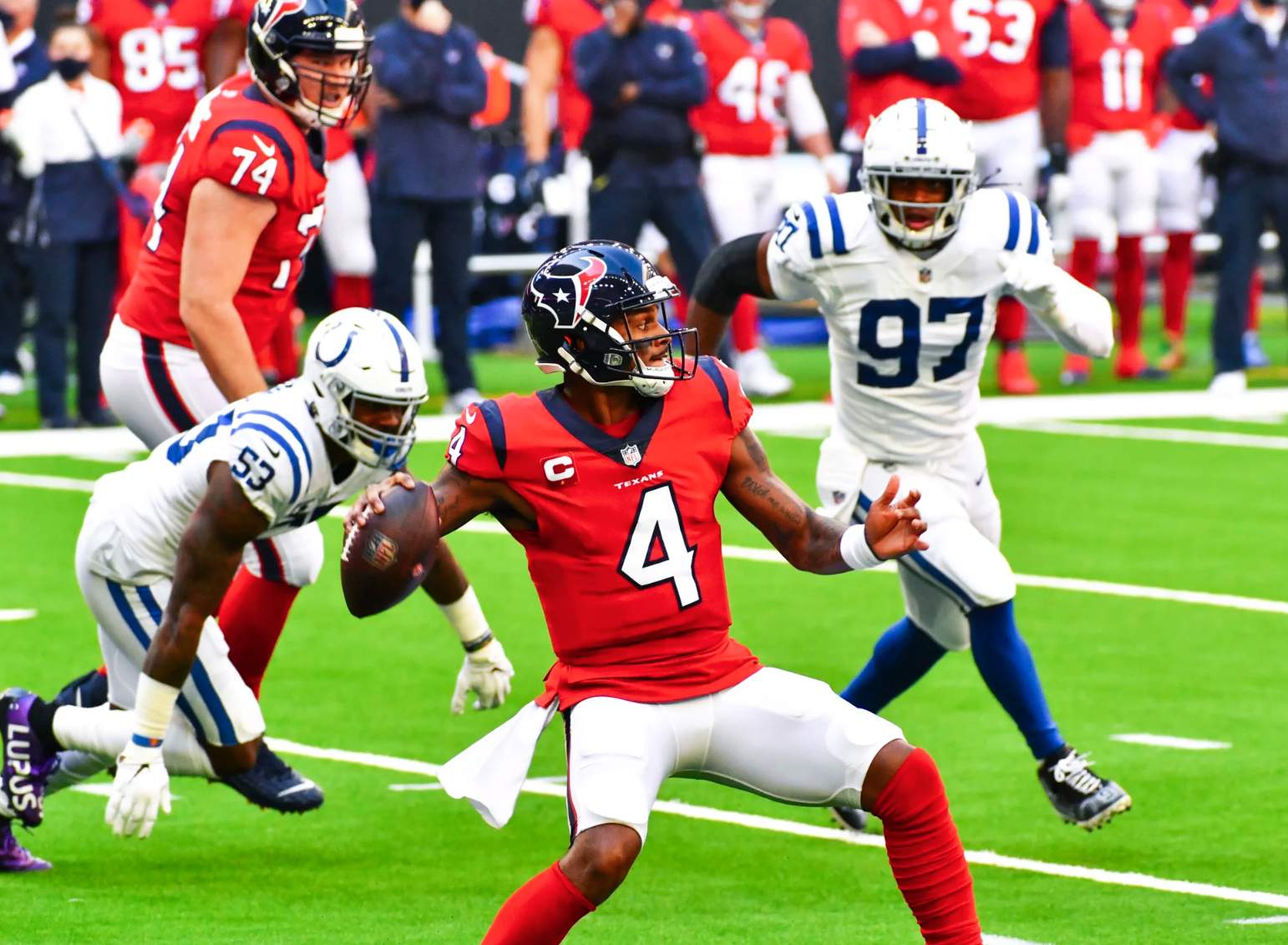
• The Texans wore their red alternate jerseys:
• Brutal-looking game in Arizona, as the Cardinals went mono-BFBS and the Rams went mono-dishwater:
• In that same game, the Cardinals had the NFL logo at midfield, instead of their usual primary logo:
I’m told that they also had “Arizona” in both end zones (instead of having “Cardinals” in one of them). I’m assuming all of this is because the Cards are now sharing their stadium with the 49ers, who’ll be “hosting” the Bills in Arizona tonight due to pandemic restrictions that have made it impossible for them to play in their own building.
• The Jets went mono-green:
• For the first time this year, the Titans went mono-sky blue:
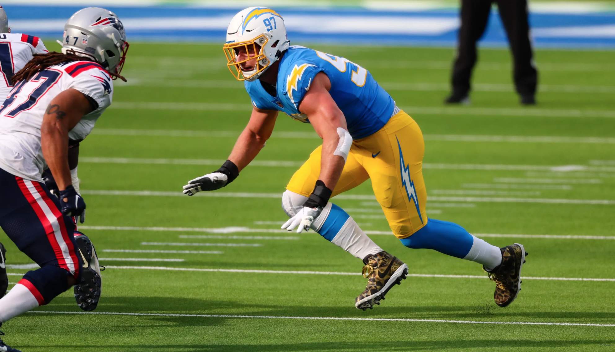
• Oh man, I just love it when the Chargers wear their yellow pants:
• And as a lifelong fan of the color green, I also love it when the Packers host the Eagles — with Philly wearing the green pants:
• Not a single home team wore white.
(My thanks to Matt Brooks and Josh Pearlman for the info about the Cardinals’ field.)
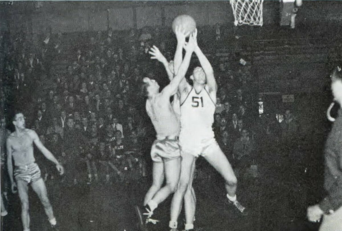
Click to enlarge
Shirts vs. skins: According to Todd Golden, sports editor and Indiana State beat writer at the Terre Haute-based Tribune-Star, the photo shown above is from the 1940 Indiana State yearbook. The team in the rather minimalist white uniform is Indiana State. The other team, though, seems to be taking minimalism to a new level.
The stands appear to be full, so It can’t be a scrimmage or an exhibition. Maybe the opposing team mistakenly brought their white uniforms, which would have set up a kit clash..?
(Big thanks to Blaine Williams for bringing this one to my attention.)
Definitely a weird one. Anybody..?


ITEM! Another membership raffle: Kristopher Stahr and Erik Papke won themselves Uni Watch memberships in two of our recent raffles, and each of them decided to pay it forward by purchasing another membership for me to give away, so that’s what we’re going to do today.
This will be a one-day raffle. No entry restrictions. To enter, send an email to the raffle in-box by 8pm Eastern tonight. One entry per person. I’ll announce the two winners tomorrow.
Big thanks to Erik and Kristopher for doing this!
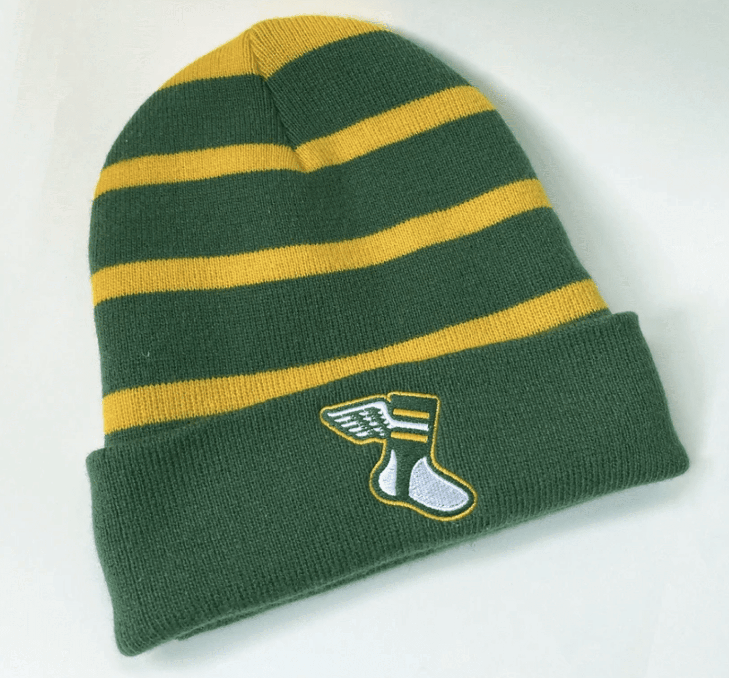
Click to enlarge
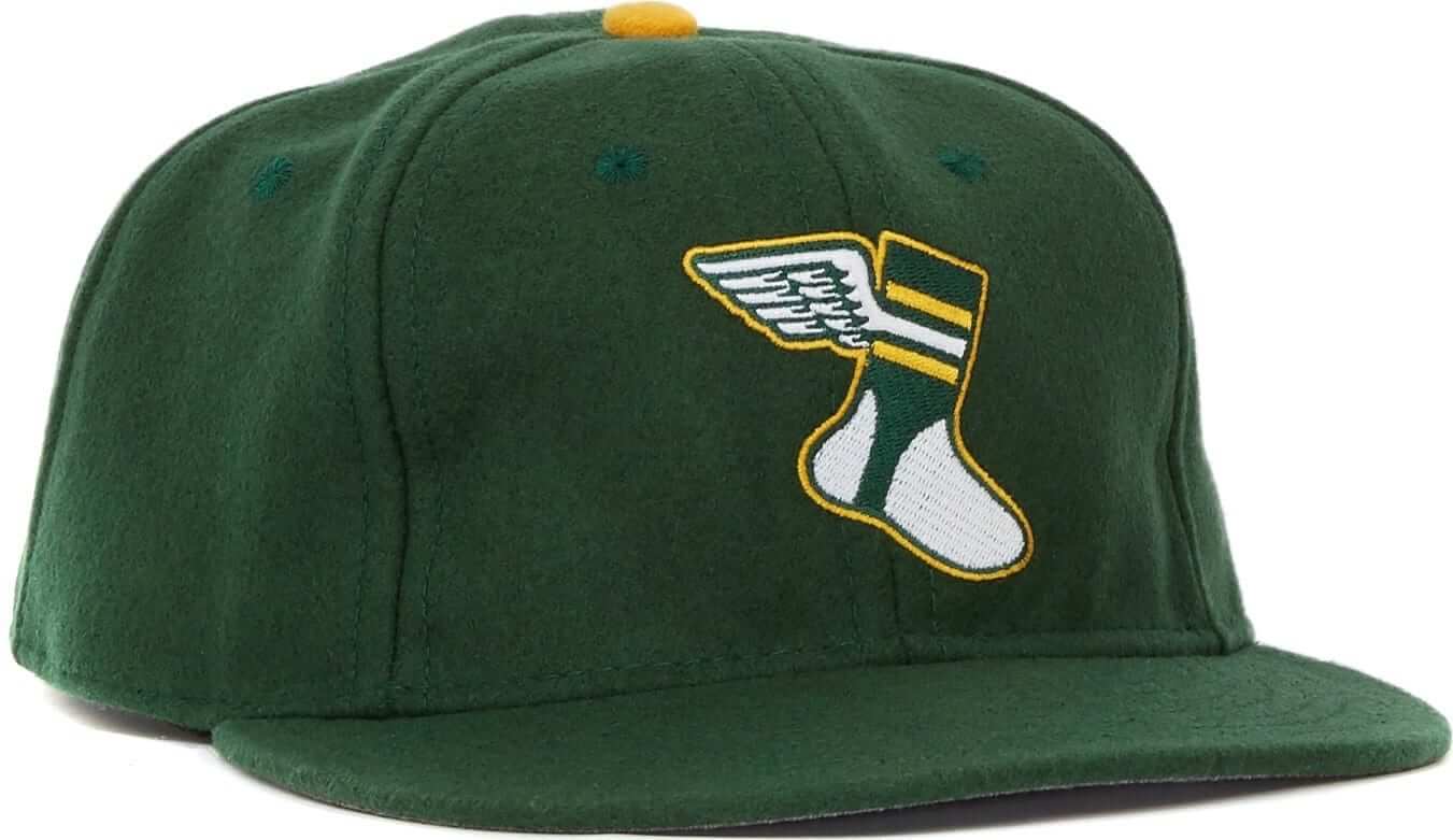
Merch updates In case you missed it last week, we’re now offering a Uni Watch toque! It’s available here. As of today, Christmas delivery is no longer guaranteed, but it’s still possible if you get your order in today or tomorrow. We’ll keep offering it all winter.
In addition, we have a bunch of new Uni Watch Color Remix caps available in a variety of autumn and Christmas color combos (click to enlarge):
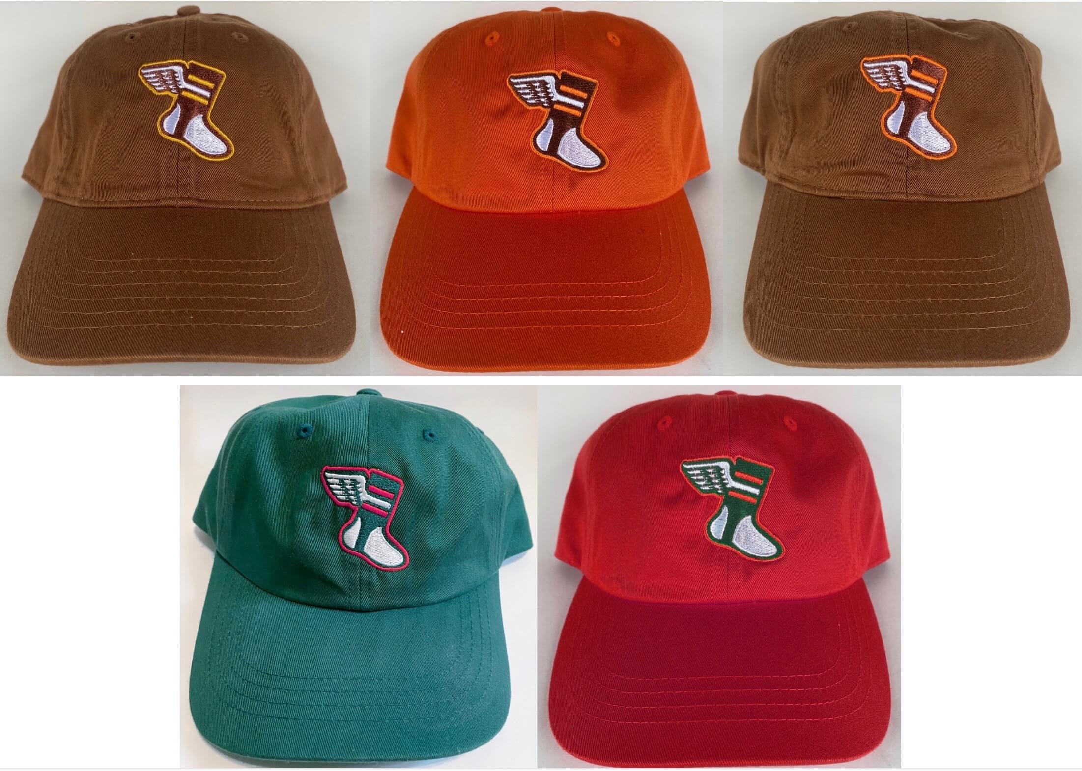
Plus we’ve brought back most of the previous Color Remix caps. All of them are available here. Again, Christmas delivery is no longer guaranteed but is still possible.
While we’re at it:
• We’re also taking pre-orders for Uni Watch hockey and cycling jerseys, all with your choice of number of NOB:
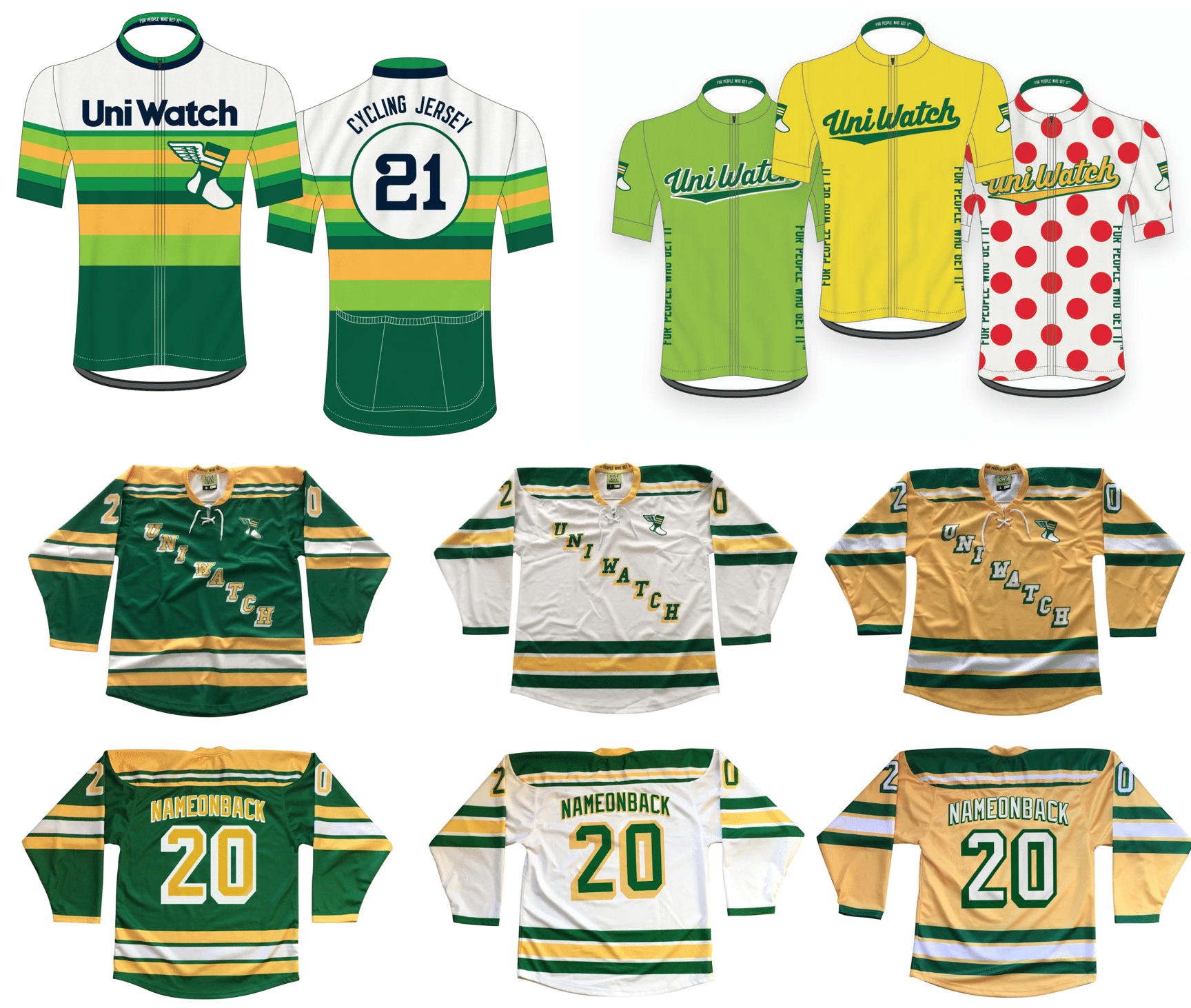
Get your order in by this Friday. The jerseys should ship by Jan. 11. (Sorry, no holiday delivery for these.)
• As of this morning, I have only eight Uni Watch Winged Stirrup Magnets remaining. So if you want one, move fast.
• The Uni Watch Pin Club’s design for December has also sold well. As of this morning, there were 36 of them remaining. Available here while supplies last.
Also, important: People who’ve collected all 12 monthly pins are eligible to get our Uni Watch Pin Club 2020 All-Star pin as a free bonus. If you qualify, you can claim your prize by emailing me with (a) your mailing address and (b) some combination of photographic evidence and/or receipts. For example, if you order the December pin today, you could send me a photo of the 11 pins you’ve already received plus your email from Teespring confirming that you ordered the December pin. Or you could wait until the December pin arrives and take a photo of all 12 pins. Or you can simply go to “My Purchases” in your Teespring account and take a screen shot of that. As long as you can prove that you collected ’em all, that’s what I’m looking for, okay? Okay!
• The Uni Watch Classic Cap is currently selling at 10% off its usual price. We have all fitted sizes in stock, as well as the adjustable strapback version. Available here.
• The rest of our Uni Watch merchandise is listed here.
Okay, end of sales pitch. Thanks for listening!
The Ticker
By Jamie Rathjen

Baseball News: In October 1979, the U.S. Postal Service used a variety of World Series postmarks. Josh Lee spotted those in a display at his local post office in Portland, Ore.

Football News: With the 49ers playing a “home” game in Arizona tonight, workers began installing Niners banners and graphics around the Cardinals’ stadium after yesterday’s Rams/Cards game. But many of the pre-existing Cardinals banners were left in place, making for an oddly jumbled sight (from Wade Heidt). … Here’s a story about the 12-year-old boy who designed the cleats that Packers RB Aaron Jones wore yesterday (from Joe Werner). … Left over from Saturday: Virginia RB Shane Simpson wore injured LB Charles Snowden’s No. 11. … Here’s a good recap of how Texas A&M RB Ainias Smith, who normally wears No. 0, had to switch to No. 19 on special teams and then back to No. 0 on the next play (from Justin Hicks). … North Carolina LB Chazz Surratt was originally also going to play basketball in college, so last week UNC men’s basketball coach Roy Williams gave him a basketball jersey ahead of Senior Day (from James Gilbert).

Hockey News: Sweden G Hugo Alnefelt has new pads for the upcoming world junior championships (from Wade Heidt). … The logo of the Toledo Hornets, a team in the International Hockey League in the ’60s and ’70s, was a somewhat hilariously angry hornet wearing a helmet and skates (from Jeff Wilk).

Basketball News: NBA numerologist Etienne Catalan has more new and changed player numbers. … The Raptors’ training camp in Tampa has its own logo (from multiple readers). … Cross-listed from the football section: North Carolina LB Chazz Surratt was originally also going to play basketball in college, so last week UNC men’s basketball coach Roy Williams gave him a basketball jersey ahead of Senior Day (from James Gilbert). … Josh Claywell notes that the video game NBA 2K shows last year’s City alternate for the Nuggets, but lists this year’s colors as options. The game also uses outdated City alts for the Celtics and Pistons. … Two new franchises making their debuts in The Basketball League this upcoming season — the Temecula Eagles and the Salem Capitals — have unveiled their logos. Oddly the Salem press release shows a cropped version of their logo, so here’s the full version (from Kary Klismet).

Soccer News: English and Scottish men’s and women’s teams started the annual Rainbow Laces campaign this weekend. Besides the namesake shoelaces, the promotion always includes other rainbow items, like warm-up shirts, captain’s armbands, and, in an apparent first, goal nets at Reading. Brighton and Hove Albion’s women’s team also wore rainbow numbers and NOBs. … Liverpool goalie Caoimhin Kelleher had his NOB misspelled for his Premier League debut yesterday (from Tom Gronek and Colm Heaney). … Liverpool’s opponents, Wolverhampton Wanderers, wore warm-up shirts in support of injured striker Raúl Jiménez. … Italian club Napoli’s stadium, Stadio San Paolo, was renamed after Diego Maradona. … Scottish women’s team Glasgow City added the charity Scottish Women’s Aid to their shirts yesterday. … In Norway’s Toppserien, IL Sandviken fullback Synne Vatshelle Raa has a double-decker NOB. “Also interesting that the kit manager seems to have allowed enough space for a double-decker name on all the other jerseys as well,” says Roy Ellingsen.

Grab Bag: One of Gaelic football’s All-Ireland semifinals between Dublin and Cavan was blue-vs.-blue. … “You know how there’s ‘A House Divided’ merchandise for families who are split between rival teams?” asks Mike Chamernik. There’s a Twitter bot that makes the same kind of graphics by choosing two teams randomly from the listed leagues. … The Chicago team in the American Ultimate Disc League, the men’s ultimate league, changed its name to the Chicago Union and has a new logo (from Alex Rubin). … A township in Pennsylvania wants students from the local school district to design it a logo (from Timmy Donahue). … CBS News Sunday Morning featured the evolution of the PBS logo (from James Gilbert). … The Italian rugby union team Zebre Rugby Club has unveiled the new kit that it will wear during the European Rugby Challenge Cup (from Ed Zelaski).

And as a lifelong fan of the collar green.
Assuming you mean color here.
Yes, thanks. Fixed.
“life long fan of the collar green”
Did you mean “color”?
Yes. Fixed.
Thank God you didn’t espouse “Green-Collar Values”. That would have been beyond the pale.
And as a lifelong fan of the collar green should be color green, unless you forgot the d and meant collard greens which is something else I’d imagine you’d be a fan of Paul.
Who isn’t a fan of collard greens?
Falcons/Saints would have looked great if New Orleans still wore their gold pants. I have no idea why the Saints think the black pants look good with white or black jerseys, such a downgrade for an otherwise good look.
Red jerseys /white pants should be the standard home look for the Texans, it looks much better than the navy jersey, which, aside from being bland, just makes them look like a knock off of the Bears.
Back in “before times” I’d often see people wearing the original PBS logo t-shirt in the greater Arlandria area on the bus and train. Related, the accompanying msmusic is very difficult to hum.
I had heard on the Serie Awesome podcast that buildings in Italy cannot be renamed for a person until that person has been dead for 10 years. I asked Gabriele Marcotti on Twitter if he knew of that prohibition and he did not, but joked that 1) for every law, there’s a loophole and 2)it would take 10 years of bureaucracy to rename the stadium for Maradona. Well. . . I guess when Italy wants to move mountains, it can.
Just read the story about the 12-year-old boy who designed Aaron Jones’s cleats, and how Jones surprised the boy with a jersey and his own pair or matching cleats. Can you imagine that kid watching Jones’s 77-yard TD run to clinch the win in those cleats? Very cool.
I’d argue that the Falcons lids are more of the ‘satin’ finish than matte, matte to me looks more like this:
link
The Falcons helmet certainly isn’t glossy, but there’s still way more of a sheen to it than matte generally has. Closer to Iowa State’s blackout helmets.
Wearing something different in the national televised game seems counterintuitive to me. It seems like the national game would be the prime opportunity to reinforce your brand, by putting forth your unquestionably best look. Doing something different just for the fun of it adds an otherwise harmless bit of pizzazz to an otherwise boring 1:00 game is fine every once an while too. But in the Chiefs’ situation it’s not even like they sell red pants. I wouldn’t like it if they were just hawking another jersey because it’s Christmas time but at least I’d understand it. Finally, it just seems like something a college team would do, again fun, but not super professional.
I couldn’t agree more.
On the biggest stages, you wear your best look. If that look is your alternate uniform, then it shouldn’t be an alternate uniform. And I don’t think anybody would argue that red/red/red/red is Kansas City’s best look.
^^^
This is exactly my thinking. If the jersey were notably different, then I would at least understand the move as a merch advertising venture. I wouldn’t like it, but I’d understand it. But when the main difference is pants color, what’s the point? In no other sector would a competent company management use unusual national exposure as a platform to feature non-standard brand identity.
I dunno, it might be that I’m not quite old enough to have really paid attention to Maradona in his heyday (I’m 40 so I was 6 during the 86 WC), but the amount of fawning over him (like the idea of retiring 10 for all) seems a bit over the top. Again, it’s probably more of you had to see him to know about his greatness, but on paper you’ve got the likes of Messi and C. Ronaldo who have been both more productive and productive for a longer period of time than Maradona. Maybe people are romanticizing the idea of the potential he had. But I don’t think retiring a number for him is really a step to take
It’s not an option. I seem to remember back around 1995 or 1996 that Argentina was going to retire the No. 10 for its men’s teams, but FIFA said no. I don’t even think it was an option for Argentina to not register a player No. 10 and send a roster which was one player short.
(of course, me being the contrarian, thought that you could simply replace the zero in the number 10 with either a Q or the greek “rho”, which looks like a zero)
But even if it were an option, is Maradona even worth that step? I guess I’m just wondering if maybe he’s a bit overrated. Pele wore 10, Messi wears 10, both at least as good as Maradona, so seeing people suggesting to retire 10 for Maradona just seemed a bit absurd, there are lots of all time great 10’s and there will be other great 10’s in the future.
And that’s the best argument against retiring numbers.
Maybe there’ll never be another Babe Ruth, but are you telling me that the Yankees will never have another pitcher as good as Ron Guidry?
It’s really hard to win the World Cup, and only one team can win it–every 4 years. It would be like the Super Bowl but only once every 4 years and it’s played between countries (like the Olympics) and there is no baseball, basketball and hockey. And imagine if the Buffalo Bills won 4 of them, and ONLY the quarterback can score. And that quarterback? Maradona.
But since Pele also wore number 10, I don’t think that FIFA should retire it, at least not for Diego alone.
I agree totally.
Sure he was a great player, but he was also a drug addict whose “greatest moment” should have been disallowed.
The idea of retiring 10 globally is laughable and insulting to all of the great players who have and are wearing 10.
Phil, Maradona was also mostly before my time, though I’ve watched some of his outstanding games and read a lot about him over the years. And I completely agree. If Maradona were arguably the greatest player of all time – and he’s not – even then I would have a hard time justifying so radical a gesture as retiring his number. That’s just not how numbers work in soccer. It’s not like Argentines are going to forget who Maradona was unless his number is retired worldwide.
If you made an all-time men’s 11, then absolutely you’d want Maradona on the team. But then if you’re retiring 10, you’d also need to retire ten other numbers, and now FIFA is just the Yankees and the next Messi or Wambach will have to wear 67.
There is no real analogous person in United State’s sports to Maradona in terms of unquestioned greatness in the eyes of the world coupled with achievement. The closest I can come up with would be to say, if Neil Armstrong had a number, we’d expect it to be retired worldwide.
Maybe if Ali wore a number?
I would agree with that statement.
Is there no longer a policy on sleeve colors because I saw some packer players wear white under sleeves and some green.
Re: the skins game.
I’d think that, in a timed, scored, and officiated basketball game, that having a team without numbers would be completely taboo. How would the referees count up personal fouls?
I think this is either masterful photoshop or this was a halftime exhibition (think Mites on Ice).
The Falcons made a huge mistake in not going back to the uni’s they wore yesterday. Such a sharp looking uniform compared to the disasters they wear now.
If the Falcons were a “Legacy Team”, public opinion could sway them into returning to traditional uniforms. Unfortunately, to most of America, they are just a “Brand X” team with no compelling history or cohesive image. There isn’t even agreement on which of their old uniforms is the best; I like the 1976 look with red helmets and jerseys.
I agree wholeheartedly. The 1970’s red helmets/jerseys/gray pants were their best.
As a Liverpool fan, I watched the match yesterday happy the team kit-person didn’t have to spell out “Caoimhin” (pronounced “Quee-vin.”)
Surprised to say I kinda liked the Titans in mono-sky. The symmetry with the navy helmet and socks works for me.
That number font is still awful, though.
Agreed – I thought the sky and navy looked great together. The shoulders and some of the other accents were awful, but that color combo looked mighty fine.
I felt like I had taken the Limitless drug when I stopped confusing the 1s on the Falcons jerseys for a 7. Alas, just a throwback day.
I was surprised to see no mention of Miami wearing their aqua jerseys yesterday for the first (and only!) time this season. They were originally slated to wear them at home against the Jets in Week 10, but that game got rescheduled to Week 6 and they ended up wearing white instead.
They are scheduled to wear aqua jerseys two more times in the month of December, but both of those will be throwbacks. So on the season, the primary aqua jersey will be worn one less time than the designated alternate aqua jersey.
No complaints from me, as the throwbacks are far superior, but are there any other cases of a designated alternate jersey being worn more times than the corresponding alternate? Without researching, maybe the 1994 49ers or the Cowboys from any random year? One of the byproducts of wearing white at home the majority of the time?
Great point, Frankie — I didn’t realize that they had gone aqua-free all season long until yesterday! Thanks for that info.
Like the 2019 Rams? I’m a bit confused on the question
The Chargers uniforms did look great yesterday. Now if they’d only let Pat Patriot out to play again.