As you may have noticed in the left sidebar, our friends at Grey Flannel Auctions are running another catalog auction. Here are some of the items that have caught my eye:
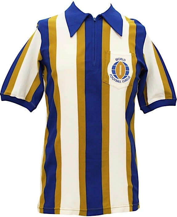
• I always like leagues that deviate from the standard black/white zebra-striped officiating uniforms. The World Football League’s blue/gold jerseys (shown at right, click to enlarge) are a prime example. Bid on it here.
• Love love love the striped collar on this 1891 (!) Cy Young baseball card. Scroll over the thumbnail to get the full effect.
• With Willie McCovey’s recent death, a bunch of his memorabilia is now up for auction. McCovey was left-handed, so it seems odd that this trophy for his 500th home run shows a right-handed batter figurine (and a righty glove to boot).
• Speaking of McCovey, I really like this 1971 All-Star Game platter. Never seen that type of item before!
• One last McCovey entry: The Giants usually styled his NOB with a raised “c,” as seen here, here, and here, but this one has a base-aligned “c.”
• I never really noticed before how the Astros’ 1972 road jerseys had matching radially arched chest lettering and NOBs, while the ’73 design had matching vertically arched chest lettering and NOBs.
• This 1980 Reds jacket design, with the team logo down toward the bottom, is one of the oddest jacket formats I’ve ever seen.
• Speaking of jackets, check out this 1967 Earl Monroe College Division championship beauty.
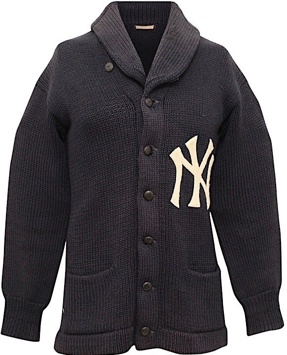
• Oh baby, it doesn’t get much better than this century-old Yankees dugout sweater!
• It’s rare enough for a MLB team to have TV numbers on one sleeve. But in 1979 and ’80, the Cardinals had them on both sleeves!
• Attention, Brinke Guthrie! We don’t often see tennis gear come up for auction, but here’s a 1991 autographed Jimmy Connors warm-up top.
• I love everything about the lettering styles on this mid-1970s 76ers warm-up jacket.
Want to see more? You can click through all of the auction listings — more than 500 of them — here.
Click to enlarge
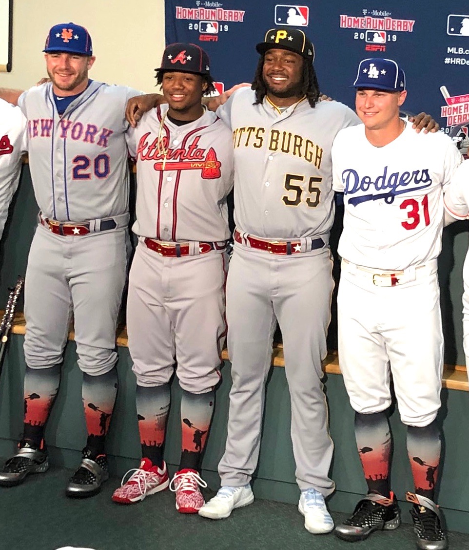
All-Star stuff: We got our first look yesterday at some of this year’s MLB All-Stars in their completely absurd ASG socks. Yes, the design shows a batter about to swing a guitar. (Speaking of which, here’s an article about how the guitar became the all-purpose Cleveland symbol.)
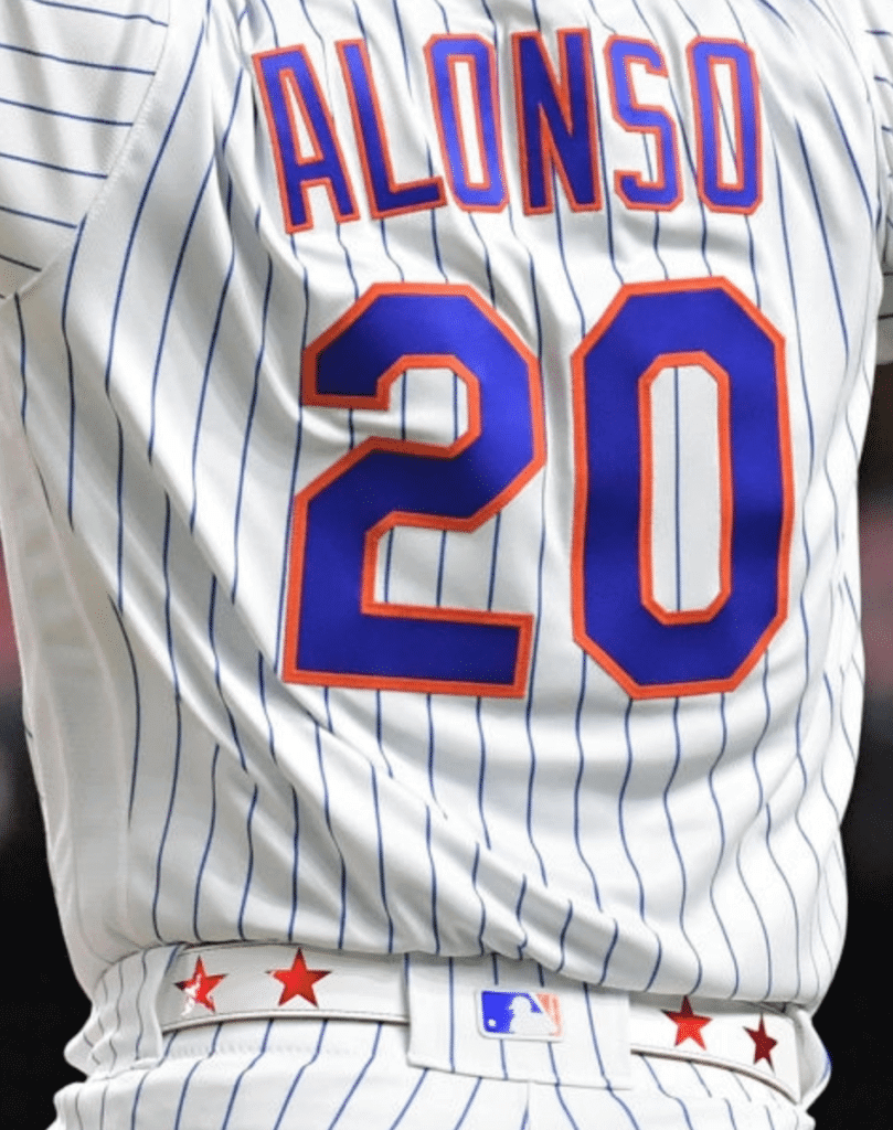
As you can also see there, the players also have All-Star belts this year. Pretty sure that’s a first. Along with the two-tone and uni-numbered belts we’ve seen this year, this appears to be MLB’s latest attempt to turn this accessory into a piece of merchandise, or at least a point of interest. Here’s how they look from the back:
Meanwhile, in last night’s Home Run Derby:
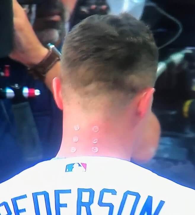
• I don’t know if Dodgers outfield/first baseman Joc Pederson is doing acupuncture or if he’s a cyborg or what, but he’s got something very weird on the back of his neck:
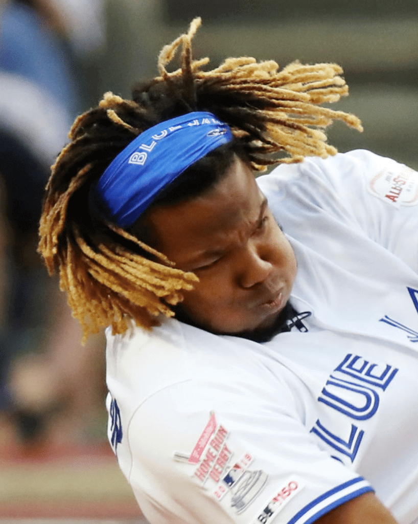
• Most of the players wore their regular team caps, but Blue Jays third baseman Vlad Guerrero Jr. wore a Jays bandana:
• I’m pretty sure this photo is from a day or two earlier, but Pirates first baseman Josh Bell’s Derby pitcher, Jonathan Schwind, was channeling some Buccos history with a Dave Parker throwback T-shirt:
Luv this ode to Dave Parker by @JBell_19 & his HR Derby pitcher, Jonathan Schwind! But how cool would it have been had Schwind rocked The Cobra-style hat too?🤣 @BeautyOfAGame @JPosnanski @MLB @MLB_PLAYERS @JayHarrisESPN @MLBONFOX @Pirates @GregProops @MLBNetwork @MrChuckD RT pic.twitter.com/HFn8G3ou05
— negroleaguesmuseum (@nlbmprez) July 9, 2019
(My thanks to Brian Hansen and our own Alex Hider for their contributions to this section.)
Click to enlarge
Collector’s Corner
By Brinke Guthrie
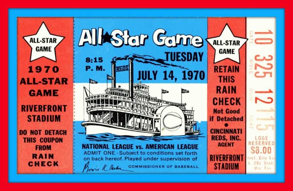
Tonight’s the night for the 2019 MLB All-Star Game in Cleveland. As of this writing, standing room tickets are $235 — and that’s with an obstructed view! So let’s go back to July 14, 1970, when the Midsummer Classic was played at a different Ohio venue — then-new Riverfront Stadium in Cincinnati. This ticket stub says you could get a seat in the upper reaches of the stadium for just eight bucks! One puzzling detail: The flags on the steamboat show the years 1919, 1939, 1940, and 1961. The Reds won the World Series in 1919 and 1940, but the other two years don’t match up with Cincy championships or with the city’s previous All-Star hosting years. Anyone know what those flag dates mean?
One other thing about that 1970 ASG: When I said Riverfront was new, I meant it was really new. The first game had been played there on June 30, just two weeks earlier! Not only that, but this website says the ASG’s location wasn’t even announced until June 1! Atlanta was standing by in case the new ballpark wasn’t ready in time. Can you imagine that happening now?
Now for the rest of this week’s picks:
• In keeping with the 1970 All-Star Game theme, this eBay seller is offering a set of then-Commissioner Bowie Kuhn’s business cards.
• This auction is for a 1970s Baskin-Robbins MLB helmet display board, and you get 21 helmets with it. “Two-scoop sundae in a mini helmet. THE HELMET IS FREE!”
• This 1970s-1980s Phillies sweatshirt was made by Velva Sheen of Cincinnati. If you lived there back in the day, the VS outlets were the place to go for T-shirt seconds.
• When I lived in Dallas, there was a 7-Eleven right up the street. So I’d hop on my bike and go get one of these baseball cups with a Slushee or Slurpee or Icee or whatever they were called. Always a mix of cherry and cola if I could get it. Even back then at age 10, I Got It™, because I didn’t like how there were no logos on the caps!
• The seller of this Wilson-made satin Atlanta Braves dugout jacket says it’s “team issued.”
• This custom-made DIY Pittsburgh Steelers rug has been rolled up in storage since the late 1970s.
• Just wanted to include this “Vintage Bengals Helmet 1960s-1970s” because it’s, well, so sad-looking.
• Good golly Miss Molly, straight from Sears NFL Shoppes, how about this 1970s Dallas Cowboys bulletin board, with helmet pins included.
• Here’s a set of 28 NFL helmet vending machine stickers. The seller dates them from the late 1970s-1990s.
• Never seen one of these before; a 1970s Green Bay Packers zip-front pullover made by Allison. Team logo on the front by the zipper, city on the back.
Seen an item on eBay that would be good for Collector’s Corner? Send any submissions here.

Uni-versary patch reminder: In case you haven’t seen, the Uni Watch 20th-anniversary logo is now available as an embroidered patch. The patch was made for us by Stitches, the same shop that does all the sewing for the Mets, Yankees, and Islanders. It measures four inches across and is suitable for sewing onto a jersey or jacket, or just for displaying.
The price is $9.99, plus $1 for shipping (or $2 for shipping outside the USA). To order, send payment to me via Venmo (use @Paul-Lukas-2 as the payee), Zelle (plukas64@gmail.com), or Cash App (plukas64@gmail.com). If you want to use Apple Pay or a paper check, or if you’re outside the USA and can only use PayPal, shoot me a note and I’ll fill you in.
Once you send payment, be sure to send me your shipping address so I can send the patch on its way to you. Thanks!
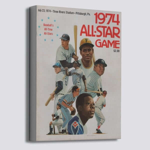

Raffle reminder: Our friends at Vintage Brand are once again letting a lucky Uni Watch reader choose anything from their broad range of retro-minded offerings. With the MLB All-Star Game taking place tonight, this 1974 ASG program cover canvas would be a good choice, or maybe this 1961 ASG cutting board, or anything else. Your choice does not have to be ASG-related!
To enter, send an email to the raffle address by this Thursday, July 11, 8pm Eastern. One entry per person. I’ll announce the winner on Friday. Good luck!
Bengals contest reminder: In case you missed it last week, I’m teaming up with Sports Illustrated for a Bengals-redesign contest. Full details here.
Click to enlarge
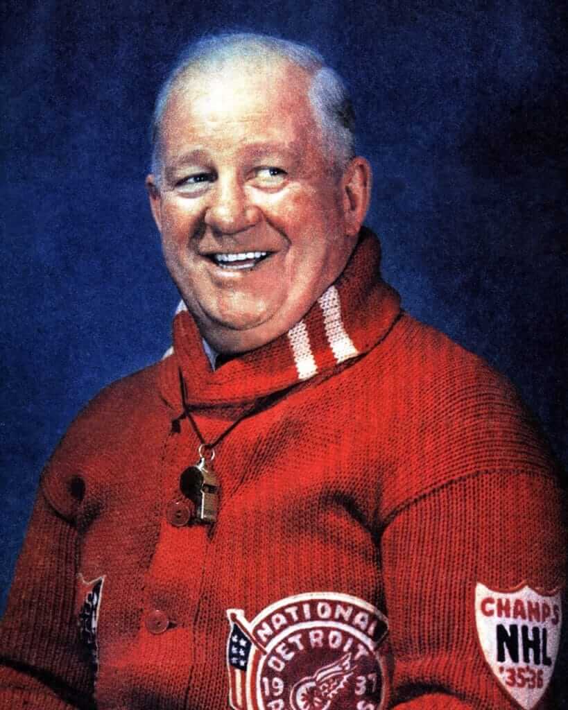
Too good for the Ticker: Oh man, check out this spectacular photo of former Detroit Red Wings GM Jack Adams! The striped hood, the patches, the texture — even the whistle looks Just Right. Uni Watch’s highest rating!
(Big thanks to Fred Teigen for this one.)
KRC update: The latest installment of Key Ring Chronicles involves a tropical island, a fashion model, a load of drugs, and some very bad air quality. Check it out here.
The Ticker
By Paul

’Skins Watch: A junior hockey team in Ontario that for the past 85 years has been called the Redmen is changing its name to the Reds (from many readers). … In addition, two other junior hockey teams are scrapping their indigenous-based logos (from Mike Golley). … At the recent Indigenous Bowl — a high school football game featuring Native American and First Nations players from all over North America — a player from Winnipeg wore face paint to bring attention to the large number of missing and murdered indigenous women and girls in Canada (from @ohhhsourry).

Baseball News: The Charleston RiverDogs are taking dumb minor league uni promotions to their logical conclusion with Dumbest Night of the Year Night on Aug. 12 (from @TheBenJye). … Oops: All-Star Game banners all over Cleveland feature Phillies OF Bryce Harper — who, as it turns out, didn’t make the National League roster (from Mike Chamernik). … Want to see Ted Kluszewski wearing sleeves? Here he is in a suit and tie, along with a bunch of his 1956 Redlegs teammates, on an old segment of What’s My Line? (nice find by Bob Moon). … Here’s Cleveland’s record so far this season broken down by uniform. … Not uni-related, but in case you missed it over the holiday weekend, ESPN ran a fun piece of “What If?” fiction about how the Home Run Derby supplanted regular baseball as the national pastime. It’s entertaining and semi-plausible — recommended. … Here’s what Corvallis Knights wore for their recent “futuristic” game against the Portland Pickles. ” The inspiration behind our uniforms was 7-on-7 football, because baseball in the year 2050 will be sleeker and faster,” explains team spokesman Derek Buchheit. … William Yurasko has written a piece in which he argues that the Nats should wear Senators throwbacks, not Expos throwbacks. … The Single-A Aberdeen IronBirds have some weirdly truncated pants striping (from Blue Burke). … Think the Home Run Derby is cool? Check out its polar opposite: the Korean bunting contest! (Big thanks to James Gilbert.) … Back in 1984, The Pittsburgh Press ran a pretty good article on the Pirates’ clubhouse managers (from Jerry Wolper).

NFL News: A recent episode of The Loudest Voice had an era-inappropriate Jets helmet. … Speaking of the Jets, check out this recently unearthed archival concert footage of the Velvet Undergound with drummer Mo Tucker wearing a Jets sweatshirt! (Big thanks to Patrick Reynolds.)
College Football News: For the first time since 2015, Florida will have players wearing No. 1. … Arkansas will apparently unveil new uniforms today (from Matt Snyder).

Pro Basketball News: Instead of listing all of the new NBA uni number assignments, I’m going to recommend that you just check out Etienne Catalan’s Twitter feed. … Former NBAer Glen “Big Baby” Davis was ejected from a BIG3 game the other day, whereupon he removed his uniform and tossed it into the crowd.

College Hoops News: North Texas is letting fans vote on the school’s new court design (from @profjimmyc). … New logo and hashtag for the Horizon League 2020 championship.

Soccer News: The USWNT has added a fourth star to their crest. … Pretty weird number/NOB font for Mexico. … New kits for Portuguese side Boavista (from @mikeDfromCT). … Budweiser is now the official beer advertiser of the NWSL (from our own Jamie Rathjen). … Also from Jamie: New second kit for the Republic of Ireland. “The 3 on the front is an ad that appears on retail versions, not a number,” says Jamie. … The daily download from Josh Hinton: AS Roma’s new away shirt is available for sale in Hong Kong even though it hasn’t been officially released yet; OKC Energy’s reserve side is switching to Adidas, even though the senior team wears Under Armour; and new kits for Aston Villa, Crawley Town, Stade de Reims, Darmstadt, Torquay United, AFC Leopards, Caykur Rizespor, MSV Duisburg, Charleroi, AC Milan (leak), Coventry City, Cercle Brugge (home and away), Norrköping, Heracles Almelo, Cardiff City, and VfL Wolfsburg. … Meanwhile, Ed Zelaski has Viktoria Plzeň’s new home/road kits and goalkeeper kits; new kits for Bournemouth, Arka Gdynia, and Brondby.

Grab Bag: Oklahoma’s license plates are getting a redesign. … Trentino in the Italian men’s volleyball league is letting their fans vote for the team’s next libero jersey (from, of course, volleyball maven Jeremy Brahm). … Interesting article on the history and symbolism of American flag-themed clothing (from K.C. Kless). … New uniforms in the works for the Vermont Army National Guard.
For the Home Run Derby, I liked seeing the players wear their regular uniforms instead of the All-Star batting practice jerseys, which seemed to be the practice for a long time.
Noticed all the players wore their home white uniforms, not just the American Leaguers.
Some of my favorites, too; Mets, Blue Jays, Dodgers, Pirates, Braves, Athletics — a fine-looking bunch!
Everyone wore home whites for the Derby last year as well. Appears to be the new standard.
Once upon a time, you had to be in the ASG in order to get into Home Run Derby. The ASG at New Shea had an exception, bringing in Yoenis Cespedes. They gave him an ASG jersey anyway. Last year, two non-All Stars got into the Derby. I think that’s when and why it changed. But I like it.
Those uniforms for the VTARNG are the same ones the US Army have been developing for the last 3 years. The National Guard follows the same uni regs as the regular Army and get their unis from the Army. When new dress unis are issued usually the recruiters get them first since they are the public face of the service.
The Reds won the NL-but lost the World Series-in 1939 and 1961. Yankees both times.
Per Brinke’s question about the flags at Riverfront for 1939 and 1961, the Reds won the NL pennant those years.
“Velvet Undergound with drummer Mo Tucker wearing a Jets jersey”
you mean sweatshirt.
Yup. Fixed.
Funny that the sad bengals helmet on eBay is still a way better look than their current look, lol.
Two nitpicking items: Pederson is primarily an outfielder, not a first baseman. Bell goes by Josh not Joshua.
Whoever thought of that River Dogs promotion needs a big raise. Fan-fucking-tastic.
“Oklahoma’s license plates are getting a redesign. ”
Well, just the main one. there are 71 other designs to opt for in OK.
That Baskin Robbins display is from 1987, or I’m Don Baylor.
I assume literally everyone else spotted that instantly and I’m just wasting your time.
I want to marry that Sixers warmup and have its little warmup babies.
How did you narrow it down to 1987 exactly (or does it say so somewhere on the display and I just missed it?)? I do know that the Pirates and Twins helmets on that display (and maybe others) are styles that they switched to in 1987, but that alone only means that it’s no older than 1987. I could instantly tell that it’s definitely NOT from the 70s as the listing says, but I didn’t see anything that narrowed it down to exactly 1987. So again, asking respectfully, what am I not seeing? Thanks
The Minnesota Twins and Seattle Mariners didn’t start using the logos seen on their respective mini helmets until 1987.
Budweiser becoming the NWSL’s advertiser (this is for the playoffs, championship game, and MVP award) actually came the day after they took out a link essentially telling people to please watch the NWSL.
Unless I’ve just seen the same “take” repeated a few times, it seems like there are way too many people complaining that the Nats wore Expos uniforms for one stinkin’ game. They may play in the same city but they share no lineage with either version of the Senators, with a 35 year gap between them to boot.
Agree. They have worn Senators throwbacks a couple of times in the past,
Incredible that so many people are bothered by their wearing an Expos outfit one time.
Exactly. It’s not an either/or choice, and although Yurasko is my favorite Nats fan, I think he’s got this one all wrong. The Expos throwbacks very much are “fan service” for Nats fans. For real Nats fans, that is. But Yurasko is right in calling for the team to wear throwbacks to pre-2005 Washington baseball more often than they do. I want to see 1924, 1925, 1959, and 1963 Senators uniforms on the field in Washington on the regular, alongside the 1968 Senators and Homestead Grays throwbacks they already sometimes wear. And I want to see the Nats in Expos unis from time to time too. It’s all meaningful heritage for Nats fans. I’m not sure we know for sure what the brief Negro League Washington Potomacs really looked like, nor is there, to the best of my knowledge, a definitive view of what the 1859 Washington Nationals wore, but those teams should also be in the mix for Nats throwbackery. The 1859 squad (well, technically the 1867 squad of the same team) is one of the most important teams in baseball history, possibly more significant to the development of the game than the 1869 Reds, and just about nobody in Washington knows about that team.
It could just be a vocal minority, similar IMO to the “Texans should dress as the Oilers because…Houston” crowd.
I would like to see the Nats feature those Expos throwbacks more often; it would be a shame if that uniform period of their franchise history got moth-balled again.
Regarding the difference in arching style between the 1972 and 1973 Astros jerseys – the 1972 was supplied by Spaulding and the 1973 was by Wilson. So it was likely a manufacturing thing.
With regard to the unusual 1980 Reds jacket design seen in the Grey Flannels auction, authentic jackets were one of the few retail items that a fan could buy in those days. I have one of these odd jackets that I bought new back in the early ’80s. I did not wear it much, because it looked weird to me, and instead wore the “normal” jacket with CINCINNATI across the front much more.
I’m not positive- but it looked like deGrom and McNeil both had on white pants with blue piping- no pinstripes. Looked an awful lot like the old snow whites. I looked at the video on my TV and the video from the the Mets website when they came out to congratulate Pete. It could have been the lighting making the them look white- but I just don’t know.
Homage makes those Dave Parker shirts
I have way to many Homage shirts in my dresser drawer. Love the stuff they put out
The WFL official jersey calls to mind link
Disagree, and not even a little bit.
Lee
“New second kit for the Republic of Ireland. “The 3 on the front is an ad that appears on retail versions, not a number,” says Jamie”
Back in 2010 when the ads they put on the retail jerseys switched from Eircom to Three I remember a friend of mine who already owned that year’s retail jersey (ie. with the Eircom ad on it) going out and buying what was *the exact same shirt*, just with the new (not what they wear on the field) Three ad on it. Very little surprises me about how stupid the merchandising culture around sports can be after that.
I think the Detroit Red Wings GM Jack Adams painting is not a striped hood, but rather a striped scarf with the ends tucked into the sweater.
Fantastic image though, even though it’s from the wings.
It looks like a shawl collar – common on curling sweaters and cowichan sweaters.
that is a good call too. Definitely not a hood.
Re: link. You’re welcome. :)
I don’t know the context of that show The Loudest Voice, but that Jets helmet was worn in the 60s and 70s, so there’s no problem with someone having one in an office in the mid-90s.
Nope. The one in the picture is indeed the newer one, as you can tell by the logo’s rounded edges. The ones they wore in the 60s and 70s had pointed edges, more like a football.
Your “friends” are selling a phony Dorsett jersey and are about to rip off an unsuspecting bidder. Nor have they replied to an email I sent them alerting them to all the problems with the listing. Buyer beware indeed.
link
so whats the deal?
oboy, that Dorsett is not. even. close.
“New uniforms in the works for the Vermont Army National Guard.”
These are new uniforms for the entire Army, the Vermont National Guard wears the same uniforms as the rest of the Army, Army National Guards and Army Reserves. You can read more about the uniforms at link
The logo on link looks really modern. Interesting that it doesn’t match link in the auction link.
My sentiments exactly. Verrrry interestink! Think I’ll save my money on that one.
Whoa, this link is a beaut. I know we’ve talked about the link before, but have we ever seen it link?
Agreed again…the Met logo patch looks pretty perfect for a 46 year old patch though.
link; the Mets patches do show what appears to be appropriate wear.
New Wolfsburg jersey appears to be inspired by D-Generation X.
link
Paul and whoever puts together the Ticker, do we REALLY need to know EVERY time a players uniform number changes or what specific uniform numbers are given to rookies?
I get that it can help to add space to a thin ticker on a slow uni news day, but COME ON.
I noticed Paul linked to a website that apparently takes care of that and I think it’d be awesome if this particular uni item was taken care of that way, unless of course there’s some story where some egomaniac gets traded to a new team and gets his current number from a player already wearing it on his new team in exchange for a Ferrari, a years worth of free tattoos, three years worth of pot/HGH/roids and $500,000 in pennies.
Uniform news is uniform news.
We’ll figure out the best way to present it to you. But we decide what is or ins’t newsworthy.
Disagreeing with an opinion that’s expressed on Uni Watch is fine (i.e., if you love purple and hate stirrups, have at it!). But disagreeing with what does or doesn’t appear on Uni Watch, or trying to tell us what is or isn’t worth of inclusion, is a non-starter. Sorry.