Ever since the Reds announced their massive 150th-anniversary throwback program last fall, I’ve had yesterday’s game, featuring Cincy’s 1956 road unis, circled on my calendar.
That’s not because the ’56 road greys are my favorites (that distinction goes to the 1936 design with the red pants, which they wore on June 30). No, the reason I’ve been particularly interested in the ’56 design is that it’s the only uni in this year’s throwback program that falls within the Kluszewski era, and that raised some intriguing possibilities.
To explain: Ted Kluszewski was a slugging first baseman who played for the Reds from 1947 through 1957. He was known for his bulging biceps, which he often accentuated by cutting the sleeves off of his jerseys and undershirts. So when the Reds wore vest jerseys, as they did for Big Klu’s final two years with the team, all of the players were sleeveless, but Kluszewski was really sleeveless.
As it happens, there are lots of photos of him going bare-armed in the uniform that the Reds were wearing yesterday (for most of these, you can click to enlarge):
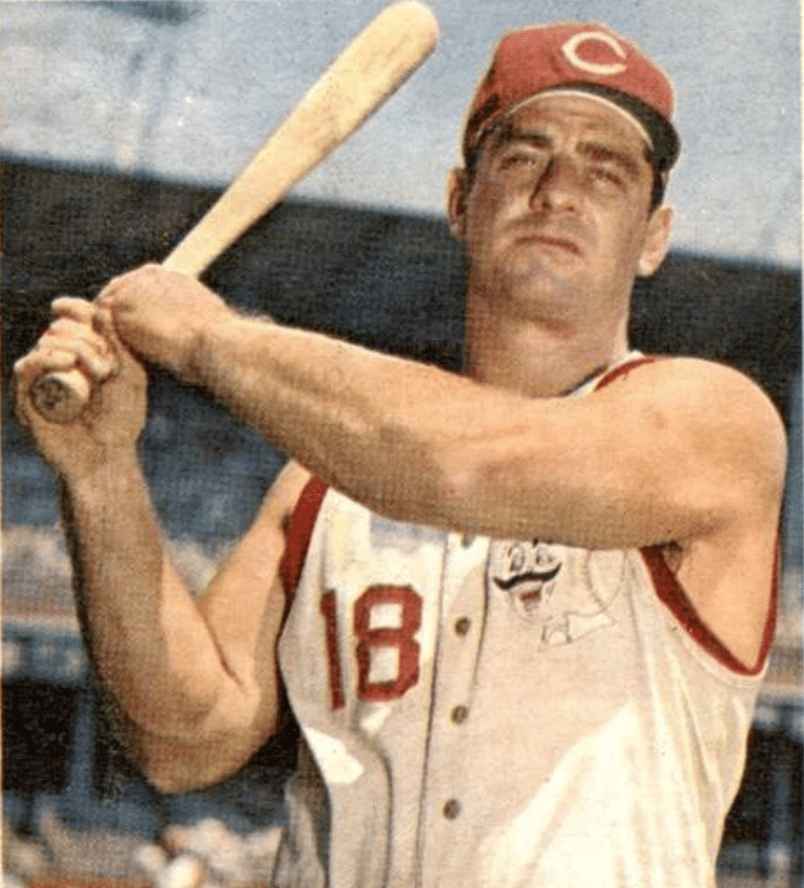
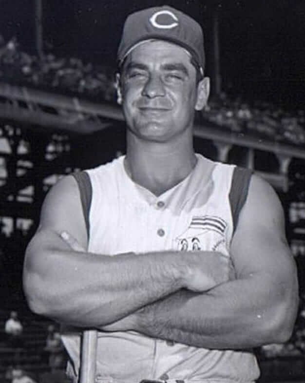

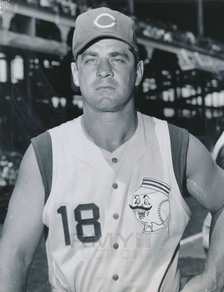
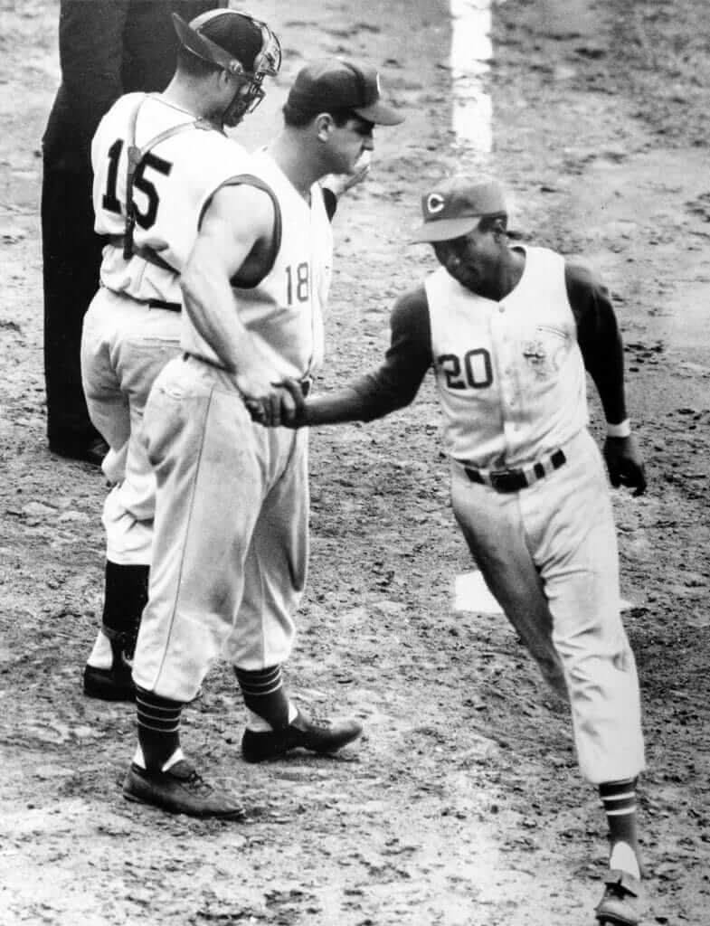
It was a unique look. To my knowledge, no other big leaguer ever went this route with his uniform.
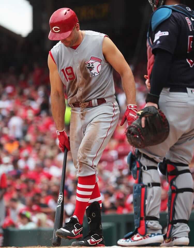
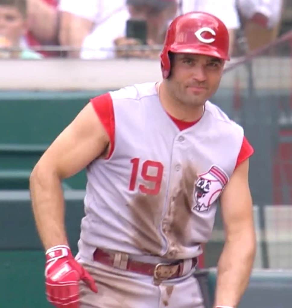
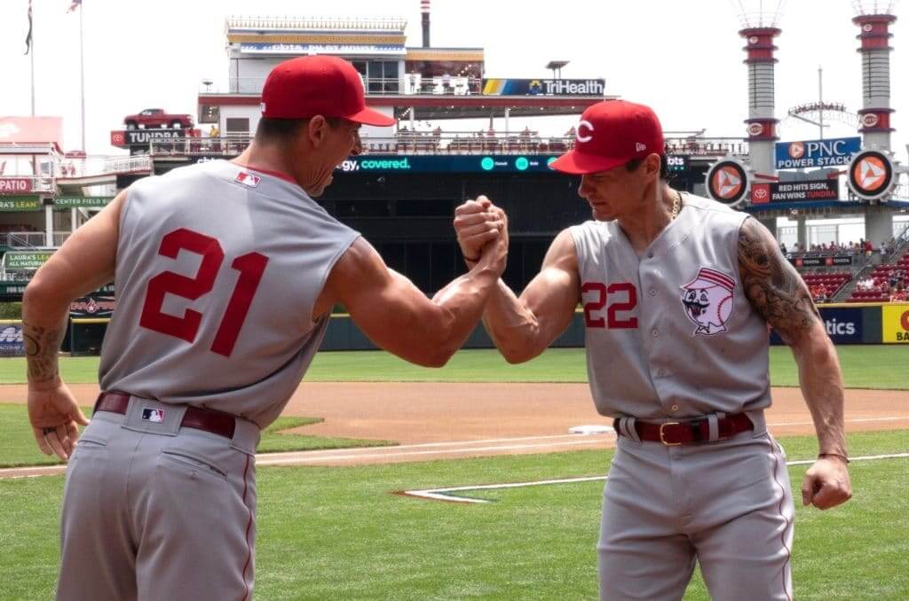
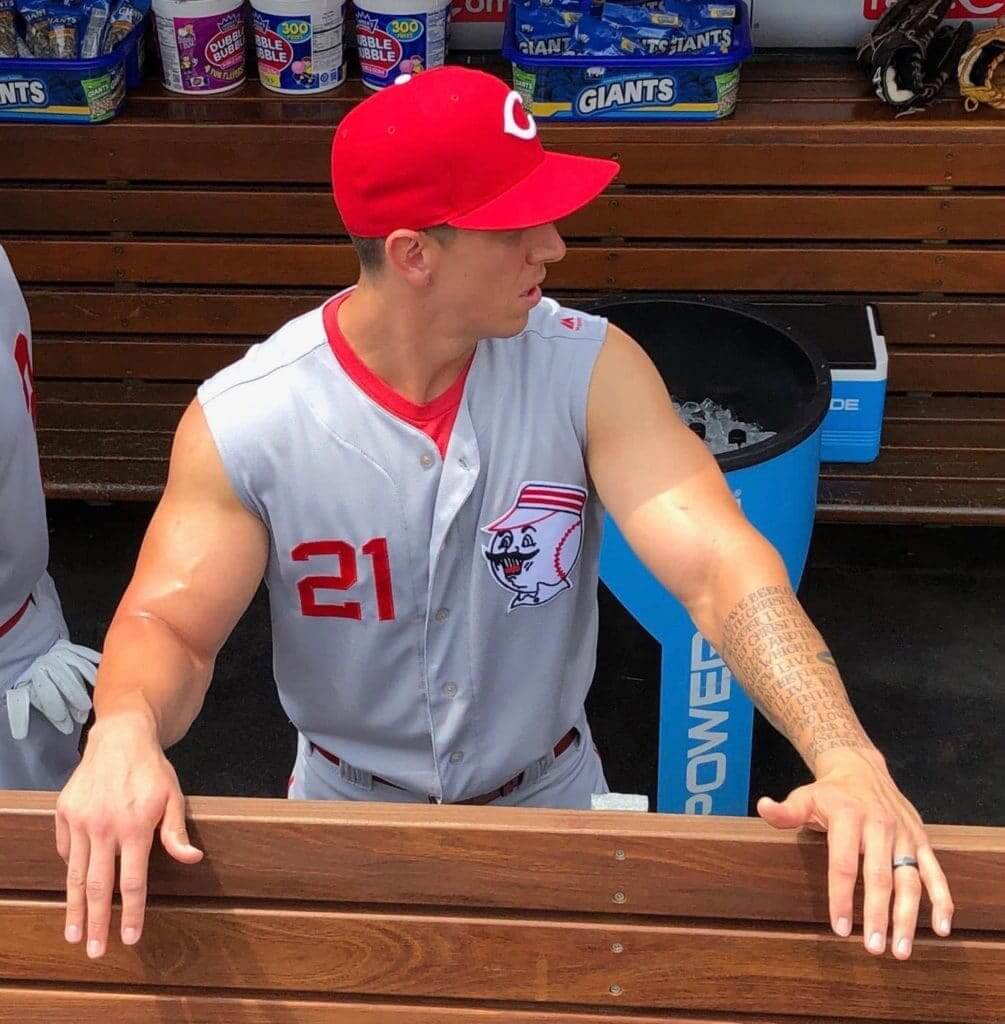
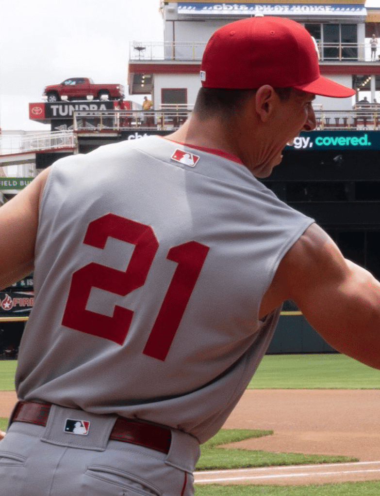
The Reds have their own slugging first baseman today, of course — Joey Votto. (Okay, so he’s not the offensive force he once was, but still.) So for months I was looking forward to yesterday’s game and wondering if Votto would honor the Reds’ heritage by going bare-armed à la Big Klu.
So did he or didn’t he? Yup, he did — take a look (for all of yesterday’s game pics, you can click to enlarge):
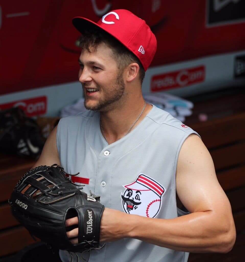
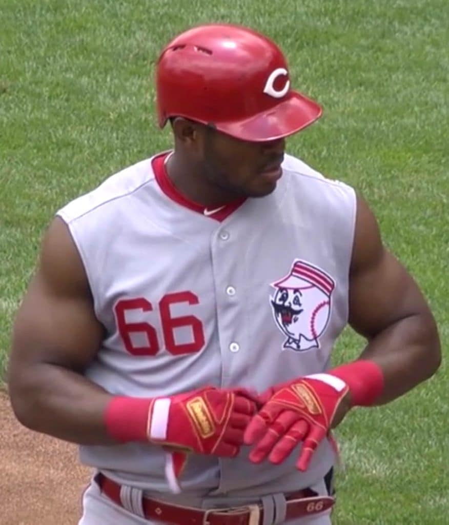
Good job, Joey! But here’s the thing — it didn’t occur to me that other Reds besides Votto would choose to go bare-armed yesterday. As it turned out, the fully sleeveless look was more the rule than the exception:
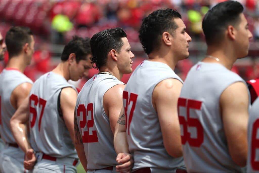
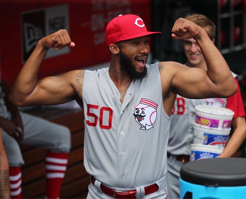
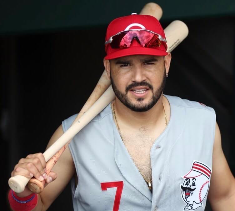
I have to admit, I didn’t anticipate this mass display of exhibitionism. As is so often the case, the gesture seems a bit less special when it’s repeated so many times, but it was a fun move by the Cincy players.
Still, some players pulled it off better than others. Note that some Reds wore undershirts with the sleeves completely cut off (not bad), while others dispensed with their undershirts altogether (ewww), but only Votto really captured the quintessence of Kluszewski by leaving his undersleeves barely visible (nicely done!).
A few other notes about yesterday’s throwbacks:
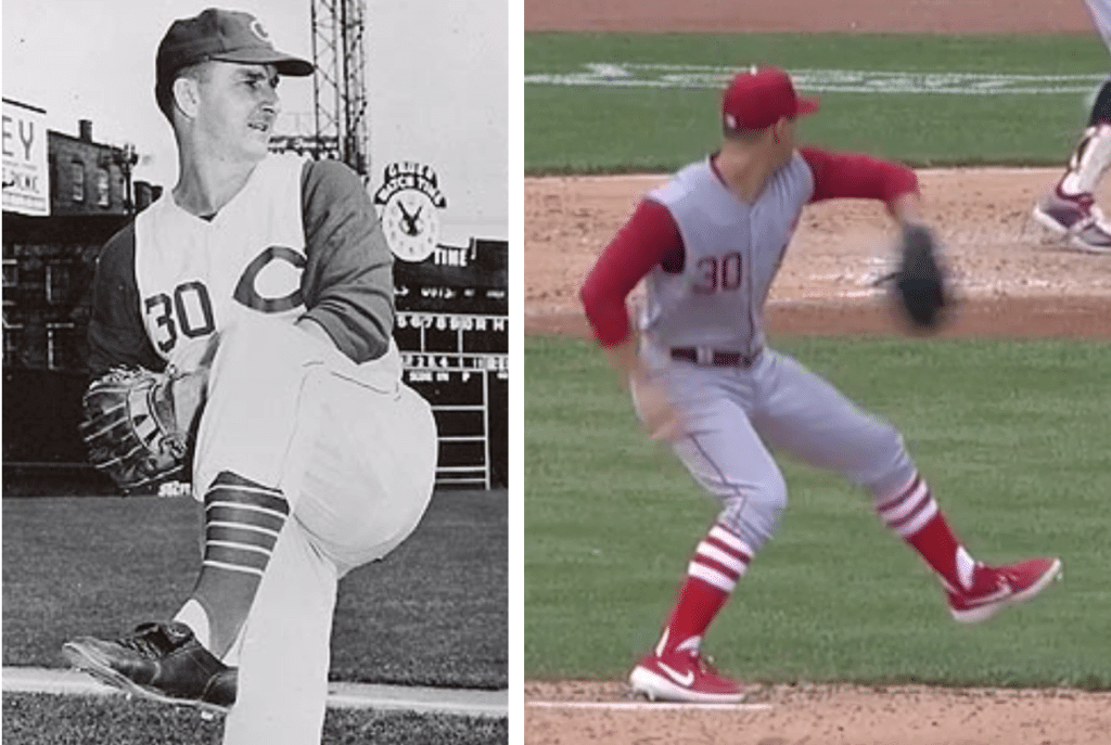
• If you look at those old pics of Big Klu, you can see that the Reds’ original vest jerseys were tailored very narrow across the shoulders, with large armholes. But the Reds (or maybe just Majestic) took the lazy approach with yesterday’s throwbacks, using regular jersey tailoring — wide across the shoulders — but without the sleeves. Booooo! The Cubs and A’s have done this the right way in recent years, so there’s really no excuse.
• The original 1956 stirrups had pencil-thin stripes, but yesterday’s throwback stirrups had much thicker stripes — double-boooo! Here’s a comparison:
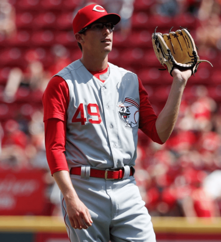
• Reds pitcher Jimmy Herget, perhaps overcompensating for his bare-armed teammates, wore two undershirts:
• The Reds’ current road pants match the 1956 design. So did they get new throwback pants or just use their current road pants? Answer: The current pants. How can you tell? The MLB logos on the jersey and pants didn’t match:
This was the eighth of the Reds’ 15 throwbacks for this season, so they’ve now passed halfway point. Next up: the 1961 pinstriped vest, which they’ll wear on July 21. Here’s hoping they don’t go bare-armed for that game, since Big Klu was no longer with the Reds in 1961, so the look would be more gratuitous than historically accurate.
(Thanks to David Sonny for catching the mismatched MLB logos.)
Click to enlarge
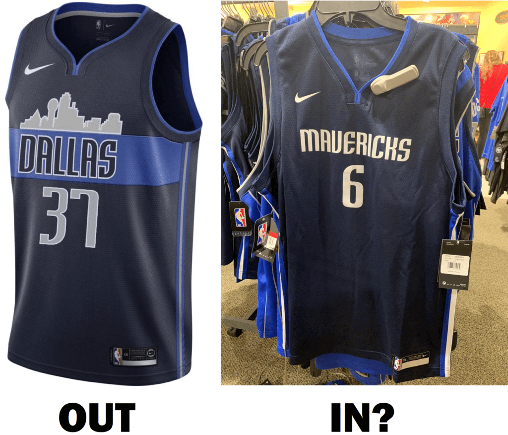
New NBA leak?: The Mavs are getting a new Statement alternate this season, and multiple sources suggest that it’s probably the very lackluster design shown above, which was spotted at a Dallas-area Dick’s. Man, what a downgrade.
Can’t look away: In the fall of 1985, I worked the Monday-night proofreading shift at my college newspaper. On one particular Monday night that November, I was waiting outside my apartment for the bus to take me to campus when I suddenly realized I’d forgotten my Walkman (which was essential for getting through those long proofreading shifts). So I ran back to my apartment and headed toward my bedroom to retrieve the Walkman. As I walked through the living room, where my housemates were watching Monday Night Football, I glanced at the TV so I could see the play that was in progress.
That was the play that ended Joe Theismann’s career.
I ended up missing the bus. In fact, I missed several buses and was late for my shift, because I sat there gawking along with my housemates as we watched the replays and tried to process what had just happened to Theismann’s right leg. It was horrific, but we couldn’t look away.
I mention all of this for two reasons. First, it’s a good story (if I hadn’t forgotten my Walkman, I would have missed one of the iconic sports moments of the 1980s). But more importantly, The New York Times Magazine has a piece this week about why we watch and rewatch injury footage. Interesting stuff — recommended.

Uni-versary patch reminder: Traffic has been low over the past several days, so you may have missed the news that the Uni Watch 20th-anniversary logo is now available as an embroidered patch. The patch was made for us by Stitches, the same shop that does all the sewing for the Mets, Yankees, and Islanders. It measures four inches across and is suitable for sewing onto a jersey or jacket, or just for displaying.
The price is $9.99, plus $1 for shipping (or $2 for shipping outside the USA). To order, send payment to me via Venmo (use @Paul-Lukas-2 as the payee), Zelle (plukas64@gmail.com), or Cash App (plukas64@gmail.com). If you want to use Apple Pay or a paper check, or if you’re outside the USA and can only use PayPal, shoot me a note and I’ll fill you in.
Once you send payment, be sure to send me your shipping address so I can send the patch on its way to you. Thanks!
And as long as we’re talking patches, don’t forget the wonderful chain-stitched patches that are handmade for us by master embroiderer Amy Bengtson:

These measure about six inches high and wide. They cost $35 (80% of which goes to Amy), and that price includes shipping. Same payment methods as for the uni-versary patch, okay? Okay!
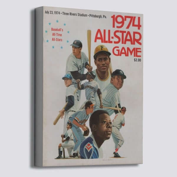

ITEM! New raffle: Our friends at Vintage Brand are once again letting a lucky Uni Watch reader choose anything from their broad range of retro-minded offerings. With the MLB All-Star Game taking place tomorrow night, this 1974 ASG program cover canvas would be a good choice, or maybe this 1961 ASG cutting board, or anything else. Your choice does not have to be ASG-related!
To enter, send an email to the raffle address by this Thursday, July 11, 8pm Eastern. One entry per person. I’ll announce the winner on Friday. Good luck!
Click to enlarge
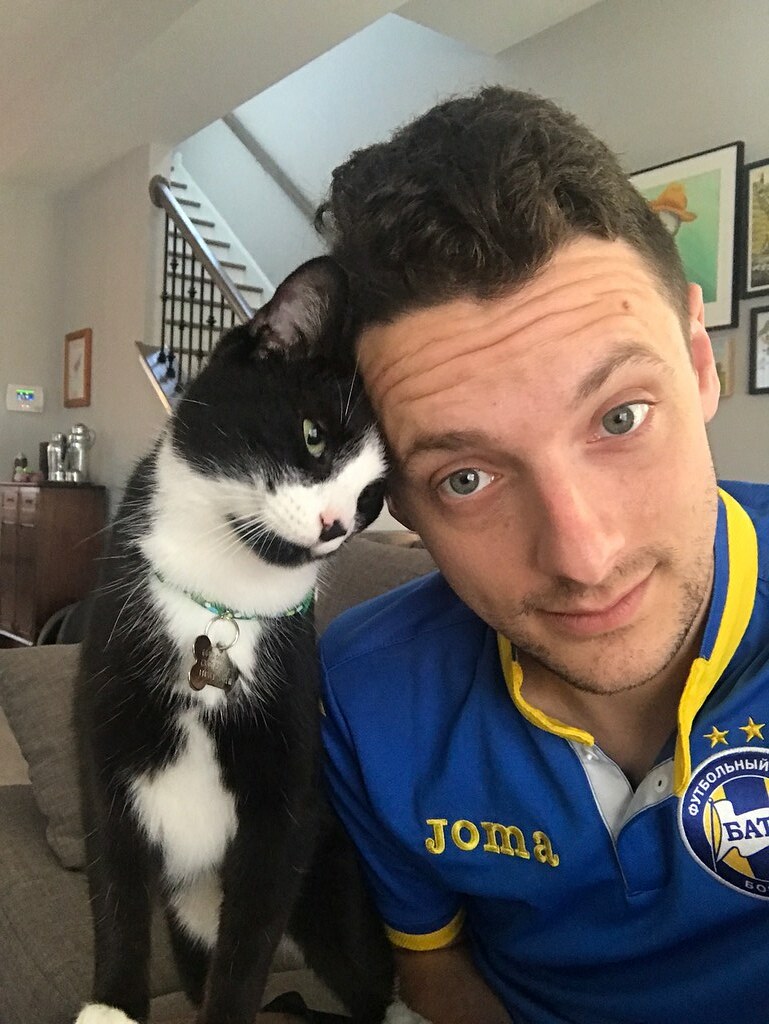
Meet the Contributors — Ed Zelaski: Welcome to another round of “Meet the Contributors,” as I continue to showcase Ticker contributors who have specific niches. Today’s featured contributor is Ed Zelaski, who’s probably our second-most-prolific source of soccer items (after Josh Hinton, who we profiled a few weeks ago). I’ll let Ed — who’s shown above, with his cat, Felix — tell his own story:
I’m a 31-year-old lawyer in Cleveland. I’ve been following the Uni Watch website for probably around seven-ish years. When I first started reading, I was nervous to submit items. Now, I read the website, comments and Twitter feed. I want to buy a membership card; I just can’t decide on a design.
I’ve always been interested in uniforms. I remember as a kid being very interested in the designs and how the teams looked. At the mall I’d ask my parents to go through the sports apparel section at stores just so I could look at uniforms (I was a weird child). In middle school I would design uniforms for the different soccer teams I liked. I played FIFA 2000 a bunch when I was younger, and would always edit the team uniforms.
I primarily follow soccer leagues in the U.S., Poland, Germany, and Scotland. I collect soccer shirts, and I try to focus on Central and Eastern Europe, so that also gets a lot of my attention. Most of my Twitter feed will have uniform-related things from those regions, so my contributions are just things I’m seeing when I check tweets. A the game has gotten more popular, I’ve paid more attention to smaller leagues, and the internet makes it so much easier to do that too.
I don’t really think of myself as “one of the Uni Watch soccer guys.” I enjoy the community, and I like submitting things. The soccer world is so big and there are a lot of teams doing really creative things with their uniforms, especially in the lower leagues here in the U.S. I just enjoy sharing that with other Uni Watch readers. There’s so much toxicity on the internet, so it’s nice to get a break from that and enjoy the Uni Watch community.
Thanks, Ed — both for sharing your story and for all your great Ticker submissions!
We’ll have another round of “Meet the Contributors” in the next week or so.

Bengals contest reminder: In case you missed it last week, I’m teaming up with Sports Illustrated for a Bengals-redesign contest. Full details here.
The Ticker
By Jamie Rathjen

Baseball News: Reds CF Nick Senzel slid into first base on Saturday and somehow ended up with Cleveland 1B Carlos Santana’s sunglasses (from Mike Chamernik). … Paul stumbled across a picture of Dodgers RF Darryl Strawberry wearing teammate Orel Hershiser’s jersey. Twitter-er @williamnyy23 tells us that the picture was taken on the day of Hershiser’s return from shoulder surgery in May 1991, so Strawberry was saluting his return. … Also from Paul: Braves 3B coach Ron Washington wears his cap under his helmet. That used to be common among players, of course, but Paul says he’s never seen a base coach doing it before … Angels CF Mike Trout added a Tyler Skaggs memorial pin to his cap on Friday (from Joanna Zweip). … Nationals SS Carter Kieboom had his name misspelled on his jersey and locker nameplate at the All-Star Futures Game. Kieboom later got a corrected jersey (from multiple readers). … Current Phillies executive Charlie Manuel was the AL bench coach at the Futures Game and wore a Phillies logo on his jersey and Phillies pants (also from multiple readers). … MLB Network broadcaster Sean Casey was also an AL coach, but had a Reds patch on his jersey, perhaps because he spent the most time there as a player (from @Clevelove1). … Mariners pitching prospect Justin Dunn has a silver glove featuring the name of T’Challa, from the movie Black Panther and other Marvel comic books (from Alex Shirley).

Football News: Reprinted from Saturday’s comments: the Saskachewan Roughriders’ mascot, Gainer the Gopher, received a new look this season, including green eyes. Fans complained about the makeover, but especially the green eyes, which were replaced with the previous black eyes this weekend (from Wade Heidt). … More CFL from Wade: because of the league’s new one-shell rule, the Calgary Stampeders wore traditional red helmets on the road for the first time in several years, while Toronto wore light blue socks with dark blue jerseys and pants, having worn dark blue socks for their first home game. Also, the three Saskatchewan-born players on the Blues — centers Brayden Schenn and Tyler Bozak and winger Jaden Schwartz — brought the Stanley Cup to this weekend’s Roughriders game. They were wearing Blues sweaters, but took them off to reveal Riders jerseys with their names and numbers.

Hockey News: Cross-posted from football: The three Saskatchewan-born players on the Blues — centers Brayden Schenn and Tyler Bozak and winger Jaden Schwartz — brought the Stanley Cup to this weekend’s Roughriders game. They were wearing Blues sweaters, but took them off to reveal Riders jerseys with their names and numbers (from Wade Heidt).

Basketball News: Here is an apparent Hornets prototype that never made it onto the court. Chad Sealine spotted it at the 3:22 mark of this video. … Warriors executive Joe Lacob says that the team plans to retire SG Andre Iguodala’s number (thanks, Brinke). … Numbers for NBA draft picks and free agents include No. 15 for Grizzlies PF Brandon Clarke and No. 3 for teammate Grayson Allen, No. 11 for Nets PG Kyrie Irving and No. 7 for teammate Kevin Durant, No. 12 for Hawks SF De’Andre Hunter and No. 24 for teammate Bruno Fernando, No. 31 for Bulls PG Tomáš Satoranský, No. 1 for Pacers SF T.J. Warren and No. 26 for teammate Jeremy Lamb, No. 4 for Wizards PG Isaiah Thomas and No. 15 for teammate Moritz Wagner, and No. 0 for Kings SF Trevor Ariza (all from Etienne Catalan).

Soccer News: The USWNT lifted the World Cup in shirts that had “Champions 19” on the back, their normal numbers on the front, and for now a golden fourth star above the first three. The star arrangement may not be permanent; JohnMark Fisher points out that in 2015, the three stars were arranged in a triangle for the post-World Cup victory tour, but were put in a row afterwards. The goalies also received yellow shirts for the celebration, even though they wore black during the game. … New kits or shirts, among numerous other releases over the past few days, for Dutch second-tier team NEC Nijmegen and Mexican team Pachuca (from Josh Hinton). … Polish team ŁKS Łódź revealed a new logo (from Ed Żelaski). … Also, Scottish Premiership team Kilmarnock revealed a a 150th-anniversary first shirt and a second shirt; the first shirt is solid blue instead of the usual blue and white stripes, which moves to third choice. A second kit for league-mates Hamilton Academical and a first kit for Scottish League One’s Peterhead (in blue) debuted during preseason games. … Germany’s women’s top tier, the Frauen-Bundesliga, has a new ball and title advertiser. … The Chicago Sun-Times asked Fire midfielder Jeremiah Gutjahr about the story behind his No. 33 (from Mike Chamernik). … USL Championship team Loudoun United’s naming-rights ad (WaPo link) for their new stadium in Leesburg, Va., is to be announced today (also from Josh Hinton). … The second-tier women’s team at English club Millwall, who formerly went by “Millwall Lionesses,” changed their name to the convoluted and somewhat meaningless “London City Lionesses.”

Grab Bag: Australia’s cricket team revealed the name/number font to be worn in August and September’s Ashes series in England. While numbers and NOBs are coming to Test cricket for the first time in its 142-year history — they’re already used in the other forms of cricket and at domestic level — they won’t be visible if players are wearing sweaters (from Ben Searle). … Wales revealed their Rugby World Cup kits. No ads are allowed at the tournament, so there is an ad-free World Cup version with a giant tournament logo patch and another version with ads. … Cycling’s governing body, the UCI, reintroduced a maximum sock height this year. As a result, somebody from the organization was at Stage 2 of the Tour de France measuring the riders’ socks (from @CeeDeeFive). … In cycling, the rider given No. 13 for a race traditionally wears one of their two numbers upside down, with the entire dossard turned upside down. At this year’s Tour de France, the numbers appear to have both been printed upside-down for Bora-Hansgrohe’s Marcus Burghardt, so the name and ad are still right-side up. During time trials, where riders only wear one number, the one number is upside down (from Tom Flanagan and Mark Smith). … A new Japanese TV show called No Side Game has the protagonist become the general manager of his fictional company’s rugby union team, Tokiwa RFC. The club, nicknamed the Astros, has its own primary and alternate logos, a shirt, and a scarf (from Jeremy Brahm). … Here’s how to build a beach volleyball court at a non-beach site (from Jeremy Brahm).
I’m a Maverick fan. It’s very disappointing the team has such a poor commitment to visual identity. I don’t even trust that a full redesign would yield anything out of the bottom quarter of the league. They’re just not very good in this regard.
What in the blue hell are the Mavs doing? Their Statement uniform looks great and they’re just gonna switch to that drab version? I don’t get it. Dallas’ skyline is what made that Statement jersey pop.
I’d be more worried about their shitty and horrible problem with sexual harassment than by whether or not their uniforms are HTE AWESOME!!!! or HTE SUXXXXXXXX!!!!!! but that’s just me.
Interesting Uni News about the Reds throwbacks –
link
SLEEVES OR NO? The Reds wore replicas of the 1956 road uniforms for the Sunday. Those are the uniforms that Ted Kluszewski famously wore with sleeves. (This should say without sleeves, I think.)
Bell’s grandfather, Gus, was on the team.
“He did wear the sleeves,” Bell said. “I haven’t seen any pictures of him without the sleeves. If he had done it, I would’ve done it. When I saw that go uniform up in locker — I didn’t realize that’s what we were wearing today — that’s the one that I’m used to seeing.”
Speaking for myself, I’ve yet to see Theismann’s injury. Looked away that night, and at each subsequent opportunity to view it.
A man’s got to know his limitations.
Ditto. I love football, but whenever an announcer says they’re going to replay a gruesome injury I check my phone.
Good. You don’t need to see it. I’ve seen it a couple of times and I never wanna see it again. The gruesome image is permanently burned into my mind.
I saw the Napoleon Mccallum injury live on Monday Night in 1994 and never again, same with Shaun Livingston’s injury in 2007 (my favorite Clipper at the time). Could never bring myself to watch any replays. The Theismann replay I always wince or look away, I’ve never seen 100% of it.
So the Reds are officially tanking now?
+1
When I played little league, I would sometimes do the hat under the helmet thing because, well, that’s what I saw the big leaguers doing! I’m too young to have ever worn a flapless helmet, so I wonder, did the practice of wearing the hat under the helmet come about to make a flapless helmet (like the ones the base coaches wear) fit better, or do they stay on the head better than I think they do? Or was there some other practical reason for doing that? And if it didn’t have anything to do with the fit of a flapless helmet, why did that practice go away?
I thought it went away when baserunners were forbidden to wear a soft cap while running bases.
It was convenient to toss away the helmet and still have the cap on. And you didn’t have to crush it in your pocket like Willie Mays did.
I thought it went away when baserunners were forbidden to wear a soft cap while running bases.
That was one factor, yes. Also: Having the cap under the helmet is a little less comfortable with an earflap helmet. So as flaps became the norm, keeping the cap under the helmet fell out of favor.
The last player to regularly wear his cap under his helmet was Juan Pierre, who retired after the 2013 season. But it’s fun to see that Ron Washington is still keeping this style alive, even if only from the third base coaching box.
I played Little League in the late 60s, early 70s, and I don’t remember what we did. I think we wore our hats under the helmets, because I don’t remember leaving my hat in the dugout. But who knows, maybe I left it on my glove. Also we did wear the double flap helmets. What I do remember is how thin the sanitary socks were, and how dirty they got from the infield dirt.
When I started little league around the mid70’s, we still had the wrap around batting helmets. They only covered your ears and the top of your head was exposed. We called them “Apple ears” helmets. You wore your hat when you had these. The next year, we had the full helmets and we kept wearing our hats under them out of habit. We wore a wool like material for our hats, so they fit just fine with the new helmets. I remember that a year or two later we got hats with the mesh backs and they were snap backs too. Those didn’t fit very well under the helmet so we started not wearing caps underneath. It’s weird that I never really thought about that until you guys brought it up.
We used the wrap-around thingies for baserunning. So if you walked or got a hit, you traded in your batting helmet for the baserunning helmet.
Wore our caps under both types of helmets.
I thought it went away when baserunners were forbidden to wear a soft cap while running bases.
It was convenient to toss away the helmet and still have the cap on. And you didn’t have to crush it in your pocket like Willie Mays did.
I’m surprised you didn’t chastise the maker’s mark on the shoulder of the Reds jerseys (best seen in the Senzel and Lorenzen pictures you posted). It made them a little less special in my eyes, even if they were great otherwise.
Pretty standard for all throwbacks, unfortunately.
For the Vintage Brands raffle – Thursday is July 11, not July 12.
“To enter, send an email to the raffle address by this Thursday, July 12, 8pm Eastern.”
Got it. Fixed!
Question: what would the opinion be of a player who went the Kluszewski route with his jersey nowadays? Would it be an ultimate “look at me” move…or would it be looked at the same way we now look at Kluszewski?
Would depend on a lot of factors. Team? Position? Circumstance? Stated homage to Klu? Other?
I don’t think there’s a blanket answer to this question.
I guess I mean it more along the lines of what if a player on any team decided to go sleeveless on a daily basis? I don’t think there are any teams that wear vests every day, so it is probably something that couldn’t happen anyway, but what if the Marlins or whoever still wore their vests…would it be acceptable if a player on the team went with that look, while everyone else wore the undershirts with sleeves?
It would be fair to say that I’m skeptical. But again, I think it would depend on the circumstances.
I don’t remember this being discussed when teams have had vests in the past, like the Diamondbacks during the Randy Johnson/Curt Schilling era. I guess it would seem inappropriate for a D-Back to do it now when they wear their throwback uniform at Thursday home games, since there’s nothing “throwback” about doing something that was never done before. Back when the Diamondbacks went to these vest jerseys I do remember wondering if a player could go without an undershirt if they wanted to, since some players didn’t wear undershirts with the standard jerseys. I just assumed the answer was no. By the way, I believe back when Johnson and Schilling played with AZ it was the starting pitcher who determined what uniform the team was going to wear.
Regarding the London City Lionesses: There is an old central section of London known as “City of London,” so the name could be construed as relating to that. But while The Den, Millwall’s grounds, are near the City of London, they are not *in* the City of London. The club is south of the Thames in Bermondsey. So kind of curious.
Someone with deeper knowledge of Millwall might be able to explain a connection?
Apparently the name change came about because they broke away from Millwall, so the team didn’t come up with it themselves, but they were the first to announce it.
They also seem to be playing at the same place they did before, which is in Dartford (Kent) and not even in London at all. Go figure.
The Reds’ original vest jerseys were tailored very narrow across the shoulders
Not to pick on the Colorado Rockies, but their black vest jersey has never looked right to me, and that wideness is a big part of it.
Probably overthinking this, but maybe the Reds knew most players would go without undershirts and requested that cut. They would’ve looked like basketball players with narrow shoulder jerseys and nothing under.
Of note: the USWNT had 3 stars down the back of their jersey near the neck (I assume, like their shorts, representing the previous 3 titles). Those 3 stars remained on the updated champions jerseys the women got after the game rather, making for a weird combo of 3 on back, 4 in front.
The stars anomaly aside, it’s so nice that they don’t pop on some “official championship gear” t-shirt. I’d rather them stay in their actual jerseys, but at least the ones with the 19 on the back are similar enough that they celebration looks good.
Nice contrast in the Klu – Frank Robby pic. One man with the no sleeves look at me uni. The other? Only one of the greatest athletes of all time humbly crossing the plate after a HR.
Also, though the back said CHAMPIONS 19 on it, there was no gold FIFA scudetto shield on the front.
I’m pretty forgiving on most aspects of throwbacks, but it really bugs me that the Reds vests are in the modern style of a regular jersey with set-in-sleeves and the sleeves just not added to the garment. Whereas the Reds old vests had narrower shoulders than just leaving off the sleeves. It’s the difference between a tank-top and a t-shirt with the sleeves cut off. You can see it in the boxy shoulders of many of the 2019 Reds players versus the narrower, more rounded profiles of the vintage Reds players. I can’t imagine that there’s any meaningful difference in the difficulty or cost of manufacturing one style over the other, so it seems a shame to me not to go with the authentic old style of vest.
I very much dislike both vests and sleeveless jerseys in baseball (and football for that matter)
Hear, hear! Football jerseys especially need to have sleeves (at least to the elbow).
I’ve been fortunate in my not-noteworthy athletic career to have never had an injury that required a trip to the ER, but I’ve rolled my ankles enough to know that getting hurt really, ya know, hurts. TV loooves injury replays, so all I can do is turn away. Makes you wonder how many TV directors and execs have ever suffered a sports injury.
Okay, I’ll say it: even back in the day, Kluszewski looked like a complete, utter, and comprehensive douchebag with his sleeves cut off. The patina of time adds nothing to his look, the Reds players did the 100% wrong thing, and any would-be “tradition” of this sort needs to get throttled in the womb.
I have to say, I love this comment. I don’t agree with it, but it’s good to have a naysayer for something like this. Thank you!
Ugh, I though it looked absolutely awful. GODawful, even. Until they showed the photo of Kluszewski, I thought it was just Puig being his usually insufferable self…and though once I realized it was more a team thing the bile receded somewhat, I agree wholeheartedly that the sleeveless Reds looked like complete, utter, and comprehensive douchebags.
I hate to be that guy, especially when I often don’t get things right myself, but the stirrups the Reds wore yesterday were exactly correct for the uniform. Indeed, the HOME stirrups for 1956 were thin (and I believe they wore seven stripes), but the road ‘rups were thicker and they only had three of them.
link.
You can also see it in some of the photos Paul posted of Klu and F-Robbie above. It was one of those oddities where the home and road stirrups were different, but similar, for the entire season.
I actually wore the 56 home stirrups this past weekend curling, with a pair of “flag” pants (wore them Friday evening). Those ‘rups had seven stripes.
Disagree! You’re right about the two different sets of stirrups (and my bad for using a home for for the side-by-side comparison), but look at the two pics you specifically referred to:
link
link
No way those stripes are as thick as the ones worn yesterday. Not even close!
I can’t argue with the photo proof on Klu, but F-Robbie’s were link to those worn yesterday. At least in some shots. In others, he link had noticeably link. If we add in a third Redleg, we can see link appear to be the norm.
I am wondering/guessing the Reds just went with the link image; also, I’ve noticed TCK doesn’t seem to produce the thinner versions of retro-stripes (those 56 homes I wore wore the bonspiel were definitely MUCH thicker in width than the 56’s the Reds wore).
So — we can agree on stirrup stripe width being wrong, but they definitely got the number of stripes correct.
Re: the Theismann injury. Michael Lewis deals with it particularly well in the beginning of his book “The Blind Side.” (I know this is a little bit to the side of the note on the NYT article) The most interesting aspect in Lewis’ reportage was that Lawrence Taylor popped up out of the scrum not because he heard the injury but because he has a phobia about tight places. Go figure.
Re: wearing a cap under the helmet
When I was in little league circa 1981-82, we didn’t have enough helmets for every player. I was told we had to wear our caps underneath for sanitary reasons, i.e. head lice. I’m pretty sure they were double flap helmets.
Worst ever televised sports injury? Clint Malarchuk.
So, if a player hits that Tundra truck in the last Reds throwback photo does that player win the truck?
Hits with a batted ball, any idiot can hit it by throwing.
No. Not reachable. But there is a sign in beyond the fence in CF that if a Reds player hits the sign, a fan wins the truck. There’s a way to sign up and a random name is drawn every game. And yes, a truck was “won” a couple of years ago.
Re: Reds vests and going sleeveless. Not sure if Reds got a special ruling for this retro uniform or rules have been changed, but the Reds had vest uniforms when Deion Sanders was on the team. He went sleeveless one game and MLB so no more. Uniforms worn by players must be uniform, as in all players must eesr them the same way. Thought it was crap and aimed directly at Deion since even then you saw players wear pants pulled all the way down and others wearing them a little short to show the socks. So I’m not sure what the actual rule was but they stopped Deion from going sleeveless after he did it a game or 2.
the Reds had vest uniforms when Deion Sanders was on the team. He went sleeveless one game and MLB so no more.
This is not quite accurate. The Reds had regular sleeved jerseys, and Sanders shortened his sleeves as a tribute to Jackie. MLB said his sleeves had to match everyone else’s, so the rest of the Reds opted to shorten their sleeves in solidarity with Sanders.
I’m pretty relaxed on most aspects of Uniform design and don’t have strong dislikes of things like makers mark etc. I would generally say that my interest is in the way that athletes tweak their uniforms and the historical aspects.
However I think I now understand the objections that people have to certain things. Even though I am not a cricket fan beyond a passing interest the thought of players wearing NOB and numbers during the ashes is completely and absolutely wrong.