The NBA season tipped off yesterday, and two teams decided to mark the occasion by becoming the latest clubs to hop on the corporate uni-advertising bandwagon.
First up are the Bulls. In keeping with our established policy, I will neither show their patch nor name their advertiser, but I will show that a Bulls jersey with an ad patch looks like crap (click to enlarge):
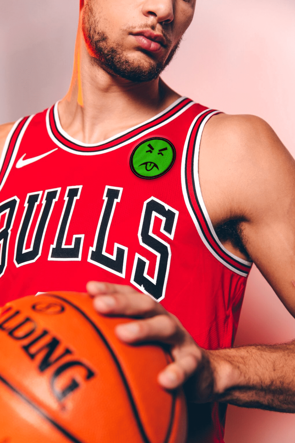
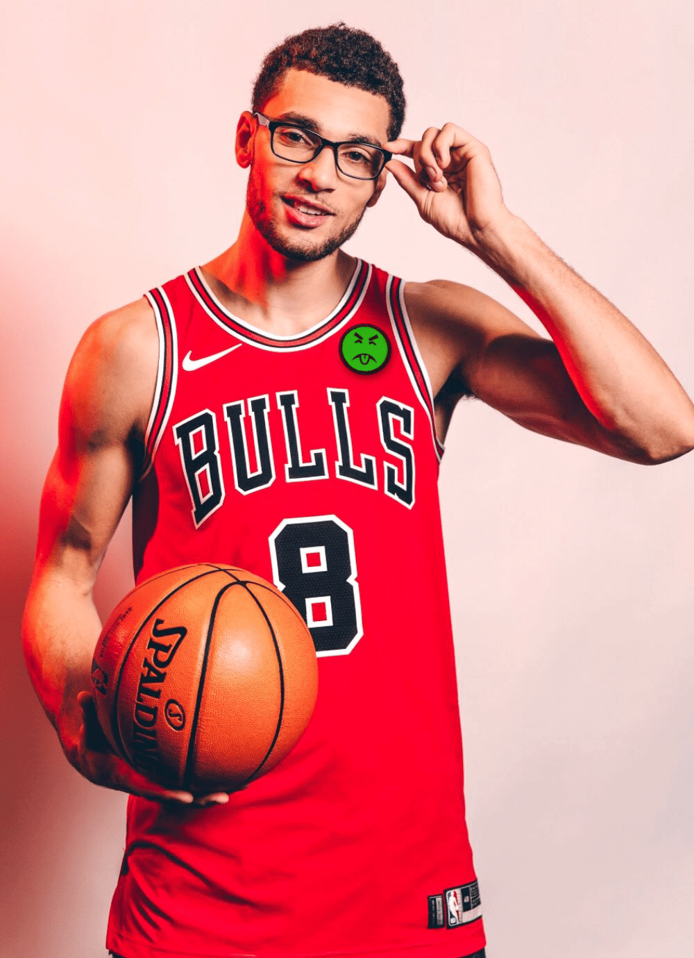
A shame to see a classic uni sullied like that, no? In a newspaper report, Bulls prexy Michael Reinsdorf said, apparently with no intended irony, “We took our time because the jersey is somewhat sacred to us.” Accent on the “somewhat,” I gather.
The Bulls are referring to the advertiser as both a “partner” and a “sponsor,” but of course it’s just an advertiser. It’s interesting to see how far teams will go to avoid using that word.
Next are the Rockets. Again, I will neither show their patch nor name their advertiser, but I will show that a Rockets jersey with an ad patch looks like crap (click to enlarge):

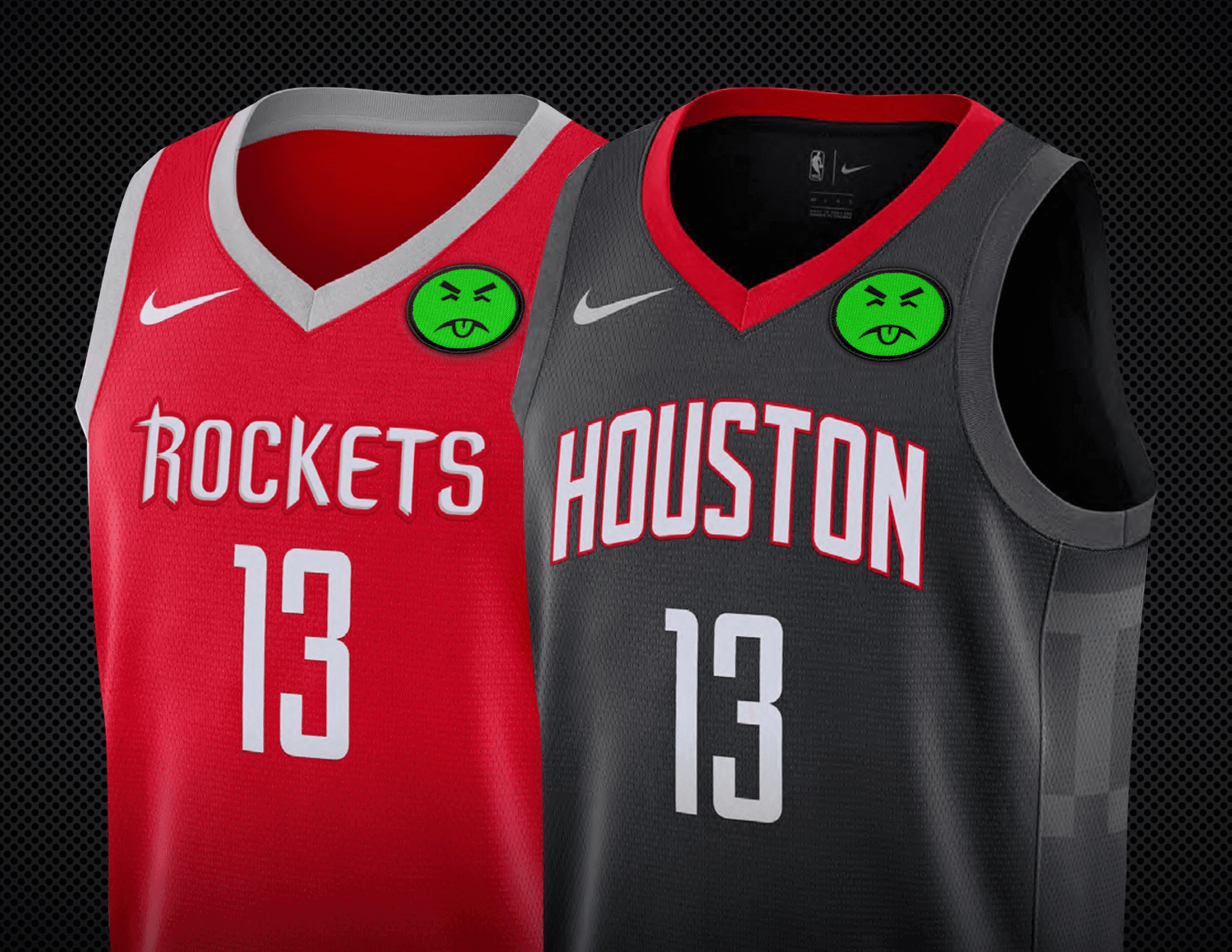
The Rockets are referring to their advertiser as a “partner” and are calling the ad patch a “logo badge.” Right.
For the record: Last Friday I mentioned that I’d been told that another team would be adding an ad patch for Opening Night. It was the Bulls. I did not know about the Rockets.
There are now 27 ad-clad teams, six of which have announced their ads for this season. That leaves three ad-free teams: the Pacers and Wizards in the Eastern Conference, and the Thunder in the Western Conference. So for now, it is still theoretically possible (but, I acknowledge, highly unlikely) for us to have an ad-free uni matchup in the NBA Finals.
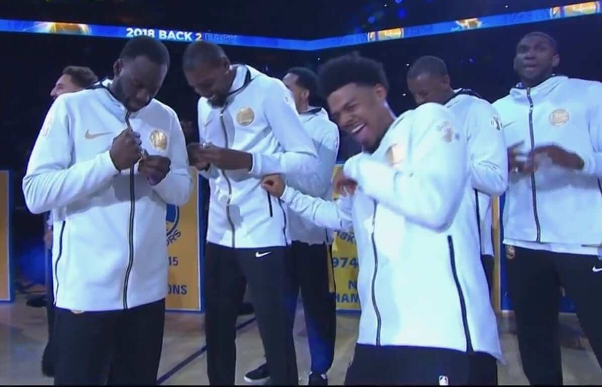
Meanwhile: The Warriors opened the defense of their championship by wearing gold-trimmed gear for their ring ceremony (click to enlarge):
And the rings themselves are pretty neat — they’re reversible (additional info here)! Check this out:
First reversible championship ring ever! Jason of Beverly Hills coming through with some innovative work in the championship hardware department. 🏆💍 #DubNation pic.twitter.com/wlxCXZQuQw
— Golden State Warriors (@warriors) October 17, 2018
👀First look! Dubs 2018 NBA Championship Rings by Jason of Beverly Hills!!! 🏆💍#DubNation pic.twitter.com/jTObw4mVcT
— Golden State Warriors (@warriors) October 17, 2018
One last order of champions’ business: The Warriors also revealed their new championship banner:
The @warriors unveil their 2017-18 NBA Championship banner in the rafters at Oracle Arena! #ThisIsWhyWePlay #KiaTipOff18 #DubNation pic.twitter.com/eV7Dd8ECmI
— NBA (@NBA) October 17, 2018
(My thanks to Brinke Guthrie for the ring ceremony screen shot, and my continued thanks to Nic Schultz for his Photoshoppery.)
Fishy happenings: Florida radio guy Andy Slater broke the news on Monday that the Marlins are changing their logo. According to Slater, “[T]here is a different M and more blue. An actual marlin on the logo remains, but has been adjusted.” He said the official announcement will come “in November.”
I can confirm that the Marlins have a new look in the works, although I have not seen what it looks like. But yesterday evening, a Marlins-centric Instagram account posted what it claims to be the new logo:
That ticket stub design template, with the team logo surrounded by the bar code, is being used by MLB for Spring Training 2019. All of the teams are using it, as you can see on these pages for the Astros, Mets, and Dodgers. Interestingly, the corresponding page for the Marlins shows their current logo — but the MLB Style Guide shows the same logo shown in the Instagram post, which suggests that this will indeed be the team’s new primary mark.
This appears to be the latest in a series of moves by Derek Jeter’s ownership group to remake the look of the team. Remember, last year they had a flurry of late-breaking moves (reducing the size of the cap logo, adding the anniversary patch, and adding the throwbacks) that weren’t even included in the MLB Style Guide but nonetheless made it onto the field.
And in a related item, the Marlins’ home run sculpture is being removed from the ballpark.
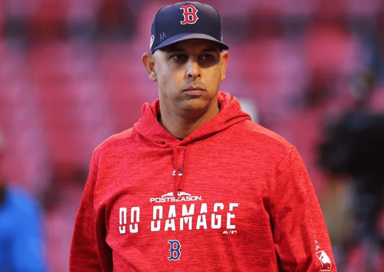
Uni Watch’s highest rating: When I see those embarrassing slogans on MLB’s postseason sweatshirts, I mostly roll my eyes and occasionally make an tangential reference in the Ticker. Now Wall Street Journal columnist Jason Gay (who, full disclosure, edited a few pieces of mine at GQ a million years ago) has done what I should have done: written an entertainingly derisive piece on them (WSJ link). Referring to the “Do Damage” slogan that the Red Sox are wearing (see above), he writes, “What does that even mean? Run headfirst into the Green Monster? Tear a meniscus? Shatter the psyche of New England with a bullpen implosion?”
Nicely done, Jason. Highly recommended.
(Thanks to Chris Lutzo, Steven Luft, and Joe Baka for this one.)
Click to enlarge
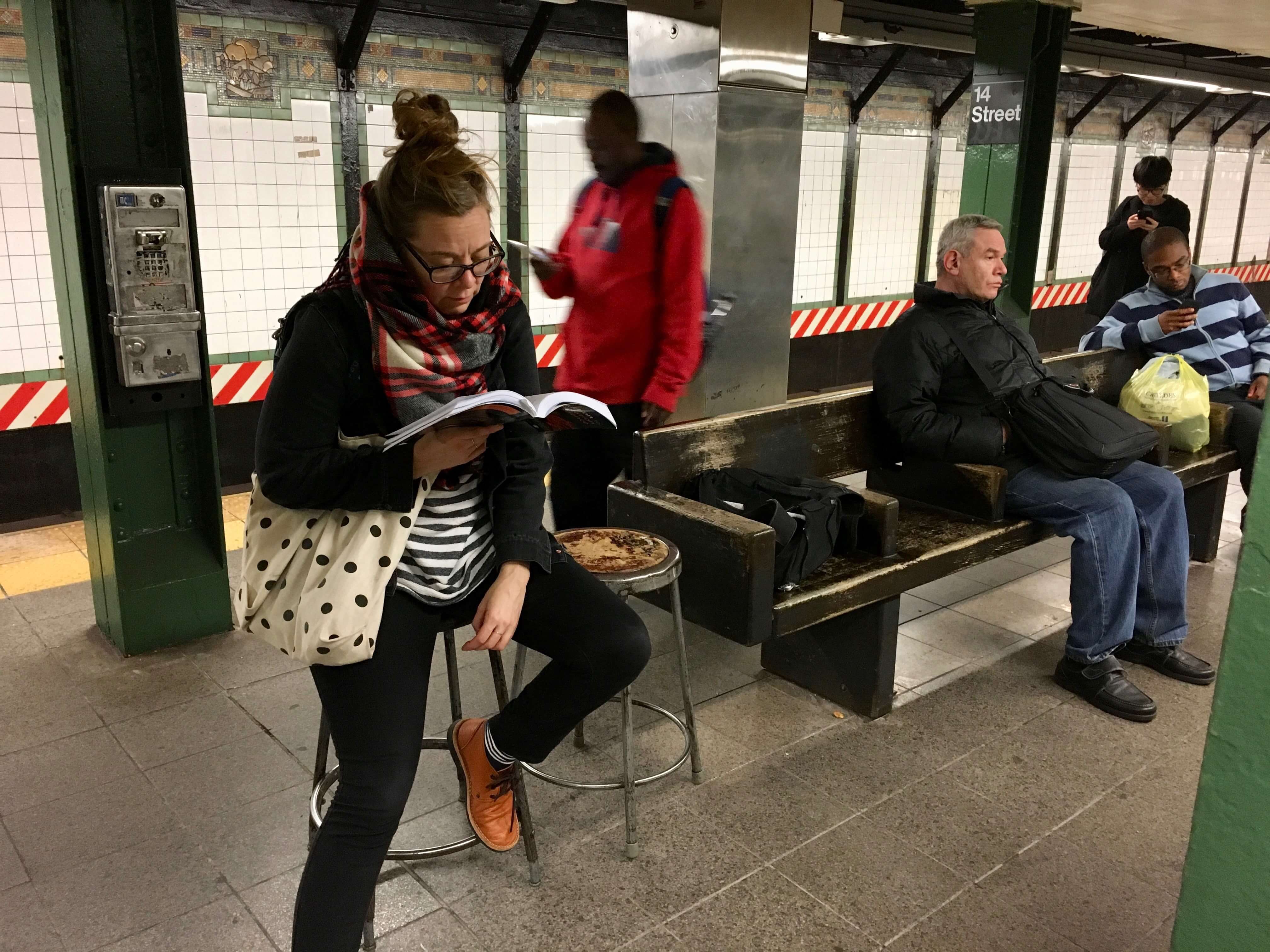
Stool pigeons The Tugboat Captain and I were walking to the subway in Manhattan last night with our friends Nate and Heather when the Captain spotted a metal stool that had been left at the curb. It was in good shape, and you can never have enough stools, so we grabbed it. Half a block later, oddly, there was another (non-matching) stool, so we took that too. It made for a fun scene on the subway platform.
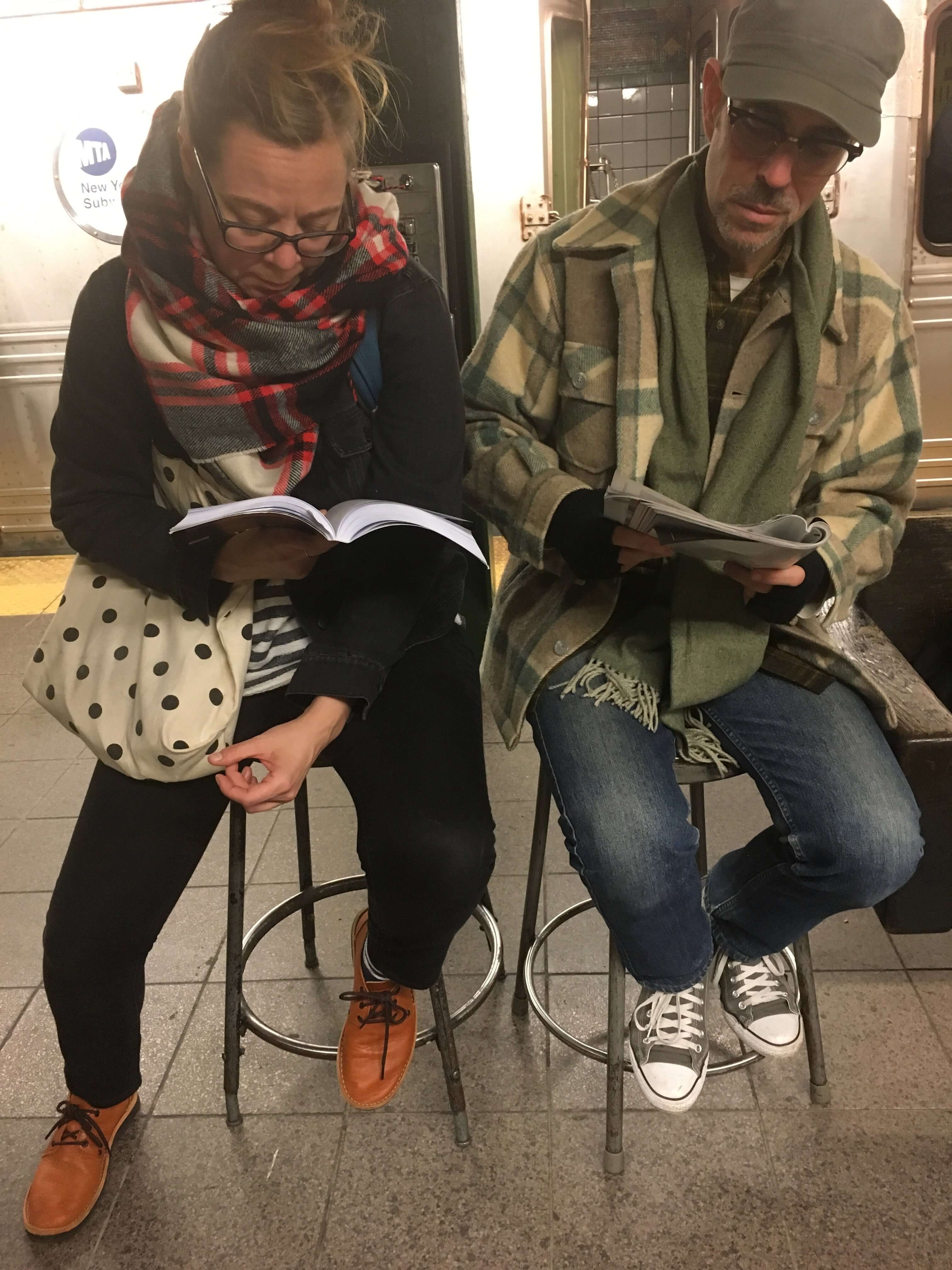
We also sat on the stools once we boarded the subway (why take up a seat that someone else could use?) but didn’t take any photos of that.
The Ticker
By Lloyd Alaban

Baseball News: ALCS news dump: Odd choice of logos for TBS — The Red Sox’s TV logo featured “Bo Sox,” (left) and the Astros featured “1962” (right), their date of establishment (from Jay Pritchard). … No pictures to confirm, but Nick Mueller says Brewers P Freddy Peralta used fellow P Jhoulys Chacin’s bat last night. … Here are the ultra-high-quality tickets from last night’s game in Houston (from Ignacio Salazar). … Someone behind Astros GM Jeff Luhnow was wearing a jersey with “Luhnow” on it last night. The jersey numbers are rendered in gold, which is what the Astros wore for their home opener to celebrate their World Series championship (from Joseph Matlock). … More Houston news: This tequila sunrise Bible just screams Texas (from Tyler Stafford). … The Padres tried everything to stop their skid early in the 1994 season. According to The San Diego Union-Tribune, the club donned their blue batting practice jerseys at Wrigley in an effort to stop their losing streak. Turns out they lost that game (from Dan Berman). … Check out these bullpen/helmet carts made from Lego-like bricks. … Speaking of bullpen carts, here’s a Nats-themed cart ornament — with Santa behind the wheel (from Stephen C. Fehr)! … In 2019, triple-A team Syracuse Chiefs will become the Syracuse Mets. Here are the new uniforms (from Mike Chamernik and Pete Simmonds).

Pro Football News: Observant reader Tyler Goldberg points out that the Jets have worn three different facemasks this season: white against the Lions, green against the Browns, and grey against the Colts. … Check out this shot of the officiating crew from the 1979 AFC Championship Game. Back in those days, the officials’ positions were spelled out, the ref wore a black hat while everyone else wore white (the opposite of today), and everyone wore striped stirrups (from Corey Buck). … From Pro Football Journal, here’s another shot of an NFL player wearing a leather belt. This particular photo is of Bears Hall of Fame DT Dan Hampton. … Cross-listed from the baseball section: Check out these bullpen/helmet carts made from Lego-like bricks. … XFL 2.0 has no plans to resurrect the original XFL’s team names (from our own Brinke Guthrie). … Reader Jim Weber asks: Who had the best helmet in the USFL?
College and High School Football News: Here’s a possible leak of LSU’s new alternate jersey with color-changing helmet (from Ray Garofalo). … Lots of feel-good nostalgia in this 1968 shot of Fairgrounds Stadium, the home of Louisville football (from @EverythingLouisville). … Teams participating in the South Dakota High School Activities Association football finals this year will wear a small helmet decal of the USS South Dakota, a submarine that will be commissioned in 2019. It is the first Navy vessel bearing South Dakota’s name in over 70 years (from Daniel Swartos).

Hockey News: The Blackhawks are giving away a 1930s-inspired soccer jersey for the Oct. 28 game against the Oilers (from Jeff McBrayer). … The “A” patches on the Rangers’ warmup jerseys were first responder-themed for last night’s First Responders Night matchup against the Avalanche (from Al N. Kreit).

NBA News: More Warriors news: Golden State now has an advertiser for their kiss cam. It’s a fitting one (from Mike Chamernik). … Also from Mike: For the first time, it looks like the NBA is allowing visible maker’s marks on headbands. Here’s a shot of Celtics G Kyrie Irving in a Nike-stamped headband from last night’s game against the Sixers. Previously, only the league logo was readily visible, although the Nike logo was visible in the right light. … Could this be the Rockets’ new alternate jersey? (From @mccauley318.) … The storied rivalry between the Celtics and Sixers opened the NBA season last night. Here’s how this matchup has looked throughout the years (from Tailgate Throwback Sports). … Starting at 25:38 in this podcast, 99% Invisible (which is an amazing podcast to listen to if you’re as obsessed with design as we are) documents how Oklahoma City stole basketball from Seattle. There’s a short mention of team colors and how the Sonics name came to be (from Andrew Cosentino). … The Celtics are apparently using new arena lighting.

College Hoops News: New uniforms for Dayton men (from John Bedell). … New uniforms for Cal State Long Beach, aka Long Beach State (from LBSU Athletics). … New unis for Houston Baptist men. … New unis for Wyoming men (from Josh VanKlompenburg). … New Nevada uniforms feature both their wordmark and their logo on the front of their jerseys. More detailed looks here (from Rob Montoya). … New court for Wake Forest. … Here’s what a high school basketball court looked like in 1941, via the Kentucky High School Athletic Association Athlete magazine (from Josh Claywell).

Grab Bag: Here’s a feature on Saint Joseph’s equipment manager Xaviar Dantzler (from Matthew H. Sher). … The pop singer Pink announced her Cardiff tour date with a customized Wales rugby shirt (from @Stumpy7780). … This company uses Big Four uni templates to make Freemasonry jerseys. Some are hockey sweaters, but most are baseball themed (from @TweedsTweetw). … Calhoun Insurance reps dressed up as players in the All-American Girls Professional Baseball League today at a local biz expo (from Phillip Tutor). … Apple has updated their bagel emoji to make it look more bagel-y (from Andrew Cosentino).
fifth link in NFL section is wonky
Thanks, Gregg. Fixed.
if that Marlins’ logo is accurate, it’s a big improvement over any of their previous logos.
I agree. Any change to The Marlins logo and/or uniform will be an improvement. Too many damn colors with no identifiable dominant one. Much like the old Devil Rays rainbow look.
Am I missing something? I don’t understand how the Canucks home sweater has been reimagined in the hockey ticker. It looks exactly the same as the actual sweater.
Those bullpen/helmet carts are not made from Legos. Oyo’s are different from Legos and a separate brand. Maybe you should change it to “Lego-Like”.
Yes, Please.
Done.
Extremely pedantic to some but according to official LEGO company lexicon and the LEGO-maniacs who immerse themselves within the hobby and culture, you would never say “Lego’s”. You would refer to them as LEGO bricks or LEGO sets.
Unless L. E. G. O. is an acronym for something, the company doesn’t get to have the whole world advertise for them by using all capitals.
It is a mashing of two Danish words that means Play Well.
If that is in fact the new Marlins logo it is an upgrade, is that pink or orange in there? Of course I still think they should have gone to the M version of their original logo that they used on batting practice caps for a few years.
Thanks for posting that SJU link, nice to see my alma mater on uni watch. I especially love SJU assistant AD’s quote: “Athletics is essentially a marketing arm of this university. It’s how people get to know St. Joe’s and it’s our job to make sure we present our teams, our facilities and ourselves in the best possible light.” Maybe other schools and pro teams could take this to heart when they roll out countless ugly alternates and never embrace a real identity.
I like the Marlin, and I’m OK with the shape of the M, at least if it ties into new Marlins and Miami jersey scripts.
But all that black is pretty terrible. The fish needs to be better distinguished from the letter. Even if, as the context suggests, it’s meant to appear on a bright non-black cap, it will look like a black blob, like spilled ink, rather than a coherent logo. The logo is all about black, with only the barest highlights of color. Has anyone ever thought that the problem with the Marlins is that they don’t wear enough black? Other than Derek Jeter, apparently?
The added context of removing the home-run statue makes me doubtful that the new uniforms will be an improvement. Jeter’s jihad against fun and whimsy seems unlikely to produce uniforms that anyone can love.
I agree with the excess black. MLB is already over saturated with navy, black, and blue teams. Miami is the perfect place to have a more colorful design, stick with teal or aqua as the main color,orange and black as accents.
Re: the home run statue. That thing is hideous. But they should replace it with some other home run thingy. Palm trees and jumping fish make sense, but you can certainly make it look better than what they have now.
I did some analysis with an online color tool and it is definitely not orange. The hues within the accent range from a sort of plum color up to light rose pink. Hard to tell exactly since it is so small and does not take up many pixels. But I am pretty excited if we are indeed going to get some pink representation in MLB at long last.
Could it be possible that the color scheme will be like the Heat’s alternates?
The non-blue accent colors appear to differ between the stripe on the fish and the drop shadow below the M. I see something in the rose or cherry family under the M, but the stripe on the fish appears more orange to me. Do you find a difference between the colors of those two elements when you eyedropper it?
Should be clarified that the Jets have worn three different masks with their white jerseys. The white and gray masks were paired with white pants as well, while the green mask was paired with green pants.
Re. the Blackhawks’ soccer shirt giveaway: nothing says 1930’s hockey more than a giant coffee ad
I think they’re going for a modern soccer jersey based on the 1930s hockey sweater design, not a 1930s-styled soccer jersey.
I was going to say, they know 1930s soccer shirts didn’t have ads, right….?
Also, it only has one star, which seems to me to represent the team’s first Cup, won in the final season the black and white stripes were worn (1933-34), because otherwise only having one doesn’t make a lot of sense.
Attn: social-media managers. If you post a video to twitter for your uniform reveal I won’t watch it. Photographs please.
True for just about anyone who puts content online. Pictures over videos please.
Question: For Monday Morning Uni Watch, I sometimes use video, not photos, to show what a team was wearing on Sunday. I’ve tried to mix it up — some photos, some video. Do you not like the video?
It’s more about the “hype videos” versus a highlight from my perspective. The on the field stuff is totally fine. It’s good to see the uniforms on the field versus seeing them on a sound stage.
Unless it has to be video, it shouldn’t be. If I can read something, or see a picture of it, and get the same message,that works. It is all about valuing someones time. With a video you are essentially held hostage during the whole thing waking for what you want to see, or the information you want. With text and photos you skim through what is unimportant to you, save time, and get to what you need to see.
I always try to create an efficient experience for the reader. Sometimes a video shows multiple views of something that a single photograph cannot show.
good take on videos here
link
Personally, if a link is a video I very rarely click (or close immediately once I see it’s a video). I agree some things need video to fully capture whatever it is, but otherwise I much prefer still images. Just my personal preference, of course!
I appreciate your attempts at efficiency, which are generally effective. I don’t like the videos that NCAA programs use to show extensive views of gloves and brief snippets of other uni elements. Then again, I’m 87% as old as dirt, so I’m not the target audience for those.
I generally try to avoid uni-reveal hype videos — in part because they’re stupid, but mainly because they don’t provide good visual information. If they include one good full-body view, I’d rather include a screen shot of that.
In theory, I can appreciate a necessary video. Like an exploding helmet decal. In practice, that should be about one in a thousand. Videos take longer to load and their audio can be shocking and/or interrupt what I’m listening to while reading.
I like the videos – because if it is a photo loaded in “offload”, I can’t see it.
If the video is meant to show what something looked like, I won’t watch it if I know it’s a video, and I’ll be a little bit upset if I follow a link and am surprised that it’s a video. Photography is superior to videography for depicting simple visual information.
If the purpose is to tell me a story, then in most cases a video will be superior to either a single image or a slideshow. Click-list slideshows are the worst, and in almost all cases are either a complete waste of time or are a decent idea for a short video ruined by lazy execution as a stack of still images.
As for things like video clips of games to show uniforms in motion, if game action reveals something that a still image doesn’t about how the uniforms appeared during game play, then great! Otherwise, video will almost always be the wrong medium for conveying the information meant to be conveyed. Although an embedded video at least alerts the reader to the option of not playing the video, whereas an unlabeled link to a video often results in an unwanted auto-playing video if clicked.
I was thinking the same thing. When I clicked on the Dayton basketball link I said, “I’m not watching a hype video of uniforms that are being panned in the Twitter comments for having low-contrast numbers.” Life is too short to endure more of Nike’s nonsense.
At first glance, I thought those Red Sox hoodies said DD Damage
Yeah, seeing as Dunkin Donuts is headquartered a few miles west of downtown.
Okay, I’m not seeing any significant difference between Tyler Duchaine’s rendering and what the Canucks are currently wearing. Near as I can tell, the only noticeable difference is that the white stripes are a little thicker than on the actual jersey, and the green stripe may be slightly thinner as a result.
The Twitter link for the Rangers’ warmups shows the backs of the jerseys with the themed numbers. This is the tweet that shows the alternate captains’ letters: link
I like the Syracuse Mets’ road look. For obvious reasons.
Best USFL helmet: Michigan Panthers.
Loved the Panthers helmet. These days, the CFL BC Lions pay homage to that look. It lives:
link
Really liked the Breakers and Bulls helmets as well for their uniqueness. Love the wraparound logos on helmets as the Bulls had. Miss my Saskatchewan Roughriders wearing the wraparound as they did from 1985-2007. Grew up with that:
link
Now we have just the Seahawks with the wraparound that I can think of.
The shortlist of things I’d change if I were Commissioner of Baseball includes banning minor-league teams adopting parent-club nicknames above single-A. The Syracuse Mets new name is a major loss for triple-A baseball.
But by gosh if you’re going to adopt a big-league nickname for a farm team, Syracuse shows how to do it. The home uni with the orange “Mets” script is a particularly nice touch. If I were a Mets fan, a jersey or a t-shirt with the orange script would become my go-to wear-to-games top. It’s the Mets, but different, but still same.
Absolutely yes as to your first paragraph sir!
Holy God, those Syracuse Mets uniforms are ugly.
If I never have to see or hear #BeBold for the Phillies, I’ll be happy. That was cringeworthy.
I realize slogans aren’t anything new for sports teams but those just seemed even more forced.
“Here are the ultra-high-quality tickets from last night’s game in Houston”
I’d like to know where these “tickets” were purchased because they really look more like slips Astros ticket-takers give out to people who enter the game with scannable tickets from their phone.
I suspect season-ticket holders and people who bought from the Astros when advance postseason tickets went on sale actually got real high-quality tickets.
“It’s called sarcasm.”
“What’s that taste like?”
“ARRRRRGH!”
Cant read the WSJ article and I agree the postseason slogans are just another gimmick to sell merchandise.
However, there is a backstory to the Do Damage slogan the Sox use.
Earlier this summer Yankees GM Brian Cashman was quoted as saying
“You wonder what their record would be if they weren’t playing us,” Cashman said, via MLB.com’s Bryan Hoch. “Because when we go head to head, we do some damage against them and it doesn’t seem like anybody else is capable.”
The since then the word Damage has been thrown around a lot here in Boston
Guessing the quote from Cashman came before the Sox swept the Yanks in that 4-game series at Fenway in early August. Boston did go 1-2 in each of the three series in the Bronx, and 1-2 in the final series of the season in Boston (though by that time they’d clinched the division).
And Never Settle was said by Astro’s manager A.J. Hinch. Our “Never Settle” slogan is our hash tag for this year. It goes deeper than the post season hoodies (which are a gross fabric and supremely overpriced – even on the clearance racks). We have had the slogan from before the season started.
The NBA tipped off last night… The next meaningful game will be in June of 2019.
Haha, true. Though I question how meaningful any NBA game is when you no longer need to dribble the ball and creating fouls is the most important part of the game. At this point the only NBA games I really enjoy are replays of the early to mid-90s games rewatching matchups like the Knicks and Pacers go at it in the playoffs.
I don’t know, I think the NBA is as entertaining as it’s ever been. I could watch Steph Curry and Kyrie Irving every day.
The Syracuse Chiefs (and SkyChiefs) were my home team growing up, and I still check in on them on FB from time to time. (So it was very cool seeing the Brannock Device promotion earlier this year.) Needless to say, there are a lot of complaints from people about the name switch. Perhaps it’s the fact that Syracuse has a lot of Yankees fans, perhaps it’s the perception of the name being changed because of sensitivities about Native Americans, but I tend to think that people in general just like to have something to complain about.
I do hope the Syracuse Mets continue the Salt Potatoes and Devices-type promotional nights, because the designs have been great and are always super fun. Also, I did quickly buy myself a Chiefs hat before they got pulled from the MiLB online store yesterday afternoon. This one: link
I forgot to add – I like that the Syracuse minor league team’s colors are now in line with the Syracuse University teams. Nice symmetry with the orange and blue.
Doesn’t that go back to the Prince’s Flag (link) I think that’s why the Knicks have that color scheme
Yeah you’re right!
The laces on that Washington Nationals ornament are going in the wrong direction.
link
Couple thoughts:
1) Paul, you do a good job with the NBA Jersey Ad-patch coverup. I mean, you get the angle right and everything. The first few times I saw it, I thought it was the actual patch.
2) Re: USS SOUTH DAKOTA & useless submarine trivia. I work in new construction submarines and this weekend both the future USS DELAWARE and USS VERMONT will be christened.
Nic Schultz deserves all the credit for the Mr. Yuk patches. He does a great job!
By the way Paul. The photo of you and TBC on the stools is great, if only because you are both reading the printed word and not glued to a screen!
Ha! Someone on Facebook had the exact same response. She was reading a book for class (she’s currently in library school), and I was reading The Atlantic.
For the record, we both spend plenty of time on our phones. But I tend to read printed magazines on the subway.
What’s the difference between reading a high quality article on your phone and reading a high quality article on a print magazine?
Jobs for the various editorial staff who put the magazine together.
Print is usually more legible and better for the eyes than screen text. Print allows for better layout and editorial control of the reading experience. If you lose connection, as is common in subway tunnels, you can lose the ability to continue scrolling through digital text, whereas you don’t lose the ability to turn a page. A book or magazine often dissuades strangers from disturbing your reading, whereas nobody hesitates to interrupt someone with their nose in a phone.
Also, it is not advisable to swat insects or rodents with your phone.
I’m surprised someone on the Subway didn’t think you were doing some goofy art performance piece LOL
I loved the San Francisco Demons & the Memphis Maniax uniforms from the original XFL.
Only 3 teams left… I can only imagine, once all 30 teams have an ad, NBA will start talking about how “the partnership program was a success and we’re thinking about expanding it” or something like that
Any follow up on the Animal Planet logo?
They officially announced it yesterday: link
kinda nice that they’re trying to appeal to both of the biggest factions in the US political divide by using blue and an elephant.
You ended up leaking it a few hours early :) I much needed improvement to a terrible logo.
Someone on Twitter suggested the Bulls go with Harold’s Chicken (a local icon) as their jersey sponsor.
While I prefer the clean look, I might make an exception for that one.
link
Paul, I’m curious – did you and the Tugboat Captain take the stools home, or leave them on the subway, or … ? I am always fascinated by your “Look what I found!” stories; this is another fun chapter!
Took them home – that was the whole point!
So Paul, do you think those were production models, or just…stool samples?
Marlins’ new logo looks lame. They had something unique with that M font and color scheme. I’d have liked to see them make the M slightly smaller and omit the Marlin silhouette and just go with the M alone. The wrapped Marlin is excessive.
@Paul — Non-sequitur sartorial query: are the TBC’s footwear Clarks? Campers? Børn?
@Max Levy — (in case he’s reading today) Non-sequitur day-late Lincoln Del-related query: Did you ever eat those weird cylindrical garbage can shaped frosted cakes at the Lincoln Del? Did you ever refer to said establishment as the “Stinkin’ Smell”?
Just checked the footwear and was pleased to discover that they don’t carry any brand identification whatsoever. Nice. She bought them for $5 at a thrift store last month. They had purple laces, but I asked her to swap them out for another color and she obliged.
They’re great! Purple laces?!
Wife had a similar style purchased here in the Holy Land that have since bit the dust…thought perhaps they could be replaced via online procurement :)
Marlins changing their logo was known months ago
New adidas men’s hoops uniforms for USF.
white: link
green: link
women’s green: link
Marlins Logo: I like that the dorsal fin finishes the top of the M. If that is really pink – awesome. Other than that, I am not a fan. Jeter should have checked out all the awesome Miami Marlins uniform concepts from the “fauxback” contest and gone with one of the cool teal and orange combos.
With the black, pink, and blue is there a chance that the Marlins new color scheme will look like the Heat’s alternates?
NFL Uniwatching Preview: On Sunday, the Titans will play the Chargers in London. This will be the 10th meeting of these two teams who each wear both navy blue and powder blue.
link
This will be the first time for the Titans in their navy blue helmet. In those ten games, each team will have worn both navy blue helmets and white helmets. They each have worn navy blue jerseys, powder blue jerseys, and white jerseys against each other. They each have worn both navy blue pants and white pants against each other. The Titans have also worn powder blue pants against the Chargers. (The Chargers have never worn powder blue pants). Quite a number of combinations of the three colors have been worn between the two teams in the ten games.
I know this is directly against what it represents but I think Mr Yuk looks quite cool as a jersey patch.
I agree. The three holdout teams should put that on their jerseys ex: “we’re not doing it”….
Two thoughts about the Warriors’ rings…
1. While I appreciate the creativity and innovation involved in the reversible face of the rings, I do wonder how durable that design will be…will there be reports in the future of players losing the tops of the rings because a moving part broke or something?
2. I’m not a big fan of teams “rubbing it in” with their title rings. This one is not as bad as the Patriots mocking the Falcons, but the elements of the design that celebrate the sweep over Cleveland seems at bit low-class and even a bit insecure. As if LeBron James is still renting space in their heads.
The new Marlins logo is pretty badass, in my opinion.
And yes, there is a little too much black being used as a primary color in sports, but combining it with the pastel colors creates a totally unique identity that nicely represents the home city.
As another reader pointed out, the fin doubling as the top corner of the “M” is a great subtle touch.
I give it an 8 out of 10. Let’s hope they can come up with uniforms now that are just as good.
Not sure about the Marlins colors, seems like more years in the uniform wilderness for that franchise.
This has probably been noted before, but J.D. Martinez is the only Martinez on the Red Sox roster, not sure why his NOB includes his initials? Isn’t that the equivalent of having the first and last name on their backs
Better fish, worse M