Good Saturday morning, Uni Watchers. I hope everyone has had a good week and is enjoying good health. I myself am still battling this flu (I think it might have been RSV), but now, two weeks on, I think it’s finally almost over.
Now then.
I think we can all agree that this past year’s NBA “City” editions have been among the worst we’ve ever seen, almost as though Nike and the teams have thrown in the towel — which is not surprising since every team has at least three or four uniforms, and incorporating a new one every season (City edition) has led to diminishing returns. But what if teams took a new angle towards uniform/jersey design?
Today I’m joined by designer Trevor Paxton who has a new twist on NBA jersey design: what if teams based a jersey on the influence of an important music artist hailing from that city? Sounds fun, right? I’ll let Trevor take it from here…
NBA Artist Series | Volume 1 (Part 1)
by Trevor Paxton
My name is Trevor Paxton, and I’m a graphic designer based in Phoenix. My love for basketball started as early as I can remember — gathered around our TV, watching Sir Charles battle MJ in the ’93 Finals. My uncle played D1 ball, I attended basketball camps, the whole nine. I’d shoot fadeaways on my Fisher Price hoop until my parents had to hide the ball.
My obsession with music also started at an early age, with bands like AC/DC, Queen, Kiss, and No Doubt blaring from my garage. I took that love to the next level as a music major in college, as well as on-and-off-again stints as a music journalist over the years.
I’m incredibly excited and honored to have partnered with ProLine Mockups to host what I’m calling the NBA Artist Series, where I blend my love for basketball with my obsession with music into jersey concepts inspired by an influential musician from each team’s city.
This project has been an awesome experience, where I can highlight some legends, shed some light on some lesser-known acts, and even learn a thing or two along the way about the music that makes a city move.
Atlanta Hawks x OutKast
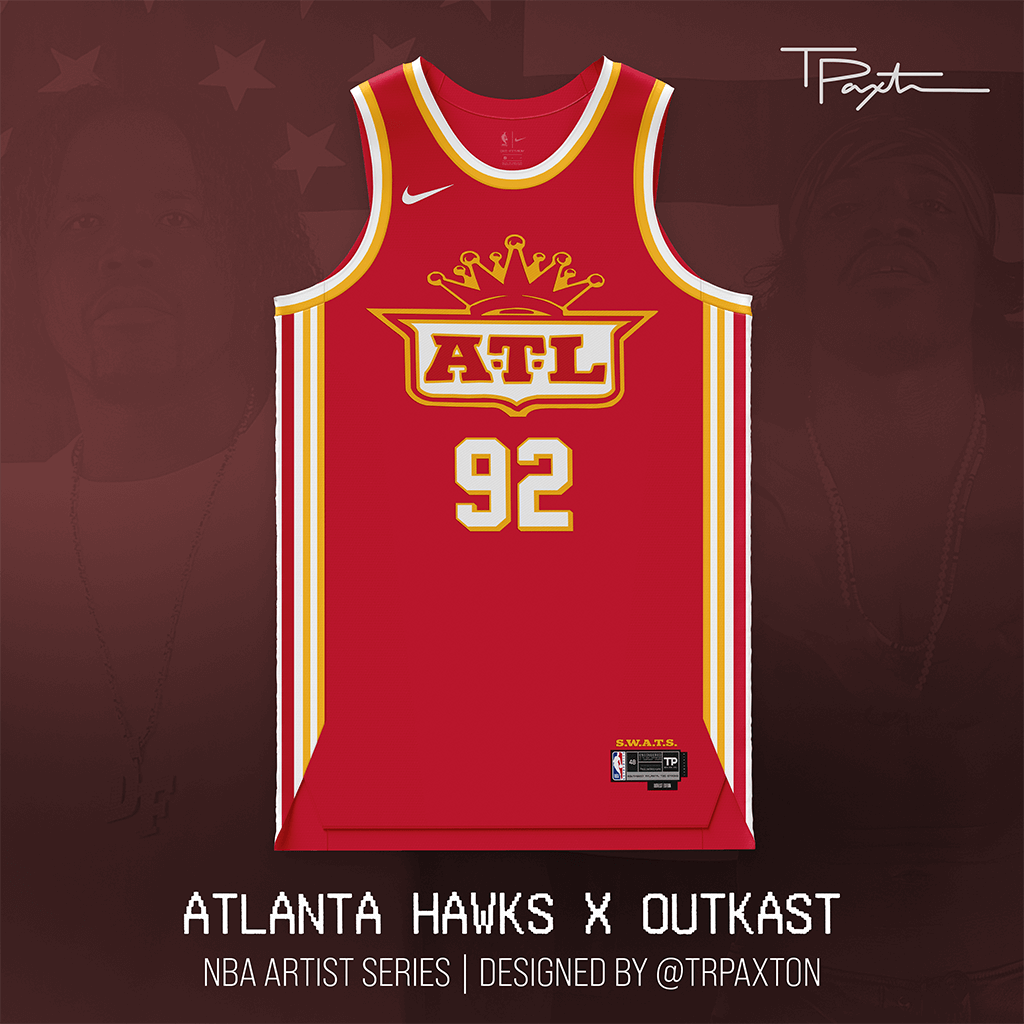
You can’t mention Atlanta music without mentioning Three Stacks and Big Boi, so the selection for the Hawks was pretty simple. Still, there are plenty of ‘Kast concepts out there, but the classic crown logo in Hawks colors was too good to not use.
The ATL wordmark is inspired by the iconic OutKast crown logo, and you’ll see S.W.A.T.S. above the jock tag — slang for “Southwest Atlanta, Too Strong” that was coined and often used by OutKast and Goodie Mob in the ‘90s.
Charlotte Hornets x J. Cole
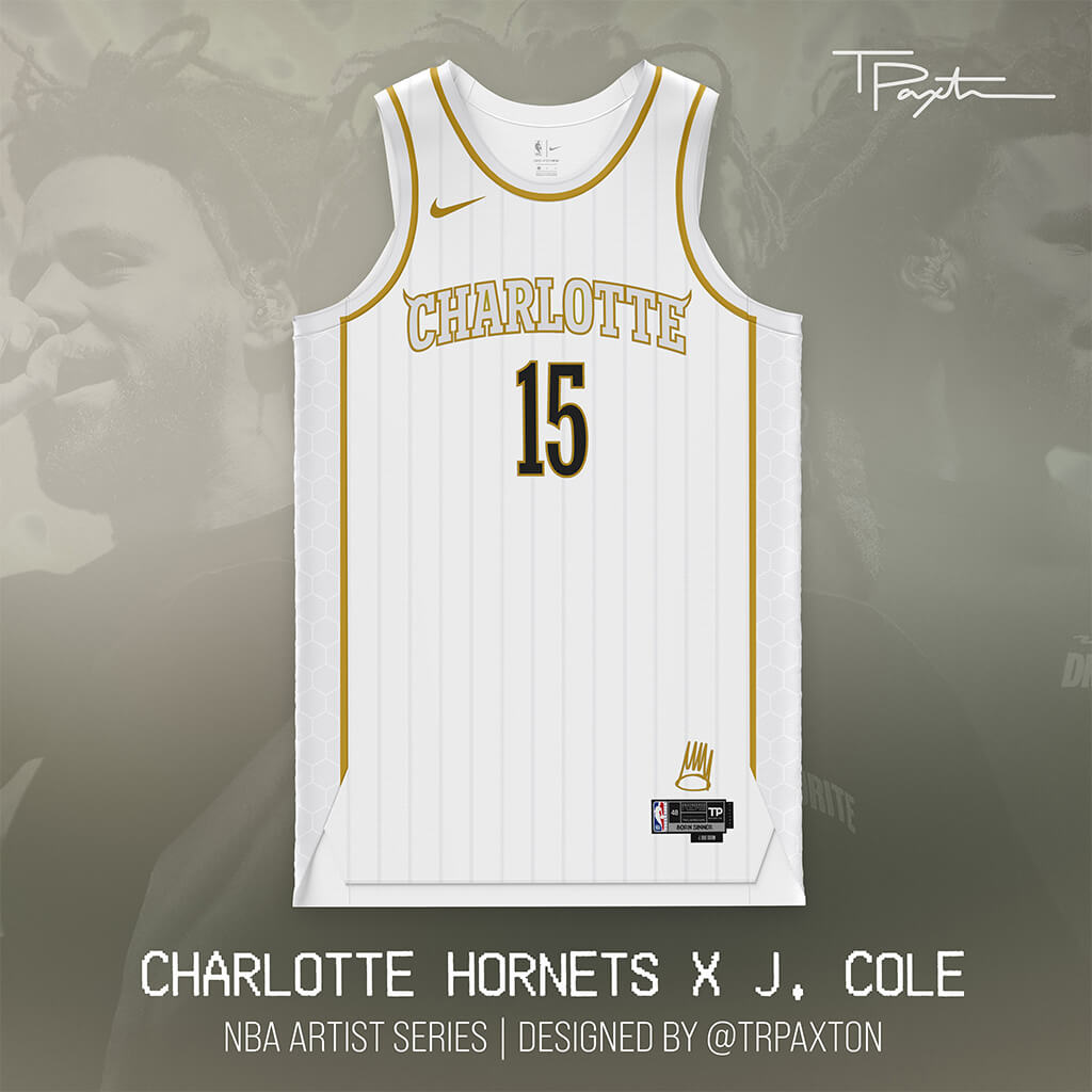
For Charlotte, I had to go with J. Cole. He was born on a military base in Germany and raised a couple hours east of the city in Fayetteville, but he is the first artist that pops into mind when you think of North Carolina.
This design is primarily inspired by his “Born Sinner” album, with the “devil horns” on the upper corners of the wordmark (inspired by the classic ‘90s uniforms), and the iconic crown from the album cover above the jock tag.
Chicago Bulls x Earth, Wind & Fire
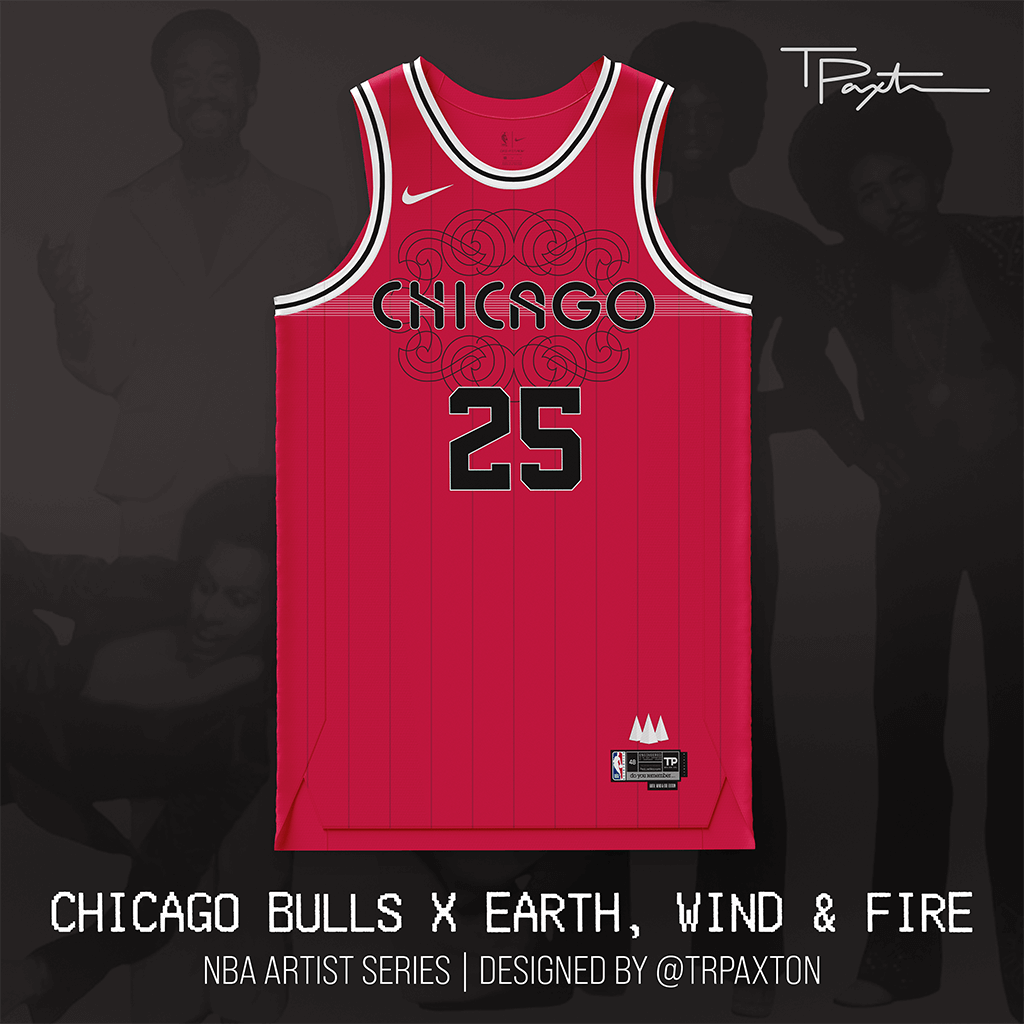
The Windy City. Sheesh. It was hard to choose just one influential Chicago artist — you should have seen my initial list — but I ultimately decided to highlight Earth, Wind & Fire, a band that pushed boundaries, blended genres & is universally loved. (Oh, and they’re one of the best-selling artists of all time.)
This design features elements from several albums, including “That’s the Way of the World,” “Spirit,” and “Gratitude” — and of course, a little “Do you remember…” on the jock tag. The number 25 also highlights the astounding 21 studio albums and 4 live albums recorded and released by the band.
Denver Nuggets x John Denver
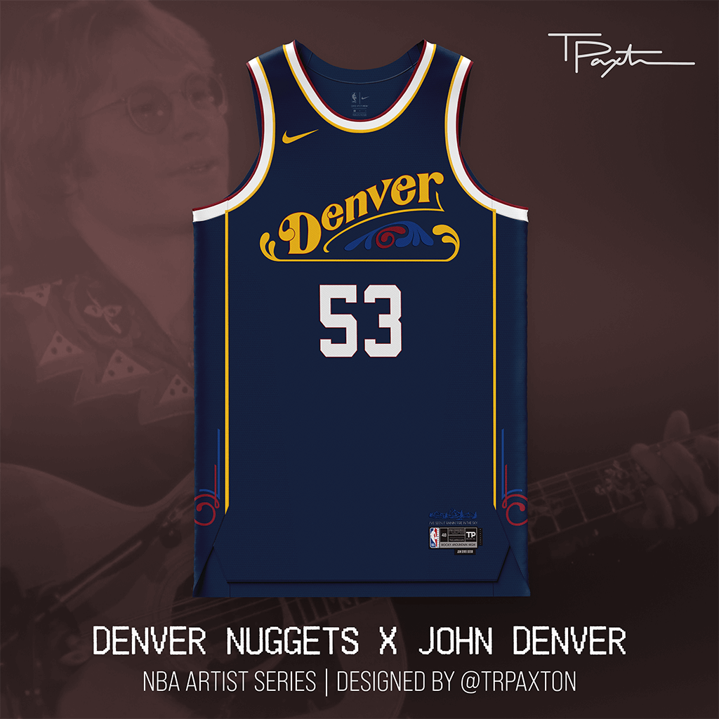
As hard as it was for me to not think “That John Denver is full of shit, man” while designing this (classic “Dumb & Dumber” line), the choice for the Nuggets was an easy one. Even though he was born in Roswell, NM, no musician evokes Colorado quite like John Denver.
This jersey pays homage to a true legend and beacon of positivity, tragically taken from the world in a plane crash at age 53. The wordmark is heavily inspired by Denver’s “Back Home Again” album, with a Rocky Mountain range design and lyric from the chorus of “Rocky Mountain High” on the jock tag. (Fun fact: “Rocky Mountain High” is the state song of Colorado.)
Detroit Pistons x J Dilla
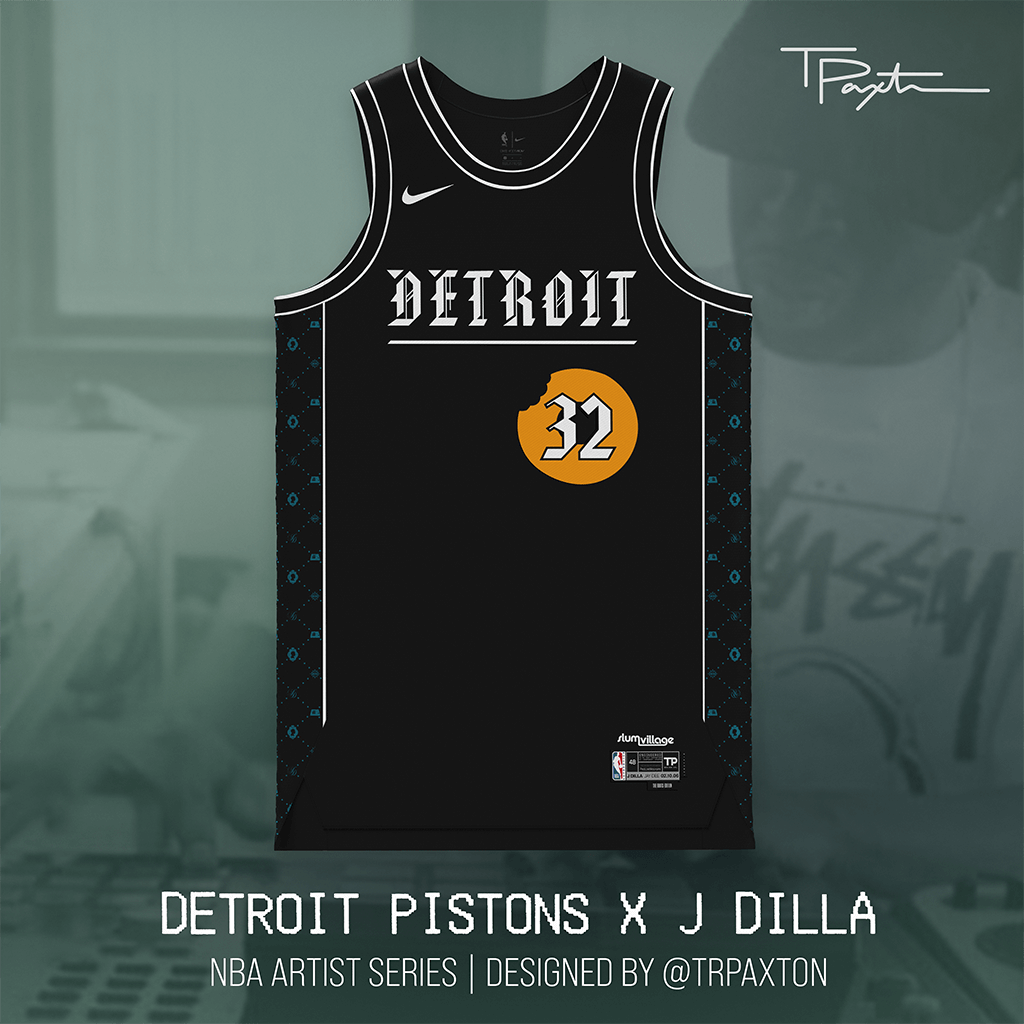
Detroit’s importance in music history is underrated. From Motown to Bob Seger to The White Stripes to Eminem (just to name a few), the Motor City is home to a tons of legendary artists. It’s also home to one of the most influential and innovative figures in hip-hop (and music) history, J Dilla — who embodied the creative spirit of Detroit until his untimely passing in ’02.
This jersey is packed with inspiration — highlighting various designs and albums in his discography (The Diary, Donuts, The Shining — and a nod to Slum Village), plus color accents inspired by the ‘90s Pistons kits.
Los Angeles Lakers x Dr. Dre
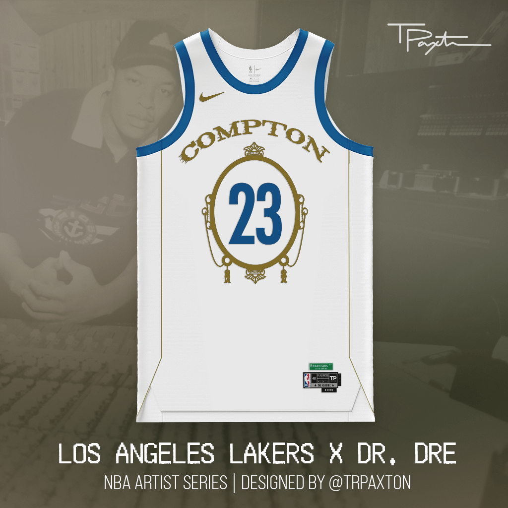
It’s like this and like that and like this and a… collab piece with ProLine Mockups! With this concept, the Lake Show pays homage to one of Los Angeles’ most successful musicians, the mogul, the Father of G-Funk, the one and only Dr. Dre and his 1992 classic “The Chronic.”
This design adds in some classic Lakers designs with the movement lines added to the Compton wordmark, as well as a nod to L.A. hip-hop’s Main Street, Rosecrans Avenue above the jock tag.
Ain’t nuthin but a G thang, baby.
Memphis Grizzlies x Elvis Presley
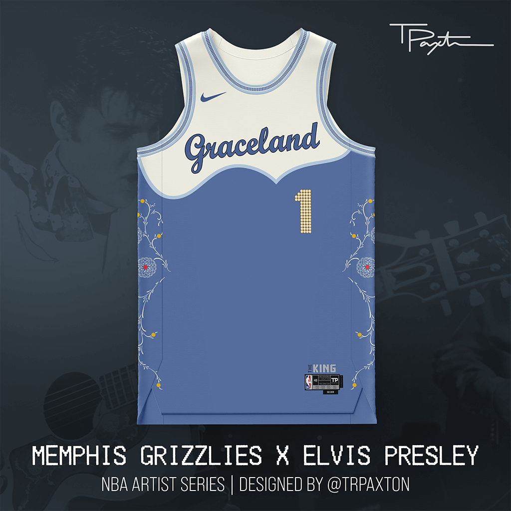
What is there to say that hasn’t been said about The King? Here, the Grizz pay homage to the Elvis’ former home (read: mansion) and final resting place with Graceland — located just 15 minutes south of the FedEx Forum — emblazoned across the chest.
Of course, I had to choose #1 — what other number would you choose for The King? The side panel detail was lovingly recreated to mirror the pickguard of Elvis’ iconic Gibson SJ-200 guitar, and the jock tag contains each year that one of his 18 No. 1 hit singles debuted.
Minnesota Timberwolves x Atmosphere
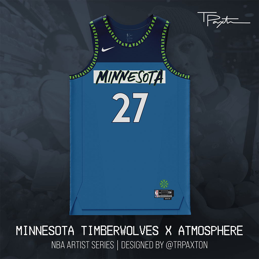
“When life gives you lemons, you paint that shit gold.
Slug and Ant. The Cadillac of DadRap. Born and raised in the city and the undisputed kings of Minnesota underground hip-hop, Atmosphere is as Minneapolis as they come — and proof that God Loves Minny.
The wordmark on this one is hand-rendered and inspired by the duo’s “You Can’t Imagine How Much Fun We’re Having” album. The “lemon slice” (complete with classic Timberwolves tree detail) is a reference to the “When Life Gives You Lemons…” album, and “God Loves Minny” is a nod to the “GodLovesUgly” album.
New York Knicks x Beastie Boys
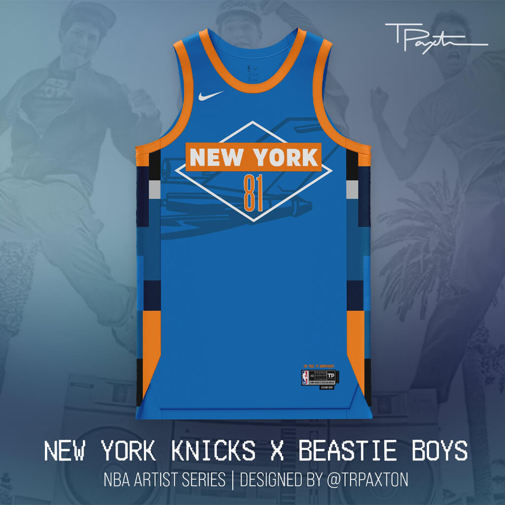
New York City. Where to start? When doing my research for Knicks — a team from a city with no shortage of brilliant artists that call it home — I knew had to go with the b-boys from NYC (and one of my favorite groups of all time), the Beastie Boys.
This design features a custom-designed version of the jet from the “Licensed to Ill” album cover, with the classic Beastie Boys diamond logo blown up. The side panels pay homage to “Hot Sauce Committee Part Two,” with “To the 5 Boroughs” written above the jock tag. Number 81 was chosen for the year the group was founded.
RIP MCA | 05.04.2012
Orlando Magic x Death
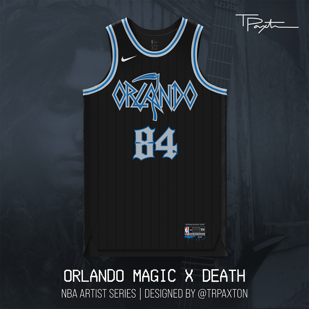
Orlando is known for Disney, boy bands & sunshine, but the city also has deep roots in metal. Founded in 1984, Death pioneered the genre, fronted by Chuck Schuldiner until his passing in 2001.
The wordmark on this jersey is hand-drawn and inspired by Death’s iconic sickle logo, with the typography and detail inspiration coming from other albums in their catalog.
It’s time the NBA goes metal.
Philadelphia 76ers x The Roots
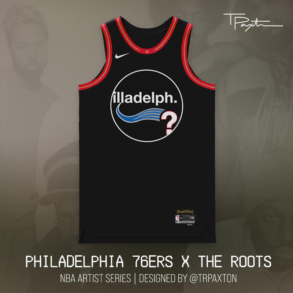
Like many east coast cities, Philadelphia was another where I could have gone in many different directions. Still, I couldn’t think of a better group to represent Illadelphia than one of the city’s most legendary and successful hip-hop groups, The Roots.
This design takes a page from most of The Roots discography, which is to say: simplicity can speak volumes. The primary design here is inspired by The Roots’ classic circle logo, with the jersey details and colors inspired by Iverson-era throwbacks. The “?” Instead of a number is a nod to Questlove, and the black jersey in honor of Black Thought.
P.S. You’ll see a fun trivia detail on the jock tag with the prior bands names crossed out before they landed on The Roots.
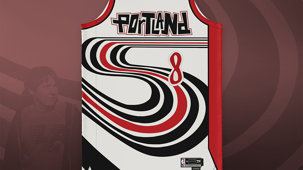
Portland Trail Blazers x Elliott Smith
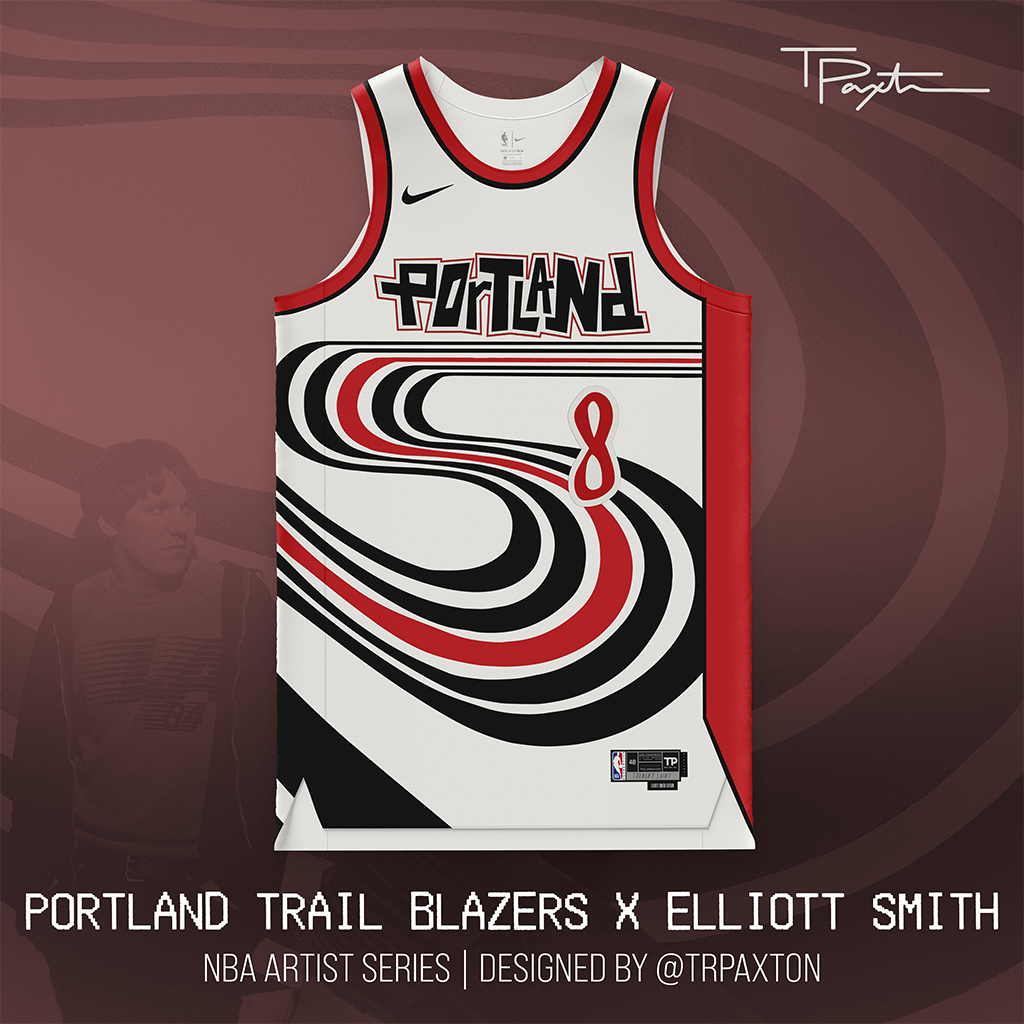
We all know Portland = indie rock. So when researching my choice for #RipCity, there were tons of great options, but arguably none more influential than the Patron Saint of Heartbreak, Elliott Smith.
From his days in Heatmiser through his solo work, Smith has inspired countless artists, from Frank Ocean to Bright Eyes, Billie Eilish to Phoebe Bridgers — even Madonna said if there was any song in the world that she wished she had written it would be “Between The Bars.”
This jersey is heavily inspired by the album cover of his album “Figure 8” and features a nod to “Torment Saint,” the biography of Smith written by William Todd Schultz.
RIP Mr. Misery | 10.21.2003
Sacramento Kings x Cake
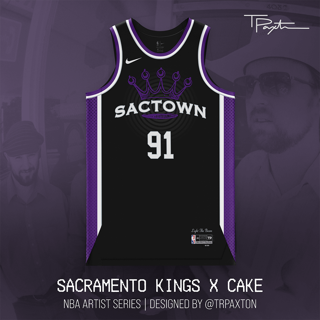
I want a girl with a short skirt and a loooong… jersey. Self-described as “an antagonistic answer to grunge,” Cake has always sought to push genre boundaries to create a truly unique product. Feels a little like this upstart Kings team — players who cross positional boundaries and meld into one of the league’s most exciting teams.
The design features Sactown prominently featured on the chest in the classic Cake typeface, with heavy inspiration from the iconic crown design from the cover of their classic ’96 album “Fashion Nugget.” The halftone dots on the side panels are a nod to other albums in Cake’s discography (most notably “Pressure Chief”), as well as a reference to lead singer John McCrea’s days working in a print shop in the early days of the band.
San Antonio Spurs x Emilio Navaira
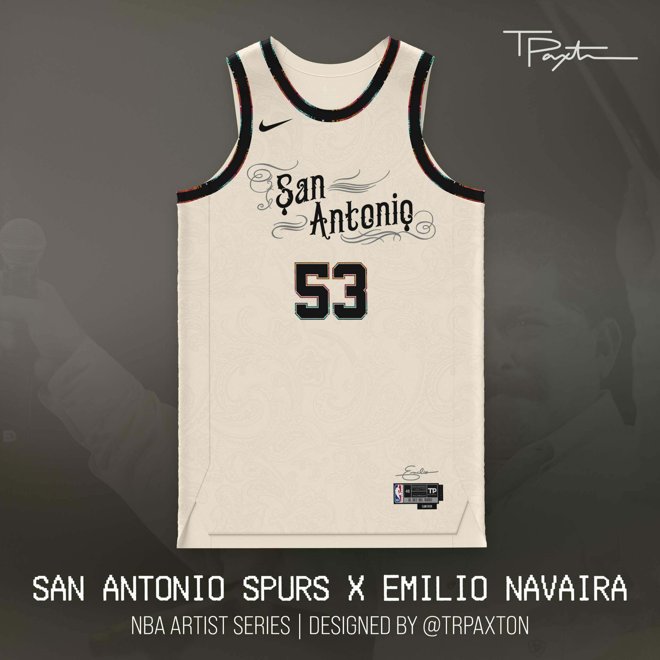
Emilio. El Rey Del Rodeo. The Garth Brooks of Tejano. No matter what you call him, Navaira is as San Antonio as they come — from his birth in until his untimely passing at age 53.
The details here are steeped in Emilio’s signature look, from the paisley pattern in the sublimation (see his albums “A Las Personas de Mi Vida” and “Siempre Grande”) to the custom wordmark, with subtle hints of the Spurs’ Fiesta era in the serape-inspired trim.
Toronto Raptors x The Weeknd
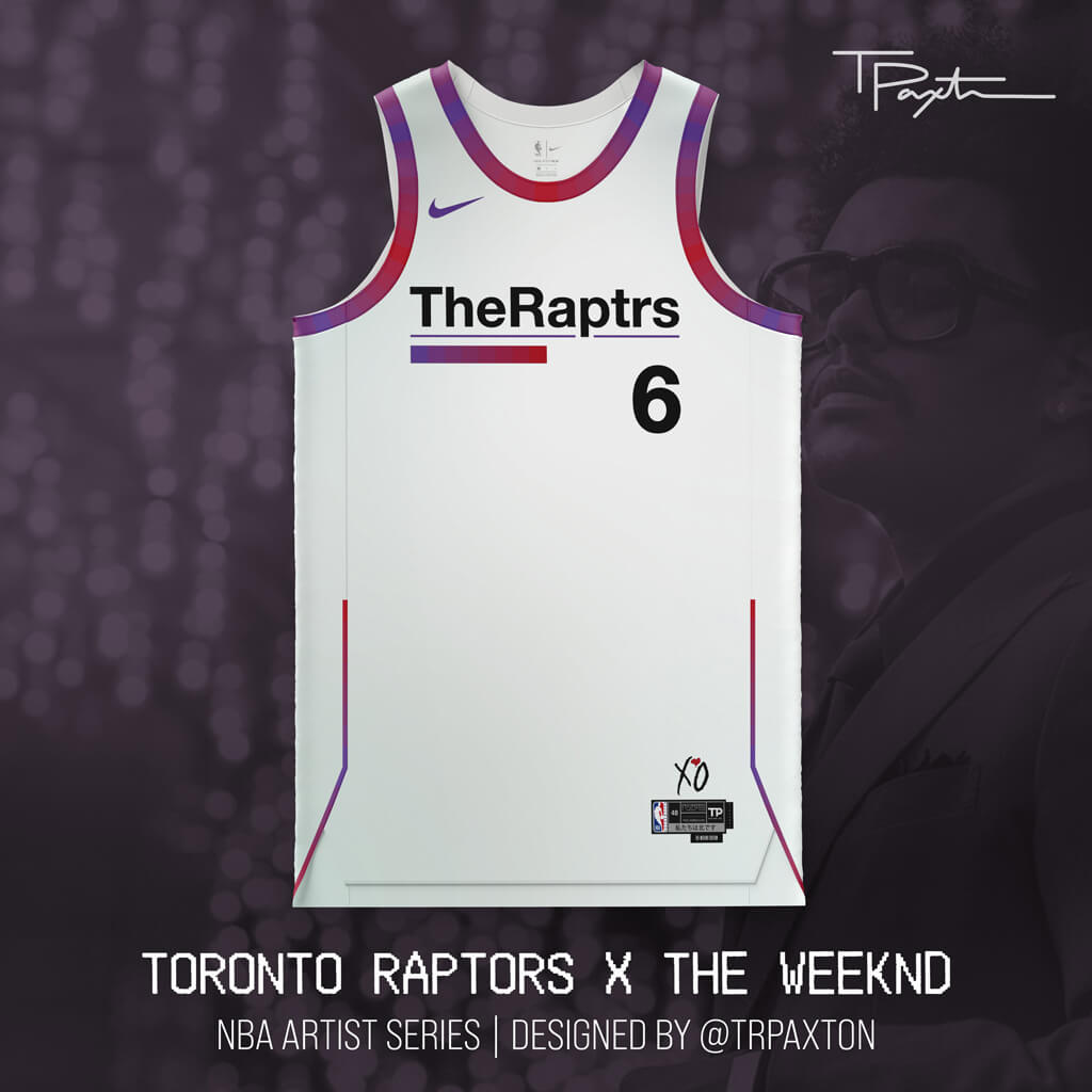
A mysterious start that turned into one of the best-selling artists of all time. Embracing the city’s roots, this concept channels Abel’s Trilogy era and embraces and era of music that was truly mystifying in its debut, but captivating in its execution.
The subtle sublimation on the jersey matches the “Echoes of Silence” album cover, and of course, we had to remove a vowel in the wordmark — The Weeknd meets The Raptrs. On the jock tag, he Raptors’ battlecry of “We the North” is translated to Japanese — a design motif often seen during Tesfaye’s “Kiss Land” era.
Thanks, Trevor. Looking forward to Part 2!
[The jersey template is provided by ProLine Mockups, who offer mockup templates, design services and apparel — PH]


I love this concept of blending the NBA teams with a musical act/artist associated with each city. I do have to question how you don’t have Prince for Minnesota? Also for Detroit not picking Motown’s Berry Gordy, or one of the top Motown acts, is surprising.
Probably because the Timberwolves already had a Prince themed uniform a couple years back.
Prince always seems like the default musician for sports/music crossover unis. It’s refreshing to see someone new. Same goes for Detroit. As much as I love Motown music (and Berry Gordy has a complicated history all his own) I learned something new today about J Dilla. As an aside, Detroit also had a band called Death.
The band called Death will always be the band called Death to me.
Congrats on finding Dilla.
I grew up in the Twin cities, and while Prince is never the wrong answer, the Cities music scene is so much deeper and more vibrant than just the one unique superstar. You’ve got era- and genre-defining acts like Dylan and Hüsker Dü and the Replacements, and connections to Lizzo and Soul Asylum and the Time, and also influential acts like the Jayhawks and Chris Strouth. Personally, I’d have gone with Dessa, who’s single-handedly remaking Minnesota’s place in the rap/pop scene. But there really aren’t bad options here. If anything, the Wolves might be a case where it would make sense to build the theme around a venue instead of a particular artist, so a First Avenue-inspired uniform. Something similar could work for DC, where a 9:30 Club-inspired uni would be fitting.
I love Atmosphere, but I would go with Husker here.
I think a First Ave. T-wolves uniform could be spectacular. I am tickled that Atmosphere was chosen (out of many great choices). Let’s not forget Minnesota’s favorite son who rejects the state Bob Dylan!
I have seen a lot of concepts where I thought, those are great and should be used, but I have never seen a set that HAS TO BE used. This is such a no-brainer for the NBA. Amazing use of a ‘story’ and every uniform is still identifiable as the team! That’s something that the City Edition has almost never accomplished.
The Elliott Smith Blazers jersey is the best community contribution jersey I can remember here, and I’ve been reading the site since before Phil got promoted to bench coach. Utterly tremendous.
That one was my favorite, too.
Same here, I would buy it right away, just like the ATL and Beasties jerseys.
The “?” Instead of a number is a nod to Questlove
The rules and regulations require a front number. This is when, in the real world, the client would say “I love your creativity, but go back to the drawing board.”
The numbers shown are just for the prototype. Each player would still wear their own number.
Curious to how the Jazz and the Pels will be treated. Queue Utah should give back their name to New Orelans now.
Love this project. Been a music and sports nut my entire life. Love the Death/Magic crossover. And of course the Chicago/Earth Wind & Fire is stunning.
I was a little bummed this morning because I knew there were no more NFL projects to look forward to on Saturday. This somewhat quelled that. Thanks!
I like these designs. They’re better than most of the ones that are worn now.
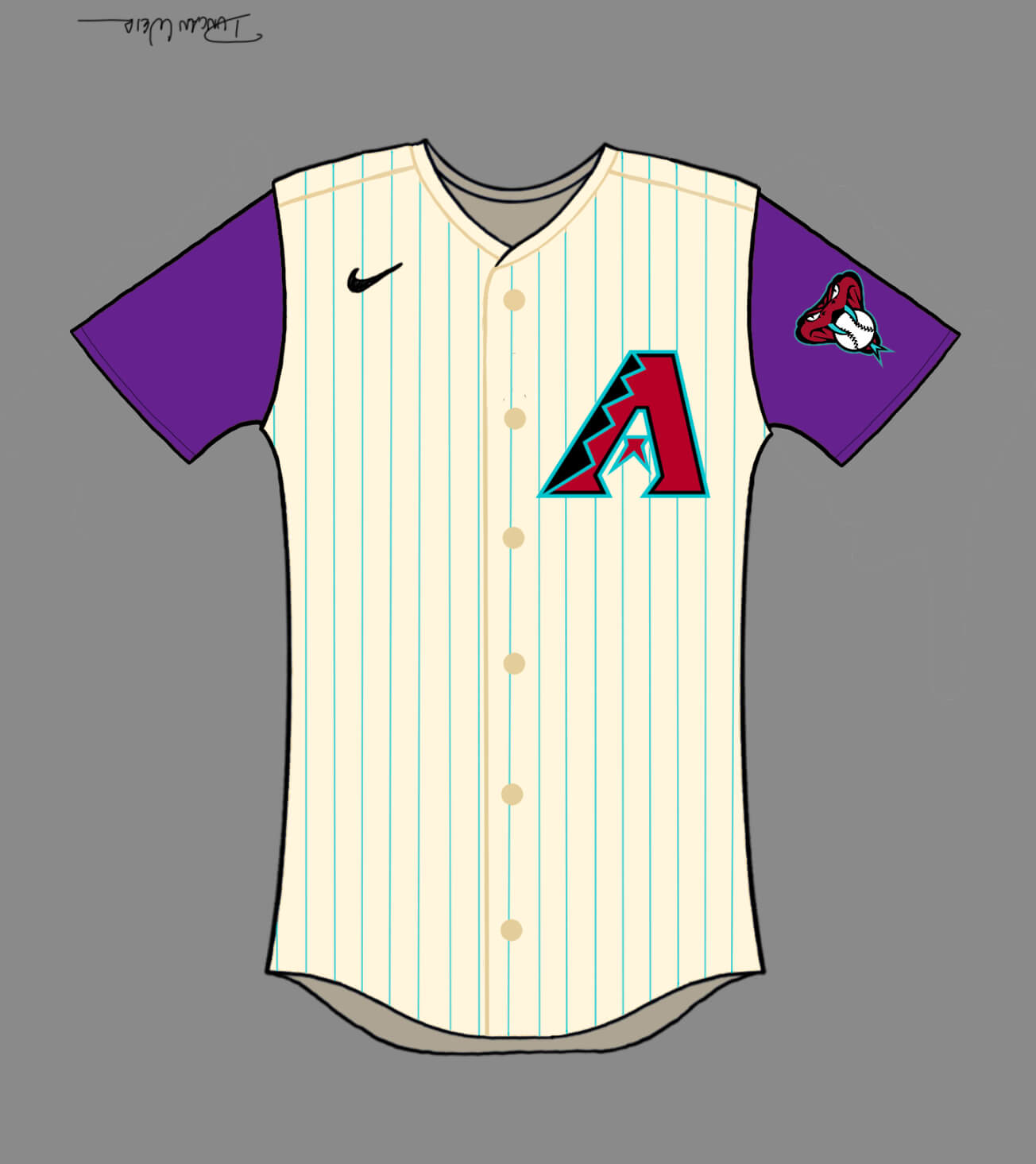
I love the D-Backs in a vest. Reminds me of the Randy Johnson World Series. I’d like to see the D-Backs go back to purple instead of red, but the next best option would be to drop red and just have teal and black. Especially with this teal now being more turquoise, which is fitting with Arizona.
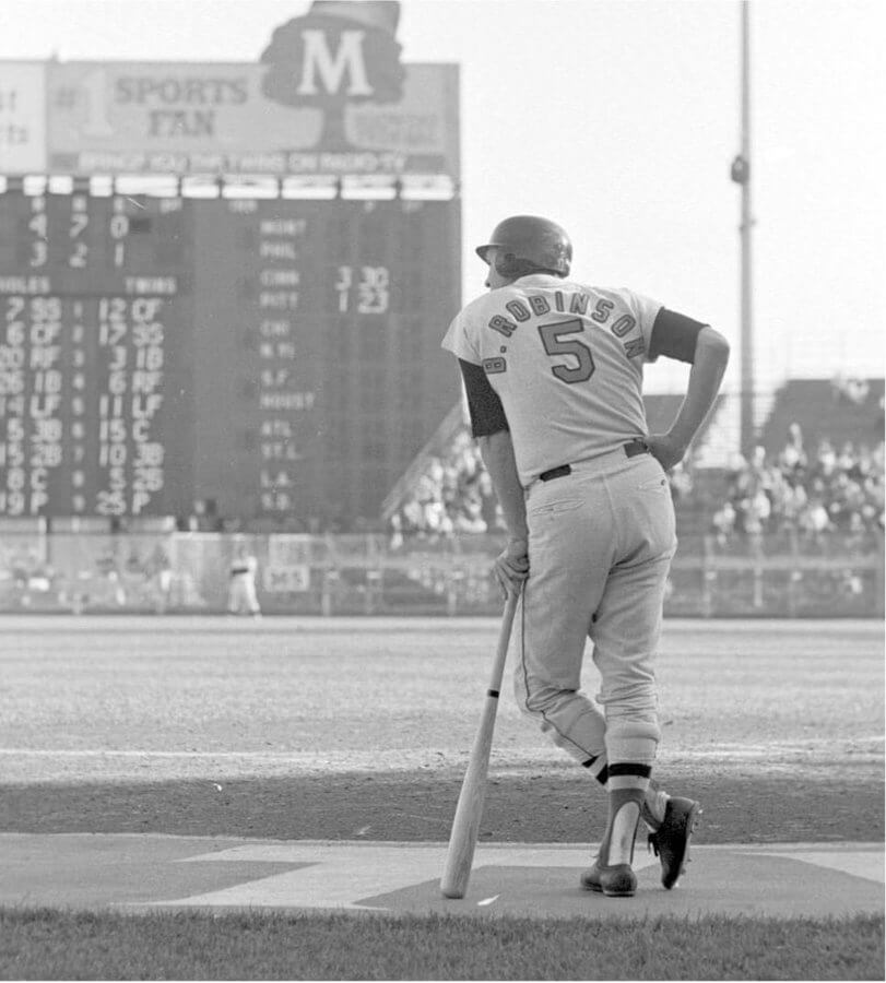
GTGFTS is the October 4, 1970 Game 2 of the American League Championship Series between the home Minnesota Twins and the visiting Baltimore Orioles. The Orioles would win the game 11 – 3 to take a 2 to 0 lead in the series. The O’s would go on to win the series the next day in Baltimore and, subsequently, win the World Series over the Cincinnati Reds 4 games to 1. The photograph shows Orioles Hall of Famer Brooks Robinson in the on-deck circle during the 5th inning as the Twins change pitchers from Bill Zepp (to Stan Williams
I meant to add that Zepp is #25. The scoreboard shows the only other game as the National League Championship Series between the Reds and the Pittsburgh Pirates.
Ummmm…
Do you know how elated I am to see J Dilla mentioned on Uni Watch?
Gotta agree, thou I’m a (still mourning) SuperSonics fan, that Portland uni is FANTASTICALLY AMAZING!
Just WOW… WOW!
Trevor,
No. Just. No.
Look, I get that this is uni watch. I really do.
But the fact that a person likes sports doesn’t make them qualified to suddenly design uniforms no more than the fact that I like for my heart to beat makes me qualified to do open heart surgery.
Ummm,,,
Pretty sure every player in the NBA would wear these designs before they let you take their temperature. Your analogy is ludicrous and quite mean.
No, M. Just no,
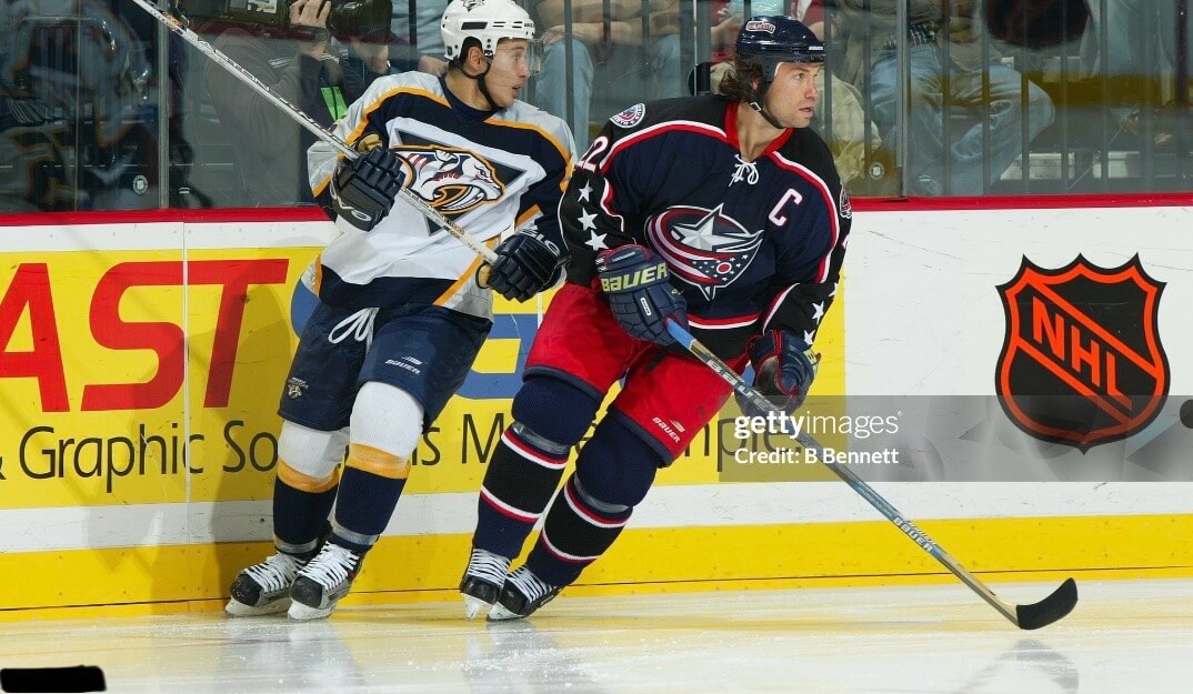
GTGFTU – February 16, 2004: Blue Jackets 4, Predators 2 at Columbus. Blue Jackets captain Luke Richardson, wearing Columbus’ original third jersey, skating against who I believe is rookie Jordin Tootoo. Tootoo had a fight against Tyler Wright, and Richardson had a fight against Adam Hall in the same game.
I narrowed it down based on the most obvious clue – the black and orange NHL shield on the board. That puts it pre-lockout, and since the Columbus thirds were introduced in the 2003-04 season, that narrowed it down to likely be one of the three home games against the Preds. Since Richardson did not play in the December tilt, that left January 29 (which fight footage shows the BJs in their original blue jerseys) and February 16 (which fight footage shows the thirds).
(And I did try to “cheat” and searched Getty… but the page for the photo only identified Richardson, does not identify the game, and gives an erroneous (likely defaulted due to incomplete data in the file) date of January 1, 2004 – a date on which Columbus didn’t play and Nashville was hosting Pittsburgh.)
Good job you totally got it!
It is Jordin Tootoo wearing #55, that’s good enough to get it down to the right season. Good thinking about the black and orange NHL logo!
Generally enjoyed these designs! Looking forward to part 2.
“undisputed kings of Minnesota underground hip-hop”
The Doomtree crew might have a thing or two to say about that, but it is hard to argue.
Awesome work – but the Beastie Boys have absolutely no place on a Knicks Jersey, they’d be on the Brooklyn Nets jerseys… sorry I’m a lifelong NYer and the BB’s are Brooklyn, listen to their catalog. Kind of sloppy considering all the amazing acts to come out of Manhattan… would’ve been better off doing something from Lower Manhattan like a NY Dolls Knicks jersey. Hope you add and correct your awesome work!
Beasties were/are Knicks fans as there was no team in Brooklyn yet when they grew up. Also: MCA was from Brooklyn, Mike D and Adrock are from Manhattan. They met in school in Manhattan. The filmed an awesome concert in the Garden (with fans holding cameras while that footage was worked into the film). They reference the Knicks (and players like Starks and Mason) in their lyrics. The Knicks are certainly qualified to wear a Beastie Boys uniform.
This is definitely a cool project but this would probably cause wars in certain cities. Any choice would be deemed wrong. Also, I lived in Atlanta from 2005-2022 (my formative years, for sure) and went to college and grad school there and had never once heard the term “Three Stacks.” Obviously I’m not the target audience, and I knew you were talking about Andre 3000 based on context, but still :P
OutKast was a big push behind the whole ATL abbreviation, is my guess. So they should be on a Hawks uniform. Even the Falcons use ATL on their home shirts now.
These are really great NBA concepts. I also like the Diamondbacks with turquoise pinstripes.
I am an old white guy from New England whose musical tastes start with 1970s classic rock and run through a lot of variants of “alternative,” and therefore I’m not super well-versed in hip hop, so take this with a huge grain of salt. I have never heard of J Dilla, which is on me. My first thought for Detroit was the MC5, and my second thought was Iggy and The Stooges. (And my third was Motown.) The Stooges in particular have a wordmark that would look great on a jersey, and the MC5 logo I think could be adapted as well. Maybe for next year’s set.
I like these concepts. I encourage you to share more. I particularly like Atlanta, Chicago, Portland and Sacramento. New York, Toronto, and illadelph are pretty good, too. I’m super curious what we will see for Boston. Will it be Aerosmith? The Cars? The Pixies? The Dropkick Murphys? Bell Biv DeVoe?
J Dilla is the best hip hop producer of all time. He’s an incredibly precise and creative sampler, so much so that he influenced jazz drumming and musicians far outside of hip hop. I’d highly recommend checking out this track, it blows my mind to this day:
link