By Phil Hecken, with Kyle Evans & CJ Fleck
Follow @PhilHecken
It’s that time again — that time when we feature the Beautiful Game, which is, unfortunately, a sport neither Paul nor I really follow that closely, so we tend to work with readers to bring you news and reviews of the upcoming kits (uniforms) for soccer leagues and tournaments. You guys are likely aware I’ve been working with Kyle Evans and CJ Fleck on MLS 2018 Kits, and other numerous soccer uniform reviews for leagues and tournaments and the Olympics (you get the idea) over the past several years. Today CJ & Kyle are back with their preview of the Olympic jerseys. It’s a biggie, so let’s get right to it!
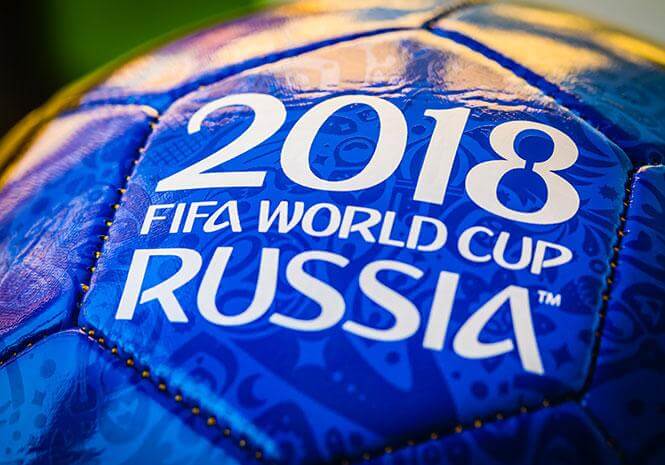
2018 World Cup Jersey Preview
By Kyle Evans & CJ Fleck
Thanks Phil! We’re really glad to be back and covering the World Cup for the first time on Uni Watch. We’re just days away from kickoff, as the tournament commences on Thursday morning (6/14) with hosts Russia playing Saudi Arabia. The event will conclude a month later with the World Cup final being played on Sunday, July 15th.
We’re covering all 64 kits (2 for each of the 32 teams) that will be seen on the field this summer, but want to begin with a couple of graphics that give additional context to the kits. The first graphic displays a breakdown of all 64 jerseys by primary color (some are debatable but you get the idea) and as you will see, red and white happen to be the dominant colors. In addition, the second graphic shows a breakdown of the kit suppliers for each of the 32 teams. It’s also worth noting that the Adidas “theme” this year is kits inspired by classic (Adidas) kits of the past and for each relevant country, you will find links to images of the past jerseys which motivated the new design.


Without further ado, here are all of the kits that will be worn during the World Cup, with teams separated by the group in which they will compete. Descriptions of the kits are followed by our comments and opinions.
Group A
Russia
The hosts are moving towards the future by using a brand new Adidas template and are also throwing back to the past with their red / white / red (jersey / shorts / socks) primary kit evoking one worn in 1988 by then-USSR. They also added a white / blue / red secondary kit with a square gradient pattern on the jersey.

CJ: The hosts come up with a nice and clean red shirt that evokes memories of older shirts, but I have to register my displeasure with the change kit. It’s not visually appealing, but maybe it’ll look better on the field. I doubt it.
Kyle: The host country has to look great, and I like the USSR throwback and appreciate the secondary kit for not being mono-white.
Egypt
Egypt are making their first appearance in the World Cup in nearly 30 years and bring two different recent Adidas templates with them. The primary jersey is red with a very subtle sublimated checkerboard gradient and their secondary kit is white / black / white.

CJ: Is there such a thing as too simple? These could have been knockoffs and I wouldn’t be able to tell the difference. The white is especially dry. Normally adidas is a little more creative, I’m surprised.
Kyle: Simple is the operative word here, although I think the primary jersey works. The secondary kit is basically Germany without actually being Germany.
Saudi Arabia
The Green Falcons will be wearing an all-white primary kit and an all-green secondary kit, each utilizing a Nike template.

CJ: Nike, on the other hand, is not expected to be creative, and they are living that mantra. Green shirt, white shirt. Oh look, a little collar!
Kyle: A safe and simple look where I would like to see a distinctive design element to make Saudi Arabia stand out more. On the plus side, the federation logo with the eagle is fantastic.
Uruguay
La Celeste bring a new take on their classic sky blue / black / white primary kits which now include a sublimated graphic inspired by a monument. Their secondary kits are white / sky blue / white.

CJ: Well, at least it’s something. I’m not super impressed, but it is certainly an artistic take.
Kyle: A traditional look with subtle art never hurts. “If it ain’t broke…” certainly applies here.
Group B
Iran
Interestingly, even though Iran’s all-white primary kit and all-red secondary kit are made by Adidas, the federation does not have a contract with the company, meaning they purchased recent templates and added their badge.

CJ: Simple and clean is the theme of the tournament, it seems. Could have done a little more.
Kyle: To an extent I applaud Iran for bucking the trend of being tied to a particular kit supplier, but at the same time a contract might allow space for some personal touches to their jerseys.
Morocco
Making their first appearance in 20 years, Morocco bring a red / green / red primary kit and an all-white (with a red shoulder panel) secondary kit.

CJ: Count me as a fan of the white kit, I like the shoulders here. The red is a bit boring.
Kyle: Nothing special about the all-white for me, but the red, green, and white combination for the primary kit works well.
Portugal
The defending European champions and Cristiano Ronaldo will be wearing Nike’s new template which includes subtle zig-zag stripes on the sleeves. The primary kit is red / red / green and the secondary kit is all-white with a “green cross” gradient pattern on the jersey.

CJ: It’s Nike. It looks like every other Nike shirt, but in Portugal’s colors.
Kyle: Can’t go wrong with Portugal’s traditional look, but a general comment which also applies here is: What’s the value of subtle design elements that are effectively invisible unless you are wearing the jersey or standing next to someone wearing it? If it’s part of the design, make it shine and more prominent.
Spain
La Furia Roja are also throwing back to the past with a red / blue / black primary kit inspired by their kit from the 1994 World Cup. Their very light blue (effectively white) secondary jersey (and all-white kit) is new, but contains sublimated graphics reminiscent of 1980s/1990s patterns.

CJ: References to earlier iterations are always good in my book. Those reds are glorious. The white ain’t bad either.
Kyle: While I appreciate throwbacks to past iconic and popular jerseys, the red primary kit is too busy for me. On the other hand, the all-”white” is too empty for me.
Group C
Australia
The Socceroos draw on elements from their run in qualifying for the 2006 World Cup (their first appearance in over 30 years) and introduce an all-yellow primary kit with a green wave-like pattern on the sleeves (fans creating a “sea of gold”). Their secondary jersey is dark-green and contains a lime green sharp sash as a reference to the sharp elements from their 2005 jersey.

CJ: Finally, a little something creative. The Aussies got something nice out of Nike! I like both of these in a subtle way.
Kyle: I’m a big fan of each of these jerseys, and my only slight complaint is that I would prefer yellow over green instead of all-yellow for the primary kit.
Denmark
Denmark’s kits are supplied by Hummel, a company based out of Denmark, and both kits contain the classic Hummel chevrons on the sleeves and on the shorts. Their primary kit is red / white / red and their secondary kit is identical but with the colors inverted (white / red / white).

CJ: A little simple, but I like the shoulder striping. It’s unique, which is something you can’t say very much in this tournament.
Kyle: Nice, clean looks which utilize the chevron marks quite well.
France
Les Bleus bring a navy / white / red primary kit using the new Nike template to produce zig-zag navy / blue sleeves. Their secondary kit is white / navy / white with subtle splashes of red / blue print on the jersey.

CJ: France has so much potential with their traditional color schemes, it’s a real shame to see Nike do absolutely nothing with it.
Kyle: I love the traditional navy / white / red primary look of the French, I just don’t think the Nike sleeve pattern (which is less subtle here) is necessary.
Peru
Peru returns to the World Cup after a 36-year absence and bring an all-white primary kit and an all-red secondary kit. Both jerseys contain their traditional sash and each sash is outlined by thin gold stripes.

CJ: Yes. Absolutely yes. Love sashes, love the red and white, love it all.
Kyle: Sometimes it’s the details or small design elements that I really love (or hate), and that’s precisely the case here with Peru’s gold stripe outlines and accents. They match the gold outline of the federation logo and add just the right amount of pop to a classic jersey.
Group D
Argentina
The runners-up of the 2014 World Cup, Argentina return with another version of their classic white and sky blue stripes / black / black primary kit, this one inspired by the 1993 version (the last time Argentina won a major title). Their all-black secondary kit with jagged sky blue and white stripes on the jersey is also inspired by the 1993 version.

CJ: You can’t mess with Argentina’s look, but hey that change kit is gorgeous as well. I’m a fan.
Kyle: Argentina’s traditional look is one of the best and distinctive looks in world soccer, and while I like the secondary design, some of the appeal is lost in the similar patterns of Colombia, Mexico, Spain, and Germany.
Croatia
Croatia bring a new take on their classic red and white checkered look by using larger checkers and a zig-zag border between the checkers. Their primary kit is red and white checkers / white / blue and their secondary kit which employs the same template is black and navy checkers / black / red.

CJ: Croatia is always a good look with the grids, but I’m not sure the change kit is a great choice of color combination.
Kyle: While I prefer the checkered design to have smaller squares and I don’t care for the zig-zag borders that produce a blurry effect, their primary kit is still one of the best looks in the world. And I’m actually ok with the secondary kit, especially given the need to avoid color clashes with other teams.
Iceland
One of two countries to make their World Cup debut this summer, Iceland have an all-blue primary kit with a red / white dot gradient pattern on the jersey sleeves and using the same template, an all-white secondary kit with a red / blue dot gradient pattern on the jersey sleeves.

CJ: Iceland is a media darling in this tournament, and they look the part. Although it’s not a great look, I like both of their options as solid and creative looks.
Kyle: I find it interesting that the sleeve patterns are identical on their jerseys, despite the different body colors. For me the pattern works much better as a contrast on the white jersey, creating one of my favorite jerseys of the event.
Nigeria
The Super Eagles will be sporting the jersey which has received by far the most attention and gained the most popularity of any this summer (here’s a recent GQ article) as their primary jersey features a bright green and white zig-zag pattern on the body and a black and white zig-zag pattern on the sleeves (and completed with white shorts and bright green socks). Their all-dark green secondary kit is far more standard.

CJ: Nigeria has really been turning heads with all of their kit and fashion options for this World Cup. That design is glorious, I can’t wait to see it on the field.
Kyle: Any mainstream conversation about this year’s World Cup kits would start with Nigeria’s primary jersey which has reached unprecedented jersey sales and attention that has extended to the fashion world. As a fashion piece, I can’t deny its appeal and as a soccer jersey, I expect it to look fantastic on the field as well.
Group E
Brazil
Seleção continue as the only country to appear in every World Cup, and bring their iconic yellow / blue / white primary kit with them. The only added nuances this time are a “slightly different” shade of yellow than their traditional shade, and the (exceptionally) subtle zig-zag pattern on the sleeves as per the new Nike template. This is complemented by their traditional blue / white / blue secondary kit, with this one featuring a sublimated star pattern on the jersey.

CJ: Brazil is probably the only country where Nike’s simplicity is acceptable, based on past history. I’m not a huge fan of the blues, but they’re ok.
Kyle: I don’t expect anyone to mess with Brazil’s traditional looks anytime soon and nor should they. I also love the new sublimated star effect on the blue jersey.
Costa Rica
Los Ticos look to solidify their impressive run to the quarterfinals in 2014, and will wear a red / blue / white primary kit which features a subtle “DNA” pattern on the jersey. Their secondary jersey is white with navy sleeve stripes and has the same subtle “DNA” pattern.

CJ: Nike are not the only company responsible for bland and boring design. Give me something to work with here!
Kyle: Although these are suitable, they feel like a bit of a letdown compared to some of their more unique designs from the past.
Serbia
Serbia will be employing a red (with white sleeve stripes) / red / white primary kit which uses a standard Puma template. Their all white (with red sleeve stripes) secondary kit uses the same template, but adds the stripes of the country’s flag down the center of the jersey (rotated to work vertically).

CJ: I love, love, love the center flag stripe. It looks amazing and is a great representation for the tournament.
Kyle: I fully expect to not be able to tell the difference between many of the red / white kits this summer, but that’s ok because I don’t expect teams to shift from their traditional colors. And I’ve said this before and I’ll say it again: I love flag-inspired design elements and Serbia’s flag stripes work quite well here.
Switzerland
The Swiss will wear a red / white / red primary kit highlighted by a topographic map from the mountainous country, which appears on the front of the jersey. The secondary kit inverts the colors (white / red / white) of the primary and contains no additional bells or whistles.

CJ: Something different! I’ll take it. Might not look great on the field, but certainly fashionable.
Kyle: I have to be honest – I love maps. I’m putting that out there to show my possible bias towards the lovely topographical design on the red jersey.
Group F
Germany
The defending champion Germans return with a (classic white / black / white) primary kit which is a nod to the past and was updated by replacing the colors of the jagged front design from the country flag colors used in 1990 to shades of gray. Green (/ white / green) returns as their secondary jersey color by using a lighter shade of green and a chevron-style pattern that evokes jerseys from the 80s and 90s.

CJ: Germany having green alternates is always one of my favorites, but these are glorious. The regular white kit is pretty good too.
Kyle: I’m glad Germany brought back the green for the first time in six years and I think both jerseys are a beautiful modern take on a classic look.
Mexico
El Tri enter the World Cup with a fresh take on their classic green / white / red primary kit, this one featuring a light green zig-zag pattern on the front / sides of the jersey. Also inspired by classic kits, their secondary white / red / green includes a green, white, and red horizontal stripe across the front of the jersey.

CJ: I can’t get over the pure beauty of the white kits. Perfectly executed. I like the green as well. Nothing to be ashamed of here.
Kyle: I can’t say it any better than CJ just said, the white jerseys are pure beauty. And their classic green / white / red primary look deserves its place as one of the best in the world.
South Korea
South Korea will wear a nondescript red / black / red primary kit and an all-white secondary kit that features a curved red and blue pattern representing balance (yin and yang) and drawn from the symbol in the center of their national flag.

CJ: Alright, I’ve been mean to Nike, and they’re trying something here, but I can’t endorse this travesty. I understand it is an attempt at a flag motif, but I am not a fan. Nothing good, that’s for sure.
Kyle: I’m going to refer back to a previous comment here: If you’re going to use a design, use it completely and prominently or don’t use it at all! I love what the design on the white jersey is trying to do, but it’s lost on me with all the separated curves and small horizontal lines. A thinner and solid red / blue curved line down the center would be an amazing look here. (Would anyone like to create this concept?)
Sweden
Sweden will wear a yellow / blue / yellow primary kit that includes subtle diagonal stripes on the jersey modeled after their 1988 jersey. Their secondary kit (blue / yellow / blue) inverts the colors and includes a subtle front pattern which has a checkered shades of blue effect.

CJ: Adidas do put a little effort in here with the sublimated designs, but I’m not a fan. There’s just not enough to interest me.
Kyle: Love the classic color combination which is accentuated by the contrasting colors of the jersey and shorts in each kit.
Group G
Belgium
The Red Devils have a new take on their 1984 jersey as their all-red primary kit includes a similar argyle pattern which utilizes colors from their flag. Meanwhile, their new yellow / black / yellow secondary kit uses the Adidas template that creates a subtle checkered shades of yellow effect on the jersey.

CJ: Stunning design on the red shirt, I adore this design. The yellow is solid.
Kyle: An absolutely beautiful design on the red jersey which is easily one of the best in the tournament. And it works out nicely that their yellow and black combination will be unique this summer.
England
The Three Lions will wear their traditional white / navy / white primary kit and a red / white / red secondary kit featuring a subtle cross design on the front, a reference to their flag.

CJ: I like the sublimated cross, but can you do something with the white kits, Nike? Please.
Kyle: Fans criticized England’s white / white / red look in the Euro 2016 tournament, so a return to the traditional look is especially welcome. And I like the sublimated cross, but why not make it even bolder?
Panama
The other country making their World Cup debut, Panama will wear an all-red primary kit and an all-white secondary kit, each using the same New Balance template. While both jerseys feature a chevron-formed-by-squares pattern, it is far more noticeable on the white jersey as the pattern uses blue to contrast the white as opposed to red-on-red. The other notable difference between the jerseys is that the white secondary also includes blue sleeve stripes.

CJ: That chevron design is certainly something to look at. I doubt it will look good on the field though. The red is just fine.
Kyle: The all-red is fine, and I’m simply not a fan of the blurry / gradient effect of the blue chevrons. If they were a solid blue, my opinion would be much different.
Tunisia
Tunisia will wear matching but inverted kits as their primary is all-white with red accents and their secondary is all-red with white accents. Each features a square gradient pattern on the sides of the jersey and shorts.

CJ: I think I fell asleep staring at these. Oh boy.
Kyle: Again, it’s not their fault that they will blend in with the many red and white kits this summer.
Group H
Colombia
Los Cafeteros introduce a yellow / blue / red primary kit which draws from their 1990 jersey but is updated with different shades of the colors and an abbreviated jagged stripe design. Their blue / orange / blue secondary kit draws from a color combination used by Colombia in the 80s and features a 90s-esque graphic print on the left half of the jersey.

CJ: I like the yellow, even if it is similar to other designs. The colors just work brilliantly. Not so much on the blue, though, as I feel the orange isn’t a great design choice.
Kyle: Similar to Argentina and others, but still a great primary design with their traditional color scheme. As a past-inspired color combination and the only appearance of orange in this tournament, I appreciate the blue over orange secondary kit.
Japan
Japan’s new all-navy primary kit is modeled after traditional samurai armor and the jersey includes alternating navy pinstripes and dashed light blue pinstripes. Their secondary kit is all-white with a light gray jagged stripe pattern at the top of the jersey.

CJ: Count me as a fan of the blue shirt, even if it is a little out there. I appreciate the effort, adidas. The white is clean and nice.
Kyle: I applaud the primary design for attempting to model samurai armor while sticking to simple yet elegant design elements. I consider it one of my favorite looks of the tournament.
Poland
Poland will wear the new Nike template with very subtle zig-zag patterns on the sleeves, with the additional design element of a gradient sash-like graphic on the front of each jersey. The primary kit is red / red / white and the secondary is all-white.

CJ: I feel like this is close to a great set. If they committed to the sash design fully I think it would be a much better look.
Kyle: CJ and I are both on board with committing to design elements and while that does apply here, I don’t mind this particular understated design.
Senegal
Senegal makes only their second World Cup appearance and will wear matching but inverted Puma templates, each featuring a sublimated lion graphic as a nod to their team nickname, the Lions of Teranga. The primary kit is all-white with a green sleeve stripe and the secondary kit is all-green with a white sleeve stripe.

CJ: Sublimated designs are the thing, and if you’re going to do them, you might as well do it well. Kudos to Puma here, I like what they’re doing.
Kyle: A simple template but an excellent use of sublimation with the lion graphic.
Please share any of your thoughts on this year’s kits (favorite? least favorite?) in the comments and feel free to follow us on Twitter @KyleEvans17 and @RealCJFleck. Thanks again Phil!
Thanks guys!
I’ll actually be back next weekend with Comrade Robert Marshall as we take a special look (and rank) the kits of the World Cup, and we’ll do it elimination style, just like they do in the games.


Old Time Base Ball Photos
Readers will recall I featured Ronnie Bolton (who posts on Twitter as @OTBaseballPhoto and who you should definitely follow) earlier this year with some great football played on baseball field photos and writeups, some MLB Opening Day specials, and more recently with some old baseball stadia (here and here). As his twitter handle implies, Ronnie’s specialty is old baseball photos.
With the World Cup jersey preview today, Ron & I thought now would be a good time to start you guys off with some tremendous old football, er…soccer, photographs.
Also Ron’s birthday was yesterday, so please join me in wishing him a (slightly belated) HAPPY BIRTHDAY!
Enjoy. Here’s Ronnie:
Arsenal Stadium

Arsenal Stadium, London, England 1951 – A London copper looks over a full house at the “Highbury” as night football is starting to take hold of England. The first game played under lights took place the previous year at The Dell in Southhampton in a friendly match against Bournemouth & Boscombe Athletic
1950 FIFA World Cup

Maracanã Stadium, Rio de Janeiro, Brazil, July 16, 1950 – Nearly 200,000 cram into the biggest venue ever built for football for what they think is a foregone conclusion – Brazil beating Uruguay in the World Cup final. But the gritty resilient Uruguay squad had other plans and shocked Brazil and the football world in a 2-1 victory that still resonates in South America to this day.
Old Trafford

Old Trafford, Greater Manchester, England, 1949 – Home to one of the most popular and successful football clubs in the world in Manchester United. Here the club plays host to the Bolton Wanderers. For most of the decade starting in 1941, Old Tafford was inoperable from being severely damaged from Nazi bombing raids during World War II.
Thanks, Ronnie. He’ll be back periodically with more wonderful old photos and the backstories that go with them.
Indians Buckeyes & Tigers Stars, oh my
Yesterday, the Cleveland Indians, throwing back to the Negro League Cleveland Buckeyes, and the Detroit Tigers (playing as the NLB Detroit Stars) matched up in Detroit for one of Detroit’s yearly Salute to the Negro League games. As always it was gorgeous.
The Indians looked great…
Today, both teams are wearing threads to pay tribute to their respective Negro League ball clubs.#RallyTogether pic.twitter.com/qwD8lV3r30
— Cleveland Indians (@Indians) June 9, 2018
…as did the Tigers…
Throwin’ it back to the Detroit Stars for today’s Negro Leagues Weekend Tribute Game. pic.twitter.com/h3wx0pID1a
— Detroit Tigers (@tigers) June 9, 2018
The uniforms both teams wore are not “new” (obviously — they’re throwbacks to begin with) — but both teams have worn these before. Last year, the Cleveland team wore this same uniform set against the Royals (who also do up a wonderful Negro League tribute yearly) — Paul offered his thoughts on those uniforms here. The Tigers have worn various iterations of Detroit Stars uniforms over the years, including the throwback seen yesterday. The Tigers seem to alternate between this amazing pinstripe/blue placket outfit and the equally gorgeous, but plainer uniform that they donned yesterday.
Some (myself included) have argued the Indians could solve a lot of their “image” problems (although with Chief Wahoo out after 2018) by simply adopting the name and uniforms of the Buckeyes. I’m not sure too many would object. I mean…look at this:
Beautiful, right?
You can see more photos here.
With Father’s Day Approaching…

…comes a new twist…
What you see above is a photo of some of the gloves (well, a glove and a mitt) that belonged to the father of reader Bill Hetrick.
As most of you know, for several years now I’ve featured photos and short remembrances of readers and their fathers “in uniform” (you can see the 2017 edition here, which also links to prior years submissions). I’d still like to invite readers to again submit photos of their dads wearing any kind of uniform (sports, work, military) with a short (less than 100 words please) writeup describing the man and his uniform — you can see the prior years’ for an idea of what I’m looking for.
This year, Bill Hetrick approached me and asked if I were still planning on doing the Father’s Day column and if he might make a suggestion for a possible addition to that column: sports equipment your dad used and which he passed down to you. I’ll let Bill explain…
My Dad’s gloves
by Bill Hetrick
My Dad was an attorney, and he worked a lot of hours, but he always found time to play catch with me when I was young.
I don’t remember when I got my first glove, but for many years we played catch with his childhood gloves, circa 1935, but anachronisms today. I’ve included some photos. For a long time, those were “my” gloves, too, and I had no idea there might be something “better” to be had.

In the 1960s, like many families, we had one car, and my sister and I would ride with my Mom to pick him up at the end of the day. He’d come home, take off his coat, tie and dress shirt, put on shorts (still with dress socks) and his slippers and then he’d brew a cup of coffee, walk the perimeter of the house, inspecting everything well, and afterwards we’d play catch for a while.
Neither of us were very good athletes, and baseball was the only sport that interested him. But I’ll always remember the games of catch, time alone, just me and my Dad.
Dad passed away on Palm Sunday this year, and I was alone with him when he died. He had been unresponsive for several hours, but just before he left us, he opened his eyes wide, stared at me, and I told him everything would be OK not to worry. Minutes later, he was gone. This will be my first Father’s Day in 56 years without him.
I admired, respected and loved my Dad, and I told him that many times over the years, especially in his latter years when he was ill and things were uncertain. For anyone who has not made sure their loved ones know that you love them, I highly recommend it. One of the blessings of my life is that there was nothing left unsaid between me and him.
When I began collecting signed baseballs, I was still living at home between semesters at college, and would display my meager collection on my dresser. One day I noticed an unfamiliar signed ball. Turns out it was from my Mom, who had signed it and slipped it in to see if I would notice. Of course, I did. We still laugh about that today.
Her signed ball is now nestled in one of my Dad’s gloves, and both gloves and the ball are proud pieces of my collection. Part of the joy of collecting for me is pairing items together for display; connections that make sense and spark memories for me. That ball and those gloves are the ultimate remembrance of the impact my parents have had on my love for sports – and my love for them.
A quick side note: Dad was at the 1950 Boy Scout Jamboree at Valley Forge, PA, and he and some friends went to Shibe Park in Philadelphia for a game. I found a scorecard and ticket from that day, June 27, 1950, among some of his personal possessions, and collected some memorabilia from the ballpark and teams; pennants, stamps and postcards off ebay. With the help of a talented framer, I put together the tribute pictured here: The scorecard kept by my Dad that day at then-Shibe Park, later Connie Mack Stadium. Red Sox 7, A’s 5, June, 27, 1950. The Splendid Splinter homered off Bobby Shantz, his 22nd of the year.

Thanks Bill. Condolences (again) on the loss of your father. I lost mine in 2011, and there isn’t a day that goes by I don’t still miss him terribly.
So, this year, I’m again asking readers to submit a photo of their dad (or granddad or uncle) in uniform and a SHORT writeup to accompany it. In addition, if you have any of your dad’s old sporting equipment (a bat, a hockey stick, a football, etc.) that he passed down to you, if you’d like to send me a photo of that with a BRIEF (less than 100 words) description, I’ll include that in next Sunday’s Father’s Day post.
Thanks.
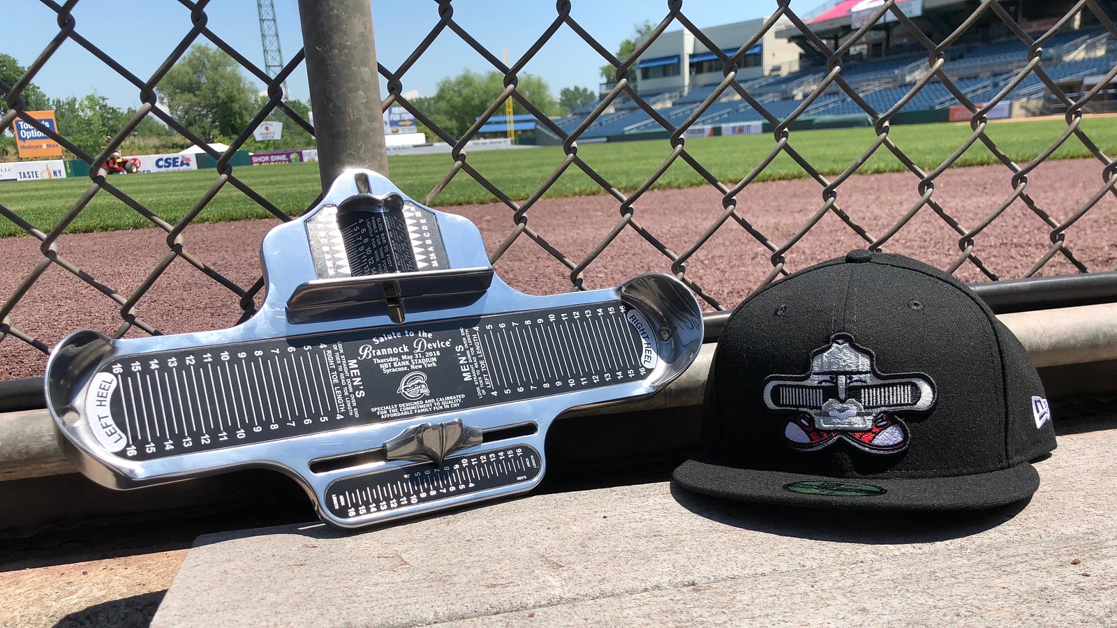
And now some words from Paul: Hey there. Have you ever wondered about the logistics of how a minor league team executes a one-game rebranding, complete with a new team name, custom uniforms, and so on? In case you missed it yesterday, I’ve written a ESPN feature about that, using the Syracuse Chiefs’ recent Brannock Device Night as a case study. Some of the piece is about the Brannock promotion and my role within it, but more of the article is about the steps that have to be taken for one of these one-game makeovers. It was a super-fun piece to report and write, and I think you’ll really enjoy it. Check it out here.
Also:
• Our friends at Vintage Brand are raffling off two of their gorgeous canvas prints. The deadline for entering is Sunday, 7pm Eastern. Full details here.
• We have some new Naming Wrongs designs. Full details here.
• With the Fourth of July fast approaching, this is a good time to grab one of our Uni Watch stars/stripes T-shirts. And if you’re Canadian, we also have Canada Day T-shirts.
That’s it for today. We now return you to your regularly scheduled Phil-harmonics.
Uni Watch News Ticker
By Phil

Baseball News: We start off with this, from Paul: Phillies OF Rhys Hoskins, activated from the DL (yester)day but still healing from a hairline fracture in his jaw, is wearing a double-earflapped helmet with C-flaps attached to *both* sides. That is an MLB first! … Here’s a look at the double flapper in action (From Ben Harris). … The Batavia Muckdogs, a Short-Season Class-A affiliate of the Miami Marlins, based in Batavia, have new jerseys. … The Royals’ Omaha affiliate became the “Runzas” last night. Tweeter Dex was at that game and snagged himself a sweet cap. … Taylor Motter has these really sweet Sandlot custom PF Flyer cleats (from Megan Brown). … “I can’t handle white pants vs white pants,” tweets @Fortlandia. “So much unstableness with uniforms in college baseball.” While I don’t disagree, I think 99.9% of all softball (color) tops look worse with gray pants. Simple solution? Wear all gray or mono-color. … The Wichita Wingnuts became the Wichita Flag yesterday (from Parker Kubiak). At first I thought this was a New Mexico flag ripoff. … This dated Atlanta Braves image is in the hallway at Dodger Stadium. That could probably (and by could, I mean DEFINITELY) should be updated (from Christina Dotson). … It was 90s Night last evening in Jacksonville. The current team, the Jacksonville Shrimp, write “And despite the fact neither the Jumbo Shrimp nor @BiloxiShuckers existed we’re both dressing like we did with these awesome faux backs!” … Not only did the Marlins (again) throwback yesterday, so did the Tampa Bay (Devil) Rays (from Jacob Bogage). … I’m not 100% certain when exactly the University of North Carolina wore these delicious powder blue beauties, but I hope it’s every game (from James Gilbert, I think). … Alongside the Michigan Brewers Guild, come August 4, the West Michigan Whitecaps will become the Beer City Bung Hammers (from MiLB Promos). … Here’s a look at some Tequila sunrise softball jerseys for North Central High School in Indiana (from Jason Merkel). … These are most certainly not the Star Wars jerseys I was looking for from the Salt Lake Bees (from Landry Heaton).

NFL/CFL News: Almost 1,500 NFL fans, in a recent poll conducted by FanJuicer.com, voted the Saints’ black and gold as the best logo and uniform combination among all teams in the National Football League. … There was another colour vs. colour game in CFL preseason on Friday night in Regina. A red vs. green game between the Stampeders and the Roughriders (from Wade Heidt). Here’s a bit more on that (from Tom Pachuta).
College Football News: College football has been flooded with trendy uniforms, but classic colors are still special to the game. Who has the best traditional threads?

Hockey News: Congratulations (slightly belated) to the Washington Capitals on their first NHL Stanley Cup. “Ovechkin threw the first pitch–no front number, NNOB #8 on the back, and a captain C smushed over the curly W,” writes Mike Engle. “Looked quite out of place, but then again the Nationals always look out of place trying to “respect” Expos history.” … Here’s a view of that jersey (from our own Jamie Rathjen). … And another angle (from Griffin Smith). … Patrick Thomas writes, “Vermont’s ice sheet for next season is very add (sic> filled. Would expect Adidas branded uniforms as well.”

NBA News: Even though the NBA finals (which for the fourth straight year featured the Cleveland Cavs and Golden State Warriors) were pretty anti-climactic, and with Nike scripting most of the playoff games, that didn’t stop Ed Kendrick (who also tracks several MLB teams) from uniform tracking the NBA playoffs. Nice job Ed!

Soccer News: The Southampton 18-19 home kit was leaked yesterday, revealing a predominantly red effort that, as some noted, renders the new third kit almost pointless (from Josh Hinton). … Also from Josh: Rotherham United, promoted to the Championship via the play-off route, have now revealed their new 2018-2019 third kit, following home and away that dropped earlier. … With the World Cup just around the corner, you can now get adidas and Nike World Cup kits in Bitmoji form. Because of course you can. … The United States men’s and women’s national teams are wearing special jerseys this month in support of LGBTQ Pride Month. The men’s national team debuted the jerseys, which feature rainbow-colored numbers, for a friendly with Ireland, and wore them again in a friendly against France on Saturday. … There’s a new home shirt for Union Berlin (from Ed Żelaski). … Also from Ed, a new home shirt for Huddersfield

Grab Bag: The score bug that NBC uses for the French Open has the flag of the country that each player is from on it. For Simona Halep, they use the Romanian flag, which is split into equal thirds (like France or Italy) of differentiating colors (blue, yellow, red). The score bug only shows the yellow and red parts of the flag (good observation by Josh Hinton). … “Not the best pic but an interesting observation from my wife as they unveiled the new triple crown winner at Belmont,” writes Paul Weisner, who asks, “The hat for American Pharoah is off to the right (view) and Justify has the hat on top of the silks. Why not the same? What do the others look like?” I was actually watching this and was wondering the same thing. … Speaking of the new Triple Crown winner, Justify was wearing the @WheelsUp blanket ahead of yesterday’s Belmont Stakes. The company reportedly paid seven figures for the deal that also includes logos on the pant legs, boots, and turtleneck of Justify’s jockey Mike Smith (from María Canales). … “For what I believe is the first time ever, a triple crown winning jockey and horse did NOT wear the same silks in all 3 races,” writes John McMunn. “After winning the Derby and Preakness in WinStar Farms predominately white silks, Mike Smith and Justify transitioned to red with yellow (maybe gold) stars. The change came about because part of the investment group that owns Justify are several business investors from China, the China Horse Club.” … Check out these Singlets for the Final X. IronMan Edition (from Phillip Brodzinski). … The US Open (Golf) starts this week, and here’s a look at what Jordan Spieth will wear (from Greg Holtzman).
UNC wore those Carolina Blue uniforms yesterday when they beat Stetson to go to the College World Series! (Not from me.)
From what little I saw, Stetson has different caps with different logos. An ‘SU’ and an ‘S’, so yesterday the catcher’s helmet had the ‘SU’ while the caps (and other helmets?) had the ‘S’.
Just trying to figure out how many World Cup teams will manage to get any sort of LGBT theme into their kits. Can we please keep the social themes out before this creeps into MLB and the NFL?
Rainbow numbers look awful, especially when it’s only on the backs and not the front. I think FIFA has regulations on the for the World Cup but I’m not certain.
Wouldn’t be allowed. The U.S. only wear them in friendlies.
Right, I thought there was a rule about that. Good, because the rainbow numbers look really bad. Really bad!
Social themes have crept into other sports. Major League Baseball honoring Jackie Robinson’s legacy as the first African American player by assigning #42 to all players is a social theme.
Sports is one facet of society where everyone should be welcome because color, sexual orientation, birthplace, religion, sex, etc. simply does not matter in any way, shape or form. Honoring the trailblazers seems genuine and goes a long way to help people who feel ostracized from sports because of discrimination have the courage to overcome their fears and get involved.
Assuming this is about rainbow numbers on soccer kits:
Who, exactly, are we honoring? Making everyone wear rainbow numbers for a month, and only in non-competitive matches (FIFA won’t allow striping on numbers) isn’t honoring a trailblazer. Having 42 on the back of a baseball uniform is different as it is honoring a player who broke the color barrier. Plus, wearing rainbow numbers, on one side of the kit but not the other, looks completely stupid.
Pink Bats? Blue Hats? Orange Ribbons?
Too late.
Love the soccer posts! While I can’t stand the German National Team, their kits are beautiful. Don’t like the Belgium sweater pattern but it may look better on the pitch. Argentina home kit and Brazil kits are solid as well. Around half of the adidas away kits are based off the same template which is terrible…
I like that many of the kits are a present-day version with a nod to uniforms in the past. Germany in green as a secondary jersey just feels like that is the way it should be. I am taking a liking to the Nigeria jerseys.
So Nigeria already wore those shirts against England: link
I didn’t think Nigeria contrasted that well with England’s white shirts/socks, because that shirt appears to also count as a light-colored shirt (or Nigeria’s other shirt wouldn’t be green). So I don’t know if they’d wear it against Croatia or Argentina.
Also, the vintage photos. Pretty cool, and there’s tons out there like with baseball. Always fun to see the masses and masses of people – most stadiums in the UK were almost all terraces (few actual seats) until the early ’90s.
What’s up with the stars on Egypt’s white jersey? I don’t know much about soccer but I’m pretty sure Egypt hasn’t won seven World Cups.
They’ve won the African Cup of Nations (the African equivalent of Copa America or the Euros) seven times, so that’s probably what it is.
Good example of the (mostly) non-standard use of stars to represent championships. All the other teams at the tournament wearing stars use them to represent World Cups won, except Uruguay, who have four, which seem to represent two World Cups and two pre-World Cup Olympic gold medals.
Typo: “This dated Atlanta Braves image is in the hallway at DODGER Stadium.”
Typo, too: “The hat for American PHAROAH is off to the right” Spelling on sign in photo is correct.
Those Final X singlets aren’t bad looking, if the promoters are trying to “professionalize” freestyle wrestling.
Typo: “This dated Atlanta Braves image is in the hallway at DODGER Stadium.”
Typo, too: “The hat for American PHAROAH is off to the right” Spelling is correct on the sign in the photo.
Those Final X singlets aren’t bad looking, if the promoters are trying to “professionalize” freestyle wrestling.
got to love Kyle’s soccer feedback
“too simple”
“too simple”
“too simple”
“too simple”
“too simple”
“too simple”
and then when Spain tries a little something he immediately fires off ” too busy for me.”
i hate soccer but love the worls cup. thanks for contributing this to both of you!
not uniform related at all but your posting had this Duckman episode immediately spring to my mind (starting at 0:52)
link
In regards to the triple crown winner and the hat being off to the side. It’s because of American Pharoah name that’s stacked double decker that the hat didn’t fit
What in the world does “Looked quite out of place, but then again the Nationals always look out of place trying to “respect” Expos history.” have to do with a DC team putting a captain’s C on their jersey to honor another DC team?
This is the kind of stuff I hate about Uni-Watch.
I came here to second that emotion. There is absolutely nothing about the event that has anything to do with the Expos.
Today’s World Cup piece is really well done. Great job guys.
It’s that time again — that time when we feature the Beautiful Game
This isn’t a cricket article…
The Socceroos draw on elements from their run in qualifying for the 2006 World Cup
Don’t get me started on ’06…Italy flopped the Soccerooos out of the tourney then went on to win the whole thing. I’m still mad and I’m not even Australian.
Other than Peru, Croatia, Iceland, Nigeria, Germany and Belgium…*yawn*
Poland not wearing white/red/white is a travesty. Still rooting for them though.
I was watching the NCAA Super Regionals last night (crazy awesome game between Oregon State and Minnesota, by the way!), and it had me thinking about Omaha, the College World Series, and naming wrongs. I don’t think that I’ve ever seen one, but I’m pretty sure that I’d totally buy a “I still call it Rosenblatt” shirt.
It would have to be “I miss The Blatt” since the new stadium is downtown and they tore Rosenblatt down a few years ago. Still a great idea!
Touché. I know they’re different parks but I do still refer at TD Ameritrade Park as Rosenblatt.
Peru wins best in show for me. Love the sashes.
France and Nike made a mistake by not utilizing their “training top” design as their secondary kit.
link
I couldn’t agree more. The training top would even make a great primary jersey!
My only guess for the different position of the hat/helmet above the silks on the American Pharoah board is due to the length of his name.
Typo in first paragraph:
“Today CJ & Kyle are back with their preview of the Olympic jerseys. It’s a biggie, so let’s get right to it!”
World Cup jerseys
I really like that shade of green that Germany uses. Australia, too.
We haven’t seen where the front numbers will be positioned on some of these jerseys. For Uruguay, I hope it’s right in the middle of that sublimated sun of theirs. Anywhere else would look weird.
Paul, I know you are not crazy about the Panthers color scheme but if you were to ever offer a black sock with the silver and blue stripes like on the shoulders of the team jersey I would definitely buy a bundle…I think you underestimate how much people like that combo and it might be a big seller even if its not to your tastes.
Remember, the Panthers “all-blacks” were voted best uniforms on a major site a while back. People love those colors together.